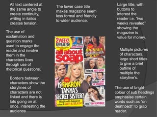
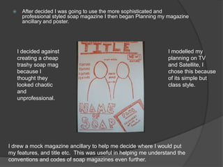
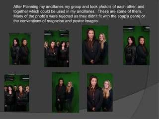
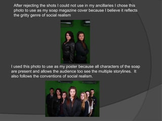
Analysing existing soap
magazines.. of soap magazine. I had to analyse the
There a few different types
    all to help me decide which would best suit my genre of soap.


 Trashy styled, easy reading                       Sophisticated, restrained
    and normally cheap.                               and professional.
Large amount of space   Masthead is large
Black and white       emphasises the          and extends over
image used to         background image        the edges of the
represent                                     page and grabs
sophistication of                             attention
the magazine.
Restrained                                     Dominating
colour scheme                                  image of star,
creates product                                gives eye
quality.                                       contact to the
                                               reader creating
                                               a connection
 Other features                                between star
 included in the                               and reader.
 magazine.
 Opposite
 colours draw                                    Writing in italics
 attention                                       to show they are
                                                 the words of the
Main article title;
                                                 star personalise
name of the star to
                                                 and give slight
personalise the
                                                 insight to the
article.
                                                 main article.
All text cantered at                                Large title, with
                          The lower case title
  the same angle to                                   buttons to
                          makes magazine seem
  create continuity,                                  interest the
                          less formal and friendly
  writing in italics                                  reader i.e. “two
                          to wider audience.
  creates tension.                                    weeks revealed”
                                                      showing the
The use of                                            magazine is
exclamation and                                       value for money.
question marks
used to engage the
reader and involve                                     Multiple pictures
them in the                                            of characters,
characters lives                                       large short titles
through use of                                         to give a brief
rhetorical questions.                                  outline of
                                                       multiple the
  Borders between                                      storyline’s.
  characters show the
  storylines of                                      The use of bright
  characters are not                                 colour of sub headings
  linked and there is                                emphasise certain
  lots going on at                                   words such as “on
  once, interesting the                              deathbed!” to grab
  audience                                           reader.
   After analysing existing examples of soap magazines in preparation
         for my ancillary, I began looking at examples of soap posters.

                                                            The large image
The text “every parents
                                                            of the woman
worst nightmare” entices a
                                                            attracts an
teenage audience who
                                                            audience due to
may want to find out why.
                                                            its suggestive
It also promotes a
                                                            nature
rebellious outlook as
teenagers my watch it for
the sole reason their                                       There not a lot of
parents do not approve.                                     text. This is so even
                                                            when passing the
                                                            poster in the street,
  The name of the soap                                      the audience can
  is quite small again                                      understand the
  showing the image as                                      nature and genre of
  the main attraction for                                   the soap in a small
  the audience. Also it                                     space of time
  creates brand                   There is also less
  recognition between            text because the
  the soap and the               image speaks loudly
  audience.                      and it is the main
                                 focus of the poster.
     After decided I was going to use the more sophisticated and
       professional styled soap magazine I then began Planning my magazine
       ancillary and poster.


     I decided against                                           I modelled my
     creating a cheap                                            planning on TV
     trashy soap mag                                             and Satellite, I
     because I                                                   chose this because
     thought they                                                of its simple but
     looked chaotic                                              class style.
     and
     unprofessional.


I drew a mock magazine ancillary to help me decide where I would put
my features, and title etc. This was useful in helping me understand the
conventions and codes of soap magazines even further.
   After finishing the first plan of my magazine, I began planning my
    poster ancillary.


        I chose to use multiple characters in the poster image
        to show the different storylines and the genre of the
        soap.
After Planning my ancillaries my group and took photo’s of each other, and
together which could be used in my ancillaries. These are some of them.
Many of the photo’s were rejected as they didn’t fit with the soap’s genre or
the conventions of magazine and poster images.
These are the rejected shots of the ancillary photo shoot.
I chose to remove them because they do not conform to the conventions of
social realism soaps and the genre of our soap.


                                              The characters
                          There is too        expressions do      Characters
  The characters                                                  are too close
                          much blank          not reflect the
  do not line up                                                  to edges of
                          space in the        attitude of the
  correctly                                                       photo.
                          photo               storyline.


     Too much
                             The characters           The characters
     space between
                             expressions              are too close
     the characters
                             cannot be seen           together.
After rejecting the shots I could not use in my ancillaries I chose this
 photo to use as my soap magazine cover because I believe it reflects
 the gritty genre of social realism


I used this photo to use as my poster because all characters of the soap
are present and allows the audience too see the multiple storylines. It
also follows the conventions of social realism.
After deciding which photo I would use for both my ancillaries I used
Photoshop to edit them.

Ancillary stages

  • 2.
    Analysing existing soap magazines..of soap magazine. I had to analyse the There a few different types all to help me decide which would best suit my genre of soap. Trashy styled, easy reading Sophisticated, restrained and normally cheap. and professional.
  • 3.
    Large amount ofspace Masthead is large Black and white emphasises the and extends over image used to background image the edges of the represent page and grabs sophistication of attention the magazine. Restrained Dominating colour scheme image of star, creates product gives eye quality. contact to the reader creating a connection Other features between star included in the and reader. magazine. Opposite colours draw Writing in italics attention to show they are the words of the Main article title; star personalise name of the star to and give slight personalise the insight to the article. main article.
  • 4.
    All text canteredat Large title, with The lower case title the same angle to buttons to makes magazine seem create continuity, interest the less formal and friendly writing in italics reader i.e. “two to wider audience. creates tension. weeks revealed” showing the The use of magazine is exclamation and value for money. question marks used to engage the reader and involve Multiple pictures them in the of characters, characters lives large short titles through use of to give a brief rhetorical questions. outline of multiple the Borders between storyline’s. characters show the storylines of The use of bright characters are not colour of sub headings linked and there is emphasise certain lots going on at words such as “on once, interesting the deathbed!” to grab audience reader.
  • 5.
     After analysing existing examples of soap magazines in preparation for my ancillary, I began looking at examples of soap posters. The large image The text “every parents of the woman worst nightmare” entices a attracts an teenage audience who audience due to may want to find out why. its suggestive It also promotes a nature rebellious outlook as teenagers my watch it for the sole reason their There not a lot of parents do not approve. text. This is so even when passing the poster in the street, The name of the soap the audience can is quite small again understand the showing the image as nature and genre of the main attraction for the soap in a small the audience. Also it space of time creates brand There is also less recognition between text because the the soap and the image speaks loudly audience. and it is the main focus of the poster.
  • 6.
     After decided I was going to use the more sophisticated and professional styled soap magazine I then began Planning my magazine ancillary and poster. I decided against I modelled my creating a cheap planning on TV trashy soap mag and Satellite, I because I chose this because thought they of its simple but looked chaotic class style. and unprofessional. I drew a mock magazine ancillary to help me decide where I would put my features, and title etc. This was useful in helping me understand the conventions and codes of soap magazines even further.
  • 7.
     After finishing the first plan of my magazine, I began planning my poster ancillary. I chose to use multiple characters in the poster image to show the different storylines and the genre of the soap.
  • 8.
    After Planning myancillaries my group and took photo’s of each other, and together which could be used in my ancillaries. These are some of them. Many of the photo’s were rejected as they didn’t fit with the soap’s genre or the conventions of magazine and poster images.
  • 9.
    These are therejected shots of the ancillary photo shoot. I chose to remove them because they do not conform to the conventions of social realism soaps and the genre of our soap. The characters There is too expressions do Characters The characters are too close much blank not reflect the do not line up to edges of space in the attitude of the correctly photo. photo storyline. Too much The characters The characters space between expressions are too close the characters cannot be seen together.
  • 10.
    After rejecting theshots I could not use in my ancillaries I chose this photo to use as my soap magazine cover because I believe it reflects the gritty genre of social realism I used this photo to use as my poster because all characters of the soap are present and allows the audience too see the multiple storylines. It also follows the conventions of social realism.
  • 11.
    After deciding whichphoto I would use for both my ancillaries I used Photoshop to edit them.