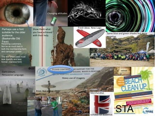
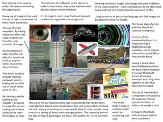
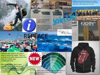
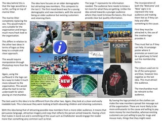
Mood Boards
Task 6
The use of Helvetica as a font can
ease the amount of text in the piece.
This can help the reader digest all the
information. This will relate to the rest
of the content, very simplistic.
This contrasts with the logo for this
idea. That takes a more negative
approach, whereas the clean text
makes it much more basic and puts a
positive look on the issues.
Using the two can attract a greater
amount of the audience.
For the text used in both the Campaign poster and the Membership form, it is important to use a
clear font so the young audience can read the information well. (Arial)
Using a font such as Comic Sans can keep the attention of the younger reader. By looking at
this text you can instantly tell it is less formal and taking a more softer approach in teaching
concerning the oceans and how they are affected.
This mood board was created for the young
audience. This is seen through some of the
images.
The eye’s here represent the awareness that
is created through the campaign poster and
educational membership form .
The eye shown is a potential
idea as a logo. The eye is to be
crowded in by waves.
The tear drop is to add
something more negative and
emotional to the message.
The tear drop is to be in blue
in order to reflect the theme
and a surfer could be trapped
inside it.
This would take the surfer in a
can idea from SAS and adapt it
into something more
emotional.
The blue shade is something
to be kept throughout. The
badges are something I want
to replicate in my production
for this audience.
Something that allows
interaction with them. This is a
much cheaper alternative to
items of clothing and it can be
produced in large quantities.
The style of this idea is that of something basic and simple but has the content and attraction. The
reasons for the green posters are to help illustrate the effect I am wanting to create with this idea.
The use of green is also another shade I want to incorporate in the designs. This describes growth
and the environment well, the reader will understand the topics much more with loud, bright
colours in the background rather than black with white text.
The blue is to illustrate trust and the sea. These psychologically tell the reader what the text is
going to be about.
The leaflets gathered are
all simple in approach,
they use short sections
of text so it is easy to
digest.
The use of the social
media icons are there to
illustrate the impact they
will have on the posters.
The idea of
#WaveAwayWaste is to
attempt to interact with
the target audience.
The fonts used here in
black are to show the
simplicity I want to get
across through the work.
The mood boards will allow me to know how to approach the idea in terms of target audience. Looking at
previous layouts for those aimed at the same demographic, will allow me to replicate it. Keeping the reader
engaged is important, therefore the use of bright colours, short paragraphs and attractive imagery.
The small white squares with waves in are to illustrate my thoughts. The idea behind them is to demonstrate the
merge between the waves and emotion. This is seen in the first with the tear drop surrounded by the wave.
STA
Retaining customers.
Not be as much text in
both the membership form
and campaign poster.
The text when used must
look friendly and less
formal. (Geneva font)
Dark colours.
Persuasive Language.
Fresh ideas. New Logo.
Heavy use of imagery.
Perhaps use a font
suitable for the older
audience.
(Baskerville Old
Face)
Show them what
you have achieved
with their help.
Changing attitudes.
Print. Not digital. Older
audience.
Merchandise
suitable for audience.
Same blue and green shades but more
negative.
Dark colours to be used to
reflect the issues concerning
the organisation.
Heavy use of images to be used
instead of text to show how the
events raise awareness.
The inclusion of surfboards in the idea is to
make it much more clear to the audience and
possibly attract newer members.
It is to make it much more fresh and relevant
to what the organisation is trying to do.
Showing emotional images can change attitudes in relation
to the issues covered. This is in comparison to the last mood
board and that of a bright, colourful approach to SAS.
Using a contrast of persuasive language and dark imagery is
designed to entice the reader.
The house style of green
and blue should be
retained throughout.
In terms of the
membership form, it is
important that if
targeting existing
members, not to include
information about SAS as
they already know.
Having a beach clean
would differentiate from
the dark theme, however
it is a way that could
attract all existing
members and bring them
together to see what
they have achieved.
The use of merchandise
is important in relation to
the audience. Having
appropriate items to
reflect the reader is vital.
A mug or office tools
such as mouse mats or
pens could work.
The use of text is
important. By having
simple and clear text
makes it stand out
from the large
amounts of images.
As the audience is
older than the last
idea, it is important
to focus on print
rather than online
advertisement.
This would be done
through creating
campaign posters
looking without the
use of social media
icons or links.
By creating a poster
looking at the
impacts is designed
to make that person
looking more aware
and to make them
feel obliged to help.
This would
make it easy to
replicate and it
would be
something that
sells.
This use of the surf boards as the logo is something that can be easily
replicated and placed onto merchandise. The cost is also a factor behind
the look. Having something so simple would allow it to be remade many
times on a variety of items and campaign posters. The reasoning behind
the idea is that all good logo’s are basic. The Golden ‘M’ or the tick from
Nike.
REPLACE
Attractive text needs to be used in
order to entice the reader. This is in
contrast to the other ideas where they
keep to a simple copy.
(Chalkduster font)
Having text that is clear is also
important. It is vital to distinguish
between the headings and the text.
Size does not always make it clear.
(Lucida Sans)
Large amounts of
information.
People need to know
what they are getting
for their money.
The blue and green colour remains an idea kept throughout. It
keeps to the organisations theme of both the ocean and
environmental protection.
Having an event where potential new members
can come is a good way to distribute membership
forms such as the existing one on the left.
The idea here focuses on an older demographic
but attracting new members. This compares to
the last 2. The first mood board was for a young
demographic and new members, with the second
being an older audience but existing customers
and retaining them.
The idea behind this is
that the logo would be a
surfer, surfing on top of
marine litter.
The marine litter
completely replacing the
sea. This would make it
very suitable for the
organisation and bring a
much more fresh look to
the organisation.
This differs in relation to
the other two ideas in
terms of logos as they
keep to a simple and
clean approach.
This would require
manipulation through
Photoshop more than the
others.
Again, using the
surfboard in the logo can
be a way to make it much
more relevant to the
organisation. This would
allow the text to not be
underneath for when
placing on merchandise.
The text used in this idea is to be different from the other two. Again, they look at a clean and easily
readable look. This is because they were looking at both educating children and retaining customers.
With this idea being that of attracting possible new members from a more older audience, it means that
persuasive language, attractive imagery and copy that reflects the person aimed towards. Having a font
that makes it stand out and is something of the usual such as Chalkduster would engage the reader
more than something very common such as Arial.
The large ‘I’ represents he information
needed. The audience here needs to know a
lot more for what they are getting. Unlike the
idea aimed towards a younger audience
where they need to know the basics, this must
provide clear but quality information.
The incorporation of
both the ‘Welcome’ and
‘New’ signs is to
represent the new
audience and making
them feel as if they can
help and offer
something to the cause.
First they must be
attracted in, the use of
the creative logo
provides it.
They must feel as if they
can help. A campaign
poster where it
promotes an event can
be a good way to hand
out the membership
forms.
The colours used are to
be of the same green
and blue, however less
negative as the last
idea. This must attract
the audience.
The merchandise must
be relevant to the
audience.
By having the logo printed on the clothes can
make the new members spread the message out
of the organisation. These are more likely to be
more enthusiastic to the cause and willing to pay
more money for merchandise, whereas existing
customers are just willing to pay for mugs and
mouse mats, things that they might need.

Task 6!

  • 1.
  • 2.
    The use ofHelvetica as a font can ease the amount of text in the piece. This can help the reader digest all the information. This will relate to the rest of the content, very simplistic. This contrasts with the logo for this idea. That takes a more negative approach, whereas the clean text makes it much more basic and puts a positive look on the issues. Using the two can attract a greater amount of the audience. For the text used in both the Campaign poster and the Membership form, it is important to use a clear font so the young audience can read the information well. (Arial) Using a font such as Comic Sans can keep the attention of the younger reader. By looking at this text you can instantly tell it is less formal and taking a more softer approach in teaching concerning the oceans and how they are affected.
  • 3.
    This mood boardwas created for the young audience. This is seen through some of the images. The eye’s here represent the awareness that is created through the campaign poster and educational membership form . The eye shown is a potential idea as a logo. The eye is to be crowded in by waves. The tear drop is to add something more negative and emotional to the message. The tear drop is to be in blue in order to reflect the theme and a surfer could be trapped inside it. This would take the surfer in a can idea from SAS and adapt it into something more emotional. The blue shade is something to be kept throughout. The badges are something I want to replicate in my production for this audience. Something that allows interaction with them. This is a much cheaper alternative to items of clothing and it can be produced in large quantities. The style of this idea is that of something basic and simple but has the content and attraction. The reasons for the green posters are to help illustrate the effect I am wanting to create with this idea. The use of green is also another shade I want to incorporate in the designs. This describes growth and the environment well, the reader will understand the topics much more with loud, bright colours in the background rather than black with white text. The blue is to illustrate trust and the sea. These psychologically tell the reader what the text is going to be about. The leaflets gathered are all simple in approach, they use short sections of text so it is easy to digest. The use of the social media icons are there to illustrate the impact they will have on the posters. The idea of #WaveAwayWaste is to attempt to interact with the target audience. The fonts used here in black are to show the simplicity I want to get across through the work. The mood boards will allow me to know how to approach the idea in terms of target audience. Looking at previous layouts for those aimed at the same demographic, will allow me to replicate it. Keeping the reader engaged is important, therefore the use of bright colours, short paragraphs and attractive imagery. The small white squares with waves in are to illustrate my thoughts. The idea behind them is to demonstrate the merge between the waves and emotion. This is seen in the first with the tear drop surrounded by the wave.
  • 4.
    STA Retaining customers. Not beas much text in both the membership form and campaign poster. The text when used must look friendly and less formal. (Geneva font) Dark colours. Persuasive Language. Fresh ideas. New Logo. Heavy use of imagery. Perhaps use a font suitable for the older audience. (Baskerville Old Face) Show them what you have achieved with their help. Changing attitudes. Print. Not digital. Older audience. Merchandise suitable for audience. Same blue and green shades but more negative.
  • 5.
    Dark colours tobe used to reflect the issues concerning the organisation. Heavy use of images to be used instead of text to show how the events raise awareness. The inclusion of surfboards in the idea is to make it much more clear to the audience and possibly attract newer members. It is to make it much more fresh and relevant to what the organisation is trying to do. Showing emotional images can change attitudes in relation to the issues covered. This is in comparison to the last mood board and that of a bright, colourful approach to SAS. Using a contrast of persuasive language and dark imagery is designed to entice the reader. The house style of green and blue should be retained throughout. In terms of the membership form, it is important that if targeting existing members, not to include information about SAS as they already know. Having a beach clean would differentiate from the dark theme, however it is a way that could attract all existing members and bring them together to see what they have achieved. The use of merchandise is important in relation to the audience. Having appropriate items to reflect the reader is vital. A mug or office tools such as mouse mats or pens could work. The use of text is important. By having simple and clear text makes it stand out from the large amounts of images. As the audience is older than the last idea, it is important to focus on print rather than online advertisement. This would be done through creating campaign posters looking without the use of social media icons or links. By creating a poster looking at the impacts is designed to make that person looking more aware and to make them feel obliged to help. This would make it easy to replicate and it would be something that sells. This use of the surf boards as the logo is something that can be easily replicated and placed onto merchandise. The cost is also a factor behind the look. Having something so simple would allow it to be remade many times on a variety of items and campaign posters. The reasoning behind the idea is that all good logo’s are basic. The Golden ‘M’ or the tick from Nike.
  • 6.
    REPLACE Attractive text needsto be used in order to entice the reader. This is in contrast to the other ideas where they keep to a simple copy. (Chalkduster font) Having text that is clear is also important. It is vital to distinguish between the headings and the text. Size does not always make it clear. (Lucida Sans) Large amounts of information. People need to know what they are getting for their money. The blue and green colour remains an idea kept throughout. It keeps to the organisations theme of both the ocean and environmental protection. Having an event where potential new members can come is a good way to distribute membership forms such as the existing one on the left.
  • 7.
    The idea herefocuses on an older demographic but attracting new members. This compares to the last 2. The first mood board was for a young demographic and new members, with the second being an older audience but existing customers and retaining them. The idea behind this is that the logo would be a surfer, surfing on top of marine litter. The marine litter completely replacing the sea. This would make it very suitable for the organisation and bring a much more fresh look to the organisation. This differs in relation to the other two ideas in terms of logos as they keep to a simple and clean approach. This would require manipulation through Photoshop more than the others. Again, using the surfboard in the logo can be a way to make it much more relevant to the organisation. This would allow the text to not be underneath for when placing on merchandise. The text used in this idea is to be different from the other two. Again, they look at a clean and easily readable look. This is because they were looking at both educating children and retaining customers. With this idea being that of attracting possible new members from a more older audience, it means that persuasive language, attractive imagery and copy that reflects the person aimed towards. Having a font that makes it stand out and is something of the usual such as Chalkduster would engage the reader more than something very common such as Arial. The large ‘I’ represents he information needed. The audience here needs to know a lot more for what they are getting. Unlike the idea aimed towards a younger audience where they need to know the basics, this must provide clear but quality information. The incorporation of both the ‘Welcome’ and ‘New’ signs is to represent the new audience and making them feel as if they can help and offer something to the cause. First they must be attracted in, the use of the creative logo provides it. They must feel as if they can help. A campaign poster where it promotes an event can be a good way to hand out the membership forms. The colours used are to be of the same green and blue, however less negative as the last idea. This must attract the audience. The merchandise must be relevant to the audience. By having the logo printed on the clothes can make the new members spread the message out of the organisation. These are more likely to be more enthusiastic to the cause and willing to pay more money for merchandise, whereas existing customers are just willing to pay for mugs and mouse mats, things that they might need.