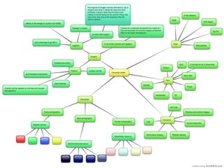
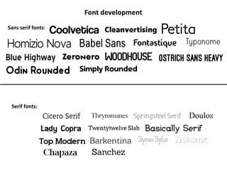
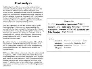
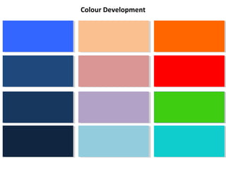
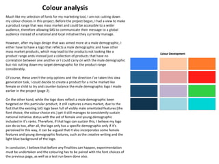
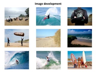
Social Action and Community Media
Task 8 – production (campaign poster)
Idea generation
While my idea of a logo was positive, due to the fact that I had to make it stand out and therefore it followed that a bright them
might be effective in this scenario. However, a negative theme might be a strong and powerful way of advertising the SAS and
allowing a wider audience have emotive feeling toward the purpose, therefore drawing in people to support the campaign and fight
against sewage in the ocean.
On the other hand, a continuation of positive themes on my campaign poster will help link the products together in a more clear
correlation other than the name on the products I am to produce. For this reason, and the fact that I’m working for a client not for
myself where risks can pay off, the risk of trying to make the company stand out through negative themes is definitely outweighed by
the risk of the company failing in their pursuit of a wider audience and therefore I will have failed with the rebranding exercise.
While I seem to have weighed up my options of whether to go positive or negative as a theme, I will not discount the negative theme
and will still experiment with a few designs before making my final poster idea. This is similar with all the choices I have to make
throughout the project, I will always test and experiment with them before discounting them and using the other options available for
my final project.
Now I seem to have chosen my themes and choice of imagery for my campaign poster, some added details can now be decided on,
such as the font, the colouration of the poster, the features and the copy featured on the promotional tool. As I have learnt from past
projects, some that have been successful and others that needed work on them, the key to a successful layout, regardless of the
purpose or the theme, a serif and a sans serif font should be paired together to make a successful product. The problem of making a
product with copy however may make my choices of fonts even more extensive and it may lead to me using 3 fonts instead of 2,
therefore furthering complicating my decisions on this poster. While the idea to select a serif and a sans serif font alongside one
another, this has just posed another question; which sans serif and serif fonts will be used?
The next item in the visual hierarchy is the colouration of the poster; one of the mot important features on this
design. A possible choice for the colouring is to match the colour of the poster to a certain demographic, whether
It’s age, gender or social status. This feature should be chosen carefully, due to the consequences and repercussions
if this project goes wrong for both the client and us as the rebranding team. I could try and match it to the mainly
male orientated product I made for my logo, despite it trying to appeal to a mass market, hence the light tints of
blue, as well as the darker ones. I think the idea of a continuation in demographic type and colouring can be effective
And make my product range look more together and mainly, more like a product range.
Font development
Sans serif fonts:
Serif fonts:
Traditionally, the serif fonts are somewhat bolder and more
noticeable out of the two kinds I’m planning to use, serif is the
one most likely to fit the font for the title. However, when
looking for fonts, it seemed that I had found an unconventional
pattern; the Sans Serif fonts were generally bolder than those in
the Serif category. However, at this stage, it didn’t matter about
finding perfect fonts for the layout, it was just about using
interesting serif and sans serif fonts to give me an idea of what
kind of fonts I could use on my campaign poster.
From here, I went onto Da Font and pulled a range of fonts I
thought could work together on my design. As well as this, I
sourced fonts that could work well on their own and in a layout
where three fonts are included. Even though I haven’t chosen my
main copy font yet, I was also looking for a font that could be
used for titles and sub-titles within my layout, it’s something I
have to start thinking about if I want to make an effective
product and product range.
Due to their inclusion on my fontal choices slide, all these fonts
are contenders to be featured on my design layout and could
also be used on other marketing tools such as my membership
form and merchandise if they are successfully added to my
campaign poster.
While some of these fonts are too bold or too thin to be included
on my design, I didn’t want to cut down the fontal choices too
early and regret my decision later In the project. This is mainly to
avoid making an ineffective product but it’s also about allowing
for experimentation and further research of fonts later in the
project if I wish, therefore no font will be missed and potential
opportunities to make my product and the rebranding successful
will be taken.
Font analysis
Colour Development
Much like my selection of fonts for my marketing tool, I am not cutting down
my colour choices in this project. Before the project began, I had a view to make
a product range that was mass market and could be accessible to a wider
audience, therefore allowing SAS to communicate their message to a global
audience instead of a national and local initiative they currently manage.
However, after my logo design that was aimed more at a male demographic, I
either have to have a logo that reflects a male demographic and have other
mass market products, which may lead to the products not looking like a
product range ands instead just a collection of products that have no
correlation between one another or I could carry on with the male demographic
but risk cutting down my target demographic for the product range
considerably.
Of course, these aren’t the only options and the direction I’ve taken this idea
generation task, I could decide to create a product for a niche market like
female or child to try and counter-balance the male demographic logo I made
earlier in the project (page 2).
On the other hand, while the logo does reflect a male demographic been
targeted on this particular product, it still captures a mass market, due to the
fact that the existing SAS logo been full of visibly male orientated features (the
font choice, the colour choice etc.) yet it still manages to consistently sustain
national initiative status with the aid of female and young demographic
included in it’s ranks. Therefore, if that logo can sustain this, I believe my logo
can do so too, after all, the logo only has a specific demographic only if it’s
perceived in this way, it can be argued that it also incorporates some female
features and young demographic features, such as the creative writing and the
light blue background of the logo.
In conclusion, I believe that before any finalities can happen, experimentation
must be undertaken and the colouring has to be paired with the font choices of
the previous page, as well as a test run been done also.
Colour analysis
Image development
After deciding to pick positive themes and
imagery back on the first few slides, I had
to then decide on some potential imagery
for my design layout. After much
deliberation, I selected some imagery
suitable for my piece, despite not knowing
which demographic I was to target for this
product. My main focus was to try and
collect individual images that would appeal
to various demographics, therefore, as a
collective, they should appeal to a mass
market. Of course, I can’t include every
image on the poster, only a select few,
which will be decided after experiment with
other features of the poster to see if they
compliment each other well. While these
images won’t be used as a background for
any of the posters, they will be one of the
most predominant features in the visual
hierarchy of this design and will be seen by
many consumers (which is why they need
to be the right choices). The images that
don’t make it on to the poster design may
be used for the membership leaflet, due to
me using consistently positive imagery
throughout my product range.
*the absence of images that solely appeal
to younger demographics may be a
problem, as might the issue of not
including an image of SAS at parliament.
This image clearly shows that SAS make a
monumental impact and have done so to
change legislation. I should review this
decision and possibly try to include it in at
least one of my products in this project.
The reason for the inclusion of the beach clean up
images on the previous slide was due to them been
positive imagery for my poster design. I was
thinking about having solely clean beach images on
the product, however, this doesn’t prove they were
littered in the first place and the SAS have made a
difference, where as the images of the initial clean
up proves this and effectively shows how SAS make
a difference to beaches across the UK.
A mix of imagery sourced from SAS and from other
external sources has been selected for the shortlist
of poster imagery I have available for this project. I
didn’t want predominantly one over the other, due
to the fact that too little SAS imagery and I risk
depicting SAS as a charity who don’t make a
sizeable difference to the UK’s oceans, too much
SAS imagery and it shows that SAS are self-
orientated and don’t communicate or encourage
clean up imagery from members and other surf
fans, which is not a message that SAS want to
convey.
As for demographic orientated imagery,
as mentioned before; I included at least
one image that would appeal to a male
demographic, a female demographic and
a young demographic (caters for most
demographics/mass market). For the
male demographic, I have tapped into
the stereotypically competitive males by
including an image of a professional
surfer, therefore showing that surfing is
competitive and can compete with other
sports. As for a female audience; I have
included a female surfer, however, she is
an amateur and suggests that anyone
can do the sport. This feature has also
been mirrored for sections of the male
demographic that don’t want to be
competitive but instead wants
conformation that anyone can do the
sport instead of just professionals. The
last demographic I have tried to appeal
to is a younger one. I have done so by
depicting a family with surf boards which
suggests that all demographics are
welcome, even children. This piece of
imagery may also appeal to a female
demographic who traditionally look for
family activities to d, rather than the
men doing this job.

Campaign Poster Development

  • 1.
    Social Action andCommunity Media Task 8 – production (campaign poster)
  • 3.
    Idea generation While myidea of a logo was positive, due to the fact that I had to make it stand out and therefore it followed that a bright them might be effective in this scenario. However, a negative theme might be a strong and powerful way of advertising the SAS and allowing a wider audience have emotive feeling toward the purpose, therefore drawing in people to support the campaign and fight against sewage in the ocean. On the other hand, a continuation of positive themes on my campaign poster will help link the products together in a more clear correlation other than the name on the products I am to produce. For this reason, and the fact that I’m working for a client not for myself where risks can pay off, the risk of trying to make the company stand out through negative themes is definitely outweighed by the risk of the company failing in their pursuit of a wider audience and therefore I will have failed with the rebranding exercise. While I seem to have weighed up my options of whether to go positive or negative as a theme, I will not discount the negative theme and will still experiment with a few designs before making my final poster idea. This is similar with all the choices I have to make throughout the project, I will always test and experiment with them before discounting them and using the other options available for my final project. Now I seem to have chosen my themes and choice of imagery for my campaign poster, some added details can now be decided on, such as the font, the colouration of the poster, the features and the copy featured on the promotional tool. As I have learnt from past projects, some that have been successful and others that needed work on them, the key to a successful layout, regardless of the purpose or the theme, a serif and a sans serif font should be paired together to make a successful product. The problem of making a product with copy however may make my choices of fonts even more extensive and it may lead to me using 3 fonts instead of 2, therefore furthering complicating my decisions on this poster. While the idea to select a serif and a sans serif font alongside one another, this has just posed another question; which sans serif and serif fonts will be used? The next item in the visual hierarchy is the colouration of the poster; one of the mot important features on this design. A possible choice for the colouring is to match the colour of the poster to a certain demographic, whether It’s age, gender or social status. This feature should be chosen carefully, due to the consequences and repercussions if this project goes wrong for both the client and us as the rebranding team. I could try and match it to the mainly male orientated product I made for my logo, despite it trying to appeal to a mass market, hence the light tints of blue, as well as the darker ones. I think the idea of a continuation in demographic type and colouring can be effective And make my product range look more together and mainly, more like a product range.
  • 4.
    Font development Sans seriffonts: Serif fonts:
  • 5.
    Traditionally, the seriffonts are somewhat bolder and more noticeable out of the two kinds I’m planning to use, serif is the one most likely to fit the font for the title. However, when looking for fonts, it seemed that I had found an unconventional pattern; the Sans Serif fonts were generally bolder than those in the Serif category. However, at this stage, it didn’t matter about finding perfect fonts for the layout, it was just about using interesting serif and sans serif fonts to give me an idea of what kind of fonts I could use on my campaign poster. From here, I went onto Da Font and pulled a range of fonts I thought could work together on my design. As well as this, I sourced fonts that could work well on their own and in a layout where three fonts are included. Even though I haven’t chosen my main copy font yet, I was also looking for a font that could be used for titles and sub-titles within my layout, it’s something I have to start thinking about if I want to make an effective product and product range. Due to their inclusion on my fontal choices slide, all these fonts are contenders to be featured on my design layout and could also be used on other marketing tools such as my membership form and merchandise if they are successfully added to my campaign poster. While some of these fonts are too bold or too thin to be included on my design, I didn’t want to cut down the fontal choices too early and regret my decision later In the project. This is mainly to avoid making an ineffective product but it’s also about allowing for experimentation and further research of fonts later in the project if I wish, therefore no font will be missed and potential opportunities to make my product and the rebranding successful will be taken. Font analysis
  • 6.
  • 7.
    Much like myselection of fonts for my marketing tool, I am not cutting down my colour choices in this project. Before the project began, I had a view to make a product range that was mass market and could be accessible to a wider audience, therefore allowing SAS to communicate their message to a global audience instead of a national and local initiative they currently manage. However, after my logo design that was aimed more at a male demographic, I either have to have a logo that reflects a male demographic and have other mass market products, which may lead to the products not looking like a product range ands instead just a collection of products that have no correlation between one another or I could carry on with the male demographic but risk cutting down my target demographic for the product range considerably. Of course, these aren’t the only options and the direction I’ve taken this idea generation task, I could decide to create a product for a niche market like female or child to try and counter-balance the male demographic logo I made earlier in the project (page 2). On the other hand, while the logo does reflect a male demographic been targeted on this particular product, it still captures a mass market, due to the fact that the existing SAS logo been full of visibly male orientated features (the font choice, the colour choice etc.) yet it still manages to consistently sustain national initiative status with the aid of female and young demographic included in it’s ranks. Therefore, if that logo can sustain this, I believe my logo can do so too, after all, the logo only has a specific demographic only if it’s perceived in this way, it can be argued that it also incorporates some female features and young demographic features, such as the creative writing and the light blue background of the logo. In conclusion, I believe that before any finalities can happen, experimentation must be undertaken and the colouring has to be paired with the font choices of the previous page, as well as a test run been done also. Colour analysis
  • 8.
  • 9.
    After deciding topick positive themes and imagery back on the first few slides, I had to then decide on some potential imagery for my design layout. After much deliberation, I selected some imagery suitable for my piece, despite not knowing which demographic I was to target for this product. My main focus was to try and collect individual images that would appeal to various demographics, therefore, as a collective, they should appeal to a mass market. Of course, I can’t include every image on the poster, only a select few, which will be decided after experiment with other features of the poster to see if they compliment each other well. While these images won’t be used as a background for any of the posters, they will be one of the most predominant features in the visual hierarchy of this design and will be seen by many consumers (which is why they need to be the right choices). The images that don’t make it on to the poster design may be used for the membership leaflet, due to me using consistently positive imagery throughout my product range. *the absence of images that solely appeal to younger demographics may be a problem, as might the issue of not including an image of SAS at parliament. This image clearly shows that SAS make a monumental impact and have done so to change legislation. I should review this decision and possibly try to include it in at least one of my products in this project. The reason for the inclusion of the beach clean up images on the previous slide was due to them been positive imagery for my poster design. I was thinking about having solely clean beach images on the product, however, this doesn’t prove they were littered in the first place and the SAS have made a difference, where as the images of the initial clean up proves this and effectively shows how SAS make a difference to beaches across the UK. A mix of imagery sourced from SAS and from other external sources has been selected for the shortlist of poster imagery I have available for this project. I didn’t want predominantly one over the other, due to the fact that too little SAS imagery and I risk depicting SAS as a charity who don’t make a sizeable difference to the UK’s oceans, too much SAS imagery and it shows that SAS are self- orientated and don’t communicate or encourage clean up imagery from members and other surf fans, which is not a message that SAS want to convey. As for demographic orientated imagery, as mentioned before; I included at least one image that would appeal to a male demographic, a female demographic and a young demographic (caters for most demographics/mass market). For the male demographic, I have tapped into the stereotypically competitive males by including an image of a professional surfer, therefore showing that surfing is competitive and can compete with other sports. As for a female audience; I have included a female surfer, however, she is an amateur and suggests that anyone can do the sport. This feature has also been mirrored for sections of the male demographic that don’t want to be competitive but instead wants conformation that anyone can do the sport instead of just professionals. The last demographic I have tried to appeal to is a younger one. I have done so by depicting a family with surf boards which suggests that all demographics are welcome, even children. This piece of imagery may also appeal to a female demographic who traditionally look for family activities to d, rather than the men doing this job.
  • 10.
    After deciding topick positive themes and imagery back on the first few slides, I had to then decide on some potential imagery for my design layout. After much deliberation, I selected some imagery suitable for my piece, despite not knowing which demographic I was to target for this product. My main focus was to try and collect individual images that would appeal to various demographics, therefore, as a collective, they should appeal to a mass market. Of course, I can’t include every image on the poster, only a select few, which will be decided after experiment with other features of the poster to see if they compliment each other well. While these images won’t be used as a background for any of the posters, they will be one of the most predominant features in the visual hierarchy of this design and will be seen by many consumers (which is why they need to be the right choices). The images that don’t make it on to the poster design may be used for the membership leaflet, due to me using consistently positive imagery throughout my product range. *the absence of images that solely appeal to younger demographics may be a problem, as might the issue of not including an image of SAS at parliament. This image clearly shows that SAS make a monumental impact and have done so to change legislation. I should review this decision and possibly try to include it in at least one of my products in this project. The reason for the inclusion of the beach clean up images on the previous slide was due to them been positive imagery for my poster design. I was thinking about having solely clean beach images on the product, however, this doesn’t prove they were littered in the first place and the SAS have made a difference, where as the images of the initial clean up proves this and effectively shows how SAS make a difference to beaches across the UK. A mix of imagery sourced from SAS and from other external sources has been selected for the shortlist of poster imagery I have available for this project. I didn’t want predominantly one over the other, due to the fact that too little SAS imagery and I risk depicting SAS as a charity who don’t make a sizeable difference to the UK’s oceans, too much SAS imagery and it shows that SAS are self- orientated and don’t communicate or encourage clean up imagery from members and other surf fans, which is not a message that SAS want to convey. As for demographic orientated imagery, as mentioned before; I included at least one image that would appeal to a male demographic, a female demographic and a young demographic (caters for most demographics/mass market). For the male demographic, I have tapped into the stereotypically competitive males by including an image of a professional surfer, therefore showing that surfing is competitive and can compete with other sports. As for a female audience; I have included a female surfer, however, she is an amateur and suggests that anyone can do the sport. This feature has also been mirrored for sections of the male demographic that don’t want to be competitive but instead wants conformation that anyone can do the sport instead of just professionals. The last demographic I have tried to appeal to is a younger one. I have done so by depicting a family with surf boards which suggests that all demographics are welcome, even children. This piece of imagery may also appeal to a female demographic who traditionally look for family activities to d, rather than the men doing this job.