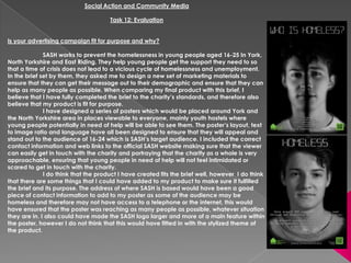
The document discusses an advertising campaign created for a charity called SASH that helps prevent homelessness among young people aged 16-25. The creator believes their campaign fits the charity's brief and is fit for purpose. They designed posters with appealing layout, text, and language to target the 16-24 demographic. While the campaign communicates the message clearly, the creator notes some additions could have improved reaching more people in need. Both the imagery featuring peers and simple language make the campaign appropriate for the dual target audiences of young people and potential volunteers of any age. The final campaign blended concepts from initial ideas of positive and negative messaging to take a serious yet stylized approach.
Ethanol (CH3CH2OH), or beverage alcohol, is a two-carbon alcohol
that is rapidly distributed in the body and brain. Ethanol alters many
neurochemical systems and has rewarding and addictive properties. It
is the oldest recreational drug and likely contributes to more morbidity,
mortality, and public health costs than all illicit drugs combined. The
5th edition of the Diagnostic and Statistical Manual of Mental Disorders
(DSM-5) integrates alcohol abuse and alcohol dependence into a single
disorder called alcohol use disorder (AUD), with mild, moderate,
and severe subclassifications (American Psychiatric Association, 2013).
In the DSM-5, all types of substance abuse and dependence have been
combined into a single substance use disorder (SUD) on a continuum
from mild to severe. A diagnosis of AUD requires that at least two of
the 11 DSM-5 behaviors be present within a 12-month period (mild
AUD: 2–3 criteria; moderate AUD: 4–5 criteria; severe AUD: 6–11 criteria).
The four main behavioral effects of AUD are impaired control over
drinking, negative social consequences, risky use, and altered physiological
effects (tolerance, withdrawal). This chapter presents an overview
of the prevalence and harmful consequences of AUD in the U.S.,
the systemic nature of the disease, neurocircuitry and stages of AUD,
comorbidities, fetal alcohol spectrum disorders, genetic risk factors, and
pharmacotherapies for AUD.
- Video recording of this lecture in English language: https://youtu.be/lK81BzxMqdo
- Video recording of this lecture in Arabic language: https://youtu.be/Ve4P0COk9OI
- Link to download the book free: https://nephrotube.blogspot.com/p/nephrotube-nephrology-books.html
- Link to NephroTube website: www.NephroTube.com
- Link to NephroTube social media accounts: https://nephrotube.blogspot.com/p/join-nephrotube-on-social-media.html
These simplified slides by Dr. Sidra Arshad present an overview of the non-respiratory functions of the respiratory tract.
Learning objectives:
1. Enlist the non-respiratory functions of the respiratory tract
2. Briefly explain how these functions are carried out
3. Discuss the significance of dead space
4. Differentiate between minute ventilation and alveolar ventilation
5. Describe the cough and sneeze reflexes
Study Resources:
1. Chapter 39, Guyton and Hall Textbook of Medical Physiology, 14th edition
2. Chapter 34, Ganong’s Review of Medical Physiology, 26th edition
3. Chapter 17, Human Physiology by Lauralee Sherwood, 9th edition
4. Non-respiratory functions of the lungs https://academic.oup.com/bjaed/article/13/3/98/278874
micro teaching on communication m.sc nursing.pdfAnurag Sharma
Microteaching is a unique model of practice teaching. It is a viable instrument for the. desired change in the teaching behavior or the behavior potential which, in specified types of real. classroom situations, tends to facilitate the achievement of specified types of objectives.
Anti ulcer drugs and their Advance pharmacology ||
Anti-ulcer drugs are medications used to prevent and treat ulcers in the stomach and upper part of the small intestine (duodenal ulcers). These ulcers are often caused by an imbalance between stomach acid and the mucosal lining, which protects the stomach lining.
||Scope: Overview of various classes of anti-ulcer drugs, their mechanisms of action, indications, side effects, and clinical considerations.
Report Back from SGO 2024: What’s the Latest in Cervical Cancer?bkling
Are you curious about what’s new in cervical cancer research or unsure what the findings mean? Join Dr. Emily Ko, a gynecologic oncologist at Penn Medicine, to learn about the latest updates from the Society of Gynecologic Oncology (SGO) 2024 Annual Meeting on Women’s Cancer. Dr. Ko will discuss what the research presented at the conference means for you and answer your questions about the new developments.
These lecture slides, by Dr Sidra Arshad, offer a quick overview of physiological basis of a normal electrocardiogram.
Learning objectives:
1. Define an electrocardiogram (ECG) and electrocardiography
2. Describe how dipoles generated by the heart produce the waveforms of the ECG
3. Describe the components of a normal electrocardiogram of a typical bipolar leads (limb II)
4. Differentiate between intervals and segments
5. Enlist some common indications for obtaining an ECG
Study Resources:
1. Chapter 11, Guyton and Hall Textbook of Medical Physiology, 14th edition
2. Chapter 9, Human Physiology - From Cells to Systems, Lauralee Sherwood, 9th edition
3. Chapter 29, Ganong’s Review of Medical Physiology, 26th edition
4. Electrocardiogram, StatPearls - https://www.ncbi.nlm.nih.gov/books/NBK549803/
5. ECG in Medical Practice by ABM Abdullah, 4th edition
6. ECG Basics, http://www.nataliescasebook.com/tag/e-c-g-basics
ARTIFICIAL INTELLIGENCE IN HEALTHCARE.pdfAnujkumaranit
Artificial intelligence (AI) refers to the simulation of human intelligence processes by machines, especially computer systems. It encompasses tasks such as learning, reasoning, problem-solving, perception, and language understanding. AI technologies are revolutionizing various fields, from healthcare to finance, by enabling machines to perform tasks that typically require human intelligence.
Explore natural remedies for syphilis treatment in Singapore. Discover alternative therapies, herbal remedies, and lifestyle changes that may complement conventional treatments. Learn about holistic approaches to managing syphilis symptoms and supporting overall health.
The hemodynamic and autonomic determinants of elevated blood pressure in obes...
Task 12
1. Social Action and Community Media
Task 12: Evaluation
Is your advertising campaign fit for purpose and why?
SASH works to prevent the homelessness in young people aged 16-25 In York,
North Yorkshire and East Riding. They help young people get the support they need to so
that a time of crisis does not lead to a vicious cycle of homelessness and unemployment.
In the brief set by them, they asked me to design a new set of marketing materials to
ensure that they can get their message out to their demographic and ensure that they can
help as many people as possible. When comparing my final product with this brief, I
believe that I have fully completed the brief to the charity’s standards, and therefore also
believe that my product is fit for purpose.
I have designed a series of posters which would be placed around York and
the North Yorkshire area in places viewable to everyone, mainly youth hostels where
young people potentially in need of help will be able to see them. The poster’s layout, text
to image ratio and language have all been designed to ensure that they will appeal and
stand out to the audience of 16-24 which is SASH’s target audience. I included the correct
contact information and web links to the official SASH website making sure that the viewer
can easily get in touch with the charity and portraying that the charity as a whole is very
approachable, ensuring that young people in need of help will not feel intimidated or
scared to get in touch with the charity.
I do think that the product I have created fits the brief well, however I do think
that there are some things that I could have added to my product to make sure it fulfilled
the brief and its purpose. The address of where SASH is based would have been a good
piece of contact information to add to my poster as some of the audience may be
homeless and therefore may not have access to a telephone or the internet, this would
have ensured that the poster was reaching as many people as possible, whatever situation
they are in. I also could have made the SASH logo larger and more of a main feature within
the poster, however I do not think that this would have fitted in with the stylized theme of
the product.
2. Does it communicate your message clearly and why?
The specific message that I decided to put across to the general public was that
you cannot generally specify what a homeless person looks like despite their stereotypes.
Usually people think that a homeless person will look un-clean, scruffy and un-well, I wanted
to make people think about the reality of the situation - that many young people are
homeless for many different reasons. I thought it would be effective if the poster also gave the
message to its audience that they can help with the subject of homelessness and that they
are there to talk to about the issue.
I think that the product which I created portrays this message very well. The
colour scheme (monochrome) that I decided to use connote the seriousness of the subject,
and along with the bright green of the SASH logo makes it immediately stand out even though
the logo is small and has been placed in the bottom corner of both posters. The imagery that I
have used is the main component to how well the message is communicated. The image to
text ratio of my product is large, so this ultimately means that the image should be striking and
full of information, this is why I decided to create an unusual image, firstly to attract the
audience, and secondly I believe that the text in which the image has been anchored with is
very important in order to put across the main message that you cannot tell who a homeless
person is just by their appearance, hence why two different people’s faces were used in the
photograph of my first poster.
Within both posters I have included the relevant contact information for SASH. This
puts across the message that SASH are easy to get in contact with and want you to be able to
talk to them if you need to very simply. I made sure that the contact information was clear
and would not be over-looked, even though the text had been sized small and put at he
bottom of the poster, I put a central alignment on it which draws the eye down and makes the
message clearer. The second poster in my campaign is the one which holds the most
information and advertising for SASH. I have included a short punchy piece of copy regarding
how someone would be able to help with homelessness through the charity and also the
charity‘s own method of tackling the issue of homelessness. The placement, text and length of
the copy all contribute to the effectiveness of communicating my message, putting the copy
towards the bottom of the poster and not overlapping any of the main features of the image
and the colour of the text make it stand out from the poster. Making sure that the copy was to
the point and short makes sure that it will be attractive to my audience as well as keeping
their attention, as having too much text to read could be off-putting to a viewer. Although the
style of my poster was intended to be simple and stylised, I think that I could have possibly
included some more information about the charity instead of being inconspicuous, however I
do think that this works well to make the viewer curious and find out for themselves.
3. Is it appropriate for your target audience and why?
The charity SASH work with young people ages 16-24, however the volunteers
that they work with can be of any age as long as they have a spare room in their home, so
when I was designing the product which is was going to create for SASH I has to take both of
these points into consideration and create something that would be attractive both to young
people and volunteers who could potentially be of any age.
My final product is both appealing and appropriate to both young people and
an open age range, first of all I think that the imagery will stand out to people of a young age
between 16 and 24, this is because I used two subjects who are both 17 years old, in other
words I used a photograph of people who are part of my target audience which will
immediately appeal to people for hat age as they will feel like they can relate to the people
in the campaign, this will make them feel more at ease and more likely to get in touch with
the charity if they are in need of assistance. On the other hand using these images will also
appeal to my second target audience as people who would volunteer to be a part of this
charity will be people who care about the well-being of young people, so if a person like this
were to see a poster of a young person being associated with homelessness this will make
them more likely to want to do something to help the issue.
I have made sure that all of the language that I have used within my copy is
simple and the sentences are short in order to make sure that it will appeal to a younger
audience who may not have the same educational background or academic ability of an
older person. Keeping this in mind I have also tried to make sure that the language is not too
immature in order to ensure that the poster I have created will be attractive and keep the
focus of the second target audience of my products who are potentially an older generation.
Keeping the colour scheme of these posters black and white also means that I
will be targeting a wider variety of people, where as if I were to create a product which is
bold and colourful, I could potentially be targeting a younger audience. Having black and
white as my foundation means that I am not restricting my target audience to one specific
group of people. I am also both expressing the seriousness of the subject and also being
expressive in my approach to the stylised theme of my product, which will be attracting a
more expressive and artistic audience. For all of these reasons, I believe that these products
which I have created are appropriate for my target audience.
4. Compare and contrast your original intentions with the outcomes you arrived at
When I started to develop my initial ideas I had three main concepts for posters
that I could create (See mood boards and appropriate flat plans). Firstly I had the idea of
creating a positive campaign which would promote the actions of the charity and what they
have done or will do to help homeless young people in York and the surrounding areas. This
concept would have included bold and bright colours with a general positive feel, the
images would have been of healthy happy looking people and the tag line would have
been a short sentence describing the situation of the person/people anchoring the image
with the charity. There would have been more amount of text compared to the images on
the poster, the text would have been describing the charity, how to donate, how to
volunteer and how to contact the charity if you were in a situation where you needed help
with housing and were between 16 and 24.
Another idea which I created mood boards and flat plans for was more of a
negative concept. I had the idea of creating a poster with a large, striking, black and white
negative image of a typical homeless person on the street looking un-kept and sad. The tag
line was going to be a short, punchy sentence, something similar to ‘would you walk past’. I
wanted to make the viewer think about the situation of the person in the image, and also
give an example of someone who would benefit from the help of SASH. I would have made
the poster more visually interesting by picking out the same green from the SASH logo and
subtly adding it to the black and white image of the homeless person, linking the two
together and promoting SASH more. The text to image ratio would have been small, the only
information given would have been the contact details for SASH and the logo.
My third and final idea was the one that I decided to use for my final product. I
drew different concepts from each of my prior ideas and mixed them together, instead of
having either a positive or negative theme I decided to focus mainly on making the
audience think about who could be homeless and giving the answer of anyone could be
homeless. I took the large, striking, black and white image and combined it with my first
idea by adding slightly more text in order to make sure that I was promoting SASH properly
and attracting the correct target audience. I took the green from the SASH logo and added
it to the QR code which should usually be white, this helps promote SASH and also balances
out the poster with having green at both corners. I think that this idea is much more effective
than the other two ideas that I had, mainly because it is a much more stylised and
expressive approach to promoting the charity, making it different to other posters and
therefore standing out from the crowd.
5. How effective are the techniques you have used and why?
With regards to the way in which I have produced my product I used many different
techniques within the Photoshop programme. First of all I had to create my first image which involved me
taking a photograph of my two models separately with light shining only on one side of their face –
opposite sides for each so I could place their faces together later on in Photoshop. Then I had to edit each
individual photograph in the Photoshop programme which was a very lengthy process. I decided that I
wanted the people within my image to look extremely clean-cut and well-kept, so I learnt how to use
Photoshop to airbrush images and used this effect on both of them which made the skin of my subjects
look smooth, blemish-free, and gave the clean effect I desired. After this I then had to add the
monochrome effect to each image, turn down the contrast slightly along with the exposure whilst making
sure that each image had the same amount of effects applied so that the illusion of them being the same
photograph would work. When I was happy with the appearance of each image I then had to merge
them together, this meant I had to delete the background along with the unwanted side of each face and
then place the remaining sides of the face together into a new document . I aligned the photographs up
so that their separate features began to look like they were part of one face, this worked very well
however there was still a harsh line down the middle of the new face, I resolved this by applying a black
background to the whole image and used the eraser tool with a soft brush and around 60% opacity to
give a shadowed effect. I also used this tool with an opacity of 20% and a larger size to use around the
edges of the image to make the outlines of the face look softer and not so cut-out. This proved to be very
effective in creating the exact illusion that I intended to, however if I had more time or an extended
deadline I would have tried to find two different subjects who did not look as similar as the two here, as
from my feedback I have found that around 45% of people think they are the same person at first glance.
The photograph for the second image was the same process without having to use one side of the face to
add to another, I used the same technique for editing the photograph, however when taking the image I
did not have to use light on one side of the face, I made sure that the lighting was high key for this image.
The advertising techniques that I have used are very stylised, I decided to focus on an
audiences curiosity and what would have a certain effect on a viewer that would make them want to find
out what the campaign is about. The fact that I have used two different posters is a very good example of
this, the first poster would be released , being an eye-catching, unusual picture and giving a question for
the audience to think about without providing an answer, would stimulate the viewers curiosity, then
providing the relevant contact information would mean that they could find out for themselves. Then the
second poster would be released, having the same theme as the first one would let the viewer know that
they are part of the same campaign, and providing the answer would make the audience engage with
the poster pushing them to want to read the rest of the information which is provided on the second
poster. I thought about all of this while producing my ideas for my final plan and am very happy with the
effect it has.
6. Is the content effective and why?
I believe that the content of the two posters I have created for my advertising
campaign are very effective, the main contributor being the colour scheme that I chose to
base my product on. The fact that I have decided to use a monochrome photograph on a
black background is in itself a very unusual way to go about advertising something, because
the connotation with advertising is that the advert will need to be bright and bold in order to
be as eye-catching as possible and draw the audience in. The poster that I have created is
bold and eye catching and will draw the audience in due to the fact that it looks so different
to the usual type of posters that are around at the moment.
Along with this, the tag line is also one of the most important aspects to my
poster, it both anchors the image and is large enough for it to be one of the first things that
the viewer will see upon first glance of this poster. I was very careful when picking out the
font that I would use, I wanted to use something that would be very structured and square,
but not too simple that it wouldn’t draw focus to it. I came across a set of fonts that had a
digital effect and thought most of them were too bold and didn’t suit the look of the posters
that I visualised in my head, I wanted a slimmer, sleek looking font that would fit in with the
stylised theme that I wanted. I think that I chose final font very well and was lucky to find one
that was exactly what I wanted. It works very well in standing out as it is not the type of font
that you would usually see on a poster, as it is actually usually associated with alarm clocks.
The fact that I used a black and white colour theme means that the lime green
colour of the SASH logo stands out extremely well. I decided to have the logo small and
placed in the bottom corner of the poster for multiple reasons, firstly because I wanted my
image to be the main focus of the campaign as it is the main aspect which communicates
the message to the viewer. Secondly because after researching other charity’s posters and
campaigns I noticed that the charities that were very well known had a small logo placed at
the bottom, so I thought that doing this with my posters would portray the charity as being
very well known and therefore would not need their logo to be splashed across an
advertising campaign. The fact that the logo itself is not also in black and white makes it
stand out so much that in my opinion it does not need to be any bigger.
The copy within my poster is probably the most week aspect, mostly within the
second poster as this is the one which was supposed to have the most information about the
charity. I think that I could have used a more powerful statement in order to promote the
charity more and ensure that the viewer will read what it says. However over all I believe that
all of the content within my advertising campaign is very effective and would work well when
released.
7. What effect do you think your advertising campaign will have on the public and why?
I think that in general my campaign looks very striking, so I think that initially my
posters will have an impact on the audience which will make them need to take a ‘second
take’, this applies mainly to the first poster in my campaign. The reason for this is because of
the fact that both the images and colour scheme, and general style of the posters are very
different to what is usually seen within the advertising industry. After taking a ‘second-take’ I
think that the next reaction to the first poster would be intrigue and curiosity, after the viewer
has seen the fact that the main image is actually two different faces, and when they then
connect the image with the tag line it will make them want to know exactly what the advert
is about. Because all of the information and the answer to the question featured within the
tag line is not provided this may lead the viewer to want to find out for themselves what the
campaign is about, at which point their eyes will be drawn down to the contact details given
at the bottom of the poster for SASH.
Within the first poster there is not much information about the charity, so some
people may not feel inspired to get into contact with them after seeing just this first poster,
this is why I decided to create a second poster. I feel that these two posters work well
together because the first poster will cause curiosity in the audience, and the second poster
is the one which is more likely to get the results that we want – for people to get in touch with
the charity, either to ask for help, or to volunteer. There are the same elements of this second
poster which are similar to the first in the sense that it is thought provoking, however the fact
that, with the tag line, the poster is in essence an answer to the first poster means that it will
cause a viewer who has seen the first poster to be happy that they do not need to be curious
anymore as they now have been told the answer – this makes the first poster a kind of cliff
hanger. After this initial reaction I then think that the audience will see the clear image of the
clean well-kept subject and be shocked that this person has been declared as homeless,
this would then urge them more to get in touch with the charity when their eyes are drawn to
the same contact details that are provided at the bottom of the poster. After they have seen
the image, they will then see the copy which is a statement from the charity explaining what
you could do to help young people like the subject within the poster, this will give them more
of a reason and inspiration to donate to the charity or get in touch with them. The over all
effect that I hope my campaign will have on the public is that they will want to go through
the charity SASH to try and help homelessness and the people effected by it. Also I think that
this poster will make them think properly about hopelessness and make them think twice
when they see a homeless person in the street for example.
8. What are the technical aesthetic qualities of your work?
Aesthetically I think that the two posters I have created are both very appealing
and will attract the correct target audience. When I was designing my posters, the main thing
that I was concentrating on was how to make my products look attractive. First of all I
needed to know generally what style my products were going to be in, I decided to make
my posters look stylised and different to other posters that were on the market at that time,
which also meant that they would effectively stand out more because they would not be in
the conventional style of a promotional item, that is why I believe that tat was the best theme
for my posters to be in. The next thing in decided to think about was the imagery that I was
going to use, with regards to my models, I knew that I would have to chose two people who
would attract a wide variety of people within my audience, therefore I chose two people
who were attractive knowing that they would look good on the front of a poster.
When I had started to think about what my posters were physically going to look
like I started to product some mood boards and flat plans where I could test out what fonts
looked best and how I could make my images look as good as possible. When choosing my
fonts I made sure that they fitted in with the stylised there and monochrome colour scheme
of the products. I tried out taking the same lime green colour from the SASH logo and adding
it to the tag line and copy within the second poster however this did not work well and gave
the posters an unbalanced look. Aesthetically the poster looked much better and I got much
more positive feed back when the text was a white colour. Later on I had to add a thin black
stroke around the copy within the posters as there were points at which the text lay over the
image and was difficult to read, having a black outline resolved this issue immediately
without being too obvious and looking less professional.
Towards the very end of my production when I had finished my work I noticed
that my product looked slightly unbalanced. After collecting some feed back I observed that
towards the bottom of the image opposite where I had placed with green SASH logo I had a
white QR code, this completely unbalanced the bottom half of my product. Someone from
my feedback had suggested changing the white background of the code to the same green
in the SASH logo, after I had tested this theory out I noticed that it immediately resolved my
problem and the product looked much more professional and technically made sense.
Overall I think that my product is extremely aesthetically pleasing and I am
personally very pleased with the outcome of my project.