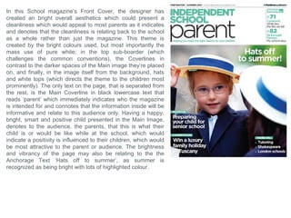
This magazine cover targets parents of school-aged children. It uses bright colors like red and green along with a lot of white to create a clean, positive aesthetic. The only text is the lowercase word "parent" in the main coverline, clearly indicating the intended audience. The large, happy image of a smiling child in a white hat and top further appeals to parents by representing the clean, happy environment of the school. Overall the cover designs aims to inform and appeal to parents by depicting the school and its magazine positively.
Npm : 201243501163
Nama : Hamim Suyuti
Kelas : R7H
Mata Kuliah : Komputer Grafik
Dosen : Nahot Frastian , M.Kom
Program Studi : Teknik Informatika
Universitas : Universitas Indraprasta PGRI
Presentación de la materia planificación de sistemas en la cual se estudian algunos de los principales aspectos en cuanto a la planificación de proyectos tales como; control de proyectos, planificación del alcance de un proyecto y métodos en gestión de proyectos.
Npm : 2012 4350 1163
Nama : Hamim Suyuti
Kelas : R7H
Mata Kuliah : Komputer Grafik
Dosen : Nahot Frastian, M.Kom
Program Studi : Teknik Informatika
Universitas : Universitas Indraprasta PGRI
As unit g321 research and planning presentationBillyLetchford
This is my research and planning powerpoint, which shows what has been learnt in Media in depth. I have shown my understanding in all of the topics and thats why i have done a lot of work throughout the powerpoint.
This powerpoint has been produced for part of my coursework in Media, so it has to be executed to a high standard to get the top marks.
Surat Digital Marketing School is created to offer a complete course that is specifically designed as per the current industry trends. Years of experience has helped us identify and understand the graduate-employee skills gap in the industry. At our school, we keep up with the pace of the industry and impart a holistic education that encompasses all the latest concepts of the Digital world so that our graduates can effortlessly integrate into the assigned roles.
This is the place where you become a Digital Marketing Expert.
Grow Your Reddit Community Fast.........SocioCosmos
Sociocosmos helps you gain Reddit followers quickly and easily. Build your community and expand your influence.
https://www.sociocosmos.com/product-category/reddit/
Your Path to YouTube Stardom Starts HereSocioCosmos
Skyrocket your YouTube presence with Sociocosmos' proven methods. Gain real engagement and build a loyal audience. Join us now.
https://www.sociocosmos.com/product-category/youtube/
Multilingual SEO Services | Multilingual Keyword Research | Filosemadisonsmith478075
Multilingual SEO services are essential for businesses aiming to expand their global presence. They involve optimizing a website for search engines in multiple languages, enhancing visibility, and reaching diverse audiences. Filose offers comprehensive multilingual SEO services designed to help businesses optimize their websites for search engines in various languages, enhancing their global reach and market presence. These services ensure that your content is not only translated but also culturally and contextually adapted to resonate with local audiences.
Visit us at -https://www.filose.com/
Improving Workplace Safety Performance in Malaysian SMEs: The Role of Safety ...AJHSSR Journal
ABSTRACT: In the Malaysian context, small and medium enterprises (SMEs) experience a significant
burden of workplace accidents. A consensus among scholars attributes a substantial portion of these incidents to
human factors, particularly unsafe behaviors. This study, conducted in Malaysia's northern region, specifically
targeted Safety and Health/Human Resource professionals within the manufacturing sector of SMEs. We
gathered a robust dataset comprising 107 responses through a meticulously designed self-administered
questionnaire. Employing advanced partial least squares-structural equation modeling (PLS-SEM) techniques
with SmartPLS 3.2.9, we rigorously analyzed the data to scrutinize the intricate relationship between safety
behavior and safety performance. The research findings unequivocally underscore the palpable and
consequential impact of safety behavior variables, namely safety compliance and safety participation, on
improving safety performance indicators such as accidents, injuries, and property damages. These results
strongly validate research hypotheses. Consequently, this study highlights the pivotal significance of cultivating
safety behavior among employees, particularly in resource-constrained SME settings, as an essential step toward
enhancing workplace safety performance.
KEYWORDS :Safety compliance, safety participation, safety performance, SME
“To be integrated is to feel secure, to feel connected.” The views and experi...AJHSSR Journal
ABSTRACT: Although a significant amount of literature exists on Morocco's migration policies and their
successes and failures since their implementation in 2014, there is limited research on the integration of subSaharan African children into schools. This paperis part of a Ph.D. research project that aims to fill this gap. It
reports the main findings of a study conducted with migrant children enrolled in two public schools in Rabat,
Morocco, exploring how integration is defined by the children themselves and identifying the obstacles that they
have encountered thus far. The following paper uses an inductive approach and primarily focuses on the
relationships of children with their teachers and peers as a key aspect of integration for students with a migration
background. The study has led to several crucial findings. It emphasizes the significance of speaking Colloquial
Moroccan Arabic (Darija) and being part of a community for effective integration. Moreover, it reveals that the
use of Modern Standard Arabic as the language of instruction in schools is a source of frustration for students,
indicating the need for language policy reform. The study underlines the importanceof considering the
children‟s agency when being integrated into mainstream public schools.
.
KEYWORDS: migration, education, integration, sub-Saharan African children, public school
Unlock TikTok Success with Sociocosmos..SocioCosmos
Discover how Sociocosmos can boost your TikTok presence with real followers and engagement. Achieve your social media goals today!
https://www.sociocosmos.com/product-category/tiktok/
Buy Pinterest Followers, Reactions & Repins Go Viral on Pinterest with Socio...SocioCosmos
Get more Pinterest followers, reactions, and repins with Sociocosmos, the leading platform to buy all kinds of Pinterest presence. Boost your profile and reach a wider audience.
https://www.sociocosmos.com/product-category/pinterest/
Enhance your social media strategy with the best digital marketing agency in Kolkata. This PPT covers 7 essential tips for effective social media marketing, offering practical advice and actionable insights to help you boost engagement, reach your target audience, and grow your online presence.
1. AS MEDIA
AS UNIT G321
FOUNDATION PORTFOLIO IN MEDIA
RESEARCH AND PLANNING
Candidate Name
Candidate Number
Centre Name
Centre Number
Joshua Rogers
c11626
The Leigh Academy
61101
2. Masthead
Price and issue
Puffs Main Image Anchorage text
Skyline Coverline
Barcode Main Coverline
Name of company or
magazine, printed in a
large font in the center-top
of the feature.
A banner of information
about the content, at the
top of the page.
Leading titles of the
contents inside the
magazine, but featured
smaller than the main title.
A promotion or
competition happening
inside the magazine
usually highlighted or
separate from the page
layout.
Literally the main and
largest image on the
magazine cover, usually
inspired by the magazine
category.
A relation to the main
image, explaining what it
is or who it is about.
Leading title of the
contents inside the
magazine of most
importance.
Digital pattern to record
the sale.
The cost of the magazine
and its current issue
number.
3. Using, developing and challenging
conventions.
This Magazine’s colour scheme is mainly darker to
represent the music style of the main feature or band. It
has used the common conventions of using only 2-3
colours, so the cover doesn’t look too busy or distracting. It
has also used the common convention of one strapline at
the very top of the Magazine cover. It has challenged the
conventions by interacting both the text and images
together to make this magazine stand out and be original,
which enhances the specific theme or style, and draws in
the audience that would be more interested in this specific
magazine. This also gives the cover a depth which
develops the conventions as most magazine covers to
create a depth by placing the Main Image over the
Masthead of the Magazine, however the Main Image in this
Cover is still placed behind the Masthead layer, but has still
created a depth. It has developed the the conventions of
the usual close up Main Image, to a medium, all body shot
of the artist. This also presents the artist more, including
the clothing, to enhance the theme/style of the magazine.
The Main Coverline is presented as the largest text on the
page which compliments the ‘impact’ theme, of the artist or
band presented, as it is designed to be the first text noticed
as is the image.
4. Representing & Appealing to social groups
Age
• Toddlers >3
• Teenagers
• Young adults
• Middle age – property
owners
• Pensioners
Gender
• Male
• Female
Race
• Asian
• South African
• European
• African
• South American
• North American
Sexuality
• Heterosexual
• Homosexual
• Asexual
• Bisexual
• Transgender
• Lesbian
Education
• Private
• School haters
• Work enthusiasts
• Public
• Stationary
• Teen-based
Occupation
• Information Tech
• Teaching
• Un-employment
• Hospitality
• Health & Beauty
• Law
Income
• High income
• Low income
• Council support
• Un- employed
Lifestyle
• Health and Fitness
• Health and Beauty
• Hobbies
• Home accessories
• Clothing
• music
5. Occupational social groups
Social group A
Considered as the ‘higher
class’ social group. Prone to
pay for the more expensive
products as more conscious
about health and pleasure,
and are not restricted by
price. Have less chance to be
distracted by the media,
music and film industries, as
they have very busy lives.
Social group E
Consisting of company services
such as postman .etc. They
usually have Low incomes, so
also low budgets. Shop at
discount stores. No preference
on leisure or fashion. Lot of time
with media. Shop online for
bargains.
Social group C
Live in low-mortgage properties
and can receive government
benefits. Shop at known, non-
expensive, high street brands.
Spend time on social media
and TV each day. Do own a
car, and do go on discounted
holiday packages.
Social group D
Usually the unemployed. Rely
on government benefits.
Shop cheaply and cheap
fashion. A lot of time with
media such as TV and social
media. Watch big celebrity
shows. Read free media or
found on public transport.
Social group B
Middle management and
professionals are in this
social group. They do get
paid a fair good amount, and
tend to buy high fashion
items and accessories.
Would watch a couple hours
of TV each day. They spend
money on expensive leisure
such as holidays and nice
cars.
Social group C2
Work in home services such
as plumbing. Live in rented
properties and receive
government benefits.
Usually buy several different
medias. Buy goods from
local stores. Spend more
time with media. In-country
holidays. Usually read
newspapers.
6. How is this magazine directed to social group B?
This magazine is directed to social group B. You can tell this by
the mise-en-scene. The first example, would be the Masthead
‘Inc.’ which immediately is directed to a company owner or
middle management, who may be in-charge or employees. The
anchorage text above, ‘what your employees really think’. This
text is not directed towards any social group lower than social
group B, as it’s only relevant to large business owners. Also,
the colours of the magazine, simply back and white, and are not
bright and bold, as this gives it more intelligent and
sophisticated aesthetics, mimicking office documents etc. The
fashion of the model in the Main Image, is smart-casual,
suggesting it’s possibly not social class A, as its not entirely
formal, however it is smarter than an ‘gossip’ magazine for
example, plus the clothing is hidden much more, implying that
the fashion seems irrelevant to the viewer which directs to
social group B and higher as they would be less bothered about
the current fashion, as long as it looks smart and expensive.
The model is in quite a business position, being leant forward,
he suggest a welcoming gesture that looks as if he could be
leaning forward from an office desk or at a formal meeting, as
he would if it was an actual advice meeting for a business
owner. Also, his hand position is in a hand shake gesture,
which is a more formal greeting action. In the Coverline, the
language, such as ‘founder’ and ‘master’, would appeal to a
more sophisticated audience, as they would be more educated
and are attracted by impressive vocabulary. The font utilized in
both the Masthead and Coverlines, is presented neat and
professional.
7. Examples of current magazine
distributors.
Distributor:
Thrust Publishing
Distributor: IPC
Media
Distributor: Bauer
media
8. Technologies and processes
Physical technology Digital technology
Software Printing press
Nickon D750:
24.3 Megapixels (high)
3.5 frames per sec (high)
The higher the resolution (megapixels), the
better the quality of the images. When taking
photos for in the magazine, you would need
the best quality as possible to maintain
professionalism. Digital Cameras and studios,
these are used for photos in the magazine
including the main image, they'll need produce
good quality images to meet the standard of a
magazine and to maintain an appeal.
Computing hardware such as computer
screens and displayers. Mac OS is used for
most creative media as is offers several
compatible, creative, adobe software such
as Photoshop.
Photoshop, Illustrator, In-design, Fireworks
are some most common software used in
magazine design. Photoshop will allow you
to manipulate your images taken with your
physical technology, plus adding additional
features and advancements to the whole
main magazine layout and design.
Printing possessors and printing hardware
are essential in the magazine industry, as
this is how we transfer the digital magazines
to physical ones, that then go into marketing
to be sold. Publication printing is for
magazine printers that target the high
amount work in a specific market. Gravure is
usually the printing process for magazines.
An images is engraved into a cylinder, and
as ink is introduced to it, the ink is simply
transferred to the paper.
9. In this students school magazine, the masthead is positioned at
the very top of the magazine, using the conventions with large
text, but has developed the conventions by creating their own
font and making it completely unique. The puff creates
temptation for the viewer with ‘find out’ which is persuasive text.
The layout and colours of the whole magazine colours are
related to the main image, which is a medium shot, of a woman
with a woman looking directly at the viewer with at bold and
child-like pose with her thumbs up. The colours, red and green,
are bright and bold which has challenged the usual conventions
of a school magazine, which is usually designed with mostly
subtle colours, with a single bright colour. The price is quite bold
on the cover, to state that the price is cheaper than usual. It
doesn’t follow the conventions of having a main Coverline, but
only smaller Coverlines. The anchorage text is placed at the
bottom, with persuasive vocabulary such as ‘exclusive’ which
draws the viewer to look inside. This design also has no skyline
at the top, but has one at the very bottom of the page.
10. In this School magazine’s Front Cover, the designer has
created an bright overall aesthetics which could present a
cleanliness which would appeal to most parents as it indicates
and denotes that the cleanliness is relating back to the school
as a whole rather than just the magazine. This theme is
created by the bright colours used, but most importantly the
mass use of pure white; in the top sub-boarder (which
challenges the common conventions), the Coverlines in
contrast to the darker spaces of the Main image they’re placed
on, and finally, in the image itself from the background, hats
and white tops (which directs the theme to the children most
prominently). The only text on the page, that is separated from
the rest, is the Main Coverline in black lowercase text that
reads ‘parent’ which immediately indicates who the magazine
is intended for and connotes that the information inside will be
informative and relate to this audience only. Having a happy,
bright, smart and positive child presented in the Main Image,
denotes to the audience, the parents, that this is what their
child is or would be like while at the school, which would
indicate a positivity is influenced to their children, which would
be most attractive to the parent or audience. The brightness
and vibrancy of the page may also be relating to the the
Anchorage Text ‘Hats off to summer’, as summer is
recognized as being bright with lots of highlighted colour.
11. What forms and conventions will be in my
design and why? School Conclusion
Skyline - at the top of the page to use the common conventions of existing magazines.
Sub-Border – which will surround the Masthead and Coverline, inspired by the second school
magazine analysis. This will be presented in a blue to match the colour scheme of the school
already, which will immediately relate this magazine with the school. Also this Sub-boarder will
have a smooth style with slight curves to mimic the structure of the school’s modern building
which is a pull factor for most viewers, as it indicates the future and ‘perfection’ of the school’s
current state.
Masthead – positioned at the top of the page with a neat, bold font with a slight curvature, to
maintain the professionalism but also to look attractive and aesthetically pleasing.
Colour – the colours I will pick will probably range between blue and white, because the school
already features a blue colour scheme so a relationship can be made between both magazine
and school.
Puff – will be at the bottom corner of the page, mimicking a pulled back corner, often seen on
books, or possibly educational papers.
Coverlines – they will be positioned to the left or right of the page, depending what side they will
be covering the least amount of the image, plus it would look aesthetically pleasing if it was the
opposite side to the direction the people, if any, are looking.
Contents Page
The contents page should follow the same style and theme of the cover page.
The images I will try to feature in this page should look professional and fit within the guides of
the page, plus they must also suit the colour scheme since it wouldn't look as aesthetically
pleasing by having images with a completely different hue and saturation to the blue theme.
The page should have an aspect of simplicity and not look too busy which could distract or
confuse the reader, and making the purpose of the page unclear.
12. In this music magazine’s contents page, the designer
has decided to fill the majority of the page with images,
this may be because visual aspects such as images
make the page look more visually and aesthetically
pleasing. Also the main and largest image is a extreme
close-up of a well-known artist’s face. The designer
has used the colours red, white and grey for the page
as it matches the constant theme that every one of
their magazines is designed with. Using a bold red
colour, with two dull colours, is a good way to highlight
the important information and sub-titles, to indicate to
the viewer where to look as it draws the eye first. The
page has been laid-out using geometry and making all
the sections flush and align with each other, also with
grey lines to subtlety separate the different sections,
which almost denotes that the designer wanted to
create a professionalism within the page. The
language used is informative, demanding and
suggestive to make the reader intrigued to check out
the specific pages, such as ‘now!’. All Coverlines and
straplines on the page have been typed in capitals to
segregate them from the main text which denotes that
the designer wants the reader to notice the titles
before the main text because it’s more bold and
informative. The font used for the sub-headers and
titles are bold and elongated, which connotes the
designer has considered the layout, and how it almost
mimics the size and layout of the A4 page its
presented on. The Page numbers, especially on the
images, are very bold and large which stand out from
any image or background they are placed on.
13. In this music magazine’s contents page, the designer
has developed the conventions and decided to fill the
majority of the page with a single image. The Image is
of an well-known artist, in a very posed position to
highlight the style and liveliness of the artist, and to
stand out on the page. The designer has challenged
the conventions by creating a depth within the page by
overlapping the main image over the masthead, which
is usually seen on most front covers, which denotes
that the designer wanted to intrigue the viewer which
immediately creates an interest to read that specific
page featuring that artist. The designer has placed a
quote from the artist, positioned above the artist
segregated from the rest of the text, to immediately
indicate that it’s a quote from the artist featured in the
main image. The designer has challenged the
conventions by not actually having the title ‘contents’
on the page, which denotes that the designer does not
think its necessary, as the only text on the page is
presented with page numbers, which indicates that it’s
a contents page already. The Masthead of the
magazine is positioned at the top of the page, to
remind the viewer of the magazine they are reading.
The colours used, such as blue and grey, are not
related to the red Masthead which indicates that the
designer wanted to segregate this page from the rest
of the magazine. However the designer has used the
conventions by aligning most of the text together
neatly, which denotes that the page was intended to
maintain a professionalism and to look presentable.
14. In this double page spread, the designer
has considered the layout and available
space of the pages. The image is
spread entirely across both of the pages
which immediately makes it
aesthetically pleasing and visually
interesting. The main image is a
photographic shot of a single artist
looking directly at the reader which
connotes that a communication is being
created between the viewer and the
artist. The artist’s name is in bold,
upper-case lettering, in a bright eye-
catching red which is overlaid over the
main image to signify that it’s the name
of the artist presented. The image
description and sub-headers on both
pages are also in the same colour red,
as it compliments the black and white
image background by standing out and
to draw the attention of the viewer
before the factual text which is
accompanied with it. The layout is set to
be the most effective way to present the
text with the image, as it is positioned
within the blank spaces in the image
where there is no interesting feature,
such as the ground. The image sets a
theme of un-organization and rebellion
as the artist is sitting on the floor, which
seems to be unclean, which could
This theme is complemented by the layout of the text, as it’s not set
align to each one. The text has been placed in a white box to stand
out and be noticeable to the viewer and prevent it from blending
into the image, as white is contrast to the black background behind.
The designer has used the common conventions by placing the
page numbers in the bottom corners of the pages. They have been
placed in black boxes with white text to create another contrast and
be noticeable if needed, but not as noticeable when viewing the
page as a whole.
15. In this double page spread, the
designer has used the conventions by
filling one page entirely by a single
main image of an artist, which
denotes that these pages are about
that specific artist and style of music.
The designer has then used this
theme and style to present the rest of
the page and appeal to the target
audience that would buy this specific
magazine. For example, the colours
used are mainly black and white,
except for a pink which is used to
highlight key words and phrases in
the Main Coverline, so it becomes
interesting and stands out. The pink
also contradicts with the dark rock
theme, which compliments the
purpose of the words, which is to be
abnormal and noticeable. The double
pages have a single boarder to share
which makes a link or connection
between both pages that indicates
that they are of the same topic and
style, which disguises the fact that it
is two pages. To compliment the idea
and function of the border, the
Anchorage Text, largest on the page,
is also spread across both the pages
to create a link.
The Artist in the main image, is looking directly at the viewer making
direct communication between the reader and the artist, which is a
convention usually found in magazines. The puff to the top-left corner,
is positioned in blank space, away from the main text, to stand out and
look aesthetically separate from the content of the page, by bing in a
bold black boarder, plus the text is printed at the only red text on the
page, signifying that this text has a different topic the rest of the page.
16. Influences and inspirations
To create and design my Music Magazine, I need to decide
what genre of music I will be featuring throughout, plus what
themes and aesthetic ideas which would relate to both the
style and artist in that genre, which will also enable me to
decide and head towards my target audience. For curtain, I
need to make my Magazine visually attractive and aesthetically
pleasing, which will attract my audience into picking up my
Magazine, and another aspect to consider is it has to be
unique with an original design, otherwise, if it’s too similar to an
existing Magazine, the target audience would be the same,
which would limit the consumption of my magazine as the
audience would already be directed towards reading the
existing magazine. I decided to think back to myself and what
my preferences are and what I listen to, as this will immediately
help me to get information on my possible consumers and
target audiences, plus it can allow me to be more passionate
about the Magazine and the themes and styles that
accompany it. To the right I have made a collage of two music
channels majestic casual and La belle musique, and their
backgrounds. I think that using the design style and influence
from these channels will enable my Magazine to be unique as
there is not yet a Magazine available for this style, and there is
a large audience available to address, as these channels are
already very popular which confirms that an audience is
available to attract. The music genres featured within this style
is: Deep House, Chill Out, Singer/songwriters and ambient
style music. I have put a couple of example artists and music
producers, to the right, that would usually feature in these
channels, which will allow me to find their similarities and
common conventions which will help me to use to then attract
their audiences. For starters, all the artists are unique with
completely different designs. All have either their name or a
logo/symbol to recognize themselves by.
17. On this page, I will focus on the aesthetic side of my music
magazine, and what conventions could I follow from existing
magazines from this style and genre.
The images to the right of some existing magazine designs I
believe look aesthetically pleasing mainly because their
element of simplicity; the page simply features a main artist
or model image, and very little detail and/or text surrounding
them. They are presented on a blank canvas background
which limits the distraction on the page, enabling all viewers
focus to be on what's most important, the image: so the
reader automatically knows who or what is inside without
having to read further, but also making the page look more
attractive. Masthead: so the magazine is advertised and the
company gets credited for the magazine that they’ve
produced.
I visited a globally recognised
online magazine shop, and on
their first page, they presented
their world-wide best sellers and
not just continental best-sellers,
such as billboard etc. I was
pleased to discover that many of
them do follow the design aspect
of simplicity to present their
magazines, and all use quite
subtle colours, including in their
images, so the page looks
aesthetically pleasing. This also
shows me the different options of
presenting my main image.
18. This magazine is a very unique but aesthetically pleasing
magazine cover because it also bases it’s design upon
simplicity. The designer has followed the common
conventions with the Masthead by positioning it at the very
top of the page which immediately and clearly identifies their
magazine company to the viewer. But I believe the main
feature on the page that makes this look aesthetically
pleasing is the fact that the main image in the center has
been edited to have the same orange hue and colour
saturation as the blank orange background its placed onto.
Plus the colour of the models hair also aids this theme,
which could be the main reason for the designer’s choice of
orange.
The designer has decided use use very little information in
the Coverline which I believe suites the style because it
makes the page less-busy, plus most information needed
will be presented on the contents page inside. The designer
has put the artist’s name on the front separated from the
Coverlines to present to the viewer that it holds different
information about a different topic. Plus the indication of the
topic is set because it is positioned over the Image of who it
is about. The clothing that the person is wearing also
compliments the style and theme of the page since it
presents a fashion style that’s suits the bold pop-art design
movement.
When this image was edited, the contrast was also decreased and the layers were blended, creating high
contrasts between the shadowed and highlighted areas, but also makes the image have an white overlay
which creates a vintage effect, which emphasises the theme of the whole page, since the clothing is also
related back to the vintage style.
19. Indie is a globally known Magazine company simply
because of their individuality which makes them
stand-out from other magazines by not specifically
following the common conventions, which the viewers
identify, which makes them recognisable from their
simplicity.
The two on the right are their newest magazine
designs with their latest Masthead design that looks
more professional because they removed the line
through the center. However what they are
memorable for and which is their main feature, is their
abnormal main images which goes against common
magazine conventions that usually focus on beauty
and/or clothing. This magazine’s purpose is to present
and highlight their differences and how they’re unique,
which is what attracts their audience. Each use the
main image to cover the whole page, and the
Masthead is always at the top which does follow the
conventions. They have maintained the positioning of
their barcode throughout, and their layout are all
similar which makes them recognisable as the same
magazine company.
The designer has decided to use subtle and light
shades of colour to present the page with, which I
believe makes the magazine have a soft and calm
aesthetic look, but this is contradicted by the wild and
‘loud’ images, which is another aspect which makes
them unique or indie/individual.
20. What forms and conventions will be in my
design and why? Music conclusion
Skyline - I’m planning on not including a skyline in my music magazine cover design, since I also
want to make my magazine unique to ‘stand-out’ similar to Indie Magazine, by being
recognizable from the simplicity, which is what I will gain by not having an overcrowded page,
which it possibly could be if it had a skyline.
Masthead – I’m not entirely sure what I will finally decide to make my masthead look like, since
there are so many styles that represent different music genres etc. So to make this decision, I
must experiment with different styles, and I must take the main image first so I know what to
adapt around it and understand exactly in what direction my magazine will head, and what
style/genre/audience may it be for, which I will decide when I come to taking the images.
Colour – The colours I’m planning to head towards for my magazine should be subtle and light
to compliment the idea of simplicity and possibly link with the style I choose.
Puff – I’m not planning to have a puff on may page, because this will divert from my idea of
simplicity.
Coverlines – I’m not planning to have too many Coverlines (possibly two), so it aids with the
style of simplicity, plus so the page doesn't look aesthetically overcrowded and unattractive.
Meaning my magazine cover must rely only on looking aesthetically attractive to attract and
appeal to by-passing customers.
Contents Page
The contents page should follow the same style and theme of the cover page.
The images I will try to feature in this page should look professional and fit within the layout of
the design. I will also try and make this page as simple as possible, but I will include more
images for the contents of the magazine. (Possibly festival images, and appealing artists).