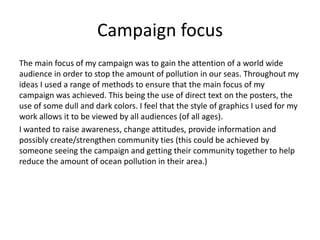
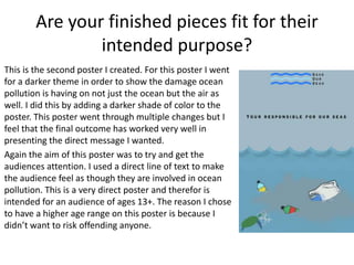
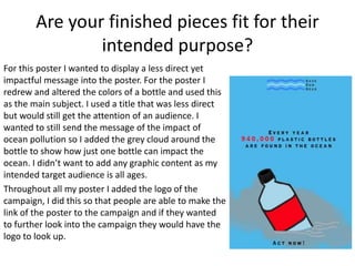
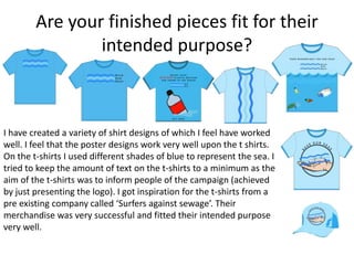
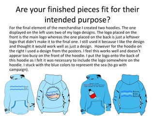
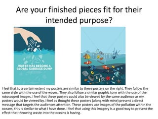
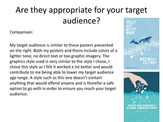
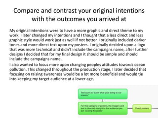
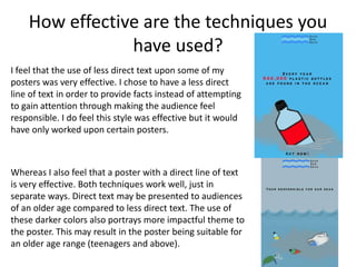
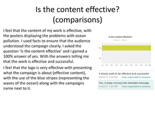
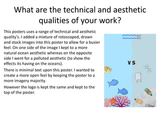
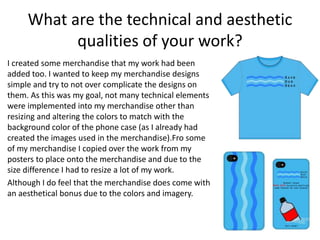
SlideShare a Scribd company logo
1 of 27
Evaluation
Tom Armstrong
Campaign focus
The main focus of my campaign was to gain the attention of a world wide
audience in order to stop the amount of pollution in our seas. Throughout my
ideas I used a range of methods to ensure that the main focus of my
campaign was achieved. This being the use of direct text on the posters, the
use of some dull and dark colors. I feel that the style of graphics I used for my
work allows it to be viewed by all audiences (of all ages).
I wanted to raise awareness, change attitudes, provide information and
possibly create/strengthen community ties (this could be achieved by
someone seeing the campaign and getting their community together to help
reduce the amount of ocean pollution in their area.)
Are your finished pieces fit for their
intended purpose?
The first thing I created for my campaign was the
logos. The first design (shown on the right) originally
included an image of some waves, but after further
development I decided to use a more simple design
design for the wave feature (logo at the bottom).
The reason for this is so that the logo could be easily
recognized and recreated. I feel that this new and
simpler design works a lot better than the original
image. Due to the corrections made to give me the
simpler design, I was able to simplify this logo even
more to give me my final product.
Are your finished pieces fit for their
intended purpose?
My final logo design has worked very well, it provides a simple and recognizable design. I feel
that a simple logo works a lot better than a more complicated design. The logo is also
designed in a way that if needed could be reconstructed. For example, if there was limited
room the logo may be shortened (by removing some of the blue waves on the left side or
the ‘save our seas’ text could be removed, and the logo would be still be recognizable due to
the patter of the blue waves).
As my campaign was focused upon the oceans, I created a simple wave feature on the logo. I
changed the colors of the waves to blue to signify that it represents the sea. To ensure that
people were able to make out what the campaign was about just from looking at the logo, I
added the campaigns name ‘ Save our seas’. The text upon the logo could be shortened,
leaving the first letter of each word to make ‘SOS’, which signifies a distress signal.
Are your finished pieces fit for their
intended purpose?
I have created a range of posters to suit my campaign.
The style of the posters include a selection of
rotoscoping, shape merging and drawings. This was my
first poster I designed, at first (first draft of this poster)
the poster felt very limited to the amount within it. So to
counter this I further added more images to each side of
the poster. I feel that now I have added more into the
poster the overall look is a lot better. I do feel that the
poster could still be built up with images upon either
side, but from what I have done the poster still shows
the effect ocean pollution is having upon the oceans.
The aim behind the poster is to make the audience
think. The poster is designed to show what the seas
should look like versus what they look like after they
have been polluted. A poster such as this could be
viewed by audiences of all ages.
Are your finished pieces fit for their
intended purpose?
This is the second poster I created. For this poster I went
for a darker theme in order to show the damage ocean
pollution is having on not just the ocean but the air as
well. I did this by adding a darker shade of color to the
poster. This poster went through multiple changes but I
feel that the final outcome has worked very well in
presenting the direct message I wanted.
Again the aim of this poster was to try and get the
audiences attention. I used a direct line of text to make
the audience feel as though they are involved in ocean
pollution. This is a very direct poster and therefor is
intended for an audience of ages 13+. The reason I chose
to have a higher age range on this poster is because I
didn’t want to risk offending anyone.
Are your finished pieces fit for their
intended purpose?
For this poster I wanted to display a less direct yet
impactful message into the poster. For the poster I
redrew and altered the colors of a bottle and used this
as the main subject. I used a title that was less direct
but would still get the attention of an audience. I
wanted to still send the message of the impact of
ocean pollution so I added the grey cloud around the
bottle to show how just one bottle can impact the
ocean. I didn’t want to add any graphic content as my
intended target audience is all ages.
Throughout all my poster I added the logo of the
campaign, I did this so that people are able to make the
link of the poster to the campaign and if they wanted
to further look into the campaign they would have the
logo to look up.
Are your finished pieces fit for their
intended purpose?
This is some my merchandise, for the merchandise I
wanted to keep them at simple designs as I feel this
would have worked a lot better than making them busy.
For the phone cases I kept them minimalistic by using
the logo in different ways. I attempted to put one of my
posters onto a phone case but I felt it was too busy and
didn’t work as well as the simpler designs.
However I feel that the mugs have not worked as well as
the phone cases did. The mugs present the logo nicely
but I was limited to the amount I could with them. I
attempted to implement the poster designs onto them
but the it became so busy that the main message was
unclear. This is yet another reason as to why I feel the
simpler designs have worked much better.
Are your finished pieces fit for their
intended purpose?
I have created a variety of shirt designs of which I feel have worked
well. I feel that the poster designs work very well upon the t shirts.
On the t-shirts I used different shades of blue to represent the sea. I
tried to keep the amount of text on the t-shirts to a minimum as the
aim of the t-shirts was to inform people of the campaign (achieved
by just presenting the logo). I got inspiration for the t-shirts from a
pre existing company called ‘Surfers against sewage’. Their
merchandise was very successful and fitted their intended purpose
very well.
Are your finished pieces fit for their
intended purpose?
For the final element of the merchandise I created two hoodies. The one
displayed on the left uses two of my logo designs. The logo placed on the
front is the main logo whereas the one placed on the back is just a leftover
logo that didn’t make it to the final one. I still used it because I like the design
and thought it would work well as just a design. However for the hoodie on
the right I used a design from the posters. I feel this works well and doesn’t
appear too busy on the front of the hoodie. I put the logo onto the back of
this hoodie as I felt it was necessary to include the logo somewhere on the
hoodie. I stuck with the blue colors to represent the sea (to go with
campaign).
Are your finished pieces fit for their
intended purpose?
I feel that to a certain extent my posters are similar to these posters on the right. They follow the
same style with the use of the waves. They also follow a similar graphic tone with the use of the
rotoscoped images. I feel that these posters could also be viewed by the same audience as my
posters would be viewed by. I feel as thought these posters (along with mine) present a direct
message that targets the audiences attention. These posters use images of the pollution within the
oceans, this is similar to what I have done. I feel that using this imagery Is a good way to present the
effect that throwing waste into the oceans is having.
Do they communicate your message
clearly?
I wanted t ensure that my message (to stop ocean
pollution) was clear within my work. I feel that it is most
clear within my posters as they present more text tan
the other sections of work. I feel that my posters are
informative and grab the audiences attention.
To ensure that my posters would communicate my
message clearly I took inspiration from a pre-existing
company similar to mine. I took inspiration from ‘Surfers
against sewage’ as their campaigns have been very
successful and communicated very well to gain a large
audience. My posters are not as graphic as their posters
are, but I do feel that they portray the message near just
as well. Using inspiration from this pre-existing company
worked well in allowing me to communicate my message
clearly.
Do they communicate your message
clearly?
This was the response from the
first question I asked, I got a
100% yes answer to my
question, Showing that my work
does communicate the message
clearly. A comment that came
with an answer was ‘Text and
images clearly convey this point’.
Overall I feel that my work does
communicate the intended
message clearly.
Are they appropriate for your target
audience?
My target audience is people of all ages, that have little knowledge of ocean
pollution. I feel that my work is appropriate for my target audience. I feel that
because I didn’t use graphic imagery I was able t achieve this target audience.
Originally my target audience was going to be people over the age of 16 as I
was going to use more direct messages within the posters and I didn’t want to
offend people of a younger age, but I felt that having a less graphic and less
direct tone within the imagery I would be able to focus on an all age target
audience. I did try a more graphic route by adding darker tones and much
more direct text but I felt as thought it would be just as effective as a more
subtle approach would've had. I did create one poster that has the intended
target audience of people 13+, the reason for this is because that particular
poster includes darker tones, direct text, and slightly more graphic imagery.
Therefor I put a higher age target on this one as I didn’t want to offend
anyone of a younger age.
Are they appropriate for your target
audience?
I asked the question ‘Do you think my work is suitable for all ages?’. I got a
100% answer of yes. A comment upon this was ‘No use of violent vocabulary
or imagery’. This is what I wanted as I was aiming for a target audience of all
ages.
Overall I feel that the campaign I have designed is suitable for my target
audience.
Are they appropriate for your target
audience?
Comparison:
My target audience is similar to these posters presented
on the right. Both my posters and theirs include colors of a
lighter tone, no direct text or too graphic imagery. The
graphics style used is very similar to the style I chose, I
chose this style as I felt it worked a lot better and would
contribute to me being able to lower my target audience
age range. A style such as this one doesn’t contain
anything that would offend anyone and is therefor a safe
option to go with in order to ensure you reach your target
audience.
Compare and contrast your original intentions
with the outcomes you arrived at
My original intentions were to have a more graphic and direct theme to my
work. I later changed my intentions and I thought that a less direct and less
graphic style would work just as well if not better. I originally included darker
tones and more direct text upon my posters. I originally decided upon a logo
that was more technical and didn’t include the campaigns name, after further
designs I decided that for my final design it should be simple and should
include the campaigns name.
I also wanted to focus more upon changing peoples attitudes towards ocean
pollution. This changed throughout the production stage, I later decided that
focusing on raising awareness would be a lot more beneficial and would tie
into keeping my target audience at a lower age.
How effective are the techniques you
have used?
I feel that the techniques used in my work have
been effective. As stated before, I asked the
question ‘would you say my work conveys the
message clearly’. Form this I got a 100% answer of
yes. This allows me to feel confident in saying that
my techniques have been effective. I further asked
the question ‘is the content effective’, where I
again got a 100% answer of yes. This backs up the
effectiveness of my techniques.
I used a range of techniques in my work, such as
the use of designing my work to fit the criteria of
all age ranges. The use of directing my text within
the posters to the audience was an effective
technique in gaining more attention.
How effective are the techniques you
have used?
I feel that the use of less direct text upon some of my
posters was very effective. I chose to have a less direct
line of text in order to provide facts instead of attempting
to gain attention through making the audience feel
responsible. I do feel this style was effective but it would
have only worked upon certain posters.
Whereas I also feel that a poster with a direct line of text
is very effective. Both techniques work well, just in
separate ways. Direct text may be presented to audiences
of an older age compared to less direct text. The use of
these darker colors also portrays more impactful theme to
the poster. This may result in the poster being suitable for
an older age range (teenagers and above).
Is the content effective?
(comparisons)
I feel that the content of my work is effective, with
the posters displaying the problems with ocean
pollution. I used facts to ensure that the audience
understood the campaign clearly. I asked the
question ‘Is the content effective’ and I gained a
100% answer of yes. With the answers telling me
that the work is effective and successful.
I feel that the logo is very effective with presenting
what the campaign is about (effective content),
with the use of the blue stripes (representing the
waves of the ocean) along with the campaigns
name next to it.
Is the content effective?
(comparisons)
Comparing my poster to a poster made for the Surfers Against
Sewage campaign, I feel that my posters took a much more
lighter approach to gaining he attention of the audience. My
original posters were going to be based for people of an older
age range but after trails I decided a lighter approach would
be more suitable for what I was wanting to achieve. The
surfers against sewage posters have gone for a much more
graphic approach in order to grab the audiences attention.
The poster created by surfers against sewage will be aimed to
a different age group than my posters are. However they have
been very successful with this more graphic approach.
The graphic styles used in the posters are very different, as
the poster designed for the surfers against sewage is a lot
more realistic whereas mine has a more cartoonist style to
get the attention of a younger audience.
Overall I feel that although my poster is very different to the
poster for the surfers against sewage it is still just as effective.
Only both the posters are presented in totally different ways.
What impact do you think your advertising
campaign will have on the public?
I feel that my advertising campaign will have a positive impact upon the public.
Hopefully the advertising campaign will be able to change people views upon ocean
pollution. It might change how people act, this being people recycling more instead
of dumping their waste. The facts provided upon my advertising campaign should
inform people about the problems of ocean pollution, allowing them to think about
ways in which they are able to help reduce the amount of waste within the oceans.
The overall impact on the public should be positive. From feedback I have received, I
am informed that the campaign has been successful and effective in presenting the
message across to the public.
I don’t see any reason for my campaign having a negative effect on the public as I
have been very careful in presenting my imagery and text used.
My campaign ahs been influenced by pre-existing campaigns and company's set up
specifically to help reduce the pollution in the oceans. The ones that influenced my
work had previously been very successful in creating a positive impact on the public.
What are the technical and aesthetic
qualities of your work?
I used a mixture of both technical and aesthetic qualities within my work.
All my posters were placed onto an A3 size page in Photoshop. The graphic
style was the main technical quality of my work as it allowed for originality to
be implemented. The graphic style used also allows for an aesthetic quality to
my work. Due to the less graphic approach (no violence or disturbing
imagery) to my work, I now that this quality is very successful for younger
ages. The font and colors I used for the text is another technical and aesthetic
quality to my work. I attempted to keep the colors and fonts the same
throughput all my work to ensure that the campaign was recognizable
through these elements. I wanted to try and keep the same aesthetic
throughout all my posters, this being the natural side of the oceans and the
side that pollution is having upon the oceans. For the natural side I would
keep to a lighter and more happier aesthetic, whereas for the polluted side I
wanted to keep a darker and more dull aesthetic.
What are the technical and aesthetic
qualities of your work?
I implemented a range of technical and aesthetic quality's
into my posters. These being the graphic style of the
posters, I used the ‘Polygonal Lasso tool’ to allow me to
rotoscope images. After rotoscoping the images I was hen
able to change the colors to my choice and alter the strokes
and shadowing. For some of the imagery I used the pen
tool to redraw pre-existing images to get a more aesthetical
look. For the text I placed it into a bold black color in order
for it to stand out form the blue background. The waves
were created from using the magnetic lasso tool in order to
rotoscope them, form there I changed the colors to a
deeper blue. I finally added a gradient over the sky and
waves to give a grey and polluted aesthetic to the poster.
What are the technical and aesthetic
qualities of your work?
This poster is a lot more simple compared to the previous
one, it includes less technical and aesthetic quality’s due
to the more simple design. I used a plain blue color for the
background to give a bright aesthetic to show the natural
color of an ocean. I then applied a grey cloud over the
section of the bottle to demonstrate that's what effect the
pollution is having on the oceans.
However the text upon this poster has been altered to
give a different technical effect. For the text ‘940,000’ I
enlarged it and placed it into a red color. I did this to draw
the audiences attention to that section. However the logo
is kept the same.
What are the technical and aesthetic
qualities of your work?
This posters uses a range of technical and aesthetic
quality's. I added a mixture of rotoscoped, drawn
and stock images into this poster to allow for a busier
feel. On one side of the image I kept to a more
natural ocean aesthetic whereas on the opposite
side I went for a polluted aesthetic (to show the
effects its having on the oceans).
There is minimal text upon this poster. I wanted to
create a more open feel by keeping the poster to a
more imagery majority.
However the logo is kept the same and kept to the
top of the poster.
What are the technical and aesthetic
qualities of your work?
I created some merchandise that my work had been
added too. I wanted to keep my merchandise designs
simple and try to not over complicate the designs on
them. As this was my goal, not many technical elements
were implemented into my merchandise other than
resizing and altering the colors to match with the
background color of the phone case (as I already had
created the images used in the merchandise).Fro some
of my merchandise I copied over the work from my
posters to place onto the merchandise and due to the
size difference I had to resize a lot of my work.
Although I do feel that the merchandise does come with
an aesthetical bonus due to the colors and imagery.

More Related Content

What's hot

How effective is the combination of your main product and ancillary texts?
How effective is the combination of your main product and ancillary texts?How effective is the combination of your main product and ancillary texts?
How effective is the combination of your main product and ancillary texts?HarryDenn1
 
E1 how effective is the combination of your main
E1 how effective is the combination of your mainE1 how effective is the combination of your main
E1 how effective is the combination of your mainHarryDenn1
 
Evaluation advanced portfolio
Evaluation advanced portfolioEvaluation advanced portfolio
Evaluation advanced portfolioPriyanka Chawla
 
Evelaution
Evelaution Evelaution
Evelaution munirba
 
Evaluation magazine front covers
Evaluation magazine front coversEvaluation magazine front covers
Evaluation magazine front coversso05056454
 
Generating and developing ideas
Generating and developing ideasGenerating and developing ideas
Generating and developing ideashndoja
 
Evaluation 2 how effective is the combination of your main (1)
Evaluation 2  how effective is the combination of your main (1)Evaluation 2  how effective is the combination of your main (1)
Evaluation 2 how effective is the combination of your main (1)Joehardyofficial
 
Evaluation fashion spreads
Evaluation fashion spreadsEvaluation fashion spreads
Evaluation fashion spreadsso05056454
 
Evaluation 2 how effective is the combination of your main (1)
Evaluation 2  how effective is the combination of your main (1)Evaluation 2  how effective is the combination of your main (1)
Evaluation 2 how effective is the combination of your main (1)Joehardyofficial
 

What's hot (19)

How effective is the combination of your main product and ancillary texts?
How effective is the combination of your main product and ancillary texts?How effective is the combination of your main product and ancillary texts?
How effective is the combination of your main product and ancillary texts?
 
advert analysis
advert analysisadvert analysis
advert analysis
 
E1 how effective is the combination of your main
E1 how effective is the combination of your mainE1 how effective is the combination of your main
E1 how effective is the combination of your main
 
Evaluation
EvaluationEvaluation
Evaluation
 
Evaluation
EvaluationEvaluation
Evaluation
 
Evaluation
EvaluationEvaluation
Evaluation
 
Evaluation advanced portfolio
Evaluation advanced portfolioEvaluation advanced portfolio
Evaluation advanced portfolio
 
Mood board ideas
Mood board ideasMood board ideas
Mood board ideas
 
Moodboards
MoodboardsMoodboards
Moodboards
 
Evelaution
Evelaution Evelaution
Evelaution
 
Task 3
Task 3Task 3
Task 3
 
Evaluation magazine front covers
Evaluation magazine front coversEvaluation magazine front covers
Evaluation magazine front covers
 
Generating and developing ideas
Generating and developing ideasGenerating and developing ideas
Generating and developing ideas
 
Evaluation 2 how effective is the combination of your main (1)
Evaluation 2  how effective is the combination of your main (1)Evaluation 2  how effective is the combination of your main (1)
Evaluation 2 how effective is the combination of your main (1)
 
Evaluation fashion spreads
Evaluation fashion spreadsEvaluation fashion spreads
Evaluation fashion spreads
 
Canon brief campaign
Canon brief campaignCanon brief campaign
Canon brief campaign
 
Irn bru
Irn bruIrn bru
Irn bru
 
Unit 15 - LO3
Unit 15 - LO3Unit 15 - LO3
Unit 15 - LO3
 
Evaluation 2 how effective is the combination of your main (1)
Evaluation 2  how effective is the combination of your main (1)Evaluation 2  how effective is the combination of your main (1)
Evaluation 2 how effective is the combination of your main (1)
 

Similar to Evaluation

Social action evaluation
Social action evaluationSocial action evaluation
Social action evaluationZkyQatDalyani
 
Task 9: Evaluation
Task 9: EvaluationTask 9: Evaluation
Task 9: EvaluationMel Storey
 
Media Evaluation
Media EvaluationMedia Evaluation
Media Evaluationguest404096
 
Task 6 products and evaluations
Task 6 products and evaluationsTask 6 products and evaluations
Task 6 products and evaluationsMel Storey
 
Task 6 products and evaluations
Task 6 products and evaluationsTask 6 products and evaluations
Task 6 products and evaluationsMel Storey
 
Task 6 products and evaluations
Task 6 products and evaluationsTask 6 products and evaluations
Task 6 products and evaluationsMel Storey
 
Product research
Product researchProduct research
Product researchOliviaBolt
 
Jamie cranwell
Jamie cranwellJamie cranwell
Jamie cranwellafrench14
 
Social action evaluation
Social action evaluation Social action evaluation
Social action evaluation JoeHeadford
 
Social action evaluation
Social action evaluation Social action evaluation
Social action evaluation JoeHeadford
 
Social Action Task 6
Social Action Task 6Social Action Task 6
Social Action Task 6TheJellehKed
 
Task 6 Initial Ideas and Mood Boards
Task 6 Initial Ideas and Mood BoardsTask 6 Initial Ideas and Mood Boards
Task 6 Initial Ideas and Mood BoardsTheJellehKed
 

Similar to Evaluation (20)

Social action evaluation
Social action evaluationSocial action evaluation
Social action evaluation
 
Evaluation
EvaluationEvaluation
Evaluation
 
Moodboards
MoodboardsMoodboards
Moodboards
 
Evaluation
EvaluationEvaluation
Evaluation
 
Evaluation
EvaluationEvaluation
Evaluation
 
Eval
EvalEval
Eval
 
LO2
LO2 LO2
LO2
 
Task 9: Evaluation
Task 9: EvaluationTask 9: Evaluation
Task 9: Evaluation
 
Evaluation
EvaluationEvaluation
Evaluation
 
Media Evaluation
Media EvaluationMedia Evaluation
Media Evaluation
 
Task 6 products and evaluations
Task 6 products and evaluationsTask 6 products and evaluations
Task 6 products and evaluations
 
Task 6 products and evaluations
Task 6 products and evaluationsTask 6 products and evaluations
Task 6 products and evaluations
 
Task 6 products and evaluations
Task 6 products and evaluationsTask 6 products and evaluations
Task 6 products and evaluations
 
Product research
Product researchProduct research
Product research
 
Jamie cranwell
Jamie cranwellJamie cranwell
Jamie cranwell
 
Evaluation
Evaluation Evaluation
Evaluation
 
Social action evaluation
Social action evaluation Social action evaluation
Social action evaluation
 
Social action evaluation
Social action evaluation Social action evaluation
Social action evaluation
 
Social Action Task 6
Social Action Task 6Social Action Task 6
Social Action Task 6
 
Task 6 Initial Ideas and Mood Boards
Task 6 Initial Ideas and Mood BoardsTask 6 Initial Ideas and Mood Boards
Task 6 Initial Ideas and Mood Boards
 

More from thomas-armstrong (20)

Working to a brief pro forma
Working to a brief pro formaWorking to a brief pro forma
Working to a brief pro forma
 
Idea development pro forma
Idea development pro formaIdea development pro forma
Idea development pro forma
 
Working to a brief pro forma
Working to a brief pro formaWorking to a brief pro forma
Working to a brief pro forma
 
Client evaluation
Client evaluationClient evaluation
Client evaluation
 
Pitch
Pitch Pitch
Pitch
 
Working to a brief pro forma
Working to a brief pro formaWorking to a brief pro forma
Working to a brief pro forma
 
Booklet pages
Booklet pagesBooklet pages
Booklet pages
 
Working to a brief pro forma
Working to a brief pro formaWorking to a brief pro forma
Working to a brief pro forma
 
Working to a brief pro forma
Working to a brief pro formaWorking to a brief pro forma
Working to a brief pro forma
 
Idea development pro forma
Idea development pro formaIdea development pro forma
Idea development pro forma
 
All my ideas
All my ideasAll my ideas
All my ideas
 
All my ideas
All my ideasAll my ideas
All my ideas
 
Schedule and resources
Schedule and resources Schedule and resources
Schedule and resources
 
All my ideas
All my ideasAll my ideas
All my ideas
 
Aims and considerations sheet
Aims and considerations sheetAims and considerations sheet
Aims and considerations sheet
 
task 2 2
task 2 2task 2 2
task 2 2
 
Social action research
Social action research Social action research
Social action research
 
Social action and community media
Social action and community media Social action and community media
Social action and community media
 
Page layout t5 pro forma 2
Page layout t5 pro forma 2Page layout t5 pro forma 2
Page layout t5 pro forma 2
 
Factual products
Factual productsFactual products
Factual products
 

Recently uploaded

Presiding Officer Training module 2024 lok sabha elections
Presiding Officer Training module 2024 lok sabha electionsPresiding Officer Training module 2024 lok sabha elections
Presiding Officer Training module 2024 lok sabha electionsanshu789521
 
Enzyme, Pharmaceutical Aids, Miscellaneous Last Part of Chapter no 5th.pdf
Enzyme, Pharmaceutical Aids, Miscellaneous Last Part of Chapter no 5th.pdfEnzyme, Pharmaceutical Aids, Miscellaneous Last Part of Chapter no 5th.pdf
Enzyme, Pharmaceutical Aids, Miscellaneous Last Part of Chapter no 5th.pdfSumit Tiwari
 
Crayon Activity Handout For the Crayon A
Crayon Activity Handout For the Crayon ACrayon Activity Handout For the Crayon A
Crayon Activity Handout For the Crayon AUnboundStockton
 
18-04-UA_REPORT_MEDIALITERAСY_INDEX-DM_23-1-final-eng.pdf
18-04-UA_REPORT_MEDIALITERAСY_INDEX-DM_23-1-final-eng.pdf18-04-UA_REPORT_MEDIALITERAСY_INDEX-DM_23-1-final-eng.pdf
18-04-UA_REPORT_MEDIALITERAСY_INDEX-DM_23-1-final-eng.pdfssuser54595a
 
Hierarchy of management that covers different levels of management
Hierarchy of management that covers different levels of managementHierarchy of management that covers different levels of management
Hierarchy of management that covers different levels of managementmkooblal
 
Capitol Tech U Doctoral Presentation - April 2024.pptx
Capitol Tech U Doctoral Presentation - April 2024.pptxCapitol Tech U Doctoral Presentation - April 2024.pptx
Capitol Tech U Doctoral Presentation - April 2024.pptxCapitolTechU
 
call girls in Kamla Market (DELHI) 🔝 >༒9953330565🔝 genuine Escort Service 🔝✔️✔️
call girls in Kamla Market (DELHI) 🔝 >༒9953330565🔝 genuine Escort Service 🔝✔️✔️call girls in Kamla Market (DELHI) 🔝 >༒9953330565🔝 genuine Escort Service 🔝✔️✔️
call girls in Kamla Market (DELHI) 🔝 >༒9953330565🔝 genuine Escort Service 🔝✔️✔️9953056974 Low Rate Call Girls In Saket, Delhi NCR
 
Blooming Together_ Growing a Community Garden Worksheet.docx
Blooming Together_ Growing a Community Garden Worksheet.docxBlooming Together_ Growing a Community Garden Worksheet.docx
Blooming Together_ Growing a Community Garden Worksheet.docxUnboundStockton
 
Final demo Grade 9 for demo Plan dessert.pptx
Final demo Grade 9 for demo Plan dessert.pptxFinal demo Grade 9 for demo Plan dessert.pptx
Final demo Grade 9 for demo Plan dessert.pptxAvyJaneVismanos
 
ECONOMIC CONTEXT - LONG FORM TV DRAMA - PPT
ECONOMIC CONTEXT - LONG FORM TV DRAMA - PPTECONOMIC CONTEXT - LONG FORM TV DRAMA - PPT
ECONOMIC CONTEXT - LONG FORM TV DRAMA - PPTiammrhaywood
 
Proudly South Africa powerpoint Thorisha.pptx
Proudly South Africa powerpoint Thorisha.pptxProudly South Africa powerpoint Thorisha.pptx
Proudly South Africa powerpoint Thorisha.pptxthorishapillay1
 
Organic Name Reactions for the students and aspirants of Chemistry12th.pptx
Organic Name Reactions  for the students and aspirants of Chemistry12th.pptxOrganic Name Reactions  for the students and aspirants of Chemistry12th.pptx
Organic Name Reactions for the students and aspirants of Chemistry12th.pptxVS Mahajan Coaching Centre
 
MARGINALIZATION (Different learners in Marginalized Group
MARGINALIZATION (Different learners in Marginalized GroupMARGINALIZATION (Different learners in Marginalized Group
MARGINALIZATION (Different learners in Marginalized GroupJonathanParaisoCruz
 
Gas measurement O2,Co2,& ph) 04/2024.pptx
Gas measurement O2,Co2,& ph) 04/2024.pptxGas measurement O2,Co2,& ph) 04/2024.pptx
Gas measurement O2,Co2,& ph) 04/2024.pptxDr.Ibrahim Hassaan
 
Full Stack Web Development Course for Beginners
Full Stack Web Development Course  for BeginnersFull Stack Web Development Course  for Beginners
Full Stack Web Development Course for BeginnersSabitha Banu
 
Introduction to AI in Higher Education_draft.pptx
Introduction to AI in Higher Education_draft.pptxIntroduction to AI in Higher Education_draft.pptx
Introduction to AI in Higher Education_draft.pptxpboyjonauth
 
Meghan Sutherland In Media Res Media Component
Meghan Sutherland In Media Res Media ComponentMeghan Sutherland In Media Res Media Component
Meghan Sutherland In Media Res Media ComponentInMediaRes1
 

Recently uploaded (20)

OS-operating systems- ch04 (Threads) ...
OS-operating systems- ch04 (Threads) ...OS-operating systems- ch04 (Threads) ...
OS-operating systems- ch04 (Threads) ...
 
9953330565 Low Rate Call Girls In Rohini Delhi NCR
9953330565 Low Rate Call Girls In Rohini  Delhi NCR9953330565 Low Rate Call Girls In Rohini  Delhi NCR
9953330565 Low Rate Call Girls In Rohini Delhi NCR
 
Presiding Officer Training module 2024 lok sabha elections
Presiding Officer Training module 2024 lok sabha electionsPresiding Officer Training module 2024 lok sabha elections
Presiding Officer Training module 2024 lok sabha elections
 
ESSENTIAL of (CS/IT/IS) class 06 (database)
ESSENTIAL of (CS/IT/IS) class 06 (database)ESSENTIAL of (CS/IT/IS) class 06 (database)
ESSENTIAL of (CS/IT/IS) class 06 (database)
 
Enzyme, Pharmaceutical Aids, Miscellaneous Last Part of Chapter no 5th.pdf
Enzyme, Pharmaceutical Aids, Miscellaneous Last Part of Chapter no 5th.pdfEnzyme, Pharmaceutical Aids, Miscellaneous Last Part of Chapter no 5th.pdf
Enzyme, Pharmaceutical Aids, Miscellaneous Last Part of Chapter no 5th.pdf
 
Crayon Activity Handout For the Crayon A
Crayon Activity Handout For the Crayon ACrayon Activity Handout For the Crayon A
Crayon Activity Handout For the Crayon A
 
18-04-UA_REPORT_MEDIALITERAСY_INDEX-DM_23-1-final-eng.pdf
18-04-UA_REPORT_MEDIALITERAСY_INDEX-DM_23-1-final-eng.pdf18-04-UA_REPORT_MEDIALITERAСY_INDEX-DM_23-1-final-eng.pdf
18-04-UA_REPORT_MEDIALITERAСY_INDEX-DM_23-1-final-eng.pdf
 
Hierarchy of management that covers different levels of management
Hierarchy of management that covers different levels of managementHierarchy of management that covers different levels of management
Hierarchy of management that covers different levels of management
 
Capitol Tech U Doctoral Presentation - April 2024.pptx
Capitol Tech U Doctoral Presentation - April 2024.pptxCapitol Tech U Doctoral Presentation - April 2024.pptx
Capitol Tech U Doctoral Presentation - April 2024.pptx
 
call girls in Kamla Market (DELHI) 🔝 >༒9953330565🔝 genuine Escort Service 🔝✔️✔️
call girls in Kamla Market (DELHI) 🔝 >༒9953330565🔝 genuine Escort Service 🔝✔️✔️call girls in Kamla Market (DELHI) 🔝 >༒9953330565🔝 genuine Escort Service 🔝✔️✔️
call girls in Kamla Market (DELHI) 🔝 >༒9953330565🔝 genuine Escort Service 🔝✔️✔️
 
Blooming Together_ Growing a Community Garden Worksheet.docx
Blooming Together_ Growing a Community Garden Worksheet.docxBlooming Together_ Growing a Community Garden Worksheet.docx
Blooming Together_ Growing a Community Garden Worksheet.docx
 
Final demo Grade 9 for demo Plan dessert.pptx
Final demo Grade 9 for demo Plan dessert.pptxFinal demo Grade 9 for demo Plan dessert.pptx
Final demo Grade 9 for demo Plan dessert.pptx
 
ECONOMIC CONTEXT - LONG FORM TV DRAMA - PPT
ECONOMIC CONTEXT - LONG FORM TV DRAMA - PPTECONOMIC CONTEXT - LONG FORM TV DRAMA - PPT
ECONOMIC CONTEXT - LONG FORM TV DRAMA - PPT
 
Proudly South Africa powerpoint Thorisha.pptx
Proudly South Africa powerpoint Thorisha.pptxProudly South Africa powerpoint Thorisha.pptx
Proudly South Africa powerpoint Thorisha.pptx
 
Organic Name Reactions for the students and aspirants of Chemistry12th.pptx
Organic Name Reactions  for the students and aspirants of Chemistry12th.pptxOrganic Name Reactions  for the students and aspirants of Chemistry12th.pptx
Organic Name Reactions for the students and aspirants of Chemistry12th.pptx
 
MARGINALIZATION (Different learners in Marginalized Group
MARGINALIZATION (Different learners in Marginalized GroupMARGINALIZATION (Different learners in Marginalized Group
MARGINALIZATION (Different learners in Marginalized Group
 
Gas measurement O2,Co2,& ph) 04/2024.pptx
Gas measurement O2,Co2,& ph) 04/2024.pptxGas measurement O2,Co2,& ph) 04/2024.pptx
Gas measurement O2,Co2,& ph) 04/2024.pptx
 
Full Stack Web Development Course for Beginners
Full Stack Web Development Course  for BeginnersFull Stack Web Development Course  for Beginners
Full Stack Web Development Course for Beginners
 
Introduction to AI in Higher Education_draft.pptx
Introduction to AI in Higher Education_draft.pptxIntroduction to AI in Higher Education_draft.pptx
Introduction to AI in Higher Education_draft.pptx
 
Meghan Sutherland In Media Res Media Component
Meghan Sutherland In Media Res Media ComponentMeghan Sutherland In Media Res Media Component
Meghan Sutherland In Media Res Media Component
 

Evaluation

  • 2. Campaign focus The main focus of my campaign was to gain the attention of a world wide audience in order to stop the amount of pollution in our seas. Throughout my ideas I used a range of methods to ensure that the main focus of my campaign was achieved. This being the use of direct text on the posters, the use of some dull and dark colors. I feel that the style of graphics I used for my work allows it to be viewed by all audiences (of all ages). I wanted to raise awareness, change attitudes, provide information and possibly create/strengthen community ties (this could be achieved by someone seeing the campaign and getting their community together to help reduce the amount of ocean pollution in their area.)
  • 3. Are your finished pieces fit for their intended purpose? The first thing I created for my campaign was the logos. The first design (shown on the right) originally included an image of some waves, but after further development I decided to use a more simple design design for the wave feature (logo at the bottom). The reason for this is so that the logo could be easily recognized and recreated. I feel that this new and simpler design works a lot better than the original image. Due to the corrections made to give me the simpler design, I was able to simplify this logo even more to give me my final product.
  • 4. Are your finished pieces fit for their intended purpose? My final logo design has worked very well, it provides a simple and recognizable design. I feel that a simple logo works a lot better than a more complicated design. The logo is also designed in a way that if needed could be reconstructed. For example, if there was limited room the logo may be shortened (by removing some of the blue waves on the left side or the ‘save our seas’ text could be removed, and the logo would be still be recognizable due to the patter of the blue waves). As my campaign was focused upon the oceans, I created a simple wave feature on the logo. I changed the colors of the waves to blue to signify that it represents the sea. To ensure that people were able to make out what the campaign was about just from looking at the logo, I added the campaigns name ‘ Save our seas’. The text upon the logo could be shortened, leaving the first letter of each word to make ‘SOS’, which signifies a distress signal.
  • 5. Are your finished pieces fit for their intended purpose? I have created a range of posters to suit my campaign. The style of the posters include a selection of rotoscoping, shape merging and drawings. This was my first poster I designed, at first (first draft of this poster) the poster felt very limited to the amount within it. So to counter this I further added more images to each side of the poster. I feel that now I have added more into the poster the overall look is a lot better. I do feel that the poster could still be built up with images upon either side, but from what I have done the poster still shows the effect ocean pollution is having upon the oceans. The aim behind the poster is to make the audience think. The poster is designed to show what the seas should look like versus what they look like after they have been polluted. A poster such as this could be viewed by audiences of all ages.
  • 6. Are your finished pieces fit for their intended purpose? This is the second poster I created. For this poster I went for a darker theme in order to show the damage ocean pollution is having on not just the ocean but the air as well. I did this by adding a darker shade of color to the poster. This poster went through multiple changes but I feel that the final outcome has worked very well in presenting the direct message I wanted. Again the aim of this poster was to try and get the audiences attention. I used a direct line of text to make the audience feel as though they are involved in ocean pollution. This is a very direct poster and therefor is intended for an audience of ages 13+. The reason I chose to have a higher age range on this poster is because I didn’t want to risk offending anyone.
  • 7. Are your finished pieces fit for their intended purpose? For this poster I wanted to display a less direct yet impactful message into the poster. For the poster I redrew and altered the colors of a bottle and used this as the main subject. I used a title that was less direct but would still get the attention of an audience. I wanted to still send the message of the impact of ocean pollution so I added the grey cloud around the bottle to show how just one bottle can impact the ocean. I didn’t want to add any graphic content as my intended target audience is all ages. Throughout all my poster I added the logo of the campaign, I did this so that people are able to make the link of the poster to the campaign and if they wanted to further look into the campaign they would have the logo to look up.
  • 8. Are your finished pieces fit for their intended purpose? This is some my merchandise, for the merchandise I wanted to keep them at simple designs as I feel this would have worked a lot better than making them busy. For the phone cases I kept them minimalistic by using the logo in different ways. I attempted to put one of my posters onto a phone case but I felt it was too busy and didn’t work as well as the simpler designs. However I feel that the mugs have not worked as well as the phone cases did. The mugs present the logo nicely but I was limited to the amount I could with them. I attempted to implement the poster designs onto them but the it became so busy that the main message was unclear. This is yet another reason as to why I feel the simpler designs have worked much better.
  • 9. Are your finished pieces fit for their intended purpose? I have created a variety of shirt designs of which I feel have worked well. I feel that the poster designs work very well upon the t shirts. On the t-shirts I used different shades of blue to represent the sea. I tried to keep the amount of text on the t-shirts to a minimum as the aim of the t-shirts was to inform people of the campaign (achieved by just presenting the logo). I got inspiration for the t-shirts from a pre existing company called ‘Surfers against sewage’. Their merchandise was very successful and fitted their intended purpose very well.
  • 10. Are your finished pieces fit for their intended purpose? For the final element of the merchandise I created two hoodies. The one displayed on the left uses two of my logo designs. The logo placed on the front is the main logo whereas the one placed on the back is just a leftover logo that didn’t make it to the final one. I still used it because I like the design and thought it would work well as just a design. However for the hoodie on the right I used a design from the posters. I feel this works well and doesn’t appear too busy on the front of the hoodie. I put the logo onto the back of this hoodie as I felt it was necessary to include the logo somewhere on the hoodie. I stuck with the blue colors to represent the sea (to go with campaign).
  • 11. Are your finished pieces fit for their intended purpose? I feel that to a certain extent my posters are similar to these posters on the right. They follow the same style with the use of the waves. They also follow a similar graphic tone with the use of the rotoscoped images. I feel that these posters could also be viewed by the same audience as my posters would be viewed by. I feel as thought these posters (along with mine) present a direct message that targets the audiences attention. These posters use images of the pollution within the oceans, this is similar to what I have done. I feel that using this imagery Is a good way to present the effect that throwing waste into the oceans is having.
  • 12. Do they communicate your message clearly? I wanted t ensure that my message (to stop ocean pollution) was clear within my work. I feel that it is most clear within my posters as they present more text tan the other sections of work. I feel that my posters are informative and grab the audiences attention. To ensure that my posters would communicate my message clearly I took inspiration from a pre-existing company similar to mine. I took inspiration from ‘Surfers against sewage’ as their campaigns have been very successful and communicated very well to gain a large audience. My posters are not as graphic as their posters are, but I do feel that they portray the message near just as well. Using inspiration from this pre-existing company worked well in allowing me to communicate my message clearly.
  • 13. Do they communicate your message clearly? This was the response from the first question I asked, I got a 100% yes answer to my question, Showing that my work does communicate the message clearly. A comment that came with an answer was ‘Text and images clearly convey this point’. Overall I feel that my work does communicate the intended message clearly.
  • 14. Are they appropriate for your target audience? My target audience is people of all ages, that have little knowledge of ocean pollution. I feel that my work is appropriate for my target audience. I feel that because I didn’t use graphic imagery I was able t achieve this target audience. Originally my target audience was going to be people over the age of 16 as I was going to use more direct messages within the posters and I didn’t want to offend people of a younger age, but I felt that having a less graphic and less direct tone within the imagery I would be able to focus on an all age target audience. I did try a more graphic route by adding darker tones and much more direct text but I felt as thought it would be just as effective as a more subtle approach would've had. I did create one poster that has the intended target audience of people 13+, the reason for this is because that particular poster includes darker tones, direct text, and slightly more graphic imagery. Therefor I put a higher age target on this one as I didn’t want to offend anyone of a younger age.
  • 15. Are they appropriate for your target audience? I asked the question ‘Do you think my work is suitable for all ages?’. I got a 100% answer of yes. A comment upon this was ‘No use of violent vocabulary or imagery’. This is what I wanted as I was aiming for a target audience of all ages. Overall I feel that the campaign I have designed is suitable for my target audience.
  • 16. Are they appropriate for your target audience? Comparison: My target audience is similar to these posters presented on the right. Both my posters and theirs include colors of a lighter tone, no direct text or too graphic imagery. The graphics style used is very similar to the style I chose, I chose this style as I felt it worked a lot better and would contribute to me being able to lower my target audience age range. A style such as this one doesn’t contain anything that would offend anyone and is therefor a safe option to go with in order to ensure you reach your target audience.
  • 17. Compare and contrast your original intentions with the outcomes you arrived at My original intentions were to have a more graphic and direct theme to my work. I later changed my intentions and I thought that a less direct and less graphic style would work just as well if not better. I originally included darker tones and more direct text upon my posters. I originally decided upon a logo that was more technical and didn’t include the campaigns name, after further designs I decided that for my final design it should be simple and should include the campaigns name. I also wanted to focus more upon changing peoples attitudes towards ocean pollution. This changed throughout the production stage, I later decided that focusing on raising awareness would be a lot more beneficial and would tie into keeping my target audience at a lower age.
  • 18. How effective are the techniques you have used? I feel that the techniques used in my work have been effective. As stated before, I asked the question ‘would you say my work conveys the message clearly’. Form this I got a 100% answer of yes. This allows me to feel confident in saying that my techniques have been effective. I further asked the question ‘is the content effective’, where I again got a 100% answer of yes. This backs up the effectiveness of my techniques. I used a range of techniques in my work, such as the use of designing my work to fit the criteria of all age ranges. The use of directing my text within the posters to the audience was an effective technique in gaining more attention.
  • 19. How effective are the techniques you have used? I feel that the use of less direct text upon some of my posters was very effective. I chose to have a less direct line of text in order to provide facts instead of attempting to gain attention through making the audience feel responsible. I do feel this style was effective but it would have only worked upon certain posters. Whereas I also feel that a poster with a direct line of text is very effective. Both techniques work well, just in separate ways. Direct text may be presented to audiences of an older age compared to less direct text. The use of these darker colors also portrays more impactful theme to the poster. This may result in the poster being suitable for an older age range (teenagers and above).
  • 20. Is the content effective? (comparisons) I feel that the content of my work is effective, with the posters displaying the problems with ocean pollution. I used facts to ensure that the audience understood the campaign clearly. I asked the question ‘Is the content effective’ and I gained a 100% answer of yes. With the answers telling me that the work is effective and successful. I feel that the logo is very effective with presenting what the campaign is about (effective content), with the use of the blue stripes (representing the waves of the ocean) along with the campaigns name next to it.
  • 21. Is the content effective? (comparisons) Comparing my poster to a poster made for the Surfers Against Sewage campaign, I feel that my posters took a much more lighter approach to gaining he attention of the audience. My original posters were going to be based for people of an older age range but after trails I decided a lighter approach would be more suitable for what I was wanting to achieve. The surfers against sewage posters have gone for a much more graphic approach in order to grab the audiences attention. The poster created by surfers against sewage will be aimed to a different age group than my posters are. However they have been very successful with this more graphic approach. The graphic styles used in the posters are very different, as the poster designed for the surfers against sewage is a lot more realistic whereas mine has a more cartoonist style to get the attention of a younger audience. Overall I feel that although my poster is very different to the poster for the surfers against sewage it is still just as effective. Only both the posters are presented in totally different ways.
  • 22. What impact do you think your advertising campaign will have on the public? I feel that my advertising campaign will have a positive impact upon the public. Hopefully the advertising campaign will be able to change people views upon ocean pollution. It might change how people act, this being people recycling more instead of dumping their waste. The facts provided upon my advertising campaign should inform people about the problems of ocean pollution, allowing them to think about ways in which they are able to help reduce the amount of waste within the oceans. The overall impact on the public should be positive. From feedback I have received, I am informed that the campaign has been successful and effective in presenting the message across to the public. I don’t see any reason for my campaign having a negative effect on the public as I have been very careful in presenting my imagery and text used. My campaign ahs been influenced by pre-existing campaigns and company's set up specifically to help reduce the pollution in the oceans. The ones that influenced my work had previously been very successful in creating a positive impact on the public.
  • 23. What are the technical and aesthetic qualities of your work? I used a mixture of both technical and aesthetic qualities within my work. All my posters were placed onto an A3 size page in Photoshop. The graphic style was the main technical quality of my work as it allowed for originality to be implemented. The graphic style used also allows for an aesthetic quality to my work. Due to the less graphic approach (no violence or disturbing imagery) to my work, I now that this quality is very successful for younger ages. The font and colors I used for the text is another technical and aesthetic quality to my work. I attempted to keep the colors and fonts the same throughput all my work to ensure that the campaign was recognizable through these elements. I wanted to try and keep the same aesthetic throughout all my posters, this being the natural side of the oceans and the side that pollution is having upon the oceans. For the natural side I would keep to a lighter and more happier aesthetic, whereas for the polluted side I wanted to keep a darker and more dull aesthetic.
  • 24. What are the technical and aesthetic qualities of your work? I implemented a range of technical and aesthetic quality's into my posters. These being the graphic style of the posters, I used the ‘Polygonal Lasso tool’ to allow me to rotoscope images. After rotoscoping the images I was hen able to change the colors to my choice and alter the strokes and shadowing. For some of the imagery I used the pen tool to redraw pre-existing images to get a more aesthetical look. For the text I placed it into a bold black color in order for it to stand out form the blue background. The waves were created from using the magnetic lasso tool in order to rotoscope them, form there I changed the colors to a deeper blue. I finally added a gradient over the sky and waves to give a grey and polluted aesthetic to the poster.
  • 25. What are the technical and aesthetic qualities of your work? This poster is a lot more simple compared to the previous one, it includes less technical and aesthetic quality’s due to the more simple design. I used a plain blue color for the background to give a bright aesthetic to show the natural color of an ocean. I then applied a grey cloud over the section of the bottle to demonstrate that's what effect the pollution is having on the oceans. However the text upon this poster has been altered to give a different technical effect. For the text ‘940,000’ I enlarged it and placed it into a red color. I did this to draw the audiences attention to that section. However the logo is kept the same.
  • 26. What are the technical and aesthetic qualities of your work? This posters uses a range of technical and aesthetic quality's. I added a mixture of rotoscoped, drawn and stock images into this poster to allow for a busier feel. On one side of the image I kept to a more natural ocean aesthetic whereas on the opposite side I went for a polluted aesthetic (to show the effects its having on the oceans). There is minimal text upon this poster. I wanted to create a more open feel by keeping the poster to a more imagery majority. However the logo is kept the same and kept to the top of the poster.
  • 27. What are the technical and aesthetic qualities of your work? I created some merchandise that my work had been added too. I wanted to keep my merchandise designs simple and try to not over complicate the designs on them. As this was my goal, not many technical elements were implemented into my merchandise other than resizing and altering the colors to match with the background color of the phone case (as I already had created the images used in the merchandise).Fro some of my merchandise I copied over the work from my posters to place onto the merchandise and due to the size difference I had to resize a lot of my work. Although I do feel that the merchandise does come with an aesthetical bonus due to the colors and imagery.