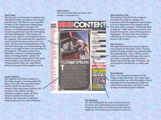
This document provides an analysis of the layout and design elements of a magazine cover and contents page. Key points analyzed include the use of the magazine's name and masthead to stand out, photographic choices that reflect the rock music genre, easily located page numbers for sections, and design elements that appeal to the magazine's target audience of young, straight, Caucasian males interested in rock music. Overall the document examines how the visual presentation works to represent the magazine's brand and engage its intended readership.


![Evaluation[1]](https://cdn.slidesharecdn.com/ss_thumbnails/evaluation1-140509042735-phpapp02-thumbnail.jpg?width=640&height=640&fit=bounds)


