This document discusses how the student's media product uses and develops conventions of real music magazines.
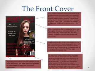
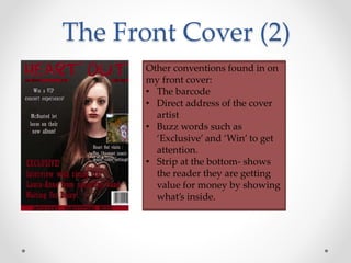
The front cover includes elements commonly found on music magazines like the masthead, date/issue number/price, and a medium shot of the cover artist. However, the image does not overlap the title since this is the first issue. The main cover line stands out in a different color and larger font to draw attention.
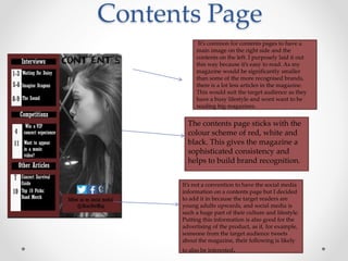
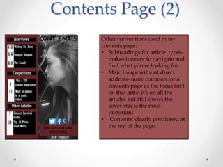
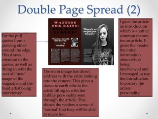
The contents page lists articles in a left column and features a large image on the right, making it easy to read. It also includes social media info to promote the magazine to its target audience. Article pages continue the color scheme and include things like pull quotes, a three-column layout, and bold