
Recommended
More Related Content
What's hot
What's hot (19)
Viewers also liked
Viewers also liked (20)
Similar to Task 2b
Similar to Task 2b (20)
Recently uploaded
Recently uploaded (20)
Task 2b
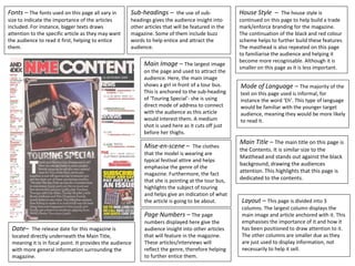
- 1. Fonts – The fonts used on this page all vary in size to indicate the importance of the articles included. For instance, bigger texts draws attention to the specific article as they may want the audience to read it first, helping to entice them. Main Image – The largest image on the page and used to attract the audience. Here, the main image shows a girl in front of a tour bus. This is anchored to the sub-heading of ‘Touring Special’- she is using direct mode of address to connect with the audience as this article would interest them. A medium shot is used here as it cuts off just before her thighs. Mise-en-scene – The clothes that the model is wearing are typical festival attire and helps emphasise the genre of the magazine. Furthermore, the fact that she is pointing at the tour bus, highlights the subject of touring and helps give an indication of what the article is going to be about. House Style – The house style is continued on this page to help build a trade mark/enforce branding for the magazine. The continuation of the black and red colour scheme helps to further build these features. The masthead is also repeated on this page to familiarise the audience and helping it become more recognisable. Although it is smaller on this page as it is less important. Sub-headings – the use of sub- headings gives the audience insight into other articles that will be featured in the magazine. Some of them include buzz words to help entice and attract the audience. Mode of Language – The majority of the text on this page used is informal, for instance the word ‘Eh’. This type of language would be familiar with the younger target audience, meaning they would be more likely to read it. Page Numbers – The page numbers displayed here give the audience insight into other articles that will feature in the magazine. These articles/interviews will reflect the genre, therefore helping to further entice them. Date– The release date for this magazine is located directly underneath the Main Title, meaning it is in focal point. It provides the audience with more general information surrounding the magazine. Layout – This page is divided into 3 columns. The largest column displays the main image and article anchored with it. This emphasises the importance of it and how it has been positioned to draw attention to it. The other columns are smaller due as they are just used to display information, not necessarily to help it sell. Main Title – The main title on this page is the Contents. It is similar size to the Masthead and stands out against the black background, drawing the audiences attention. This highlights that this page is dedicated to the contents.