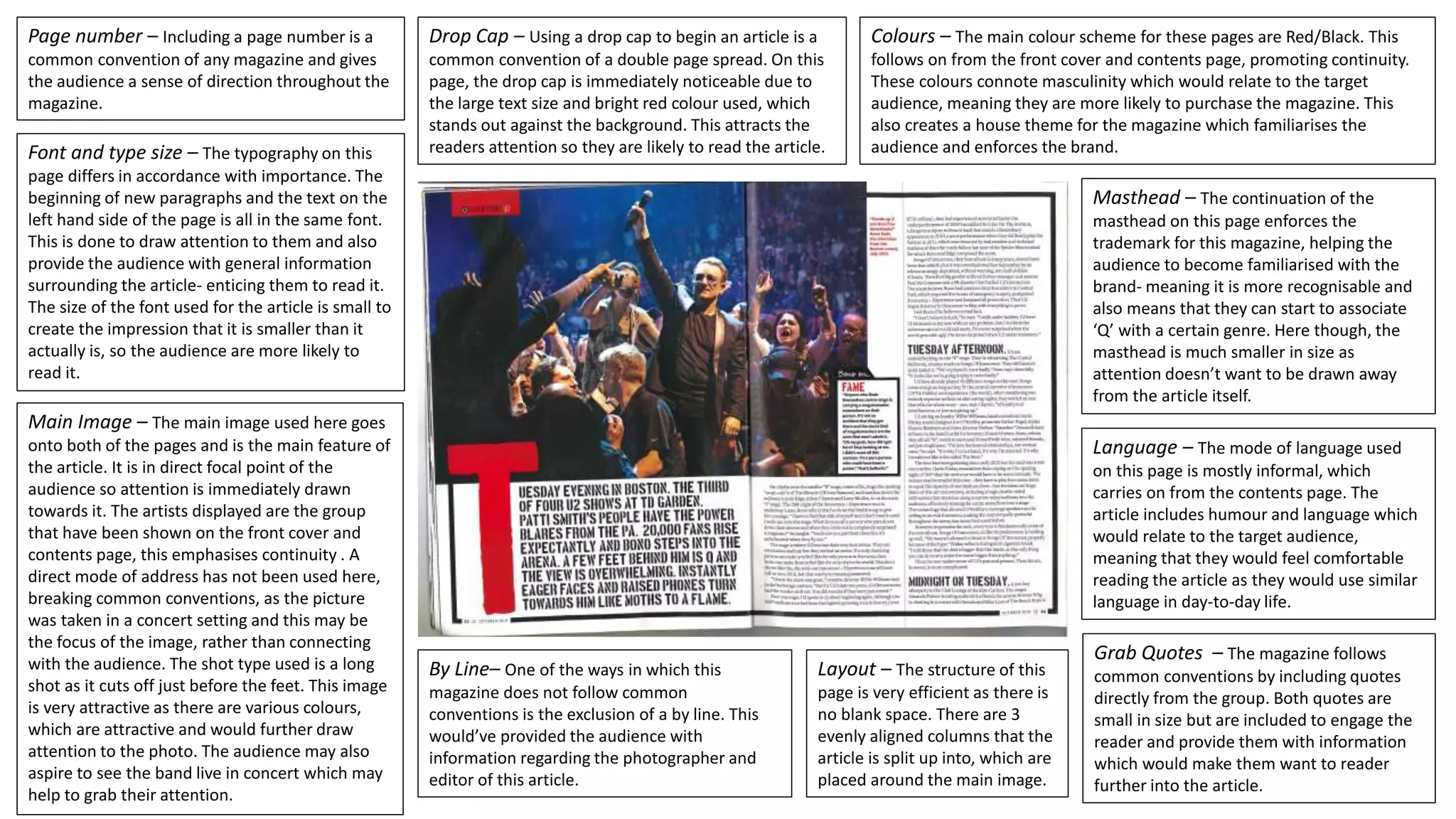
This document analyzes the layout and design elements used on a magazine page. It discusses several key components: the page number provides orientation; the masthead reinforces the brand; a large red drop cap attracts attention to the article; font size and type differentiate important information; red and black colors promote continuity from the cover; informal language relates to the target audience; columns and images efficiently use space without blank areas; the main image draws the eye and emphasizes continuity from previous pages; and grab quotes engage readers to read further. However, it breaks convention by not including a photographer byline.