The document summarizes the design elements and style of a music magazine cover and contents pages focusing on Q Magazine. Some key points:
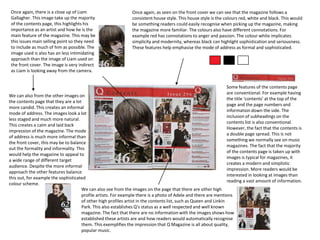
- The masthead is a white Q logo against a red background in the top left corner to stand out.
- Cover lines use different fonts, sizes, and colors following the magazine's house style of red, white, black.
- Images of artists like Liam Gallagher take up most space to highlight their importance.
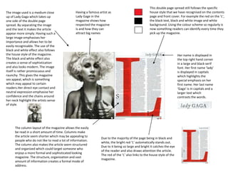
- Contents pages also follow the house style and include many celebrity photos and mentions to establish the magazine's credibility.
- Lady Gaga's image and article separate text from a large black and white photo to draw attention through the magazine's signature