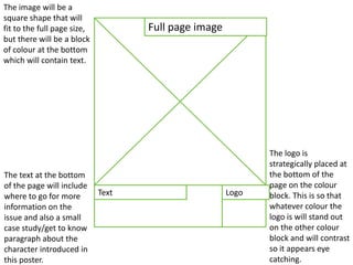
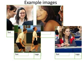
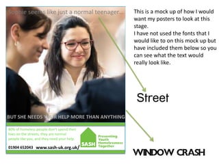
Poster campaign flatplans
Full page image
LogoText
Layout choices
• I have chosen a simple layout to keep the
message clear. The design details and images
will still be interesting and eye catching
however I want the message that is being put
across here to be mirrored in the layout
design; simple and with one purpose.
Full page image
LogoText
The image will be a
square shape that will
fit to the full page size,
but there will be a block
of colour at the bottom
which will contain text.
The logo is
strategically placed at
the bottom of the
page on the colour
block. This is so that
whatever colour the
logo is will stand out
on the other colour
block and will contrast
so it appears eye
catching.
The text at the bottom
of the page will include
where to go for more
information on the
issue and also a small
case study/get to know
paragraph about the
character introduced in
this poster.
Example copy
• On each poster, something like ‘Sophie seems like just a
normal teenager… But she needs your help more than
anything. 80% of homeless people don’t spend their lives
on the streets, they are normal people like you, and they
need your help.’
• Each poster will have a small case study or a ‘get to know
the character’ paragraph. I have chosen to do this because I
think that if people read the text and see the person in the
photograph, they will feel like they know them and this
may make them more inclined to help SASH or volunteer.
• There will also be statistics on each poster such as ‘80% of
homeless people don’t spend their lives on the street.’
Example images
LogoText LogoText
LogoTextLogoText
Example images
• I want to use images like the ones that I have included
in the previous slide. I want to use photographs of
normal people in normal situations that may people
aged 16-24 experience daily and are familiar with. This
includes things such as studying, partying, shopping
and other things that people this age do on a daily
basis.
• I think it will emphasise that homelessness can happen
to anyone and will make people realise that this issue is
shocking mainly because you don’t know who it is
happening to. People are not just openly going to come
out and broadcast that they are homeless, they will
keep it on the down low and so you do not know who
it is happening to at all.
Fonts
• I would like to use a clear, serif font like ‘Street’ for most of
the copy and important information such as contact
information so that it is clear and simple to read. However, I
would like to use a different font such as ‘Window Crash’
for the sentences like the example ‘But she needs your help
more than anything’. These sentences will vary from poster
to poster.
• I think that having the text that talks about people helping
in a different font will draw people to it and make them
realise that it is important. The ‘Window Crash’ font looks
like smashed glass, this indicates how people feel when
their life falls apart when they suddenly become homeless.
It will emphasise the fact that help is needed and how this
issue is perceived by the people that it happens to.
Colours
• I would like to use the SASH original colour, which is
green. Green is the colour of positivity, health and
fresh starts which are all applicable to this issue.
• Some people who already know about SASH as an
organisation may already be familiar with the colour
green that is associated and find it familiar when they
see my posters. This may draw them in because they
have already volunteered, donated of helped out in
some way.
• The colour of the green is quite bright and eye
catching. This would be useful to the poster and the
issue.
80% of homeless people don’t spend their
lives on the streets, they are normal
people like you, and they need your help.
Sophie seems like just a normal teenager…
BUT SHE NEEDS YOUR HELP MORE THAN ANYTHING
www.sash-uk.org.uk/01904 652043
This is a mock up of how I would
want my posters to look at this
stage.
I have not used the fonts that I
would like to on this mock up but
have included them below so you
can see what the text would
really look like.
Sticker/Beer mat flatplan
Logo
Image (Green
background)
Text – Contact
details
(Green background) Text
The image will
take up most of
the shape. This
is because it will
be eye catching
and shows the
theme and issue
itself well.
Layout choices
• The layout for this sticker/beer mat design is simple. Again,
this is to simply put across the message and be sure that
the message is the main focus of the product. There will be
an image of a homeless person on the street that will take
up a majority of the area. I think that it is important for the
image to be a main part of the product; images catch
people’s attention and the content can cause the reader to
feel emotion.
• There will be text areas that will contain contact
information and also that will talk about SASH and how
they can help the issue of homelessness. The sticker/beer
mat will be sure to state how ‘you’ the reader/audience can
help SASH and homelessness in the UK.
Example copy
• ‘No home. No hope. No life for a young adult.’
• ‘Help us to help them.’
• ‘Call … or visit our website to find out more …’
• Because this product is small, the text will be
used to put across information to the reader
and to make an impact on them about the
issue of homelessness to a point where they
may want to help the organisation.
Example images
Example images
• I want to use black and white, grey scale images
because I think that they bring a factual feel and tone
to the product. They also have a tendency to make
things seem negative such as the issue of
homelessness; it is not a positive issue.
• The image that I would use would be of a homeless
person on the street, how most people see them when
they are walking around a town centre. I would need
there to be some space on the image with no image
detail relevant to the picture where I can put text over
it and it would show up well.
Example fonts
• A very clear, simple font like ‘Arial’ would work
well here; it is the words that matter, not the
text. I do not want to distract too much
attention to the small details of the product.
• I will use a slightly more bold font for the ‘No
home. No hope.’ section. This is because I
want this part of the product to catch the
most attention, as well as the image.
Example colours
• I will stick to using the green colour that is currently
used at SASH’s home colour. This is because the colour
is bright, eye catching and positive and the symbolises
health and new beginnings. This is exactly what SASH
try to help to increase and create for homeless people
as an organisation.
• I will use two different shades of green for the text:
One light and one dark. I will do this because if all of
the writing is all in one colour the product may look
slightly boring and monotone, and also so that the
chunks of text stand out equally because they are two
different colours, a change of colour will catch
attention.
Please.
Help us to help them.
Call 01904 652043 or visit our website:
www.sash-uk.org.uk/

Flatplans

  • 1.
  • 2.
  • 3.
    Layout choices • Ihave chosen a simple layout to keep the message clear. The design details and images will still be interesting and eye catching however I want the message that is being put across here to be mirrored in the layout design; simple and with one purpose.
  • 4.
    Full page image LogoText Theimage will be a square shape that will fit to the full page size, but there will be a block of colour at the bottom which will contain text. The logo is strategically placed at the bottom of the page on the colour block. This is so that whatever colour the logo is will stand out on the other colour block and will contrast so it appears eye catching. The text at the bottom of the page will include where to go for more information on the issue and also a small case study/get to know paragraph about the character introduced in this poster.
  • 5.
    Example copy • Oneach poster, something like ‘Sophie seems like just a normal teenager… But she needs your help more than anything. 80% of homeless people don’t spend their lives on the streets, they are normal people like you, and they need your help.’ • Each poster will have a small case study or a ‘get to know the character’ paragraph. I have chosen to do this because I think that if people read the text and see the person in the photograph, they will feel like they know them and this may make them more inclined to help SASH or volunteer. • There will also be statistics on each poster such as ‘80% of homeless people don’t spend their lives on the street.’
  • 6.
  • 7.
    Example images • Iwant to use images like the ones that I have included in the previous slide. I want to use photographs of normal people in normal situations that may people aged 16-24 experience daily and are familiar with. This includes things such as studying, partying, shopping and other things that people this age do on a daily basis. • I think it will emphasise that homelessness can happen to anyone and will make people realise that this issue is shocking mainly because you don’t know who it is happening to. People are not just openly going to come out and broadcast that they are homeless, they will keep it on the down low and so you do not know who it is happening to at all.
  • 8.
    Fonts • I wouldlike to use a clear, serif font like ‘Street’ for most of the copy and important information such as contact information so that it is clear and simple to read. However, I would like to use a different font such as ‘Window Crash’ for the sentences like the example ‘But she needs your help more than anything’. These sentences will vary from poster to poster. • I think that having the text that talks about people helping in a different font will draw people to it and make them realise that it is important. The ‘Window Crash’ font looks like smashed glass, this indicates how people feel when their life falls apart when they suddenly become homeless. It will emphasise the fact that help is needed and how this issue is perceived by the people that it happens to.
  • 9.
    Colours • I wouldlike to use the SASH original colour, which is green. Green is the colour of positivity, health and fresh starts which are all applicable to this issue. • Some people who already know about SASH as an organisation may already be familiar with the colour green that is associated and find it familiar when they see my posters. This may draw them in because they have already volunteered, donated of helped out in some way. • The colour of the green is quite bright and eye catching. This would be useful to the poster and the issue.
  • 10.
    80% of homelesspeople don’t spend their lives on the streets, they are normal people like you, and they need your help. Sophie seems like just a normal teenager… BUT SHE NEEDS YOUR HELP MORE THAN ANYTHING www.sash-uk.org.uk/01904 652043 This is a mock up of how I would want my posters to look at this stage. I have not used the fonts that I would like to on this mock up but have included them below so you can see what the text would really look like.
  • 11.
  • 12.
    Logo Image (Green background) Text –Contact details (Green background) Text The image will take up most of the shape. This is because it will be eye catching and shows the theme and issue itself well.
  • 13.
    Layout choices • Thelayout for this sticker/beer mat design is simple. Again, this is to simply put across the message and be sure that the message is the main focus of the product. There will be an image of a homeless person on the street that will take up a majority of the area. I think that it is important for the image to be a main part of the product; images catch people’s attention and the content can cause the reader to feel emotion. • There will be text areas that will contain contact information and also that will talk about SASH and how they can help the issue of homelessness. The sticker/beer mat will be sure to state how ‘you’ the reader/audience can help SASH and homelessness in the UK.
  • 14.
    Example copy • ‘Nohome. No hope. No life for a young adult.’ • ‘Help us to help them.’ • ‘Call … or visit our website to find out more …’ • Because this product is small, the text will be used to put across information to the reader and to make an impact on them about the issue of homelessness to a point where they may want to help the organisation.
  • 15.
  • 16.
    Example images • Iwant to use black and white, grey scale images because I think that they bring a factual feel and tone to the product. They also have a tendency to make things seem negative such as the issue of homelessness; it is not a positive issue. • The image that I would use would be of a homeless person on the street, how most people see them when they are walking around a town centre. I would need there to be some space on the image with no image detail relevant to the picture where I can put text over it and it would show up well.
  • 17.
    Example fonts • Avery clear, simple font like ‘Arial’ would work well here; it is the words that matter, not the text. I do not want to distract too much attention to the small details of the product. • I will use a slightly more bold font for the ‘No home. No hope.’ section. This is because I want this part of the product to catch the most attention, as well as the image.
  • 18.
    Example colours • Iwill stick to using the green colour that is currently used at SASH’s home colour. This is because the colour is bright, eye catching and positive and the symbolises health and new beginnings. This is exactly what SASH try to help to increase and create for homeless people as an organisation. • I will use two different shades of green for the text: One light and one dark. I will do this because if all of the writing is all in one colour the product may look slightly boring and monotone, and also so that the chunks of text stand out equally because they are two different colours, a change of colour will catch attention.
  • 19.
    Please. Help us tohelp them. Call 01904 652043 or visit our website: www.sash-uk.org.uk/