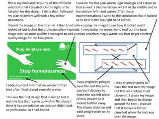
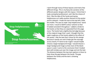
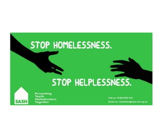
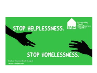
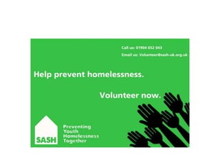
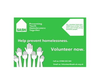
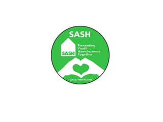
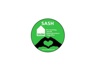
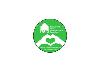
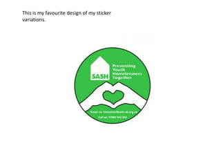
SlideShare a Scribd company logo
SASH Advertisements
By Henry Paul
Evaluation
•

There were guidelines to follow when thinking about making my adverts fit for purpose. With that said there were also
a lot of choices to be made too. I wanted all my designs to follow a theme so that they were fluent throughout. I think
that most, if not all my designs are fit for purpose. The reason I think my advertising campaign is fit for purpose is
because of its continuance. I used a colour scheme that correlated throughout my designs. I didn’t want any of them to
be hard hitting because I wanted them all to be inviting and warm. The best way to encourage people to volunteer is to
make them realise how easy it is to help. If all my posters were hard hitting it might be slightly un encouraging for the
people who I want to apply. I think my bus advert was slightly less fit for purpose because it doesn’t really state clearly
that its an advert trying to get you to volunteer. The bus advert could be asking for donations to help stop
homelessness. In some respects you could look at it as multipurpose but that wasn’t the task. The campaign on a hole
does feel although it fits together well as I’ve used all the same colour schemes throughout. There are some variations
in colour throughout my design but it normally changed between black and white until I came to a decision I liked.

•

The only way to make my designs more fit for purpose would be to make them more professional and consistent
throughout. I could make them better if I had more skills on Photoshop because I would be able to fine tune the
layouts and images. I got feedback from class members throughout the project, this helped me cut down my ideas and
be more critical of my own work. I think my work defiantly got better as I went along because I gained more ideas and I
begun to learn what fitted and what didn’t. I begun to learn how to create a product for this audience as I gained the
knowledge I needed from class mates and tutors. SASH obviously want to keep their work consistent throughout so to
make mine this way I used the same logo for each design. I wanted to keep all the colours warm through out my
designs so that they were more fit for purpose. The idea of these posters was to encourage, not show suffering. I think
if I had gone for more hard hitting images and text then my designs would have become less and less fit for purpose. I
was trying to design quite stereotypical adverts this was so they could be relatable and more effective for the masses. I
needed my designs to state clearly their reason for existence, basically I didn’t want any hidden messages. This is so my
poster/bus advert/sticker can be as effective as possible. I think that my poster and sticker were especially fit for
purpose. I like the solid look they seem to have. Originally I liked the bus advert because I liked the idea of the hands
representing the loneliness and helplessness that being homeless can cause. The bus advert didn’t have the same feel
as my other two adverts and didn’t look as crisp. It could be partially to do with the slightly poor quality of the image I
chose.
I think that my advertising campaign for SASH will have a positive or good effect on the public. My
reason for this being that they don’t look too out of place. They stand out enough to be read
but they don’t stick out like a swore thumb. I tried to make all my designs in this campaign
quite stereotypical in terms of poster layouts, this was so I could optimise the effectiveness
and guarantee they weren't going to be too far fetched that they were dismissed on sight. I
think that the theme of hands that flows through my designs is what will make them
memorable. If you saw the bus advert on a bus I don’t think it would make you instantly want
to volunteer at all, but what it would do is make you think about homelessness on a whole. I
think that the sticker will be more effective because of how easy a sticker is to distribute.
Children can wear them, they can be given out along side a collection box and they can even
be stuck on posters them selves. An advert on the side of a bus doesn’t really give you the
chance to write down details or anything like that because a majority of the time it will be
passing by you.
I tried to make my poster look interesting but I also didn’t want there to be an overload of
information. I think I found a good balance between the two. I think its eye catching enough
for you to stop and read it especially if you passed it every day. I think that if you want to
volunteer in anything you will already be looking into it somewhat. The idea of my campaign
is almost a memory jogger. It could be something that's happened to a friend or a family
member and then seeing the poster is what encourages you to take the next step of
volunteering. It could be something subconscious after passing the poster everyday. I think all
my designs would be effective, some less than others but all have the required information. I
think they all fit the criteria for being an advert for SASH, they aren't over crowded and all
have a solid feel. Non of them are hard hitting because I wanted them to be encouraging for
the right reasons.
Bus advert
•

I think that this idea could have potential because I like the caption of text that I decided to
put on it. It took me quite a bit of time to get this idea done because I didn’t like the
unprofessional look that I had given it the first time around. I tweaked my idea until I came
up with something I was happy with. The point of this task is to try and design something to
encourage volunteers to join SASH. I think it does communicate my message well because its
bold and and the text is easy to read. It isn’t really direct because its not asking you to
volunteer its asking you to help stop homelessness. There are many ways you can help stop
homelessness other than volunteering.

•

This bus advert could be seen as thought provoking because it makes you think about ways in
which you could help other than just volunteering. The image is of two hands slipping away
from each other, this is to show helplessness. The hands aren’t hard hitting but still show the
helplessness of being homeless. We are trying to encourage volunteers because of this I
chose quite a warm colour scheme that is very similar to SASH’s. I think this bus advert does
communicate the message well because its eye catching and depending on the colour
scheme can be bold or subtle. Its stating contact details and SASH’s logo/brand. They are the
two important things that need to be on there so that people can remember SASH as a social
enterprise and remember them as a contact. Depending on who sees it and where the
hypothetical bus might travel it could be useful for a young person who is in distress but
doesn’t realise who they can contact. I think I would defiantly need to tweak it before it
begun looking anymore professional but I do think it fits the brief well.
•

I think that it is appropriate for my target audience because it relatively quick to read and it just gives you information that
you need to know. We are targeting a young audience because of this I made sure my bus advert didn’t have loads of text on
it. Another obvious reason for not wanting lots of text is the fact that it could potentially be on a moving bus. You need
something that’s quick to read that also stay in peoples minds. I thought the large eye catching hands would probably be
something that would be easy to remember. On the side of a bus they may have some impact. The colours aren’t old
fashioned or too bright so that the piece could be off putting to some. I used a generic colour scheme that fits in with the
SASH colour scheme. The advert is towards young people in need and people who could potentially volunteer. This is a
broad age range to a certain extent that is why I have gone for quite a simple design that is difficult to criticize for any age
based reason. There are some aesthetic qualities of this piece of work. My favorite of the different variations is stated below.
I think this is the best because it looks the most professional of my designs. It doesn’t look out of place and all the strokes
are added were appropriate.

•

I have used some different techniques throughout this poster design. One technique I used was choosing two words that are
very similar in terms of the way they look when written down. Its almost relating helplessness with homelessness. I made
the first piece of text saying “stop helplessness” in smaller font this is because stopping helplessness in the main focus of
this poster. The piece of text saying “stop homelessness” is in a larger font so that people see it more clearly and so they
know what the poster is about. The large gaps between the hands and font are showing helplessness, the sea of green is
necessary for this to be seen. I chose to put a stroke around the hands on my final design to separate the image from the
page and make them stand out more. I thought about putting a stroke around the text but it looked better embedded into
the background.
I think that the content within this design is relatively effective, the purpose of it is to raise awareness of SASH and I think
that it does this well. It states what the charity does and it gives you some contact information so that you can get in touch if
needs be. The logo is also in plane site so that it’s a memorable part of the piece. The hands slipping away from each other
are to show helplessness. I think this is quite clear by the placement of the hands themselves.

•
This is my final and favourite of the different
variations that I created. On the right is the
flat plan for this design. I think that I followed
my plan relatively well with a few minor
alterations.

I said on the flat plan where logo could go and I stuck to
that as well. I tried variations with it in the middle and in
the bottom left hand corner. After these
experimentations I came to the conclusion that it looked
at its best in the top right hand corner.

I found the image on the internet. I then tried roto-scoping my image to see how it looked and it
looked ok but lacked the professionalism I wanted. I tried using the magic wand tool but the base
image was too poor quality. I managed to add a stroke and then magic wand tool that to get a better
quality image for the final piece.

I added contact information where it fitted
best after I had placed everything else.
This was the first design that I created but it
was the last that I came up with in flat plans. I
think it has potential as an idea but didn’t look
as professional as I had hoped.

I was originally going to

I was originally going to
have the text the same have the text over my image
size but I decided to
but this was before I had
make the top left piece chosen it. I chose my image
of text smaller so it
and then begun to change
looked further away.
around the text. I realised
This shows distance and that it looked a bit too
adds progression to the crowded when the text was
piece.
over the image.
I went through many of these layouts and tried a few
different things. This is my favourite variation of the
different poster designs with this layout. I think that it
looks somewhat professional and I like the choice of
font. I like the idea of the hands portraying
helplessness as it adds another element to the poster
and its relevant. I made the text at the top left a little
bit smaller. This was to make ‘stop helplessness’ stand
out more. I stuck to SASH’S colour scheme so that
It looked consistent throughout. I added a stroke to
the hands so that they are separated from the page
more. The hands had a slightly blurred edge because
of the original image that I used. I thought that the
slight roughness of the hands added to the effect of
the poster. I like the text that I chose for this design
because it stands out and it helps get the message
across clearly. If I were to do it again I would maybe
choose a larger background image. I would choose a
larger background image so that more of the blank
space is used. I came to the conclusion that it looked
best with strokes just over the image and not the text.
The distance between the two text captions is there to
help show the gap between the hands. The gap
between the hands and the text is showing
helplessness.
This is my favourite of my bus adverts.
Poster design
•

The message on this piece is very direct and tells people instantly that what they are looking
at is a poster encouraging you to volunteer. The message is very clear as its not asking you a
question its making a statement. Its almost telling you to do something. Its telling you to
prevent homelessness by volunteering. The main goal of this activity is to get people to
volunteer and I think this poster would be quite effective at that. There’s nothing you have to
figure out in this poster that is why I think it could have the potential to be successful. Its
direct and straight foreword. I think with this design it gets more and more clear as you go
along.

•

I think my first design had a bit of a layout problem. I think that the text placement seemed a
bit off and could have placed in a more easily readable position. That is why I continued on to
make the other improved versions of the first design. These different variations consist of
two main blocks of text, contact information, logo and the image. I thought the image was
relevant as it matched with the theme of hands. The hands in this image is to show people
wanting to volunteer. The hands are all people rushing to be of help. I tried the image in
different colours and with different effects such as the stroke. After looking at the image in a
lot of different places I discovered that it looked best in the bottom left hand corner. This was
because it became less of a main focus for the poster so I could then concentrate on the free
space. I added a text box to make it more informative and to relate the poster to SASH itself a
little bit more. Its clear and laid out to a somewhat professional standard.
•

I think that these designs are appropriate for my target audience because they stick to the same
theme as the other pieces in this project. This keeps up consistency and professionalism
throughout. As I began altering the designs I realised that it looked a bit bare so I began filling in the
blank spots. I added a triangle shaped text box to make it informative and to appeal to a slightly
older audience. Its not a hard hitting poster at all so it needs to be bold and stand out. I think the
hands that I have continued through my theme are the eye catching part of the piece. I think that it
looks consistent throughout and does look somewhat professional.

•

I used a different array of techniques to get my message across and make sure its applicable for the
target audience. In my original image I was going to use black to colour the hands. I decided to see
what it would look like on this too. I thought that it looked bold which would have been good for
grabbing peoples attention. In the end I decided that it looked too separate from the rest of the
poster. I decided to make the hands a more subtle part of the piece and to make the focus the font
instead. In white the hands looked good but needed something to make them look right. I added a
small stroke around the hands to make them subtle but still visible. It also wouldn't have continued
to comply with the theme I had chosen. I steered away from my original flat plan because I didn’t
completely like my original idea. I made the text close together so that when people read it they
will get the message straight away. I have chosen hands on this poster because its telling you to
volunteer. The hands are supposed to represent peoples hands rushing up to volunteer.

•

I think that the content for this design is quite effective. Its not too hard hitting and the images and
text stand out from the page. It gives you some contact information alongside a thought provoking
message. I added a fact from the SASH’s website. This is so people can learn more about SASH to
then relate to it. I chose the image of the hands because its supposed to show people rushing to
volunteer. This will hopefully be a subconscious message, if not an obvious one. It also upkeeps
with the theme of hands that I am replicating throughout my designs.
The poster design on the left is my favourite design of the
I decided to go with neither of my
different variations. The design on the right is the one that
original ideas for the image as it didn’t
looks closest to my original plan.
seem to fully comply with my theme. I
decided on something less hard hitting
Originally I was going to have the hands in black because it
in the end and continued the hands
looked bolder. After feedback and trying different layouts I
throughout my designs.
concluded that they looked better in white with a small
black stroke.
My completed design to
the left was very different
from my original plan. I
added an information box
to fill some space out in
the poster. It was going to
be quit a plain poster but
then ended up being
constructively crowed.
At first there was going to be three
Originally I was either going to put
different pieces of text on the
an image of a young homeless
poster. I removed a piece of text that
person looking distressed or an
was not that necessary. The piece of
image of volunteers looking happy. I
text said “help stop poverty” and it
was going to chose an image of a
was in the centre as shown on the
homeless person in distress to try
flat plan. The point of the campaign
and get the sympathy vote from
is to fight homelessness, not poverty
people that may see the piece. I was
on a whole. Another reason for
going to choose happy volunteers to
removing this piece of text is that it
show how rewarding helping SASH
made the poster too crowed.
can be.
This is my favourite poster from the ones I designed
because it looks the most professional. I tried lots of
different versions of this design with slight colour
differences. This is the most professional poster I
designed with this layout. I added strokes where
necessary, to separate things from the page. In the
end I decided again that the stroke only looked good
around the image. The text and information box
looked better flush to the page. I like how well the
white and green work together. Everything on the
poster is stated clearly. I also used progression with
the two lines of text. I made the sizes different
between the text so that ‘volunteer now’ would stand
out more. The images of the hands are supposed to
represent people rushing to volunteer. If I were to
change anything I would make the piece of text saying
‘volunteer now’ a bit larger. I would make it a bit
larger so that it stood out more. I used the same font
as in my previous designs so that my pieces would be
more consistent. I continued the theme of hands
through onto this design because I found an image
that could work well. I don’t think that anything on
the page looks out of place and you could imagine this
as a poster that could be put around college.
This is my favourite design of my poster
variations.
Sticker design
•

This sticker is my favourite design out of the four base ones that I created. I like this design
because it seems to fit well together. The colours, fonts and image all seem to work. This was
my last design and I think it was a good collaboration of my previous ideas. I think this does
send a clear message. The original one that I created stated the name of the company, had
the logo underneath, then the image and some contact information. This did look ok but it
seemed to just double up on the logo.

•

I though it would look more professional if it just had the logo, image and the contact
information. Stickers tend not to be jam packed full of information so I made it simple and
more effective. The sticker tells you who the company is, it also has some contact
information that could be useful at a desperate time. SASH’s slogan is “preventing youth
homelessness together”, I thought I would choose an image appropriate to that. I chose two
hands coming together to meet in the middle. I thought it was an appropriate image because
it shows togetherness, the heart is to show the love and shelter that SASH has to offer. I think
it is a clear design especially after changing the layout around a bit. I think the design looks
somewhat professional and I could imagine it being used to promote SASH. I think I could
have made it a little better by playing around with the background shape as appose to just
keeping it a circle throughout.
•

I think that this sticker is defiantly appropriate for my target audience. It uses a generic colour
scheme that I use throughout all of my designs. I think you imagine this being handed out in a
college or in someone's place of work alongside a collection box. There are two target
audiences for this sticker so I tried to make it appeal to everyone. I chose an image that is
appropriate for everyone so it was something that people would feel proud to wear. I think
that because its promoting a charity, people will want to wear it as long as its not completely
off putting. If someone is supporting something they will more likely than not, show it. The
colours are quite warm as well as being bold this gives it a well rounded professional look. I
made the logo and slogan larger so that they they were the more prominent part of the
piece. The logo and slogan are a fairly self explanatory when comes to stating what SASH
does.

•

I used some similar techniques as the other two designs because I am continuing my theme. I
knew that I wanted to continue the hands over to my sticker design. I have chosen two hands
coming together to create a love heart. In SASH’s slogan they state that they are “preventing
youth homelessness together”, the hands meeting in the middle are showing togetherness.
The heart is showing SASH’s care and love for helping the homeless. This sticker is meant to
make people aware of SASH and give them the details they need to contact them if they need
to. I think it fills out its purpose relatively well. I kept it simple so that it is easy to understand
what its about. I made sure the image of the hands is large so that it grabs peoples eye. I
added a stroke to the outer edge of the sticker, this made it stand out more. I also added the
same size stroke to the hands and I think it made it look a lot more of a full and clear piece.

•

I think the content within this sticker is effective. Its simple yet everything seems to work well
together. It gives you some key contact information whilst also stating SASH’s logo. The logo
itself is quite self explanatory in terms of telling you what SASH does. It tells you everything
you need to know without telling you anything unnecessary. I think all the space is used well.
I think that you could imagine this sticker next to some kind of collection box.
The design to the left is my favourite of the
different sticker designs that I did. It looks
professional and everything works well together. I
continued my theme of hands through onto this
design. There was no planning involved in the
creation of this sticker, with that said it didn’t
hinder me too much. I knew exactly what I wanted
it to look like. I like the colour scheme as it
matches the ones from my other designs. I chose
hands forming a heart to show SASH’s love and
commitment for their work. I added a stroke that
was the same size around both the hands and the
outer edge of the sticker. I tried a few different
variations of this design just to see what looked
best in terms of colour scheme and placement. I
originally made the hands black but I thought they
stood out a bit too much and they didn’t really fit
in properly with the rest of my designs. I tried
another design where it said in bold letters ‘SASH’
but I realised it was pointless because it states it
clearly within the logo.
This is my favourite design of my sticker
variations.

More Related Content

What's hot

Social action evaluation resubmission
Social action evaluation resubmissionSocial action evaluation resubmission
Social action evaluation resubmissionsavannahryan11
 
Evaluation
Evaluation Evaluation
Evaluation
Emily Shaw
 
Social action evaluation
Social action evaluationSocial action evaluation
Social action evaluation
MCFCEdwaardz
 
Idea development pro forma done
Idea development pro forma doneIdea development pro forma done
Idea development pro forma done
willydavisj
 
Task 5, 6 & 7
Task 5, 6 & 7Task 5, 6 & 7
Task 5, 6 & 7
Millie Casemore
 
Evaluation
EvaluationEvaluation
Evaluation
paige moorby
 
Evaluation
Evaluation Evaluation
Evaluation
Emily Shaw
 
Evaluation
Evaluation Evaluation
Evaluation
Emily Shaw
 
Evaluation
Evaluation Evaluation
Evaluation
Emily Shaw
 
Evaluation Pro - Forma
Evaluation Pro - FormaEvaluation Pro - Forma
Evaluation Pro - Forma
niamhdarby
 
Social action evaluation
Social action evaluationSocial action evaluation
Social action evaluation
BHuyton10
 
Campaign PDF
Campaign PDFCampaign PDF
Campaign PDF
Loren Coad
 

What's hot (19)

Social action evaluation resubmission
Social action evaluation resubmissionSocial action evaluation resubmission
Social action evaluation resubmission
 
Evaluation
EvaluationEvaluation
Evaluation
 
Evaluation
EvaluationEvaluation
Evaluation
 
Evaluation
EvaluationEvaluation
Evaluation
 
Evaluation
Evaluation Evaluation
Evaluation
 
Evaluation
Evaluation Evaluation
Evaluation
 
Task 12
Task 12Task 12
Task 12
 
Social action evaluation
Social action evaluationSocial action evaluation
Social action evaluation
 
Idea development pro forma done
Idea development pro forma doneIdea development pro forma done
Idea development pro forma done
 
Task 5, 6 & 7
Task 5, 6 & 7Task 5, 6 & 7
Task 5, 6 & 7
 
Evaluation
EvaluationEvaluation
Evaluation
 
Evaluation
Evaluation Evaluation
Evaluation
 
Evaluation
Evaluation Evaluation
Evaluation
 
Evaluation
Evaluation Evaluation
Evaluation
 
Evaluation Pro - Forma
Evaluation Pro - FormaEvaluation Pro - Forma
Evaluation Pro - Forma
 
Flat plans
Flat plansFlat plans
Flat plans
 
Task 7
Task 7Task 7
Task 7
 
Social action evaluation
Social action evaluationSocial action evaluation
Social action evaluation
 
Campaign PDF
Campaign PDFCampaign PDF
Campaign PDF
 

Viewers also liked

عرض تقديمي | تيك كير | نظام إدارة المبيعات لوكلاء الخطوط والبطاقات
عرض تقديمي | تيك كير | نظام إدارة المبيعات لوكلاء الخطوط والبطاقاتعرض تقديمي | تيك كير | نظام إدارة المبيعات لوكلاء الخطوط والبطاقات
عرض تقديمي | تيك كير | نظام إدارة المبيعات لوكلاء الخطوط والبطاقات
Atsc Group
 
Mine-action-and-explosive-hazard-management-certificate
Mine-action-and-explosive-hazard-management-certificateMine-action-and-explosive-hazard-management-certificate
Mine-action-and-explosive-hazard-management-certificateColin Eriksen
 
LA INCERTIDUMBRE ELECTORAL ENFRIARÁ EL PIB Y LA INVERSIÓN EN EL PRÓXIMO AÑOE...
 LA INCERTIDUMBRE ELECTORAL ENFRIARÁ EL PIB Y LA INVERSIÓN EN EL PRÓXIMO AÑOE... LA INCERTIDUMBRE ELECTORAL ENFRIARÁ EL PIB Y LA INVERSIÓN EN EL PRÓXIMO AÑOE...
LA INCERTIDUMBRE ELECTORAL ENFRIARÁ EL PIB Y LA INVERSIÓN EN EL PRÓXIMO AÑOE...
EAE Business School
 
Dementia Caregiving Tips (Part 2)
Dementia Caregiving Tips (Part 2)Dementia Caregiving Tips (Part 2)
Dementia Caregiving Tips (Part 2)
Home Instead Senior Care Outer East
 
Sociedad de la informacion
Sociedad de la informacionSociedad de la informacion
Sociedad de la informacionNancy Gonsalez
 
Mr. Rajat Nayar Bollywood Astrologer
Mr. Rajat Nayar  Bollywood AstrologerMr. Rajat Nayar  Bollywood Astrologer
Mr. Rajat Nayar Bollywood Astrologer
Rajat Nayar
 
Accelerated consolidation
Accelerated consolidationAccelerated consolidation
Accelerated consolidationTCM infosys
 
Reference Letter - FHRD - Mr Joe Gerada
Reference Letter - FHRD - Mr Joe GeradaReference Letter - FHRD - Mr Joe Gerada
Reference Letter - FHRD - Mr Joe GeradaOwen Farrugia
 
Is Content Still King?
Is Content Still King?Is Content Still King?
Is Content Still King?
21TORR
 
Bookclub 24symbols
Bookclub 24symbolsBookclub 24symbols
Bookclub 24symbols
Valentina Morotti
 
Dossier cicloturista
Dossier cicloturistaDossier cicloturista
Dossier cicloturista
CicloturistaPamplona
 
EL contrato asegurador definitivo para las Startups tecnológicas
EL contrato asegurador definitivo para las Startups tecnológicasEL contrato asegurador definitivo para las Startups tecnológicas
EL contrato asegurador definitivo para las Startups tecnológicas
JUAN JOSE BORIA MIGUELAÑEZ
 
1212817147 rule vii bldg occupancy(anotated)
1212817147 rule vii bldg occupancy(anotated)1212817147 rule vii bldg occupancy(anotated)
1212817147 rule vii bldg occupancy(anotated)nealeekate11
 
Three lessons for clearer communication
Three lessons for clearer communicationThree lessons for clearer communication
Three lessons for clearer communication
Iriss
 
10 common mistakes that will blow your app launch (and how to avoid them!)
10 common mistakes that will blow your app launch (and how to avoid them!)10 common mistakes that will blow your app launch (and how to avoid them!)
10 common mistakes that will blow your app launch (and how to avoid them!)
Paperlit
 
Sexo Extremo Con Perros
workableviewpoi0
 
Iso 20000 presentation
Iso 20000 presentationIso 20000 presentation
Iso 20000 presentation
Musibau Taiwo Lasisi
 
behavioristik vs konstruktivistik
behavioristik vs konstruktivistikbehavioristik vs konstruktivistik
behavioristik vs konstruktivistikDedi Yulianto
 

Viewers also liked (19)

عرض تقديمي | تيك كير | نظام إدارة المبيعات لوكلاء الخطوط والبطاقات
عرض تقديمي | تيك كير | نظام إدارة المبيعات لوكلاء الخطوط والبطاقاتعرض تقديمي | تيك كير | نظام إدارة المبيعات لوكلاء الخطوط والبطاقات
عرض تقديمي | تيك كير | نظام إدارة المبيعات لوكلاء الخطوط والبطاقات
 
Mine-action-and-explosive-hazard-management-certificate
Mine-action-and-explosive-hazard-management-certificateMine-action-and-explosive-hazard-management-certificate
Mine-action-and-explosive-hazard-management-certificate
 
LA INCERTIDUMBRE ELECTORAL ENFRIARÁ EL PIB Y LA INVERSIÓN EN EL PRÓXIMO AÑOE...
 LA INCERTIDUMBRE ELECTORAL ENFRIARÁ EL PIB Y LA INVERSIÓN EN EL PRÓXIMO AÑOE... LA INCERTIDUMBRE ELECTORAL ENFRIARÁ EL PIB Y LA INVERSIÓN EN EL PRÓXIMO AÑOE...
LA INCERTIDUMBRE ELECTORAL ENFRIARÁ EL PIB Y LA INVERSIÓN EN EL PRÓXIMO AÑOE...
 
Dementia Caregiving Tips (Part 2)
Dementia Caregiving Tips (Part 2)Dementia Caregiving Tips (Part 2)
Dementia Caregiving Tips (Part 2)
 
Sociedad de la informacion
Sociedad de la informacionSociedad de la informacion
Sociedad de la informacion
 
Mr. Rajat Nayar Bollywood Astrologer
Mr. Rajat Nayar  Bollywood AstrologerMr. Rajat Nayar  Bollywood Astrologer
Mr. Rajat Nayar Bollywood Astrologer
 
Accelerated consolidation
Accelerated consolidationAccelerated consolidation
Accelerated consolidation
 
Reference Letter - FHRD - Mr Joe Gerada
Reference Letter - FHRD - Mr Joe GeradaReference Letter - FHRD - Mr Joe Gerada
Reference Letter - FHRD - Mr Joe Gerada
 
Is Content Still King?
Is Content Still King?Is Content Still King?
Is Content Still King?
 
Bookclub 24symbols
Bookclub 24symbolsBookclub 24symbols
Bookclub 24symbols
 
40 minutos
40 minutos40 minutos
40 minutos
 
Dossier cicloturista
Dossier cicloturistaDossier cicloturista
Dossier cicloturista
 
EL contrato asegurador definitivo para las Startups tecnológicas
EL contrato asegurador definitivo para las Startups tecnológicasEL contrato asegurador definitivo para las Startups tecnológicas
EL contrato asegurador definitivo para las Startups tecnológicas
 
1212817147 rule vii bldg occupancy(anotated)
1212817147 rule vii bldg occupancy(anotated)1212817147 rule vii bldg occupancy(anotated)
1212817147 rule vii bldg occupancy(anotated)
 
Three lessons for clearer communication
Three lessons for clearer communicationThree lessons for clearer communication
Three lessons for clearer communication
 
10 common mistakes that will blow your app launch (and how to avoid them!)
10 common mistakes that will blow your app launch (and how to avoid them!)10 common mistakes that will blow your app launch (and how to avoid them!)
10 common mistakes that will blow your app launch (and how to avoid them!)
 
Sexo Extremo Con Perros
 
Iso 20000 presentation
Iso 20000 presentationIso 20000 presentation
Iso 20000 presentation
 
behavioristik vs konstruktivistik
behavioristik vs konstruktivistikbehavioristik vs konstruktivistik
behavioristik vs konstruktivistik
 

Similar to All the work

Evaluationhomeless
EvaluationhomelessEvaluationhomeless
EvaluationhomelessCallumknight
 
Homeless evaluation
Homeless evaluationHomeless evaluation
Homeless evaluation
ashboyne
 
Task 11 and 12 Final Products and Evaluation
Task 11 and 12 Final Products and EvaluationTask 11 and 12 Final Products and Evaluation
Task 11 and 12 Final Products and EvaluationHatieBruton
 
Production Powerpoint
Production PowerpointProduction Powerpoint
Production Powerpoint
hayleylou11
 
Production Powerpoint
Production PowerpointProduction Powerpoint
Production Powerpoint
hayleylou11
 
Evaluation finished
Evaluation finishedEvaluation finished
Evaluation finished
Emily Shaw
 
Social action
Social actionSocial action
Social actionchamahan
 
Evaluation
EvaluationEvaluation
EvaluationMarieSie
 
Sa&cp evaluation IMPROVED
Sa&cp evaluation IMPROVEDSa&cp evaluation IMPROVED
Sa&cp evaluation IMPROVED
eleanor-dawson
 
Campaign Poster Development
Campaign Poster Development Campaign Poster Development
Campaign Poster Development
PJG123
 

Similar to All the work (17)

Evaluation
EvaluationEvaluation
Evaluation
 
Final plan LO3
Final plan LO3Final plan LO3
Final plan LO3
 
Evaluation
EvaluationEvaluation
Evaluation
 
Evaluationhomeless
EvaluationhomelessEvaluationhomeless
Evaluationhomeless
 
Homeless evaluation
Homeless evaluationHomeless evaluation
Homeless evaluation
 
Task 11 and 12 Final Products and Evaluation
Task 11 and 12 Final Products and EvaluationTask 11 and 12 Final Products and Evaluation
Task 11 and 12 Final Products and Evaluation
 
Eval
EvalEval
Eval
 
Evaluation
EvaluationEvaluation
Evaluation
 
Evaluation
EvaluationEvaluation
Evaluation
 
Evaluation
EvaluationEvaluation
Evaluation
 
Production Powerpoint
Production PowerpointProduction Powerpoint
Production Powerpoint
 
Production Powerpoint
Production PowerpointProduction Powerpoint
Production Powerpoint
 
Evaluation finished
Evaluation finishedEvaluation finished
Evaluation finished
 
Social action
Social actionSocial action
Social action
 
Evaluation
EvaluationEvaluation
Evaluation
 
Sa&cp evaluation IMPROVED
Sa&cp evaluation IMPROVEDSa&cp evaluation IMPROVED
Sa&cp evaluation IMPROVED
 
Campaign Poster Development
Campaign Poster Development Campaign Poster Development
Campaign Poster Development
 

Recently uploaded

Understanding the Running Costs of Electric Scooters.pptx
Understanding the Running Costs of Electric Scooters.pptxUnderstanding the Running Costs of Electric Scooters.pptx
Understanding the Running Costs of Electric Scooters.pptx
Zivah ElectriVa Private Limited
 
Antarctica- Icy wilderness of extremes and wonder
Antarctica- Icy wilderness of extremes and wonderAntarctica- Icy wilderness of extremes and wonder
Antarctica- Icy wilderness of extremes and wonder
tahreemzahra82
 
TRAVEL TO MT. RWENZORI NATIONAL PARK WITH NILE ABENTEUER SAFARIS.docx
TRAVEL TO MT. RWENZORI NATIONAL PARK WITH NILE ABENTEUER SAFARIS.docxTRAVEL TO MT. RWENZORI NATIONAL PARK WITH NILE ABENTEUER SAFARIS.docx
TRAVEL TO MT. RWENZORI NATIONAL PARK WITH NILE ABENTEUER SAFARIS.docx
nileabenteuersafaris
 
MC INTERNATIONALS | TRAVEL COMPANY IN JHANG
MC INTERNATIONALS | TRAVEL COMPANY IN JHANGMC INTERNATIONALS | TRAVEL COMPANY IN JHANG
MC INTERNATIONALS | TRAVEL COMPANY IN JHANG
AshBhatt4
 
Jose RIZAL History and his travel Paris to berlin
Jose RIZAL History and his travel Paris to berlinJose RIZAL History and his travel Paris to berlin
Jose RIZAL History and his travel Paris to berlin
MaryGraceArdalesLope
 
How To Change Name On Volaris Ticket.pdf
How To Change Name On Volaris Ticket.pdfHow To Change Name On Volaris Ticket.pdf
How To Change Name On Volaris Ticket.pdf
namechange763
 
4 DAYS MASAI MARA WILDEBEEST MIGRATION SAFARI TOUR PACKAGE KENYA
4 DAYS MASAI MARA WILDEBEEST MIGRATION SAFARI TOUR PACKAGE KENYA4 DAYS MASAI MARA WILDEBEEST MIGRATION SAFARI TOUR PACKAGE KENYA
4 DAYS MASAI MARA WILDEBEEST MIGRATION SAFARI TOUR PACKAGE KENYA
Bush Troop Safari
 
Agence Régionale du Tourisme Grand Est - brochure MICE 2024.pdf
Agence Régionale du Tourisme Grand Est - brochure MICE 2024.pdfAgence Régionale du Tourisme Grand Est - brochure MICE 2024.pdf
Agence Régionale du Tourisme Grand Est - brochure MICE 2024.pdf
MICEboard
 
Exploring Montreal's Artistic Heritage Top Art Galleries and Museums to Visit
Exploring Montreal's Artistic Heritage Top Art Galleries and Museums to VisitExploring Montreal's Artistic Heritage Top Art Galleries and Museums to Visit
Exploring Montreal's Artistic Heritage Top Art Galleries and Museums to Visit
Spade & Palacio Tours
 
Winter Festivities in Italy
Winter Festivities in ItalyWinter Festivities in Italy
Winter Festivities in Italy
Time for Sicily
 
Get tailored experience with Stonehenge tours from London
Get tailored experience with Stonehenge tours from LondonGet tailored experience with Stonehenge tours from London
Get tailored experience with Stonehenge tours from London
London Country Tours
 
Hunza Cherry Blossom tour 2025- Hunza Adventure Tours
Hunza Cherry Blossom tour 2025- Hunza Adventure ToursHunza Cherry Blossom tour 2025- Hunza Adventure Tours
Hunza Cherry Blossom tour 2025- Hunza Adventure Tours
Hunza Adventure Tours
 
Paddle, Float, and Explore The Ultimate River Tour Experience in Monitor, WA
Paddle, Float, and Explore The Ultimate River Tour Experience in Monitor, WAPaddle, Float, and Explore The Ultimate River Tour Experience in Monitor, WA
Paddle, Float, and Explore The Ultimate River Tour Experience in Monitor, WA
River Recreation - Washington Whitewater Rafting
 
欧洲杯开户-信誉的欧洲杯开户-正规欧洲杯开户|【​网址​🎉ac123.net🎉​】
欧洲杯开户-信誉的欧洲杯开户-正规欧洲杯开户|【​网址​🎉ac123.net🎉​】欧洲杯开户-信誉的欧洲杯开户-正规欧洲杯开户|【​网址​🎉ac123.net🎉​】
欧洲杯开户-信誉的欧洲杯开户-正规欧洲杯开户|【​网址​🎉ac123.net🎉​】
bljeremy734
 
Exploring Heritage The Ultimate Cultural Tour in Palmer, Puerto Rico
Exploring Heritage The Ultimate Cultural Tour in Palmer, Puerto RicoExploring Heritage The Ultimate Cultural Tour in Palmer, Puerto Rico
Exploring Heritage The Ultimate Cultural Tour in Palmer, Puerto Rico
Caribbean Breeze Adventures
 
TOP 10 Historic Places To See in Kuruskhetra.
TOP 10 Historic Places To See in Kuruskhetra.TOP 10 Historic Places To See in Kuruskhetra.
TOP 10 Historic Places To See in Kuruskhetra.
ujjwalsethi113
 

Recently uploaded (16)

Understanding the Running Costs of Electric Scooters.pptx
Understanding the Running Costs of Electric Scooters.pptxUnderstanding the Running Costs of Electric Scooters.pptx
Understanding the Running Costs of Electric Scooters.pptx
 
Antarctica- Icy wilderness of extremes and wonder
Antarctica- Icy wilderness of extremes and wonderAntarctica- Icy wilderness of extremes and wonder
Antarctica- Icy wilderness of extremes and wonder
 
TRAVEL TO MT. RWENZORI NATIONAL PARK WITH NILE ABENTEUER SAFARIS.docx
TRAVEL TO MT. RWENZORI NATIONAL PARK WITH NILE ABENTEUER SAFARIS.docxTRAVEL TO MT. RWENZORI NATIONAL PARK WITH NILE ABENTEUER SAFARIS.docx
TRAVEL TO MT. RWENZORI NATIONAL PARK WITH NILE ABENTEUER SAFARIS.docx
 
MC INTERNATIONALS | TRAVEL COMPANY IN JHANG
MC INTERNATIONALS | TRAVEL COMPANY IN JHANGMC INTERNATIONALS | TRAVEL COMPANY IN JHANG
MC INTERNATIONALS | TRAVEL COMPANY IN JHANG
 
Jose RIZAL History and his travel Paris to berlin
Jose RIZAL History and his travel Paris to berlinJose RIZAL History and his travel Paris to berlin
Jose RIZAL History and his travel Paris to berlin
 
How To Change Name On Volaris Ticket.pdf
How To Change Name On Volaris Ticket.pdfHow To Change Name On Volaris Ticket.pdf
How To Change Name On Volaris Ticket.pdf
 
4 DAYS MASAI MARA WILDEBEEST MIGRATION SAFARI TOUR PACKAGE KENYA
4 DAYS MASAI MARA WILDEBEEST MIGRATION SAFARI TOUR PACKAGE KENYA4 DAYS MASAI MARA WILDEBEEST MIGRATION SAFARI TOUR PACKAGE KENYA
4 DAYS MASAI MARA WILDEBEEST MIGRATION SAFARI TOUR PACKAGE KENYA
 
Agence Régionale du Tourisme Grand Est - brochure MICE 2024.pdf
Agence Régionale du Tourisme Grand Est - brochure MICE 2024.pdfAgence Régionale du Tourisme Grand Est - brochure MICE 2024.pdf
Agence Régionale du Tourisme Grand Est - brochure MICE 2024.pdf
 
Exploring Montreal's Artistic Heritage Top Art Galleries and Museums to Visit
Exploring Montreal's Artistic Heritage Top Art Galleries and Museums to VisitExploring Montreal's Artistic Heritage Top Art Galleries and Museums to Visit
Exploring Montreal's Artistic Heritage Top Art Galleries and Museums to Visit
 
Winter Festivities in Italy
Winter Festivities in ItalyWinter Festivities in Italy
Winter Festivities in Italy
 
Get tailored experience with Stonehenge tours from London
Get tailored experience with Stonehenge tours from LondonGet tailored experience with Stonehenge tours from London
Get tailored experience with Stonehenge tours from London
 
Hunza Cherry Blossom tour 2025- Hunza Adventure Tours
Hunza Cherry Blossom tour 2025- Hunza Adventure ToursHunza Cherry Blossom tour 2025- Hunza Adventure Tours
Hunza Cherry Blossom tour 2025- Hunza Adventure Tours
 
Paddle, Float, and Explore The Ultimate River Tour Experience in Monitor, WA
Paddle, Float, and Explore The Ultimate River Tour Experience in Monitor, WAPaddle, Float, and Explore The Ultimate River Tour Experience in Monitor, WA
Paddle, Float, and Explore The Ultimate River Tour Experience in Monitor, WA
 
欧洲杯开户-信誉的欧洲杯开户-正规欧洲杯开户|【​网址​🎉ac123.net🎉​】
欧洲杯开户-信誉的欧洲杯开户-正规欧洲杯开户|【​网址​🎉ac123.net🎉​】欧洲杯开户-信誉的欧洲杯开户-正规欧洲杯开户|【​网址​🎉ac123.net🎉​】
欧洲杯开户-信誉的欧洲杯开户-正规欧洲杯开户|【​网址​🎉ac123.net🎉​】
 
Exploring Heritage The Ultimate Cultural Tour in Palmer, Puerto Rico
Exploring Heritage The Ultimate Cultural Tour in Palmer, Puerto RicoExploring Heritage The Ultimate Cultural Tour in Palmer, Puerto Rico
Exploring Heritage The Ultimate Cultural Tour in Palmer, Puerto Rico
 
TOP 10 Historic Places To See in Kuruskhetra.
TOP 10 Historic Places To See in Kuruskhetra.TOP 10 Historic Places To See in Kuruskhetra.
TOP 10 Historic Places To See in Kuruskhetra.
 

All the work

  • 2. Evaluation • There were guidelines to follow when thinking about making my adverts fit for purpose. With that said there were also a lot of choices to be made too. I wanted all my designs to follow a theme so that they were fluent throughout. I think that most, if not all my designs are fit for purpose. The reason I think my advertising campaign is fit for purpose is because of its continuance. I used a colour scheme that correlated throughout my designs. I didn’t want any of them to be hard hitting because I wanted them all to be inviting and warm. The best way to encourage people to volunteer is to make them realise how easy it is to help. If all my posters were hard hitting it might be slightly un encouraging for the people who I want to apply. I think my bus advert was slightly less fit for purpose because it doesn’t really state clearly that its an advert trying to get you to volunteer. The bus advert could be asking for donations to help stop homelessness. In some respects you could look at it as multipurpose but that wasn’t the task. The campaign on a hole does feel although it fits together well as I’ve used all the same colour schemes throughout. There are some variations in colour throughout my design but it normally changed between black and white until I came to a decision I liked. • The only way to make my designs more fit for purpose would be to make them more professional and consistent throughout. I could make them better if I had more skills on Photoshop because I would be able to fine tune the layouts and images. I got feedback from class members throughout the project, this helped me cut down my ideas and be more critical of my own work. I think my work defiantly got better as I went along because I gained more ideas and I begun to learn what fitted and what didn’t. I begun to learn how to create a product for this audience as I gained the knowledge I needed from class mates and tutors. SASH obviously want to keep their work consistent throughout so to make mine this way I used the same logo for each design. I wanted to keep all the colours warm through out my designs so that they were more fit for purpose. The idea of these posters was to encourage, not show suffering. I think if I had gone for more hard hitting images and text then my designs would have become less and less fit for purpose. I was trying to design quite stereotypical adverts this was so they could be relatable and more effective for the masses. I needed my designs to state clearly their reason for existence, basically I didn’t want any hidden messages. This is so my poster/bus advert/sticker can be as effective as possible. I think that my poster and sticker were especially fit for purpose. I like the solid look they seem to have. Originally I liked the bus advert because I liked the idea of the hands representing the loneliness and helplessness that being homeless can cause. The bus advert didn’t have the same feel as my other two adverts and didn’t look as crisp. It could be partially to do with the slightly poor quality of the image I chose.
  • 3. I think that my advertising campaign for SASH will have a positive or good effect on the public. My reason for this being that they don’t look too out of place. They stand out enough to be read but they don’t stick out like a swore thumb. I tried to make all my designs in this campaign quite stereotypical in terms of poster layouts, this was so I could optimise the effectiveness and guarantee they weren't going to be too far fetched that they were dismissed on sight. I think that the theme of hands that flows through my designs is what will make them memorable. If you saw the bus advert on a bus I don’t think it would make you instantly want to volunteer at all, but what it would do is make you think about homelessness on a whole. I think that the sticker will be more effective because of how easy a sticker is to distribute. Children can wear them, they can be given out along side a collection box and they can even be stuck on posters them selves. An advert on the side of a bus doesn’t really give you the chance to write down details or anything like that because a majority of the time it will be passing by you. I tried to make my poster look interesting but I also didn’t want there to be an overload of information. I think I found a good balance between the two. I think its eye catching enough for you to stop and read it especially if you passed it every day. I think that if you want to volunteer in anything you will already be looking into it somewhat. The idea of my campaign is almost a memory jogger. It could be something that's happened to a friend or a family member and then seeing the poster is what encourages you to take the next step of volunteering. It could be something subconscious after passing the poster everyday. I think all my designs would be effective, some less than others but all have the required information. I think they all fit the criteria for being an advert for SASH, they aren't over crowded and all have a solid feel. Non of them are hard hitting because I wanted them to be encouraging for the right reasons.
  • 4. Bus advert • I think that this idea could have potential because I like the caption of text that I decided to put on it. It took me quite a bit of time to get this idea done because I didn’t like the unprofessional look that I had given it the first time around. I tweaked my idea until I came up with something I was happy with. The point of this task is to try and design something to encourage volunteers to join SASH. I think it does communicate my message well because its bold and and the text is easy to read. It isn’t really direct because its not asking you to volunteer its asking you to help stop homelessness. There are many ways you can help stop homelessness other than volunteering. • This bus advert could be seen as thought provoking because it makes you think about ways in which you could help other than just volunteering. The image is of two hands slipping away from each other, this is to show helplessness. The hands aren’t hard hitting but still show the helplessness of being homeless. We are trying to encourage volunteers because of this I chose quite a warm colour scheme that is very similar to SASH’s. I think this bus advert does communicate the message well because its eye catching and depending on the colour scheme can be bold or subtle. Its stating contact details and SASH’s logo/brand. They are the two important things that need to be on there so that people can remember SASH as a social enterprise and remember them as a contact. Depending on who sees it and where the hypothetical bus might travel it could be useful for a young person who is in distress but doesn’t realise who they can contact. I think I would defiantly need to tweak it before it begun looking anymore professional but I do think it fits the brief well.
  • 5. • I think that it is appropriate for my target audience because it relatively quick to read and it just gives you information that you need to know. We are targeting a young audience because of this I made sure my bus advert didn’t have loads of text on it. Another obvious reason for not wanting lots of text is the fact that it could potentially be on a moving bus. You need something that’s quick to read that also stay in peoples minds. I thought the large eye catching hands would probably be something that would be easy to remember. On the side of a bus they may have some impact. The colours aren’t old fashioned or too bright so that the piece could be off putting to some. I used a generic colour scheme that fits in with the SASH colour scheme. The advert is towards young people in need and people who could potentially volunteer. This is a broad age range to a certain extent that is why I have gone for quite a simple design that is difficult to criticize for any age based reason. There are some aesthetic qualities of this piece of work. My favorite of the different variations is stated below. I think this is the best because it looks the most professional of my designs. It doesn’t look out of place and all the strokes are added were appropriate. • I have used some different techniques throughout this poster design. One technique I used was choosing two words that are very similar in terms of the way they look when written down. Its almost relating helplessness with homelessness. I made the first piece of text saying “stop helplessness” in smaller font this is because stopping helplessness in the main focus of this poster. The piece of text saying “stop homelessness” is in a larger font so that people see it more clearly and so they know what the poster is about. The large gaps between the hands and font are showing helplessness, the sea of green is necessary for this to be seen. I chose to put a stroke around the hands on my final design to separate the image from the page and make them stand out more. I thought about putting a stroke around the text but it looked better embedded into the background. I think that the content within this design is relatively effective, the purpose of it is to raise awareness of SASH and I think that it does this well. It states what the charity does and it gives you some contact information so that you can get in touch if needs be. The logo is also in plane site so that it’s a memorable part of the piece. The hands slipping away from each other are to show helplessness. I think this is quite clear by the placement of the hands themselves. •
  • 6. This is my final and favourite of the different variations that I created. On the right is the flat plan for this design. I think that I followed my plan relatively well with a few minor alterations. I said on the flat plan where logo could go and I stuck to that as well. I tried variations with it in the middle and in the bottom left hand corner. After these experimentations I came to the conclusion that it looked at its best in the top right hand corner. I found the image on the internet. I then tried roto-scoping my image to see how it looked and it looked ok but lacked the professionalism I wanted. I tried using the magic wand tool but the base image was too poor quality. I managed to add a stroke and then magic wand tool that to get a better quality image for the final piece. I added contact information where it fitted best after I had placed everything else. This was the first design that I created but it was the last that I came up with in flat plans. I think it has potential as an idea but didn’t look as professional as I had hoped. I was originally going to I was originally going to have the text the same have the text over my image size but I decided to but this was before I had make the top left piece chosen it. I chose my image of text smaller so it and then begun to change looked further away. around the text. I realised This shows distance and that it looked a bit too adds progression to the crowded when the text was piece. over the image.
  • 7. I went through many of these layouts and tried a few different things. This is my favourite variation of the different poster designs with this layout. I think that it looks somewhat professional and I like the choice of font. I like the idea of the hands portraying helplessness as it adds another element to the poster and its relevant. I made the text at the top left a little bit smaller. This was to make ‘stop helplessness’ stand out more. I stuck to SASH’S colour scheme so that It looked consistent throughout. I added a stroke to the hands so that they are separated from the page more. The hands had a slightly blurred edge because of the original image that I used. I thought that the slight roughness of the hands added to the effect of the poster. I like the text that I chose for this design because it stands out and it helps get the message across clearly. If I were to do it again I would maybe choose a larger background image. I would choose a larger background image so that more of the blank space is used. I came to the conclusion that it looked best with strokes just over the image and not the text. The distance between the two text captions is there to help show the gap between the hands. The gap between the hands and the text is showing helplessness.
  • 8.
  • 9.
  • 10.
  • 11. This is my favourite of my bus adverts.
  • 12.
  • 13. Poster design • The message on this piece is very direct and tells people instantly that what they are looking at is a poster encouraging you to volunteer. The message is very clear as its not asking you a question its making a statement. Its almost telling you to do something. Its telling you to prevent homelessness by volunteering. The main goal of this activity is to get people to volunteer and I think this poster would be quite effective at that. There’s nothing you have to figure out in this poster that is why I think it could have the potential to be successful. Its direct and straight foreword. I think with this design it gets more and more clear as you go along. • I think my first design had a bit of a layout problem. I think that the text placement seemed a bit off and could have placed in a more easily readable position. That is why I continued on to make the other improved versions of the first design. These different variations consist of two main blocks of text, contact information, logo and the image. I thought the image was relevant as it matched with the theme of hands. The hands in this image is to show people wanting to volunteer. The hands are all people rushing to be of help. I tried the image in different colours and with different effects such as the stroke. After looking at the image in a lot of different places I discovered that it looked best in the bottom left hand corner. This was because it became less of a main focus for the poster so I could then concentrate on the free space. I added a text box to make it more informative and to relate the poster to SASH itself a little bit more. Its clear and laid out to a somewhat professional standard.
  • 14. • I think that these designs are appropriate for my target audience because they stick to the same theme as the other pieces in this project. This keeps up consistency and professionalism throughout. As I began altering the designs I realised that it looked a bit bare so I began filling in the blank spots. I added a triangle shaped text box to make it informative and to appeal to a slightly older audience. Its not a hard hitting poster at all so it needs to be bold and stand out. I think the hands that I have continued through my theme are the eye catching part of the piece. I think that it looks consistent throughout and does look somewhat professional. • I used a different array of techniques to get my message across and make sure its applicable for the target audience. In my original image I was going to use black to colour the hands. I decided to see what it would look like on this too. I thought that it looked bold which would have been good for grabbing peoples attention. In the end I decided that it looked too separate from the rest of the poster. I decided to make the hands a more subtle part of the piece and to make the focus the font instead. In white the hands looked good but needed something to make them look right. I added a small stroke around the hands to make them subtle but still visible. It also wouldn't have continued to comply with the theme I had chosen. I steered away from my original flat plan because I didn’t completely like my original idea. I made the text close together so that when people read it they will get the message straight away. I have chosen hands on this poster because its telling you to volunteer. The hands are supposed to represent peoples hands rushing up to volunteer. • I think that the content for this design is quite effective. Its not too hard hitting and the images and text stand out from the page. It gives you some contact information alongside a thought provoking message. I added a fact from the SASH’s website. This is so people can learn more about SASH to then relate to it. I chose the image of the hands because its supposed to show people rushing to volunteer. This will hopefully be a subconscious message, if not an obvious one. It also upkeeps with the theme of hands that I am replicating throughout my designs.
  • 15. The poster design on the left is my favourite design of the I decided to go with neither of my different variations. The design on the right is the one that original ideas for the image as it didn’t looks closest to my original plan. seem to fully comply with my theme. I decided on something less hard hitting Originally I was going to have the hands in black because it in the end and continued the hands looked bolder. After feedback and trying different layouts I throughout my designs. concluded that they looked better in white with a small black stroke. My completed design to the left was very different from my original plan. I added an information box to fill some space out in the poster. It was going to be quit a plain poster but then ended up being constructively crowed. At first there was going to be three Originally I was either going to put different pieces of text on the an image of a young homeless poster. I removed a piece of text that person looking distressed or an was not that necessary. The piece of image of volunteers looking happy. I text said “help stop poverty” and it was going to chose an image of a was in the centre as shown on the homeless person in distress to try flat plan. The point of the campaign and get the sympathy vote from is to fight homelessness, not poverty people that may see the piece. I was on a whole. Another reason for going to choose happy volunteers to removing this piece of text is that it show how rewarding helping SASH made the poster too crowed. can be.
  • 16. This is my favourite poster from the ones I designed because it looks the most professional. I tried lots of different versions of this design with slight colour differences. This is the most professional poster I designed with this layout. I added strokes where necessary, to separate things from the page. In the end I decided again that the stroke only looked good around the image. The text and information box looked better flush to the page. I like how well the white and green work together. Everything on the poster is stated clearly. I also used progression with the two lines of text. I made the sizes different between the text so that ‘volunteer now’ would stand out more. The images of the hands are supposed to represent people rushing to volunteer. If I were to change anything I would make the piece of text saying ‘volunteer now’ a bit larger. I would make it a bit larger so that it stood out more. I used the same font as in my previous designs so that my pieces would be more consistent. I continued the theme of hands through onto this design because I found an image that could work well. I don’t think that anything on the page looks out of place and you could imagine this as a poster that could be put around college.
  • 17.
  • 18.
  • 19. This is my favourite design of my poster variations.
  • 20.
  • 21.
  • 22. Sticker design • This sticker is my favourite design out of the four base ones that I created. I like this design because it seems to fit well together. The colours, fonts and image all seem to work. This was my last design and I think it was a good collaboration of my previous ideas. I think this does send a clear message. The original one that I created stated the name of the company, had the logo underneath, then the image and some contact information. This did look ok but it seemed to just double up on the logo. • I though it would look more professional if it just had the logo, image and the contact information. Stickers tend not to be jam packed full of information so I made it simple and more effective. The sticker tells you who the company is, it also has some contact information that could be useful at a desperate time. SASH’s slogan is “preventing youth homelessness together”, I thought I would choose an image appropriate to that. I chose two hands coming together to meet in the middle. I thought it was an appropriate image because it shows togetherness, the heart is to show the love and shelter that SASH has to offer. I think it is a clear design especially after changing the layout around a bit. I think the design looks somewhat professional and I could imagine it being used to promote SASH. I think I could have made it a little better by playing around with the background shape as appose to just keeping it a circle throughout.
  • 23. • I think that this sticker is defiantly appropriate for my target audience. It uses a generic colour scheme that I use throughout all of my designs. I think you imagine this being handed out in a college or in someone's place of work alongside a collection box. There are two target audiences for this sticker so I tried to make it appeal to everyone. I chose an image that is appropriate for everyone so it was something that people would feel proud to wear. I think that because its promoting a charity, people will want to wear it as long as its not completely off putting. If someone is supporting something they will more likely than not, show it. The colours are quite warm as well as being bold this gives it a well rounded professional look. I made the logo and slogan larger so that they they were the more prominent part of the piece. The logo and slogan are a fairly self explanatory when comes to stating what SASH does. • I used some similar techniques as the other two designs because I am continuing my theme. I knew that I wanted to continue the hands over to my sticker design. I have chosen two hands coming together to create a love heart. In SASH’s slogan they state that they are “preventing youth homelessness together”, the hands meeting in the middle are showing togetherness. The heart is showing SASH’s care and love for helping the homeless. This sticker is meant to make people aware of SASH and give them the details they need to contact them if they need to. I think it fills out its purpose relatively well. I kept it simple so that it is easy to understand what its about. I made sure the image of the hands is large so that it grabs peoples eye. I added a stroke to the outer edge of the sticker, this made it stand out more. I also added the same size stroke to the hands and I think it made it look a lot more of a full and clear piece. • I think the content within this sticker is effective. Its simple yet everything seems to work well together. It gives you some key contact information whilst also stating SASH’s logo. The logo itself is quite self explanatory in terms of telling you what SASH does. It tells you everything you need to know without telling you anything unnecessary. I think all the space is used well. I think that you could imagine this sticker next to some kind of collection box.
  • 24. The design to the left is my favourite of the different sticker designs that I did. It looks professional and everything works well together. I continued my theme of hands through onto this design. There was no planning involved in the creation of this sticker, with that said it didn’t hinder me too much. I knew exactly what I wanted it to look like. I like the colour scheme as it matches the ones from my other designs. I chose hands forming a heart to show SASH’s love and commitment for their work. I added a stroke that was the same size around both the hands and the outer edge of the sticker. I tried a few different variations of this design just to see what looked best in terms of colour scheme and placement. I originally made the hands black but I thought they stood out a bit too much and they didn’t really fit in properly with the rest of my designs. I tried another design where it said in bold letters ‘SASH’ but I realised it was pointless because it states it clearly within the logo.
  • 25.
  • 26.
  • 27.
  • 28. This is my favourite design of my sticker variations.