Download to read offline
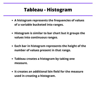
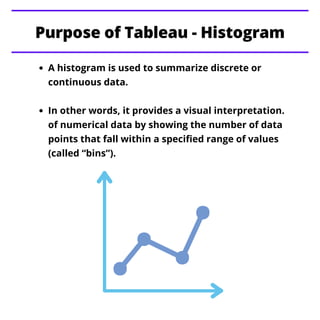
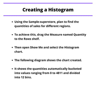
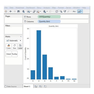
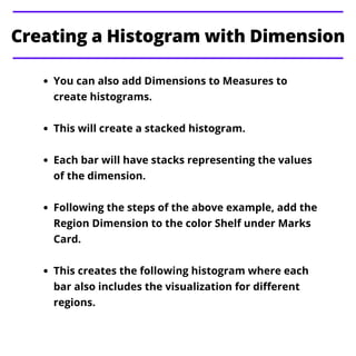
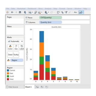


A histogram visualizes the distribution of a variable's values by grouping them into continuous ranges (bins) to show the frequency of occurrences. In Tableau, creating a histogram involves dragging a measure to the rows shelf and selecting the histogram chart option, which automatically buckets the data. Additional dimensions can be added for a stacked histogram, allowing for more detailed visual analysis across categories.