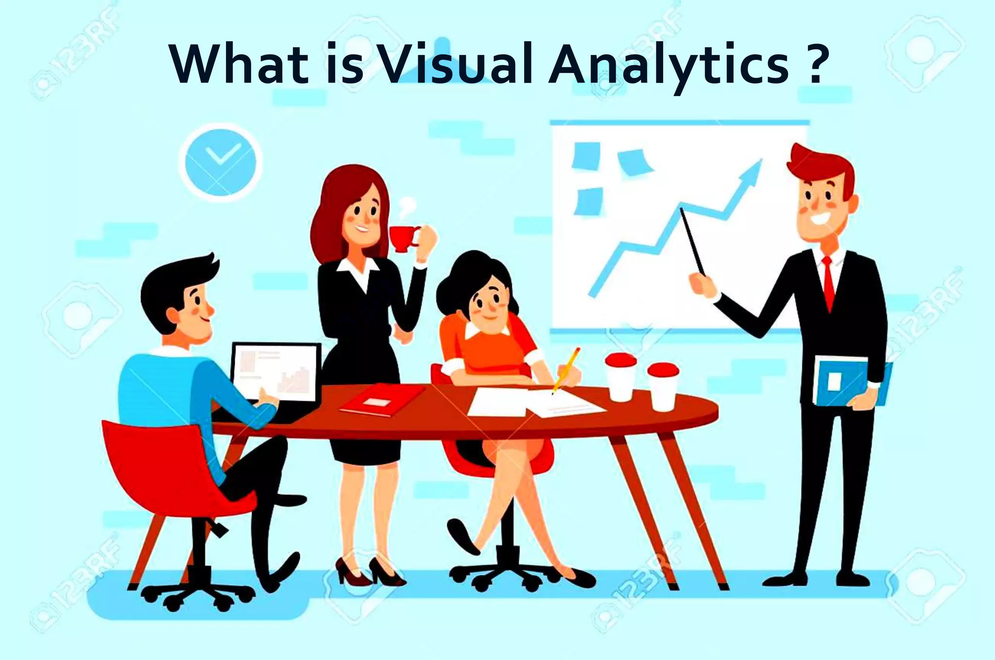
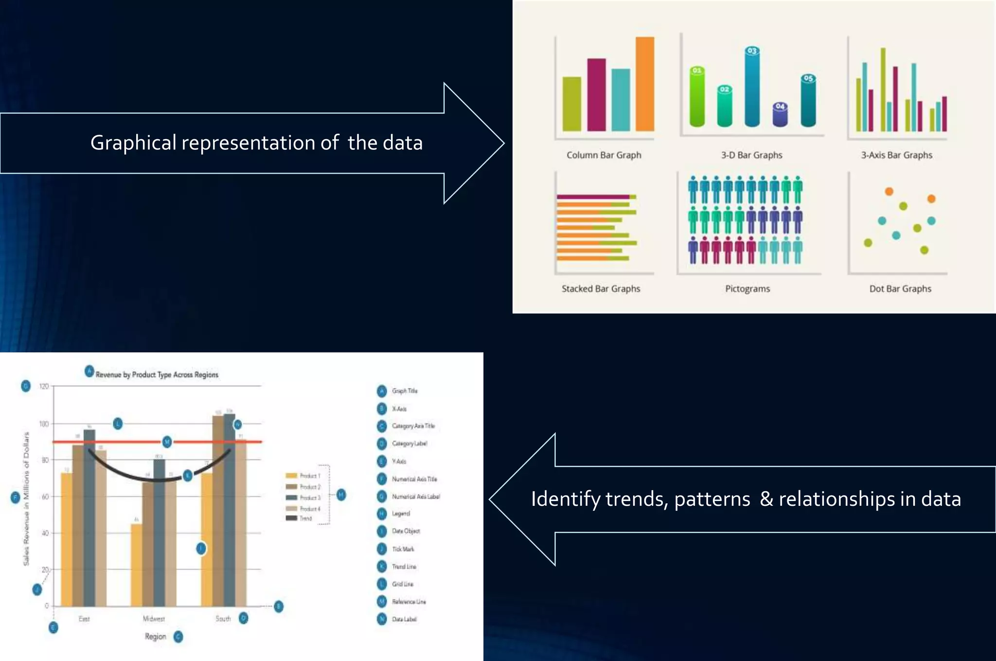
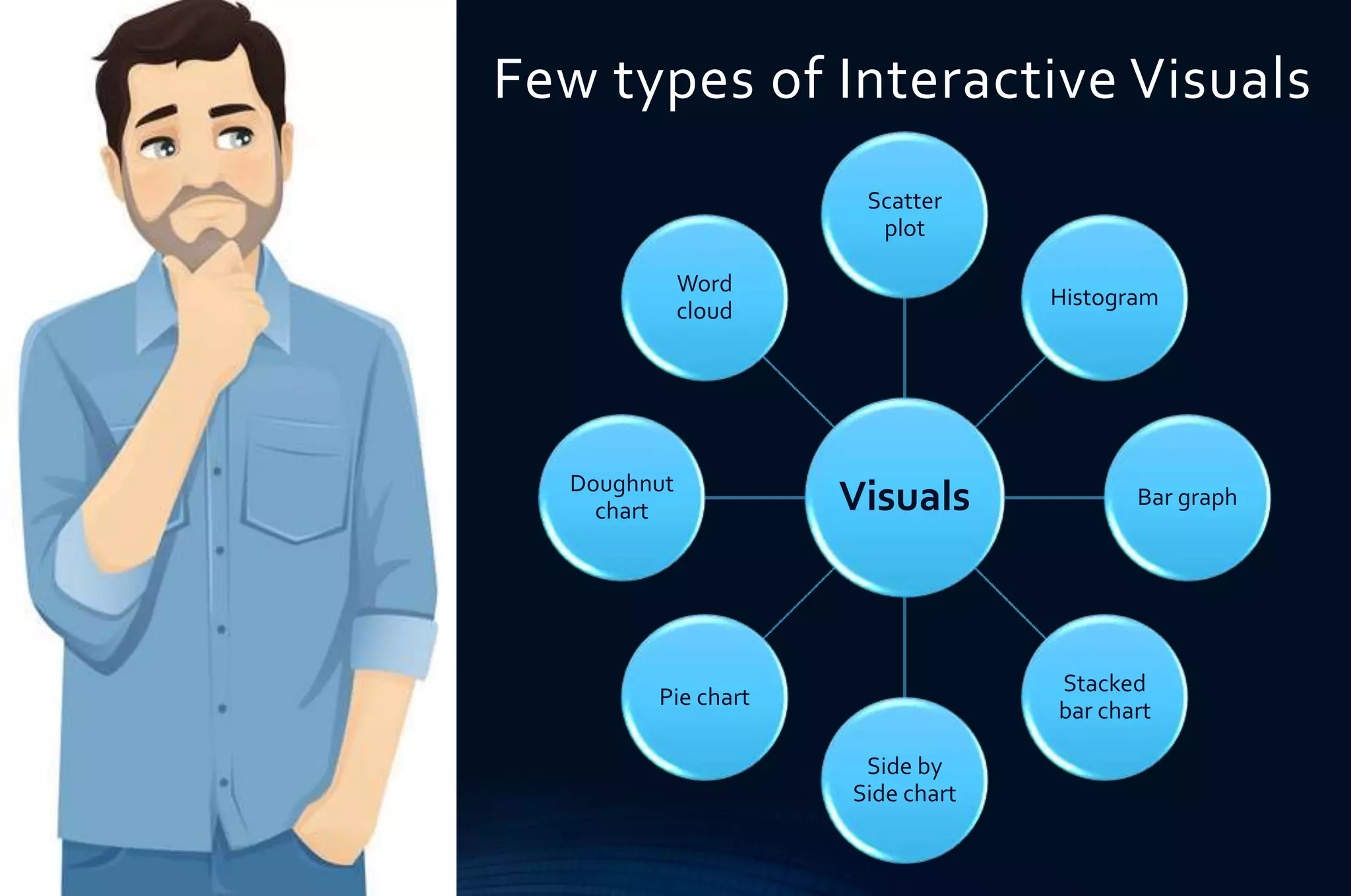
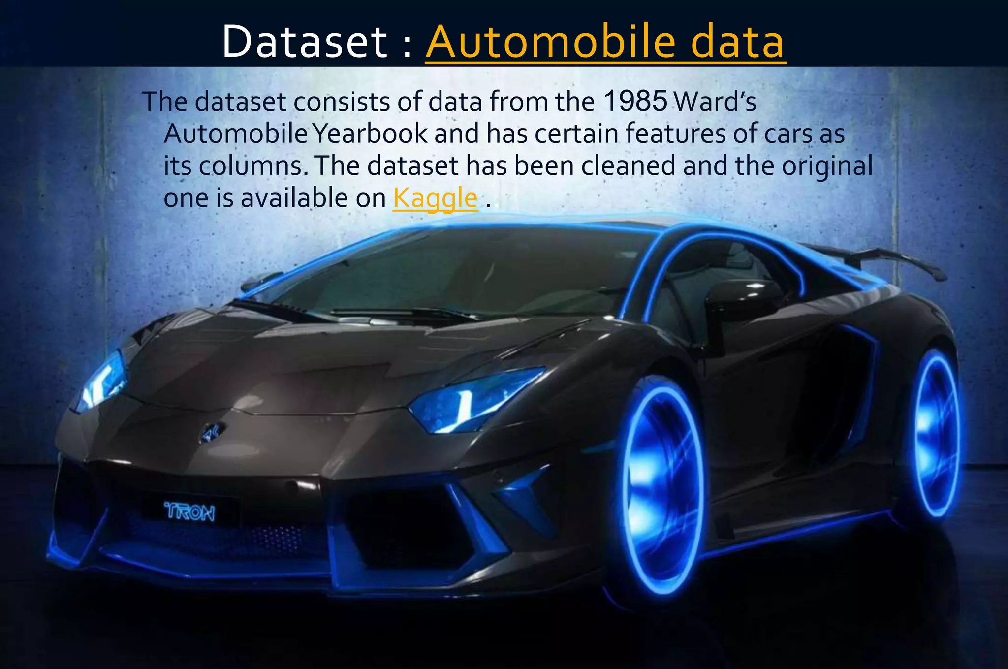
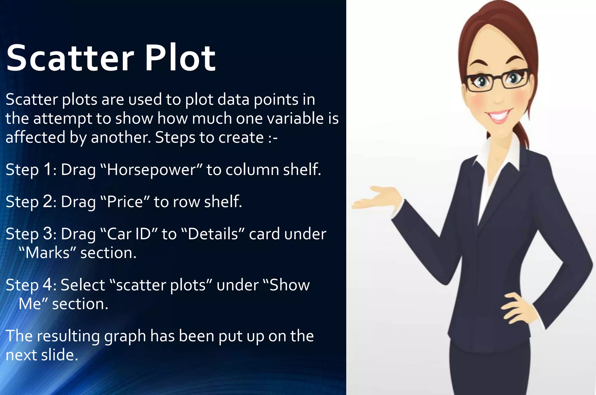
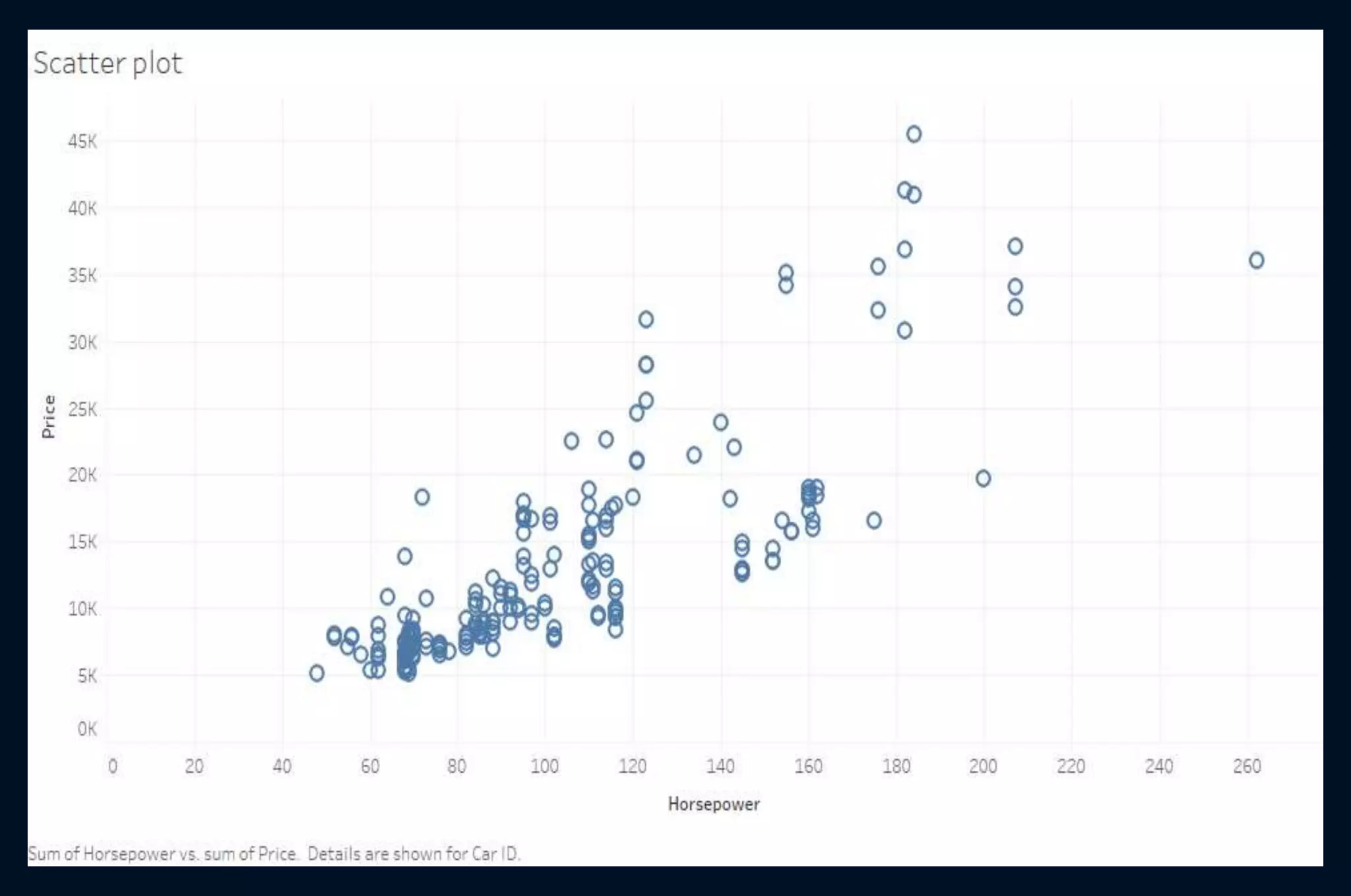
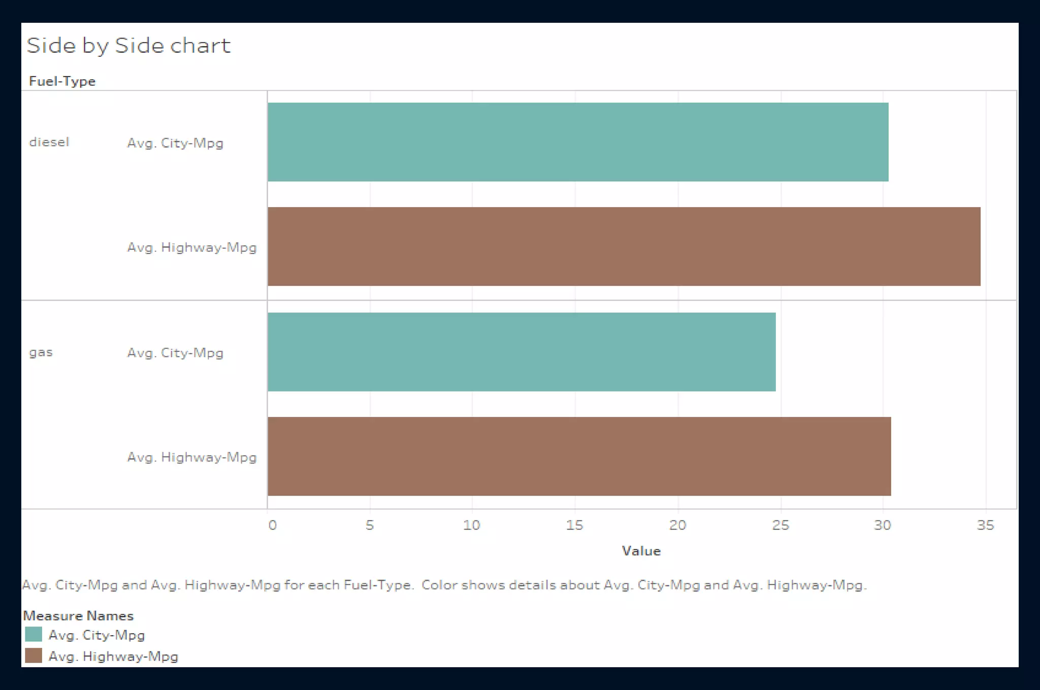
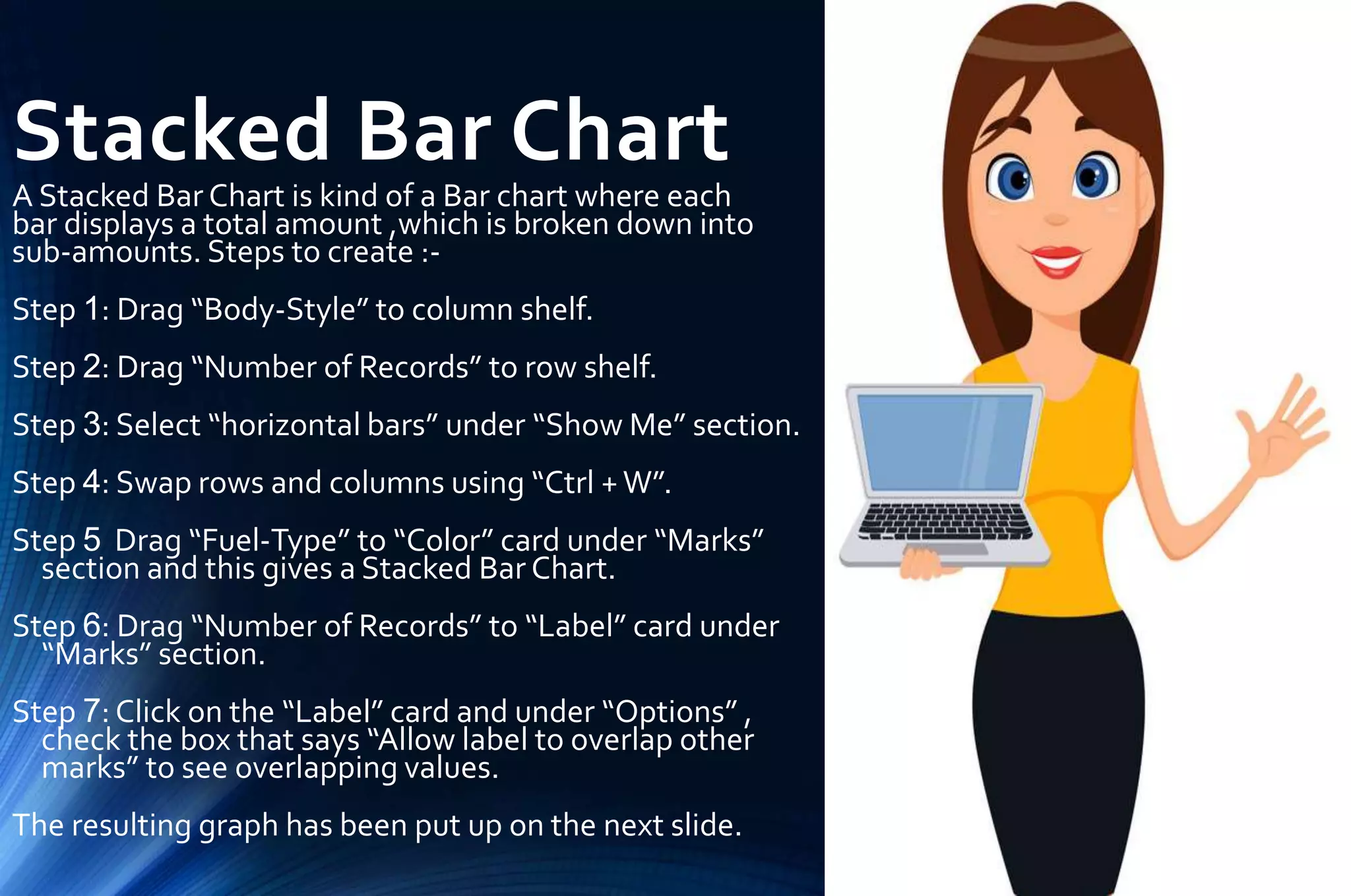
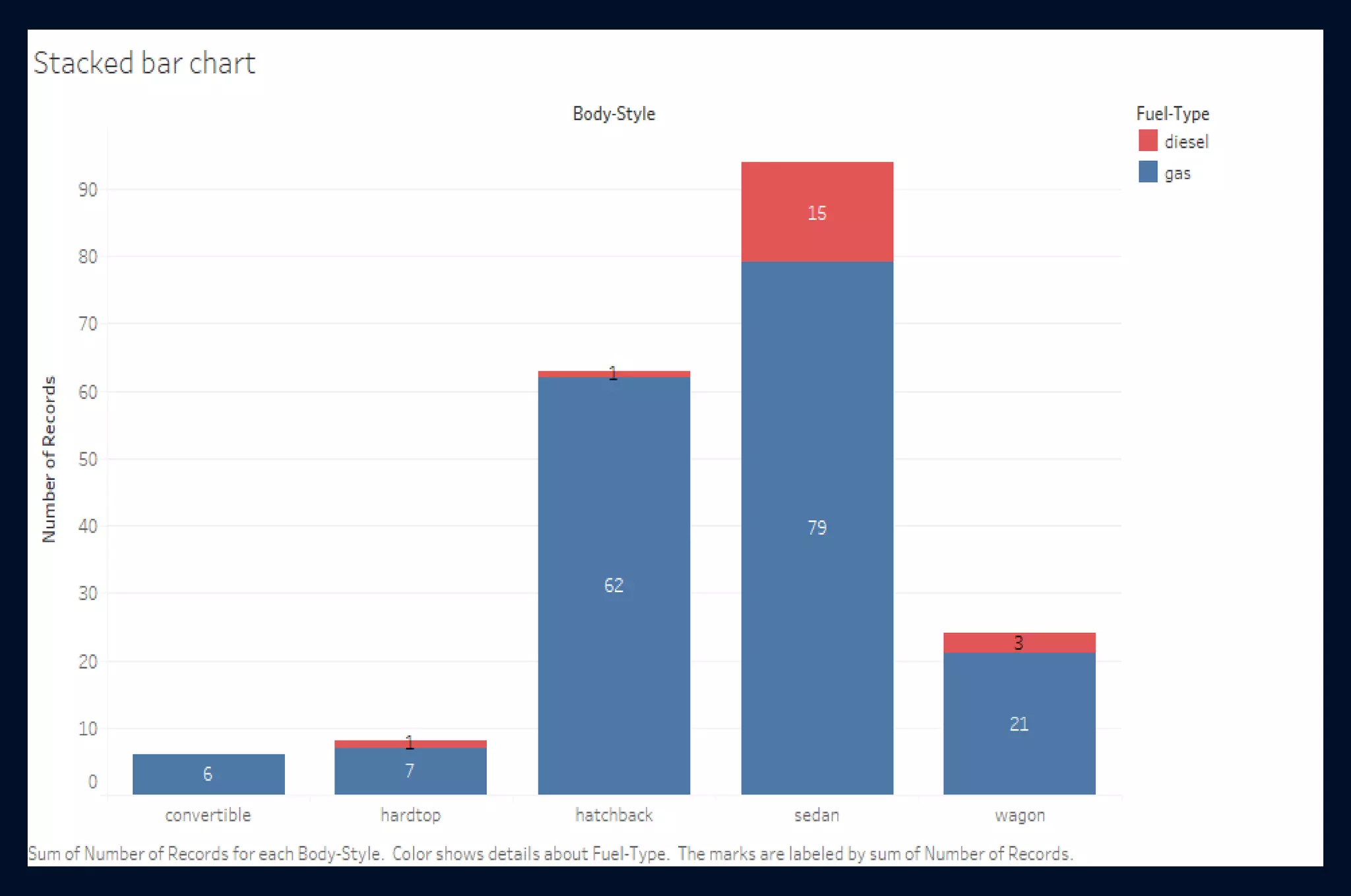
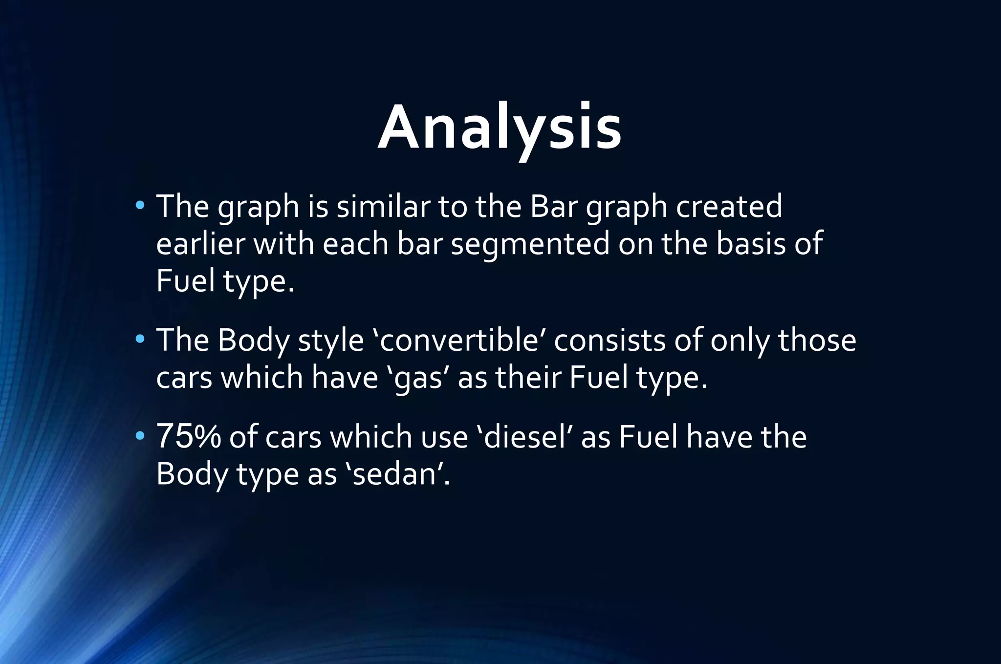
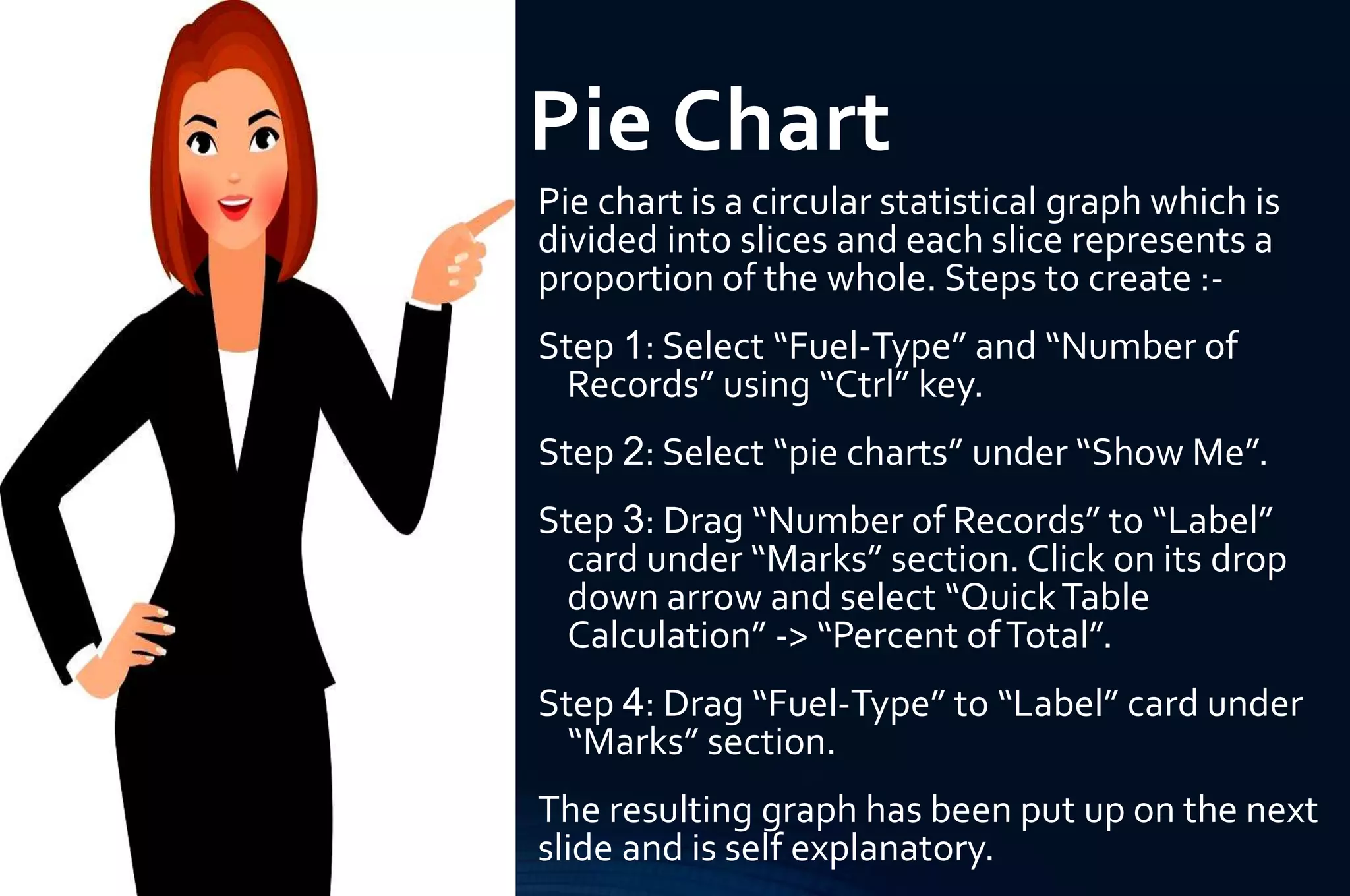
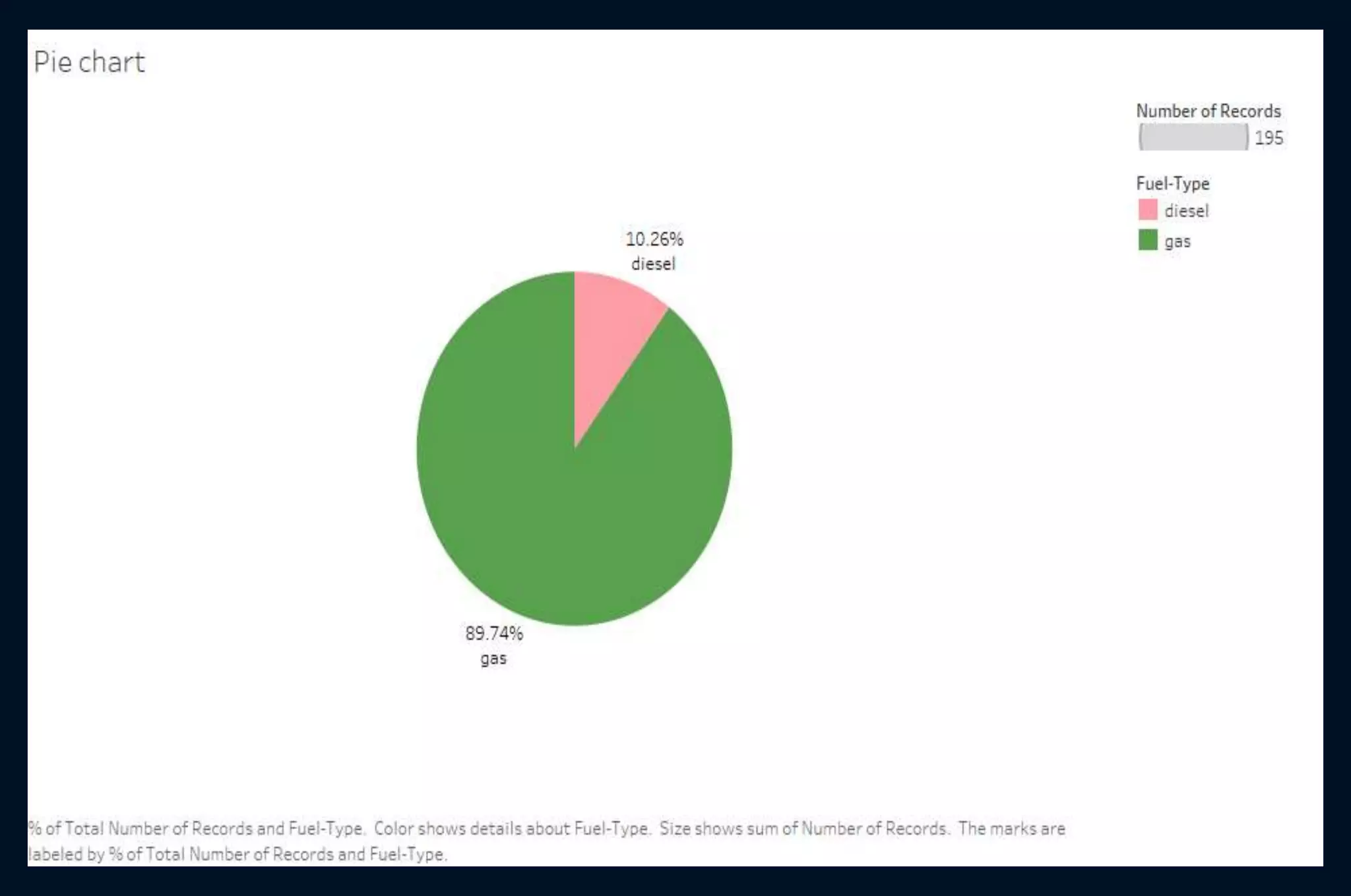
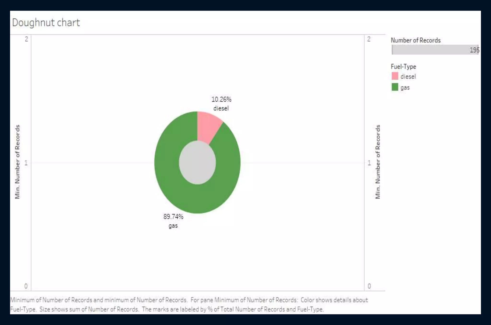
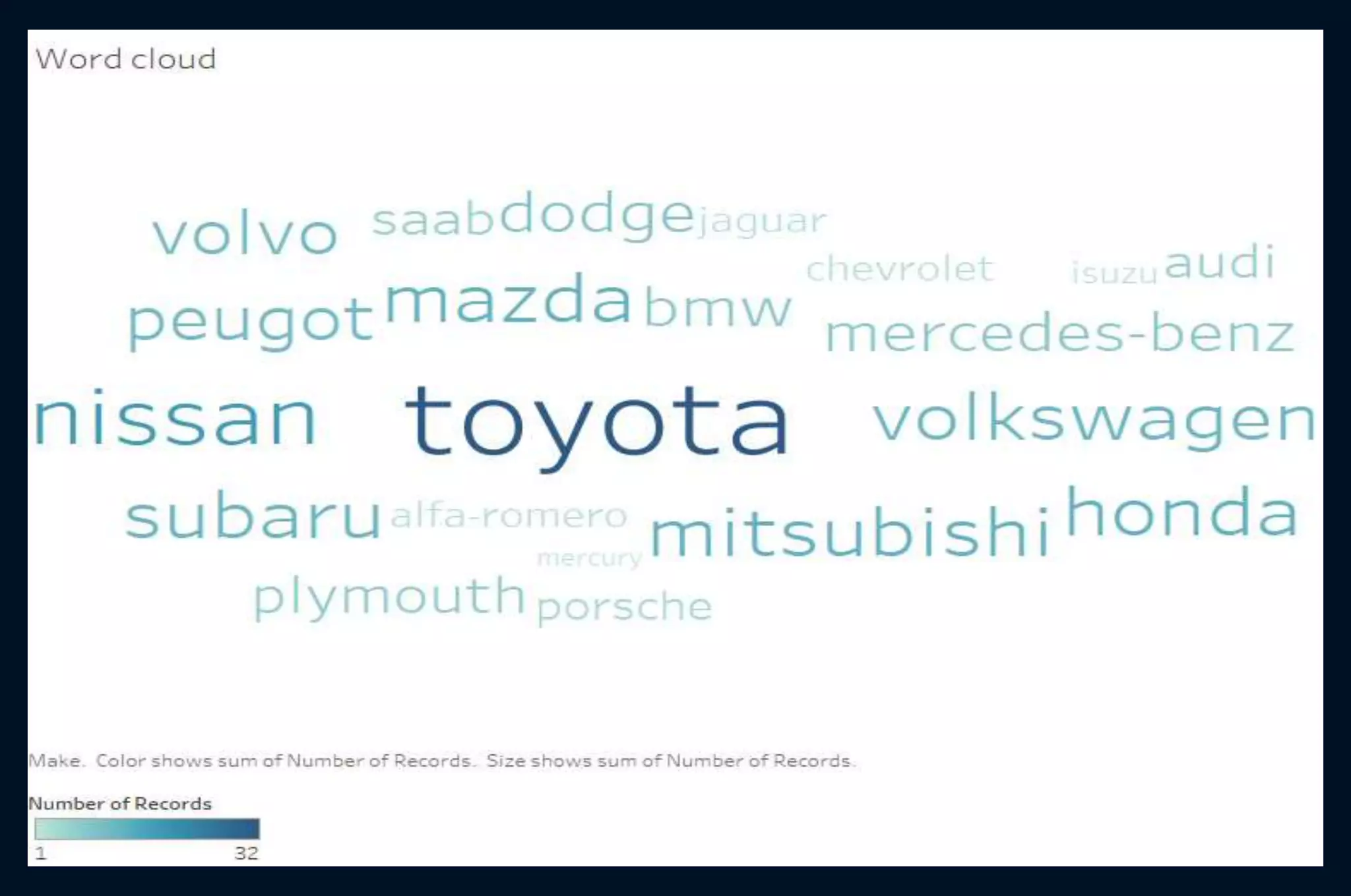
5. Few types of Interactive Visuals
Visuals
Scatter
plot
Histogram
Bar graph
Stacked
bar chart
Side by
Side chart
Pie chart
Doughnut
chart
Word
cloud
6. Dataset : Automobile data
The dataset consists of data from the 1985 Ward’s
AutomobileYearbook and has certain features of cars as
its columns.The dataset has been cleaned and the original
one is available on Kaggle ..
9. Scatter Plot
Scatter plots are used to plot data points in
the attempt to show how much one variable is
affected by another. Steps to create :-
Step 1: Drag “Horsepower” to column shelf.
Step 2: Drag “Price” to row shelf.
Step 3: Drag “Car ID” to “Details” card under
“Marks” section.
Step 4: Select “scatter plots” under “Show
Me” section.
The resulting graph has been put up on the
next slide.
10.
11. Analysis
• The graph shows a linear relationship between
the Horsepower and the Price of the car.
• There is only one car with Horsepower greater
than 260 which can be considered as an Outlier
for the data.
• Maximum number of data points lie in the area
where the Horsepower varies in the range 60 to
120 and the Price varies from 5K to 15K.
13. Histogram
Histogram is a graphical display of frequency
distribution showing how often each different value in
a set of data occurs. Steps to create:-
Step 1: Drag “Length” to row shelf.
Step 2: Select “histogram” under “Show Me” section.
The graph automatically changes and displays the
count of Length instead of sum in the row shelf. Also,
in column shelf and “Dimensions” section, a new
column is created byTableau called “Length (bin)”
which contains the range of Length.
Step 3: In “Dimensions” section, select the drop down
from “Length (bin)” -> “Edit” and change the “Size
of bins” to 10 for proper distribution.
Step 4: Drag “Length” to “Label” card and change
aggregation from sum to count.
The resulting graph has been put up on the next slide.
14.
15. Analysis
• The graph shows that the Length ranges from
140 to 210 and the thickness of each bar
corresponds to 10 units of Length.
• The height of each bar represents the number of
Length values that lie in the range corresponding
to that bar.
• The maximum number of length values are in the
range 170 to 180 which represents around 35%
of data.
17. Bar graph
A Bar graph is graph that displays data using
rectangular bars which represents the frequency
of observations in the data. Steps to create:-
Step 1: Drag “Body-Style” to column shelf.
Step 2: Drag “Number of Records” to row shelf.
Step 3: Select “horizontal bars” under “Show Me”
section.
Step 4: Swap rows and columns using “Ctrl +W”.
Step 5: Drag “Body-Style” to “Color” card and
“Number of Records” to “Label” card, under
“Marks” section.
The resulting graph has been put up on the next
slide.
18.
19. Analysis
• The graph shows that there are 5 different Body
types of cars and each bar has been colored
differently to showcase each Body type.
• The number on top of each bar refers to the
frequency of each Body type.
• There are 94 sedan cars which represents around
48% of data.This percentage is even greater than
that of the other top two body types combined.
21. Side by Side Chart
A Side by Side chart is a kind of a Bar chart
where the bar segments within a category are
placed next to each other. Steps to create :-
Step 1: Select “Fuel-Type”, “City-Mpg” and
“Highway-Mpg” using “Ctrl” key.
Step 2: Select “side-by-side bars” under “Show
Me” section.
Step 3: Swap rows and columns using “Ctrl +W”.
Step 4: Under “MeasureValues” card change the
aggregation of both columns to average by
clicking on the drop down of each one and
selecting “Measure (Sum)” -> “Average”.
The resulting graph has been put up on the next
slide.
22.
23. Analysis
• The graph shows two Fuel types being compared
on the basis of the average City mpg (miles per
gallon) and average Highway mpg.
• Both the average City mpg and average Highway
mpg of Diesel cars is more as compared to that of
Gas cars.
• For both the Fuel types, the average City mpg is
less than the average Highway mpg.
25. Stacked Bar Chart
A Stacked Bar Chart is kind of a Bar chart where each
bar displays a total amount ,which is broken down into
sub-amounts. Steps to create :-
Step 1: Drag “Body-Style” to column shelf.
Step 2: Drag “Number of Records” to row shelf.
Step 3: Select “horizontal bars” under “Show Me” section.
Step 4: Swap rows and columns using “Ctrl +W”.
Step 5 Drag “Fuel-Type” to “Color” card under “Marks”
section and this gives a Stacked Bar Chart.
Step 6: Drag “Number of Records” to “Label” card under
“Marks” section.
Step 7: Click on the “Label” card and under “Options” ,
check the box that says “Allow label to overlap other
marks” to see overlapping values.
The resulting graph has been put up on the next slide.
26.
27. Analysis
• The graph is similar to the Bar graph created
earlier with each bar segmented on the basis of
Fuel type.
• The Body style ‘convertible’ consists of only those
cars which have ‘gas’ as their Fuel type.
• 75% of cars which use ‘diesel’ as Fuel have the
Body type as ‘sedan’.
29. Pie Chart
Pie chart is a circular statistical graph which is
divided into slices and each slice represents a
proportion of the whole. Steps to create :-
Step 1: Select “Fuel-Type” and “Number of
Records” using “Ctrl” key.
Step 2: Select “pie charts” under “Show Me”.
Step 3: Drag “Number of Records” to “Label”
card under “Marks” section. Click on its drop
down arrow and select “QuickTable
Calculation” -> “Percent ofTotal”.
Step 4: Drag “Fuel-Type” to “Label” card under
“Marks” section.
The resulting graph has been put up on the next
slide and is self explanatory.
32. Doughnut Chart
A Doughnut chart is like a Pie chart with an area of the
centre cut out. It shows the relationship of parts to the
whole. Steps to create :-
Step 1: Create a duplicate sheet of Pie Chart.
Step 2: Drag “Number of Records” to column shelf.
Select its drop down -> Measure (Sum) -> Minimum.
Step 3: Repeat Step 2 and this will give two pie charts.
Step 4: Under “Marks” section, remove all the filters of
the second graph by simply clicking on the drop
down of each filter and selecting “Remove”.
Step 5: Select the drop down of the second pill in
column shelf and select “Dual Axis” to combine the
two graphs.
Step 6: Select “Size” card of first graph, under “Marks”
section and increase the size to 50%.
The resulting graph has been put up on the next slide
and is self explanatory.
35. Word Cloud
AWord cloud is a collection of words depicted in
different sizes.The bigger and bolder the word,
the more significance it holds in the dataset.
Steps to create :-
Step 1: Select “Make” and “Number of Records”
using “Ctrl” key.
Step 2: Select “tree maps” under “Show Me”.
Step 3: Under “Marks” section, click on the drop
down beside “Automatic” and then select
“Text”.
The resulting graph has been put up on the next
slide and is self explanatory.