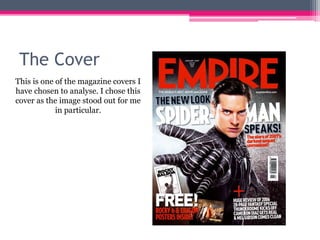
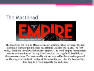
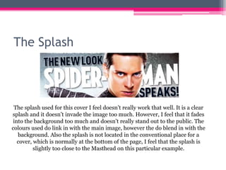
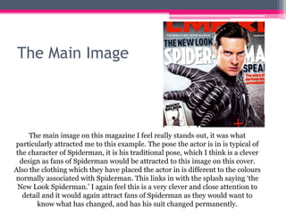
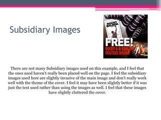
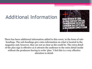
This analysis summarizes the key elements of the Empire magazine cover featuring Spiderman. It discusses the masthead which stands out in bold red font conveying the magazine's name. The main image of Spiderman in his signature pose attracts fans while his different colored suit references the story's new look. However, the splash is less noticeable and subsidiary images clutter the cover somewhat. Additional information uses clear plus signs to entice readers without extra words.