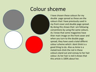
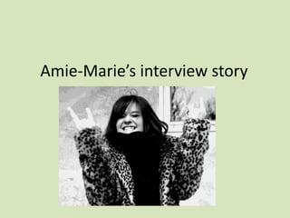
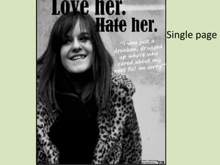
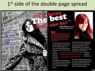
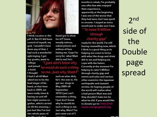
This document contains planning and drafts for a student's double-page magazine spread on musician Amie-Marie. It includes details on color schemes, fonts, layouts, and photos to be used. The main story is Amie-Marie reflecting on her past drug and alcohol abuse which was encouraged by her former bandmate Matt, and how she has changed after rehab.
The document provides details on Amber Roberts' planning and design process for the front cover of her magazine "Metal Entity". She discusses choosing a close-up image of Molly from her photo shoot to feature on the cover. Amber also outlines the fonts, colors, masthead, and headlines she will include, such as "100 Greatest Gigs of the Year" and promoting a free Children of Bodom CD. Her goal is to create an eye-catching cover that draws readers in and effectively summarizes the issue's focus on Amie-Marie's career change.
This document contains the responses to three questions about a media product - a magazine covering grime music.
1) The magazine's design uses gold and black colors and fonts to represent the "dark" and "urban" nature of grime music. Photographs and article layouts mimic real music magazines.
2) The magazine represents teenagers and young adults interested in grime music. It represents all genders, ethnicities, and regions of the UK involved in this genre. However, it mainly targets working-class audiences.
3) The magazine would be well-suited for distribution by RWDmag, an existing publisher of magazines about related urban music genres like UK garage, rap, and dub
The document outlines plans for a fanzine focused on interviewing role models. It discusses ideas for features like interviews with role models, Instagram accounts to follow, reviews of Netflix shows and music, and poems. It includes style sheets, potential interviewees who responded, and flat plans for features like an introductory article on why we should have role models, the Michelle Obama interview, and an Instagram feature. The goal is to create an aesthetically pleasing fanzine that inspires the target audience and highlights influential people.
This document provides a review and analysis of several magazine covers, merchandise items, and other products related to music genres like rap and hip hop. For each product, the reviewer analyzes design elements like images, colors, fonts, and layout to understand how they relate to the artist or genre and appeal to target audiences. The reviewer chose to analyze these specific products to gain inspiration for their own work in magazine design and merchandise creation focused on similar music genres.
- The document discusses Emily Monsey's work creating a magazine layout, interview, and press release about an actress, as well as an obituary for the same actress.
- For the magazine layout, Emily researched ELLE magazine's style and structure and aimed to replicate this for her fictional interview article.
- For the obituary, Emily researched real celebrity obituaries to ensure her writing matched the appropriate style and included relevant personal and career details.
- The interview was written in the article format used by magazines like ELLE and Cosmopolitan, incorporating quotes from a survey about the actress.
The document discusses various fonts and design elements being considered for use in a magazine. For the masthead, the Laranjha Pro Fraco font is liked as it is simple and easy to read. For the main text, Calibri is liked as it is easy to read and professional looking. For the cover line, the Vanadine font is preferred as it is simplistic and sophisticated. Inspiration is taken from magazine covers showing medium close-up shots of models for the cover image. Poses using hands and busy backgrounds are noted. Double page spreads with articles and full images are preferred. Low angle informal shots and props like guitars are liked for content pages.
The document discusses the layout and design conventions used in the student's media magazine project. It summarizes the inspirations and layout choices for the title, photo shoot including costumes and props, fonts, written content, genre, front cover, contents page, and double page spread. Real magazines like Kerrang, Q, and Channel were used for inspiration for things like titles, photoshoots, and layouts. The goal was to create a musical theater magazine that also featured the models as a girl band using conventions from real music magazines.
Q magazine uses a large red pull quote in the form of the letter "L" to emphasize Lady Gaga's name across a double page spread. They utilize significant white space around the spread to make the black and grey photograph and text stand out. Drop capitals are also used to liven up the dense copy and keep readers engaged. The magazine targets young males through revealing photographs and avoids taboo language.
The document outlines plans for a fanzine that will interview people about their role models. It will include poems, illustrations, and in-depth interviews with the role models. The creator plans to contact people around the country and include their stories. Each interview will have a photo of the role model, questions, and biographical information. Other planned pages include articles on inspirational Instagram accounts, reviews of movies and music about empowering figures, and a double-page spread of poems with an illustration. The style will be minimal with pastel colors and handwritten titles to make the fanzine visually appealing.
The document provides details about the planning and initial ideas for a fanzine. The author wants to create a fanzine that interviews people around the country about their role models. It will include the interviews, information about the role models, poems, illustrations, and quotes. The author has outlined various page layouts and elements, including the cover, contents page, introduction article, interview pages, Instagram feature, poetry pages, and conclusion. Research was also done on styles of other fanzines.
The document provides peer feedback and reflections on a fanzine project. The peer feedback suggests improving the font size and readability, adjusting some stretched out images. It compliments the conspiracy theory topic and vintage aesthetic. The reflections agree the feedback was helpful and improvements could include adding more images while maintaining organization. Research on fonts looked at styles used in magazines and products to appeal to the target audience. Fonts were considered for readability and matching the vintage secret file aesthetic.
This document provides feedback from three reviewers on Clara Johnson's fanzine project. The reviewers provide their opinions on the storyline, illustrations, and their favorite elements. They generally enjoyed the storyline and found it easy to follow, though one reviewer noted a confusing transition between parts. The illustrations received praise for being detailed and effective. All three reviewers cited the illustrations as their favorite part. The feedback will help Clara improve transitions and standardize the art style between the cover and interior.
When designing a rave magazine article, the author chose colors, fonts, images, and an appropriate amount of text very carefully. They included many colorful images and text to engage the intended audience. The front cover features a collage of old rave posters to intrigue both younger and older readers who may have attended similar events. Throughout the magazine, borders and images are used to give the pages a "ripped" look and feel as if assembled by hand with scissors and tape, capturing the intended quirky vibe. The amount of text allows readers to learn facts while staying engaged with quick facts and images.
The document discusses plans for photography for different pages of a magazine called Muse Mag.
For the cover page, a female character will be photographed in modern, fashionable clothing with a straight face to invite readers. Sub-images of pop music CDs will advertise the magazine's contents.
For the contents page, a male character will be photographed in front of a brick wall in casual clothing. The layout will list the magazine contents alongside the character photo.
For the double-page spread, a close-up shot of a character will occupy one page with a related article on the facing page and a sub-image. A solid colored background and modern outfit will make the character stand out, with possible added
The document outlines plans for a fanzine that interviews people about their role models. It discusses ideas for including poems, illustrations, and in-depth interviews in the fanzine. It also covers plans for layout, design elements like colors and fonts, potential interviews, and sample page layouts. The writer aims to create a fanzine they will be proud of that readers will enjoy learning about different role models through.
The document provides details on the design plans for a student magazine called "INDIE WORKS". It includes descriptions of font choices, images, cover lines, pricing, and sections to include on the contents page and a double page spread. Specific ideas are given for the masthead, cover images, story topics, pricing, editors letter, section headings, and a profile of a band to feature in the double page spread. Inspiration is drawn from research of other magazines.
The original script describes the town of Hamelin which lived contentedly until the rats began multiplying to plague the town, overwhelming it with their numbers in a "black sea" of rats. The citizens of Hamelin were honest folk who lived peacefully in their grey stone houses until the rats disturbed their peace and multiplied out of control, swarming over the entire town.
This document describes a proposed magazine cover design project for Scarface, which is celebrating its 35th anniversary. The designer chose Scarface as it has had a powerful visual impact over the years. Secondary images and quotes from positive movie reviews are included. Text boxes advertise the anniversary, describe the movie's genre, and warn about mature content. The final design is presented, incorporating the main character's face, weapon, title text, and the designer's magazine logo. Feedback has been positive, attracting interest in the movie from those unfamiliar with it.
Product Research (3 double page spreads) - Task 4vcolquhoun12
This double page spread uses minimal colors and layout to focus on one main image and article. The image of Lady Gaga on the left page depicts her in a provocative way to appeal to the male gaze. The text on the right page is written in a blog style across three columns. While there is a lot of writing, the language is sophisticated and the columns make it easy to read. The simple black, white and red color scheme and layout with the image separate from the text is effective at clearly presenting the content.
The student has proposed creating a children's story book using digital graphic techniques like rotoscoping in Photoshop. The story involves a princess named Florine who is to marry a charming prince, but an evil queen wants her own daughter to marry him instead. The queen locks Florine in a tower and turns the prince into a blue bird. Eventually, a good fairy helps Florine and the prince, and the evil queen faces justice. The student has created mood boards and character designs to develop the story. The proposal provides a detailed story overview, production methods, target audience, and deadline. The evaluator notes the proposal is well laid out but recommends further detailing the export format advantages and disadvantages.
The proposal provides a clear overview for a children's book adaptation of "Jack and the Beanstalk" titled "Jack and the Peastalk". Key details include a 12-page, paperback book format for ages 7-11. The story involves Jack buying a pea pod that grows into a peastalk inhabited by a nimble rather than strong giant and his magic chicken. Production methods like rotoscoping and shaping will be used to hand-draw original characters and settings in Photoshop. The strengths are a well-developed story and consideration of format, audience, and production. Further work could refine specific visuals and page layouts.
The document provides initial ideas for drafting various sections of a magazine, including the contents page, front cover, and double page spread. For the contents page, the designer wanted secondary images to make points more realistic and encourage purchasing. For the front cover, the masthead typography was to have sharp edges to complement the rock theme. Social media sites were to be included to update the target audience. For the double page spread, the artist's name was to be at the top to indicate it is about the artist, and the model was to appear seductive and passionate.
The document discusses the layout and content planned for a double page magazine spread.
For the layout, the second design is preferred as it uses columns, boxes and borders to appear more organized than the first design. Images and articles will be placed on opposite sides and linked thematically.
The main image features the magazine's cover model and Bob Marley, representing an interview about their connection through reggae music. A second image of a female reggae singer was chosen to appeal to readers with its use of typical reggae colors, costume, props and realistic posing.
The content will include a main article and a 4-question interview relating to the cover model's career. This interview format aims to make the spread feel
This document provides an evaluation and comparison of a student's magazine cover, double page spread, and basic website for a music magazine to professional examples.
For the magazine cover, the student notes similarities like both having side profiles of artists and limited colors, but their cover includes more information. They feel their cover looks realistic but could improve the plug area and differentiate the headline more.
Regarding the double page spread, similarities include photos of artists and quotes, but the student wishes they included pull quotes and more photos.
The student compares their simple welcome website to Cosmopolitan's, noting differences in number of articles and focus. They feel their blog post strength but wish they included more content and balanced formality
This document provides information and guidance for designing a magazine cover and double page spread. It outlines the key elements that should be included, such as the masthead, sell lines, images, and credits. It then shows the process an individual took to design a sample magazine cover and double page spread. They experimented with different layouts, images, and color schemes before refining their final designs. The final designs include elements like a film strip of primary images on the cover and an article, images, and credits on the double page spread.
The document discusses photography plans for various pages of a magazine, including the cover, contents page, and a double-page spread. For the cover, the main image will feature a male model in modern, brand-name clothing against a brick wall to look edgy. The contents page will show a female model casually dressed and sitting on a wall in natural lighting. For the double-page spread, a full-bleed female image will run across both pages with text boxes layered over her leg to introduce an article in a readable yet visually interesting format.
For their double page spread, the student will include an interview and article that relate to the main image. The main image will feature their father and Bob Marley to represent their connection through reggae music. The interview will include questions about Bob Marley and the artist's relationship to further explain the image. The article will be about reggae artist Taja Gaza and her career and background, linked to a supporting image showing aspects relating to her music. Overall, the content and images will be carefully chosen to engage the target audience through relevant stories and connections within the reggae genre.
The proposal outlines a 10-page children's storybook about two friends, including a story overview where one bakes a cake for the other but encounters a bear on the way. Photoshop will be used to create pages through rotoscoping and shapes. The strengths are a clear story overview and production plan using rotoscoping and shapes. Further details could be added on the audience and development of the bear character. Idea generation includes story elements and colors but could provide more character details.
The document discusses the author's process for planning and creating a contents page for their magazine called "Metal Entity". They go through multiple drafts, focusing on layout, image selection, font choices and keeping the design consistent with the rest of the magazine. They evaluate their final contents page as having an organized structure with a good use of images and fonts to represent the metal genre and draw in readers.
Questions of intent double page spread blogNycole16
The document discusses the design of a double-page magazine spread. It will feature 3 columns of text on the left page interviewing a new artist, with a large image on the right page of someone recording in a studio. This layout was chosen to be easy to understand while representing the story and appealing to teenage readers as the target audience.
The document discusses how the author's music magazine Metal Entity uses and develops conventions from real music magazines like Metal Hammer, Kerrang!, and Rock Sound. It covers the magazine's title, font, masthead style, written content, and photo shoots. The author aimed to be unique while taking inspiration from these magazines, using fonts, changing mastheads, addressing readers directly, and taking natural photos to seem realistic rather than staged.
The document discusses how the author's music magazine Metal Entity uses and develops conventions from real music magazines like Metal Hammer, Kerrang!, and Rock Sound. It covers the magazine's title, font, masthead design, written content style, and photo shoot techniques. The author aimed to be unique while drawing inspiration from these established magazines. They wanted the masthead and fonts to stand out without distracting from the main stories, and for the photos to look natural rather than staged.
The document outlines plans for a magazine article and design. It will feature a double page spread with one light side and one dark side to represent the light and dark sides of rock music and the human mind. The front cover will have gold dripping from the masthead to imply it was rushed to publication. The target audience is males and females ages 18+ as it will explore mature themes. Contact details for support services will be included. Photographs on the cover and spread will feature the artist in different poses and mindsets. The purpose is to inspire readers that one can achieve goals despite hard times.
1. The document summarizes a student's media evaluation project for a magazine called TEMPO.
2. The student designed the magazine's front cover, contents page, and a double page article spread.
3. For each design element, the student explains the colors, images, fonts, and layout choices they made and why those choices would be appealing and clear for the audience.
- The document discusses the process of creating a magazine in InDesign, including screenshots of selecting images, laying out pages on a grid, and editing photos.
- The author created a contact sheet to choose images for articles, selecting one with powerful facial expressions. Photos were edited and placed on pages.
- Steps are described for creating a feature article on rock music and violence, including writing with fake blood and selecting pull quotes.
- The contents page was made with the magazine title, "CONTENTS," and images and text listing article pages. An interview spread included a large photo and introduction.
This document contains evaluations from a student of various digital graphic narrative exercises they completed, including shaping an image, rotoscoping, working with text, creating a comic book page, photography, illustration, and initial ideas generation. For each exercise, the student provides what they liked about the image and what they would improve if doing it again. They note things like making shapes more detailed, adding more detail to rotoscoped images, experimenting more with text warping, increasing levels on a cutout tool, improving poses for emotions, and being more consistent with shading.
This document contains evaluations of different digital graphic narrative assignments, including shape tasks, rotoscoping, text-based images, comic books, photography, illustrations, and initial ideas. For each assignment, the student provides what they liked about the image and what they would improve. They receive feedback on their story proposal, which includes a plot overview, production methods, target audience, and advantages/disadvantages of the file format. The feedback identifies strengths and areas needing further development.
This document contains summaries of several magazine double page spreads:
1) The first discusses a Q magazine spread that separates the picture from the article to avoid distraction. It also notes the use of initials at the start of text blocks.
2) The second describes a Vibe magazine spread with a color scheme and images suited to the female artist. It uses pull quotes to engage readers.
3) The third has a similar layout to the Q magazine spread but uses enlarged pull quotes instead of a masthead. It keeps the article in large columns for neatness.
4) The fourth praised a spread from their genre of music for its varied fonts, column structure, and interesting picture that provide a sophisticated
The document discusses planning and style sheets for a music magazine. It considers different font types and colors for the magazine title/masthead. Blue and grey are selected as potential colors that are bold yet neutral. Different front cover mockups are presented, exploring layouts centered around a main image with text placement. Sample magazine covers are reviewed for inspiration. Contents page mockups experiment with layouts featuring one or multiple images alongside section listings. Photo planning and contact sheets from a mock photo shoot of an indie girl band are included to illustrate potential feature images.
Here are the storyboards for the beginning of the story:
Page 1
Panel 1: A widow and her son Jack are sitting at a table. The widow says "What shall we do? Milky-White isn't giving milk."
Panel 2: Jack says "Don't worry mother, I'll go sell Milky-White at the market to get us some money."
Page 2
Panel 1: Jack leads Milky-White down the road. In the background an old man watches.
Panel 2: The man approaches Jack "Good morning Jack, where are you off to?"
Page 3
Panel 1: Jack replies "I'm going to sell our cow Milky-White at the market."
Unit 14 outlines Ashley B's plans for creating a magazine focused on TV. The document details mockups for the front cover and double page spreads, including main images, text placement, and quotes. It also includes plans for a photo shoot, production schedule, and presentation environment. The production plan lays out the process from content selection to printing and distribution across a two-week period.
The proposal outlines a 10-page children's storybook about two friends, including a story overview, production methods using Photoshop, and target audience of 3-6 year old girls. Strengths include a clear story overview and understanding of the end goal. Further work could provide more audience details and expand on the bear character in the idea generation. Production methods and idea generation are well developed, while the audience section and bear idea could use more elaboration. Overall the proposal and idea generation demonstrate a thoughtful approach, with minor areas identified for additional details.
The document provides a template for evaluating a graphic narrative project. It prompts the creator to summarize their project, praise strong elements, identify areas for improvement, and reflect on how well their final product achieved their original intentions. It also includes questions about constructing images, using text to support images, suitability for the intended audience, and techniques used.
The document outlines the progress of a student on a digital graphic narrative development project, including feedback received on image and text-based exercises, as well as proposals, scripts, and revisions for a children's book on the fairy tale "The Bear and the Two Travelers." The student incorporated feedback to refine elements like their target audience age range and further developed initial ideas.
The document discusses three potential images for a magazine contents page. For the first image, the writer feels the model's pose and outfit suit the pop genre but it may be too similar to the front cover image. The second image is the writer's favorite as the model's expression and pose are well-suited to the magazine genre. Some edits were made to brighten her lips and remove the background. The third image was made black and white, which the writer feels makes the contrasts pop but may not suit the overall style. Both the pose and smiling face are effective but the color version may integrate better.
The document summarizes changes being made to the final plans and designs for a music magazine. Key changes include:
- Slightly adapting the initial designs after further review to improve the magazine.
- Adding some photos and removing others from the photo plans due to design changes.
- Making minor changes to the front cover design, including changing the cover photo and article heading.
- Changing backgrounds and photos used on the contents page and double-page feature spread to improve layouts.
Hildegard Westerkamp is a German-Canadian composer and sound artist born in 1946. She emigrated to Canada in 1968 and lives in Vancouver. Westerkamp is known for her work with soundscapes and composed environments. Some of her notable compositions include Für Dich - For You, which explores themes of language, culture and home, and Moments of Laughter, which incorporates recordings of her daughter's voice from a young age. She has also created sound installations that immerse listeners in environmental audio, such as Türen der Wahrnehmung and Music from the Zone of Silence.
Hildegard Westerkamp is a German-Canadian composer born in 1946 who emigrated to Canada in 1968. She studied music and joined the World Soundscape Project at Simon Fraser University, led by R. Murray Schafer. This project studied the acoustic environment and influenced Westerkamp's focus on soundscapes in her compositions. She has created pieces incorporating environmental sounds, voices, and poetry. Westerkamp aims to bring awareness to acoustic environments and has had her works performed worldwide.
Josh's photo shoot went better than expected, with Amber taking 11 quality images instead of the 3 needed for her magazine's contents page. She wanted to portray Josh as a teenage/early adult metalhead to relate to the magazine's main audience. The shoot took place in Josh's bedroom, which was perfect for capturing his metal posters, guitars, and clothing. Amber was pleased she didn't need extra lighting due to the natural sunlight, having researched to make the shoot as realistic as possible for her target audience.
This shoot went better than expected despite some challenges with the weather. The model, Molly, was easy to work with and followed all of the photographer's directions well. Some images had to be discarded because Molly's eyes were closed, but many strong images were captured. The photographer was pleased with the quality of the images given the equipment used and lighting challenges. Minor edits were made in Photoshop to enhance brightness, contrast, and convert to black and white while maintaining the model's natural look.
This document contains a flat plan layout for the May 2011 issue of the magazine "Rock Sound". It includes descriptions of the various elements that will be included on each page such as interviews, advertisements, images, and articles. Some key details include:
- The issue will include free CDs and posters given away to subscribers and readers.
- Photos and descriptions of band members, concerts, CD releases, and music festivals are planned to be featured.
- Page layouts include double page spreads, images spanning two pages, and blocks of text and images.
- Content is focused on rock music news, reviews, and promoting upcoming music events and releases.
The document provides an overview of the various
The document discusses different music genres and subcultures that would be the target audience for a metal magazine, including emos, goths, metalheads, and scene kids. It provides descriptions of their fashion styles, music preferences, and lifestyles. Examples are given of popular bands and artists in each genre.
This document provides an analysis of the design elements of magazine front covers. It examines several magazine covers in detail, analyzing aspects like the main image, masthead, cover lines, and other design features. Key points made include how the main image is used to attract the target audience, how mastheads stand out from other magazines on shelves, and how cover lines are used to entice readers and draw in different subscriber groups. Analysis of specific covers discusses how images and design convey messages about the featured artists and align with magazine brands. Overall, the document demonstrates an understanding of how magazine covers are designed to appeal to audiences and sell issues through visual rhetoric.
This document summarizes Amber Roberts' process of creating a magazine for her college. She began by brainstorming possible topics for the magazine, including student issues, clubs, and local businesses. Her target audience became "girly girls" as they seemed to be the largest demographic at the college. She created a draft magazine cover using basic design software that received feedback it had too much text. For her final cover, Amber used a black and white photo of her friend Natalie that she felt was eye-catching without being overloaded of information. She was happier with the feedback on her final cover design.
The document compares a college newsletter to a magazine front cover. It analyzes the layout, design, and content of the Henley College newsletter and the December issue of Cosmopolitan magazine. The college newsletter is described as bland with too much text and basic design. In contrast, the Cosmopolitan cover is called bright, colorful, and eye-catching with glamorous photographs and headlines that entice readers and advertise the magazine's contents. The conclusion is that the magazine cover is more appealing and effective at attracting readers.
A Visual Guide to 1 Samuel | A Tale of Two HeartsSteve Thomason
These slides walk through the story of 1 Samuel. Samuel is the last judge of Israel. The people reject God and want a king. Saul is anointed as the first king, but he is not a good king. David, the shepherd boy is anointed and Saul is envious of him. David shows honor while Saul continues to self destruct.
THE SACRIFICE HOW PRO-PALESTINE PROTESTS STUDENTS ARE SACRIFICING TO CHANGE T...indexPub
The recent surge in pro-Palestine student activism has prompted significant responses from universities, ranging from negotiations and divestment commitments to increased transparency about investments in companies supporting the war on Gaza. This activism has led to the cessation of student encampments but also highlighted the substantial sacrifices made by students, including academic disruptions and personal risks. The primary drivers of these protests are poor university administration, lack of transparency, and inadequate communication between officials and students. This study examines the profound emotional, psychological, and professional impacts on students engaged in pro-Palestine protests, focusing on Generation Z's (Gen-Z) activism dynamics. This paper explores the significant sacrifices made by these students and even the professors supporting the pro-Palestine movement, with a focus on recent global movements. Through an in-depth analysis of printed and electronic media, the study examines the impacts of these sacrifices on the academic and personal lives of those involved. The paper highlights examples from various universities, demonstrating student activism's long-term and short-term effects, including disciplinary actions, social backlash, and career implications. The researchers also explore the broader implications of student sacrifices. The findings reveal that these sacrifices are driven by a profound commitment to justice and human rights, and are influenced by the increasing availability of information, peer interactions, and personal convictions. The study also discusses the broader implications of this activism, comparing it to historical precedents and assessing its potential to influence policy and public opinion. The emotional and psychological toll on student activists is significant, but their sense of purpose and community support mitigates some of these challenges. However, the researchers call for acknowledging the broader Impact of these sacrifices on the future global movement of FreePalestine.
Andreas Schleicher presents PISA 2022 Volume III - Creative Thinking - 18 Jun...EduSkills OECD
Andreas Schleicher, Director of Education and Skills at the OECD presents at the launch of PISA 2022 Volume III - Creative Minds, Creative Schools on 18 June 2024.
CapTechTalks Webinar Slides June 2024 Donovan Wright.pptxCapitolTechU
Slides from a Capitol Technology University webinar held June 20, 2024. The webinar featured Dr. Donovan Wright, presenting on the Department of Defense Digital Transformation.
2. For this i am planning to make a double page spread for my media magazine. I am hoping to create it to a high standard so that it does look like a professional copy rather than a student made copy. I am hoping from this i am more confident with creating magazines and will help me in the future.
3. Colour shceme I have chosen these colours for my double page spread as these are the colours that i have previously used in my front cover and double page spread. By doing this shows that i am following conventions by using the same colours. As i know that some magazines have thier main image on the front cover and when you turn to the double page spread, they have used a total differnt colour scheme which idont think is a good thing to do. Also as Amie is a metal/rock chick the red in these colours stand out and convay to her hair colour. As her hair is red it shows that this article is 100% about her.
4. Fonts that i am planning to use Wide Latin Times New Roman. Britannic Bold Seogoe print Comic sans Stencil
5. Mode of Address For this article i am going to be letting Amie do all the talking so its going to be informal as thats how she talks. This is a good thing as it shows that its really here not some “drugged up whore”. Also its showing she has changed and this is her time to speak up to the people and not have them judge her as much.
22. From looking at some of the double page spreads idont think that they have enough infomation in them. As i brought the recent edition of KERRANG! And it had 22 out of i think 88 pages of interviewes and double or single page spreads, the rest of it was either gig guides ( idont count them) advertisement or more advertisement. But i am planning to create four pages as i want to have a cover page, one page with a picture covering one page and two pages with some pictures on and lots of texts explaining how she has changed.
24. I am hhoping that these two exsamples will help me when i am creating my double page spread. As i do have the Olisykesintervieew on my bedroom wall, which gave me the idea to create a cover page. The My Chemical Romance interview is amazing how it has been displayed as the fotns and the colours really make it feel rocky and there being truthful . I am hoping to create a page like this
25. Double page spread cover page 1st draft This is the 1st draft for my double page spread I got the idea for this from Kerrnag! As they usually do this and create 6 4-6 pages for a double page spread. I do think that it is a good thing to do as its almost like welcoming you into the interview. Its almost like teasing you into reading on. I do like the image that I have planned to use and I hope that I can capture this. I'm unsure on the amount of text that I have used here. As I do think that there is far to much for this image its almost taking the focus away from the image and saying focus on me? I'm unsure on whether to use this or not.
26. Draft 2 I prefer this one as there is less text on this page and the focus is on the image and the heading. Which I think is a good thing. As the text on the side is just a quote so it shouldn't be to much in focus. As I want the story line on the next page to be the main focus. The image on this page is going to be in black and white and heading “Love her” will have “hate her” will have “hate” under “her” as I think it fit in well with the image. And the text is going to be in black so it stands out against the grey image.
27. 1st page of double page spread I think that I may use this one as I think that it uses up the most space and the text isn't to squished and isn't wasting as much space as the next draft. I like the fact that there is an A4 image and that there is a small quote so that its not taking the focus away from the main image. The image on the 2nd side, I think relates better to the story than the image on the next page as yes she is smiling but its overloading the page. The use of Puff and pull quotes is proportioned well I am pleased with this design than the other one as I think that everything is placed a lot better here.
28. 2nd draft of double page spread Need to scan in I'm not too keen on this one as I think that there are far to many pull quotes for the 1st page and it wouldn't be the best use of space that's available. I do like the fact that there is an A4 image so its almost like Amie’s having more of an impact on the story than if I had placed the two pages of writing on this page. I'm not keen with the slanted image of her smiling maybe this is to much for this story I think I may not use this one as there is too much going on and it may overload the reader with too much and they may choose to read other stories in the magazine.
29. 2nd page of double page spread draft 1 This is the 1st draft of the 4th page on my double page spread. I think that this is ok, but I don't think that I've designed the best use of the space. I think that I should get rid of most of the pull quotes as its to much as I don't need as many as its just wasting space, which could be used to make the story more interesting. The 2nd draft to me looks a lot better than this one. Considering this is Amie’s come back I don't think that I have used all the space that I can for her story. As I should maybe use a maximum of 3 pull quotes or just 2? As I don't need them as the font will be too stretched across the page and wont make the people take as much interest into the story than if I use less pull quotes. I like it when the text goes around the pull quote as it fits into the story more or when the pull quote goes into two columns as then it connects the story a lot more than on one column.
30. 2nd draft This is my 2nd draft and in my opinion is a lot better than my 1st one. As I don't have as many pull quotes, well I have two. This looks a lot better than the other one as I have one of them taking up two columns which is bring the story closer together. Also the reader can focus more eon the story and is having to re-read less less as pull quotes are bits of information from the story and I do think they will enjoy this a lot more than if it was the 1st draft .
31. What i will be using in order for me to create my double page spread I will be using dafont, www.dafont.com I will be using indesign to create my four pages as i feel this will give me the best quality and more marks for my ICT I might use other free font websites so that i can gain more metal and gothic fonts for my magazine
32. The story line Basically everyone in the music industry isnt too pleased with her behaviour and how she has been towards the fans ( i got this idea from how Oli Sykes has been etc) and shes just came out of Rehab and is refelcting on what she has done and why it wasnt her who did all the stuff. Matt did. As she had loads of fans to being with and when Living for the dead became huge, he got her onto drugs, alcohol, tattoos, having sex all the time and taking naked pictures of her self. But she is a changed person raising money for the earth quake and tsunami victims and is hoping people and her haters will realise it was Matt not her
33. The interview Well I don't want to do the whole ask a question and they reply with answer. This was Amie’s time to shine, her time to speak to the world about what she had been through. As i think this is a better way rather than ask her, why did you take all these pictures or how are you. This isn't the best way to find out. But giving her two pages to reflect upon what she's been through will enable fans to listen, well read what she's been through
35. Joining Living For The Dead was the biggest mistake of my life that I have made so far. I just can’t believe all the stuff that I have done to myself and to what was once all of my loyal fans. I just feel like everywhere I go, people hate me for what I’ve done. But for a matter of fact Matt made me into that Monster. That horrible, terrible person, I will never ever be able to forgive him for that. I just couldn’t understand why people were hating me till I asked someone up on stage to sing with us and I asked him why he hated me and he told me what I was like. It shocked me as I didn’t know I had done all of that stuff to myself and had naked pictures of myself exposed all over the internet. By that time I was on god knows what I think cocaine or the pill :S. But if I did have control of myself, my god, I wouldn’t have done any of that. I had such a wonderful upbringing, I got top grades, went to college and joined a band. I thought I had it all till Matt asked me to be the lead singer of his band, at that time back in 2009, we were really close and having on and off late night session together which carried out to the morning. I just feel like I’ve lost two whole years of my life and what have I got to show for it?? Some measly tattoos, naked pictures and millions of fans hating me. Guys I’m sorry for what I did, I mean Matt did to me! But I shouldn’t be sorry really, he’s such an utter dick, he’s the one to hate he’s the one to blame. He got me on weed in May 2009 and from then and till September 2010 I just can’t remember a thing. I just don’t know why he would do such a thing to me. Just why, Matt? I’ve just came out of 5 amazing months in rehab, I’m probably one of the few who enjoyed their experience, apparently at the beginning I was one of the worse that they had seen, but I was quick to recover and stayed an extra month just to make sure I was ready for the world. I’m still having counselling now, which I think is a good thing as its helping me come to terms with what the drugs and drink did to me and helping me cope with the haters. Currently at the moment I’m helping raise 5 Million through charity gigs and events and sales etc for the Japanese earthquake and tsunami victims.im hoping people of the world will realise what a bad person Matt was and they shouldn’t hate me for what he did. (Currently Amie and friends have raised 2.5 million in 3 months) “I’m just hoping that Avenged the Living will be a new start so the world can see I’m Amie not that drunken drugged up whore that Matt made me into”
40. Evaluation Overall i am pleased with my final outcome. I know that i was supposed to create only two pages but i really liked the idea of having a cover page for it as i think that this is reallyty effective for double page spreads its almost bringing you into it more. I am happy with the colour scheme it looks a lot better than i thought it would look as ididnt think it would work, but it has. I got the idea for this from Olisykes & My Chemical Romance’s interviews with Kerrang! As i feel that they were really inspiring for me. The images i feel really show how happy Amie is right now and fit in with the text. The text its self i had a few issues with but im happy with the final outcomes of them.