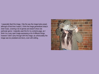
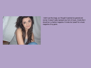
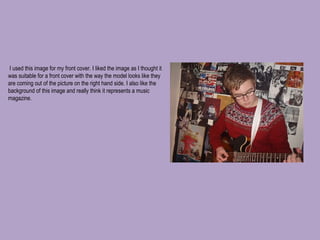
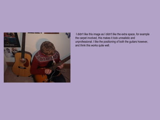
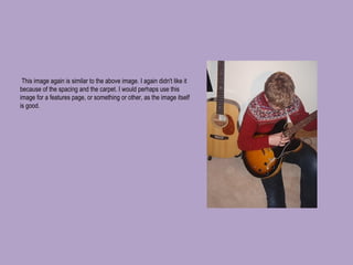
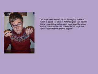
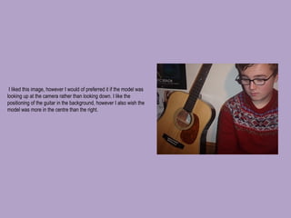
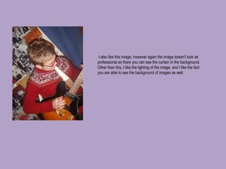
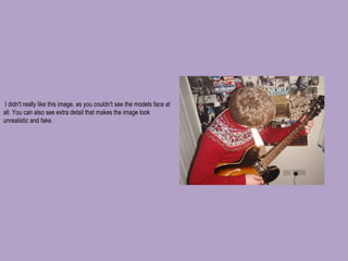
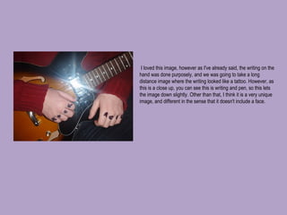
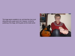
Images for Coursework Collette Howard
  I especially liked this image. I like the way the image looks posed, although at that time it wasn't. I think the image generalizes today's chart music, covering a lot of genres and doesn't show one particular genre. I originally used this for my contents page, as I think it is a very open image expressing a lot of different things, however I didn’t carry through with this image, as unfortunately the image was too pixelated and blurry, even with editing.
  I didn't use this image, as I thought it seemed too general and normal. It doesn't really represent any form of music, it looks like it should be in a fashion magazine. It is also too 'posed' for a music magazine of my genre.
  I used this image for my front cover. I liked the image as I thought it was suitable for a front cover with the way the model looks like they are coming out of the picture on the right hand side. I also like the background of this image and really think it represents a music magazine. 
  I didn't like this image as I didn't like the extra space, for example the carpet involved, this makes it look unrealistic and unprofessional. I like the positioning of both the guitars however, and think this works quite well.
  This image again is similar to the above image. I again didn't like it because of the spacing and the carpet. I would perhaps use this image for a features page, or something or other, as the image itself is good.
  This image I liked. However, I felt like the image did not look as realistic as it could. The letters on the hand originally were meant to be shot from a distance, as this made it appear almost like a tattoo and from a distance this worked. However now this image to me, looks like it should be from a fashion magazine. 
  I liked this image, however I would of preferred it if the model was looking up at the camera rather than looking down. I like the positioning of the guitar in the background, however I also wish the model was more in the centre than the right.
  I also like this image, however again the image doesn't look as professional as there you can see the curtain in the background. Other than this, I like the lighting of the image, and I like the fact you are able to see the background of images as well.
  I didn't really like this image, as you couldn't see the models face at all. You can also see extra detail that makes the image look unrealistic and fake.
  I loved this image, however as I've already said, the writing on the hand was done purposely, and we was going to take a long distance image where the writing looked like a tattoo. However, as this is a close up, you can see this is writing and pen, so this lets the image down slightly. Other than that, I think it is a very unique image, and different in the sense that it doesn't include a face.
This image seems unrealistic to me, and looks like a boy is just sitting there with a guitar next to him. However, I do like the positioning of the image, with the guitar and the model central. 

Images for coursework

  • 1.
    Images for CourseworkCollette Howard
  • 2.
      I especiallyliked this image. I like the way the image looks posed, although at that time it wasn't. I think the image generalizes today's chart music, covering a lot of genres and doesn't show one particular genre. I originally used this for my contents page, as I think it is a very open image expressing a lot of different things, however I didn’t carry through with this image, as unfortunately the image was too pixelated and blurry, even with editing.
  • 3.
      I didn'tuse this image, as I thought it seemed too general and normal. It doesn't really represent any form of music, it looks like it should be in a fashion magazine. It is also too 'posed' for a music magazine of my genre.
  • 4.
      I usedthis image for my front cover. I liked the image as I thought it was suitable for a front cover with the way the model looks like they are coming out of the picture on the right hand side. I also like the background of this image and really think it represents a music magazine. 
  • 5.
      I didn'tlike this image as I didn't like the extra space, for example the carpet involved, this makes it look unrealistic and unprofessional. I like the positioning of both the guitars however, and think this works quite well.
  • 6.
      This imageagain is similar to the above image. I again didn't like it because of the spacing and the carpet. I would perhaps use this image for a features page, or something or other, as the image itself is good.
  • 7.
      This imageI liked. However, I felt like the image did not look as realistic as it could. The letters on the hand originally were meant to be shot from a distance, as this made it appear almost like a tattoo and from a distance this worked. However now this image to me, looks like it should be from a fashion magazine. 
  • 8.
      I likedthis image, however I would of preferred it if the model was looking up at the camera rather than looking down. I like the positioning of the guitar in the background, however I also wish the model was more in the centre than the right.
  • 9.
      I alsolike this image, however again the image doesn't look as professional as there you can see the curtain in the background. Other than this, I like the lighting of the image, and I like the fact you are able to see the background of images as well.
  • 10.
      I didn'treally like this image, as you couldn't see the models face at all. You can also see extra detail that makes the image look unrealistic and fake.
  • 11.
      I lovedthis image, however as I've already said, the writing on the hand was done purposely, and we was going to take a long distance image where the writing looked like a tattoo. However, as this is a close up, you can see this is writing and pen, so this lets the image down slightly. Other than that, I think it is a very unique image, and different in the sense that it doesn't include a face.
  • 12.
    This image seemsunrealistic to me, and looks like a boy is just sitting there with a guitar next to him. However, I do like the positioning of the image, with the guitar and the model central.