Skills development
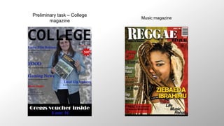
Preliminary task – College
magazine
Music magazine
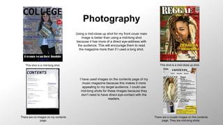
Photography
This shot is a mid-long shot. This shot is a mid-close up shot.
There are no images on my contents
page.
There are a couple images on this contents
page. They are mid-long shots.
Using a mid-close up shot for my front cover main
image is better than using a mid-long shot
because it has more of a direct eye-address with
the audience. This will encourage them to read
the magazine more than if I used a long shot.
I have used images on the contents page of my
music magazine because this makes it more
appealing to my target audience. I could use
mid-long shots for these images because they
don’t need to have direct eye-contact with the
readers.
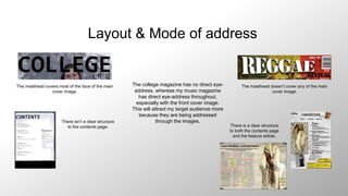
Layout & Mode of address
The masthead covers most of the face of the main
cover image.
The masthead doesn’t cover any of the main
cover image.
There isn’t a clear structure
to the contents page. There is a clear structure
to both the contents page
and the feature article.
The college magazine has no direct eye-
address, whereas my music magazine
has direct eye-address throughout,
especially with the front cover image.
This will attract my target audience more
because they are being addressed
through the images.
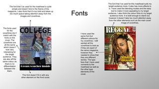
Fonts
The font that I’ve used for the masthead is quite
simple and doesn’t link to the theme of the
magazine. I also think that it’s too bold and takes up
too much space taking attention away from the
images and coverlines.
The fonts used
for the
coverlines don’t
match with the
fonts on the
cover. The
coverlines are
all the same
which doesn’t
look very
interesting for
the target
audience. They
are also all the
same colour, so
there is no
differentiation
between the
them.
This font doesn’t fit in with any
other element on the front cover.
The font that I’ve used for this masthead suits my
target audience more. It also has more effects to
it. I have used the blending modes and the warp
tool to make it more appealing to my target
audience. I also think the colour links to my target
audience more. It is bold enough to stand out,
however it doesn’t take too much attention away
from the other elements such as the main cover
image of coverlines.
I have used the
same font but
different colours for
my coverlines. I still
wanted all the
coverlines to look as
if they are apart of
the same magazine,
however they
needed to show that
they are different
stories. The type
face that I have used
connects to the
masthead as well as
the other type
elements of the
cover.
Audience
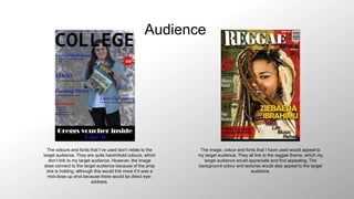
The colours and fonts that I’ve used don’t relate to the
target audience. They are quite harsh/bold colours, which
don’t link to my target audience. However, the image
does connect to the target audience because of the prop
she is holding, although this would link more if it was a
mid-close up shot because there would be direct eye-
address.
The image, colour and fonts that I have used would appeal to
my target audience. They all link to the reggae theme, which my
target audience would appreciate and find appealing. The
background colour and textures would also appeal to the target
audience.
Photoshop devices
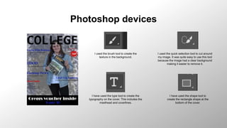
I used the brush tool to create the
texture in the background.
I used the quick selection tool to cut around
my image. It was quite easy to use this tool
because the image had a clear background
making it easier to remove it.
I have used the type tool to create the
typography on the cover. This includes the
masthead and coverlines.
I have used the shape tool to
create the rectangle shape at the
bottom of the cover.
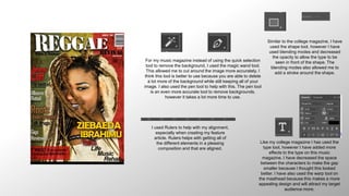
For my music magazine instead of using the quick selection
tool to remove the background, I used the magic wand tool.
This allowed me to cut around the image more accurately. I
think this tool is better to use because you are able to delete
a lot more of the background while still keeping all of your
image. I also used the pen tool to help with this. The pen tool
is an even more accurate tool to remove backgrounds,
however it takes a lot more time to use.
Like my college magazine I has used the
type tool, however I have added more
effects to the type on this music
magazine. I have decreased the space
between the characters to make the gap
smaller because I thought this looked
better. I have also used the warp tool on
the masthead because this makes a more
appealing design and will attract my target
audience more.
I used Rulers to help with my alignment,
especially when creating my feature
article. Rulers helps with getting all of
the different elements in a pleasing
composition and that are aligned.
Similar to the college magazine, I have
used the shape tool, however I have
used blending modes and decreased
the opacity to allow the type to be
seen in front of the shape. The
blending modes also allowed me to
add a stroke around the shape.

Skills development

  • 1.
  • 2.
    Preliminary task –College magazine Music magazine
  • 3.
    Photography This shot isa mid-long shot. This shot is a mid-close up shot. There are no images on my contents page. There are a couple images on this contents page. They are mid-long shots. Using a mid-close up shot for my front cover main image is better than using a mid-long shot because it has more of a direct eye-address with the audience. This will encourage them to read the magazine more than if I used a long shot. I have used images on the contents page of my music magazine because this makes it more appealing to my target audience. I could use mid-long shots for these images because they don’t need to have direct eye-contact with the readers.
  • 4.
    Layout & Modeof address The masthead covers most of the face of the main cover image. The masthead doesn’t cover any of the main cover image. There isn’t a clear structure to the contents page. There is a clear structure to both the contents page and the feature article. The college magazine has no direct eye- address, whereas my music magazine has direct eye-address throughout, especially with the front cover image. This will attract my target audience more because they are being addressed through the images.
  • 5.
    Fonts The font thatI’ve used for the masthead is quite simple and doesn’t link to the theme of the magazine. I also think that it’s too bold and takes up too much space taking attention away from the images and coverlines. The fonts used for the coverlines don’t match with the fonts on the cover. The coverlines are all the same which doesn’t look very interesting for the target audience. They are also all the same colour, so there is no differentiation between the them. This font doesn’t fit in with any other element on the front cover. The font that I’ve used for this masthead suits my target audience more. It also has more effects to it. I have used the blending modes and the warp tool to make it more appealing to my target audience. I also think the colour links to my target audience more. It is bold enough to stand out, however it doesn’t take too much attention away from the other elements such as the main cover image of coverlines. I have used the same font but different colours for my coverlines. I still wanted all the coverlines to look as if they are apart of the same magazine, however they needed to show that they are different stories. The type face that I have used connects to the masthead as well as the other type elements of the cover.
  • 6.
    Audience The colours andfonts that I’ve used don’t relate to the target audience. They are quite harsh/bold colours, which don’t link to my target audience. However, the image does connect to the target audience because of the prop she is holding, although this would link more if it was a mid-close up shot because there would be direct eye- address. The image, colour and fonts that I have used would appeal to my target audience. They all link to the reggae theme, which my target audience would appreciate and find appealing. The background colour and textures would also appeal to the target audience.
  • 7.
    Photoshop devices I usedthe brush tool to create the texture in the background. I used the quick selection tool to cut around my image. It was quite easy to use this tool because the image had a clear background making it easier to remove it. I have used the type tool to create the typography on the cover. This includes the masthead and coverlines. I have used the shape tool to create the rectangle shape at the bottom of the cover.
  • 8.
    For my musicmagazine instead of using the quick selection tool to remove the background, I used the magic wand tool. This allowed me to cut around the image more accurately. I think this tool is better to use because you are able to delete a lot more of the background while still keeping all of your image. I also used the pen tool to help with this. The pen tool is an even more accurate tool to remove backgrounds, however it takes a lot more time to use. Like my college magazine I has used the type tool, however I have added more effects to the type on this music magazine. I have decreased the space between the characters to make the gap smaller because I thought this looked better. I have also used the warp tool on the masthead because this makes a more appealing design and will attract my target audience more. I used Rulers to help with my alignment, especially when creating my feature article. Rulers helps with getting all of the different elements in a pleasing composition and that are aligned. Similar to the college magazine, I have used the shape tool, however I have used blending modes and decreased the opacity to allow the type to be seen in front of the shape. The blending modes also allowed me to add a stroke around the shape.