Downloaded 45 times


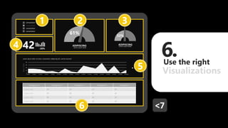

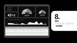

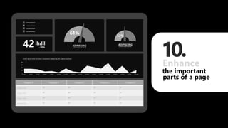
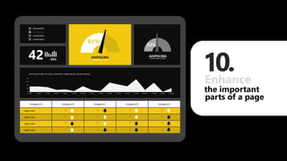


The document provides tips for designing visually stunning reports in Power BI, including using appropriate background colors, spacing, alignment and grids. It recommends focusing 80% of effort on cleaning and enhancing the data, and using techniques like gauges/indicators, charts, images and text in reports, panels, dashboards and infographics. Specific tips include using fewer than 4 colors from a consistent palette, drawing on a grid, leaving empty space and enhancing important page elements. The overall goal is to present data and insights in a simple, visually appealing and easy to understand format.


