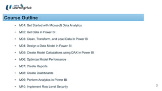
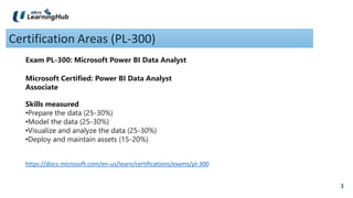
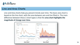
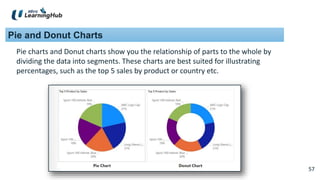
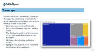
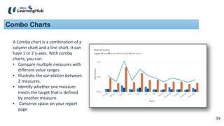
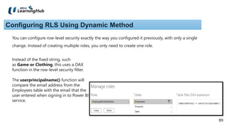
SlideShare a Scribd company logo
1 of 89
1
Analyzing and
Visualizing Data with
Power BI(SF)
-MridulaSingh
2
2
Course Outline
• M01: Get Started with Microsoft Data Analytics
• M02: Get Data in Power BI
• M03: Clean, Transform, and Load Data in Power BI
• M04: Design a Data Model in Power BI
• M05: Create Model Calculations using DAX in Power BI
• M06: Optimize Model Performance
• M07: Create Reports
• M08: Create Dashboards
• M09: Perform Analytics in Power BI
• M10: Implement Row Level Security
3
3
Certification Areas (PL-300)
Microsoft Certified: Power BI Data Analyst
Associate
Exam PL-300: Microsoft Power BI Data Analyst
Skills measured
•Prepare the data (25-30%)
•Model the data (25-30%)
•Visualize and analyze the data (25-30%)
•Deploy and maintain assets (15-20%)
https://docs.microsoft.com/en-us/learn/certifications/exams/pl-300
4
Install Power BI Desktop
• Microsoft Store
• Microsoft Download Center:
https://www.microsoft.com/en-us/download/details.aspx?id=58494
5
5
M01: Get Started with Microsoft Data Analytics
6
6
Key Concepts:
• BI
• Data Analysis
• Visualization
• Self-Service BI
7
7
BI Tools:
 Others:
o Tableau
o Qlik Sense
o SAP Crystal Reports
o Google Data Studio
 Microsoft
o Power BI Desktop
o Power BI Service
o SQL Server Analysis Services
o Power BI Mobile
o Power BI Gateway
o Power BI Report Server
8
8
Overview of Data Analysis:
 Descriptive
 Diagnostic
 Predictive
 Prescriptive
 Cognitive
Components of data analysis:
9
9
Descriptive Analytics:
Descriptive analytics help answer questions about what has happened based on
historical data. Descriptive analytics techniques summarize large datasets to
describe outcomes to stakeholders.
An example of descriptive analytics is generating reports to provide a view of an
organization's sales and financial data.
10
10
Diagnostic analytics:
Diagnostic analytics help answer questions about why events happened. Diagnostic
analytics techniques supplement basic descriptive analytics, and they use the findings
from descriptive analytics to discover the cause of these events.
Includes these processes:
1. Identify anomalies in the data. These anomalies might be unexpected changes in a
metric or a particular market.
2. Collect data that's related to these anomalies.
3. Use statistical techniques to discover relationships and trends that explain these
anomalies.
11
11
Predictive analytics:
Predictive analytics help answer questions about what will happen in the future.
Techniques include a variety of statistical and machine learning techniques such
as neural networks, decision trees, and regression.
12
12
Prescriptive analytics:
Prescriptive analytics help answer questions about which actions should be taken
to achieve a goal or target. By using insights from prescriptive analytics,
organizations can make data-driven decisions.
Prescriptive analytics techniques rely on machine learning as one of the
strategies to find patterns in large datasets.
13
13
Cognitive analytics:
Cognitive analytics attempt to draw inferences from existing data and patterns,
derive conclusions based on existing knowledge bases, and then add these
findings back into the knowledge base for future inferences, a self-learning
feedback loop. Cognitive analytics help you learn what might happen if
circumstances change and determine how you might handle these situations.
Effective cognitive analytics depend on machine learning algorithms, and will use
several natural language processing concepts to make sense of previously
untapped data sources, such as call center conversation logs and product
reviews.
14
14
Roles in Data Analysis:
 Business analyst
 Data analyst
 Data engineer
 Data scientist
 Database administrator
15
15
Business analyst:
A business analyst is closer to the business and is a specialist in interpreting the
data that comes from the visualization. Often, the roles of data analyst and
business analyst could be the responsibility of a single person.
16
16
Data analyst:
A data analyst enables businesses to maximize the value of their data assets
through visualization and reporting tools such as Microsoft Power BI.
Data analysts are responsible for profiling, cleaning, and transforming data.
Their responsibilities also include designing and building scalable and effective
data models, and enabling and implementing the advanced analytics capabilities
into reports for analysis.
17
17
Data engineer:
Data engineers provision and set up data platform technologies that are on-
premises and in the cloud.
They manage and secure the flow of structured and unstructured data from
multiple sources.
Data engineers also ensure that data services securely and seamlessly integrate
across data platforms.
18
18
Data scientist:
Data scientists perform advanced analytics to extract value from data. Their work
can vary from descriptive analytics to predictive analytics.
Descriptive analytics evaluate data through a process known as exploratory data
analysis (EDA).
Predictive analytics are used in machine learning to apply modeling techniques
that can detect anomalies or patterns. These analytics are important parts of
forecast models.
19
19
Database administrator:
A database administrator implements and manages the operational aspects of
cloud-native and hybrid data platform solutions that are built on Microsoft Azure
data services and Microsoft SQL Server.
A database administrator is responsible for the overall availability and consistent
performance and optimizations of the database solutions.
They work with stakeholders to identify and implement the policies, tools, and
processes for data backup and recovery plans.
20
20
5 Areas of Data Analysis:
 Prepare
 Model
 Visualize
 Analyze
 Manage
21
21
Prepare:
Data preparation is the process of taking raw data and turning it into information
that is trusted and understandable. This involves profiling, cleaning and
transformation to make data ready for model and visualization. Data preparation
can often be a lengthy process, which takes a data analyst through a series of
steps and methods to put the data in proper context and a state that eliminates
poor data quality and allows it to be turned into valuable insights.
22
22
Model:
Once the data is in a proper state, it is ready to be modelled. Data modelling is
the process of determining how the tables are related to each other. This is done
by defining and creating relationships between the tables.
23
23
Visualize:
This is the task where you get to bring your data to life! The goal of this task is to
ultimately solve the business problem. A well-designed report should tell a
compelling and impactful story
24
24
Analyze:
This task involves understanding and interpreting the information that is
displayed on the report. A data analyst should understand the analytical
capabilities of Power BI and use those to find insights, identify patterns and
trends, predict outcomes, and then communicate those insights in such a way
that everyone can understand.
25
25
Manage:
There are many components in Power BI, including reports, dashboards,
workspaces, datasets and more. As a data analyst, you are responsible for the
management of these Power BI assets, overseeing the sharing and distribution
of items such as reports and dashboards, ensuring the security of Power BI
assets.
26
26
Demo 1.1: Get Started with Power BI
• Power BI Interface
• Tables and Attributes
• Table Relationship and schema
• First Daxing
• First Visuals
27
27
Power BI Service (Cloud)
28
28
Demo 1.2:
• Publish Power BI Report to Power BI Service
29
29
M02: Get Data in Power BI
30
30
Ways to Extract Data
• Import
• Direct Query
31
31
Import
By default, when you extract data from a data source:
1. Source is at its place
2. Another copy of the data source is created in Power BI Desktop as part of the pbix file.
This copy is called Dataset
3. After Extraction, the link to the source is broken
Later, if the source is updated, you would need to sync your source data with data set
manually. You do this by Refreshing the Dataset.
During Refresh, the link is established and data is updated.
32
32
Direct Query
In direct connection:
• The connection is always live.
• There is no copy of the data given to the Power BI Desktop. The data set will be empty. Will
have structure, but no data.
• When you publish the data to service, there is no data uploaded to BI service.
Note: Changing the Storage mode of a table to Import is an irreversible operation. After this
property is set, it can't later be changed to either DirectQuery or Dual.
33
33
Demo 1.3: Get data from SQL Server Using DirectQuery
SQL Server: Data-AI
Database: TailspinToys2020-US
Data Connectivity mode: DirectQuery
Choose these tables:
a. Product (Dim table)
b. Sales (Fact table)
Create visual to view Price per Product
Category
1
2
3
4 Publish the report
34
34
Student Practice: 1. Prepare Data in Power BI
35
35
M03: Clean, Transform, and Load Data in Power BI
36
36
Issues with Data
 Several columns contain errors
 Some columns contain null values
 ID columns may have duplicate values
• A single column may have combined several information, such as
address
37
37
Advantages of Clean Data:
 More accurate aggregations and calculations are produced
 Tables are organized, where users can find the data in an intuitive
manner
 Duplicates are removed, making data navigation simpler. It will also
produce columns that can be used in slicers and filters
 A complicated column can be split into two simpler columns. Multiple
columns can be combined into one column for readability
 Codes and Integers can be replaced with human readable values
38
38
Clean and Transform Data Using :
 Power BI Desktop
 Power Query (Involves ETL)
39
39
Demo 1.4: Clean and Transform using Power BI Desktop
40
40
Demo 1.5: Clean and Transform using Power Query
41
41
Demo 1.6: Appending Queries
42
42
Demo 1.6: Merging Queries
43
43
Student Practice: 2. Load Data in Power BI
44
44
M04: Design a Data Model in Power BI
The databases you connect to either on-premises or in the cloud store data in tables. One
table might store data about products, while another stores data about orders, while
another stores data about salesperson commissions. Relationships define how data in
one table is related to data in another table.
A powerful component of self-service BI is the ability to compare data to find similarities,
differences, and trends.
Before you can do that, you must create a data model that defines the relationships
between different data components.
45
45
Student Practice: 3. Model Data in Power BI Desktop
46
46
M05: Create Model Calculations Using DAX in Power BI
Data Analysis Expressions (DAX) is a programming language that is used
throughout Microsoft Power BI for creating calculated columns, measures,
and custom tables.
Dax functions are available in Excel and Power BI both. However, not all
Power BI functions are available in Excel.
In this module, you will be able to:
• Create calculated columns
• Build measures
• Use Calculate function
• Implement time intelligence
47
47
Demo 2.1: (Related function and Measure (Sum and SumX
functions)
48
48
Demo 2.2: (Filters->Calculate function)
49
49
Demo 2.3: Time Intelligence
50
50
Demo 2.4: Index Column
51
51
Student Practice: 4. Create DAX Calculations in Power BI
Desktop, Part 1
Student Practice: 5. Create DAX Calculations in Power BI
Desktop, Part 2
52
52
M06: Optimize Model Performance
The performance optimization process involves minimizing the size of the data model, which
includes:
 Ensuring that the correct data types are used
 Deleting unnecessary columns and rows.
 Avoiding repeated values.
 Replacing numeric columns with measures.
 Reducing cardinalities.
 Analysing model metadata.
 Summarizing data where possible.
53
53
Some Visuals Explained
• Table and Matrix Visualizations
• Bar and Column Charts
• Line and Area Charts
• Pie Chart, Donut Chart, and
Treemaps
• Combo Charts
• Card Visualization
• Funnel Visualization
• Gauge Chart
• Waterfall Visualization
• Scatter Chart
• Maps
• Slicer Visualization
• Q&A Visualization
54
54
• Table and Matrix Visualizations
Table is a 2 dimensional grid that
contains related data in a logical series
of rows and columns.
Matrix looks similar to table. However, it
allows you to select one or more elements
(rows, columns, values) in matrix.
55
55
Bar and Column Charts
Bar and Column charts present specific data across different categories in a
stacked or clustered format.
56
56
Line and Area Charts
Line and Area charts help you present trends over time. The basic area chart is
based on the line chart, with the area between axis and line filled in. The main
difference between these 2 chart types is that the area chart highlights the
magnitude of change over time.
57
57
Pie and Donut Charts
Pie charts and Donut charts show you the relationship of parts to the whole by
dividing the data into segments. These charts are best suited for illustrating
percentages, such as the top 5 sales by product or country etc.
58
58
Treemaps
Like Pie charts and Donut charts, Treemaps
show you the relationship of parts to the
whole by dividing the data into segments. A
treemap is ideal to visualize:
• Large amounts of hierarchical data
• Proportions between each part and the
whole
• The distribution pattern of the measure
across each level of categories in the
hierarchy.
• Attributes, by using size and colour
coding.
• Spot patterns, outliers, most-important
contributors, and exceptions,
59
59
Combo Charts
A Combo chart is a combination of a
column chart and a line chart. It can
have 1 or 2 y-axes. With combo
charts, you can:
• Compare multiple measures with
different value ranges.
• Illustrate the correlation between
2 measures.
• Identify whether one measure
meets the target that is defined
by another measure.
• Conserve space on your report
page
60
60
Card Visualization
A card displays a single value: a single
data point. This is ideal to visualize
important statistics that you want to
track in your report or dashboard, such
as Total value, YTD sales, or year-over-
year change.
A multirow card visual displays one or
more data points, with one data point
for each row.
61
61
Funnel Visualization
A funnel visualization displays
a linear process that has
sequential connected stages.
For example, they are useful
for representing a workflow,
such as moving from a sales
lead to a prospect, through to
a proposal and sale.
62
62
Gauge Chart
A Gauge chart has a
circular arc and
displays a single value
that measures progress
towards a goal or
target.
63
63
Waterfall Visualization
A Waterfall visualization or Bridge chart shows running total as values are added or subtracted, which
is useful in displaying a series of positive and negative changes
It can be used to:
• Visualize change over time or
across different categories.
• Audit the major changes that
contribute to the total value.
• Plot an organization’s annual profit
by showing various sources of
revenue.
• Illustrate the beginning and ending
headcount for an organization in a
year.
• Visualize how much money you
earned and spend each month
and the running balance for your
account.
64
64
Scatter Chart
A Scatter chart shows
relationship between
2 numerical values
65
65
Maps
Power BI integrates with
Bing Maps to provide
default map coordinates
(a process called
geocoding), so you can
create maps.
66
66
Slicer Visualization
A Slicer visualization is a
standalone chart that can be
used to filter the other visuals
on the page.
67
67
Q&A Visualization
The Q&A Visualization
allows you to ask natural
language questions and
get answers in the form
of a visual.
68
68
Demo 2.8: Adding different types of visuals to Reports
69
69
Demo 2.9: Download More Visuals
70
70
Demo 2.10: Interactions (Automatic Visual Correlation)
71
71
Demo 2.11: Interactions (Using Slicer Visual)
72
72
Demo 2.12: Conditional Formatting
73
73
Demo 2.13: Cross Filter Direction
74
74
Demo 2.14: The Filters Pane
75
75
Demo 2.15: Visual Level Drill Through
76
76
Demo 2.16: Drill Through Page by Page
77
77
Demo 2.17: Insert Shapes, Buttons and Images
78
78
Student Practice: 6. Design Reports in Power BI Desktop
Student Practice: 7. Enhance Reports in Power BI Desktop
79
79
M08: Create Dashboards
A Power BI dashboard comprises of visuals that are taken from a single report or
multiple reports. The purpose of dashboards is to showcase the main, most
important highlights of the story.
Power BI dashboards is a feature only included in Power BI Service. You can also
view dashboards on mobile devices, though you can’t build them there.
80
80
Dashboards vs. Reports
• Dashboards can be created from multiple datasets or reports
• Dashboards do not have the Filter, Visualization, and the Fields pane that are
there in Power BI Desktop. That means you can’t add new filters and slicers,
and you can’t make edits.
• Dashboards can only be a single page, whereas reports can be multiple pages.
• You can’t see the underlying dataset directly in a dashboard. However, you can
see the dataset in Power BI reports under Data tab.
• Both dashboards and reports can be refreshed to show the latest data.
81
81
A Sample dashboard
82
82
Demo 3.1: Creating a Dashboard
83
83
Student Practice: Lab 9 Create a Power BI Dashboard
84
84
Mod 09: Perform Analytics in Power BI
This module outlines the advanced analytic capabilities of Power BI. Mostly Line Charts and Scatter
Charts are used.
85
85
Student Practice: Lab 8 Perform Analytics in Power BI
86
86
Mod 10: Row Level Security (RLS)
You can also share a single report but have users see different data
according to their job role.
For Instance, you want to make one report where employees in a specific
department can only see the sales for that department.
87
87
Implementing Row Level Security
• Static
• Dynamic
88
88
Configuring RLS Using Static Method
1.Create a report in Microsoft Power BI Desktop.
1. Import the data.
2. Confirm the data model between both tables.
3. Create the report visuals.
2.Create RLS roles in Power BI Desktop by using DAX.
3.Test the roles in Power BI Desktop.
4.Deploy the report to Microsoft Power BI service.
5.Add members to the role in Power BI service.
6.Test the roles in Power BI service.
89
89
Configuring RLS Using Dynamic Method
You can configure row-level security exactly the way you configured it previously, with only a single
change. Instead of creating multiple roles, you only need to create one role.
Instead of the fixed string, such
as Game or Clothing, this uses a DAX
function in the row-level security filter.
The userprincipalname() function will
compare the email address from the
Employees table with the email that the
user entered when signing in to Power BI
service.

More Related Content

Similar to Analyzing and Visualizing Data with Power BI (SF)_Student.pptx

Analyzing Systems Using Data Flow Diagrams
Analyzing Systems Using Data Flow DiagramsAnalyzing Systems Using Data Flow Diagrams
Analyzing Systems Using Data Flow Diagrams
Christina Valadez
 
Running head NETWORK DIAGRAM AND WORKFLOW1NETWORK DIAGRAM AN.docx
Running head NETWORK DIAGRAM AND WORKFLOW1NETWORK DIAGRAM AN.docxRunning head NETWORK DIAGRAM AND WORKFLOW1NETWORK DIAGRAM AN.docx
Running head NETWORK DIAGRAM AND WORKFLOW1NETWORK DIAGRAM AN.docx
jeanettehully
 

Similar to Analyzing and Visualizing Data with Power BI (SF)_Student.pptx (20)

IRJET- Data Analytics & Visualization using Qlik
IRJET- Data Analytics & Visualization using QlikIRJET- Data Analytics & Visualization using Qlik
IRJET- Data Analytics & Visualization using Qlik
 
Week 7 Database Development Process
Week 7 Database Development ProcessWeek 7 Database Development Process
Week 7 Database Development Process
 
Power BI vs Tableau vs Cognos: A Data Analytics Research
Power BI vs Tableau vs Cognos: A Data Analytics ResearchPower BI vs Tableau vs Cognos: A Data Analytics Research
Power BI vs Tableau vs Cognos: A Data Analytics Research
 
BDA-Module-1.pptx
BDA-Module-1.pptxBDA-Module-1.pptx
BDA-Module-1.pptx
 
Data Analytics | How it Works
Data Analytics | How it WorksData Analytics | How it Works
Data Analytics | How it Works
 
The Simple 5-Step Process for Creating a Winning Data Pipeline.pdf
The Simple 5-Step Process for Creating a Winning Data Pipeline.pdfThe Simple 5-Step Process for Creating a Winning Data Pipeline.pdf
The Simple 5-Step Process for Creating a Winning Data Pipeline.pdf
 
SOLIDWORKS reseller Whitepaper by Promedia Systems
SOLIDWORKS reseller Whitepaper by Promedia Systems SOLIDWORKS reseller Whitepaper by Promedia Systems
SOLIDWORKS reseller Whitepaper by Promedia Systems
 
Introducing microsoft bi tools
Introducing  microsoft bi  toolsIntroducing  microsoft bi  tools
Introducing microsoft bi tools
 
Introduction to data science
Introduction to data scienceIntroduction to data science
Introduction to data science
 
Denodo DataFest 2016: Comparing and Contrasting Data Virtualization With Data...
Denodo DataFest 2016: Comparing and Contrasting Data Virtualization With Data...Denodo DataFest 2016: Comparing and Contrasting Data Virtualization With Data...
Denodo DataFest 2016: Comparing and Contrasting Data Virtualization With Data...
 
Is 4 th
Is 4 thIs 4 th
Is 4 th
 
Data Science Introduction: Concepts, lifecycle, applications.pptx
Data Science Introduction: Concepts, lifecycle, applications.pptxData Science Introduction: Concepts, lifecycle, applications.pptx
Data Science Introduction: Concepts, lifecycle, applications.pptx
 
Decoding the Role of a Data Engineer.pdf
Decoding the Role of a Data Engineer.pdfDecoding the Role of a Data Engineer.pdf
Decoding the Role of a Data Engineer.pdf
 
Analyzing Systems Using Data Flow Diagrams
Analyzing Systems Using Data Flow DiagramsAnalyzing Systems Using Data Flow Diagrams
Analyzing Systems Using Data Flow Diagrams
 
Poster
PosterPoster
Poster
 
Exploring Data Modeling Techniques in Modern Data Warehouses
Exploring Data Modeling Techniques in Modern Data WarehousesExploring Data Modeling Techniques in Modern Data Warehouses
Exploring Data Modeling Techniques in Modern Data Warehouses
 
Running head NETWORK DIAGRAM AND WORKFLOW1NETWORK DIAGRAM AN.docx
Running head NETWORK DIAGRAM AND WORKFLOW1NETWORK DIAGRAM AN.docxRunning head NETWORK DIAGRAM AND WORKFLOW1NETWORK DIAGRAM AN.docx
Running head NETWORK DIAGRAM AND WORKFLOW1NETWORK DIAGRAM AN.docx
 
Sq lite module1
Sq lite module1Sq lite module1
Sq lite module1
 
Intro of Key Features of SoftCAAT BI Software
Intro of Key Features of SoftCAAT BI SoftwareIntro of Key Features of SoftCAAT BI Software
Intro of Key Features of SoftCAAT BI Software
 
KPI Suite Platform Brief EN
KPI Suite Platform Brief ENKPI Suite Platform Brief EN
KPI Suite Platform Brief EN
 

Recently uploaded

Ecosystem Interactions Class Discussion Presentation in Blue Green Lined Styl...
Ecosystem Interactions Class Discussion Presentation in Blue Green Lined Styl...Ecosystem Interactions Class Discussion Presentation in Blue Green Lined Styl...
Ecosystem Interactions Class Discussion Presentation in Blue Green Lined Styl...
fonyou31
 
Kisan Call Centre - To harness potential of ICT in Agriculture by answer farm...
Kisan Call Centre - To harness potential of ICT in Agriculture by answer farm...Kisan Call Centre - To harness potential of ICT in Agriculture by answer farm...
Kisan Call Centre - To harness potential of ICT in Agriculture by answer farm...
Krashi Coaching
 

Recently uploaded (20)

Mattingly "AI & Prompt Design: Structured Data, Assistants, & RAG"
Mattingly "AI & Prompt Design: Structured Data, Assistants, & RAG"Mattingly "AI & Prompt Design: Structured Data, Assistants, & RAG"
Mattingly "AI & Prompt Design: Structured Data, Assistants, & RAG"
 
Sanyam Choudhary Chemistry practical.pdf
Sanyam Choudhary Chemistry practical.pdfSanyam Choudhary Chemistry practical.pdf
Sanyam Choudhary Chemistry practical.pdf
 
IGNOU MSCCFT and PGDCFT Exam Question Pattern: MCFT003 Counselling and Family...
IGNOU MSCCFT and PGDCFT Exam Question Pattern: MCFT003 Counselling and Family...IGNOU MSCCFT and PGDCFT Exam Question Pattern: MCFT003 Counselling and Family...
IGNOU MSCCFT and PGDCFT Exam Question Pattern: MCFT003 Counselling and Family...
 
Call Girls in Dwarka Mor Delhi Contact Us 9654467111
Call Girls in Dwarka Mor Delhi Contact Us 9654467111Call Girls in Dwarka Mor Delhi Contact Us 9654467111
Call Girls in Dwarka Mor Delhi Contact Us 9654467111
 
Unit-IV- Pharma. Marketing Channels.pptx
Unit-IV- Pharma. Marketing Channels.pptxUnit-IV- Pharma. Marketing Channels.pptx
Unit-IV- Pharma. Marketing Channels.pptx
 
Código Creativo y Arte de Software | Unidad 1
Código Creativo y Arte de Software | Unidad 1Código Creativo y Arte de Software | Unidad 1
Código Creativo y Arte de Software | Unidad 1
 
SOCIAL AND HISTORICAL CONTEXT - LFTVD.pptx
SOCIAL AND HISTORICAL CONTEXT - LFTVD.pptxSOCIAL AND HISTORICAL CONTEXT - LFTVD.pptx
SOCIAL AND HISTORICAL CONTEXT - LFTVD.pptx
 
Disha NEET Physics Guide for classes 11 and 12.pdf
Disha NEET Physics Guide for classes 11 and 12.pdfDisha NEET Physics Guide for classes 11 and 12.pdf
Disha NEET Physics Guide for classes 11 and 12.pdf
 
Student login on Anyboli platform.helpin
Student login on Anyboli platform.helpinStudent login on Anyboli platform.helpin
Student login on Anyboli platform.helpin
 
9548086042 for call girls in Indira Nagar with room service
9548086042  for call girls in Indira Nagar  with room service9548086042  for call girls in Indira Nagar  with room service
9548086042 for call girls in Indira Nagar with room service
 
social pharmacy d-pharm 1st year by Pragati K. Mahajan
social pharmacy d-pharm 1st year by Pragati K. Mahajansocial pharmacy d-pharm 1st year by Pragati K. Mahajan
social pharmacy d-pharm 1st year by Pragati K. Mahajan
 
Ecosystem Interactions Class Discussion Presentation in Blue Green Lined Styl...
Ecosystem Interactions Class Discussion Presentation in Blue Green Lined Styl...Ecosystem Interactions Class Discussion Presentation in Blue Green Lined Styl...
Ecosystem Interactions Class Discussion Presentation in Blue Green Lined Styl...
 
fourth grading exam for kindergarten in writing
fourth grading exam for kindergarten in writingfourth grading exam for kindergarten in writing
fourth grading exam for kindergarten in writing
 
Kisan Call Centre - To harness potential of ICT in Agriculture by answer farm...
Kisan Call Centre - To harness potential of ICT in Agriculture by answer farm...Kisan Call Centre - To harness potential of ICT in Agriculture by answer farm...
Kisan Call Centre - To harness potential of ICT in Agriculture by answer farm...
 
A Critique of the Proposed National Education Policy Reform
A Critique of the Proposed National Education Policy ReformA Critique of the Proposed National Education Policy Reform
A Critique of the Proposed National Education Policy Reform
 
Grant Readiness 101 TechSoup and Remy Consulting
Grant Readiness 101 TechSoup and Remy ConsultingGrant Readiness 101 TechSoup and Remy Consulting
Grant Readiness 101 TechSoup and Remy Consulting
 
The Most Excellent Way | 1 Corinthians 13
The Most Excellent Way | 1 Corinthians 13The Most Excellent Way | 1 Corinthians 13
The Most Excellent Way | 1 Corinthians 13
 
Z Score,T Score, Percential Rank and Box Plot Graph
Z Score,T Score, Percential Rank and Box Plot GraphZ Score,T Score, Percential Rank and Box Plot Graph
Z Score,T Score, Percential Rank and Box Plot Graph
 
Measures of Dispersion and Variability: Range, QD, AD and SD
Measures of Dispersion and Variability: Range, QD, AD and SDMeasures of Dispersion and Variability: Range, QD, AD and SD
Measures of Dispersion and Variability: Range, QD, AD and SD
 
Class 11th Physics NEET formula sheet pdf
Class 11th Physics NEET formula sheet pdfClass 11th Physics NEET formula sheet pdf
Class 11th Physics NEET formula sheet pdf
 

Analyzing and Visualizing Data with Power BI (SF)_Student.pptx

  • 1. 1 Analyzing and Visualizing Data with Power BI(SF) -MridulaSingh
  • 2. 2 2 Course Outline • M01: Get Started with Microsoft Data Analytics • M02: Get Data in Power BI • M03: Clean, Transform, and Load Data in Power BI • M04: Design a Data Model in Power BI • M05: Create Model Calculations using DAX in Power BI • M06: Optimize Model Performance • M07: Create Reports • M08: Create Dashboards • M09: Perform Analytics in Power BI • M10: Implement Row Level Security
  • 3. 3 3 Certification Areas (PL-300) Microsoft Certified: Power BI Data Analyst Associate Exam PL-300: Microsoft Power BI Data Analyst Skills measured •Prepare the data (25-30%) •Model the data (25-30%) •Visualize and analyze the data (25-30%) •Deploy and maintain assets (15-20%) https://docs.microsoft.com/en-us/learn/certifications/exams/pl-300
  • 4. 4 Install Power BI Desktop • Microsoft Store • Microsoft Download Center: https://www.microsoft.com/en-us/download/details.aspx?id=58494
  • 5. 5 5 M01: Get Started with Microsoft Data Analytics
  • 6. 6 6 Key Concepts: • BI • Data Analysis • Visualization • Self-Service BI
  • 7. 7 7 BI Tools:  Others: o Tableau o Qlik Sense o SAP Crystal Reports o Google Data Studio  Microsoft o Power BI Desktop o Power BI Service o SQL Server Analysis Services o Power BI Mobile o Power BI Gateway o Power BI Report Server
  • 8. 8 8 Overview of Data Analysis:  Descriptive  Diagnostic  Predictive  Prescriptive  Cognitive Components of data analysis:
  • 9. 9 9 Descriptive Analytics: Descriptive analytics help answer questions about what has happened based on historical data. Descriptive analytics techniques summarize large datasets to describe outcomes to stakeholders. An example of descriptive analytics is generating reports to provide a view of an organization's sales and financial data.
  • 10. 10 10 Diagnostic analytics: Diagnostic analytics help answer questions about why events happened. Diagnostic analytics techniques supplement basic descriptive analytics, and they use the findings from descriptive analytics to discover the cause of these events. Includes these processes: 1. Identify anomalies in the data. These anomalies might be unexpected changes in a metric or a particular market. 2. Collect data that's related to these anomalies. 3. Use statistical techniques to discover relationships and trends that explain these anomalies.
  • 11. 11 11 Predictive analytics: Predictive analytics help answer questions about what will happen in the future. Techniques include a variety of statistical and machine learning techniques such as neural networks, decision trees, and regression.
  • 12. 12 12 Prescriptive analytics: Prescriptive analytics help answer questions about which actions should be taken to achieve a goal or target. By using insights from prescriptive analytics, organizations can make data-driven decisions. Prescriptive analytics techniques rely on machine learning as one of the strategies to find patterns in large datasets.
  • 13. 13 13 Cognitive analytics: Cognitive analytics attempt to draw inferences from existing data and patterns, derive conclusions based on existing knowledge bases, and then add these findings back into the knowledge base for future inferences, a self-learning feedback loop. Cognitive analytics help you learn what might happen if circumstances change and determine how you might handle these situations. Effective cognitive analytics depend on machine learning algorithms, and will use several natural language processing concepts to make sense of previously untapped data sources, such as call center conversation logs and product reviews.
  • 14. 14 14 Roles in Data Analysis:  Business analyst  Data analyst  Data engineer  Data scientist  Database administrator
  • 15. 15 15 Business analyst: A business analyst is closer to the business and is a specialist in interpreting the data that comes from the visualization. Often, the roles of data analyst and business analyst could be the responsibility of a single person.
  • 16. 16 16 Data analyst: A data analyst enables businesses to maximize the value of their data assets through visualization and reporting tools such as Microsoft Power BI. Data analysts are responsible for profiling, cleaning, and transforming data. Their responsibilities also include designing and building scalable and effective data models, and enabling and implementing the advanced analytics capabilities into reports for analysis.
  • 17. 17 17 Data engineer: Data engineers provision and set up data platform technologies that are on- premises and in the cloud. They manage and secure the flow of structured and unstructured data from multiple sources. Data engineers also ensure that data services securely and seamlessly integrate across data platforms.
  • 18. 18 18 Data scientist: Data scientists perform advanced analytics to extract value from data. Their work can vary from descriptive analytics to predictive analytics. Descriptive analytics evaluate data through a process known as exploratory data analysis (EDA). Predictive analytics are used in machine learning to apply modeling techniques that can detect anomalies or patterns. These analytics are important parts of forecast models.
  • 19. 19 19 Database administrator: A database administrator implements and manages the operational aspects of cloud-native and hybrid data platform solutions that are built on Microsoft Azure data services and Microsoft SQL Server. A database administrator is responsible for the overall availability and consistent performance and optimizations of the database solutions. They work with stakeholders to identify and implement the policies, tools, and processes for data backup and recovery plans.
  • 20. 20 20 5 Areas of Data Analysis:  Prepare  Model  Visualize  Analyze  Manage
  • 21. 21 21 Prepare: Data preparation is the process of taking raw data and turning it into information that is trusted and understandable. This involves profiling, cleaning and transformation to make data ready for model and visualization. Data preparation can often be a lengthy process, which takes a data analyst through a series of steps and methods to put the data in proper context and a state that eliminates poor data quality and allows it to be turned into valuable insights.
  • 22. 22 22 Model: Once the data is in a proper state, it is ready to be modelled. Data modelling is the process of determining how the tables are related to each other. This is done by defining and creating relationships between the tables.
  • 23. 23 23 Visualize: This is the task where you get to bring your data to life! The goal of this task is to ultimately solve the business problem. A well-designed report should tell a compelling and impactful story
  • 24. 24 24 Analyze: This task involves understanding and interpreting the information that is displayed on the report. A data analyst should understand the analytical capabilities of Power BI and use those to find insights, identify patterns and trends, predict outcomes, and then communicate those insights in such a way that everyone can understand.
  • 25. 25 25 Manage: There are many components in Power BI, including reports, dashboards, workspaces, datasets and more. As a data analyst, you are responsible for the management of these Power BI assets, overseeing the sharing and distribution of items such as reports and dashboards, ensuring the security of Power BI assets.
  • 26. 26 26 Demo 1.1: Get Started with Power BI • Power BI Interface • Tables and Attributes • Table Relationship and schema • First Daxing • First Visuals
  • 28. 28 28 Demo 1.2: • Publish Power BI Report to Power BI Service
  • 29. 29 29 M02: Get Data in Power BI
  • 30. 30 30 Ways to Extract Data • Import • Direct Query
  • 31. 31 31 Import By default, when you extract data from a data source: 1. Source is at its place 2. Another copy of the data source is created in Power BI Desktop as part of the pbix file. This copy is called Dataset 3. After Extraction, the link to the source is broken Later, if the source is updated, you would need to sync your source data with data set manually. You do this by Refreshing the Dataset. During Refresh, the link is established and data is updated.
  • 32. 32 32 Direct Query In direct connection: • The connection is always live. • There is no copy of the data given to the Power BI Desktop. The data set will be empty. Will have structure, but no data. • When you publish the data to service, there is no data uploaded to BI service. Note: Changing the Storage mode of a table to Import is an irreversible operation. After this property is set, it can't later be changed to either DirectQuery or Dual.
  • 33. 33 33 Demo 1.3: Get data from SQL Server Using DirectQuery SQL Server: Data-AI Database: TailspinToys2020-US Data Connectivity mode: DirectQuery Choose these tables: a. Product (Dim table) b. Sales (Fact table) Create visual to view Price per Product Category 1 2 3 4 Publish the report
  • 34. 34 34 Student Practice: 1. Prepare Data in Power BI
  • 35. 35 35 M03: Clean, Transform, and Load Data in Power BI
  • 36. 36 36 Issues with Data  Several columns contain errors  Some columns contain null values  ID columns may have duplicate values • A single column may have combined several information, such as address
  • 37. 37 37 Advantages of Clean Data:  More accurate aggregations and calculations are produced  Tables are organized, where users can find the data in an intuitive manner  Duplicates are removed, making data navigation simpler. It will also produce columns that can be used in slicers and filters  A complicated column can be split into two simpler columns. Multiple columns can be combined into one column for readability  Codes and Integers can be replaced with human readable values
  • 38. 38 38 Clean and Transform Data Using :  Power BI Desktop  Power Query (Involves ETL)
  • 39. 39 39 Demo 1.4: Clean and Transform using Power BI Desktop
  • 40. 40 40 Demo 1.5: Clean and Transform using Power Query
  • 43. 43 43 Student Practice: 2. Load Data in Power BI
  • 44. 44 44 M04: Design a Data Model in Power BI The databases you connect to either on-premises or in the cloud store data in tables. One table might store data about products, while another stores data about orders, while another stores data about salesperson commissions. Relationships define how data in one table is related to data in another table. A powerful component of self-service BI is the ability to compare data to find similarities, differences, and trends. Before you can do that, you must create a data model that defines the relationships between different data components.
  • 45. 45 45 Student Practice: 3. Model Data in Power BI Desktop
  • 46. 46 46 M05: Create Model Calculations Using DAX in Power BI Data Analysis Expressions (DAX) is a programming language that is used throughout Microsoft Power BI for creating calculated columns, measures, and custom tables. Dax functions are available in Excel and Power BI both. However, not all Power BI functions are available in Excel. In this module, you will be able to: • Create calculated columns • Build measures • Use Calculate function • Implement time intelligence
  • 47. 47 47 Demo 2.1: (Related function and Measure (Sum and SumX functions)
  • 49. 49 49 Demo 2.3: Time Intelligence
  • 51. 51 51 Student Practice: 4. Create DAX Calculations in Power BI Desktop, Part 1 Student Practice: 5. Create DAX Calculations in Power BI Desktop, Part 2
  • 52. 52 52 M06: Optimize Model Performance The performance optimization process involves minimizing the size of the data model, which includes:  Ensuring that the correct data types are used  Deleting unnecessary columns and rows.  Avoiding repeated values.  Replacing numeric columns with measures.  Reducing cardinalities.  Analysing model metadata.  Summarizing data where possible.
  • 53. 53 53 Some Visuals Explained • Table and Matrix Visualizations • Bar and Column Charts • Line and Area Charts • Pie Chart, Donut Chart, and Treemaps • Combo Charts • Card Visualization • Funnel Visualization • Gauge Chart • Waterfall Visualization • Scatter Chart • Maps • Slicer Visualization • Q&A Visualization
  • 54. 54 54 • Table and Matrix Visualizations Table is a 2 dimensional grid that contains related data in a logical series of rows and columns. Matrix looks similar to table. However, it allows you to select one or more elements (rows, columns, values) in matrix.
  • 55. 55 55 Bar and Column Charts Bar and Column charts present specific data across different categories in a stacked or clustered format.
  • 56. 56 56 Line and Area Charts Line and Area charts help you present trends over time. The basic area chart is based on the line chart, with the area between axis and line filled in. The main difference between these 2 chart types is that the area chart highlights the magnitude of change over time.
  • 57. 57 57 Pie and Donut Charts Pie charts and Donut charts show you the relationship of parts to the whole by dividing the data into segments. These charts are best suited for illustrating percentages, such as the top 5 sales by product or country etc.
  • 58. 58 58 Treemaps Like Pie charts and Donut charts, Treemaps show you the relationship of parts to the whole by dividing the data into segments. A treemap is ideal to visualize: • Large amounts of hierarchical data • Proportions between each part and the whole • The distribution pattern of the measure across each level of categories in the hierarchy. • Attributes, by using size and colour coding. • Spot patterns, outliers, most-important contributors, and exceptions,
  • 59. 59 59 Combo Charts A Combo chart is a combination of a column chart and a line chart. It can have 1 or 2 y-axes. With combo charts, you can: • Compare multiple measures with different value ranges. • Illustrate the correlation between 2 measures. • Identify whether one measure meets the target that is defined by another measure. • Conserve space on your report page
  • 60. 60 60 Card Visualization A card displays a single value: a single data point. This is ideal to visualize important statistics that you want to track in your report or dashboard, such as Total value, YTD sales, or year-over- year change. A multirow card visual displays one or more data points, with one data point for each row.
  • 61. 61 61 Funnel Visualization A funnel visualization displays a linear process that has sequential connected stages. For example, they are useful for representing a workflow, such as moving from a sales lead to a prospect, through to a proposal and sale.
  • 62. 62 62 Gauge Chart A Gauge chart has a circular arc and displays a single value that measures progress towards a goal or target.
  • 63. 63 63 Waterfall Visualization A Waterfall visualization or Bridge chart shows running total as values are added or subtracted, which is useful in displaying a series of positive and negative changes It can be used to: • Visualize change over time or across different categories. • Audit the major changes that contribute to the total value. • Plot an organization’s annual profit by showing various sources of revenue. • Illustrate the beginning and ending headcount for an organization in a year. • Visualize how much money you earned and spend each month and the running balance for your account.
  • 64. 64 64 Scatter Chart A Scatter chart shows relationship between 2 numerical values
  • 65. 65 65 Maps Power BI integrates with Bing Maps to provide default map coordinates (a process called geocoding), so you can create maps.
  • 66. 66 66 Slicer Visualization A Slicer visualization is a standalone chart that can be used to filter the other visuals on the page.
  • 67. 67 67 Q&A Visualization The Q&A Visualization allows you to ask natural language questions and get answers in the form of a visual.
  • 68. 68 68 Demo 2.8: Adding different types of visuals to Reports
  • 69. 69 69 Demo 2.9: Download More Visuals
  • 70. 70 70 Demo 2.10: Interactions (Automatic Visual Correlation)
  • 71. 71 71 Demo 2.11: Interactions (Using Slicer Visual)
  • 73. 73 73 Demo 2.13: Cross Filter Direction
  • 74. 74 74 Demo 2.14: The Filters Pane
  • 75. 75 75 Demo 2.15: Visual Level Drill Through
  • 76. 76 76 Demo 2.16: Drill Through Page by Page
  • 77. 77 77 Demo 2.17: Insert Shapes, Buttons and Images
  • 78. 78 78 Student Practice: 6. Design Reports in Power BI Desktop Student Practice: 7. Enhance Reports in Power BI Desktop
  • 79. 79 79 M08: Create Dashboards A Power BI dashboard comprises of visuals that are taken from a single report or multiple reports. The purpose of dashboards is to showcase the main, most important highlights of the story. Power BI dashboards is a feature only included in Power BI Service. You can also view dashboards on mobile devices, though you can’t build them there.
  • 80. 80 80 Dashboards vs. Reports • Dashboards can be created from multiple datasets or reports • Dashboards do not have the Filter, Visualization, and the Fields pane that are there in Power BI Desktop. That means you can’t add new filters and slicers, and you can’t make edits. • Dashboards can only be a single page, whereas reports can be multiple pages. • You can’t see the underlying dataset directly in a dashboard. However, you can see the dataset in Power BI reports under Data tab. • Both dashboards and reports can be refreshed to show the latest data.
  • 83. 83 83 Student Practice: Lab 9 Create a Power BI Dashboard
  • 84. 84 84 Mod 09: Perform Analytics in Power BI This module outlines the advanced analytic capabilities of Power BI. Mostly Line Charts and Scatter Charts are used.
  • 85. 85 85 Student Practice: Lab 8 Perform Analytics in Power BI
  • 86. 86 86 Mod 10: Row Level Security (RLS) You can also share a single report but have users see different data according to their job role. For Instance, you want to make one report where employees in a specific department can only see the sales for that department.
  • 87. 87 87 Implementing Row Level Security • Static • Dynamic
  • 88. 88 88 Configuring RLS Using Static Method 1.Create a report in Microsoft Power BI Desktop. 1. Import the data. 2. Confirm the data model between both tables. 3. Create the report visuals. 2.Create RLS roles in Power BI Desktop by using DAX. 3.Test the roles in Power BI Desktop. 4.Deploy the report to Microsoft Power BI service. 5.Add members to the role in Power BI service. 6.Test the roles in Power BI service.
  • 89. 89 89 Configuring RLS Using Dynamic Method You can configure row-level security exactly the way you configured it previously, with only a single change. Instead of creating multiple roles, you only need to create one role. Instead of the fixed string, such as Game or Clothing, this uses a DAX function in the row-level security filter. The userprincipalname() function will compare the email address from the Employees table with the email that the user entered when signing in to Power BI service.

Editor's Notes

  1. If the source is moved or renamed, change the data source location: Home->Transform Data-> Data Source Settings
  2. So, data is secure. But there is a challenge. In Power BI Service, the report will not show any data. So, this is totally useless.   So, you have to establish the connection from BI service to the SQL Server data source. This is possible through Gateway
  3. Show video on PowerQuery
  4. Incorrect data types will prevent you from creating certain calculations, deriving hierarchies, or creating proper relationships with other tables.
  5. The Prerequisite: Same data structures Combine two Orders datasets (Orders_SEA and Orders_Europe)
  6. Prerequisite: The datasets can have different data structures but must have a common column Objective: Merge Products and Stock tables so that we can have a report that shows product by product stock level and Stock Value
  7. We have already completed data modelling in our previous module Q&A: Types of keys, Types of relationships, Types of Tables, Types of schema, cross-filter direction
  8. In the lab, students have created hierarchies and Field properties.
  9. From a report user’s perspective, poor performance is characterized by report pages that take longer to load and visuals taking more time to update. This poor performance results in a negative user experience. Poor performance is a direct result of a bad data model, bad Data Analysis Expressions (DAX), or a mix of both. The process of designing a data model for performance can be tedious, and it is often underestimated. However, if you address performance issues during development, you will have a robust Power BI Data Model that will return better reporting performance and a more positive user experience. A smaller sized data model uses less resources (memory) and achieves faster data refresh, calculations, and rendering of visuals in reports.
  10. Visuals are a fundamental part of your report because they help your report audience connect and interact with the information to make informed business decisions quickly. Visuals allow you to share data insights more effectively and increase comprehension, retention and appeal.