Media print screens
•Download as PPTX, PDF•
0 likes•149 views

The document summarizes the changes made to a magazine from the initial draft to the final product. It describes adding a skyline to the front cover and rearranging some interior elements. It also details alterations to the contents page, such as changing the background color and rearranging information. Finally, it outlines significant revisions to a double-page spread, like highlighting quotes, adding a studio background, including a timeline of images, and placing contact information in the corners.

Recommended
More Related Content
What's hot
What's hot (20)
Viewers also liked
Viewers also liked (15)
Similar to Media print screens
Similar to Media print screens (20)
Media print screens
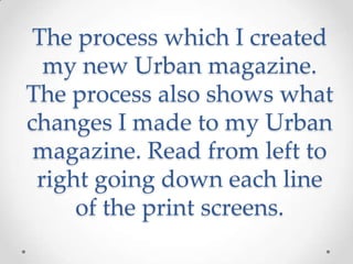
- 1. The process which I created my new Urban magazine. The process also shows what changes I made to my Urban magazine. Read from left to right going down each line of the print screens.
- 2. Front cover.
- 11. • I made a couple slight changes. Such as adding in a skyline to the front cover, moving about certain aspects of the magazine such as the buzzword, the features and how the barcode, QR code, price and date. I removed josh and added in a white background to make my image stand out more. Also at the fact the main article was revolving around the artist ‘J.’ The article headline was changed to a quote to entice the reader more. The layout was changed a bit, I looked into more magazines about how they layout there magazines with the linking in also with my final drafts. I used all of the same skills I used to produce the first draft of my magazine to my final product which looks more professional.
- 12. • I stuck with the same image of Ugne to show a feminine feel to the contents page. I changed the brick background to a solid plain white. This is so that the magazine contents page has the same colour scheme, font and all aspects the same aspect to the front cover. I changed over the block colours so that the black will stand the white out more with the red as a border. I move the editor section to the top left, so the readers can see the contact details. Finally I added in an extra three photos to show a little insight to some of the articles, so the demographics may be tempted by the images.
- 13. • I changed a lot on my double page spread. I highlighted the quotes in red to show the artist is talking. I also added in a studio background to show that ‘J’ is in a studio environment instead of a plain blue background. I used the first main image in the five smaller images to show a timeline of ‘J’s’ life. The main image is there to show dominance and how ‘J’ has made it finally. In the bottom corners I added in a twitter account and website address so that the readers can have a browse. The page numbers were increased by the fact from my research that the main article is nearly always in the middle of the magazine.