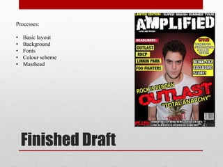
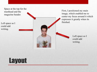
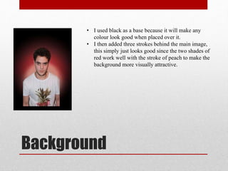
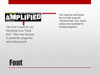
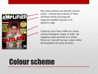
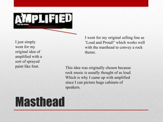
Front Page
Process
By Matheus Silva
Finished Draft
Processes:
• Basic layout
• Background
• Fonts
• Colour scheme
• Masthead
Layout
First, I positioned my main
image, which enabled me to
center my focus around it which
expresses it greatly when its
finished.Left space so I
could add
writing.
Left space so I
could add
writing.
Space at the top for the
masthead and the
magazine header.
Background
• I used black as a base because it will make any
colour look good when placed over it.
• I then added three strokes behind the main image,
this simply just looks good since the two shades of
red work well with the stroke of peach to make the
background more visually attractive.
Font
The font I used for my
Masthead was ‘Punk
Kid’. This was because
it suited the magazine
and looked good.
The strap line and header
bar are both using the
‘Skratch Punk’ font, which
mimics the masthead for
kerrang magazine.
Colour scheme
My colour scheme was literally red and
yellow with the base colours of white
and black which just bring the
magazine together and give it an
attractive edge
I kept my cover lines within my colour
scheme boundaries simply to make the
magazine stand out better as a whole.
However, I can still use any colour within
the boundaries for some diversity.
Masthead
I just simply
went for my
original idea of
amplified with a
sort of sprayed
paint like font.
I went for my original selling line as
‘Loud and Proud!’ which works well
with the masthead to convey a rock
theme.
This idea was originally chosen because
rock music is usually thought of as loud.
Which is why I came up with amplified
since I can picture huge cabinets of
speakers.

Front page process

  • 1.
  • 2.
    Finished Draft Processes: • Basiclayout • Background • Fonts • Colour scheme • Masthead
  • 3.
    Layout First, I positionedmy main image, which enabled me to center my focus around it which expresses it greatly when its finished.Left space so I could add writing. Left space so I could add writing. Space at the top for the masthead and the magazine header.
  • 4.
    Background • I usedblack as a base because it will make any colour look good when placed over it. • I then added three strokes behind the main image, this simply just looks good since the two shades of red work well with the stroke of peach to make the background more visually attractive.
  • 5.
    Font The font Iused for my Masthead was ‘Punk Kid’. This was because it suited the magazine and looked good. The strap line and header bar are both using the ‘Skratch Punk’ font, which mimics the masthead for kerrang magazine.
  • 6.
    Colour scheme My colourscheme was literally red and yellow with the base colours of white and black which just bring the magazine together and give it an attractive edge I kept my cover lines within my colour scheme boundaries simply to make the magazine stand out better as a whole. However, I can still use any colour within the boundaries for some diversity.
  • 7.
    Masthead I just simply wentfor my original idea of amplified with a sort of sprayed paint like font. I went for my original selling line as ‘Loud and Proud!’ which works well with the masthead to convey a rock theme. This idea was originally chosen because rock music is usually thought of as loud. Which is why I came up with amplified since I can picture huge cabinets of speakers.