
Recommended
More Related Content
What's hot
What's hot (19)
Similar to Print screens contents
Similar to Print screens contents (20)
More from asmediag12
More from asmediag12 (20)
Print screens contents
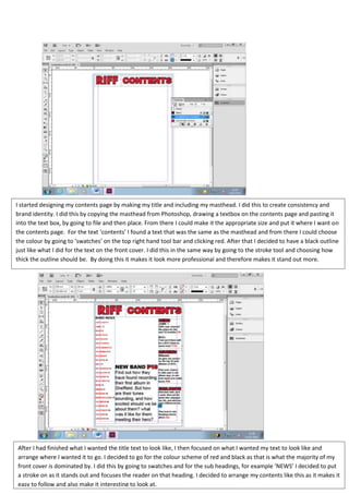
- 1. I started designing my contents page by making my title and including my masthead. I did this to create consistency and brand identity. I did this by copying the masthead from Photoshop, drawing a textbox on the contents page and pasting it into the text box, by going to file and then place. From there I could make it the appropriate size and put it where I want on the contents page. For the text ‘contents’ I found a text that was the same as the masthead and from there I could choose the colour by going to ‘swatches’ on the top right hand tool bar and clicking red. After that I decided to have a black outline just like what I did for the text on the front cover. I did this in the same way by going to the stroke tool and choosing how thick the outline should be. By doing this it makes it look more professional and therefore makes it stand out more. After I had finished what I wanted the title text to look like, I then focused on what I wanted my text to look like and arrange where I wanted it to go. I decided to go for the colour scheme of red and black as that is what the majority of my front cover is dominated by. I did this by going to swatches and for the sub headings, for example ‘NEWS’ I decided to put a stroke on as it stands out and focuses the reader on that heading. I decided to arrange my contents like this as it makes it easy to follow and also make it interesting to look at.
- 2. After that I added an image to my contents page. Firstly I manipulated it in Photoshop and made it black and white, I decided to do this as before there was a lot going on in my image, therefore by turning it black and white it makes the readers really focus on the image not the background. After editing my image, I drew out an image text box which is on the tool bar on the left hand side. After that I placed it in there by going to file and then place, then made it the right size and dragged it to where there was a blank space. Finally, I decided to have a background colour of blue. This is because it is bright and goes with the colours I chose on the front cover. I managed to do this background by using the rectangle tool and drew it round the whole of the contents page. After that I filled it by going to swatches and choosing this colour. However once I had done that it made the whole of the contents this colour meaning you couldn’t see the text. To make the background go to the back, I right clicked on the page, scrolled down to arrange and then clicked ‘send text to front’ so then you can see the text.