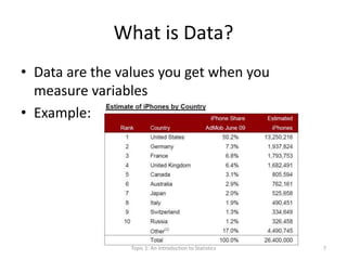
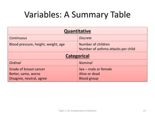
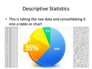
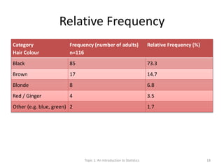
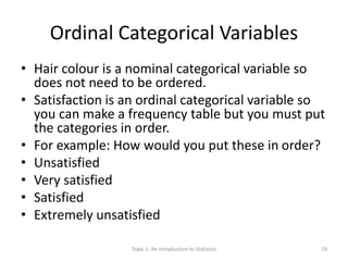
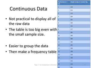
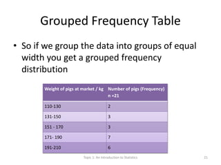
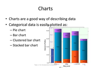
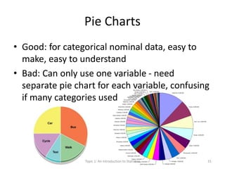
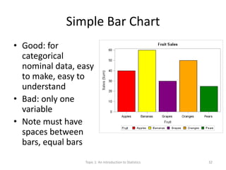
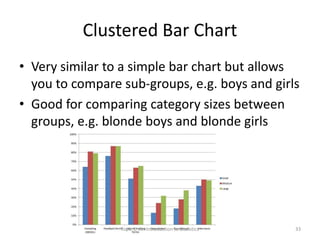
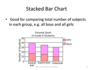
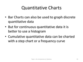
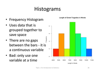
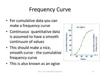
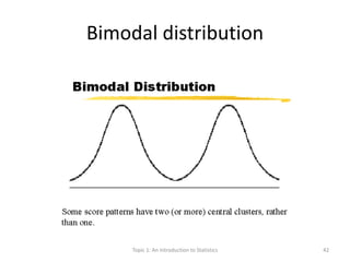
Topic 1
An Introduction to Statistics
Dr Luke Kane
April 2014
Topic 1: An Introduction to Statistics 1
OK… Rules – Very serious!
• YOU MUST ASK QUESTIONS
• If you dont understand - let's work it out!
• Otherwise – no rules
Topic 1: An Introduction to Statistics 2
What is Statistics?
• Statistics is the science of learning from data,
and of measuring, controlling, and
communicating uncertainty;
• it thereby provides the navigation essential for
controlling the course of scientific and societal
advances
Topic 1: An Introduction to Statistics 3
Outline
• Describing variables and data
• Descriptive statistics
– Tables
– Charts
– Shapes
Topic 1: An Introduction to Statistics 4
Objectives
• Define variable
• Define data
• Classify variables in quantitative or categorical
• Sub-classify quantitative variables into discrete or
continuous
• Sub-classify categorical variables into nominal or
ordinal
• Use the type of variable to determine which table and
chart to display it
• Understand the normal distribution and other shapes
Topic 1: An Introduction to Statistics 5
What is a Variable?
• A variable is something whose value can vary
• Examples (many!):
Topic 1: An Introduction to Statistics 6
What is Data?
• Data are the values you get when you
measure variables
• Example:
Topic 1: An Introduction to Statistics 7
Types of Variable
• Lots of different ways of thinking about
variables:
– Categorical vs. Metric
– Continuous vs. Categorical
I like this one:
Quantitative Vs Categorical
Topic 1: An Introduction to Statistics 8
Categorical Variables - "What type?”
• "Categories"
• Nominal:
– Unordered, order not important
– Male or female, dead/alive, Blood group A B AB O
• Ordinal:
– Ordered, order is important
– type of breast cancer, agree  neither agree nor
disagree disagree
Topic 1: An Introduction to Statistics 9
Categorical Variables
– Types of houses
– Days of the week
– Opinions/viewpoints
– Hair colour
– Malaria positive or negative
Topic 1: An Introduction to Statistics 10
Quantitative Variables - " How much?"
• Also known as metric
• Quantitative variables can be:
• Continuous:
– The variables come from measuring
– Have units of measurement
– Good for analysis
• Discrete:
– The variables come from counting
– The values are usually integer (whole number)
Topic 1: An Introduction to Statistics 11
Quantitative Variables
• Weight, Height
• Number of cigarettes per day
• Blood pressure
• How many malaria parasites in the blood
• Number of workers with malaria
Topic 1: An Introduction to Statistics 12
Variables: A Summary Table
Quantitative
Continuous Discrete
Blood pressure, height, weight, age Number of children
Number of asthma attacks per child
Categorical
Ordinal Nominal
Grade of breast cancer
Better, same, worse
Disagree, neutral, agree
Sex – male or female
Alive or dead
Blood group
Topic 1: An Introduction to Statistics 13
Variables – more!
• It is easy to summarise categorical variables
• You can convert quantitative variables into categorical variables
– For example, in diabetes it is dangerous when sugar is very low
– So a blood sugar of 1.6mmol/l is the quantitative measurement
– You can place this in a low, normal or high range (which makes it a categorical
variable)
– 1.6 is low - patient needs treatment (sugar!)
• Continuous variables allow better analysis as they are the real numbers
• Tests have more power if used on continuous variables
• So it is better to use continuous variables for statistical analysis
• Better to use categorical variables for summarising results and
presentation
Topic 1: An Introduction to Statistics 14
Descriptive Statistics
• This is taking the raw data and consolidating it
into a table or chart
Topic 1: An Introduction to Statistics 15
Descriptive Statistics
• Frequency tables
• Relative frequency tables
• Grouping the data
• Open ended groups
• Cumulative frequency
• Cross tabulation
Topic 1: An Introduction to Statistics 16
Frequency Tables
• Nominal Categorical Variables
• Start with largest
• Tell reader what the total number is (n = X)
Category
Hair Colour
Frequency (number of adults)
n=116
Black 85
Brown 17
Blonde 8
Red / Ginger 4
Other (e.g. blue, green) 2
Topic 1: An Introduction to Statistics 17
Relative Frequency
Category
Hair Colour
Frequency (number of adults)
n=116
Relative Frequency (%)
Black 85 73.3
Brown 17 14.7
Blonde 8 6.8
Red / Ginger 4 3.5
Other (e.g. blue, green) 2 1.7
Topic 1: An Introduction to Statistics 18
Ordinal Categorical Variables
• Hair colour is a nominal categorical variable so
does not need to be ordered.
• Satisfaction is an ordinal categorical variable so
you can make a frequency table but you must put
the categories in order.
• For example: How would you put these in order?
• Unsatisfied
• Very satisfied
• Satisfied
• Extremely unsatisfied
Topic 1: An Introduction to Statistics 19
Continuous Data
• Not practical to display all of
the raw data
• The table is too big even with
the small sample size.
• Easier to group the data
• Then make a frequency table
Pig Number (n =
21)
Weight of pigs at market / Kg
1 120
2 210
3 110
4 209
5 205
6 164
7 145
8 177
9 185
10 184
11 180
12 183
13 182
14 190
15 198
16 134
17 140
18 156
19 154
20 201
Topic 1: An Introduction to Statistics 20
Grouped Frequency Table
• So if we group the data into groups of equal
width you get a grouped frequency
distribution
Weight of pigs at market / kg Number of pigs (Frequency)
n =21
110-130 2
131-150 3
151 - 170 3
171- 190 7
191-210 6
Topic 1: An Introduction to Statistics 21
Outliers
• This is fine if all the data is close
together
– i.e. if all the pigs weigh about the
same
– But what do you do if there are
some giant pigs and some tiny pigs?
– Like if you added two extra pigs to
our data set:
• a pig weighing 54kg
• one big one weighing 327kg
Weight of pigs
at market / kg
Number of pigs
(Frequency) n =21
51-70 1
71-90 0
91-110 0
111-130 2
131-150 3
151 – 170 3
171- 190 7
191-210 0
211-230 0
231-250 0
251-270 0
271 – 290 0
291 – 310 0
311 – 330 1
Topic 1: An Introduction to Statistics 22
Open Ended Groups
• The big and small pig are called Outliers.
• To make things easier you can use open ended
groups at the top and bottom
Weight of pigs at market / kg Number of pigs (Frequency) n =21
≤110 1
111-130 2
131-150 3
151 - 170 3
171- 190 7
191-210 6
≥211 1
Topic 1: An Introduction to Statistics 23
Symbols
• > More than
• < Less than
• ≥ Equal to or more than
• ≤ Equal to or more than
Topic 1: An Introduction to Statistics 24
Cumulative Frequency
• Adding up (cumulate) the frequencies as you
go along
• Enables you to make a nice chart - see later
• For example, the lengths of snakes below
Length of snake / cm Frequency (number of
snakes) n = 61
Cumulative frequency
of snakes
<30 10 10
31-60 17 27 (=10+17)
61-90 19 46 (=10+17+19)
91-120 12 58 (=10+17+19+12)
>121 3 61 (10+17=+19+12+3)Topic 1: An Introduction to Statistics 25
Cross-Tabulation
• Everything so far has been a table of a single
variable
• Sometimes you want to look at how two
variables influence one sample
• Crosstab - is the combination of two variables
Topic 1: An Introduction to Statistics 26
Cross Tab Example
• Does drinking alcohol affect the number of
accidents people have on motorbikes?
• What are the two variables?
• The two variables are accidents and drinking
• If there was a big party and you breathalysed
500 people leaving, you could determine if
they were above or below the drink-drive
limit. You could then ask them the next day if
there was an accident on their way home.
Topic 1: An Introduction to Statistics 27
Cross Tab Example
Accident on way
home?
Above the alcohol limit?
Yes No
Yes 40 2
No 116 342
Total 156 344
Topic 1: An Introduction to Statistics 28
Cross Tab Example
• You can then convert this into percentages by adding up
the columns and rows.
• It is very easy to see that over 99% of the sober drivers did
not have accidents and more than 1 in 4 of the drunk
drivers had accidents
• Dont drink and drive!
Accident on way
home?
Above the alcohol limit?
Yes No
Yes 25.6% 0.6%
No 74.4% 99.4%
Topic 1: An Introduction to Statistics 29
Charts
• Charts are a good way of describing data
• Categorical data is easily plotted as:
– Pie chart
– Bar chart
– Clustered bar chart
– Stacked bar chart
Topic 1: An Introduction to Statistics 30
Pie Charts
• Good: for categorical nominal data, easy to
make, easy to understand
• Bad: Can only use one variable - need
separate pie chart for each variable, confusing
if many categories used
Topic 1: An Introduction to Statistics 31
Simple Bar Chart
• Good: for
categorical
nominal data, easy
to make, easy to
understand
• Bad: only one
variable
• Note must have
spaces between
bars, equal bars
Topic 1: An Introduction to Statistics 32
Clustered Bar Chart
• Very similar to a simple bar chart but allows
you to compare sub-groups, e.g. boys and girls
• Good for comparing category sizes between
groups, e.g. blonde boys and blonde girls
Topic 1: An Introduction to Statistics 33
Stacked Bar Chart
• Good for comparing total number of subjects
in each group, e.g. all boys and all girls
Topic 1: An Introduction to Statistics 34
Quantitative Charts
• Bar Charts can also be used to graph discrete
quantitative data
• But for continuous quantitative data it is
better to use a histogram
• Cumulative quantitative data can be charted
with a step chart or a frequency curve
Topic 1: An Introduction to Statistics 35
Histograms
• Frequency Histogram
• Uses data that is
grouped together to
save space
• There are no gaps
between the bars - it is
a continuous variable
• Bad: only use one
variable at a time
Topic 1: An Introduction to Statistics 36
Frequency Curve
• For cumulative data you can
make a frequency curve
• Continuous quantitative data
is assumed to have a smooth
continuum of values
• This should make a nice,
smooth curve - the cumulative
frequency curve
• This is also known as an ogive
Topic 1: An Introduction to Statistics 37
Frequency Curve - Snakes
• So if we take the snakes:
Length of snake / cm Frequency (number of
snakes) n = 61
Cumulative frequency
of snakes
% Cumulative
frequency of snakes
<30 10 10 10/61 = 16.4%
31-60 17 27 27/61 = 44.3%
61-90 19 46 75.4%
91-120 12 58 95.1%
>121 3 61 100%
0.00%
20.00%
40.00%
60.00%
80.00%
100.00%
120.00%
<30 31-60 61-90 91-120 >121Topic 1: An Introduction to Statistics 38
Shapes
• OK now we have charts
– how do you describe data from the shape of the
graph?
• A uniform distribution is evenly distributed
– "A normal curve represents perfectly symmetrical
distribution"
– Also known as a "bell shape"
• Then you have "skews" to the left or right
– Left skews are negatively skewed
– Right skews are positively skewed
• Bimodal distributions have two humps
Topic 1: An Introduction to Statistics 39
Normal distribution
Topic 1: An Introduction to Statistics 40
Skew
• A measure of the asymmetry
Topic 1: An Introduction to Statistics 41
Bimodal distribution
Topic 1: An Introduction to Statistics 42
Summary so far…
• Types of data and variables
• Ways to put this data in tables
• Ways to put this data in charts
• Ways to examine the shape of the data
• Next: TOPIC 2
– Using numbers to summarise the data
– Prevalence and Incidence
Topic 1: An Introduction to Statistics 43
References
• This lecture is based on David Bowers
“Medical statistics from Scratch: An
introduction for health professionals”
• Bowers, D. (2008) Medical Statistics from
Scratch: An Introduction for Health
Professionals. USA: Wiley-Interscience.
Topic 1: An Introduction to Statistics 44

Statistics for the Health Scientist: Basic Statistics I

  • 1.
    Topic 1 An Introductionto Statistics Dr Luke Kane April 2014 Topic 1: An Introduction to Statistics 1
  • 2.
    OK… Rules –Very serious! • YOU MUST ASK QUESTIONS • If you dont understand - let's work it out! • Otherwise – no rules Topic 1: An Introduction to Statistics 2
  • 3.
    What is Statistics? •Statistics is the science of learning from data, and of measuring, controlling, and communicating uncertainty; • it thereby provides the navigation essential for controlling the course of scientific and societal advances Topic 1: An Introduction to Statistics 3
  • 4.
    Outline • Describing variablesand data • Descriptive statistics – Tables – Charts – Shapes Topic 1: An Introduction to Statistics 4
  • 5.
    Objectives • Define variable •Define data • Classify variables in quantitative or categorical • Sub-classify quantitative variables into discrete or continuous • Sub-classify categorical variables into nominal or ordinal • Use the type of variable to determine which table and chart to display it • Understand the normal distribution and other shapes Topic 1: An Introduction to Statistics 5
  • 6.
    What is aVariable? • A variable is something whose value can vary • Examples (many!): Topic 1: An Introduction to Statistics 6
  • 7.
    What is Data? •Data are the values you get when you measure variables • Example: Topic 1: An Introduction to Statistics 7
  • 8.
    Types of Variable •Lots of different ways of thinking about variables: – Categorical vs. Metric – Continuous vs. Categorical I like this one: Quantitative Vs Categorical Topic 1: An Introduction to Statistics 8
  • 9.
    Categorical Variables -"What type?” • "Categories" • Nominal: – Unordered, order not important – Male or female, dead/alive, Blood group A B AB O • Ordinal: – Ordered, order is important – type of breast cancer, agree  neither agree nor disagree disagree Topic 1: An Introduction to Statistics 9
  • 10.
    Categorical Variables – Typesof houses – Days of the week – Opinions/viewpoints – Hair colour – Malaria positive or negative Topic 1: An Introduction to Statistics 10
  • 11.
    Quantitative Variables -" How much?" • Also known as metric • Quantitative variables can be: • Continuous: – The variables come from measuring – Have units of measurement – Good for analysis • Discrete: – The variables come from counting – The values are usually integer (whole number) Topic 1: An Introduction to Statistics 11
  • 12.
    Quantitative Variables • Weight,Height • Number of cigarettes per day • Blood pressure • How many malaria parasites in the blood • Number of workers with malaria Topic 1: An Introduction to Statistics 12
  • 13.
    Variables: A SummaryTable Quantitative Continuous Discrete Blood pressure, height, weight, age Number of children Number of asthma attacks per child Categorical Ordinal Nominal Grade of breast cancer Better, same, worse Disagree, neutral, agree Sex – male or female Alive or dead Blood group Topic 1: An Introduction to Statistics 13
  • 14.
    Variables – more! •It is easy to summarise categorical variables • You can convert quantitative variables into categorical variables – For example, in diabetes it is dangerous when sugar is very low – So a blood sugar of 1.6mmol/l is the quantitative measurement – You can place this in a low, normal or high range (which makes it a categorical variable) – 1.6 is low - patient needs treatment (sugar!) • Continuous variables allow better analysis as they are the real numbers • Tests have more power if used on continuous variables • So it is better to use continuous variables for statistical analysis • Better to use categorical variables for summarising results and presentation Topic 1: An Introduction to Statistics 14
  • 15.
    Descriptive Statistics • Thisis taking the raw data and consolidating it into a table or chart Topic 1: An Introduction to Statistics 15
  • 16.
    Descriptive Statistics • Frequencytables • Relative frequency tables • Grouping the data • Open ended groups • Cumulative frequency • Cross tabulation Topic 1: An Introduction to Statistics 16
  • 17.
    Frequency Tables • NominalCategorical Variables • Start with largest • Tell reader what the total number is (n = X) Category Hair Colour Frequency (number of adults) n=116 Black 85 Brown 17 Blonde 8 Red / Ginger 4 Other (e.g. blue, green) 2 Topic 1: An Introduction to Statistics 17
  • 18.
    Relative Frequency Category Hair Colour Frequency(number of adults) n=116 Relative Frequency (%) Black 85 73.3 Brown 17 14.7 Blonde 8 6.8 Red / Ginger 4 3.5 Other (e.g. blue, green) 2 1.7 Topic 1: An Introduction to Statistics 18
  • 19.
    Ordinal Categorical Variables •Hair colour is a nominal categorical variable so does not need to be ordered. • Satisfaction is an ordinal categorical variable so you can make a frequency table but you must put the categories in order. • For example: How would you put these in order? • Unsatisfied • Very satisfied • Satisfied • Extremely unsatisfied Topic 1: An Introduction to Statistics 19
  • 20.
    Continuous Data • Notpractical to display all of the raw data • The table is too big even with the small sample size. • Easier to group the data • Then make a frequency table Pig Number (n = 21) Weight of pigs at market / Kg 1 120 2 210 3 110 4 209 5 205 6 164 7 145 8 177 9 185 10 184 11 180 12 183 13 182 14 190 15 198 16 134 17 140 18 156 19 154 20 201 Topic 1: An Introduction to Statistics 20
  • 21.
    Grouped Frequency Table •So if we group the data into groups of equal width you get a grouped frequency distribution Weight of pigs at market / kg Number of pigs (Frequency) n =21 110-130 2 131-150 3 151 - 170 3 171- 190 7 191-210 6 Topic 1: An Introduction to Statistics 21
  • 22.
    Outliers • This isfine if all the data is close together – i.e. if all the pigs weigh about the same – But what do you do if there are some giant pigs and some tiny pigs? – Like if you added two extra pigs to our data set: • a pig weighing 54kg • one big one weighing 327kg Weight of pigs at market / kg Number of pigs (Frequency) n =21 51-70 1 71-90 0 91-110 0 111-130 2 131-150 3 151 – 170 3 171- 190 7 191-210 0 211-230 0 231-250 0 251-270 0 271 – 290 0 291 – 310 0 311 – 330 1 Topic 1: An Introduction to Statistics 22
  • 23.
    Open Ended Groups •The big and small pig are called Outliers. • To make things easier you can use open ended groups at the top and bottom Weight of pigs at market / kg Number of pigs (Frequency) n =21 ≤110 1 111-130 2 131-150 3 151 - 170 3 171- 190 7 191-210 6 ≥211 1 Topic 1: An Introduction to Statistics 23
  • 24.
    Symbols • > Morethan • < Less than • ≥ Equal to or more than • ≤ Equal to or more than Topic 1: An Introduction to Statistics 24
  • 25.
    Cumulative Frequency • Addingup (cumulate) the frequencies as you go along • Enables you to make a nice chart - see later • For example, the lengths of snakes below Length of snake / cm Frequency (number of snakes) n = 61 Cumulative frequency of snakes <30 10 10 31-60 17 27 (=10+17) 61-90 19 46 (=10+17+19) 91-120 12 58 (=10+17+19+12) >121 3 61 (10+17=+19+12+3)Topic 1: An Introduction to Statistics 25
  • 26.
    Cross-Tabulation • Everything sofar has been a table of a single variable • Sometimes you want to look at how two variables influence one sample • Crosstab - is the combination of two variables Topic 1: An Introduction to Statistics 26
  • 27.
    Cross Tab Example •Does drinking alcohol affect the number of accidents people have on motorbikes? • What are the two variables? • The two variables are accidents and drinking • If there was a big party and you breathalysed 500 people leaving, you could determine if they were above or below the drink-drive limit. You could then ask them the next day if there was an accident on their way home. Topic 1: An Introduction to Statistics 27
  • 28.
    Cross Tab Example Accidenton way home? Above the alcohol limit? Yes No Yes 40 2 No 116 342 Total 156 344 Topic 1: An Introduction to Statistics 28
  • 29.
    Cross Tab Example •You can then convert this into percentages by adding up the columns and rows. • It is very easy to see that over 99% of the sober drivers did not have accidents and more than 1 in 4 of the drunk drivers had accidents • Dont drink and drive! Accident on way home? Above the alcohol limit? Yes No Yes 25.6% 0.6% No 74.4% 99.4% Topic 1: An Introduction to Statistics 29
  • 30.
    Charts • Charts area good way of describing data • Categorical data is easily plotted as: – Pie chart – Bar chart – Clustered bar chart – Stacked bar chart Topic 1: An Introduction to Statistics 30
  • 31.
    Pie Charts • Good:for categorical nominal data, easy to make, easy to understand • Bad: Can only use one variable - need separate pie chart for each variable, confusing if many categories used Topic 1: An Introduction to Statistics 31
  • 32.
    Simple Bar Chart •Good: for categorical nominal data, easy to make, easy to understand • Bad: only one variable • Note must have spaces between bars, equal bars Topic 1: An Introduction to Statistics 32
  • 33.
    Clustered Bar Chart •Very similar to a simple bar chart but allows you to compare sub-groups, e.g. boys and girls • Good for comparing category sizes between groups, e.g. blonde boys and blonde girls Topic 1: An Introduction to Statistics 33
  • 34.
    Stacked Bar Chart •Good for comparing total number of subjects in each group, e.g. all boys and all girls Topic 1: An Introduction to Statistics 34
  • 35.
    Quantitative Charts • BarCharts can also be used to graph discrete quantitative data • But for continuous quantitative data it is better to use a histogram • Cumulative quantitative data can be charted with a step chart or a frequency curve Topic 1: An Introduction to Statistics 35
  • 36.
    Histograms • Frequency Histogram •Uses data that is grouped together to save space • There are no gaps between the bars - it is a continuous variable • Bad: only use one variable at a time Topic 1: An Introduction to Statistics 36
  • 37.
    Frequency Curve • Forcumulative data you can make a frequency curve • Continuous quantitative data is assumed to have a smooth continuum of values • This should make a nice, smooth curve - the cumulative frequency curve • This is also known as an ogive Topic 1: An Introduction to Statistics 37
  • 38.
    Frequency Curve -Snakes • So if we take the snakes: Length of snake / cm Frequency (number of snakes) n = 61 Cumulative frequency of snakes % Cumulative frequency of snakes <30 10 10 10/61 = 16.4% 31-60 17 27 27/61 = 44.3% 61-90 19 46 75.4% 91-120 12 58 95.1% >121 3 61 100% 0.00% 20.00% 40.00% 60.00% 80.00% 100.00% 120.00% <30 31-60 61-90 91-120 >121Topic 1: An Introduction to Statistics 38
  • 39.
    Shapes • OK nowwe have charts – how do you describe data from the shape of the graph? • A uniform distribution is evenly distributed – "A normal curve represents perfectly symmetrical distribution" – Also known as a "bell shape" • Then you have "skews" to the left or right – Left skews are negatively skewed – Right skews are positively skewed • Bimodal distributions have two humps Topic 1: An Introduction to Statistics 39
  • 40.
    Normal distribution Topic 1:An Introduction to Statistics 40
  • 41.
    Skew • A measureof the asymmetry Topic 1: An Introduction to Statistics 41
  • 42.
    Bimodal distribution Topic 1:An Introduction to Statistics 42
  • 43.
    Summary so far… •Types of data and variables • Ways to put this data in tables • Ways to put this data in charts • Ways to examine the shape of the data • Next: TOPIC 2 – Using numbers to summarise the data – Prevalence and Incidence Topic 1: An Introduction to Statistics 43
  • 44.
    References • This lectureis based on David Bowers “Medical statistics from Scratch: An introduction for health professionals” • Bowers, D. (2008) Medical Statistics from Scratch: An Introduction for Health Professionals. USA: Wiley-Interscience. Topic 1: An Introduction to Statistics 44