Download to read offline
![Some Examples in R- [Data Visualization--R graphics]
and others..
library(rpart.plot),library(rCharts),library(plyr),library(knitr),
library(reshape2),library(scales)
Reference:
https://github.com/ramnathv/rCharts/tree/master/inst/libraries
http://www.rpubs.com/dnchari/rcharts
rCharts package by Ramnath Vaidyanathan
Prepared by Volkan OBAN](https://image.slidesharecdn.com/rchart-160729210112/85/Some-Examples-in-R-Data-Visualization-R-graphics-1-320.jpg)


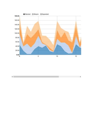
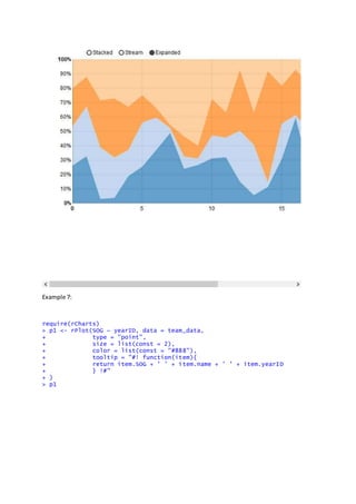
![Example6:
dat <- data.frame(
t = rep(0:23, each= 4),
var = rep(LETTERS[1:4],4),
val = round(runif(4*24,0,50)) )
p<- nPlot(val ~t,group = 'var', data = dat, type = 'stackedAreaChart',id='chart' )
p](https://image.slidesharecdn.com/rchart-160729210112/85/Some-Examples-in-R-Data-Visualization-R-graphics-6-320.jpg)

![> myteam = "Boston Red Sox"
> p1$layer(data = team_data[team_data$name == myteam,],
+ color = list(const = 'red'),
+ copy_layer = T)
> p1$set(dom = 'chart3')
> p1
>](https://image.slidesharecdn.com/rchart-160729210112/85/Some-Examples-in-R-Data-Visualization-R-graphics-10-320.jpg)


![Example:
ecm = reshape2::melt(economics[,c('date', 'uempmed', 'psavert')], id = 'dat
e')
p7 = nPlot(value ~ date, group = 'variable', data = ecm, type = 'lineWithFo
cusChart')
p7$xAxis( tickFormat="#!function(d) {return d3.time.format('%b %Y')(new Dat
e( d * 86400000 ));}!#" )
p7](https://image.slidesharecdn.com/rchart-160729210112/85/Some-Examples-in-R-Data-Visualization-R-graphics-16-320.jpg)


This document provides examples of creating various types of charts and plots using the rCharts package in R. It includes examples of creating point, bar, pie, line, stacked area, multi-bar, box, tile and map charts from different datasets. The rCharts package allows interactive charts to be created that can be embedded within R Markdown or Shiny applications.


![Some R Examples[R table and Graphics] -Advanced Data Visualization in R (Some...](https://cdn.slidesharecdn.com/ss_thumbnails/exampless-160922204223-thumbnail.jpg?width=640&height=640&fit=bounds)