Download as PDF, PPTX


![Data
Visualization in
R
Olga Scrivner
ggplot2
googleVis
plotly
igraph
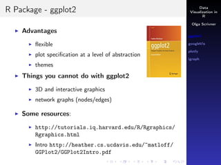
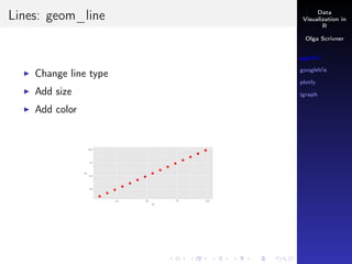
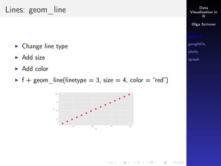
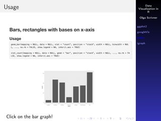
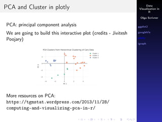
Smoother: geom_smooth()
Let’s select HAWAII from mydata:
mydata[State ==“HI”, ]
attach(mydata)
p <- ggplot(mydata[State == "HI", ],
aes(x = Year, y = Home.Value))
p + geom_point() + geom_smooth()](https://image.slidesharecdn.com/r-visualization-170310193231/85/R-visualization-ggplot2-googlevis-plotly-igraph-Overview-19-320.jpg)
![Data
Visualization in
R
Olga Scrivner
ggplot2
googleVis
plotly
igraph
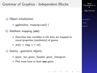
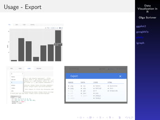
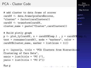
Conditions
& means AND
| means OR
How would you extract two states HAWAII and DC from
mydata? AND or OR?
mydata[State == “HI” | State == “DC” ,]](https://image.slidesharecdn.com/r-visualization-170310193231/85/R-visualization-ggplot2-googlevis-plotly-igraph-Overview-21-320.jpg)
![Data
Visualization in
R
Olga Scrivner
ggplot2
googleVis
plotly
igraph
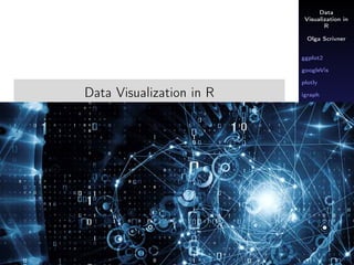
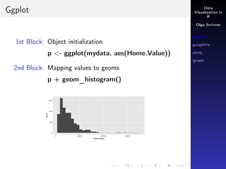
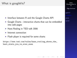
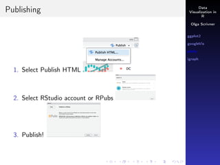
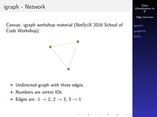
Conditions
& means AND
| means OR
How would you extract two states HAWAII and DC from
mydata? AND or OR?
mydata[State == “HI” | State == “DC” ,]
p <- ggplot(mydata[State == "HI" | State == "DC" ,],
aes(x = Year, y = Home.Value, color = State))
p + geom_point() + geom_smooth()](https://image.slidesharecdn.com/r-visualization-170310193231/85/R-visualization-ggplot2-googlevis-plotly-igraph-Overview-22-320.jpg)


![Data
Visualization in
R
Olga Scrivner
ggplot2
googleVis
plotly
igraph
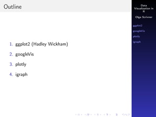
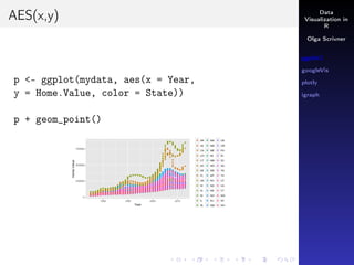
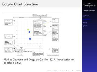
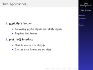
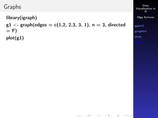
ggplotly()
Let’s revisit mydata
attach(mydata)
p <- ggplot(mydata[State == "HI" | State == "DC" ,],
aes(x = Year, y = Home.Value, color=State))
p <- p + geom_point() + geom_smooth()
ggplotly(p)](https://image.slidesharecdn.com/r-visualization-170310193231/85/R-visualization-ggplot2-googlevis-plotly-igraph-Overview-38-320.jpg)


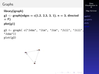


The document provides an extensive overview of data visualization techniques in R, focusing on the use of several packages including ggplot2, googlevis, plotly, and igraph. It covers topics such as the grammar of graphics, plot creation, and interactive visualizations along with practical examples and resources for each method. Additionally, it addresses the capabilities of each package and their integration for creating effective visual representations of data.