School Magazine Evaluation
Front Cover.
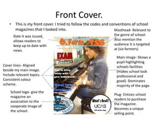
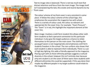
    • This is my front cover. I tried to follow the codes and conventions of school
      magazines that I looked into.                             Masthead- Relevant to
      Date it was issued,                                       the genre of school.
      allows readers to                                         Also mention the
      keep up to date with                                      audience it is targeted
      news.                                                     at (six formers)

                                                                 Main image- Shows a
                                                                 pupil highlighting
Cover lines- Aligned                                             schools facilities
beside my main image.                                            (makes school look
Include relevant topics.                                         professional and
Consistent colour                                                good). Dominates
scheme.                                                          majority of the page.
    School logo- give the
                                                                Plug- Entices school
    magazine an
                                                                readers to purchase
    association to the
                                                                the magazine.
    cooperate image of
                                                                Becomes a unique
    the school.
                                                                selling point.
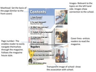
Images- Relevant to the
                                                   topics on the left hand
Masthead- Set the basis of                         side. Images show
the page (Similar to the                           connection to the school.
front cover)


                                                    Cover lines- entices
Page number- The                                    readers to read the
enables reader to easily                            magazine.
navigate themselves
through the magazine.
Follows the magazine
house style.


                             Transparent image of school- show
                             the association with school.
How my school magazine relates to
       the target audience?
• From my initial ideas and sketches, I made it clear that I
  wanted to produces a magazine that will be targeted at
  sixth form students. Due to this I was able to set up the
  content that will be included and that codes and
  conventions that I will follow. The reason my school
  magazine is aimed at sixth form students is because I
  felt that this a crucial time for them in their life and
  creating a magazine to help them along the way would
  be most beneficial for them. This is why I mention
  cover lines such as ‘Exam Pressure’ and ‘UCAS’.
  Moreover, sixth formers would also see my magazine
  as something to read while relaxing, for example in
  their free periods.
Text to image ratio is balanced. There is not too much text that
distract attention and focus from the main image. The image itself
isn’t overpowering the text, this create and neutral dynamic to my
front cover.

The colour scheme of my front cover is very consistent is some
place. It follow the colour scheme of the school logo, this
emphasises the association the magazine has with school.
There is a variety of colour used, the colour as relevant and
appropriate for the cover lines. For example- “Exam Pressure”-
The “Exam” is in red, this highlight the important element of the
cover line.

Main image- Involves a sixth form student this allows other sixth
form students to feel a personal connection to this particular
individual. It also give the target audience a chance to relate
themselves to this person on the main cover. The clothing the
young girl wears is not inappropriate and emphasises sixth form
students freedom in the school. The non-uniform also shows that
each student is able to represent them individually. There is a use
of high key lighting, this adds a friendly approach to the magazine.
Placing a girl with an Asian ethnicity perhaps suggests a cultural
diversity in the school, however this isn’t entirely clear because
only one student is on the cover (If there were more students with
different ethnicities this could be supported). If this was done then
maybe my different people in my target audience could relate to
the magazine.
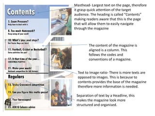
Masthead- Largest text on the page, therefore
it grasp quick attention of the target
audience. The heading is called “Contents”
making readers aware that this is the page
that will allow them to easily navigate
through the magazine


         The content of the magazine is
         aligned is a column. This
         follows the codes and
         conventions of a magazine.


  Text to Image ratio- There is more texts are
  opposed to images. This is because to
  contents provides the base of the magazine
  therefore more information is needed.

 Separation of text by a Headline, this
 makes the magazine look more
 structured and organised.
How my magazine relates to my target
       audience- Language
• The language used in my magazine isn’t overly technical and difficult to
  read. In contrast it is very complex and may even be easily read by lower
  years in school, despite my target audience being sixth formers. The
  reason for this is because if the language was overly challenging no
  student would read my magazine, therefore making it very complex
  become less intimidating for student and may be more enjoyable to read.
• The phrases used such as “Exam”, “Pressure” etc. is all linked to the daily
  lives of sixth form pupils. From this my target audience may infer that this
  magazine will help them overcome factors such as this.
• The Masthead of my magazine is self explanatory as it says “6th Form at
  TSS”. This produces a direct link with sixth form students and the
  magazine, as it addressees them in one of the first things they may see.
  The acronyms ‘TSS’ will be clear for students at this school, as they will be
  able to recognise this as Titus Salt School. This shows that this magazine is
  only for sixth form pupils at this school and not anywhere else.
What I have learnt about technologies from the
     process of constructing this product?
• I have advance my Photoshop skill and have a greater knowledge of
  various tools and what they do. These skills will enable me to create a
  professional magazine for my main task. (I have become comfortable with
  using tools such as the ‘Polygonal Lasso Tool’, The text tool and have learnt
  how to add drop shadow to layers.)
• I have learned how to edit the contrast of images (Like the one on my
  contents page). This gives the images a professional look, which then
  make the magazine seem trustworthy and reliable.
• I have discovered how to use new websites such as ‘Slide share’ this allow
  me to present my evidence effectively.
What I have learnt about technologies from the
    process of constructing this product?

• Furthermore, I have discovered how digital
  technology helps with the process of
  constructing a magazine. This is by digital
  cameras, this creates a clear image which
  through editing can be made to look
  professional. This process can be completed
  by applying a USB cable to transfer photo’s
  onto the computer.
What I have learnt from my preliminary task
     that I can carry onto my main task?
• I have developed my skills in Photoshop, and now have
  a greater understanding of what tools are for what.
• I have become familiar with the codes and convention
  that should be included in magazines and how this
  differs from magazine to magazine depending on the
  target audience.
• I have learnt that planning is crucial, this means that
  the product can easily be created and look more
  professional.
• I have learnt how different languages appeal to
  different audiences.

School magazine evaluation

  • 1.
  • 2.
    Front Cover. • This is my front cover. I tried to follow the codes and conventions of school magazines that I looked into. Masthead- Relevant to Date it was issued, the genre of school. allows readers to Also mention the keep up to date with audience it is targeted news. at (six formers) Main image- Shows a pupil highlighting Cover lines- Aligned schools facilities beside my main image. (makes school look Include relevant topics. professional and Consistent colour good). Dominates scheme. majority of the page. School logo- give the Plug- Entices school magazine an readers to purchase association to the the magazine. cooperate image of Becomes a unique the school. selling point.
  • 3.
    Images- Relevant tothe topics on the left hand Masthead- Set the basis of side. Images show the page (Similar to the connection to the school. front cover) Cover lines- entices Page number- The readers to read the enables reader to easily magazine. navigate themselves through the magazine. Follows the magazine house style. Transparent image of school- show the association with school.
  • 4.
    How my schoolmagazine relates to the target audience? • From my initial ideas and sketches, I made it clear that I wanted to produces a magazine that will be targeted at sixth form students. Due to this I was able to set up the content that will be included and that codes and conventions that I will follow. The reason my school magazine is aimed at sixth form students is because I felt that this a crucial time for them in their life and creating a magazine to help them along the way would be most beneficial for them. This is why I mention cover lines such as ‘Exam Pressure’ and ‘UCAS’. Moreover, sixth formers would also see my magazine as something to read while relaxing, for example in their free periods.
  • 5.
    Text to imageratio is balanced. There is not too much text that distract attention and focus from the main image. The image itself isn’t overpowering the text, this create and neutral dynamic to my front cover. The colour scheme of my front cover is very consistent is some place. It follow the colour scheme of the school logo, this emphasises the association the magazine has with school. There is a variety of colour used, the colour as relevant and appropriate for the cover lines. For example- “Exam Pressure”- The “Exam” is in red, this highlight the important element of the cover line. Main image- Involves a sixth form student this allows other sixth form students to feel a personal connection to this particular individual. It also give the target audience a chance to relate themselves to this person on the main cover. The clothing the young girl wears is not inappropriate and emphasises sixth form students freedom in the school. The non-uniform also shows that each student is able to represent them individually. There is a use of high key lighting, this adds a friendly approach to the magazine. Placing a girl with an Asian ethnicity perhaps suggests a cultural diversity in the school, however this isn’t entirely clear because only one student is on the cover (If there were more students with different ethnicities this could be supported). If this was done then maybe my different people in my target audience could relate to the magazine.
  • 6.
    Masthead- Largest texton the page, therefore it grasp quick attention of the target audience. The heading is called “Contents” making readers aware that this is the page that will allow them to easily navigate through the magazine The content of the magazine is aligned is a column. This follows the codes and conventions of a magazine. Text to Image ratio- There is more texts are opposed to images. This is because to contents provides the base of the magazine therefore more information is needed. Separation of text by a Headline, this makes the magazine look more structured and organised.
  • 7.
    How my magazinerelates to my target audience- Language • The language used in my magazine isn’t overly technical and difficult to read. In contrast it is very complex and may even be easily read by lower years in school, despite my target audience being sixth formers. The reason for this is because if the language was overly challenging no student would read my magazine, therefore making it very complex become less intimidating for student and may be more enjoyable to read. • The phrases used such as “Exam”, “Pressure” etc. is all linked to the daily lives of sixth form pupils. From this my target audience may infer that this magazine will help them overcome factors such as this. • The Masthead of my magazine is self explanatory as it says “6th Form at TSS”. This produces a direct link with sixth form students and the magazine, as it addressees them in one of the first things they may see. The acronyms ‘TSS’ will be clear for students at this school, as they will be able to recognise this as Titus Salt School. This shows that this magazine is only for sixth form pupils at this school and not anywhere else.
  • 8.
    What I havelearnt about technologies from the process of constructing this product? • I have advance my Photoshop skill and have a greater knowledge of various tools and what they do. These skills will enable me to create a professional magazine for my main task. (I have become comfortable with using tools such as the ‘Polygonal Lasso Tool’, The text tool and have learnt how to add drop shadow to layers.) • I have learned how to edit the contrast of images (Like the one on my contents page). This gives the images a professional look, which then make the magazine seem trustworthy and reliable. • I have discovered how to use new websites such as ‘Slide share’ this allow me to present my evidence effectively.
  • 9.
    What I havelearnt about technologies from the process of constructing this product? • Furthermore, I have discovered how digital technology helps with the process of constructing a magazine. This is by digital cameras, this creates a clear image which through editing can be made to look professional. This process can be completed by applying a USB cable to transfer photo’s onto the computer.
  • 10.
    What I havelearnt from my preliminary task that I can carry onto my main task? • I have developed my skills in Photoshop, and now have a greater understanding of what tools are for what. • I have become familiar with the codes and convention that should be included in magazines and how this differs from magazine to magazine depending on the target audience. • I have learnt that planning is crucial, this means that the product can easily be created and look more professional. • I have learnt how different languages appeal to different audiences.