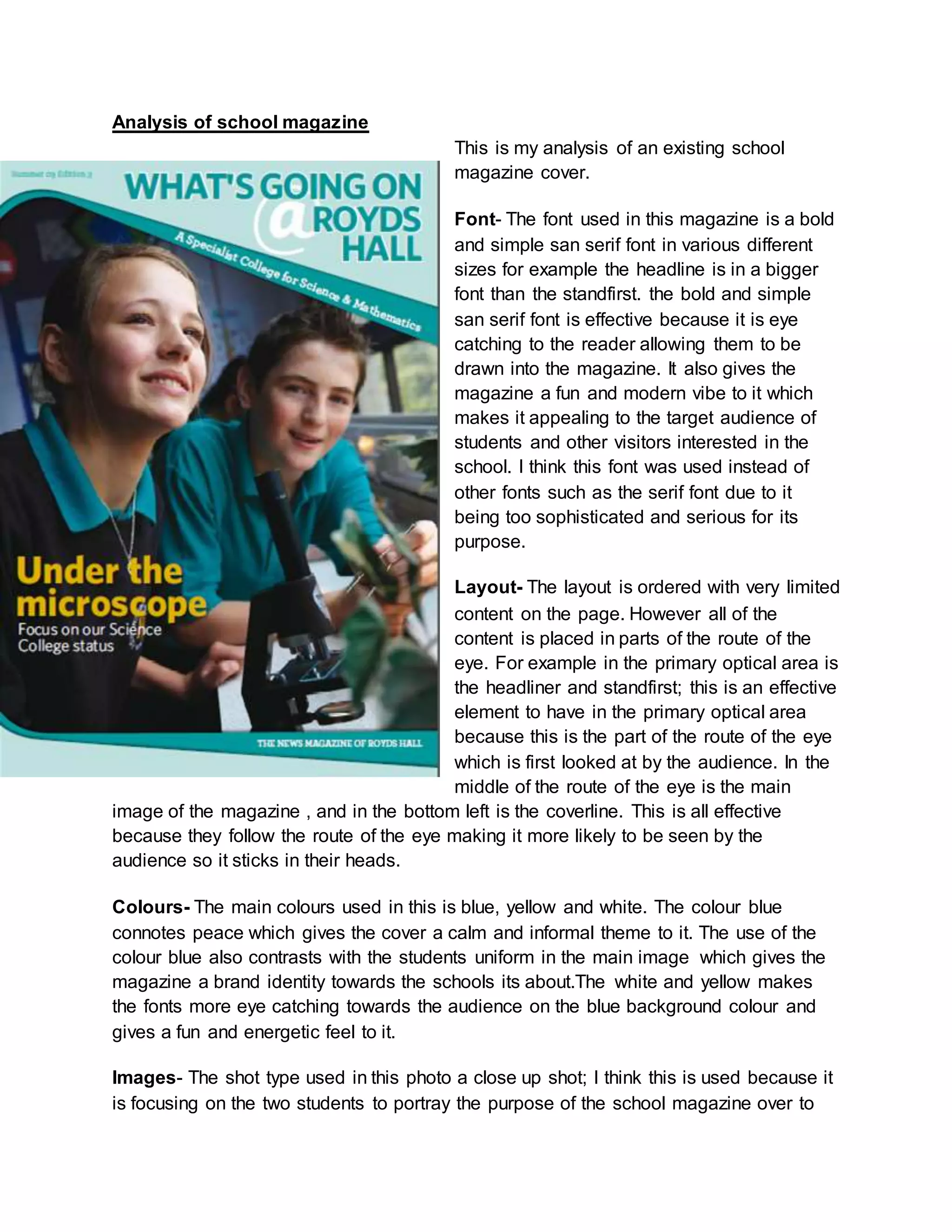
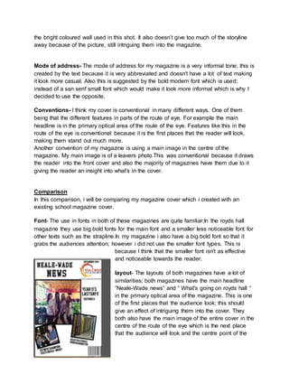
This document analyzes a school magazine cover. It discusses the font, layout, colors, images, mode of address, and conventions used in the magazine cover. The font uses a bold sans serif style to catch readers' attention. The layout places key elements in the primary optical area and route of the eye. Colors like blue and yellow make the content pop. Images include students and school settings. The mode of address is informal to appeal to students. Conventions follow typical magazine design principles. The document also evaluates the author's own school magazine cover design and compares it to an existing school magazine cover.