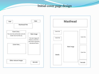
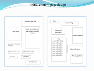
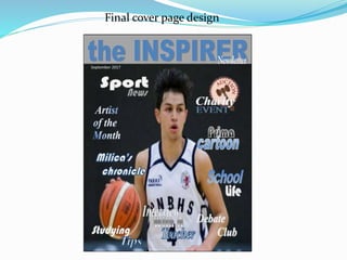
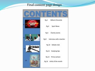
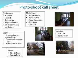
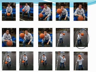
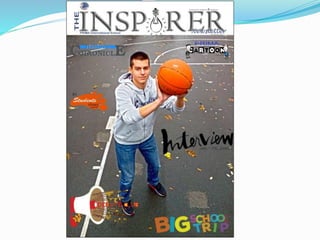
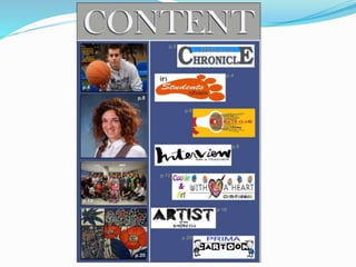
School magazine
PRELIMINARY TASK
MAGAZINE DESIGN
By Andras Pinter
INTRODUCTION
For my As level media studies course works, my first task was to produce a
draft front cover and content page of a school/collage magazine featuring a
medium close up shot of a student with an appropriately laid out text and
masthead. To successfully fulfill preliminary task criteria this unit of work will
be divided in to a three main productions stages.
 Pre- production: at this initial stage prior to rough draft design I will carry
out research into existing school magazine front covers and content pages,
as well as market research into a desired target audience.
 Production: using research findings this stage will focus on photo shoot
and selection of images for front cover as well as content page.
 Post- production: at this final stage original images will be digitally
enhanced and using design and audience research findings I will produce
unified school magazine front cover and a content page.
 Project evaluation: at the end of the preliminary task I will critically
evaluate the production as well as school magazine final outcomes.
Initial cover page design
Initial content page design
Final cover page design
Final content page design
Photo-shoot call sheet
Crew-
• Creative director-
Andras Pinter
• Photographer- Andras
Pinter
• Make-up artist- Alisa
Location-
• IT room
• Sports court
Equipment-
• Camera
• Tripod
• Rain cover
• Light deflector
• 2x memory card
• 2x Battery
Props-
• Sport shoes
• Sport clothes
Model cast-
• Andras Pinter
• Pavle Vranic
• Vanja Stanarevic
• Greatness
Olusakin
The first logo composes the main masthead of the school logo.
The characters are San Serif, with free form of the letter “S”,
which symbolizes that we have a clear structure, but we are also
open , flexible and creative in our articles. We represent our logo
in colors which are colors of the school, as the dot on the letter
“I”, which informs us that our topics are strictly connected to the
school life.
This logo shows the main colors of the school with a typical San
serif font size. The color of the letter “I” in the middle of the
word explains that we are open for different styles and forms of
writing. The black letters in the rest of the word represent that
we are professionally dedicated to our work. The bridge letters
suggest our openness. The logo of the school and the name of
the school above the title tells us that we are occupied with the
school life in our articles.
The main masthead is Serif font style. The light blue color
of the letters defers from dark blue color of the school,
which is in the bottom line and in the logo. In order to be
more eye catching for the future readers. The light bulb in
the middle of the title stands as metaphor for upcoming
ideas, inspiration and innovations.
The main masthead is San serif font, light blue, which differs from
the original school color and shows a brighter inspiration and spirit
of innovation. The logo with the blue rays has multiple meanings:
the wish to spread our word also outside of the school, to be
connected with each other because these rays look like “WIFI “
signal and in this sense to keep in touch with the former students
from our school, but the logo of the school as the dot on the “I”
suggests that our topics are about our school life. Seen together, this
may also look like an eye which would tell us that we are well
informed and up to date.
The main logo is represented in San Serif font style
with a game of the colors: brown and white, which
shows our playfulness, but these serious colors show
that we take our work seriously. In the cursive form
in the bottom we clearly spot our target group. The
school logo and the name of the school are supposed
to suggest that our articles are about our school life.
The main logo is represented in san serif font style,
with the letters “IN” is turned in 90 degree angle
which suggests quite a few things: that we are “IN”, up
to date and that we are ready to look at the reality
from different perspective. The smile line in the
bottom suggests our playfulness and the logo of the
school and the name of the school are telling us that
our articles are connected to our school life.
The main logo is signified in Serif font style. The
colors used in the logo of the school are the
original colors as well which represents how
serious school we are. The school logo in the
middle of the word, in letter “P” tells us that the
school is valuable to the students and that we
are very dedicated to school life.
The school logo is symbolized in Serif font style.
The colors used here are light blue and grey, which
show brightness, lightness towards the school, but
it also shows how important and serious our work
is. The school logo is clearly visible with the original
colors of the school: dark blue and grey, which
show the importance of the school to us.
Final Magazine Masthead
The school logo is symbolized through Serif font style. The colors used
in this logo are the original colors of the school which indicates a sign
of happiness and joy to our everyday school life. The light bulb in the
middle represents inspiration and modernization as well as cleverness
and good ideology for the ideas.
October
Students will provide us with a monthly release of the magazine, keep us
updated, invent new comics and characters to feature in our precious Prima
Cartoon.
This student artwork will be featured
regularly , Showcasing school talent and
we will feature artist biography every
month to keep the school informed.
In this article we will regularly inform students about current, social,
political issues that students can debate about.
Each month one of the regular features will be interviews with the
students in order to show the school as diverse and multicultural
community.
One of the main features of our magazine will be to interview
different teachers each month to represent them in the real light
besides being teachers.
Editors in each month, Editors letter will be featured each month at the
beginning of the magazine as an introduction to all the other articles that will
be included in the magazine.
Evaluation
My preliminary task was to create my own school magazine with front cover and content
page. I have used media conventions to make this task. The font style which I have chosen is
appropriate and eye- catching to the student s, as well as easy to read which is important to
those who wish to read this school magazine. In my school magazine cover and content page
I have tried to use media language to connect the students which is the target audience. My
cover page is a medium close-up of a student playing basketball. This is to show the readers
that sports bringsn a huge impact on school life as well as health, no need to remind that its
fun as well. The articles in the magazine are about student interests to which all can relate
and discuss equally.
During the making of this preliminary task I have developed many skills. My skills have
been improved through analyzing other school magazine content and cover pages as well as
my researching skills have gotten slightly better. My planning skill is the one which needs
work as I am not the type that thinks before writing but the one that does everything the
other way. Either way i have enjoyed doing my first As Media task and hopefully my next one
can, and will be much better with enough effort and motivation.

School magazine design

  • 1.
  • 2.
    INTRODUCTION For my Aslevel media studies course works, my first task was to produce a draft front cover and content page of a school/collage magazine featuring a medium close up shot of a student with an appropriately laid out text and masthead. To successfully fulfill preliminary task criteria this unit of work will be divided in to a three main productions stages.  Pre- production: at this initial stage prior to rough draft design I will carry out research into existing school magazine front covers and content pages, as well as market research into a desired target audience.  Production: using research findings this stage will focus on photo shoot and selection of images for front cover as well as content page.  Post- production: at this final stage original images will be digitally enhanced and using design and audience research findings I will produce unified school magazine front cover and a content page.  Project evaluation: at the end of the preliminary task I will critically evaluate the production as well as school magazine final outcomes.
  • 4.
  • 5.
  • 6.
  • 7.
  • 8.
    Photo-shoot call sheet Crew- •Creative director- Andras Pinter • Photographer- Andras Pinter • Make-up artist- Alisa Location- • IT room • Sports court Equipment- • Camera • Tripod • Rain cover • Light deflector • 2x memory card • 2x Battery Props- • Sport shoes • Sport clothes Model cast- • Andras Pinter • Pavle Vranic • Vanja Stanarevic • Greatness Olusakin
  • 17.
    The first logocomposes the main masthead of the school logo. The characters are San Serif, with free form of the letter “S”, which symbolizes that we have a clear structure, but we are also open , flexible and creative in our articles. We represent our logo in colors which are colors of the school, as the dot on the letter “I”, which informs us that our topics are strictly connected to the school life. This logo shows the main colors of the school with a typical San serif font size. The color of the letter “I” in the middle of the word explains that we are open for different styles and forms of writing. The black letters in the rest of the word represent that we are professionally dedicated to our work. The bridge letters suggest our openness. The logo of the school and the name of the school above the title tells us that we are occupied with the school life in our articles. The main masthead is Serif font style. The light blue color of the letters defers from dark blue color of the school, which is in the bottom line and in the logo. In order to be more eye catching for the future readers. The light bulb in the middle of the title stands as metaphor for upcoming ideas, inspiration and innovations. The main masthead is San serif font, light blue, which differs from the original school color and shows a brighter inspiration and spirit of innovation. The logo with the blue rays has multiple meanings: the wish to spread our word also outside of the school, to be connected with each other because these rays look like “WIFI “ signal and in this sense to keep in touch with the former students from our school, but the logo of the school as the dot on the “I” suggests that our topics are about our school life. Seen together, this may also look like an eye which would tell us that we are well informed and up to date.
  • 18.
    The main logois represented in San Serif font style with a game of the colors: brown and white, which shows our playfulness, but these serious colors show that we take our work seriously. In the cursive form in the bottom we clearly spot our target group. The school logo and the name of the school are supposed to suggest that our articles are about our school life. The main logo is represented in san serif font style, with the letters “IN” is turned in 90 degree angle which suggests quite a few things: that we are “IN”, up to date and that we are ready to look at the reality from different perspective. The smile line in the bottom suggests our playfulness and the logo of the school and the name of the school are telling us that our articles are connected to our school life. The main logo is signified in Serif font style. The colors used in the logo of the school are the original colors as well which represents how serious school we are. The school logo in the middle of the word, in letter “P” tells us that the school is valuable to the students and that we are very dedicated to school life. The school logo is symbolized in Serif font style. The colors used here are light blue and grey, which show brightness, lightness towards the school, but it also shows how important and serious our work is. The school logo is clearly visible with the original colors of the school: dark blue and grey, which show the importance of the school to us.
  • 19.
    Final Magazine Masthead Theschool logo is symbolized through Serif font style. The colors used in this logo are the original colors of the school which indicates a sign of happiness and joy to our everyday school life. The light bulb in the middle represents inspiration and modernization as well as cleverness and good ideology for the ideas.
  • 21.
    October Students will provideus with a monthly release of the magazine, keep us updated, invent new comics and characters to feature in our precious Prima Cartoon. This student artwork will be featured regularly , Showcasing school talent and we will feature artist biography every month to keep the school informed. In this article we will regularly inform students about current, social, political issues that students can debate about.
  • 22.
    Each month oneof the regular features will be interviews with the students in order to show the school as diverse and multicultural community. One of the main features of our magazine will be to interview different teachers each month to represent them in the real light besides being teachers. Editors in each month, Editors letter will be featured each month at the beginning of the magazine as an introduction to all the other articles that will be included in the magazine.
  • 27.
    Evaluation My preliminary taskwas to create my own school magazine with front cover and content page. I have used media conventions to make this task. The font style which I have chosen is appropriate and eye- catching to the student s, as well as easy to read which is important to those who wish to read this school magazine. In my school magazine cover and content page I have tried to use media language to connect the students which is the target audience. My cover page is a medium close-up of a student playing basketball. This is to show the readers that sports bringsn a huge impact on school life as well as health, no need to remind that its fun as well. The articles in the magazine are about student interests to which all can relate and discuss equally. During the making of this preliminary task I have developed many skills. My skills have been improved through analyzing other school magazine content and cover pages as well as my researching skills have gotten slightly better. My planning skill is the one which needs work as I am not the type that thinks before writing but the one that does everything the other way. Either way i have enjoyed doing my first As Media task and hopefully my next one can, and will be much better with enough effort and motivation.