MiraVid provides a suite of complementary quality assurance solutions to help companies attain the highest quality, error-free video throughout their entire media distribution chain from acquisition to transmission. MiraVid solutions range from real-time video monitoring with built in MPEG conformance testing to high volume offline content validation to high-quality analysis tools that are used to optimize compression efficiency or debug any MPEG-based product or distribution process.
MiraVid provides a suite of complementary quality assurance solutions to help companies attain the highest quality, error-free video throughout their entire media distribution chain from acquisition to transmission. MiraVid solutions range from real-time video monitoring with built in MPEG conformance testing to high volume offline content validation to high-quality analysis tools that are used to optimize compression efficiency or debug any MPEG-based product or distribution process.
A New Transliteration of the Hebrew Biblejrcovington
Introduction to our new transliteration of the Hebrew Bible (Westminster Leningrad Codex) produced using both algorithmic and manual techniques. This transliteration is freely available for non-commercial use.
Operation “Blue Star” is the only event in the history of Independent India where the state went into war with its own people. Even after about 40 years it is not clear if it was culmination of states anger over people of the region, a political game of power or start of dictatorial chapter in the democratic setup.
The people of Punjab felt alienated from main stream due to denial of their just demands during a long democratic struggle since independence. As it happen all over the word, it led to militant struggle with great loss of lives of military, police and civilian personnel. Killing of Indira Gandhi and massacre of innocent Sikhs in Delhi and other India cities was also associated with this movement.
The French Revolution, which began in 1789, was a period of radical social and political upheaval in France. It marked the decline of absolute monarchies, the rise of secular and democratic republics, and the eventual rise of Napoleon Bonaparte. This revolutionary period is crucial in understanding the transition from feudalism to modernity in Europe.
For more information, visit-www.vavaclasses.com
2024.06.01 Introducing a competency framework for languag learning materials ...Sandy Millin
http://sandymillin.wordpress.com/iateflwebinar2024
Published classroom materials form the basis of syllabuses, drive teacher professional development, and have a potentially huge influence on learners, teachers and education systems. All teachers also create their own materials, whether a few sentences on a blackboard, a highly-structured fully-realised online course, or anything in between. Despite this, the knowledge and skills needed to create effective language learning materials are rarely part of teacher training, and are mostly learnt by trial and error.
Knowledge and skills frameworks, generally called competency frameworks, for ELT teachers, trainers and managers have existed for a few years now. However, until I created one for my MA dissertation, there wasn’t one drawing together what we need to know and do to be able to effectively produce language learning materials.
This webinar will introduce you to my framework, highlighting the key competencies I identified from my research. It will also show how anybody involved in language teaching (any language, not just English!), teacher training, managing schools or developing language learning materials can benefit from using the framework.
How to Create Map Views in the Odoo 17 ERPCeline George
The map views are useful for providing a geographical representation of data. They allow users to visualize and analyze the data in a more intuitive manner.
How to Make a Field invisible in Odoo 17Celine George
It is possible to hide or invisible some fields in odoo. Commonly using “invisible” attribute in the field definition to invisible the fields. This slide will show how to make a field invisible in odoo 17.
Model Attribute Check Company Auto PropertyCeline George
In Odoo, the multi-company feature allows you to manage multiple companies within a single Odoo database instance. Each company can have its own configurations while still sharing common resources such as products, customers, and suppliers.
This is a presentation by Dada Robert in a Your Skill Boost masterclass organised by the Excellence Foundation for South Sudan (EFSS) on Saturday, the 25th and Sunday, the 26th of May 2024.
He discussed the concept of quality improvement, emphasizing its applicability to various aspects of life, including personal, project, and program improvements. He defined quality as doing the right thing at the right time in the right way to achieve the best possible results and discussed the concept of the "gap" between what we know and what we do, and how this gap represents the areas we need to improve. He explained the scientific approach to quality improvement, which involves systematic performance analysis, testing and learning, and implementing change ideas. He also highlighted the importance of client focus and a team approach to quality improvement.
The Art Pastor's Guide to Sabbath | Steve ThomasonSteve Thomason
What is the purpose of the Sabbath Law in the Torah. It is interesting to compare how the context of the law shifts from Exodus to Deuteronomy. Who gets to rest, and why?
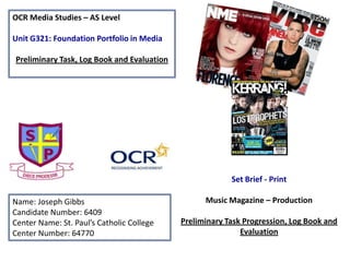
1. OCR Media Studies – AS Level
Unit G321: Foundation Portfolio in Media
Preliminary Task, Log Book and Evaluation
Set Brief - Print
Name: Joseph Gibbs
Candidate Number: 6409
Center Name: St. Paul’s Catholic College
Center Number: 64770
Music Magazine – Production
Preliminary Task Progression, Log Book and
Evaluation
2. Preliminary Task Brainstorming
Name:
- Must include the
school name – St.
Paul’s.
- Target audience is
students so must
appeal to 11-18 year
olds.
- Will include current
school news.
Ideas:
- St. Paul’s Today
- St. Paul’s Now
Preliminary
Task - Ideas
Content of the magazine:
- Puff
- Interviews with teachers and A* students
- Revision tips
- Exam results – focusing on success
- School news
Must include on the
front cover:
- Masthead
- Strapline – present
a USP, e.g. ‘best
source for St Paul’s
news’
- Headline – use
language devices,
e.g. alliteration
- Medium close-up
image of a student,
related to the
headline
- Convergence
- Barcode, price,
date and issue
number
- Cover lines
3. Preliminary Task Brainstorming
• I decided on the name the magazine ‘St. Paul’s
Today’ because I felt it was more appropriate for
what the magazine would cover – recent school
news and information. The verbal code connotes
that the information is up-to-date (‘Today’) and
therefore that the magazine is reliable as the
name of the school is endorsed in the masthead.
• In my preliminary task front cover (see next
slide), I presented the masthead in a bold,
colourful way so that it stands out on the page.
4. Preliminary Task Progression– Evidence
Front Cover
Step-by-step
1
2
I began with a blank canvas, with
the dimensions 21 cm by 29 cm,
which is the size of an A4 page. I
used the ruler tool to create
gridlines to help with aligning
certain codes and conventions on
my cover.
I used the colours of the school
for two banners at the top, which
I created using the ‘shape tool’
(U). I duplicated the logo using
Cmd + J and placed it in each
corner with the help of the light
blue gridlines (Cmd + R).
5. Preliminary Task Progression– Evidence
Front Cover
Step-by-step
3
4
I used the ‘text tool’ (T) to produce my masthead.
I used the font ‘Abadi MT Condensed Extra Bold’ to create a headline that stood out
on my front cover. After that, I added the headline and sub-headline in the font
Fragment Core, which I downloaded from dafont.com. I used this font because it
looks professional and was therefore suitable for my magazines ambitions of
providing informative coverage of day-to-day life at St. Paul’s.
6. Preliminary Task Progression– Evidence
Front Cover
Step-by-step
5
6
The next step was to add the website
near the top as a form of convergence,
as well as the barcode, issue number,
price and date. Once this was done, I
added social networking links to involve
the reader and encourage viral
marketing, which will in turn appeal to
my target audience of 11-18 year olds.
I then used the text tool to create
the strapline and the cover lines
for the bottom banner. I used this
language in my strapline because
it will present a USP (unique
selling point) to the audience.
7. Preliminary Task Progression– Evidence
Front Cover
Step-by-step
7
8
I added in the main image and edited out
the background using the quick selection
tool, before adding drop shadows and
outer glows to the text so it stands out on
the page.
I also added a puff appropriate to the
target audience using the shape and text
tools.
Finally, I added the cover lines to the
left of my main image. I used the pen
tool in order to make sure the text is
aligned with the image perfectly, with
no overlap. I made sure these were
appropriate to the target audience
and therefore they were appropriate
to what students would like to know
from their school.
8. Preliminary Task Progression– Evidence
Front Cover
Completed cover
To the left is my completed front cover,
after taking into account my feedback
from my teacher.
This feedback suggested that I change
the colour of the drop shadow for the
convergence next to the barcode, in
order for it to stand out on the page.
Furthermore, I added a smaller copy of
the masthead above the barcode using
Cmd + J on my keyboard so it can
‘repeat’ (Steve Neale) another
convention of a typical magazine.
9. Preliminary Task Progression– Evidence
Contents Page
Step-by-step
1
2
I started off my contents page by
creating a new canvas that was
the same size as that of the front
cover. I then duplicated certain
conventions over from the Front
Cover such as the logo and the
masthead so they are ‘repeated’
(Steve Neale) throughout my
magazine.
I then added text in the form of
the title for the page as well as
convergence for the top and
bottom banners. I used the same
font for these as I had on the
front cover – Fragment Core – in
order to create a brand identity
for the magazine.
10. Preliminary Task Progression– Evidence
Contents Page
Step-by-step
3
4
Next, I typed up the editorial, relevant to my
target audience, on a Word document (in
order to check spelling and grammar) and
pasted it in over a square made using the
shape tool. Yet again, I used the pen tool to
align the text at the bottom with my image. I
then added contact details, a picture of myself
(cropped using the elliptical marquee tool) and
my signature which was scanned in.
I then added the subtitles for the
cover lines on the page, using the
same colour scheme and font plus
the school logo to fit the topic of
my magazine.
11. Preliminary Task Progression– Evidence
Contents Page
Step-by-step
5
6
The next step was to add the text for
my cover lines. I typed the title of each
page as well as a sub-line giving a small
description of each story. I also added
the relevant page number.
Finally, I added the original
images to my contents page as
well as their respective page
numbers in order to anchor the
text. I used the marquee tool in
order to crop the images to the
appropriate size.
12. Preliminary Task Progression– Evidence
Contents Page
Completed cover
To the left is my completed contents
page, after taking into account my
feedback from my teacher.
This feedback suggested that I changed
the pictures around slightly so I don’t
include the same image as that of my
front cover, so I repositioned and
changed my images.
Additionally, I made changes to the
layout of the sublines and page titles to
better suit the contents page and the
new layout of the images.
14. Established Magazine for my Research
Bold masthead with
only two colours
connotes that the
magazine is targeted
at adults
Main image which
denotes “star appeal”
(Richard Dyer)
Cover lines
Headline with bold
font to stand out to
the reader.
Names of artists
convey “star
appeal” and denote
that the magazine is
for the indie/rock
genres
Barcode, date, issue
number and price
15. Target Audience – Katz, Maslow, Hartley and/or socio-economic needs
The target audience for Q magazine can be denoted as males, aged 15-30 (Hartley’s seven
subjectivities). They could be seen as ‘explorers’ (Maslow’s Hierarchy of Needs) because of
the ‘comprehensive reviews’ in every issue, recommending new music to the readers. This
would also ‘inform and educate’ (Katz) the readers on new music.
The graph below denotes that the majority of the readers of Q Magazine are males aged
15-24. Furthermore, 70% of the readers are ABC1 in the socio-economic needs scale, as
denoted to the right. This connotes that the readers of Q Magazine are intelligent and
higher earners than those who read Top of the Pops magazine (see slide 15).
16. What is the USP of this
magazine?
From the research completed into
this media product, I think the
USP is the fact that the magazine
is there to ‘inform and educate’
(Katz) on brand new music. This
will entice the reader into buying
the magazine as it will give indepth reviews to songs and
albums which many music
magazines, such as Top of the
Pops don’t actually offer. For
example, the review denoted in
the picture to the right is
incredibly in-depth, presents ‘star
appeal’ (Richard Dyer) as Coldplay
are a successful band, and it gives
a star rating and certain tracks to
download which will attract a
pass-along audience.
17. Publisher research
• Q Magazine is published by Bauer Media, whose website states that the majority
of readers of the magazine are in the 15-24 age group and are males. Therefore,
this is the target audience.
• The website denotes that “Q’s audience is younger and more affluent than any
other music monthly”, connoting that the magazine appeals to its target audience
well, making it “the UK’s number one actively-purchased music magazine”.
• The readership figure for 2012 was 377,000, with the circulation between January
and June 2013 being 58,980.
Hyperbole to
entice the target
audience in
Examples of
features in each
magazine
Sources:
http://magazines.bauermediaadvertising.com/mag
azines/detail/Q
http://www.bauermedia.co.uk/brands/q
18. Music Magazine – Genre research
•
•
•
•
•
Music magazines are magazines which
are dedicated solely to a particular genre
of music, e.g. pop music, which I will be
creating my magazine on.
Current pop music magazines include Top
of the Pops and We Love Pop, as well as
American publication Billboard and the
now defunct Smash Hits.
Typically, pop music magazines are aimed
at a younger audience, and this is
indicated through the use of bright
colours.
Other music magazines include NME, Q
and Kerrang.
All pop music magazines present a form
of ‘star appeal’ to the reader, in which a
current and successful pop act is
featured on the front cover to appeal to
the target audience of young people.
19. Conventions of a Pop-Music Magazine
Strapline with
superlatives (“biggest”
and “best”) to grab
the reader’s attention.
Cover line
Barcode, date, issue
number and price
Names of artists
convey “star
appeal” and denote
that the magazine is
for the pop genre
Bright, colourful
masthead which
connotes happiness
and will stand out
against the
background.
Main image which
denotes “star appeal”
(Richard Dyer)
Headline with bold
font to stand out to
the reader.
20. Target Audience – Katz, Maslow, Hartley and/or socio-economic needs
The target audience for Top of the Pops magazine can be denoted as girls aged 12-18 (Hartley), who would be
‘survivors’ (Maslow), wanting the security of knowing about their favourite artists rather than ‘exploring’ new
ones. In addition, ‘TOTP’ readers could also be denoted as being able to have a ‘personal relationship’ (Katz)
with the artist or band presented in each issue, wanting to be like them and forming a close bond through the
‘star appeal’ on the front cover and relevant article.
The graph below denotes that the majority of the readers are skilled manual workers, semi or unskilled
workers, or unemployed people and students, which fits in with the target audience of 11-15 year old girls,
who would fit into the E category of the socio-economic needs scale, a clear contrast from Q Magazine..
Source http://www.mediauk.com/magazines/36265/top-of-the-pops/readershipfigures
21. What is the USP of this
magazine?
I think the USP is the use of the
non-verbal code of colour on the
front cover of the magazine.
Bright, contrasting colours
connote happiness and a vibrant
feel to the magazine, making it
stand out on the page.
Furthermore, the free gifts or
incentives are a USP for ‘TOTP’
magazine, as they offer
something other pop music
magazines do not have and
therefore entice the target
audience with something extra,
for no extra money, such as a
lipstick.
22. Publisher research
• Top of the Pops Magazine is published by Immediate Media Company,
and on their website, the average age of readers, and therefore the
target audience, is 12 years old. Furthermore, my research showed
that the target audience of the magazine in terms of gender
(Hartley’s seven subjectivities) is girls. Despite that, 15% of the
readers are boys.1
• In terms of socio-economic needs, the readers of Top of the Pops
magazine are generally in the C2-E categories.2
• The circulation figure for ‘TOTP’ magazine is 98,030, and the
readership figure is 298,000.
• In June 2012, it was shown that
161,000 adults had read the
magazine, despite the target
audience being 11-15 year old
girls.
Notes
1 http://meganmediablog.wordpress.com/2012/11/13/top-of-the-pops-target-audience-research/
2 http://www.mediauk.com/magazines/36265/top-of-the-pops/readership-figures
2
23. Genre research
• The reason I chose to make a pop music
magazine for my coursework was because it’s a
genre I feel confident talking about, and is suited
to my own musical tastes, meaning I could talk
more in depth and be more enthusiastic about
the task.
• This is why I am choosing to repeat certain
conventions from ‘Top of the Pops’ instead of ‘Q’,
because it is more relevant to the genre I have
chosen to create a magazine for.
25. Questionnaire Results
1. What is your gender?
Male
Female
2. How old are you?
Under 15
16-30
31-45
46-60
1. What is your gender?
Response
Male
Female
Quantity
7
3
2. How old are you?
Response
Under 15
16-30
31-45
46-60
60+
Quantity
1
7
2
0
0
27. Questionnaire Results – Analysis
•
•
•
•
•
•
In my results, I asked 7 male and 3 female people, which is not entirely representative of
my genre which typically appeals to young girls, but will give a wide range of responses.
Most participants are aged between 16 and 30, meaning that they fit my target audience,
however there is a small selection of people that are either under 16 or over 30.
Pop music was given by 4 people as their favourite genre of music, a higher proportion
than any other genre, meaning it will have a wider appeal across many people.
Half the participants said they would prefer to buy the magazine once a month, so I need
to take this into consideration when planning my magazine in order to appeal to a casual
audience. Half also said £2 - £2.99 for the price range, and I need to consider this also.
Music reviews came up as the most interesting part of a music magazine, with
competitions being the least interesting, so I need to focus on each convention
appropriately – I should not give too much focus towards competitions as they are not as
interesting for a causal reader.
‘Star appeal’ (Richard Dyer) came up as the most interesting part of a front cover for a
music magazine, so it is important that I include a well-known artist to use for my front
cover.
28. Survey Monkey Results
The results of the first question here contradict what I expected for pop music fans.
Typically, pop music magazines are aimed at girls, but out of the 10 pop music fans I
asked, 7 were male, so I could consider aiming it at both genders. The age question,
however, did fit my expectations, with 100% of people being in the 16-30 age category.
29. Survey Monkey Results
The most important convention for my front cover going by these results is ‘star appeal’
in the main image, so I must make sure I include an appropriate image of a star in my
own music magazine. Posters were the most popular free gift for my target audience so
that would be an important convention to include in my magazine on the front cover
and/or contents page.
30. Survey Monkey Results
News and gossip emerged as the most interesting aspect of a music magazine, so that
will be an important thing to focus my magazine on. Competitions were the least
interesting, so less focus will be spent on that aspect, but it will still be included as it’s
an important convention of other magazines in my genre.
31. Survey Monkey Results
‘Once a month’ is the most common answer for how often my target audience would
buy a magazine, so therefore that’s how often my own music magazine will be
released, in order to appeal to the genre. £2-£2.99 is the ideal price going by my Survey
Monkey, and is good in terms of competition also, as it will be cheaper than many other
magazines in this genre, e.g. Top of the Pops charging £3.50 for a Justin Bieber special
issue.
32. Survey Monkey Results
Every person who answered my Survey Monkey agreed that there should be
recommendations for new music in a pop magazine, so that’s a feature that I should
definitely include in my own magazine. The majority also said that there should be a
letter from the editor, so that will feature on my contents page.
33. How did my questionnaire and Survey
Monkey help me?
•
•
•
•
•
Firstly, it helped me decide my target audience. I aimed my survey at pop music
fans and got a higher proportion of males answering, therefore proving that there
is an interest amongst males when I had initially thought of aiming my magazine at
females only. However, it did show me that 16-30 is the optimum age group for
pop music magazines, as I had initially thought.
The mode price for the magazine as found out in my questionnaire and survey was
£2 - £2.99; therefore this tells me that the price I include on the front cover should
be within this range in order to appeal to my target audience.
The majority of people in my survey agreed that there should be an editorial on
the contents page, so this convention will be included in my own Pop magazine.
My questionnaire showed that most people would be interested in music reviews,
so this could be a convention to include in my contents so it appeals to both my
target audience and a pass-along audience just perusing through the magazine.
Finally, the overwhelming response in the survey for what is most important and
expected on a front cover was some form of ‘star appeal’ (Richard Dyer), therefore
it is very important that I ‘repeat’ (Steve Neale) this on my own front cover to
appeal to my front cover.
34. Brainstorming
Masthead must:
- Be related to my
music genre –
pop
- Reflect the
content of the
magazine.
- Be appropriate
to my target
audience.
Main Task Ideas
Story ideas:
- Recent song and album reviews
- Singles: P!nk, Tom Odell, JLS, Little Mix
- Albums: One Direction, Lady Gaga
- Chart news – interview with #1 band OneRepublic
- Interview with Ellie Goulding – cover story
- Competition – win tickets to One Direction’s stadium tour
- New music
Name ideas:
- Rhythm – relevant
to music but not
genre or target
audience specific.
Doesn’t connote
pop music
specifically.
- POP! – direct and
straight to the
point, but is very
similar to another
non-music related
magazine called
‘Pop’.
- Pop Now – current
and appropriate to
the target
audience.
35. Brainstorming
• I eventually decided on the name Pop Today,
which, despite being similar to my preliminary
task title, is suitable for this also because it
connotes that the magazine has all the recent
gossip and exclusives, which is appropriate for
what would suit my target audience.