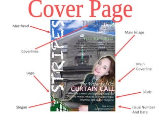
Coverlines 
Main 
Coverline 
Blurb 
Issue Number 
And Date 
Masthead 
Main Image 
Logo 
Slogan
Topics: 
Cover 
Stories 
Masthead 
Page 
Numbers 
Images 
Relating 
to Stories 
Slogan 
Image 
Relating 
to Main 
Story 
Topics: 
Regular 
Features 
Blurb
- I felt that it was important to avail of certain forms and conventions associated with real 
media products in order to make my magazine seem professional. 
- Aspects of my layout were similar to that of many other magazines: on my front cover, I 
positioned all of the coverlines in the left third of the page and used one main image as 
the backdrop rather than numerous small ones. With my contents, I defined specific 
sections, cover stories and regular features, as is common in many magazines, making 
the page clear and organised and allowing for easy navigation. 
- Through the consistent utilisation of a tranquil colour scheme made up of light blues, 
greens and yellows along with the inclusion of the same fonts, effects and layout style I 
was able to develop a house style which not only represented the school colours but 
aided in making my product seem more linked and polished. 
- However, I thought it was important to challenge the forms and conventions of real 
media products to a certain extent to make my magazine stand out – I rotated my 
masthead so that it was vertical and placed it along the right third which created an edgy, 
modern look. I also combined animated images with genuine pictures to add to this 
whilst inserting a ‘glow’ effect around my main image to make the student stand out.
- As my media product is a school magazine, I wanted to appeal to and indeed 
represent as many of the different social groups that exist within our school as I could 
as this would increase the amount of pupils reading my magazine. 
- In order to do so, I decided that the main image included on my front cover would be 
a girl in uniform. Instantly recognisable as a fellow student and in the uniform that all 
sixth-form students wear as well as the fact my magazine is for an all-girls school, I 
felt that that my target audience would be able to relate to the image and that no 
social group would be alienated. 
- The colour scheme employed is calm and sophisticated to reflect the sixth-form 
students’ senior status in school but also enticing teachers and parents alike to the 
magazine. 
- Furthermore, I tried to ensure that the coverlines on the front page and articles 
listed on the contents page would attract different social groups: drama features, 
sports updates, charity work, business interviews, university information and UCAS 
help are all included with the aim being to appeal to and interest the entire sixth-form 
student body.
- As my magazine is a media product aimed specifically at, and indeed 
tailored to, sixth-form students of St Catherine’s College, it would the 
ideal distributer for my media product – being published and printed within 
school if possible would make most sense as it would only be distributed 
in school. 
- If this was not possible, perhaps a media institution in my area, for 
example ‘The Armagh Gazette’ that produces a weekly local newspaper, 
would be willing to distribute my magazine.
- With my media product being a school magazine, as mentioned, the 
audience I have aimed my product at are sixth-form students of St 
Catherine’s College. 
- I decided to focus on Years 13 and 14 as, through my own 
experiences as a sixth-former as well as with the help of answers from 
my questionnaire and general research, I found out that the topics 
which might attract KS3 students are very different to those that would 
entice older readers. 
- The research I carried out and in particular my questionnaire results 
gave me an important insight into what I should include in my 
magazine from layout and design to language and colours.
- Through my research and personal experiences, I attained the knowledge that sixth-formers 
enjoy the extra responsibility, privileges and exclusivity they receive when 
they reach this stage in school, I chose a masthead that would make it clear the 
magazine was specifically for them. ‘STRIPES’ represents the green and white 
stripes on the sixth-form shirt which is the dominant item older students are 
recognised by and associated with. 
- I then created a small picture of a stripy shirt collar and sixth form green tie to place 
in the corner alongside the slogan ‘STRIPES FOR SENIORS’ – a pun emphasising 
the fact that not only are the iconic stripy shirts for seniors but so is the magazine. I 
continued to introduce a play on words with the contents page slogan ‘EARN YOUR 
STRIPES’ this direct address continues to involve readers and recognise that they 
have earned their place as a sixth-form in the school. 
- Using direct address throughout my two pages, with personal pronouns such as 
‘you’ and ‘your’ to engage readers, I also ensured that the language was never 
patronizing but informal and friendly to further attract audiences.
- Whilst carrying out the process of creating my media product, I have learned a lot about 
technologies through my utilisation of new sites and programmes. 
- With the website PREZI, I learned how to create and design a helpful and bright online 
‘mind-map’ which was of great use when cultivating ideas for my magazine. Another 
prominent website used for the duration of this task was PB WORKS, a blogging site 
which I used to update and display all of my media studies work and indeed will continue 
to do so. 
- The main technology I used was ADOBE PHOTOSHOP and with only limited 
experience with this programme to begin with, through constructing my product, my 
knowledge of this technology was soon greatly increased. 
- I learned about how to edit and distort photos – from making images brighter and 
manipulating backgrounds to making the shots ‘glow’ around the edges – I was able to 
make my magazine cover and contents page seem much more professional with the 
main tools I used being the magic wand tool, eyedropper tool, paintbucket and eraser 
tool. 
- Overall, I have learned a huge amount while creating my school magazine pages and I 
am sure these new skills will help me greatly as I move onto constructing my main media 
product.
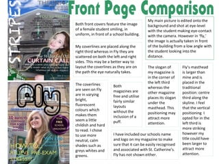
Both front covers feature the image 
of a female student smiling, in 
uniform, in front of a school building. 
My main picture is edited onto the 
background and shot at eye-level 
with the student making eye-contact 
with the camera. However in ‘fly,’ 
the image is actually taken in front 
of the building from a low angle with 
the student looking into the 
distance. 
My coverlines are placed along the 
right third whereas in Fly they are 
scattered on both the left and right 
sides. This may be a better way to 
layout the coverlines as they are on 
the path the eye naturally takes. 
Fly’s masthead 
is larger than 
mine and is 
placed in the 
traditional 
position: centre 
third along the 
skyline. I feel 
that the vertical 
positioning I 
opted for in the 
left third is 
more striking 
however my 
title could have 
been larger to 
attract more 
attention. 
The slogan of 
my magazine is 
in the corner of 
the left third 
whereas the 
other magazine 
places its slogan 
under the 
masthead. This 
positioning may 
attract more 
attention. 
I have included our schools name 
and logo on my magazine to make 
sure that it can be easily recognised 
and associated with St. Catherine’s. 
Fly has not shown either. 
The coverlines 
are seen on Fly 
are in varying 
bright, 
fluorescent 
colours which 
makes them 
seem a little 
childish and hard 
to read. I chose 
to use more 
neutral, calm 
shades such as 
greys whites and 
greens. 
Both 
magazines are 
free and utilise 
fairly similar 
layouts 
without the 
inclusion of a 
puff.
At first glance, 
the two 
contents 
pages seem 
very different, 
however 
there are 
some 
similarities. 
The masthead on my contents page is eye 
grabbing; positioned vertically in the left 
third to establish continuity with my front 
cover. The contents page of the other 
magazine is placed in the traditional 
position of the skyline of the centre third 
which I feel is little predictable and boring 
compared to mine. 
The contents page I 
analysed utilises a 
bright azure background 
with a floral pattern – 
this makes the writing 
difficult to read and 
creates quite an 
unprofessional finish. I 
used a notepaper image 
as my background to 
reflect the fact that 
Stripes is a school 
magazine, as well as this 
the neutral shade 
means words can be 
easily understood. 
Both contents pages include 
small images that relate to the 
stories listed and writing set out 
in a staggered manner to follow 
the eye-line and add interest. 
I feel that whilst the other 
contents page could have 
included brief descriptions of its 
articles, the blurb I have written 
for mine may be too long with 
the writing too small. 
The editing and 
expertise in 
both pages 
seems quite 
minimal and 
this could have 
been improved 
to create a 
more 
professional 
look. 
The colour 
schemes and 
layouts are very 
different and 
there is no clear 
image relating 
to the main 
story included 
on the other 
contents page 
The other contents page shows the schools crest 
whereas I did not include it. However both pages 
incorporate slogans and inspirational phrases.
School magazine-evaluation

School magazine-evaluation

  • 2.
    Coverlines Main Coverline Blurb Issue Number And Date Masthead Main Image Logo Slogan
  • 3.
    Topics: Cover Stories Masthead Page Numbers Images Relating to Stories Slogan Image Relating to Main Story Topics: Regular Features Blurb
  • 4.
    - I feltthat it was important to avail of certain forms and conventions associated with real media products in order to make my magazine seem professional. - Aspects of my layout were similar to that of many other magazines: on my front cover, I positioned all of the coverlines in the left third of the page and used one main image as the backdrop rather than numerous small ones. With my contents, I defined specific sections, cover stories and regular features, as is common in many magazines, making the page clear and organised and allowing for easy navigation. - Through the consistent utilisation of a tranquil colour scheme made up of light blues, greens and yellows along with the inclusion of the same fonts, effects and layout style I was able to develop a house style which not only represented the school colours but aided in making my product seem more linked and polished. - However, I thought it was important to challenge the forms and conventions of real media products to a certain extent to make my magazine stand out – I rotated my masthead so that it was vertical and placed it along the right third which created an edgy, modern look. I also combined animated images with genuine pictures to add to this whilst inserting a ‘glow’ effect around my main image to make the student stand out.
  • 5.
    - As mymedia product is a school magazine, I wanted to appeal to and indeed represent as many of the different social groups that exist within our school as I could as this would increase the amount of pupils reading my magazine. - In order to do so, I decided that the main image included on my front cover would be a girl in uniform. Instantly recognisable as a fellow student and in the uniform that all sixth-form students wear as well as the fact my magazine is for an all-girls school, I felt that that my target audience would be able to relate to the image and that no social group would be alienated. - The colour scheme employed is calm and sophisticated to reflect the sixth-form students’ senior status in school but also enticing teachers and parents alike to the magazine. - Furthermore, I tried to ensure that the coverlines on the front page and articles listed on the contents page would attract different social groups: drama features, sports updates, charity work, business interviews, university information and UCAS help are all included with the aim being to appeal to and interest the entire sixth-form student body.
  • 6.
    - As mymagazine is a media product aimed specifically at, and indeed tailored to, sixth-form students of St Catherine’s College, it would the ideal distributer for my media product – being published and printed within school if possible would make most sense as it would only be distributed in school. - If this was not possible, perhaps a media institution in my area, for example ‘The Armagh Gazette’ that produces a weekly local newspaper, would be willing to distribute my magazine.
  • 7.
    - With mymedia product being a school magazine, as mentioned, the audience I have aimed my product at are sixth-form students of St Catherine’s College. - I decided to focus on Years 13 and 14 as, through my own experiences as a sixth-former as well as with the help of answers from my questionnaire and general research, I found out that the topics which might attract KS3 students are very different to those that would entice older readers. - The research I carried out and in particular my questionnaire results gave me an important insight into what I should include in my magazine from layout and design to language and colours.
  • 8.
    - Through myresearch and personal experiences, I attained the knowledge that sixth-formers enjoy the extra responsibility, privileges and exclusivity they receive when they reach this stage in school, I chose a masthead that would make it clear the magazine was specifically for them. ‘STRIPES’ represents the green and white stripes on the sixth-form shirt which is the dominant item older students are recognised by and associated with. - I then created a small picture of a stripy shirt collar and sixth form green tie to place in the corner alongside the slogan ‘STRIPES FOR SENIORS’ – a pun emphasising the fact that not only are the iconic stripy shirts for seniors but so is the magazine. I continued to introduce a play on words with the contents page slogan ‘EARN YOUR STRIPES’ this direct address continues to involve readers and recognise that they have earned their place as a sixth-form in the school. - Using direct address throughout my two pages, with personal pronouns such as ‘you’ and ‘your’ to engage readers, I also ensured that the language was never patronizing but informal and friendly to further attract audiences.
  • 9.
    - Whilst carryingout the process of creating my media product, I have learned a lot about technologies through my utilisation of new sites and programmes. - With the website PREZI, I learned how to create and design a helpful and bright online ‘mind-map’ which was of great use when cultivating ideas for my magazine. Another prominent website used for the duration of this task was PB WORKS, a blogging site which I used to update and display all of my media studies work and indeed will continue to do so. - The main technology I used was ADOBE PHOTOSHOP and with only limited experience with this programme to begin with, through constructing my product, my knowledge of this technology was soon greatly increased. - I learned about how to edit and distort photos – from making images brighter and manipulating backgrounds to making the shots ‘glow’ around the edges – I was able to make my magazine cover and contents page seem much more professional with the main tools I used being the magic wand tool, eyedropper tool, paintbucket and eraser tool. - Overall, I have learned a huge amount while creating my school magazine pages and I am sure these new skills will help me greatly as I move onto constructing my main media product.
  • 10.
    Both front coversfeature the image of a female student smiling, in uniform, in front of a school building. My main picture is edited onto the background and shot at eye-level with the student making eye-contact with the camera. However in ‘fly,’ the image is actually taken in front of the building from a low angle with the student looking into the distance. My coverlines are placed along the right third whereas in Fly they are scattered on both the left and right sides. This may be a better way to layout the coverlines as they are on the path the eye naturally takes. Fly’s masthead is larger than mine and is placed in the traditional position: centre third along the skyline. I feel that the vertical positioning I opted for in the left third is more striking however my title could have been larger to attract more attention. The slogan of my magazine is in the corner of the left third whereas the other magazine places its slogan under the masthead. This positioning may attract more attention. I have included our schools name and logo on my magazine to make sure that it can be easily recognised and associated with St. Catherine’s. Fly has not shown either. The coverlines are seen on Fly are in varying bright, fluorescent colours which makes them seem a little childish and hard to read. I chose to use more neutral, calm shades such as greys whites and greens. Both magazines are free and utilise fairly similar layouts without the inclusion of a puff.
  • 11.
    At first glance, the two contents pages seem very different, however there are some similarities. The masthead on my contents page is eye grabbing; positioned vertically in the left third to establish continuity with my front cover. The contents page of the other magazine is placed in the traditional position of the skyline of the centre third which I feel is little predictable and boring compared to mine. The contents page I analysed utilises a bright azure background with a floral pattern – this makes the writing difficult to read and creates quite an unprofessional finish. I used a notepaper image as my background to reflect the fact that Stripes is a school magazine, as well as this the neutral shade means words can be easily understood. Both contents pages include small images that relate to the stories listed and writing set out in a staggered manner to follow the eye-line and add interest. I feel that whilst the other contents page could have included brief descriptions of its articles, the blurb I have written for mine may be too long with the writing too small. The editing and expertise in both pages seems quite minimal and this could have been improved to create a more professional look. The colour schemes and layouts are very different and there is no clear image relating to the main story included on the other contents page The other contents page shows the schools crest whereas I did not include it. However both pages incorporate slogans and inspirational phrases.