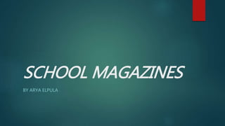
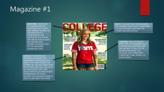
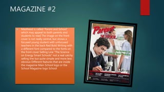
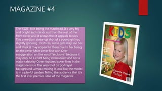
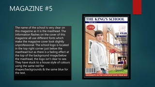
The document provides an analysis of 5 different school magazine covers. For magazine #1, the analysis notes that the masthead is bold and covers the whole top of the magazine. It also comments that the layout could make better use of empty space. For magazine #2, it notes the masthead title, cover image placement, and selling line. Magazine #3's analysis includes details on the masthead size, dateline, featured lines, and catchy selling line. Magazine #4's large, bright masthead is highlighted along with the cover girl image and exaggerated cover lines. Finally, magazine #5's analysis critiques the multiple fonts, faded school logo, and adherence to a house style of colors.


![Preliminary task main]](https://cdn.slidesharecdn.com/ss_thumbnails/preliminarytaskmain-151125143956-lva1-app6891-thumbnail.jpg?width=640&height=640&fit=bounds)


