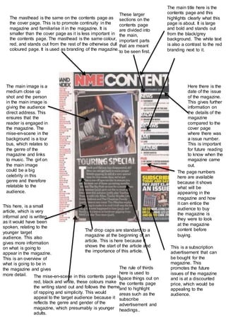
1. The masthead is the same on the contents page as
the cover page. This is to promote continuity in the
magazine and familiarise it in the magazine. It is
smaller than the cover page as it is less important in
the contents page. The masthead is the same colour,
red, and stands out from the rest of the otherwise dull
coloured page. It is used as branding of the magazine.
Here there is the
date of the issue
of the magazine.
This gives further
information on
the details of the
magazine
compared to the
cover page
where there was
a issue number.
This is important
for future reading
to know when the
magazine came
out.
The main title here is the
contents page and this
highlights clearly what this
page is about. It is large
and bold and stands out
from the black/grey
background. The white text
is also a contrast to the red
branding next to it.
The main image is a
medium close up
shot and the person
in the main image is
giving the audience
direct address. This
ensures that the
reader is engaged in
the magazine. The
mise-en-scene in the
background is a tour
bus, which relates to
the genre of the
magazine and links
to music. The girl on
the main image
could be a big
celebrity in this
genre and therefore
relatable to the
audience.
The page numbers
here are available
because it shows
what will be
appearing in the
magazine and how
it can entice the
audience to buy
the magazine is
they were to look
at the magazine
content before
buying.
This here, is a small
article, which is very
informal and is written,
as it would have been
spoken, relating to the
younger target
audience. This also
gives more information
on what is going to
appear in the magazine.
This is an overview of
what is going to be in
the magazine and gives
more detail.
The drop caps are standard to a
magazine at the beginning of an
article. This is here because it
shows the start of the article and
the importance of this article.
This is a subscription
advertisement that can
be bought for the
magazine. This
promotes the future
issues of the magazine
and is at a discounted
price, which would be
appealing to the
audience.
These larger
sections on the
contents page
are divided into
the main,
important parts
that are meant
to be seen first.
The mise-en-scene in this contents page is
red, black and white, these colours make
the writing stand out and follows the theme
of rapping and simplicity. This would
appeal to the target audience because it
reflects the genre and gender of the
magazine, which presumably is younger
adults.
The rule of thirds
here is used to
space things out on
the contents page
and to highlight
areas such as the
subscribe
advertisement and
headings..