Download to read offline

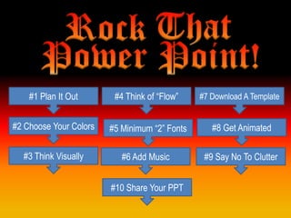
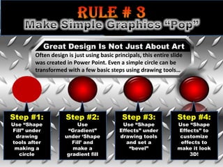
![When someone reads text, eyes flow from left to right,
[ just as you are reading this….]
The eye is then drawn to the body
or the center of the design
Your layout should follow the same principle.
Finally the eye will read the bottom of the design or slide.
This format is a lot like the letter “Z” in that the design is mimicking the flow of the eye.](https://image.slidesharecdn.com/rockthatpowerpoint-130214104335-phpapp02/85/Rock-that-Power-Point-6-320.jpg)
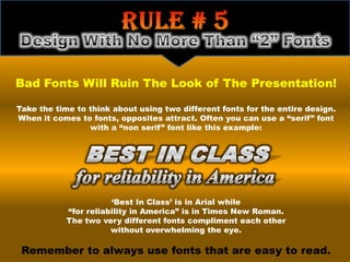
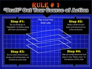
![EXAMPLE A: Cluttered Space EXAMPLE B: White Space
NOTHING IS MORE UNAPPEALING Nothing is more unappealing
THAN PLACING LOADS OF than placing loads of graphics
GRAPHICS OR TEXT INTO A or text into a presentation
PRESENTATION [THE VERY LOOK [the very look of it immediately
OF IT IMMEDIATELY MAKES THE makes the eyes strain]
EYES STRAIN] NO ONE WANTS TO
LOOK AT A BUNCH OF TEXT, OR No one wants to look at a bunch of
CROWDED GRAPHICS, KEEP IN text, or crowded graphics.
MIND THAT “LESS IS MORE”
WHEN DESIGNING. ALLOW Keep in mind that “less is more”
“WHITE SPACE” OR BREATHING when designing. Allow “white space”
SPACE TO FLOW IN THE TEXT AND or breathing space to flow in the text
GRAPHICS OF EACH SLIDE. and graphics of each slide.
BOTH EXAMPLES HAVE THE SAME MESSAGE! It is easier to read “B” than “A” because there
is space between the sentences. Avoid using capital letters because it really does not
emphasis the message. Try making your main point in a different color instead for emphasis.](https://image.slidesharecdn.com/rockthatpowerpoint-130214104335-phpapp02/85/Rock-that-Power-Point-11-320.jpg)
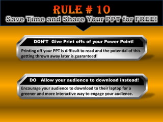

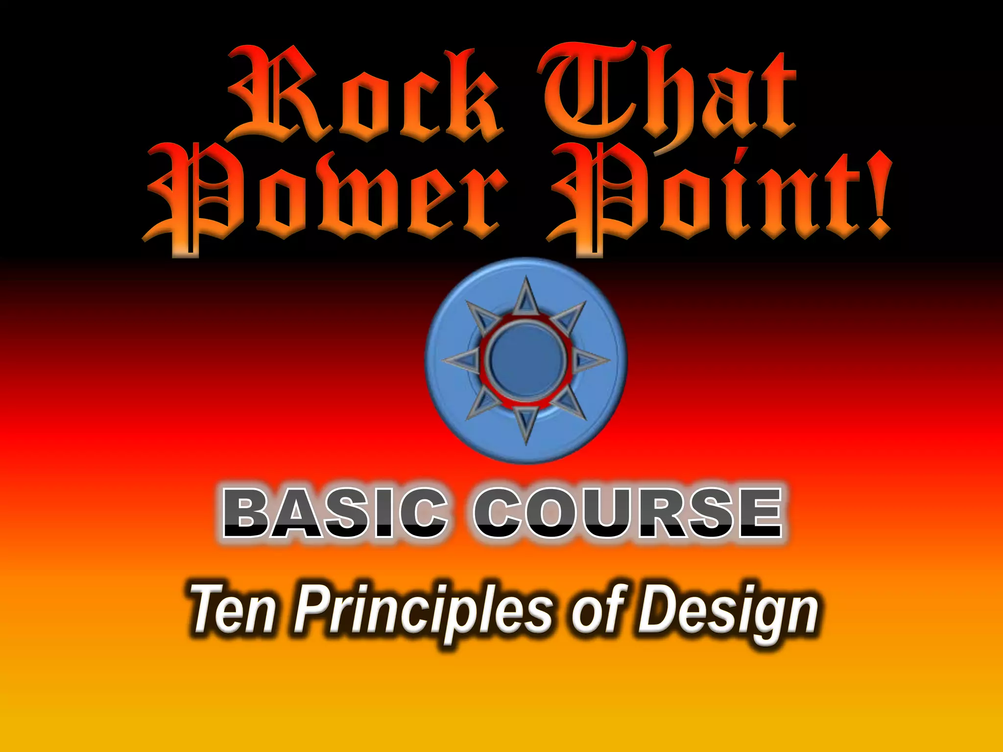
The document provides 10 tips for creating effective PowerPoint presentations: 1. Plan the presentation structure before designing slides. 2. Use a maximum of two fonts to avoid overwhelming the audience. 3. Leave white space and avoid cluttering slides with excessive text or graphics. 4. Consider adding animation and sound effects to engage audiences but do so sparingly to avoid distraction. 5. Provide digital copies for audiences to reference later rather than printing slides.


![[EMPOWERMENT TECHNOLOGIES]-ADVANCED PRESENTATION SKILLS](https://cdn.slidesharecdn.com/ss_thumbnails/et-advancedpresentationskills-211128024220-thumbnail.jpg?width=640&height=640&fit=bounds)


![Q1 WEEK 6 IN TLE 7 [Autosaved].pp777777777777777tx](https://cdn.slidesharecdn.com/ss_thumbnails/q1week6intle7autosaved-250902232032-e9a66c0d-thumbnail.jpg?width=640&height=640&fit=bounds)


