Downloaded 167 times


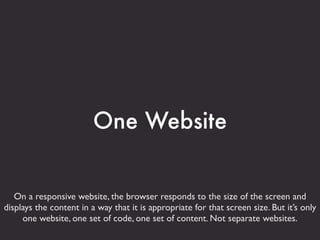

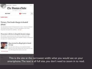


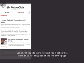
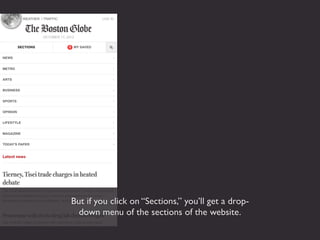

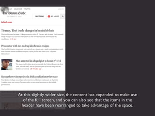
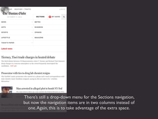


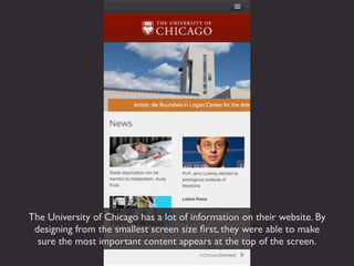


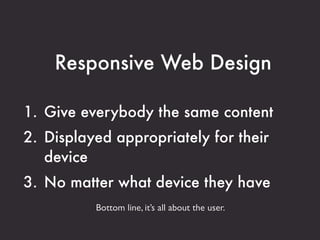


Responsive web design allows a single website to be accessed from any device by dynamically adjusting the layout depending on screen size. The content remains the same across devices but is formatted appropriately for each screen width through techniques like adjusting column numbers and widths. Designing first for mobile forces focus on essential content and ensures parity across devices. Examples demonstrate how navigation, images and text restructure seamlessly for an optimized experience on any device.


