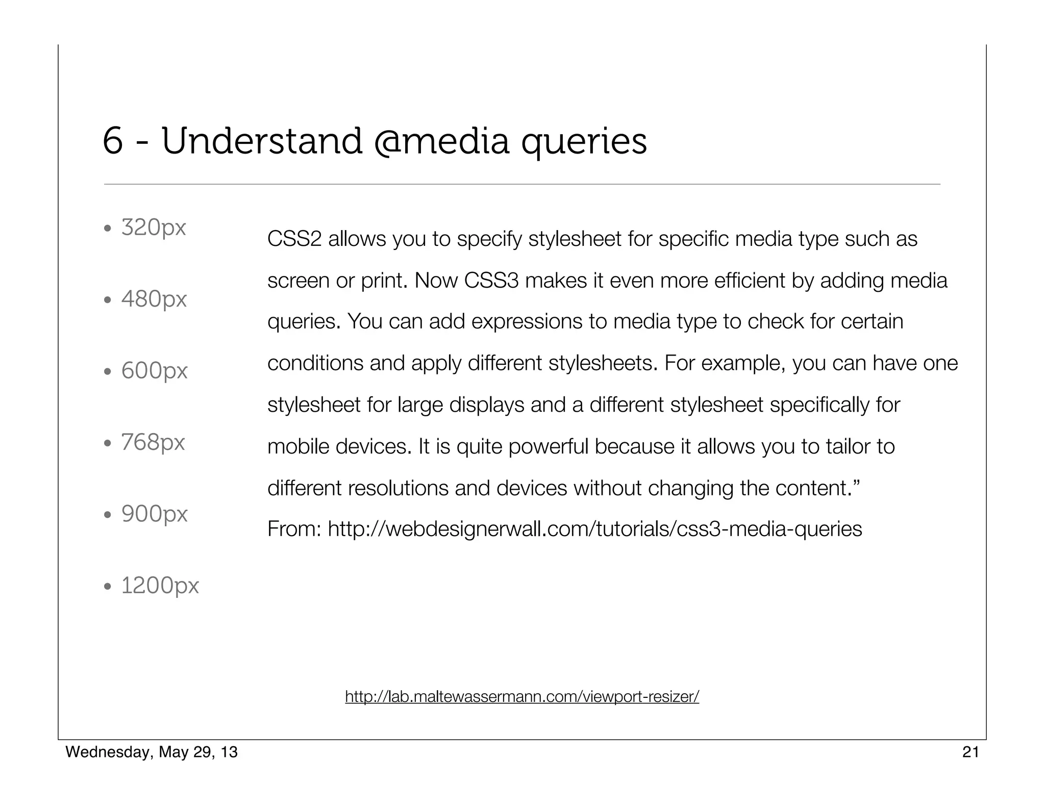
Download to read offline
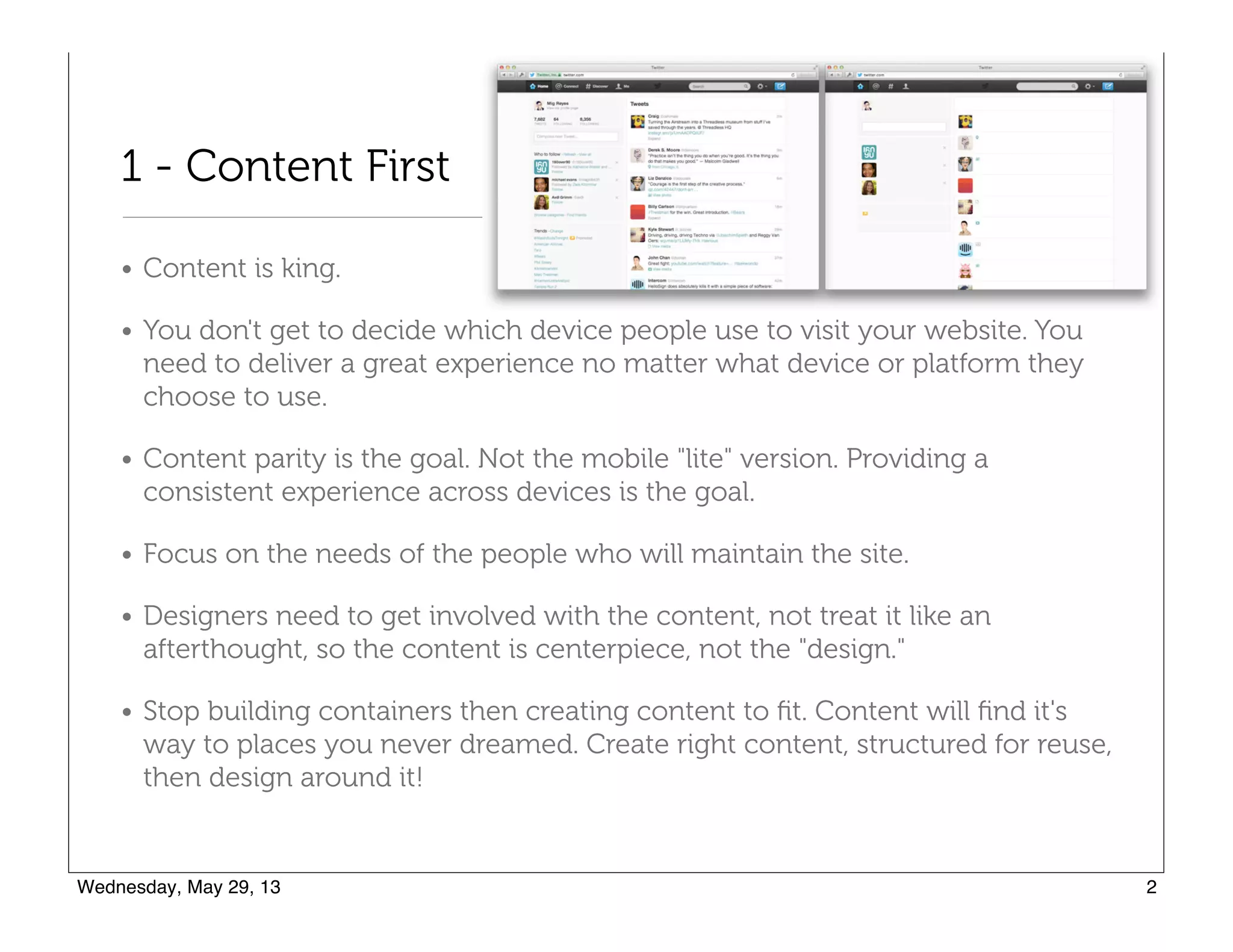
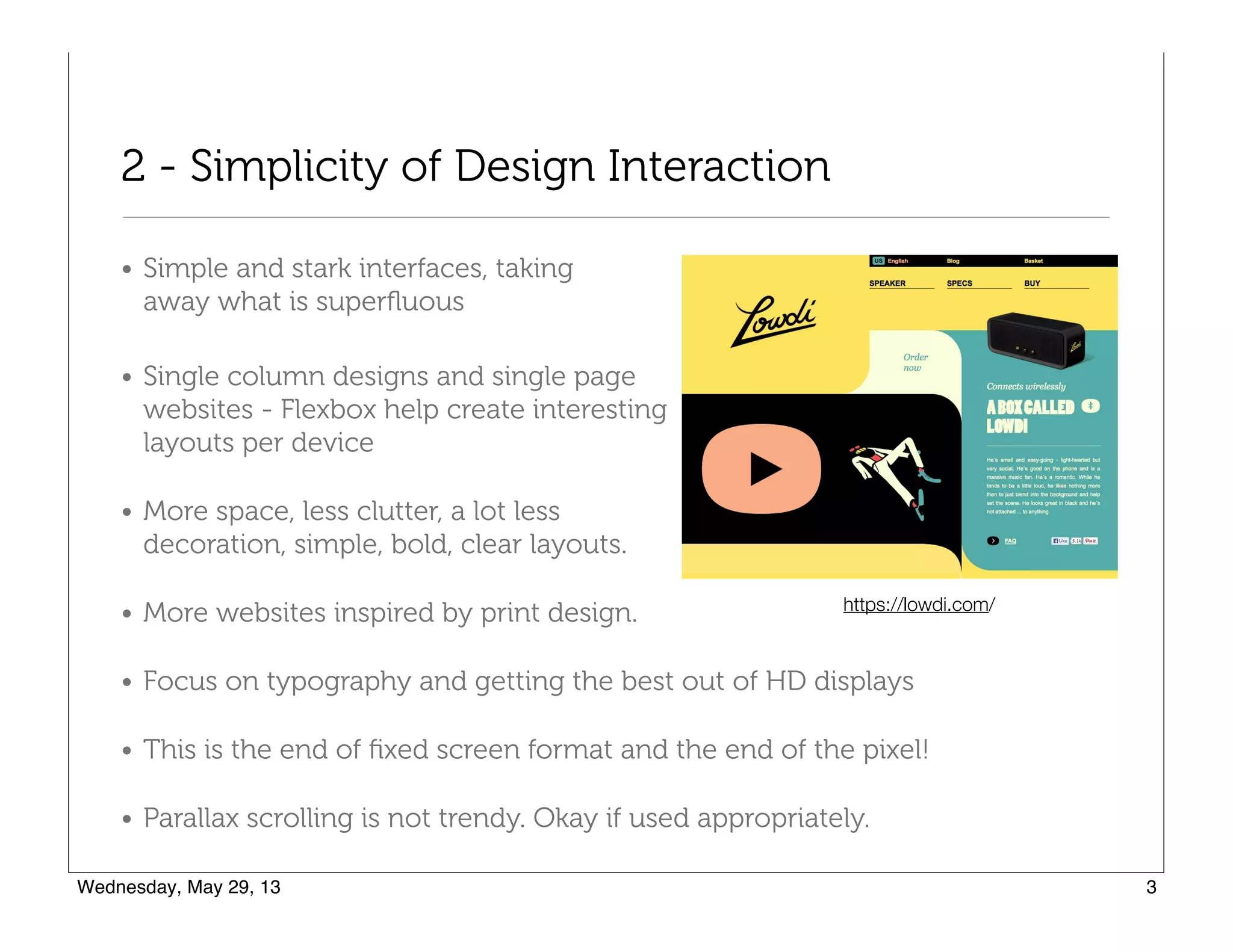
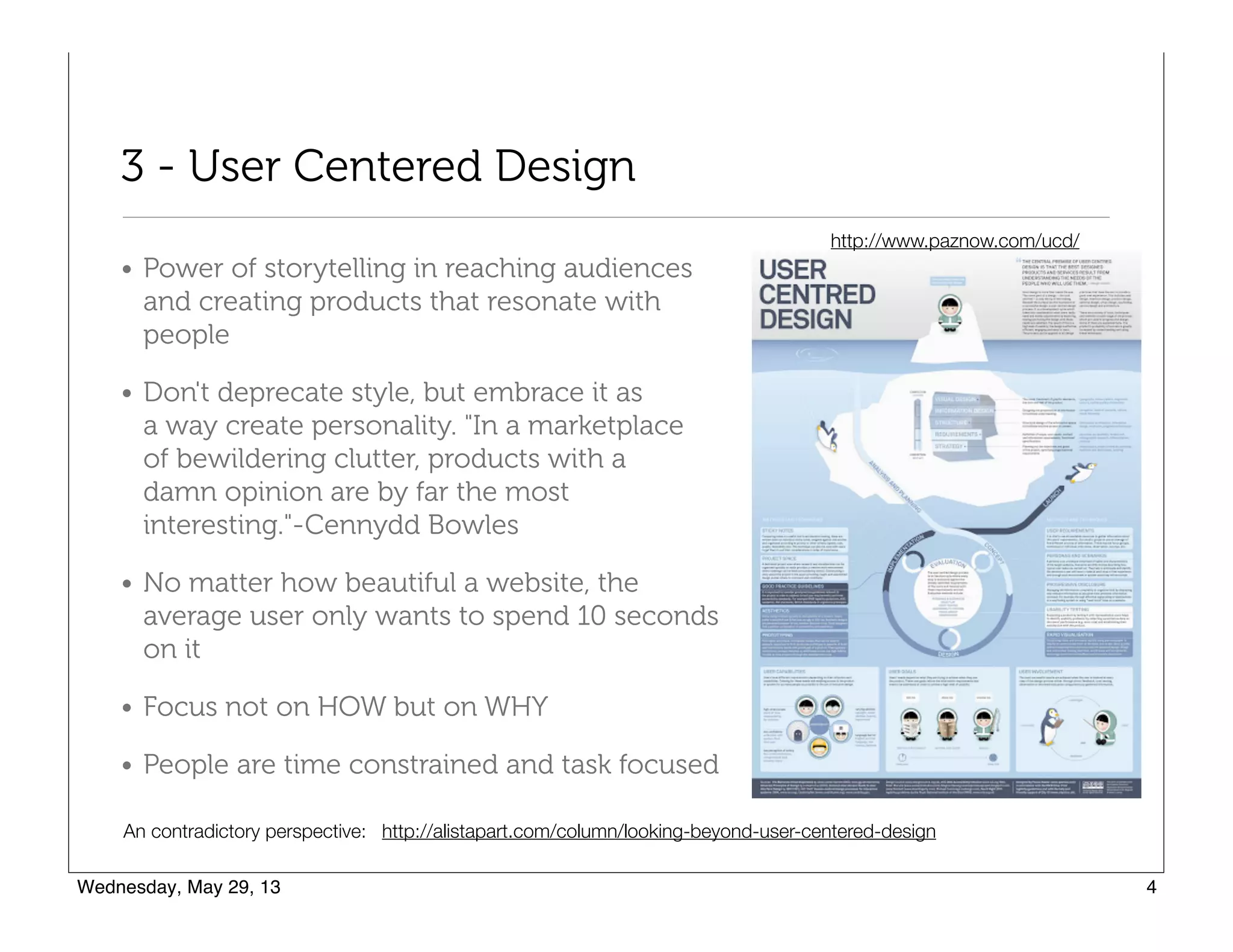
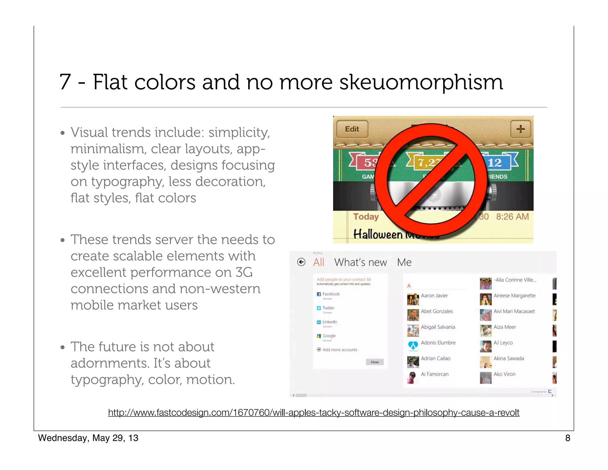

This document provides an overview of 10 web design trends for 2013 based on an e-book on web and mobile design trends. The trends discussed include: 1) Prioritizing content over design and ensuring a consistent user experience across devices. 2) Simplicity in design and interaction through minimalism, clear layouts, and focus on typography. 3) User-centered design through storytelling, personality in style, and focus on the user's purpose over design specifics.


![Vibe Coding vs. Spec-Driven Development [Free Meetup]](https://cdn.slidesharecdn.com/ss_thumbnails/vibecodingvsspecdrivendevelopment-251209105622-43f455e7-thumbnail.jpg?width=640&height=640&fit=bounds)


