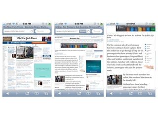
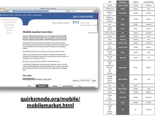
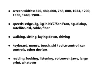
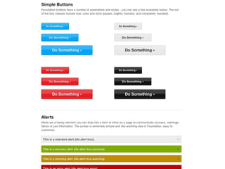
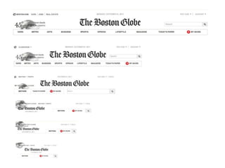
There’s Just One Web
Jen Simmons
5by5.tv/webahead
Mobile Web
really hot
Horace Deidu                   Philip Elmer-Dewitt
asymco.com/2011/11/01/the-   tech.fortune.cnn.com/2011/11/01/net-applications-
  mobile-phone-landscape/           ios-web-share-hit-record-61-6-in-oct/
what to do?
A) do nothing
B) add a mobile
 theme to your
  current site
C) create a mobile
site, and redirect
 all mobile traffic
     over there
D) create a mobile app,
and redirect all mobile
   traffic over there
what is “mobile”
   anyway?
• 640 x 480
• 14.4k modem
• keyboard & mouse
• 800 x 600
• 56.6k modem
• keyboard & mouse
• 1024 x 768
• 768 kb/sec on dsl
• keyboard & mouse
• 1200 x ???
• 1.5mb/sec+
• keyboard & mouse
“Desktop”     “Mobile”

• 1200 x ???   • 320 x 480
• 1.5mb/sec    • 3g
• keyboard &   • touch
 mouse
quirksmode.org/mobile/
  mobilemarket.html
browser detection /
 device detection /
   OS detection
        is a
     bad idea
•   screen widths: 320, 480, 600, 768, 800, 1024, 1200,
    1330, 1440, 1900…

•   speeds: edge, 3g, 3g in NYC/San Fran, 4g, dialup,
    satellite, dsl, cable, fiber

•   walking, sitting, laying down, driving

•   keyboard, mouse, touch, siri / voice control, car
    controls, other devices

•   reading, looking, listening, voiceover, jaws, large
    print, whatever
a) do nothing
b) mobile theme
 c) mobile site
 d) mobile app
     e) ???
make a website
How can one website
work for all devices?
Easy:
 Responsive
 Web Design
     &
 Progressive
Enhancement
Now sometimes a separate
   site is a good idea.

     But not just for
   a different device.
Progressive
Enhancement
modernizr.com
Responsive Web
    Design
alistapart.com/articles/responsive-web-design
mediaqueri.es
So how?
CSS Media Query
stuffandnonsense.co.uk/projects/320andup
github.com/scottjehl/Respond
Responsive images
img {
  max-width : 100%;
}
filamentgroup.com/lab/responsive_images_experimenting_with_context_aware_image_sizing
fitvidsjs.com
But what about
everything else?
flickr.com/photos/merlin/sets/72157622077100537/with/2731723031
How do you do
this for mobile?

    Don’t.
Mobile First
Content First
Biggest change >
    process
Old web design
    process
Emerging New Process
• Discovery
• Paper sketches
• Mood boards
• Style tiles
• Prototype bits of content in HTML & CSS
• Build up to full prototypes of page layouts
• Iterate
sketches by Thibaut Sailly — bureau.tsailly.net/2010/09/champagne.html
webdesignerdepot.com/
2008/12/why-mood-boards-
         matter/
badassideas.com/style-tiles-as-a-web-design-process-tool   chicago2011.drupal.org/sessions/avoiding-frankenstein-website-
                                                                            design-collaborating-clients


                                                                          Samantha Warren
Style Tiles                                                               @samanthatoy
The style tile is not a literal
translation of what the website
is going to be, but a starting
point for the designer and the
client to have a conversation
and establish a common visual
language. When a client says
“clean,” does she mean
Apple.com clean or
NYTimes.com clean?
5by5.tv/webahead/3-jeremy-keith
foundation.zurb.com/docs/layout.php
Wa la
upstatement.com/portfolio/boston-globe
flickr.com/photos/splorp/6141222275
Learn more
mediaqueri.es
netmagazine.com/features/
ethan-marcottes-20-favourite-responsive-sites
by ETHAN MARCOTTE


abookapart.com/products/responsive-web-design
by LUKE WROBLEWSKI


abookapart.com/products/mobile-first
lukew.com/ff/entry.asp?1436
easy-readers.net
5by5.tv/webahead
aneventapart.com
futurefriend.ly
futurefriend.ly
adactio.com
Jen Simmons
   @jensimmons
 jensimmons.com
5by5.tv/webahead
Jensimmons html5live-responsivedesign

Jensimmons html5live-responsivedesign