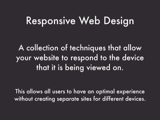
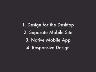
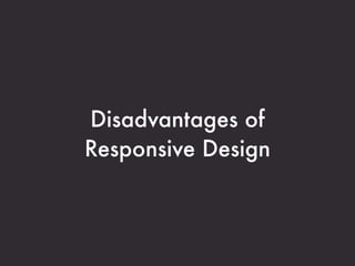
Responsive Design
      Heaven & Hell*

                Clarissa Peterson
                  clarissapeterson.com
                         @clarissa


*Someone else chose the title, not me.... I’m not quite so dramatic.
UX & Mobile Creatives Meetup
    September 25, 2012
"So you’re going to make websites
work better on mobile phones?
Because right now they mostly all suck."
              - my friend who's not a web designer
Mobile
It’s Not About
     Mobile
It’s About the Web
Responsive Web Design

 A collection of techniques that allow
your website to respond to the device
      that it is being viewed on.


This allows all users to have an optimal experience
without creating separate sites for different devices.
Options
1. Design for the Desktop
2. Separate Mobile Site
 3. Native Mobile App
  4. Responsive Design
Advantages of
Responsive Design
Consistent experience
Content parity
No zooming
Single code base
Device agnostic
URL management
Disadvantages of
Responsive Design
Context of use
Speed/bandwidth
Advertising
Workflow
We aren’t good at it yet.
"It's not like our industry nailed web
design before we started doing
responsive design. It's still a work in
progress."
                                 - Dan Willis
                                   @uxcrank
How do you choose?
Content sites vs. transactional sites
Context of use
Resources
Your CMS might decide for you
Don’t do a native app just
because your boss wants one.
Things to Consider when Doing
      Responsive Design
Device/browser support
Test on real devices
Brief promo:
 Device Lab DC
devicelabdc.com
 @devicelabdc
Speed/bandwidth
Small-screen first
Let content determine design
Let design determine breakpoints
Consider user experience
  & business goals first
Communicate with your clients
Responsive workflow
Questions
Resources
A Few Examples of Responsive Design

              Boston Globe      http://www.bostonglobe.com
        Smashing Magazine       http://www.smashingmagazine.com
               People (mobile site)     http://m.people.com
        United Pixelworkers    http://www.unitedpixelworkers.com/
             World Wildlife Fund      http://worldwildlife.org/
         Stuff & Nonsense      http://www.stuffandnonsense.co.uk/
        Emeril’s Restaurants    http://www.emerilsrestaurants.com/
       Andersson-Wise Architects      http://www.anderssonwise.com
                    AIDS.gov (HHS)      http://aids.gov
WordPress Theme: Twenty Twelve     http://twentytwelvedemo.wordpress.com/
Books

Ethan Marcotte - Responsive Web Design (2011)
http://www.abookapart.com/products/responsive-web-design/


     Luke Wroblewski - Mobile First (2011)
     http://www.abookapart.com/products/mobile-first


                    Websites

             @RWD (Ethan Marcotte)
                 https://twitter.com/RWD


                   Future Friendly
                  http://futurefriend.ly/


                      Brad Frost
              http://bradfrostweb.com/blog/
Articles

             Responsive Web Design - Ethan Marcotte (May 2010)
                   http://www.alistapart.com/articles/responsive-web-design/


How to Approach a Responsive Design (Boston Globe) - Tito Bottitta (Jan. 2012)
          http://upstatement.com/blog/2012/01/how-to-approach-a-responsive-design/


      Design Process In The Responsive Age - Drew Clemens (May 2012)
       http://uxdesign.smashingmagazine.com/2012/05/30/design-process-responsive-age/


    Making of: People Magazine's Responsive Mobile Website (July 2012)
                  http://globalmoxie.com/blog/making-of-people-mobile.shtml


        Presidential Smackdown Edition: Separate Mobile Website Vs.
                 Responsive Website - Brad Frost (Aug. 2012)
                     http://mobile.smashingmagazine.com/2012/08/22/
                  separate-mobile-responsive-website-presidential-smackdown/

Responsive Design Heaven & Hell