Downloaded 425 times


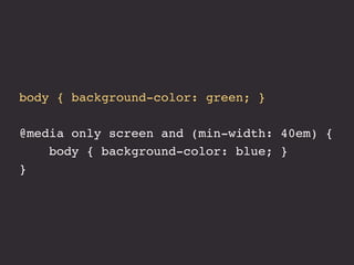
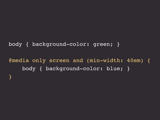


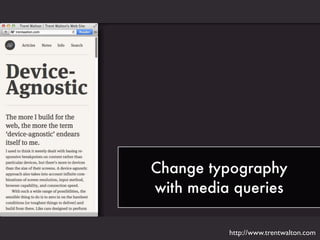


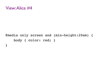

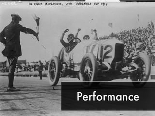

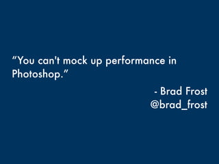


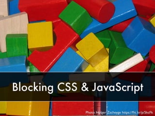


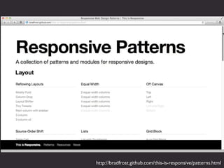


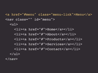


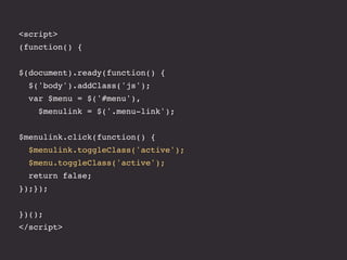

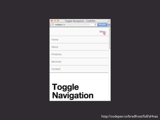
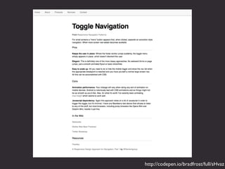
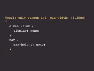
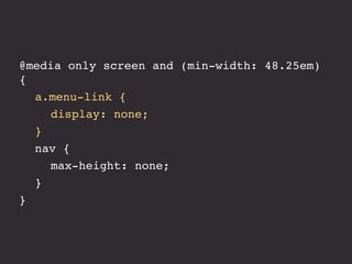
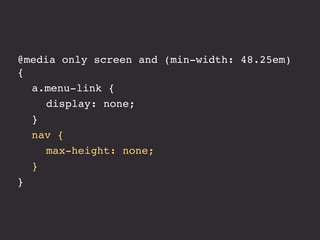


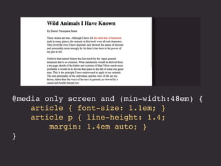
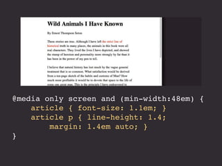
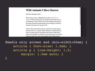
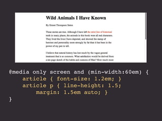


The document details a hands-on workshop on designing responsive websites, emphasizing the importance of responsive design, media queries, and performance in web development. It includes practical coding examples and resources for further exploration. The text also highlights various design processes and tools used in creating responsive layouts and emphasizes an iterative approach to web design.


