Download to read offline
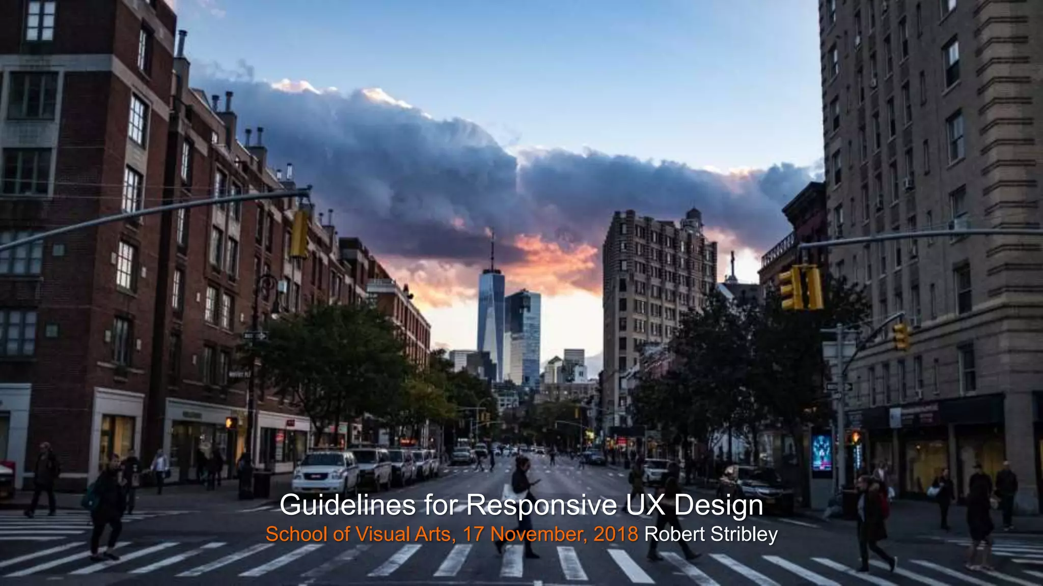


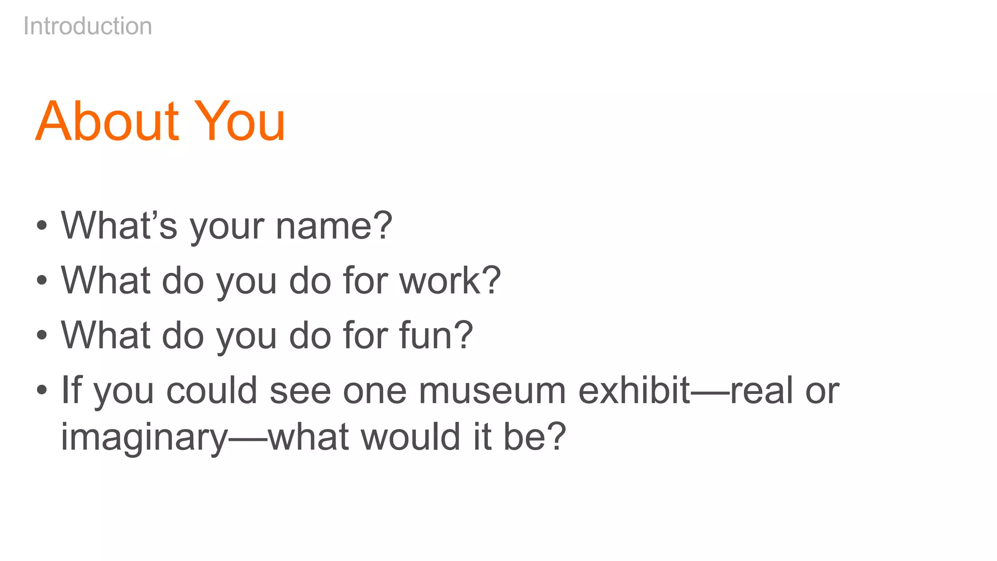


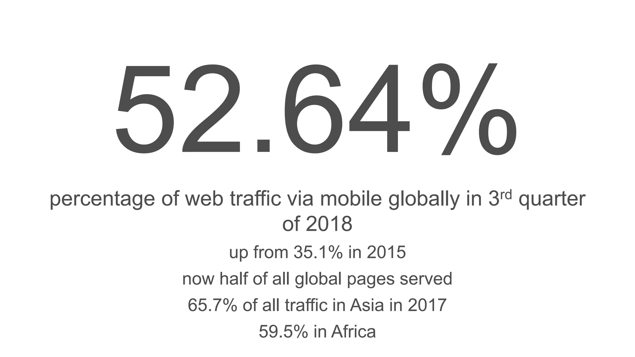
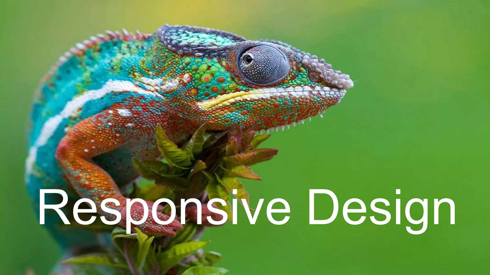
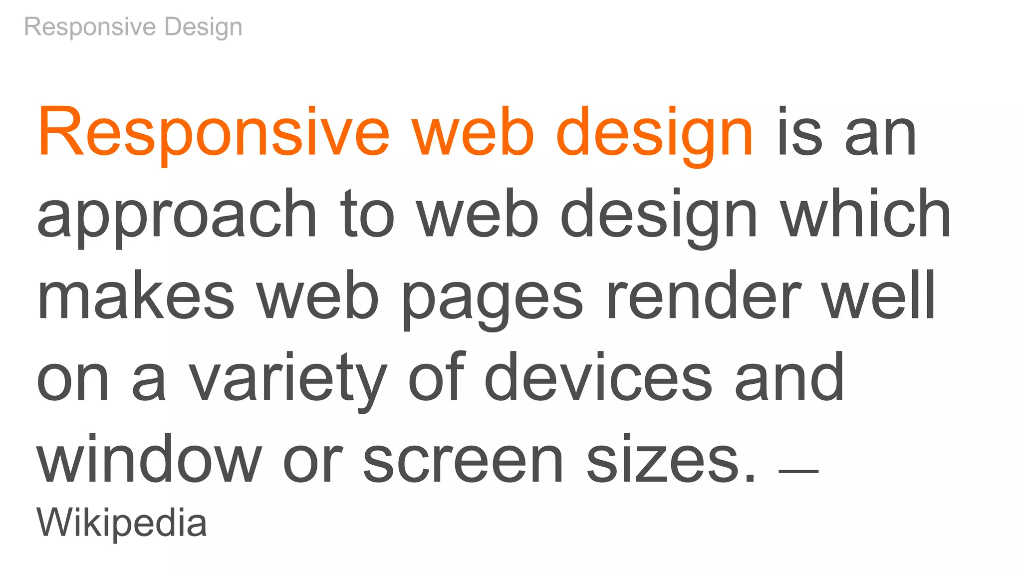
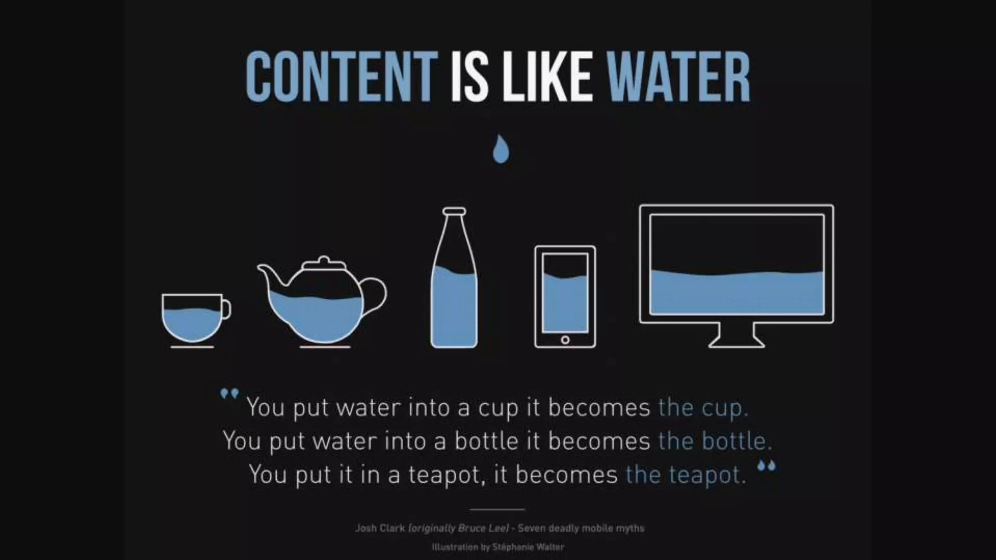
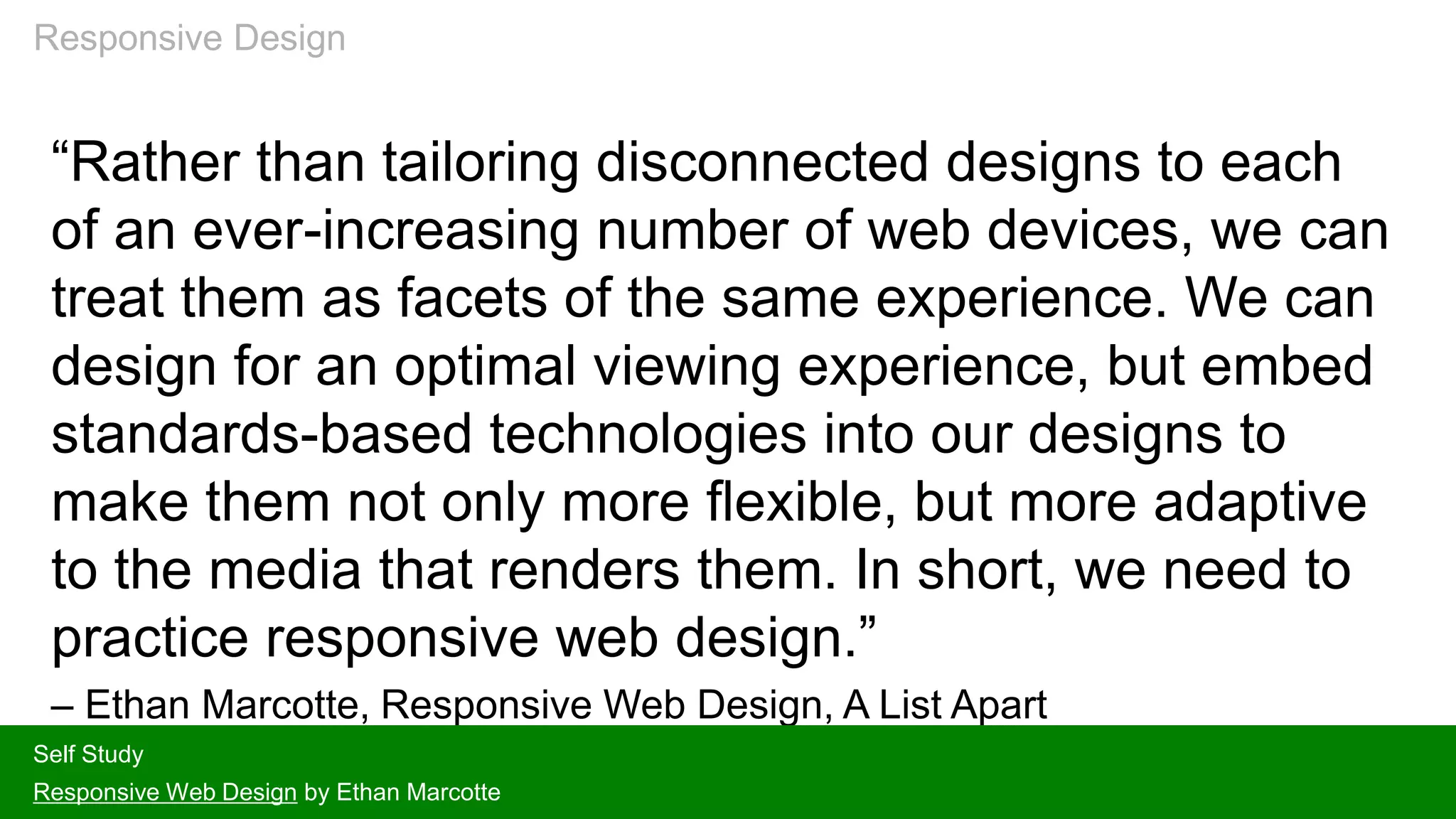
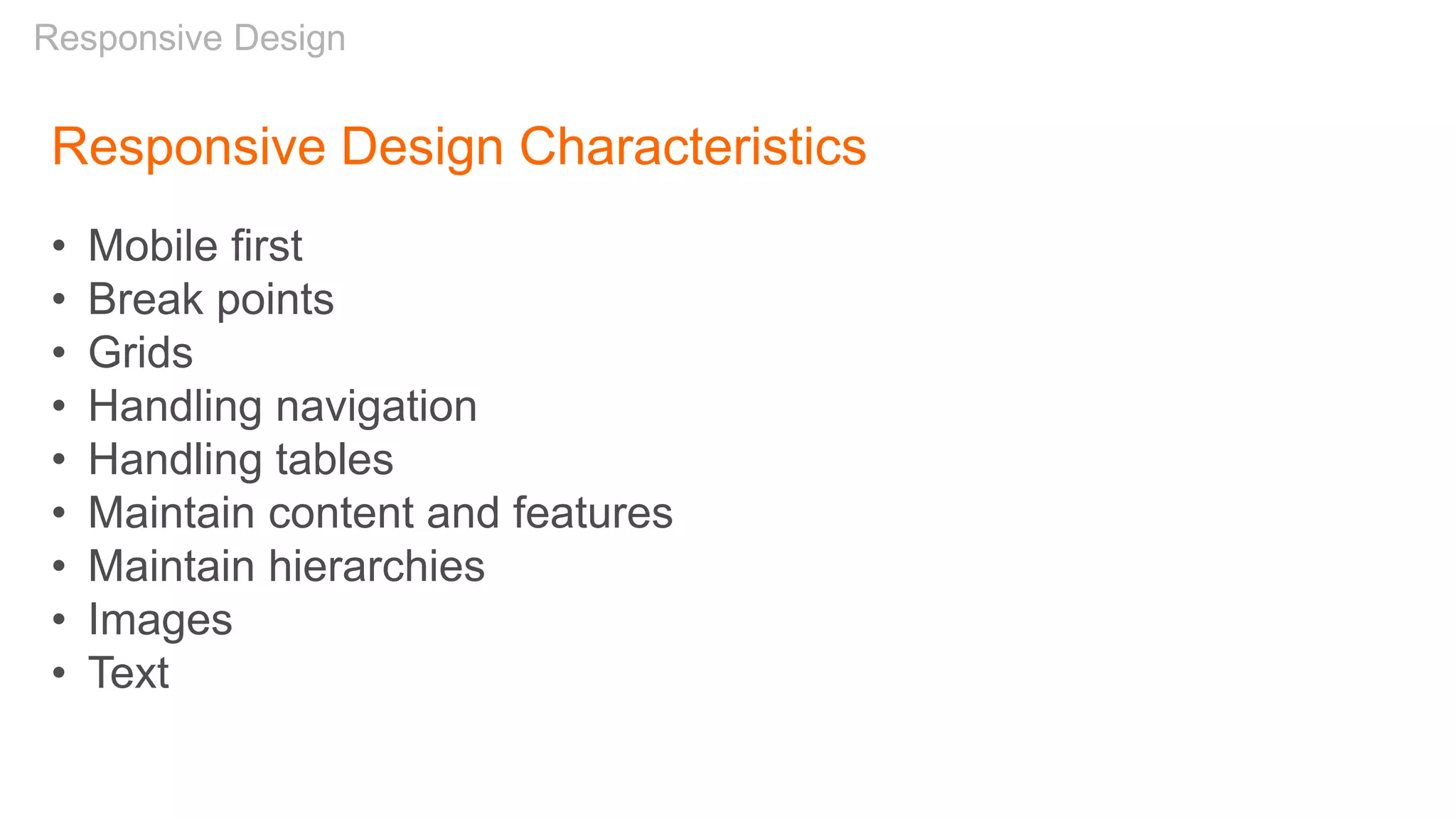
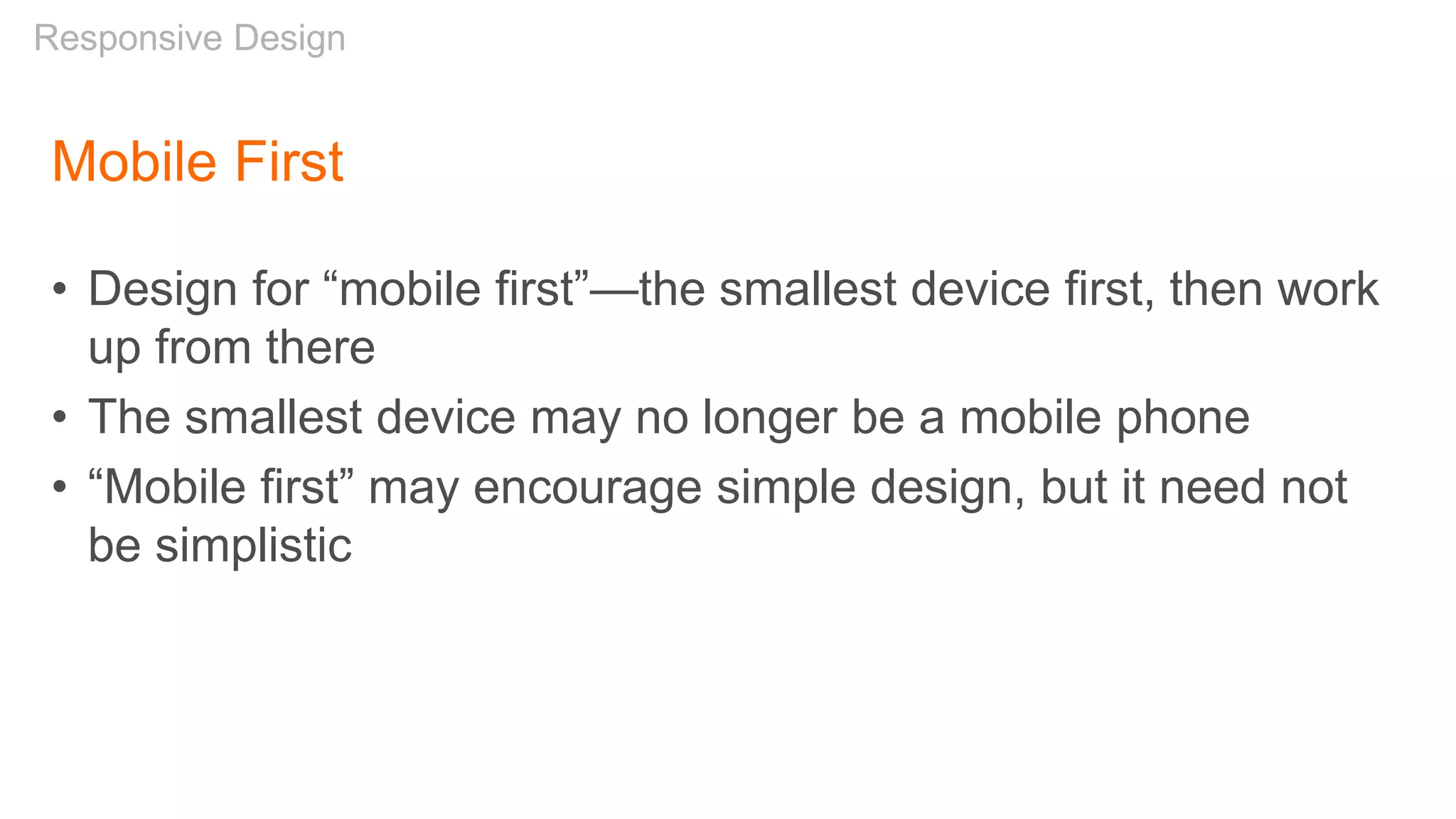
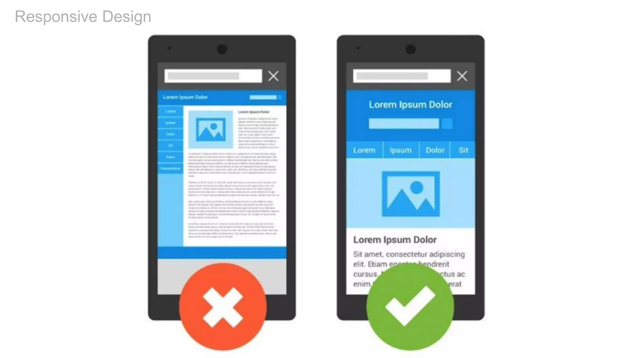
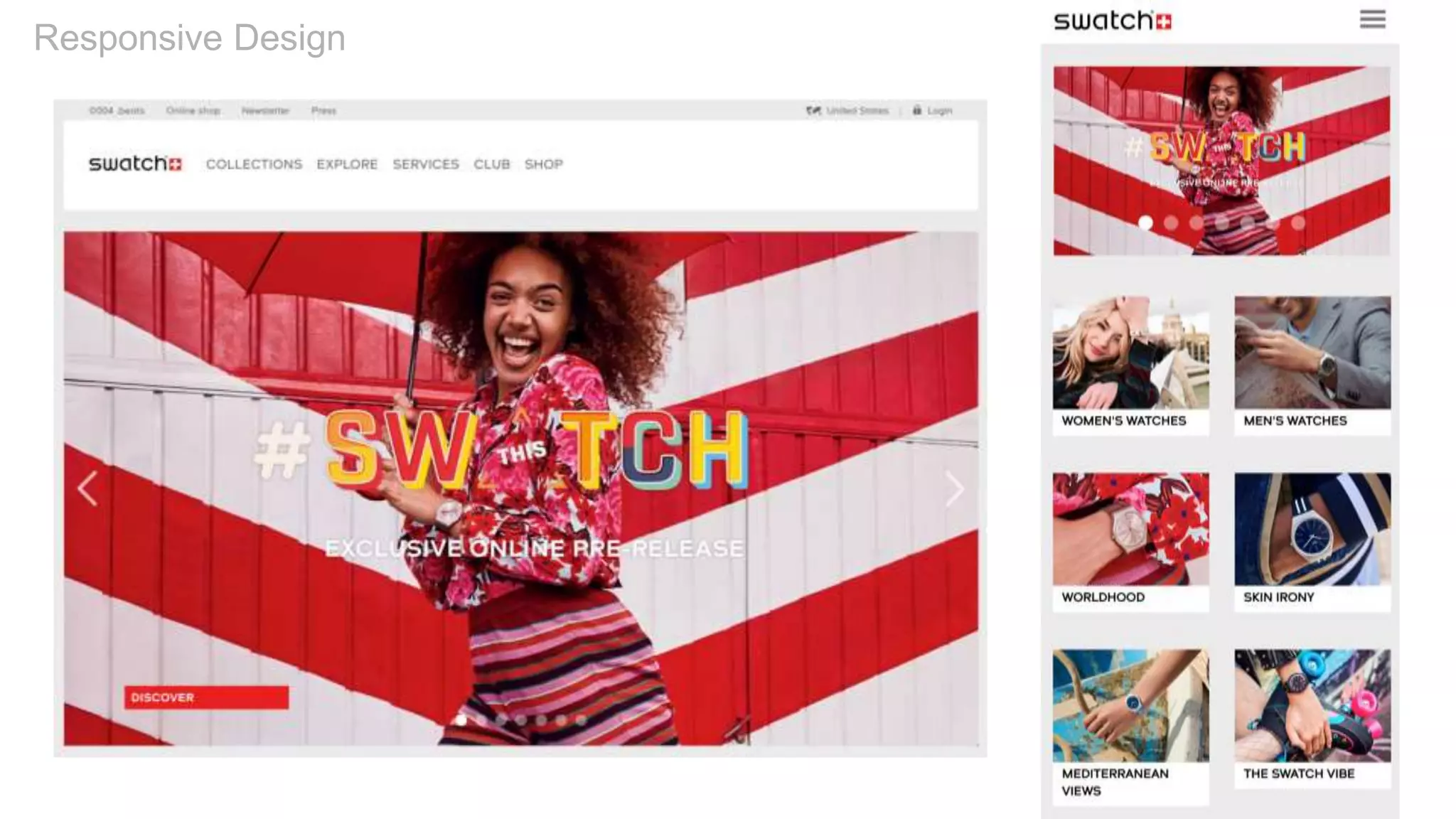
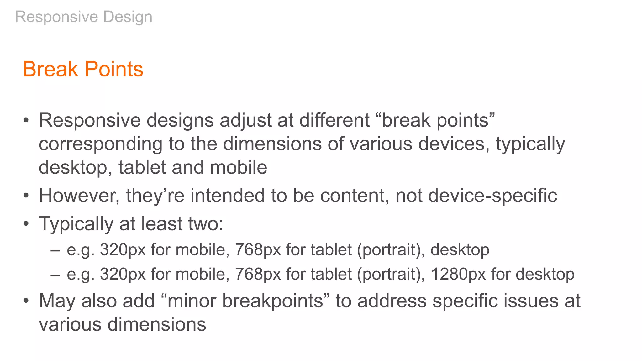
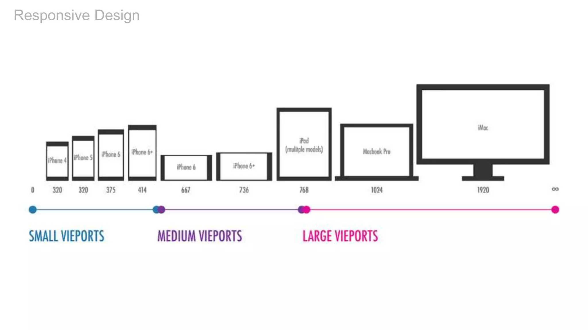
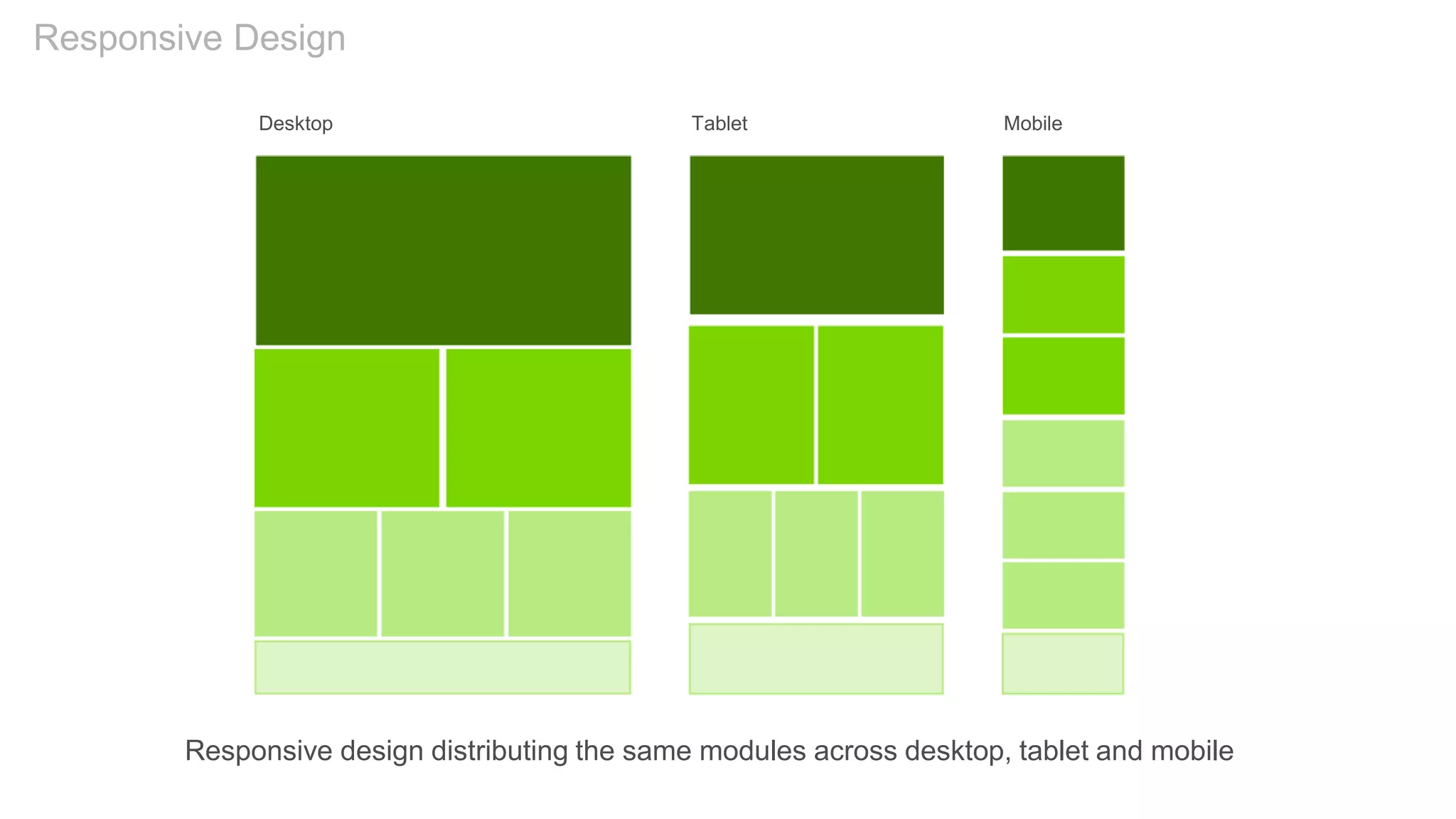
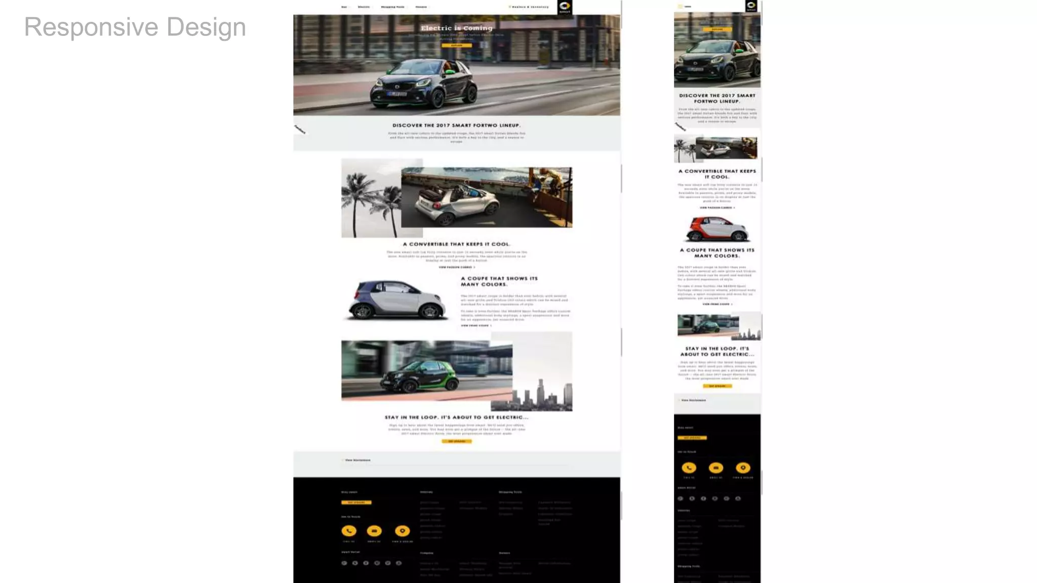
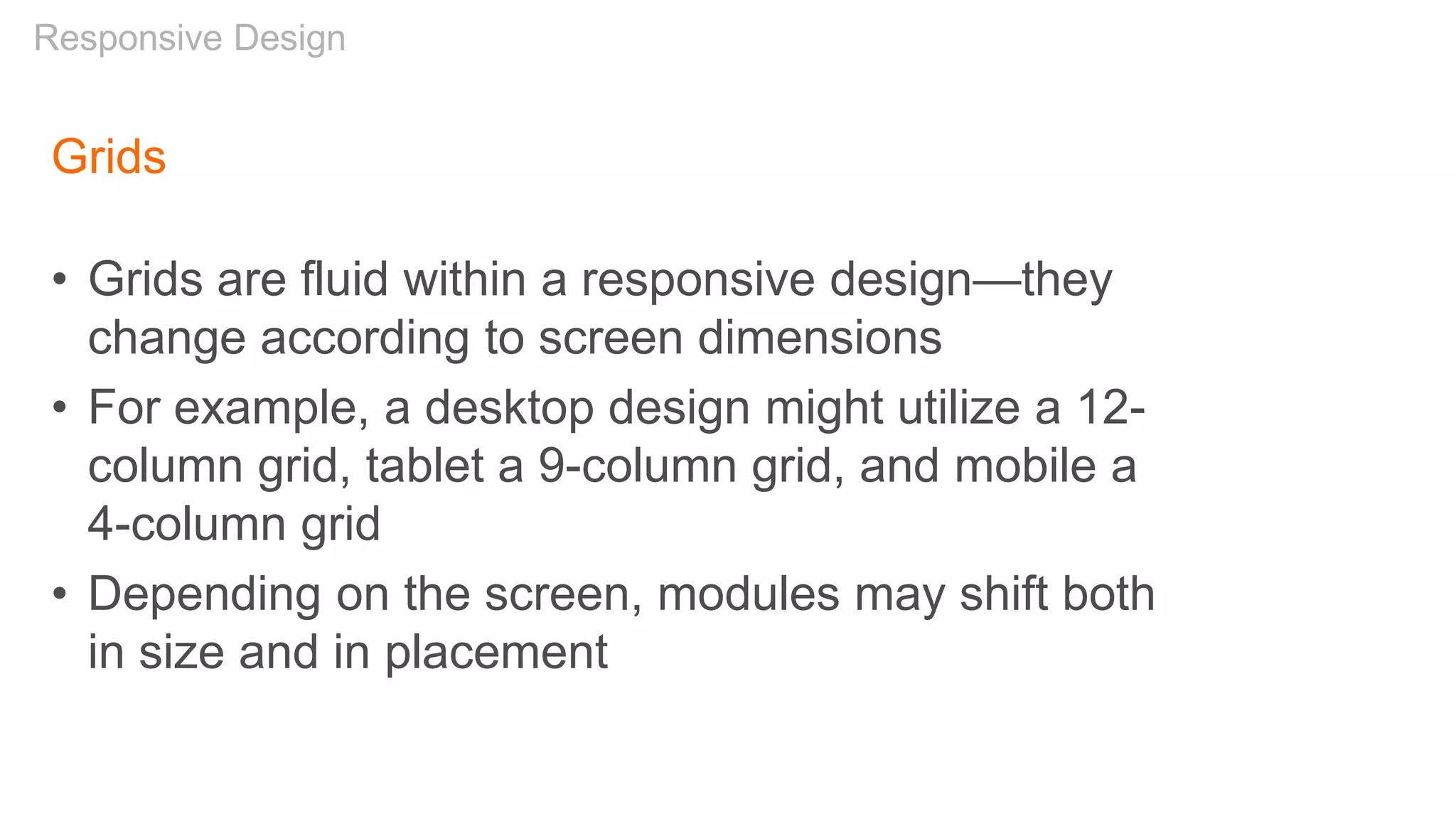
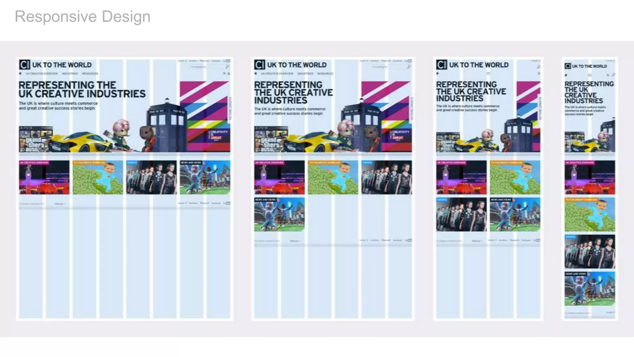
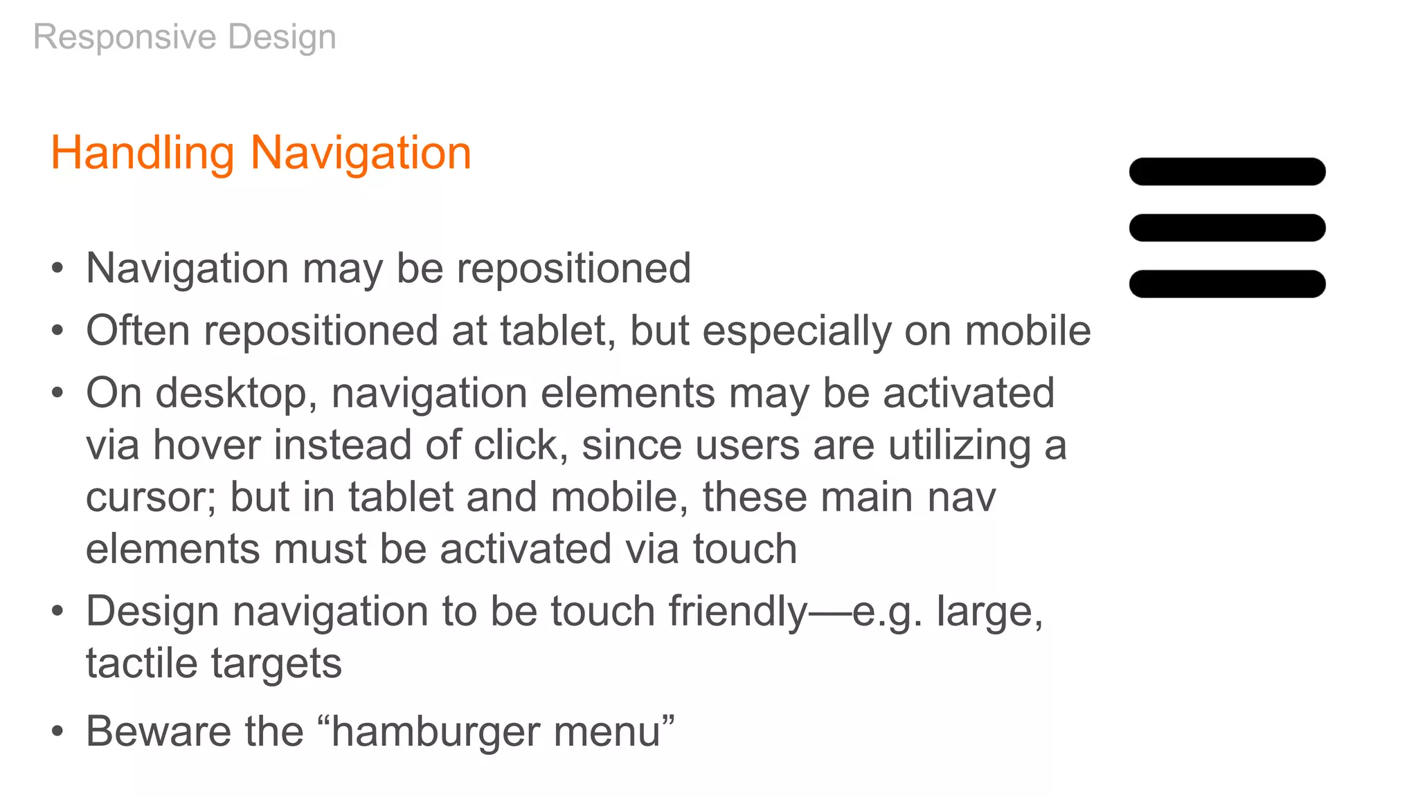
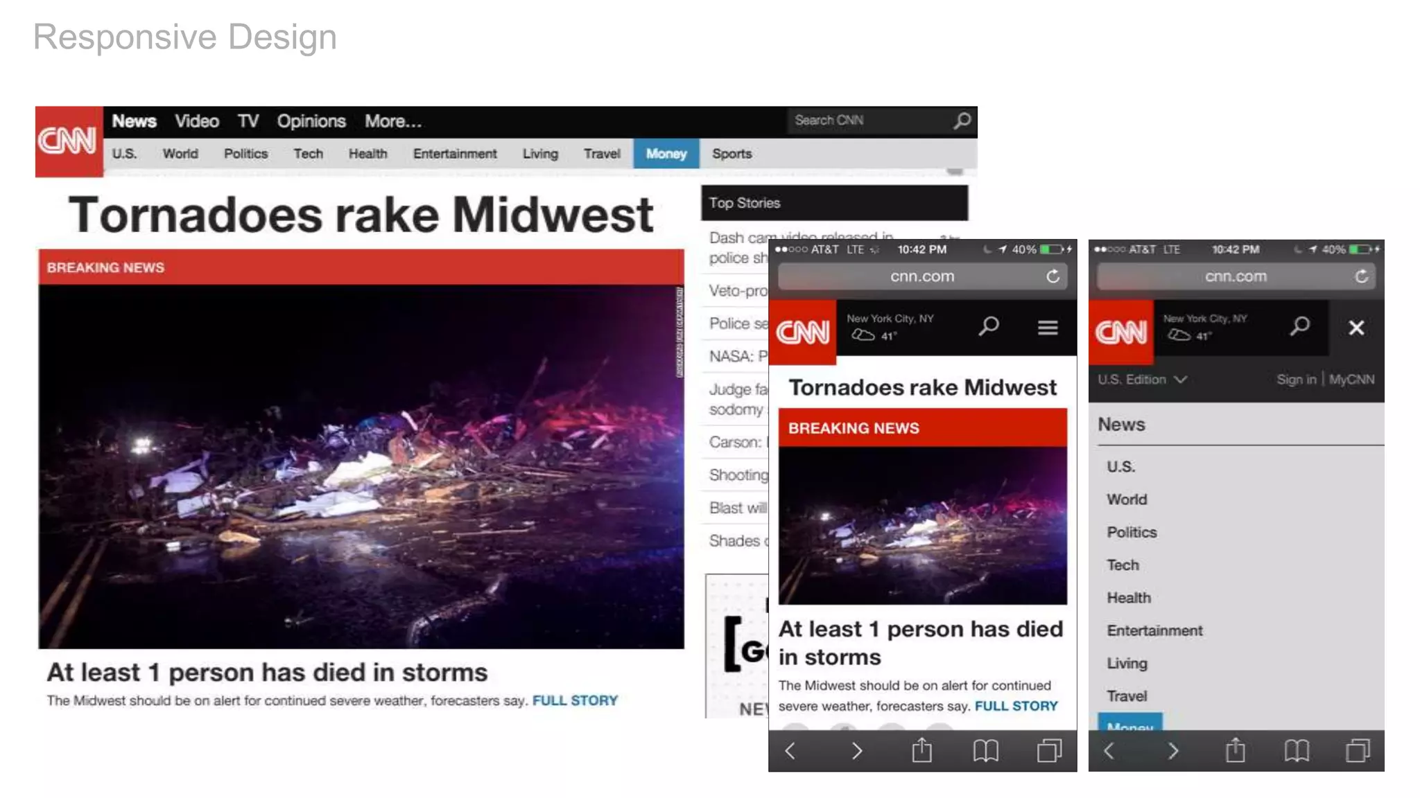
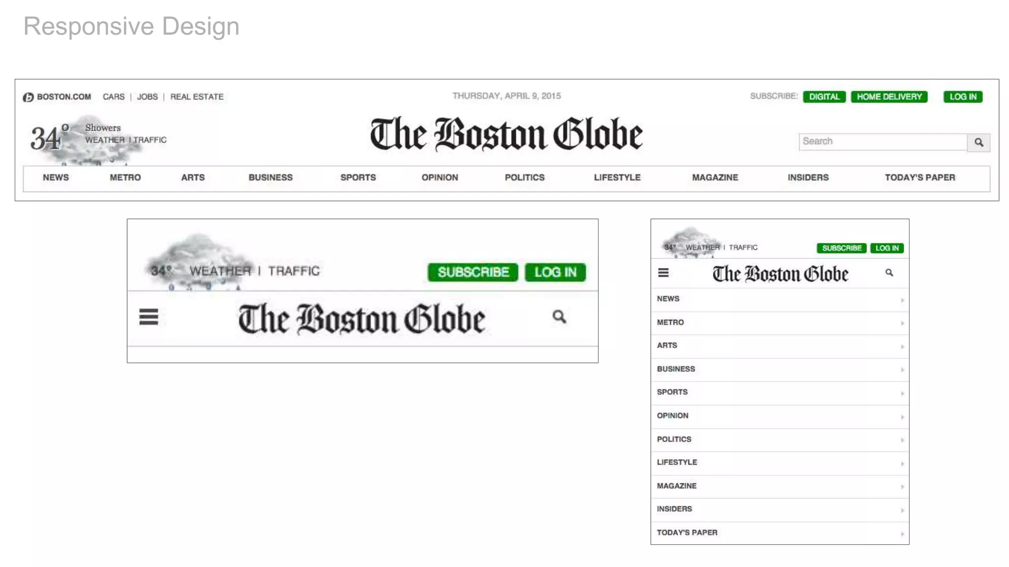
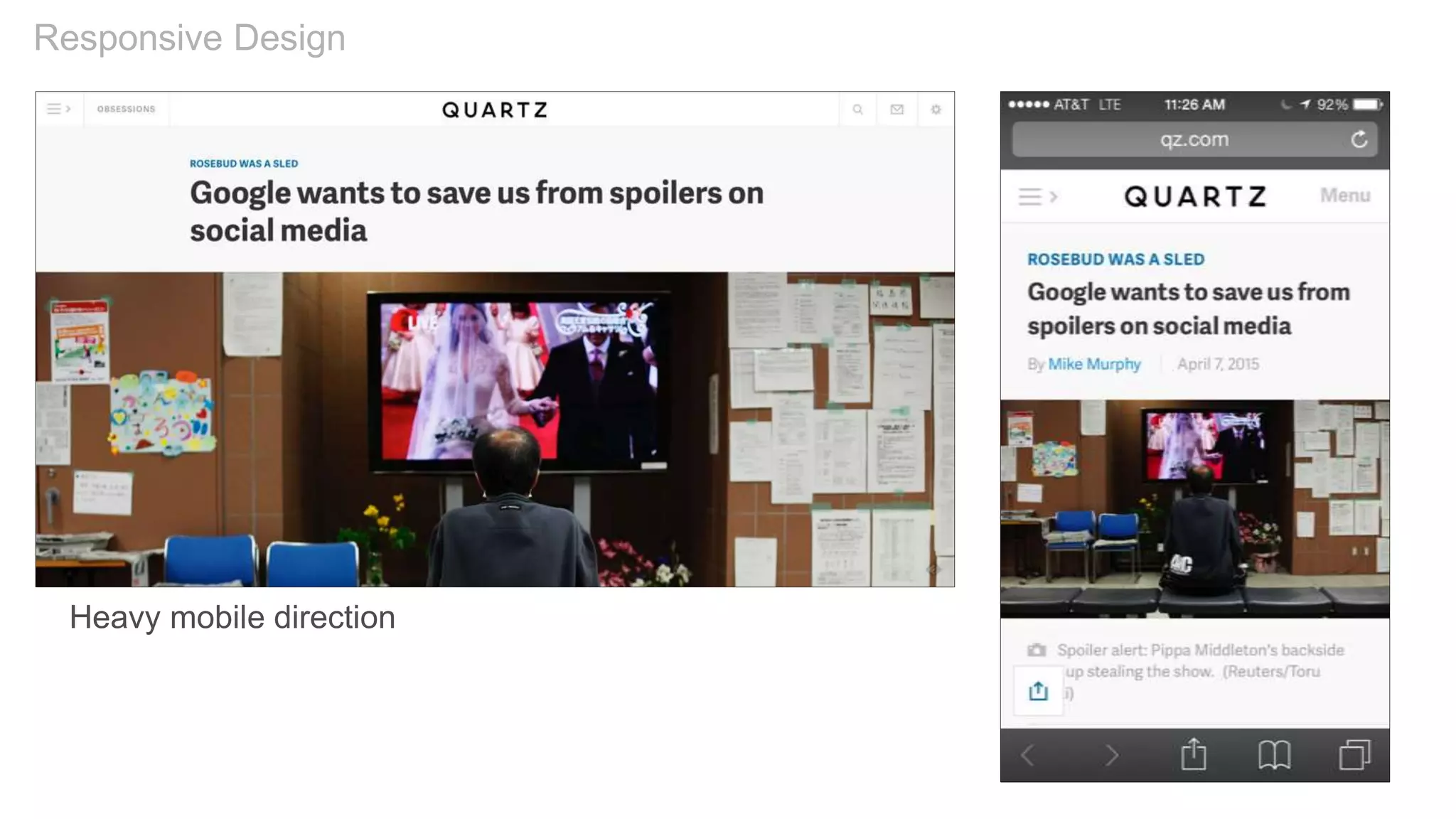
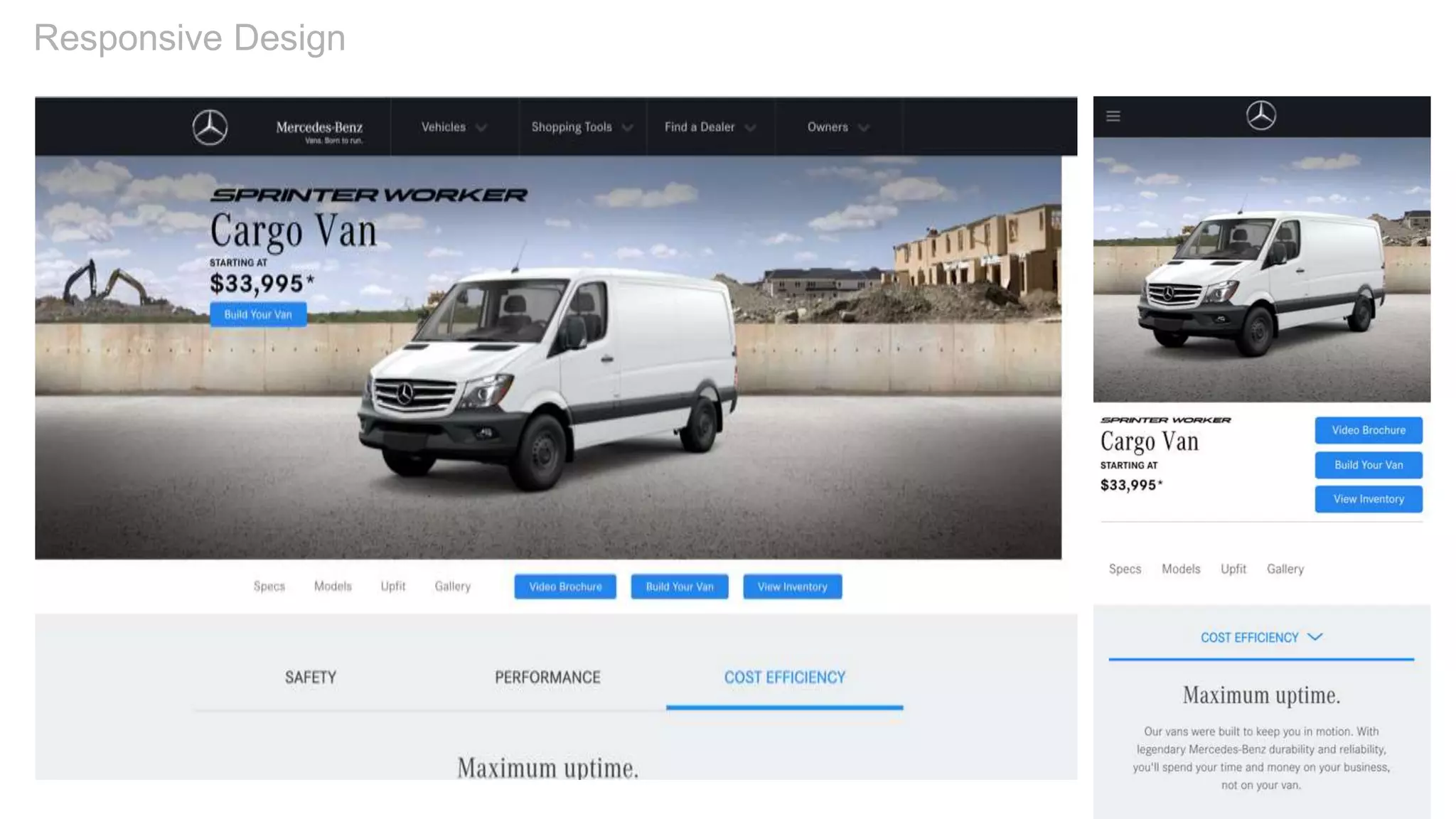
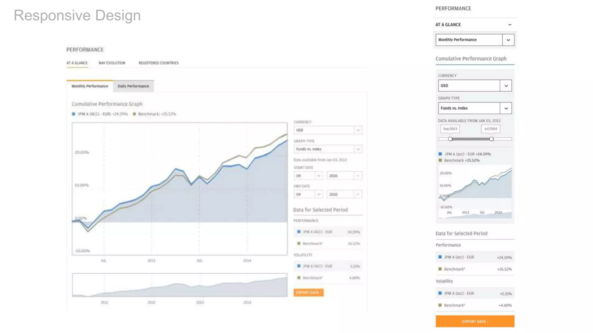
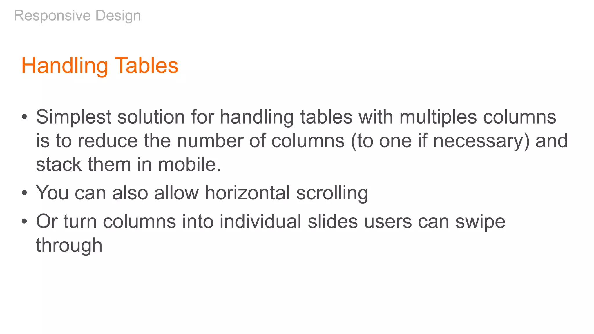
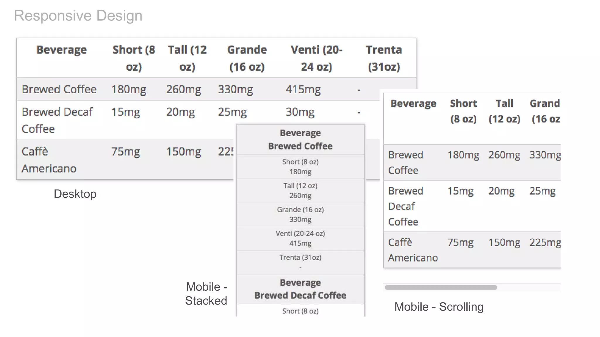

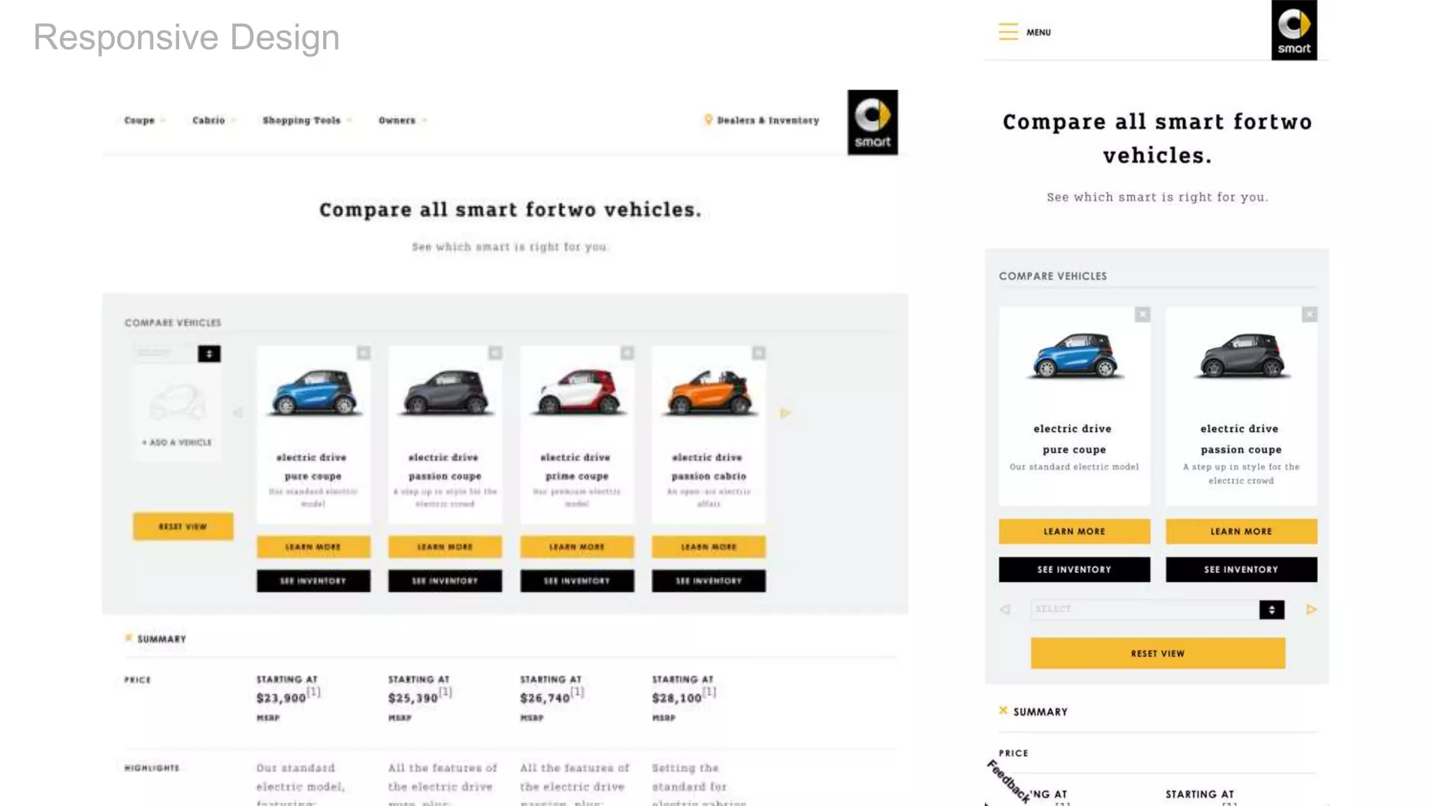
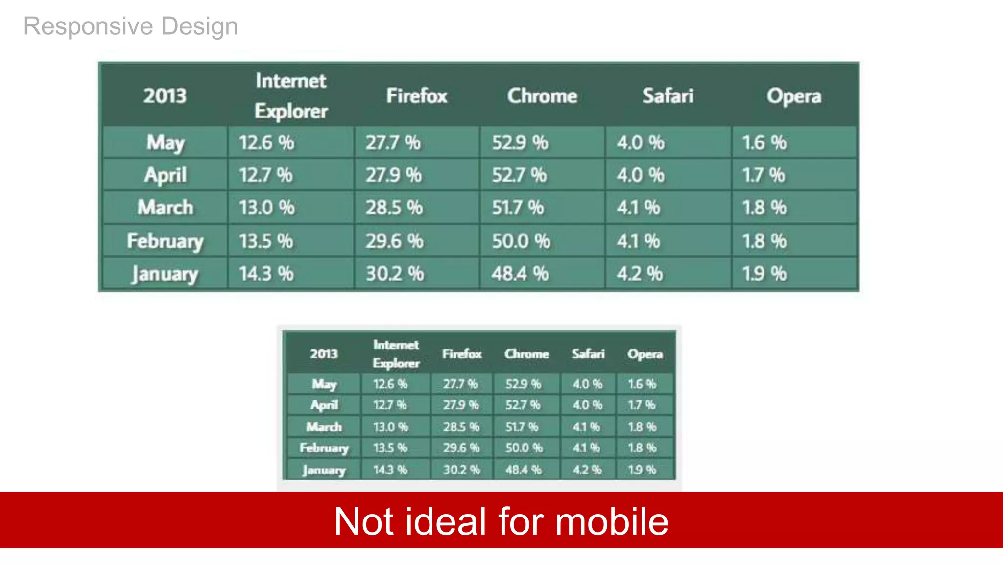
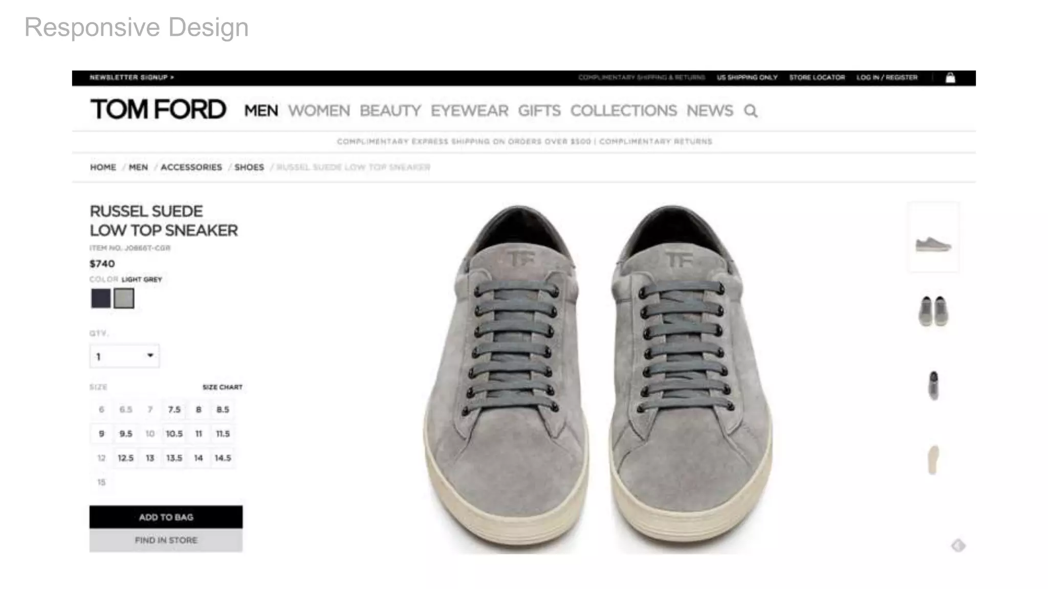

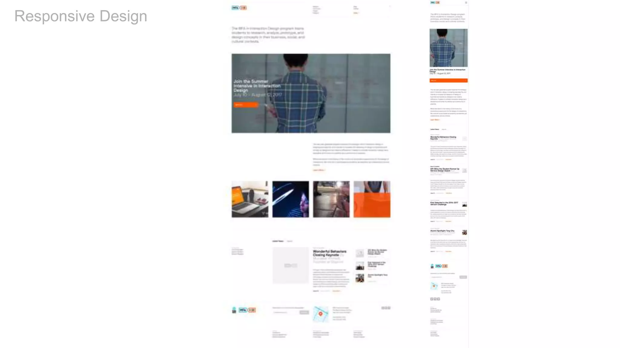
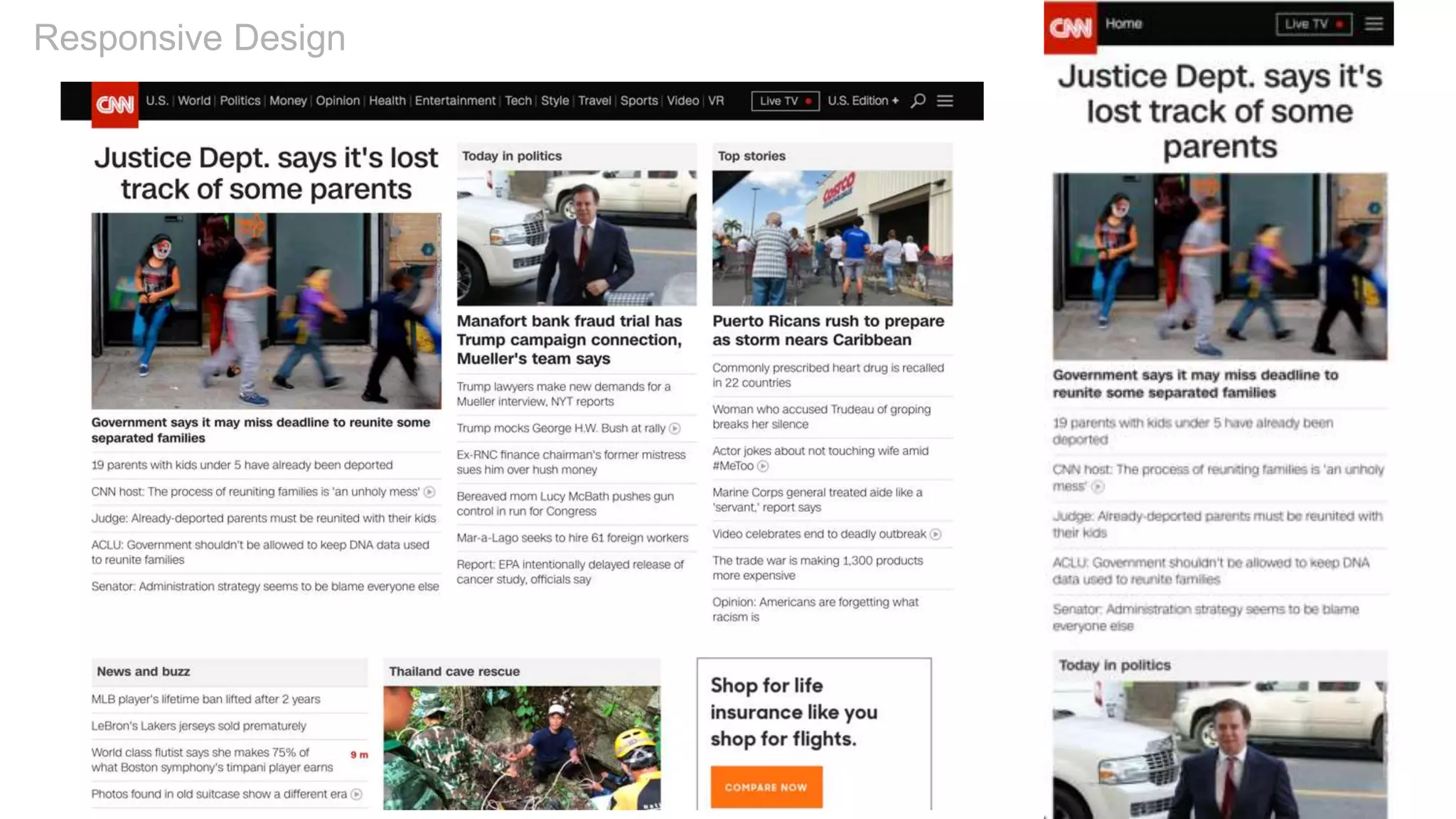
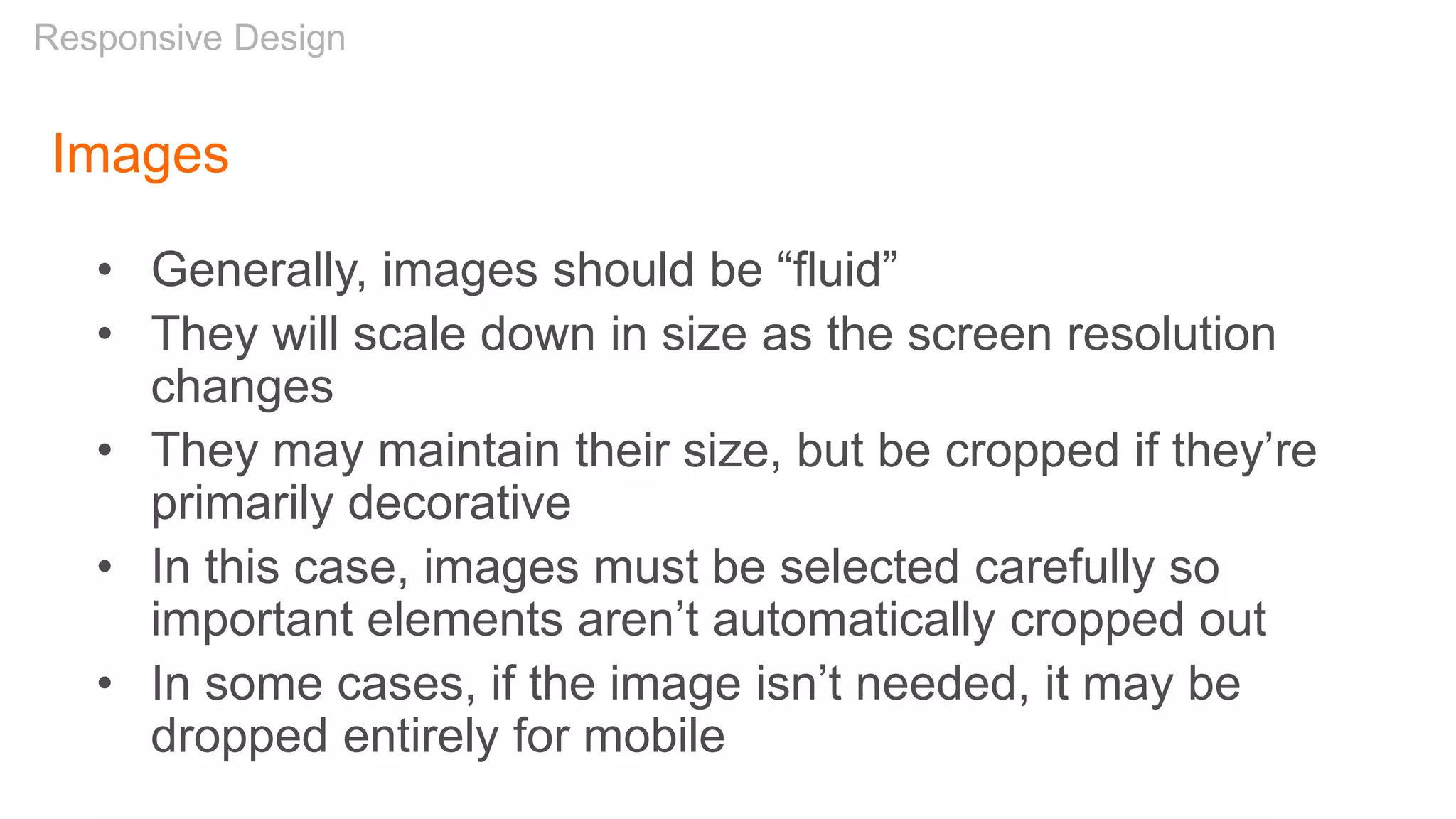
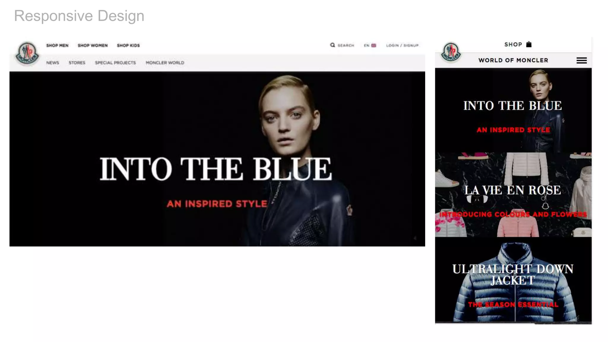
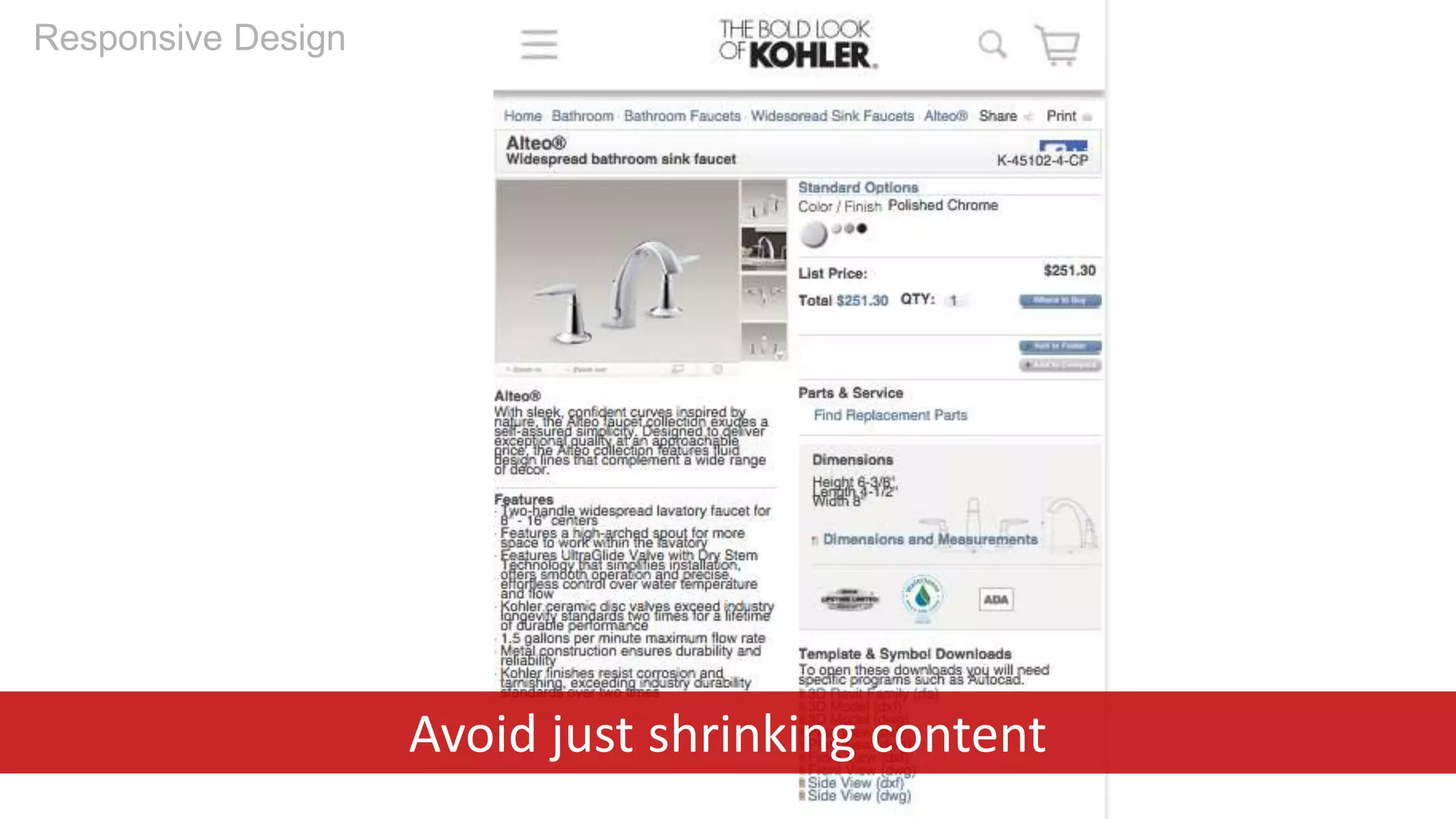


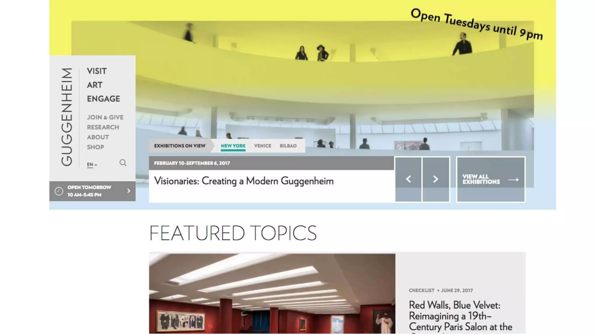

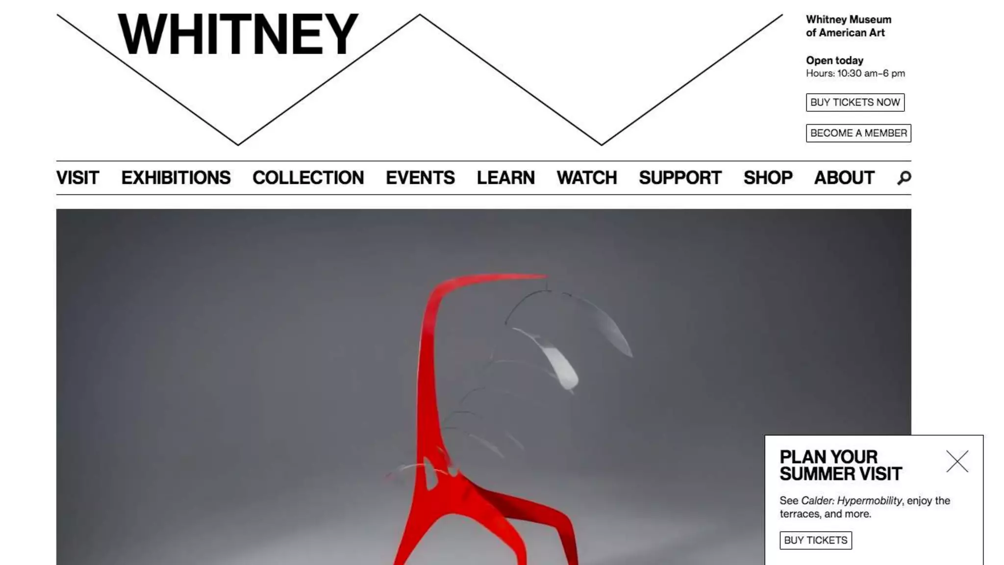
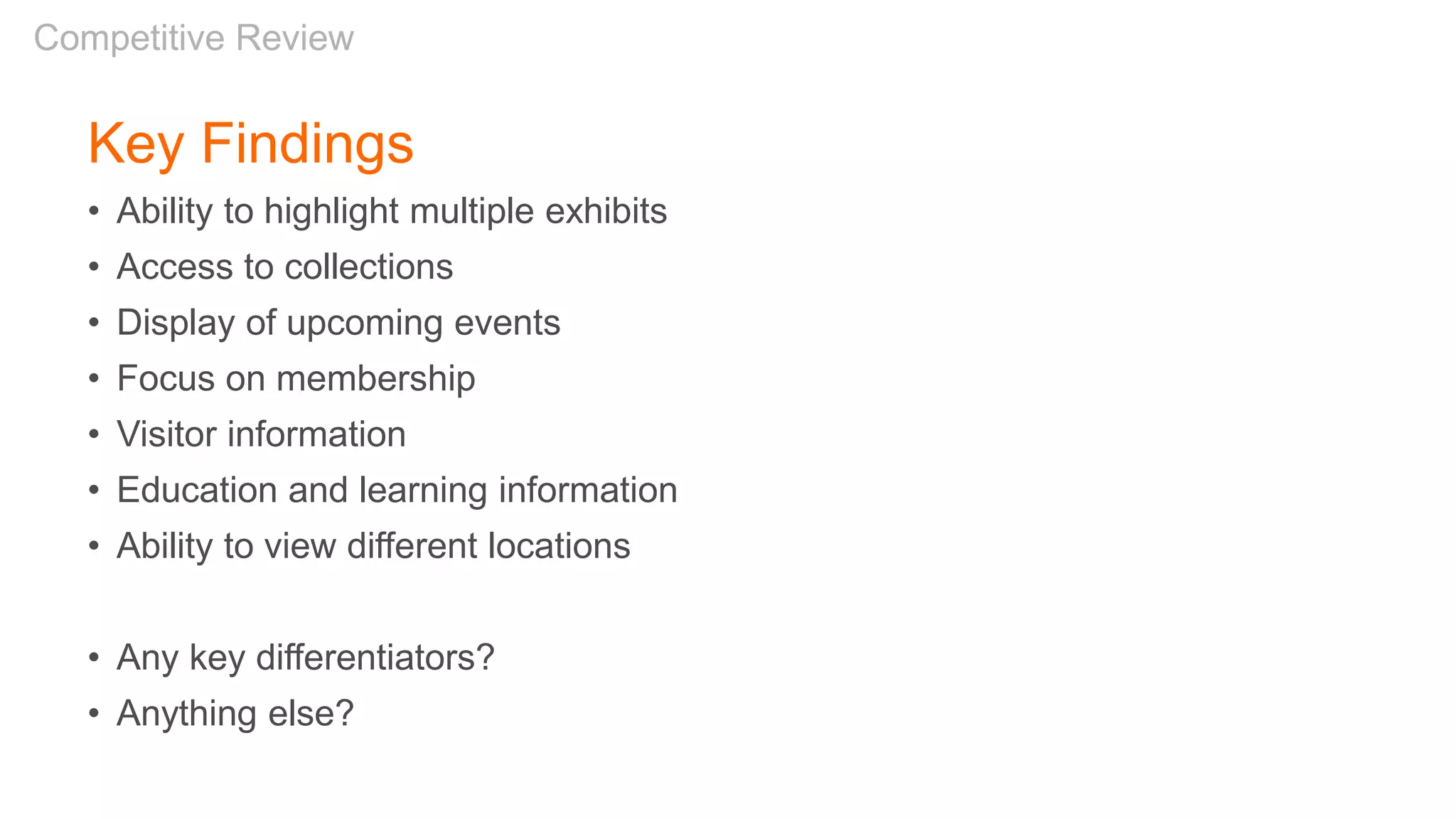


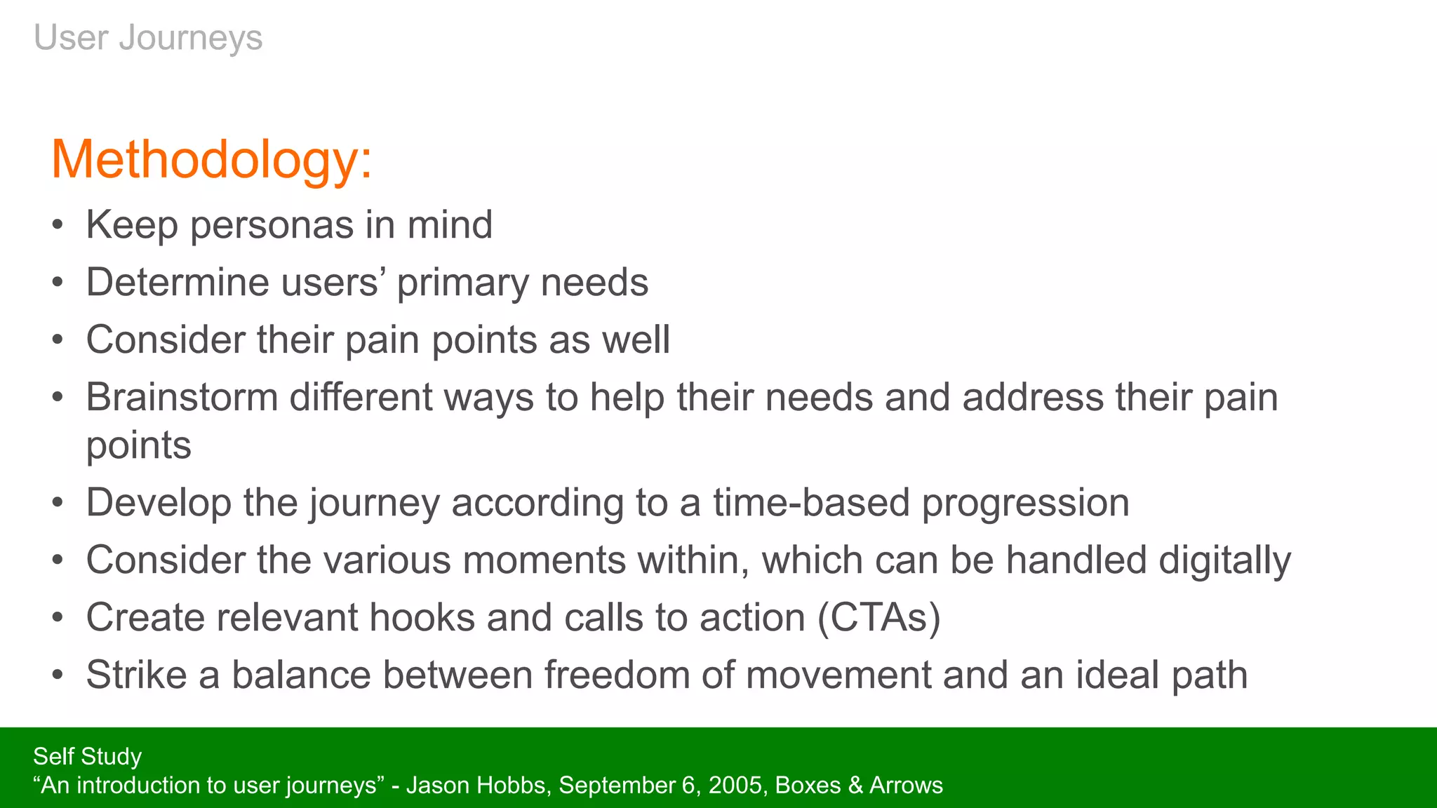
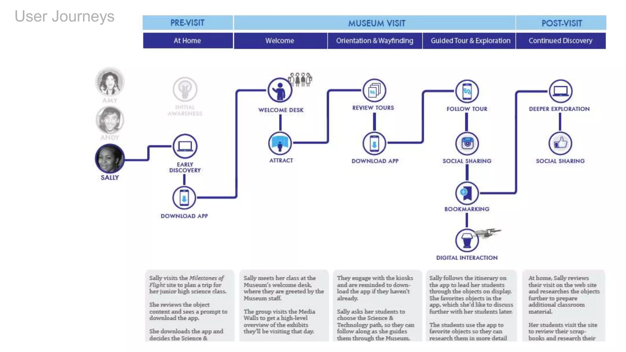
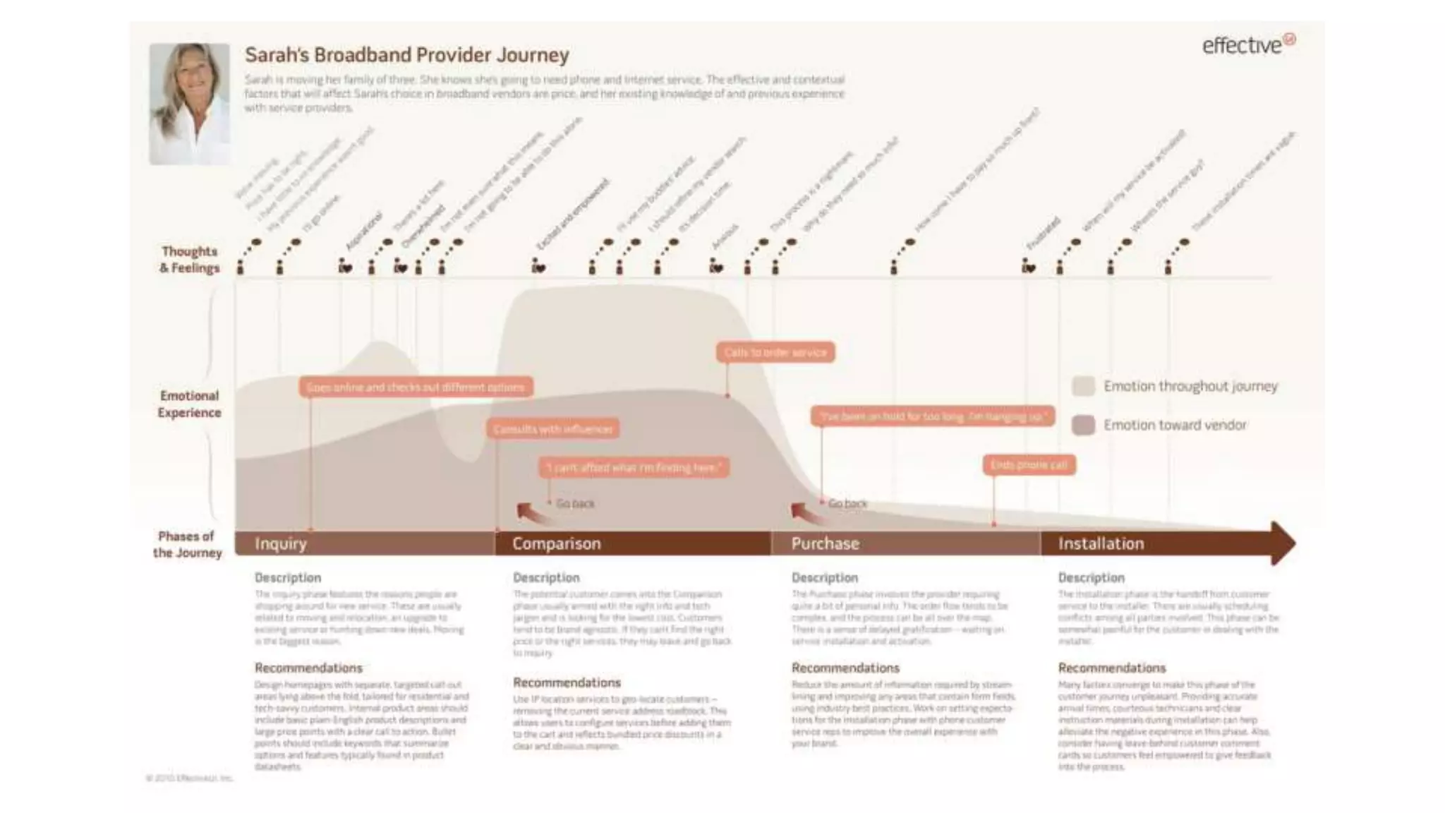
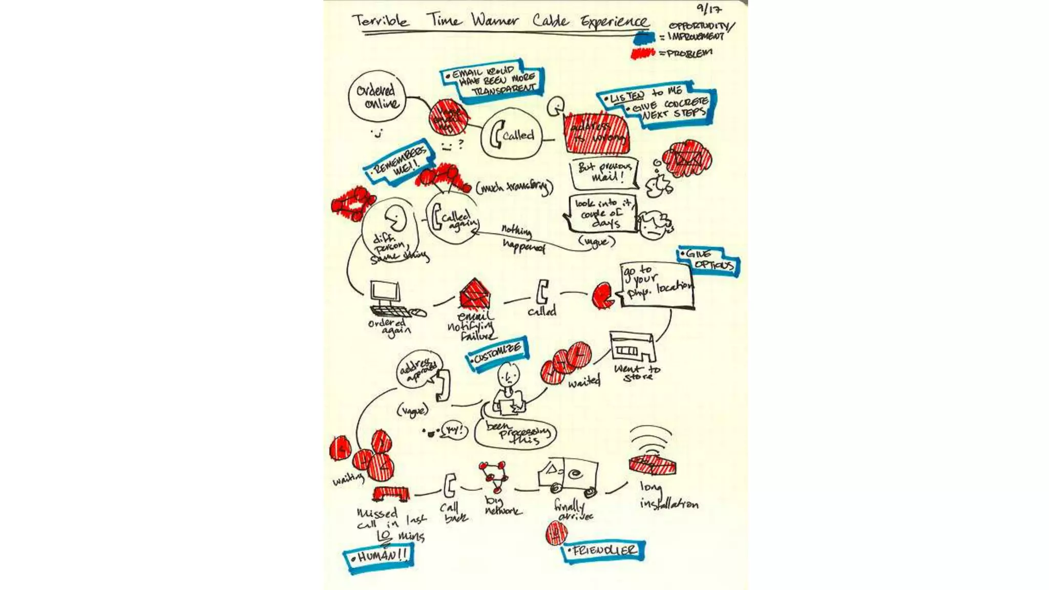
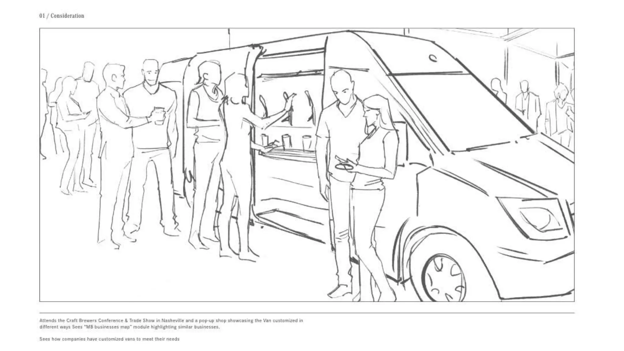


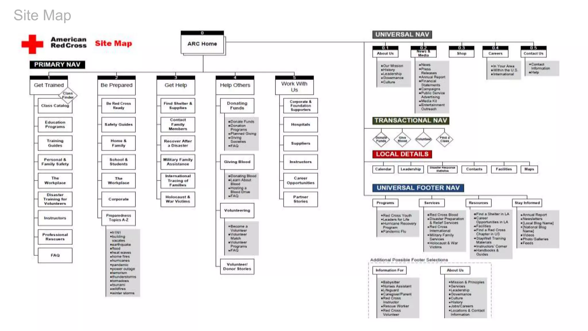
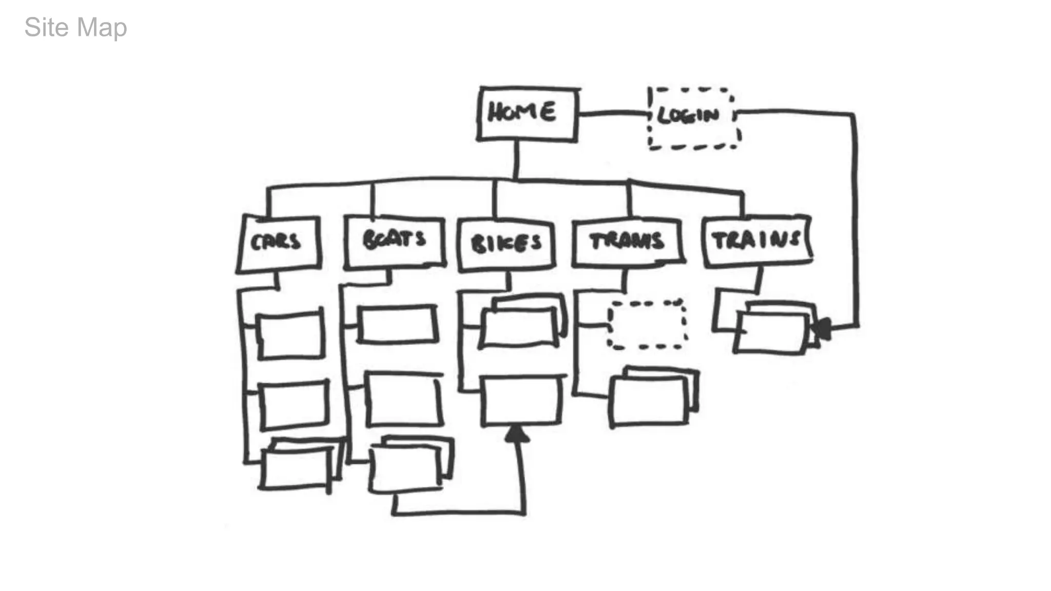


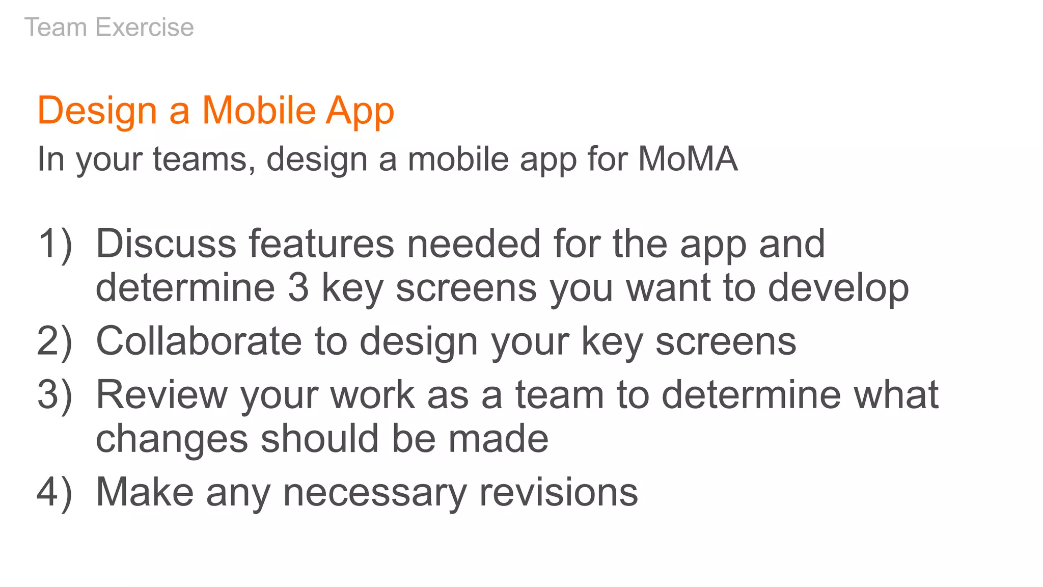


The document outlines a workshop on responsive UX design, covering principles, user journeys, and practical exercises for creating a responsive desktop website and a mobile app for a museum experience. It discusses the importance of responsive design in adapting web content to various devices, emphasizing a mobile-first approach and offering insights on navigation, content maintenance, and effective user experiences. Additionally, it includes guidelines for project work and resources for further learning in UX design.


![Responsive Design Studio [Mountain View 2013]](https://cdn.slidesharecdn.com/ss_thumbnails/responsivedesignstudiomountainview-131018101452-phpapp01-thumbnail.jpg?width=640&height=640&fit=bounds)


![Driver Easy Pro Key 7.1.0.2641 Full Mac Crack Free Activated Download [2026]....](https://cdn.slidesharecdn.com/ss_thumbnails/software-251207185324-b2fb71b4-thumbnail.jpg?width=640&height=640&fit=bounds)

![WinRAR Crack 7.13 Final Mac Keygen 2026 Download [Latest] Software.pptx](https://cdn.slidesharecdn.com/ss_thumbnails/software-251207185858-eb450678-thumbnail.jpg?width=640&height=640&fit=bounds)

![iStat Menus 7.20 Crack for MacOS 2026 Full Version [Latest] pptx](https://cdn.slidesharecdn.com/ss_thumbnails/softwareoverview-251207191544-22b737dc-thumbnail.jpg?width=640&height=640&fit=bounds)
![Soundtoys Mac v5.5.5.0 Crack for MacOS Full Version [Latest] pptx](https://cdn.slidesharecdn.com/ss_thumbnails/softwareoverview-251207193711-91d8ae6b-thumbnail.jpg?width=640&height=640&fit=bounds)
![AnyTrans for iOS 8.9.14.20251127 With Crack for MacOS [Latest] pptx](https://cdn.slidesharecdn.com/ss_thumbnails/softwareoverview-251207190907-2316965f-thumbnail.jpg?width=640&height=640&fit=bounds)


![Chapter4_Initiation_of_Sediment_Motion_v2[1].pptx](https://cdn.slidesharecdn.com/ss_thumbnails/chapter4initiationofsedimentmotionv21-251208223747-f94ef163-thumbnail.jpg?width=640&height=640&fit=bounds)


