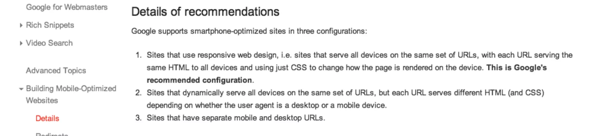
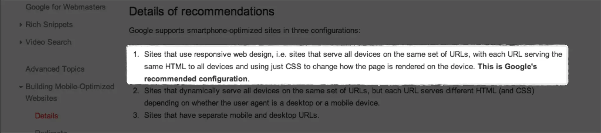
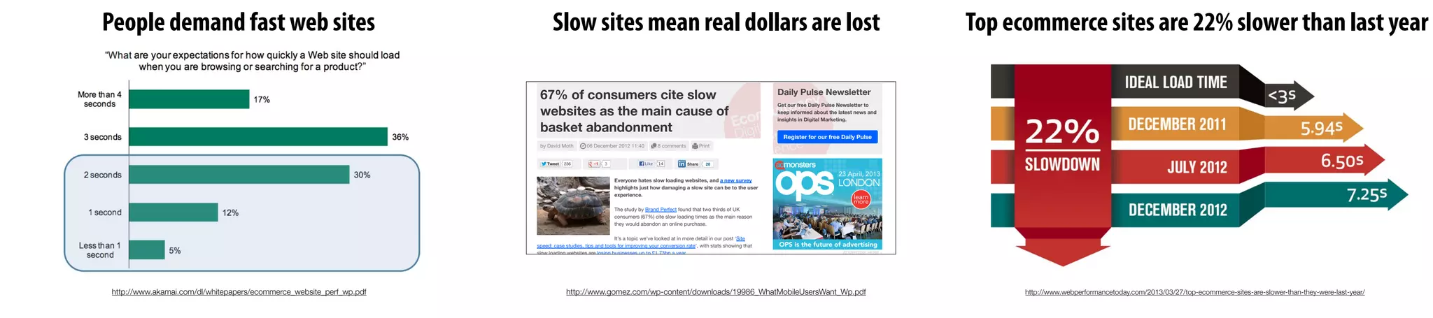
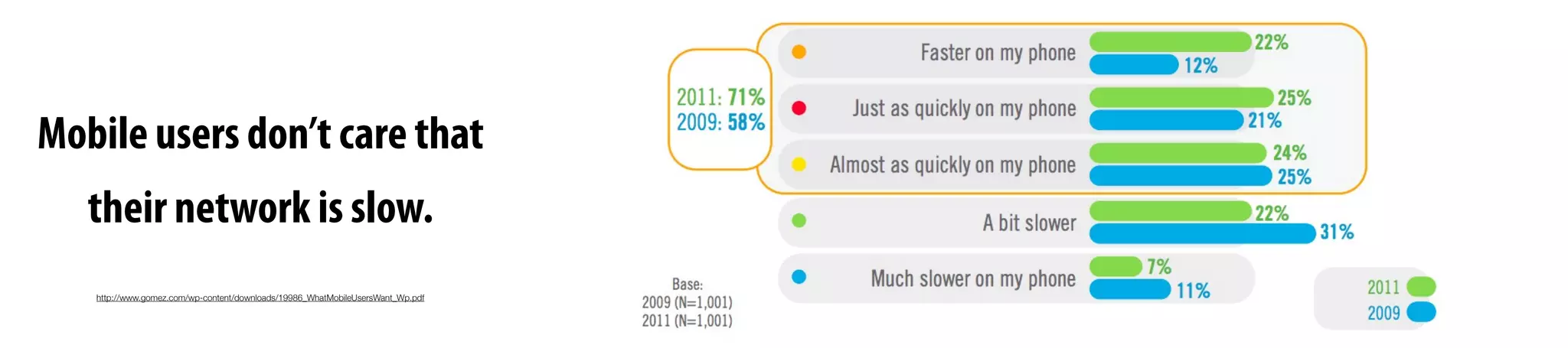
Download as PDF, PPTX


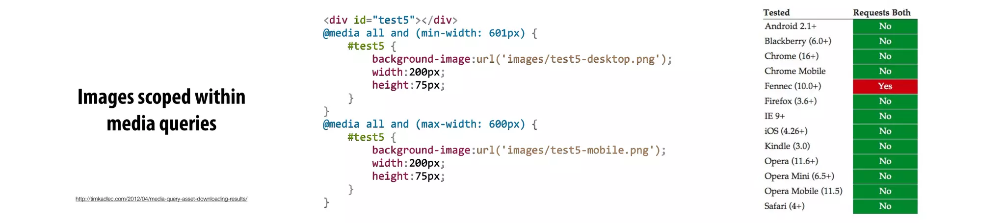
![/* Wider viewports/higher resolutions (e.g. desktop) */
@media screen and (min-width:481px) {
[Desktop layout rules here]
}
/* Mobile/lower-resolution devices */
@media screen and (max-width:480px) {
[Mobile layout rules here]
}
Move the mobile media query block
above the desktop media query.
By doing this, we’re making sure
the cascading effect of CSS is
consistent with our mobile first
progressive enhancement approach.](https://image.slidesharecdn.com/when-20responsive-20web-20design-20meets-20the-20real-20world-131009141410-phpapp02/75/When-responsive-web-design-meets-the-real-world-88-2048.jpg)
![Reorder media queries so cascade
goes from small to large screens
/* Wider viewports/higher resolutions (e.g. desktop) */
@media screen and (min-width:481px) {
[Desktop layout rules here]
}
/* Mobile/lower-resolution devices */
@media screen and (max-width:480px) {
[Mobile layout rules here]
}
Move the mobile media query block
above the desktop media query.
By doing this, we’re making sure
the cascading effect of CSS is
consistent with our mobile first
progressive enhancement approach.Keep basic styles outside of media queries.](https://image.slidesharecdn.com/when-20responsive-20web-20design-20meets-20the-20real-20world-131009141410-phpapp02/75/When-responsive-web-design-meets-the-real-world-89-2048.jpg)


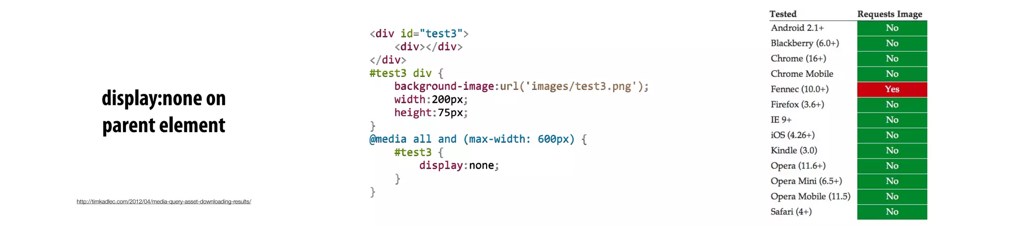
![<link rel="stylesheet" type="text/css" href="taps.css" />
<link rel="stylesheet" type="text/css" href="layout.css" media="all and
(min-width: 481px)">
<!--[if (lt IE 9)&(!IEMobile)]>
<link rel="stylesheet" type="text/css" href="layout.css" media="all" />
<![endif]-->
The conditional comment repeats the line above it
ensuring desktop IE sees our layout.css file.](https://image.slidesharecdn.com/when-20responsive-20web-20design-20meets-20the-20real-20world-131009141410-phpapp02/75/When-responsive-web-design-meets-the-real-world-94-2048.jpg)
![<link rel="stylesheet" type="text/css" href="taps.css" />
<link rel="stylesheet" type="text/css" href="layout.css" media="all and
(min-width: 481px)">
<!--[if (lt IE 9)&(!IEMobile)]>
<link rel="stylesheet" type="text/css" href="layout.css" media="all" />
<![endif]-->
The conditional comment repeats the line above it
ensuring desktop IE sees our layout.css file.
or use Respond.js
(a media query polyfill for IE)](https://image.slidesharecdn.com/when-20responsive-20web-20design-20meets-20the-20real-20world-131009141410-phpapp02/75/When-responsive-web-design-meets-the-real-world-95-2048.jpg)
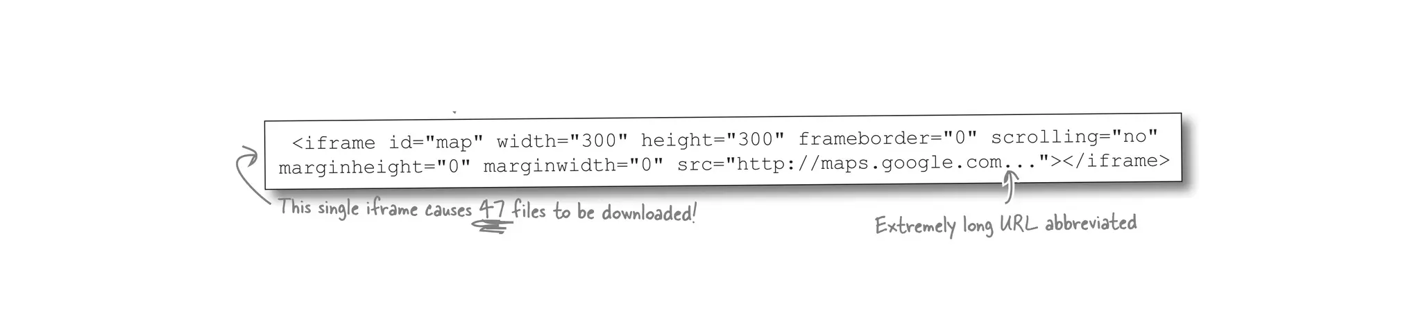
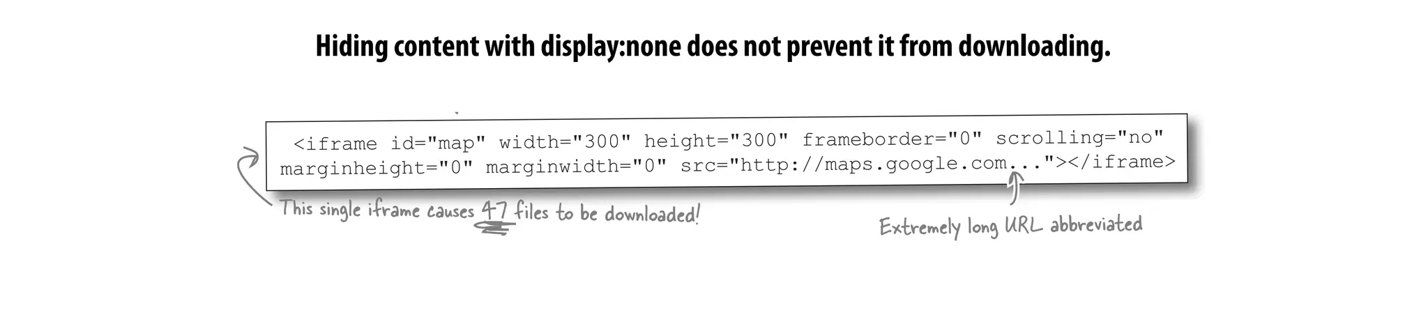
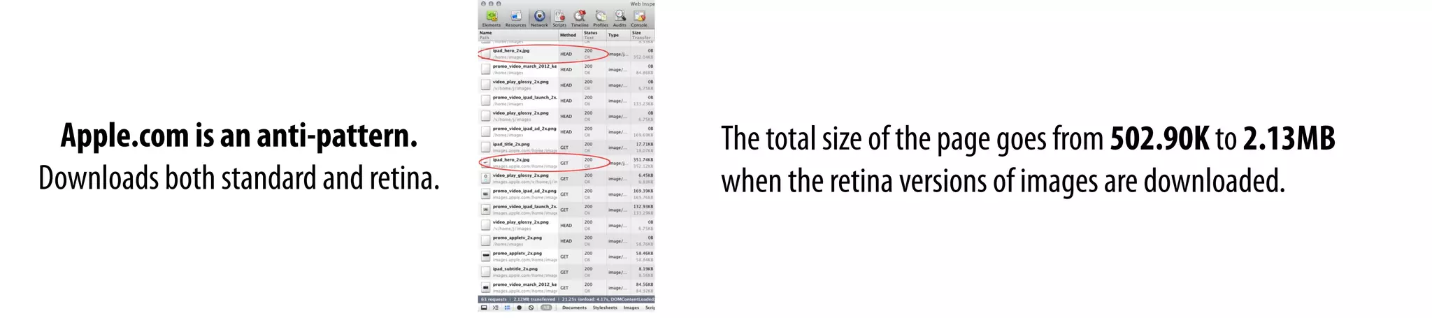
![The taps.jpg file is 440.7K making it
the largest file on the page.
@media screen and (max-width:480px) {
[Other CSS rules are here]
.header {display:none;}
}](https://image.slidesharecdn.com/when-20responsive-20web-20design-20meets-20the-20real-20world-131009141410-phpapp02/75/When-responsive-web-design-meets-the-real-world-97-2048.jpg)
![The taps.jpg file is 440.7K making it
the largest file on the page.
@media screen and (max-width:480px) {
[Other CSS rules are here]
.header {display:none;}
}
Images with display:none are still downloaded](https://image.slidesharecdn.com/when-20responsive-20web-20design-20meets-20the-20real-20world-131009141410-phpapp02/75/When-responsive-web-design-meets-the-real-world-98-2048.jpg)


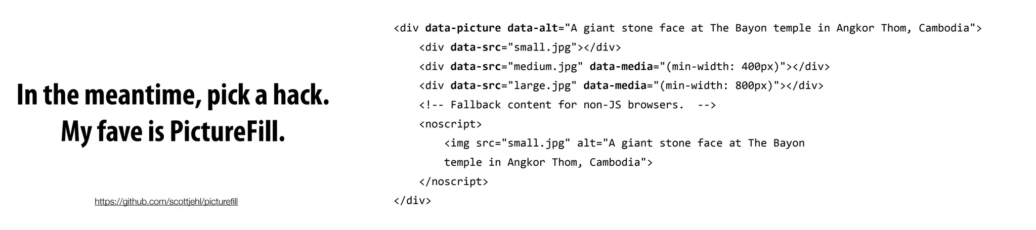

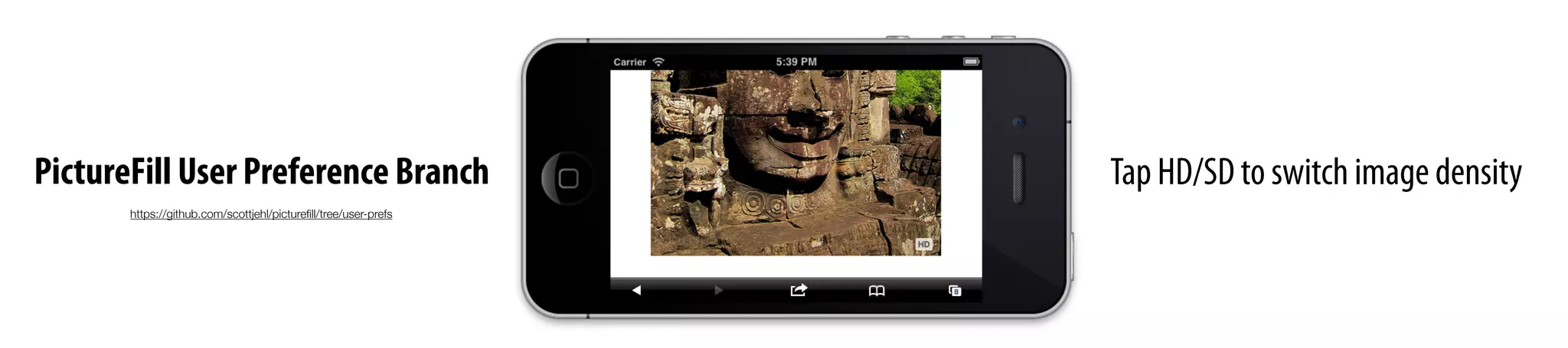


![Provide automated output
of PictureFill or alternative#5
{
"source":"/source.jpg",
"breakpoints":
[
{
"max-‐width":"30em","pixel-‐density":1,"width":360px},
{
"max-‐width":"30em","pixel-‐density":2,"width":720px},
{
"max-‐width":"30em","pixel-‐density":1,"width":800px},
{
"max-‐width":"30em","pixel-‐density":2,"width":1600px},
{
"pixel-‐density":1,"width":800px},
{
"pixel-‐density":2,"width":1600px},
]
}
templates contain breakpoint information
Responsive Images Markup Function
PictureFill
Markup
Sample syntax.Don’t get hung upon details.
Markup for allimages can bechanged in one spot.](https://image.slidesharecdn.com/when-20responsive-20web-20design-20meets-20the-20real-20world-131009141410-phpapp02/75/When-responsive-web-design-meets-the-real-world-143-2048.jpg)


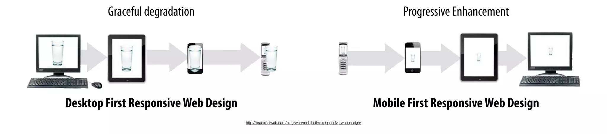
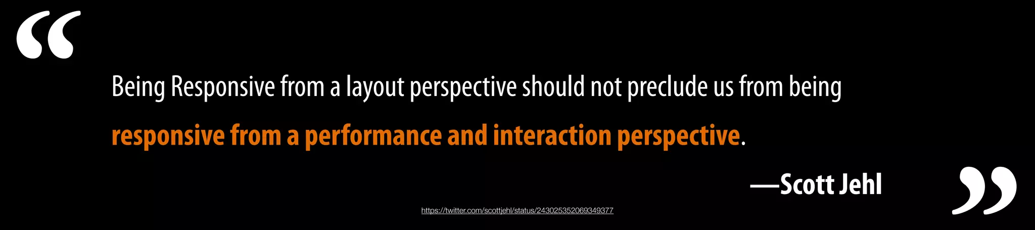
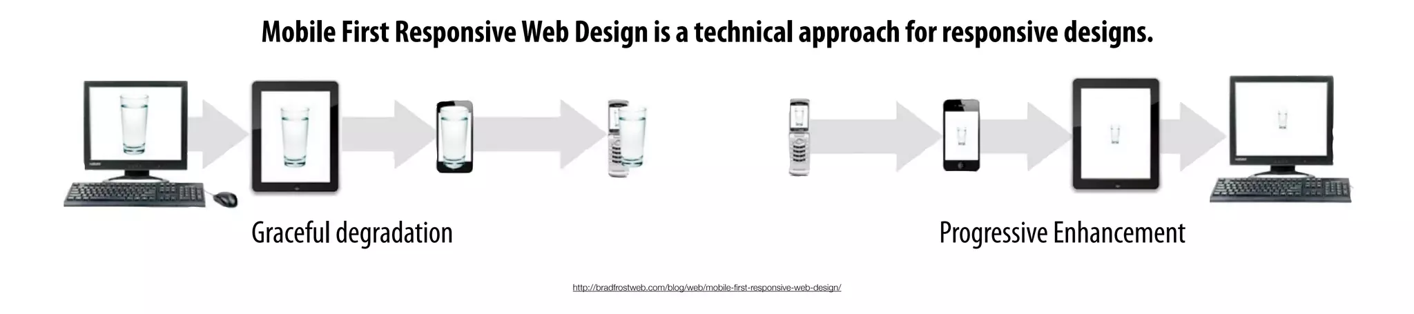
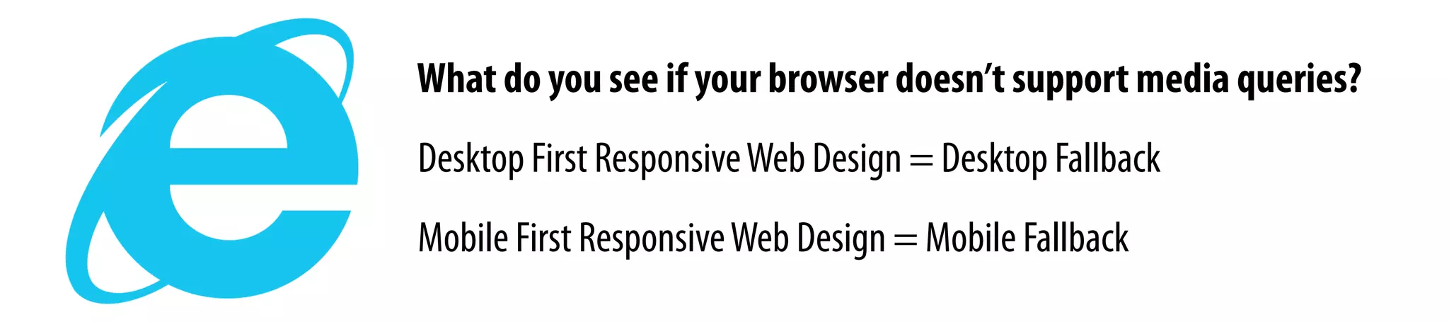
The document discusses responsive web design and some of the challenges it faces. It recommends adopting a mobile first approach where the mobile styles are defined first before desktop styles, allowing for a progressive enhancement. It also emphasizes the importance of performance and ensuring responsive designs are not just focused on layout but also on optimizing for speed. Key techniques discussed include building mobile first, reordering media queries, keeping basic styles outside queries, and scoping images within media queries to avoid unnecessary downloads.


![Responsive Design & Beyond [Code & Creativity Workshop]](https://cdn.slidesharecdn.com/ss_thumbnails/codecreativityworkshop1-140506164731-phpapp01-thumbnail.jpg?width=640&height=640&fit=bounds)


![Vibe Coding vs. Spec-Driven Development [Free Meetup]](https://cdn.slidesharecdn.com/ss_thumbnails/vibecodingvsspecdrivendevelopment-251209105622-43f455e7-thumbnail.jpg?width=640&height=640&fit=bounds)


