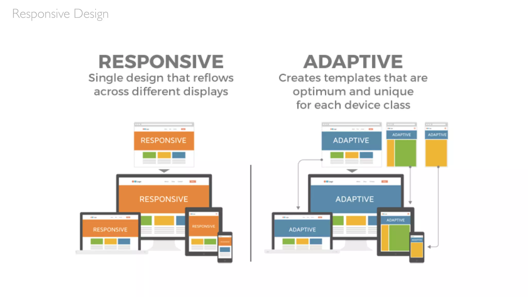
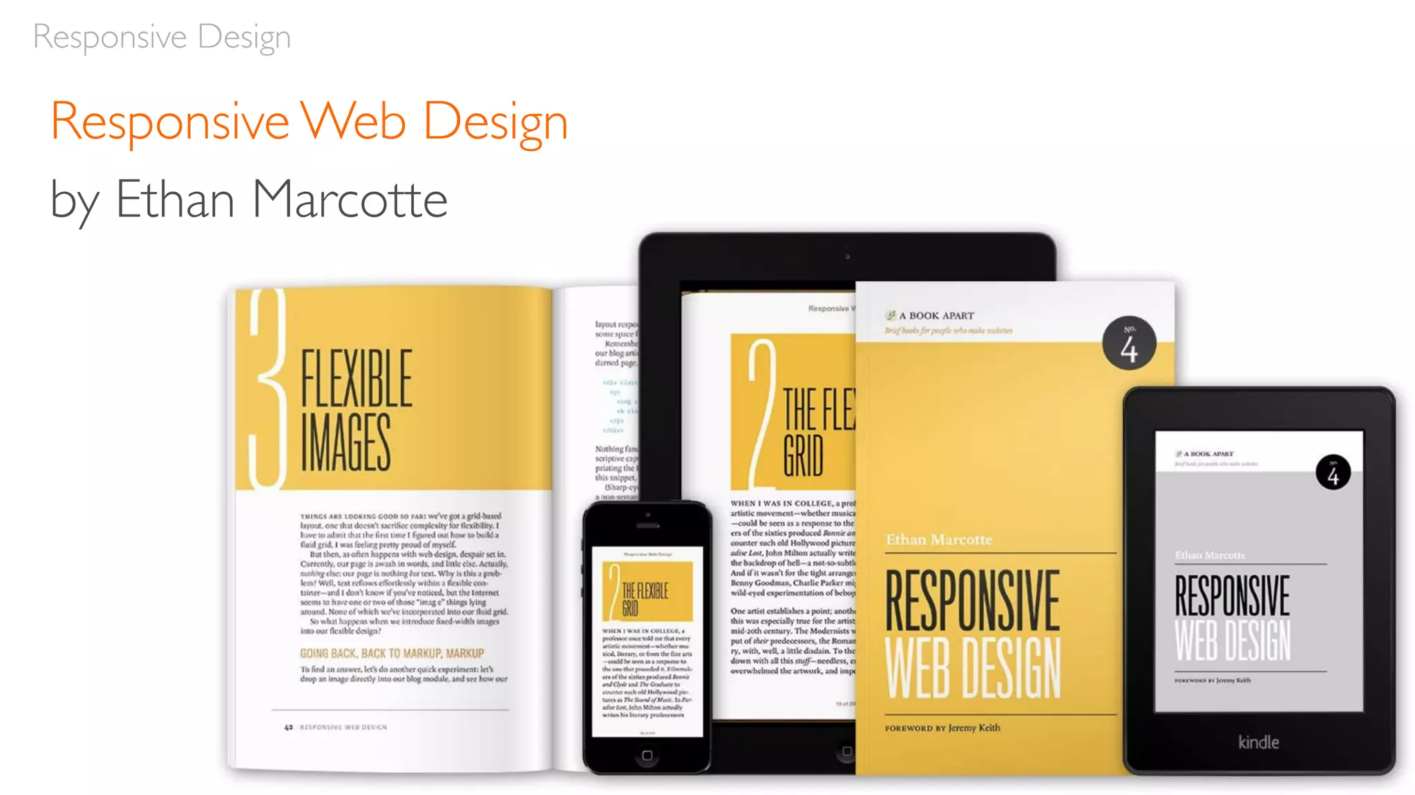
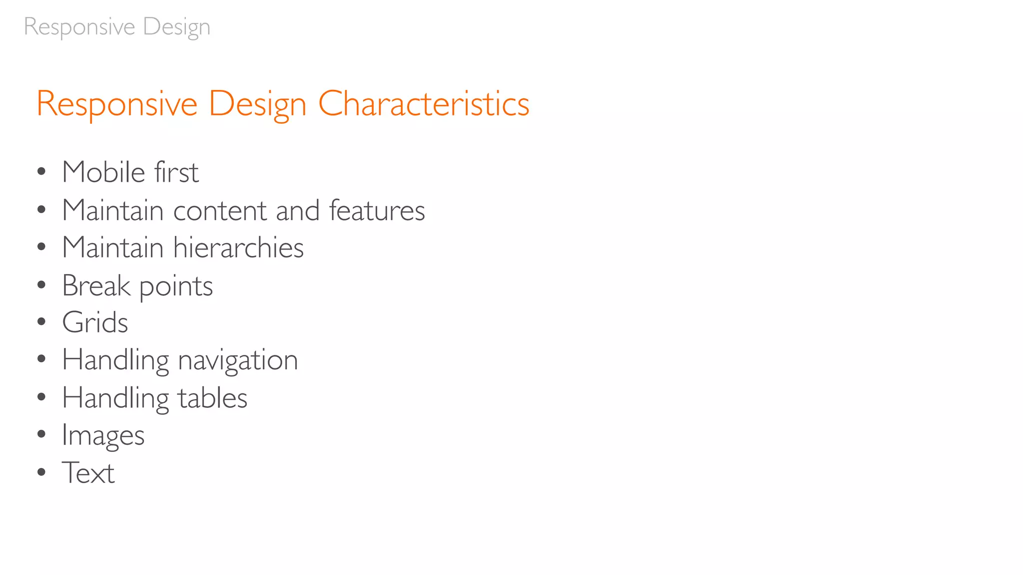
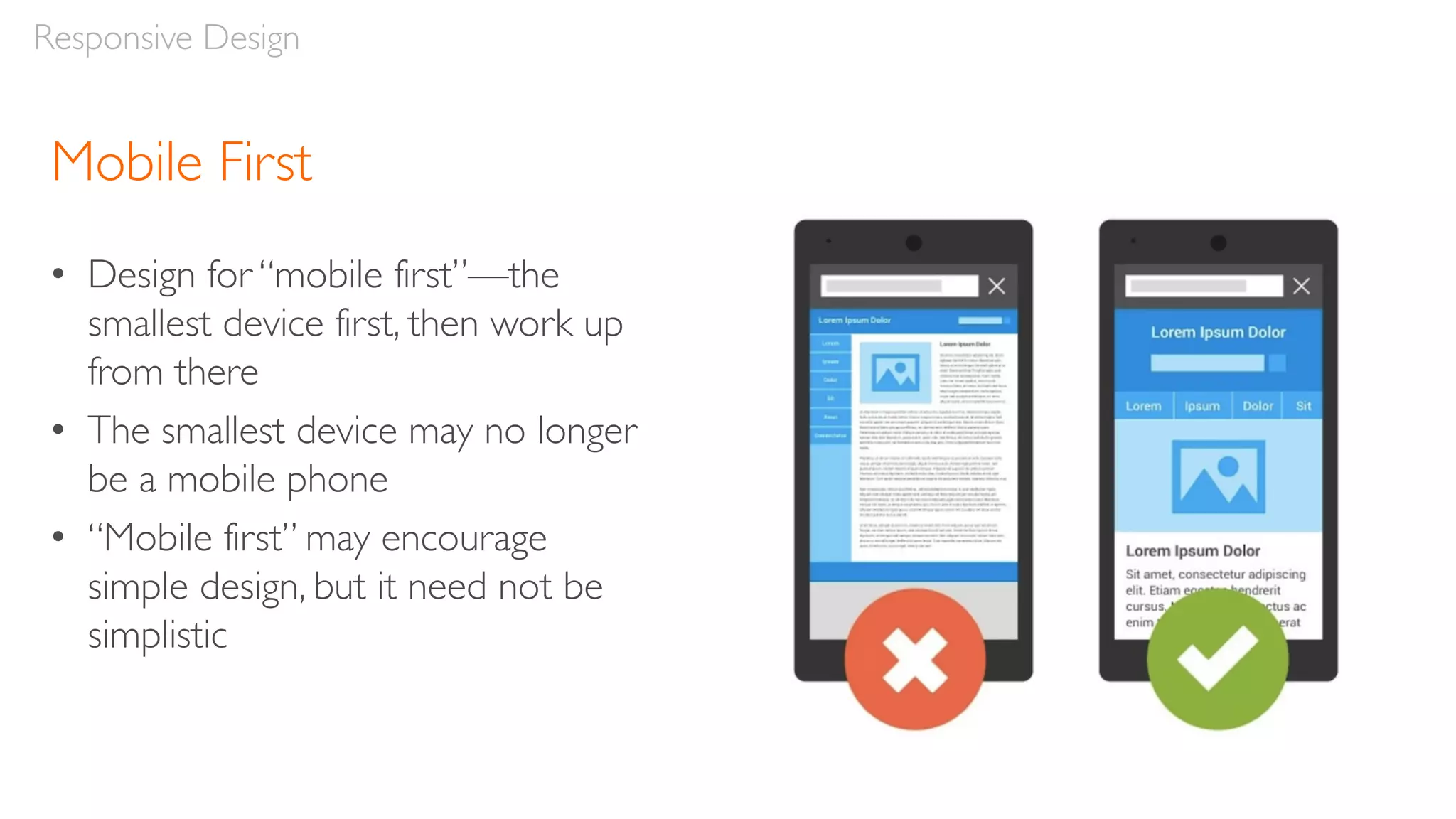
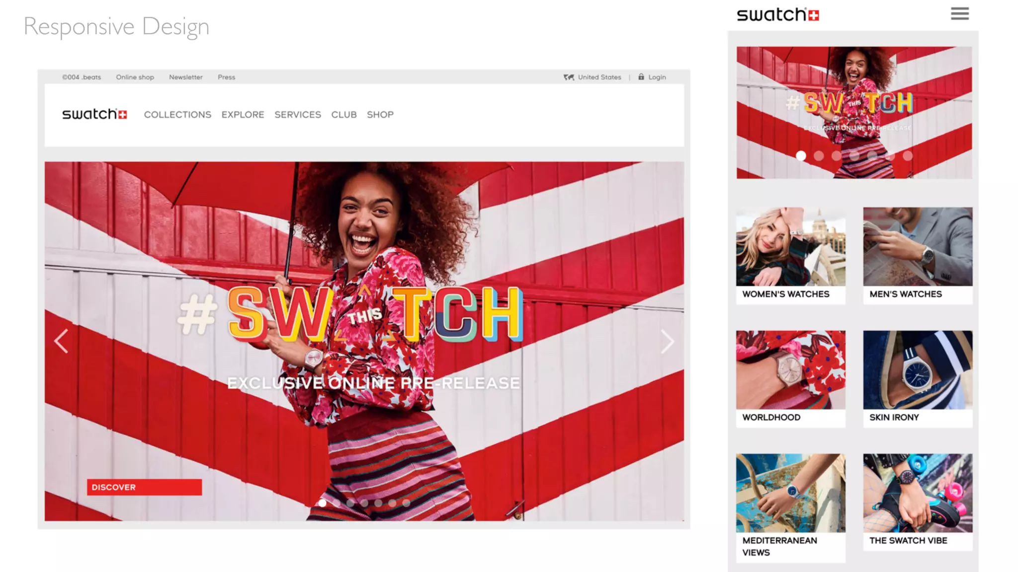
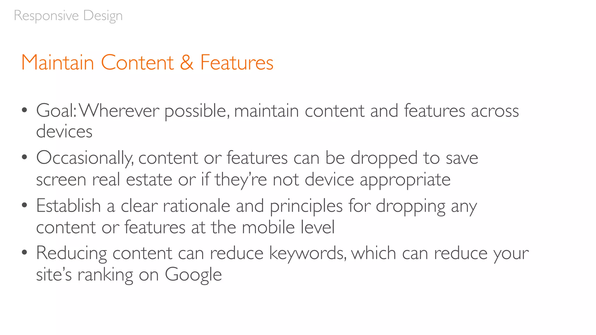
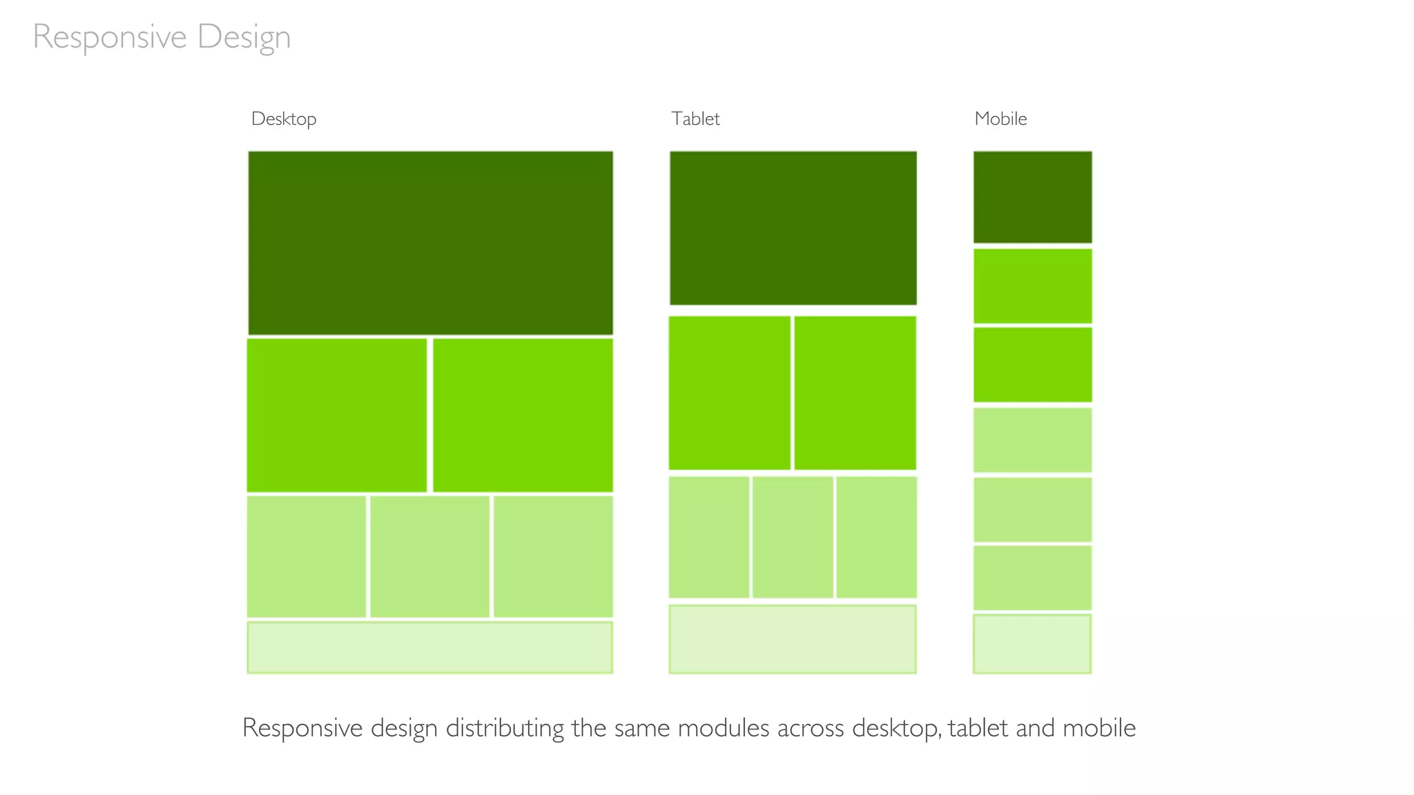
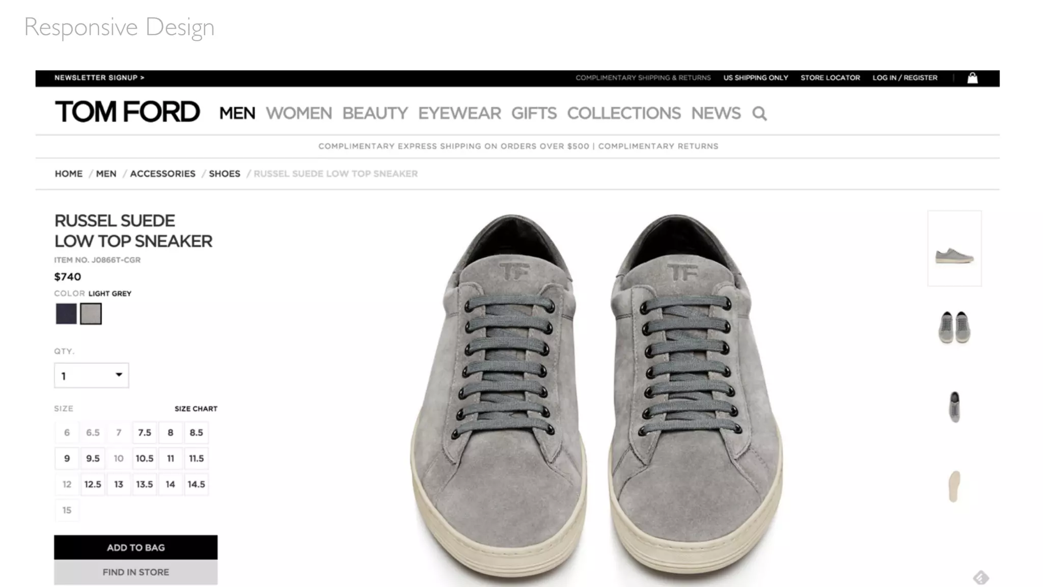
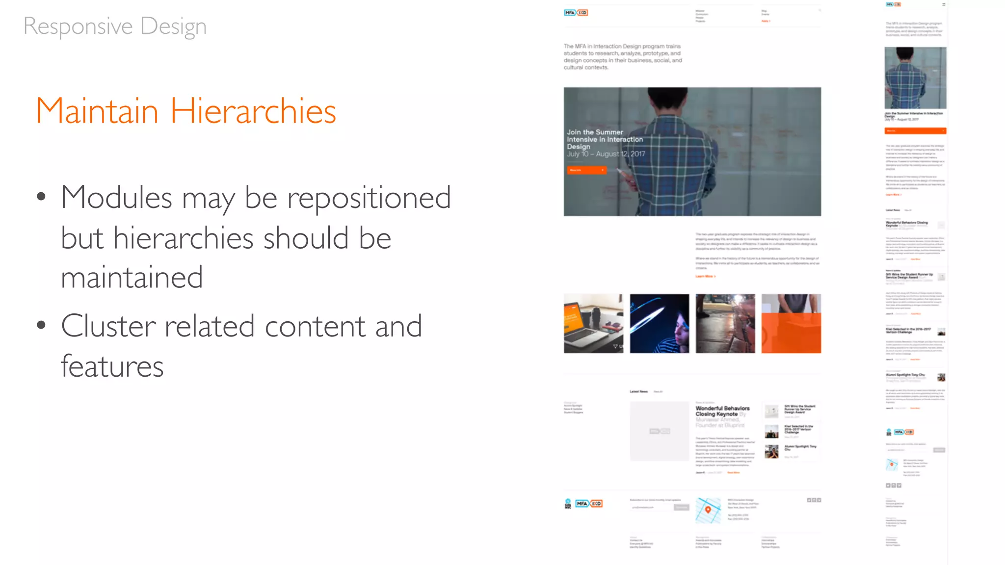
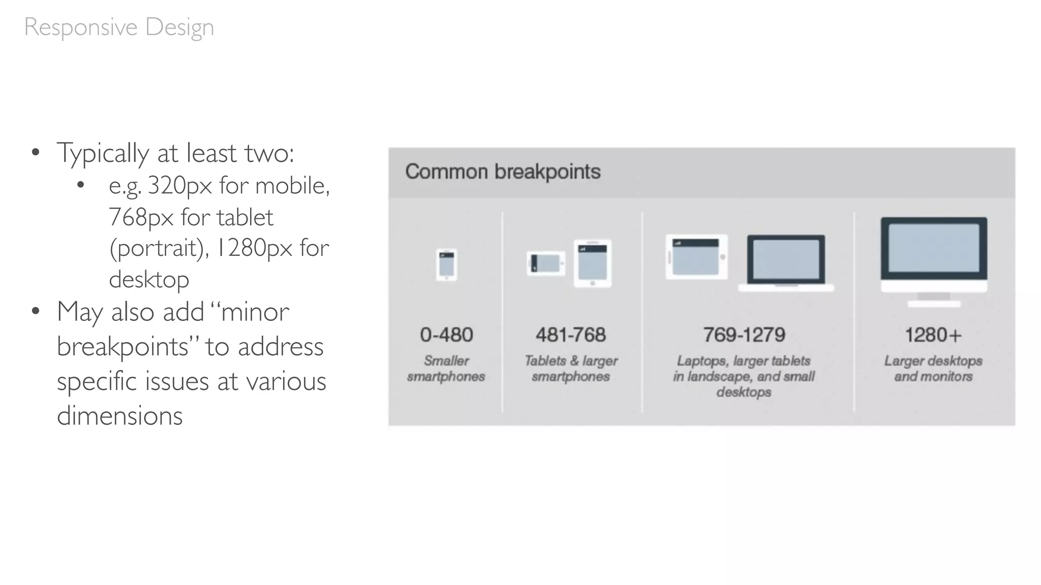
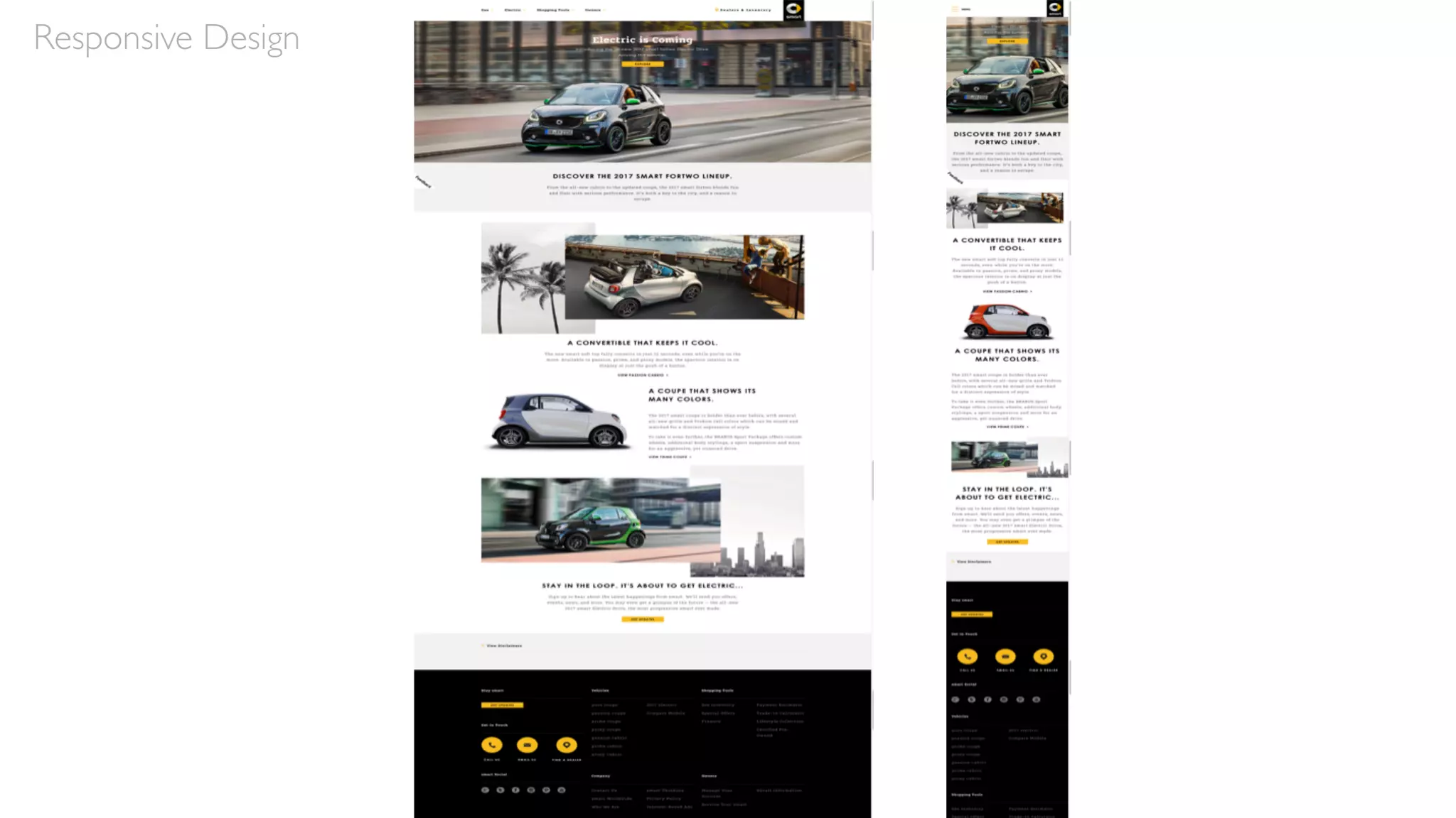
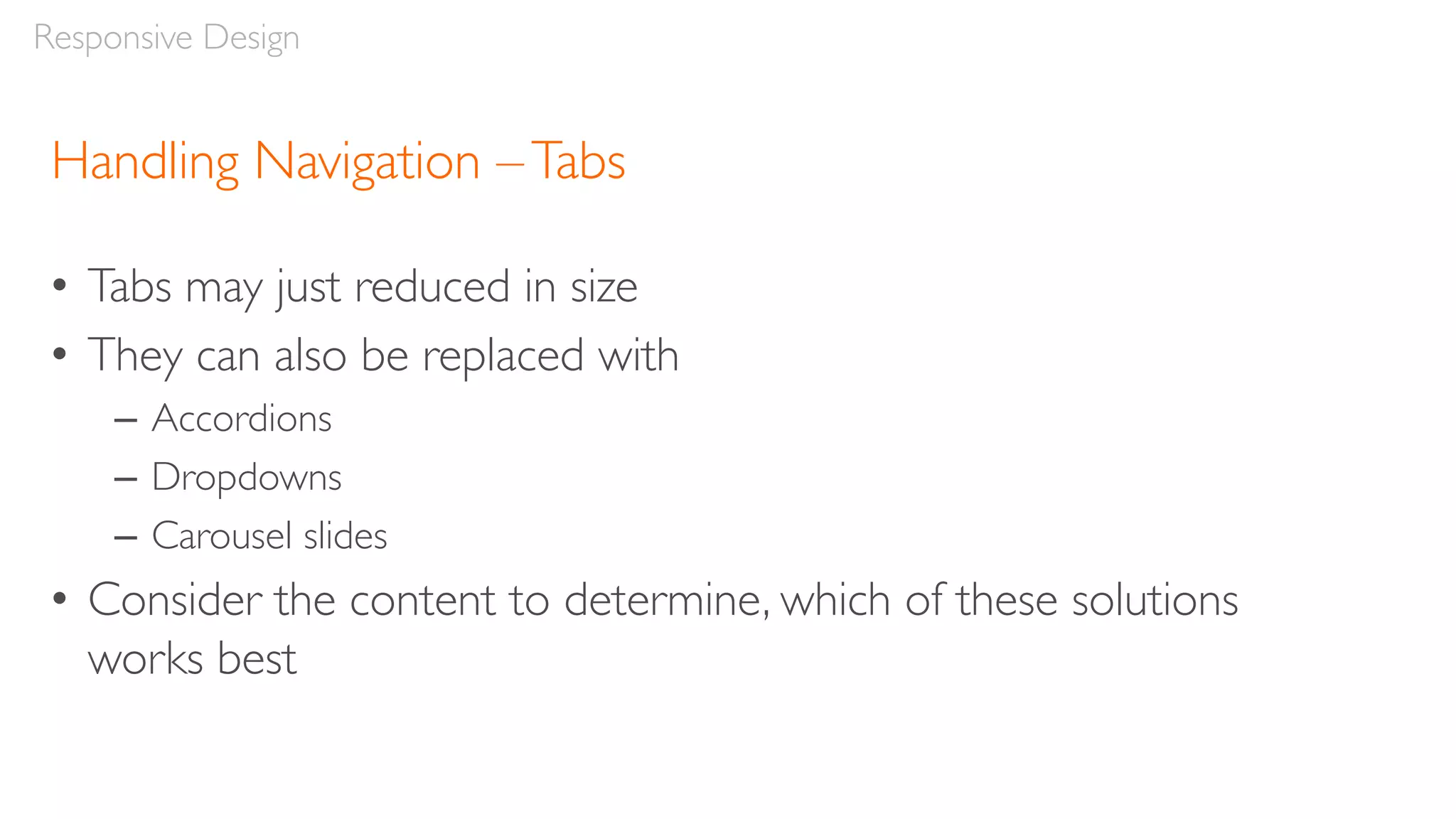
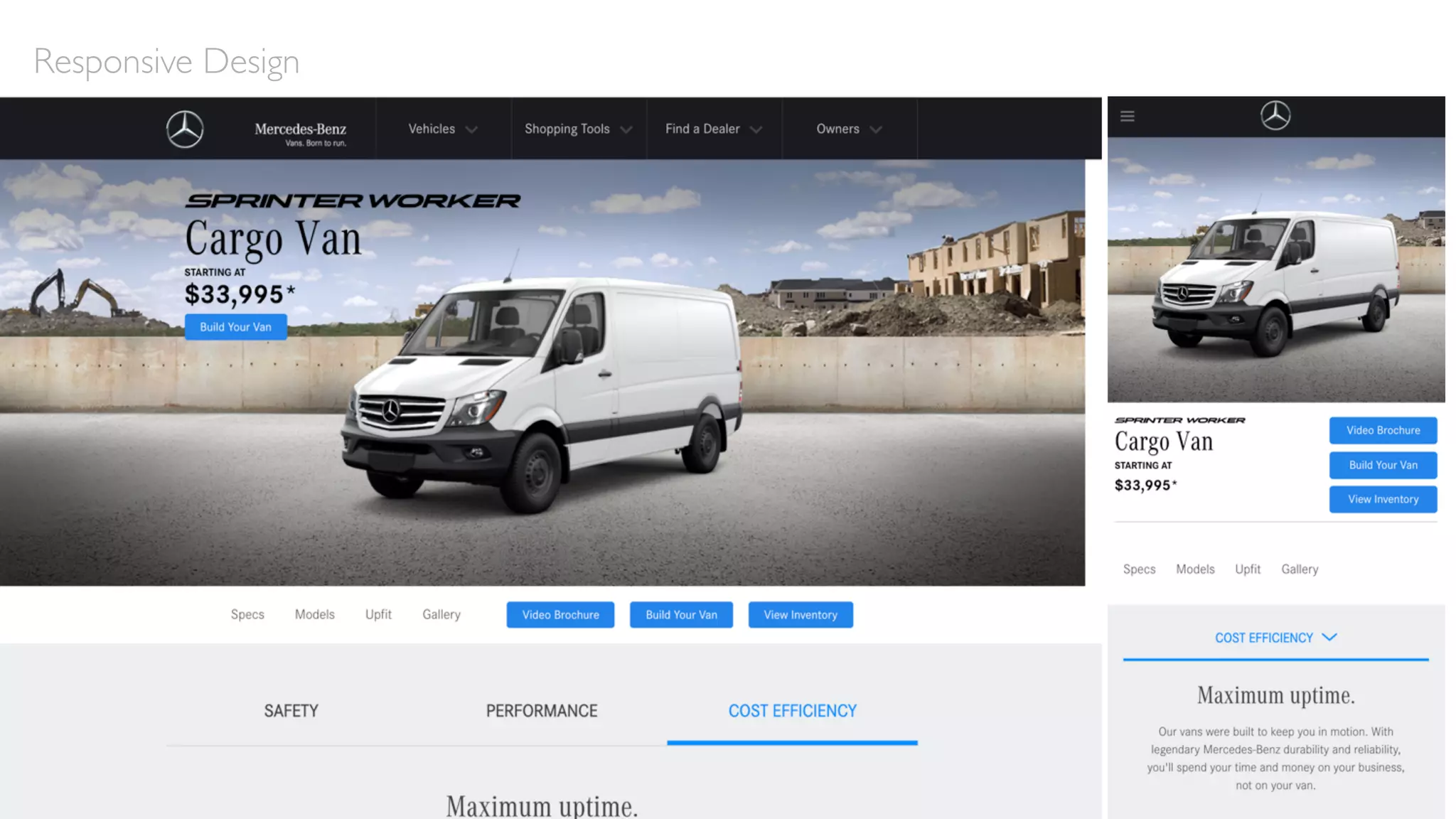
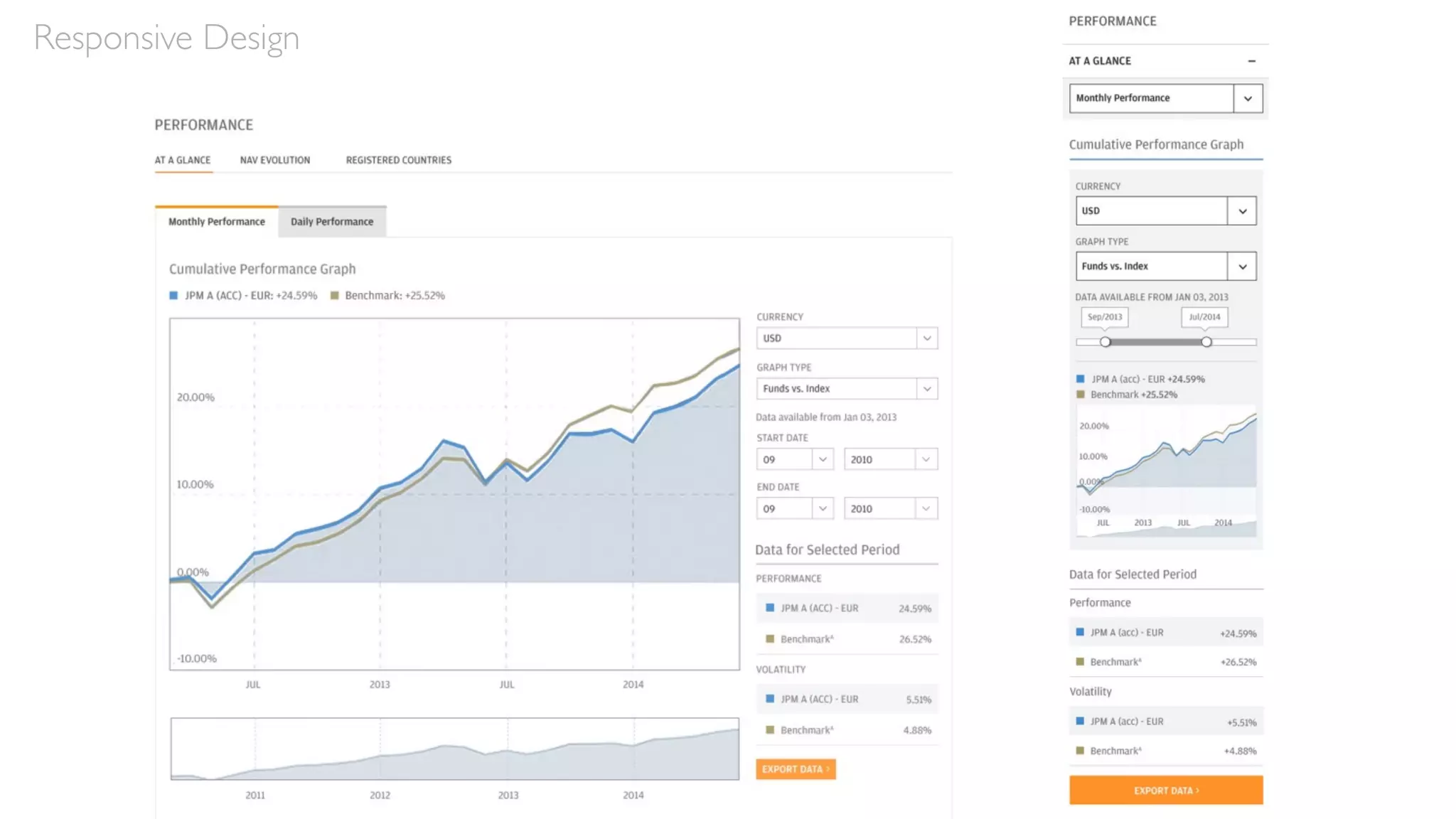
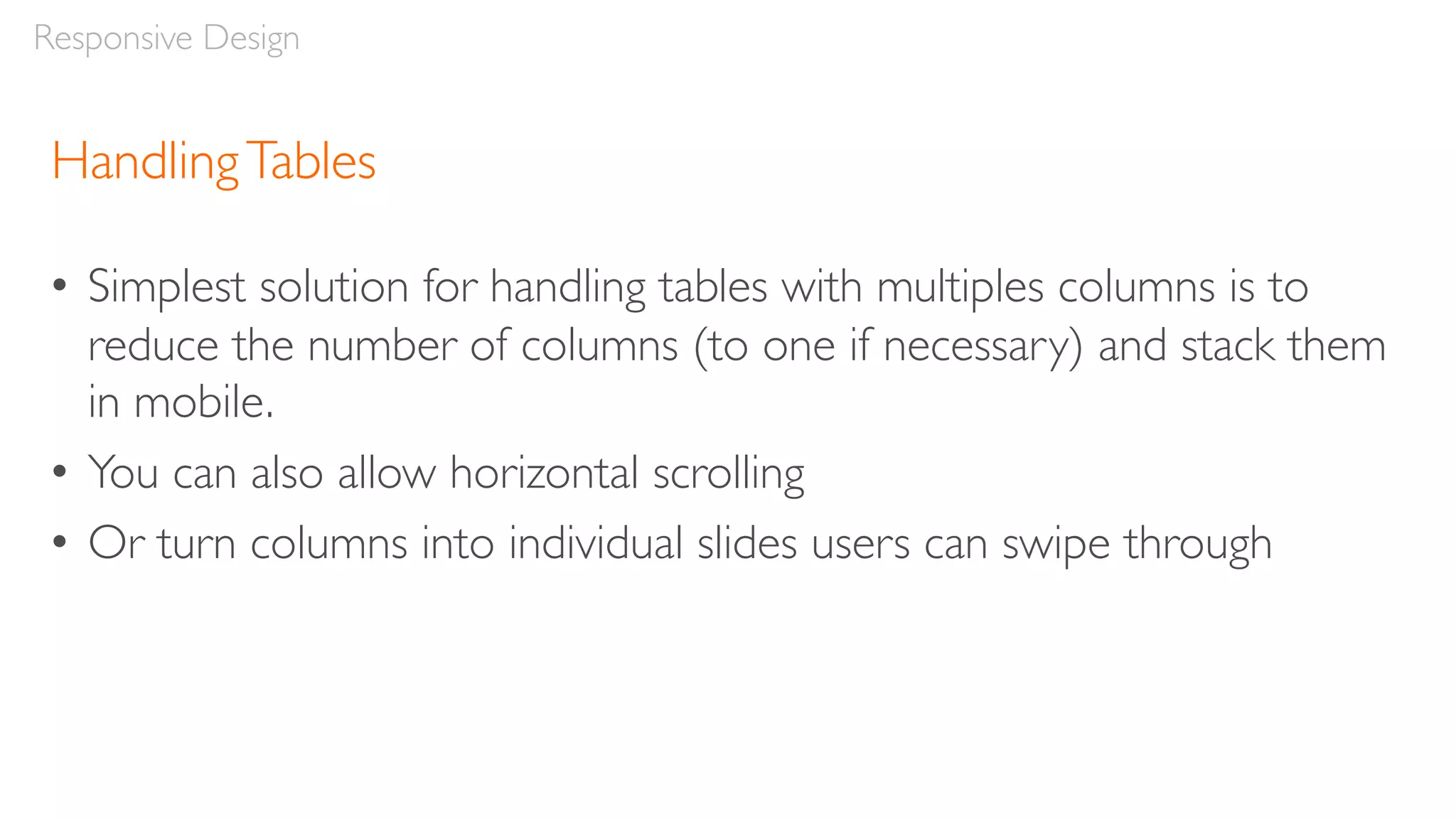
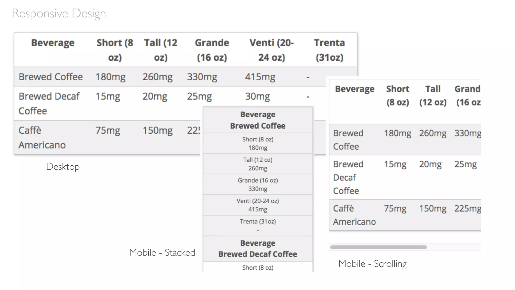
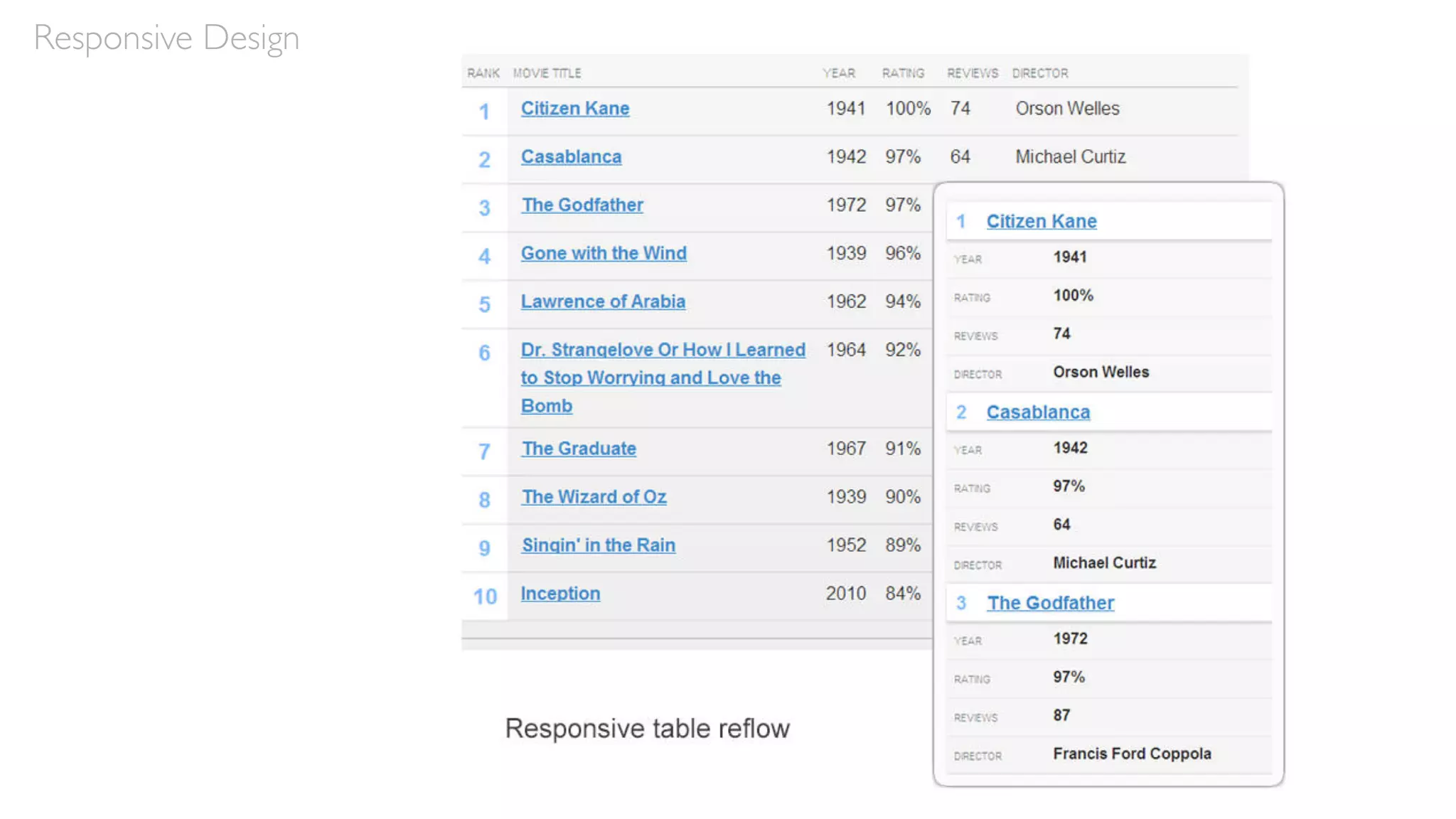
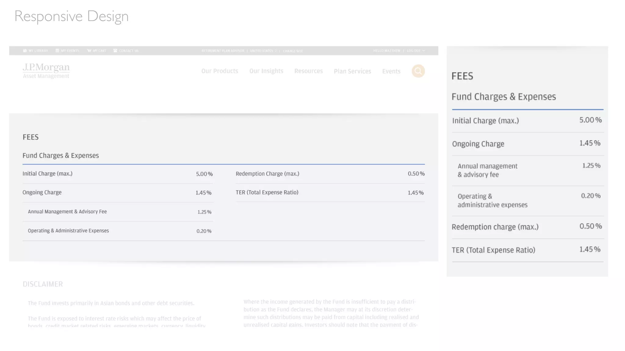
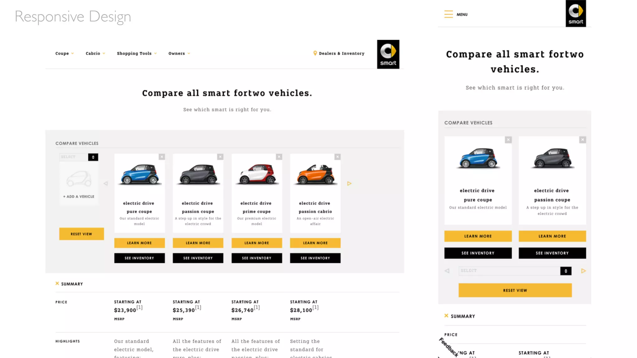
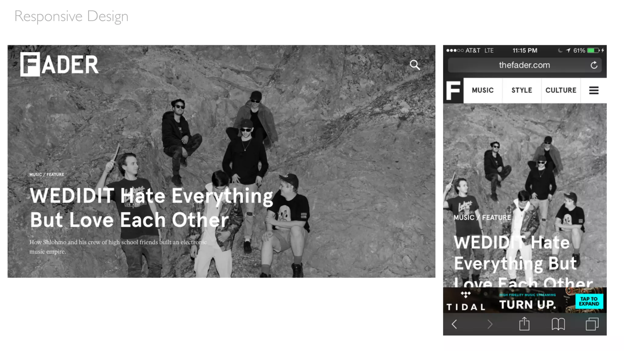
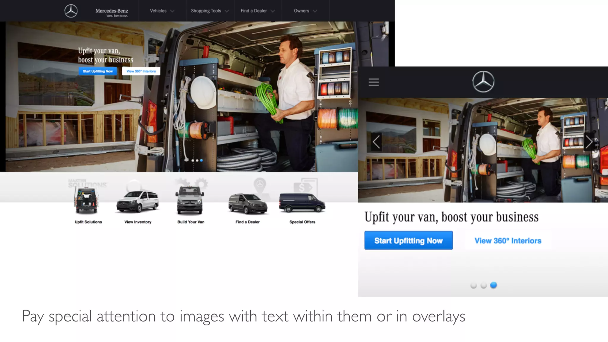
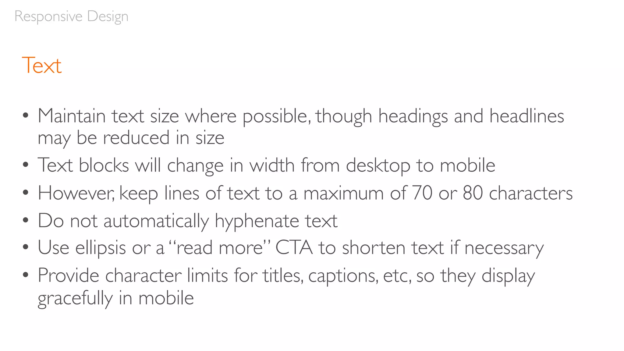
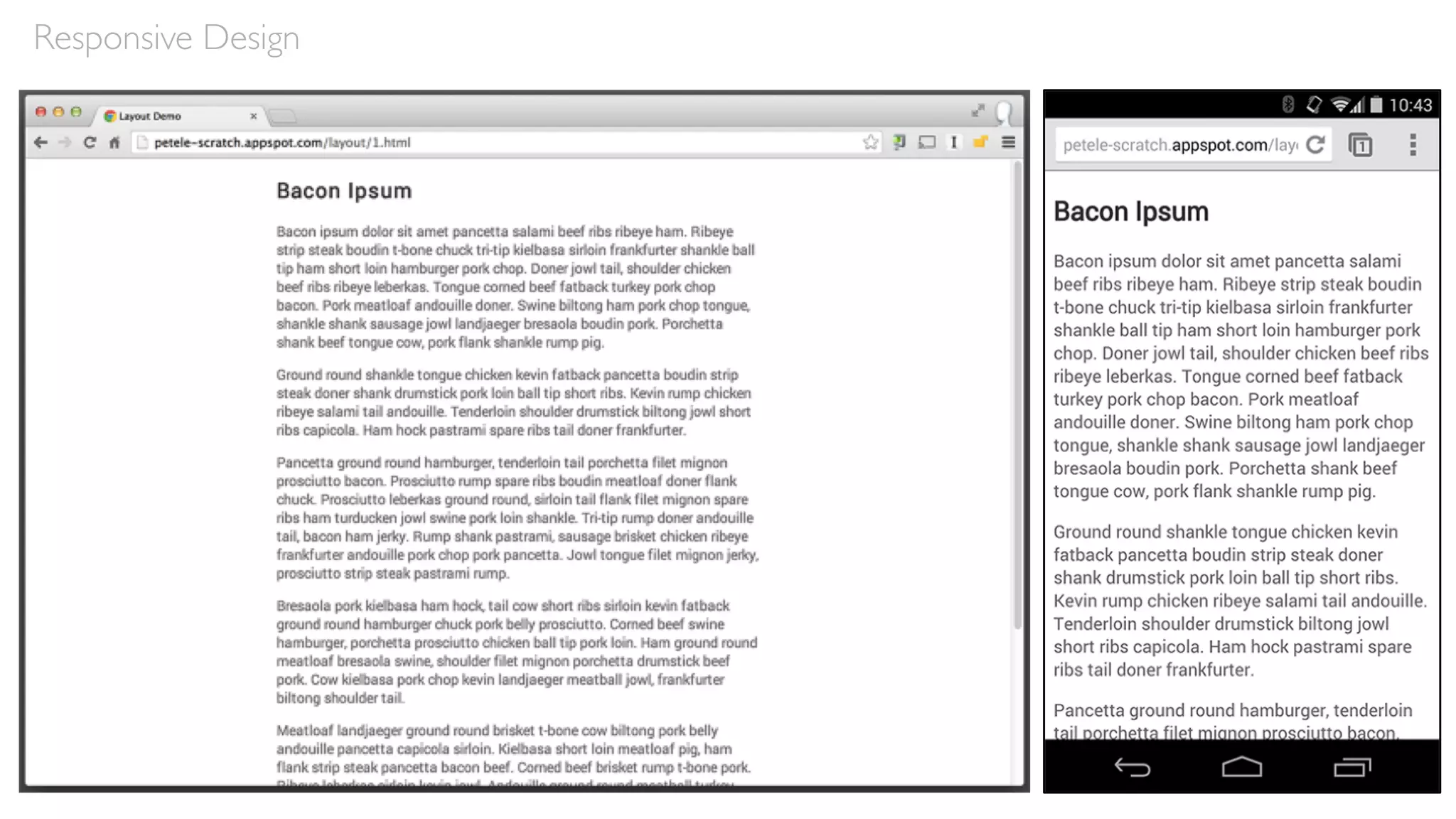
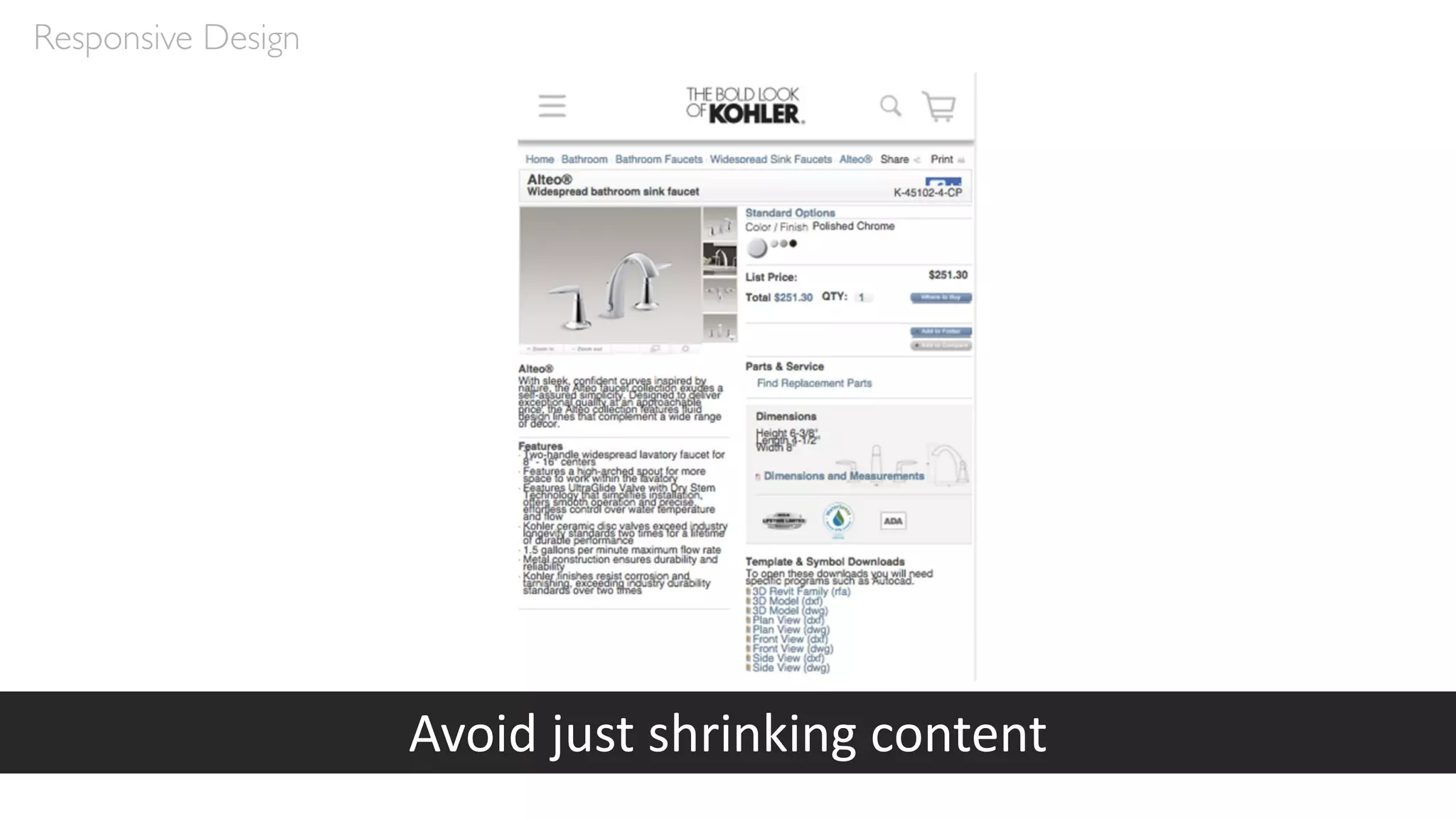
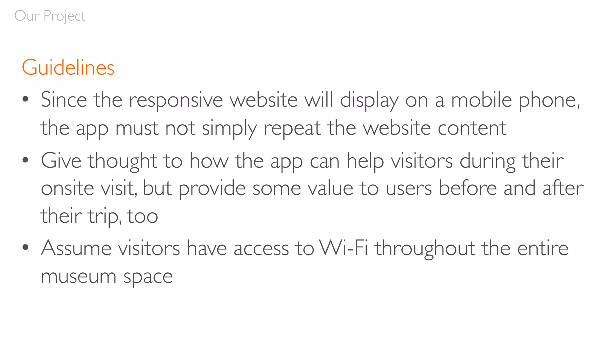
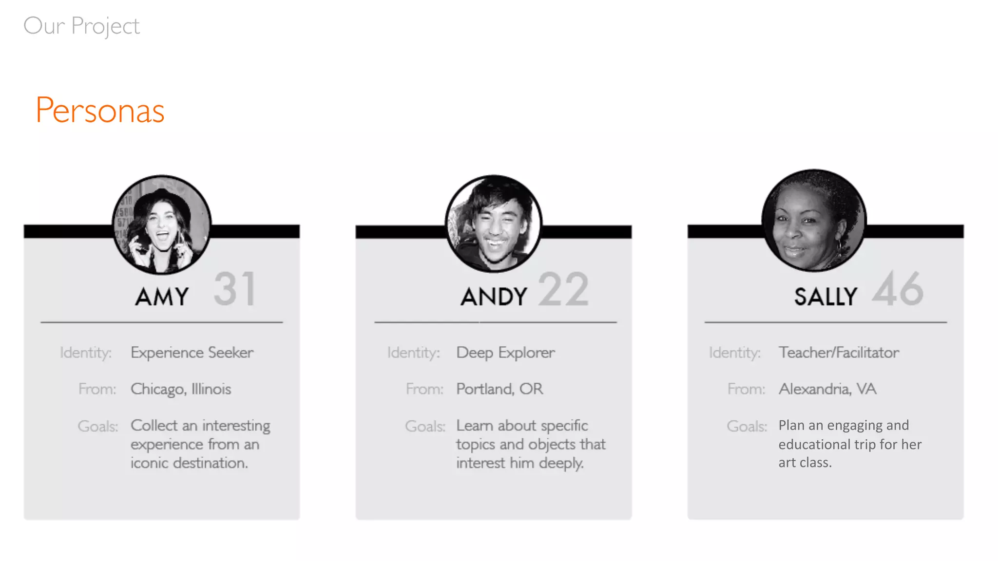
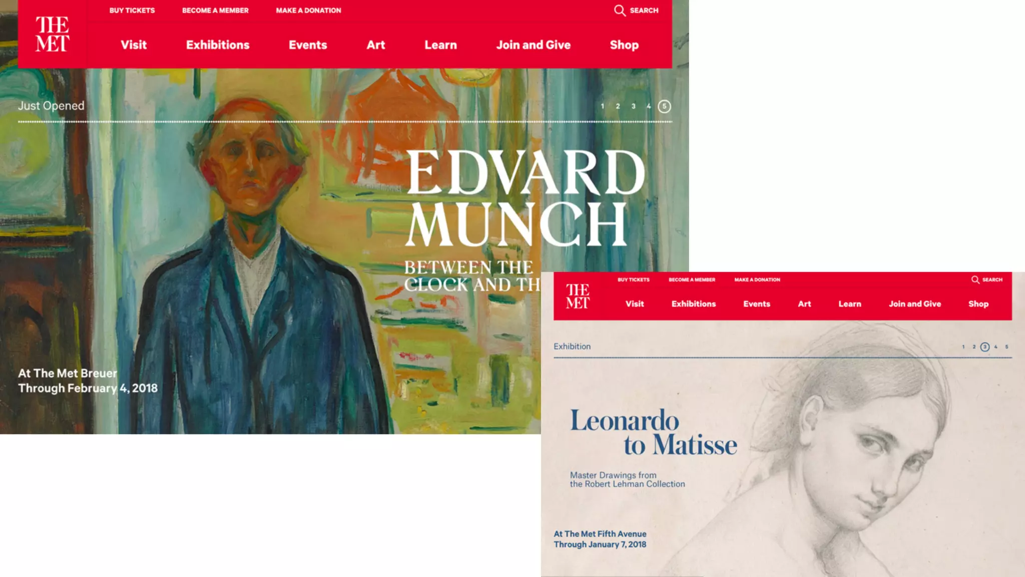
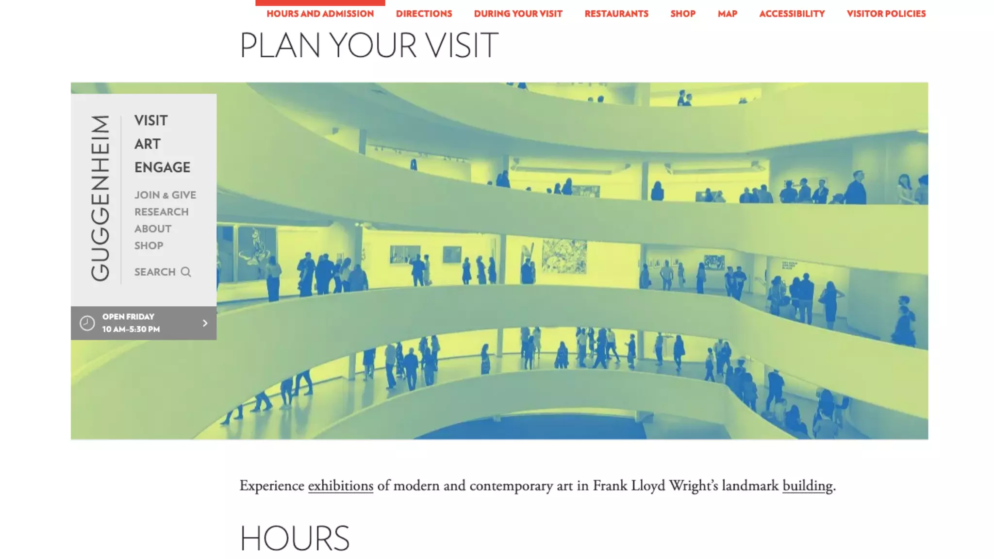
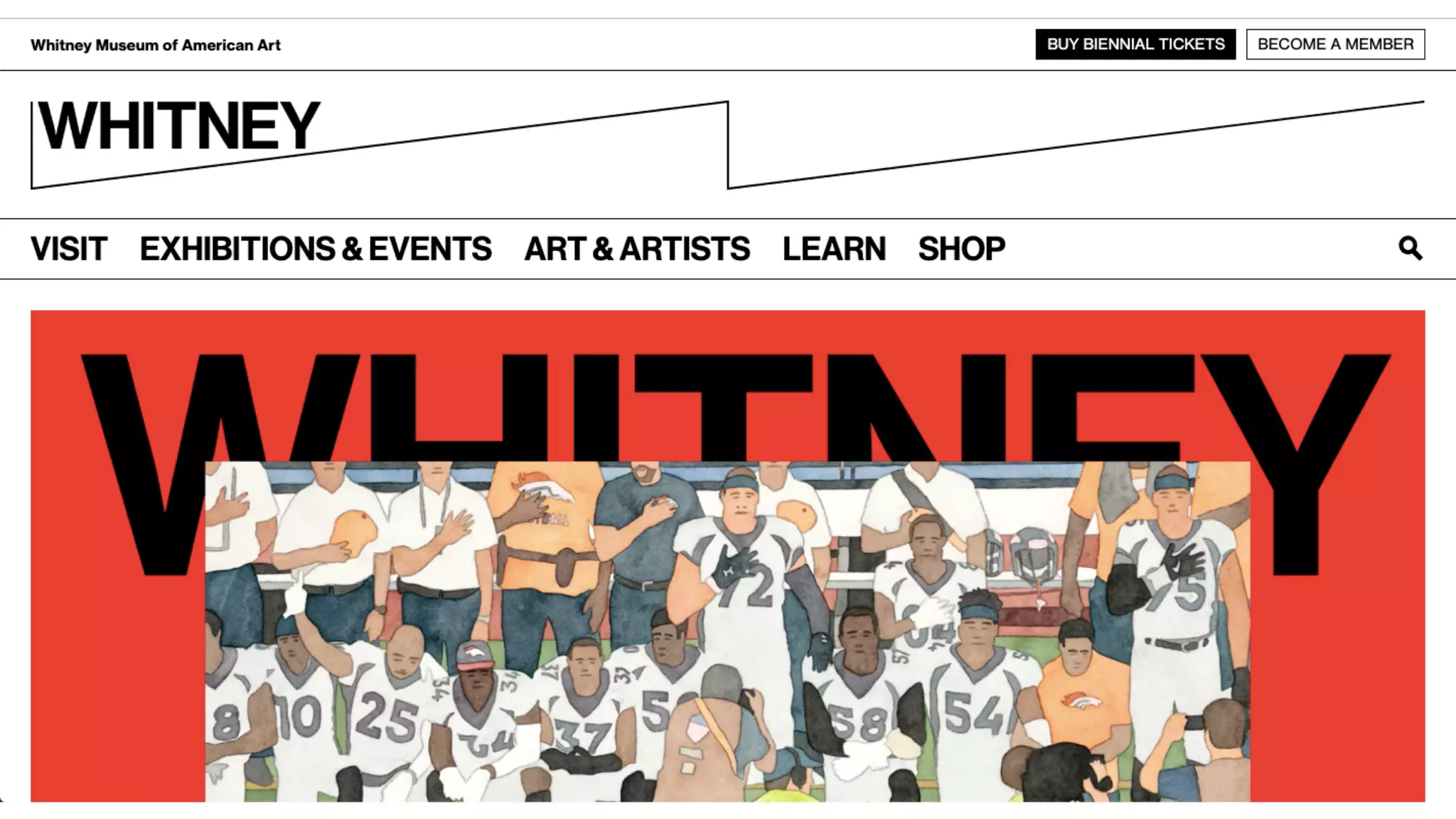
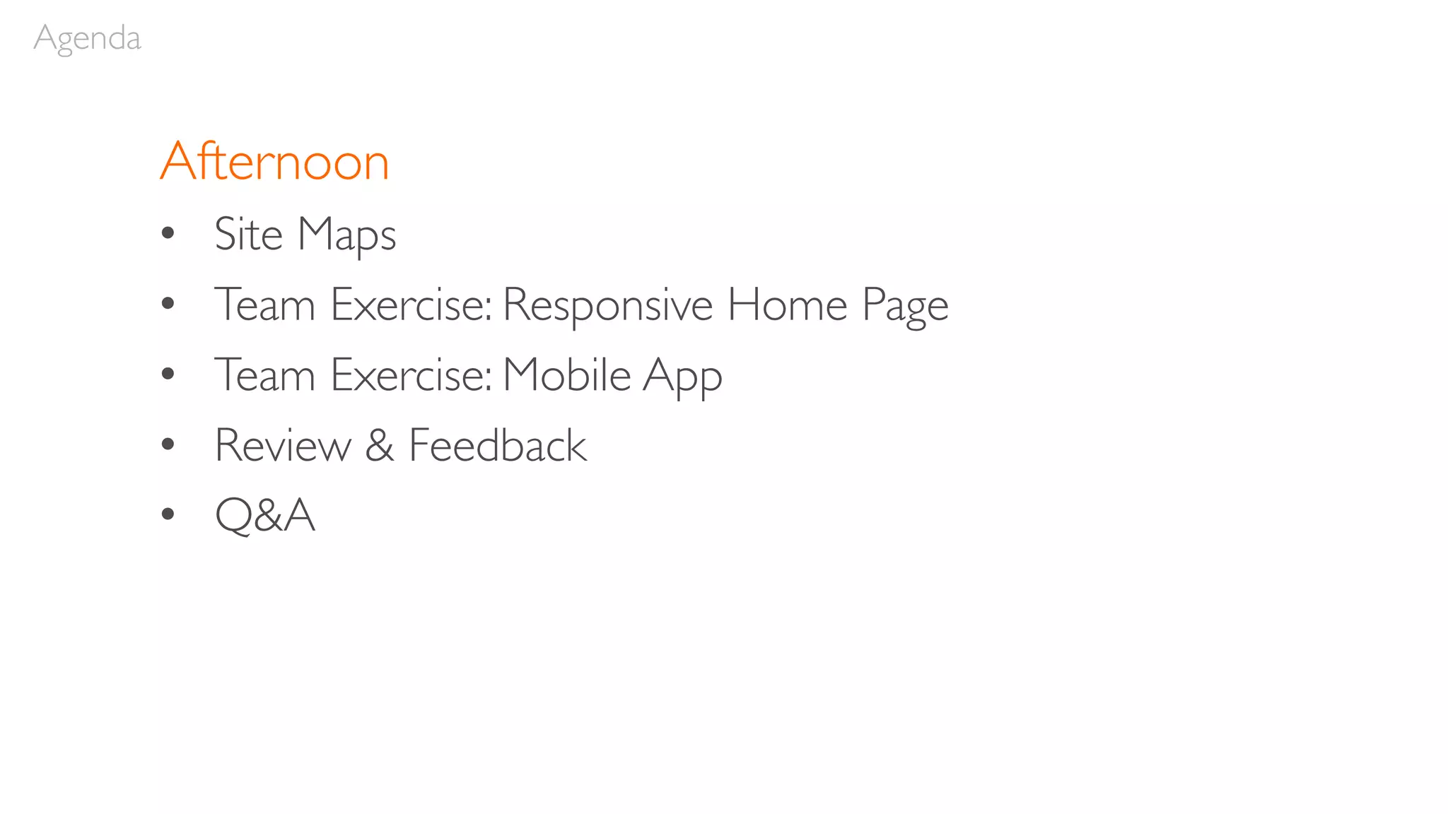
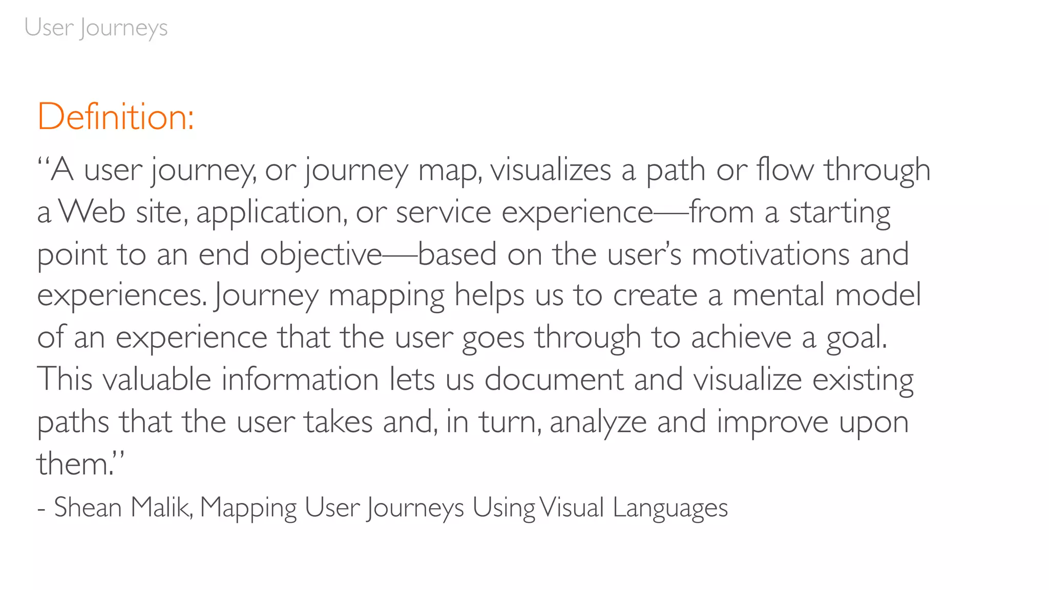
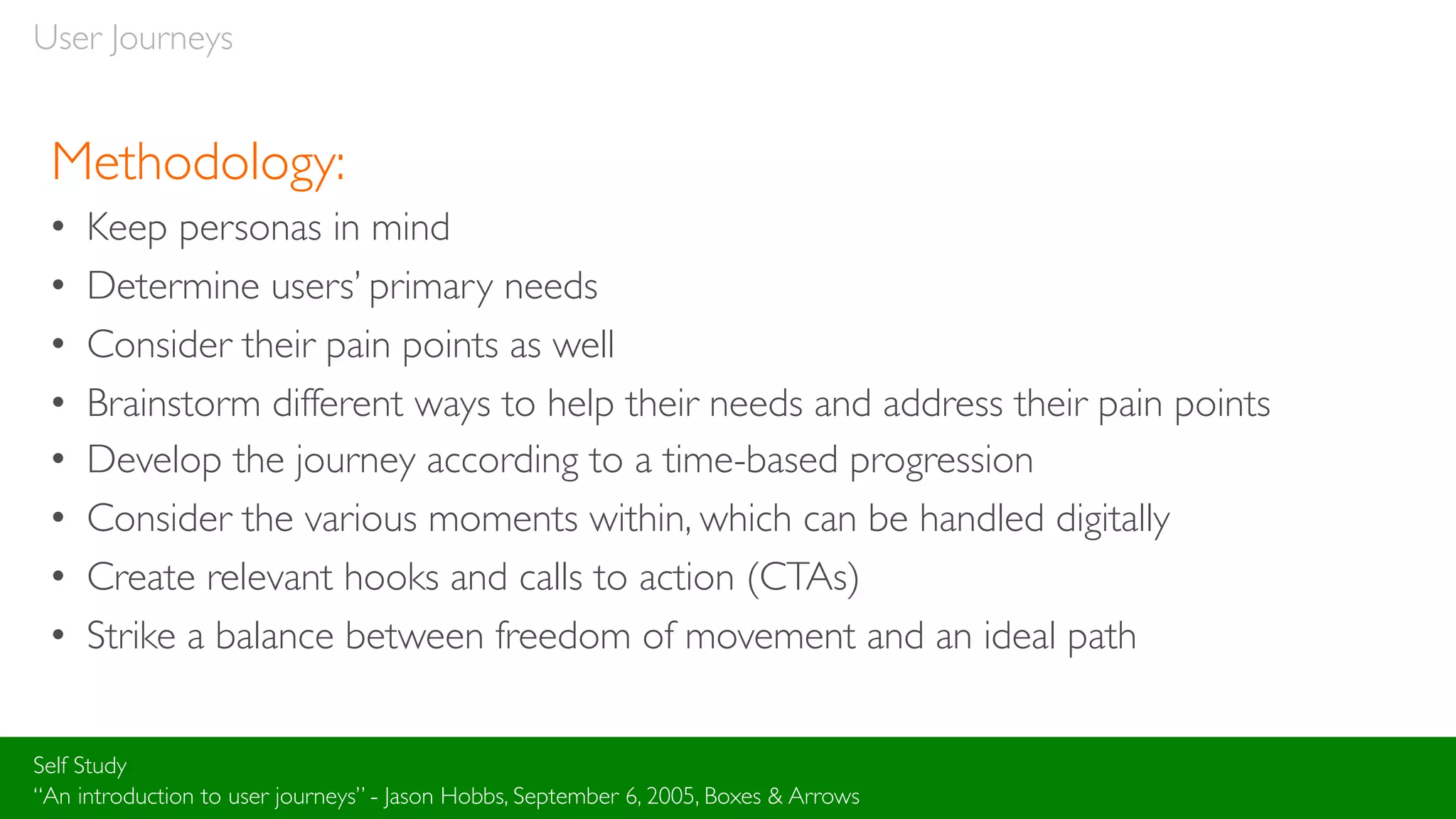
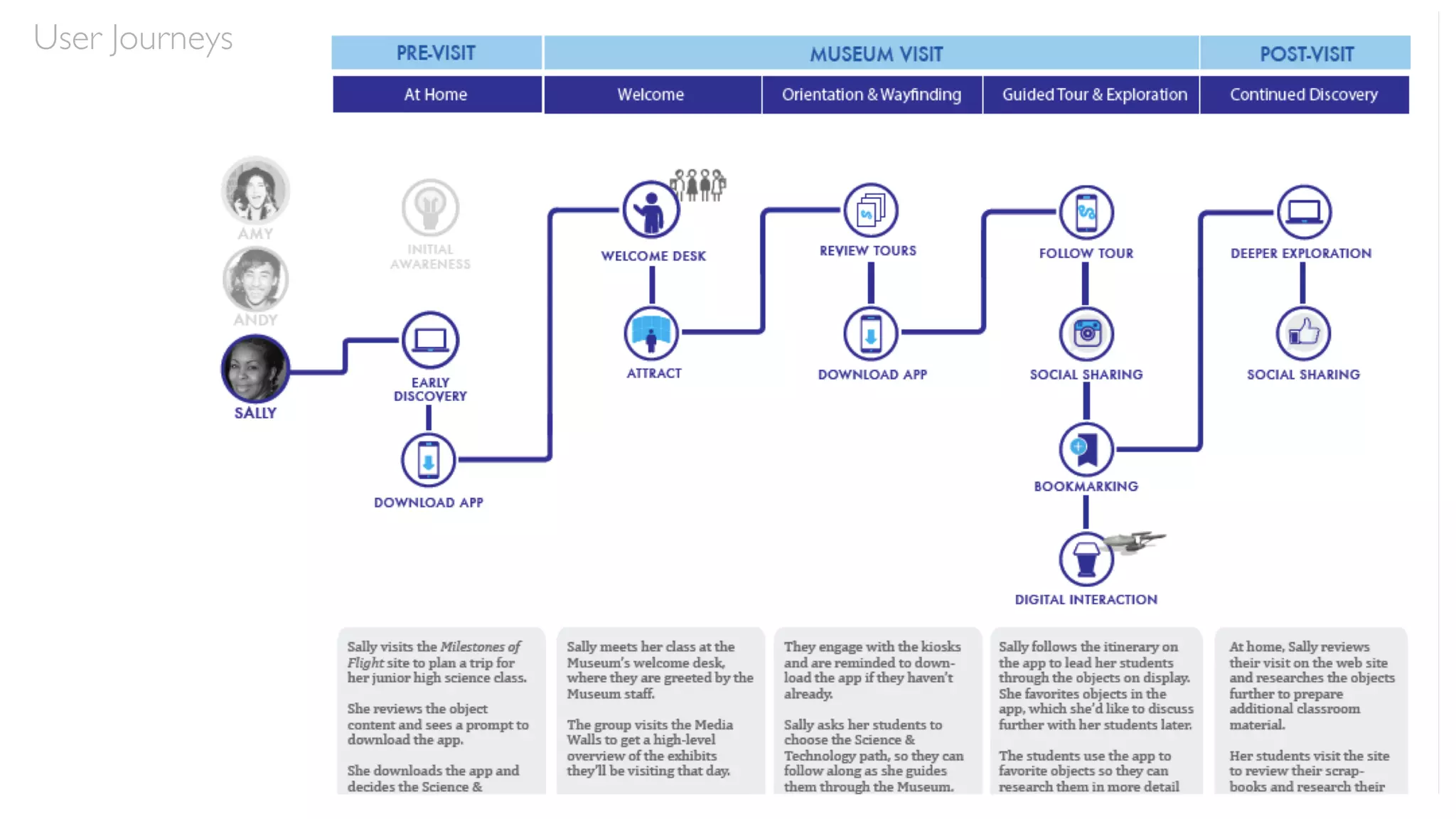
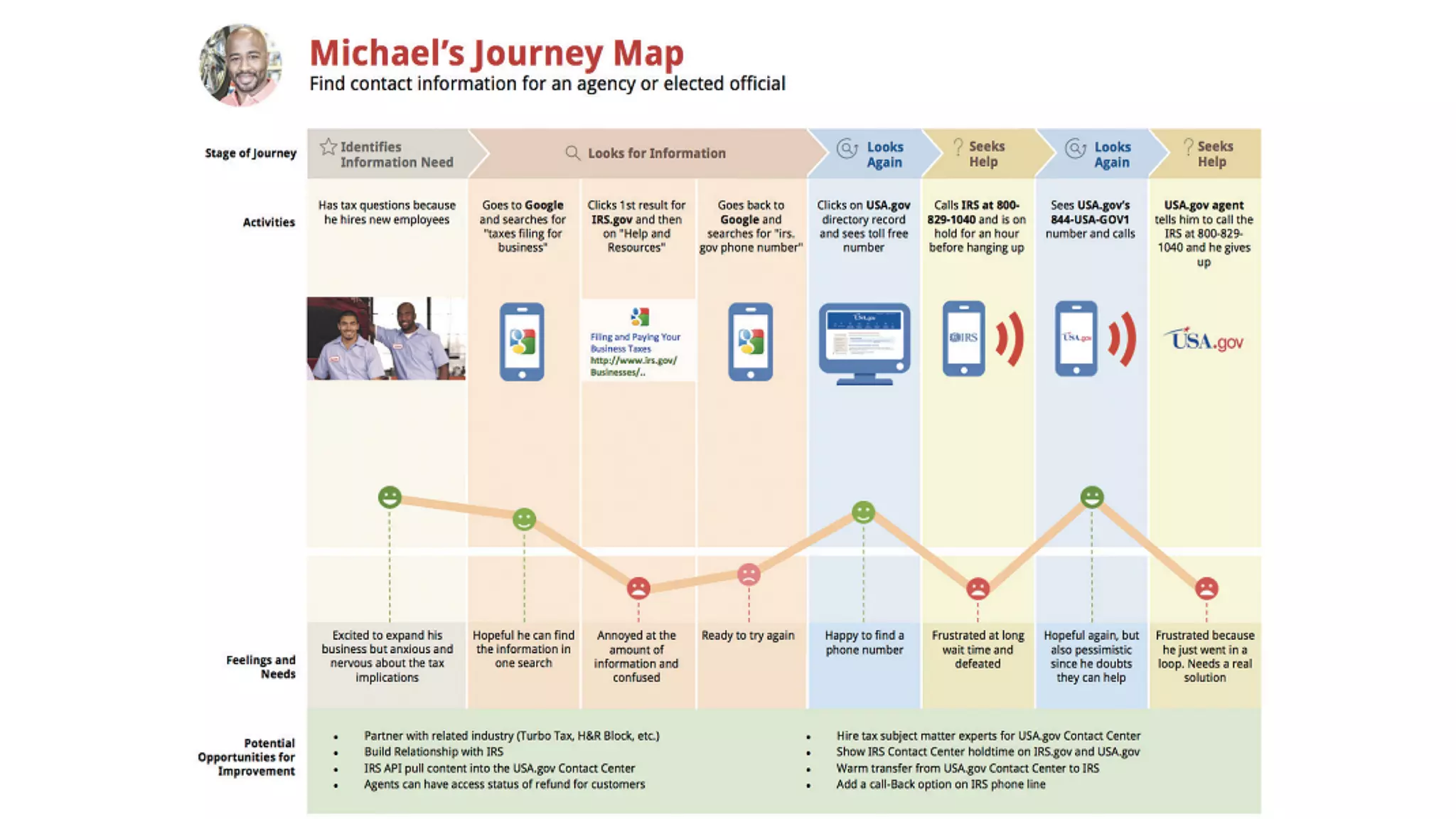
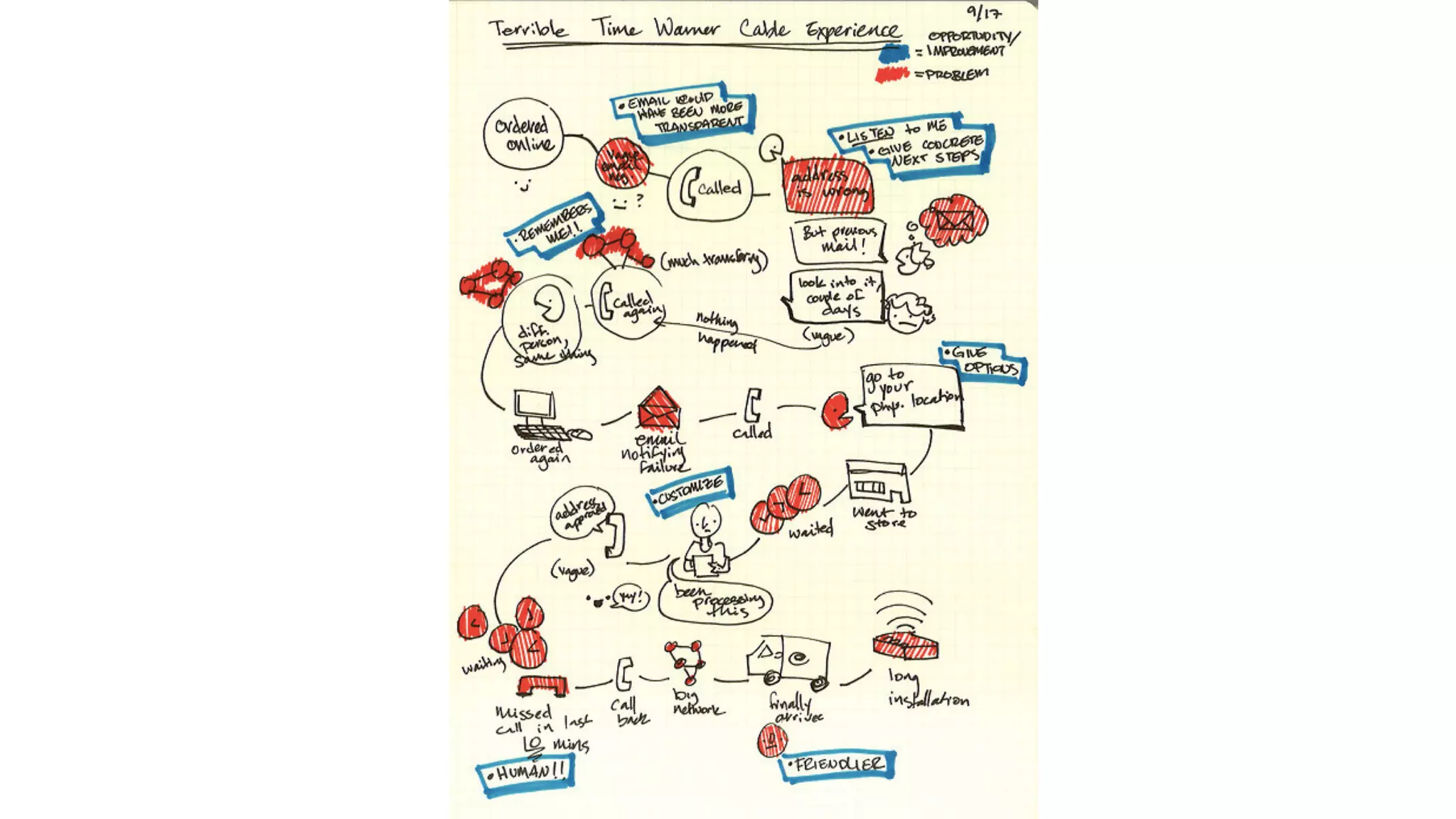
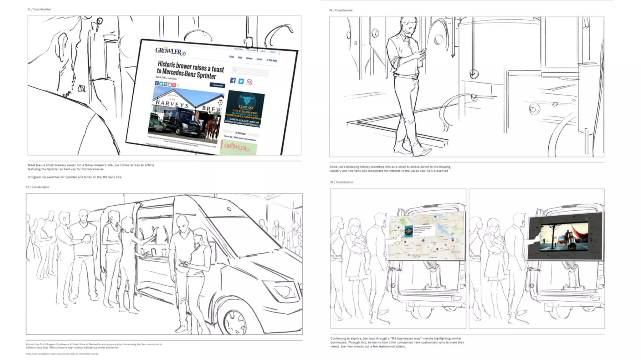
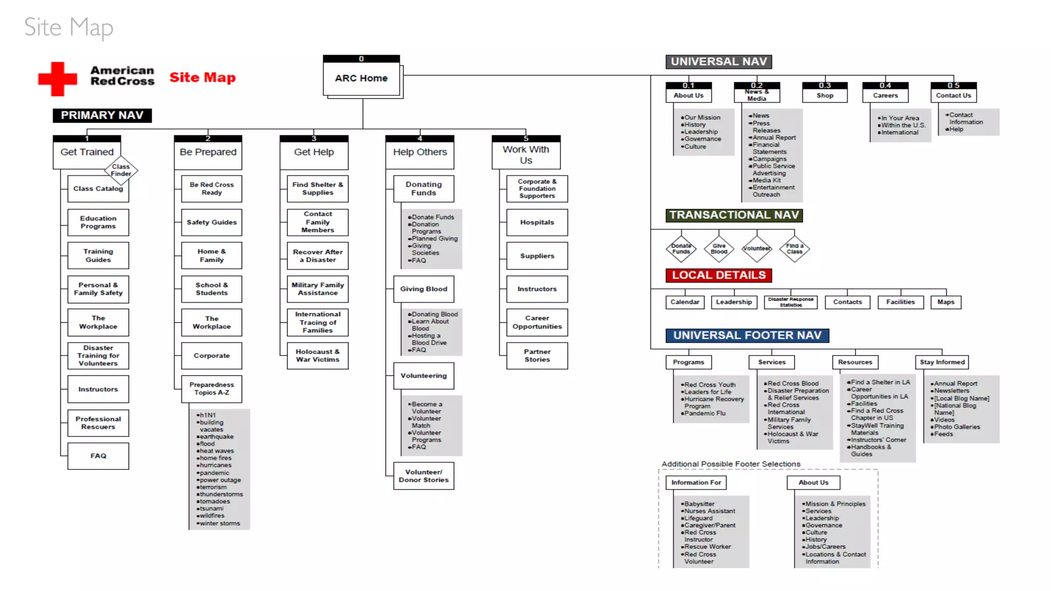
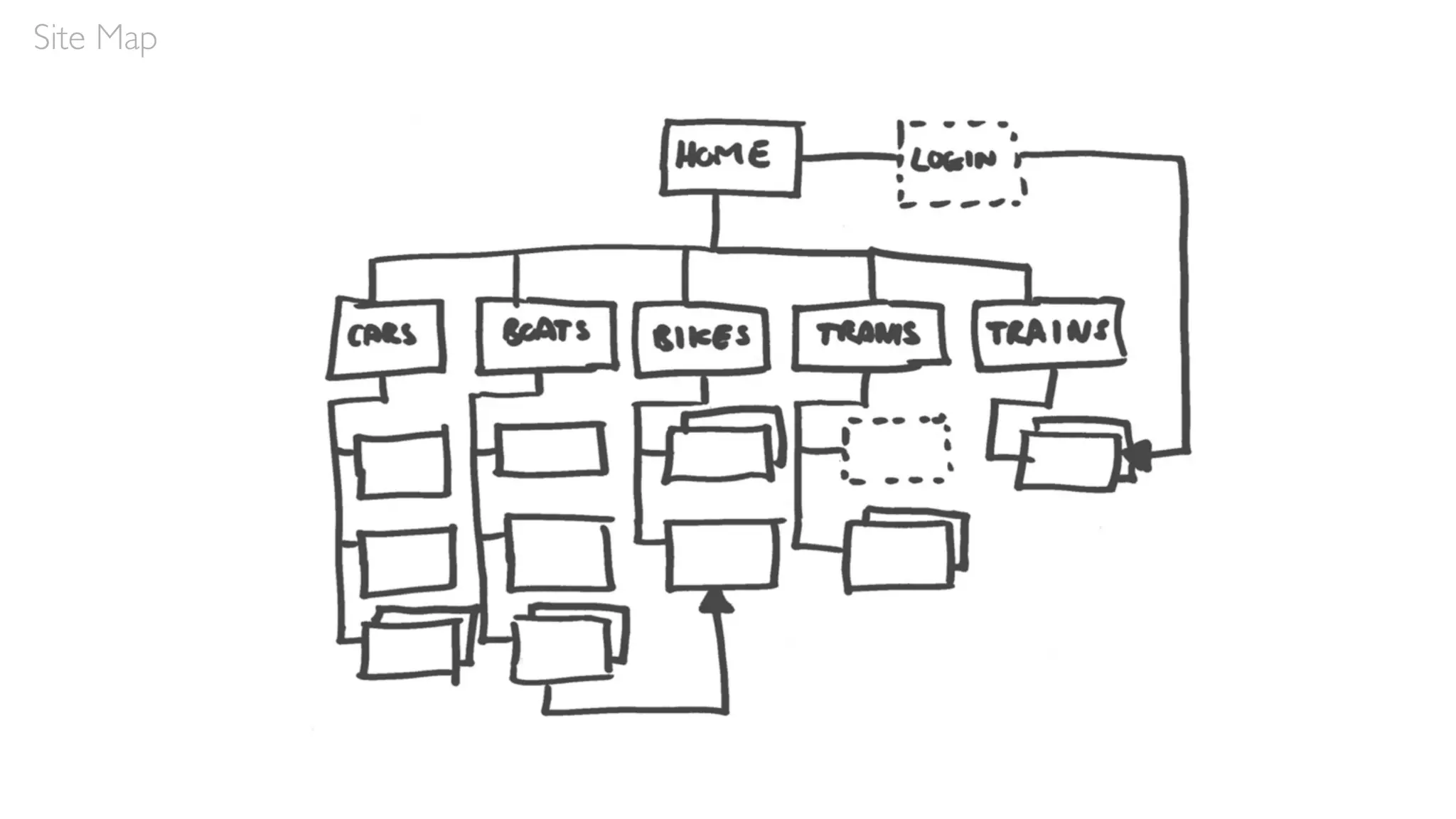
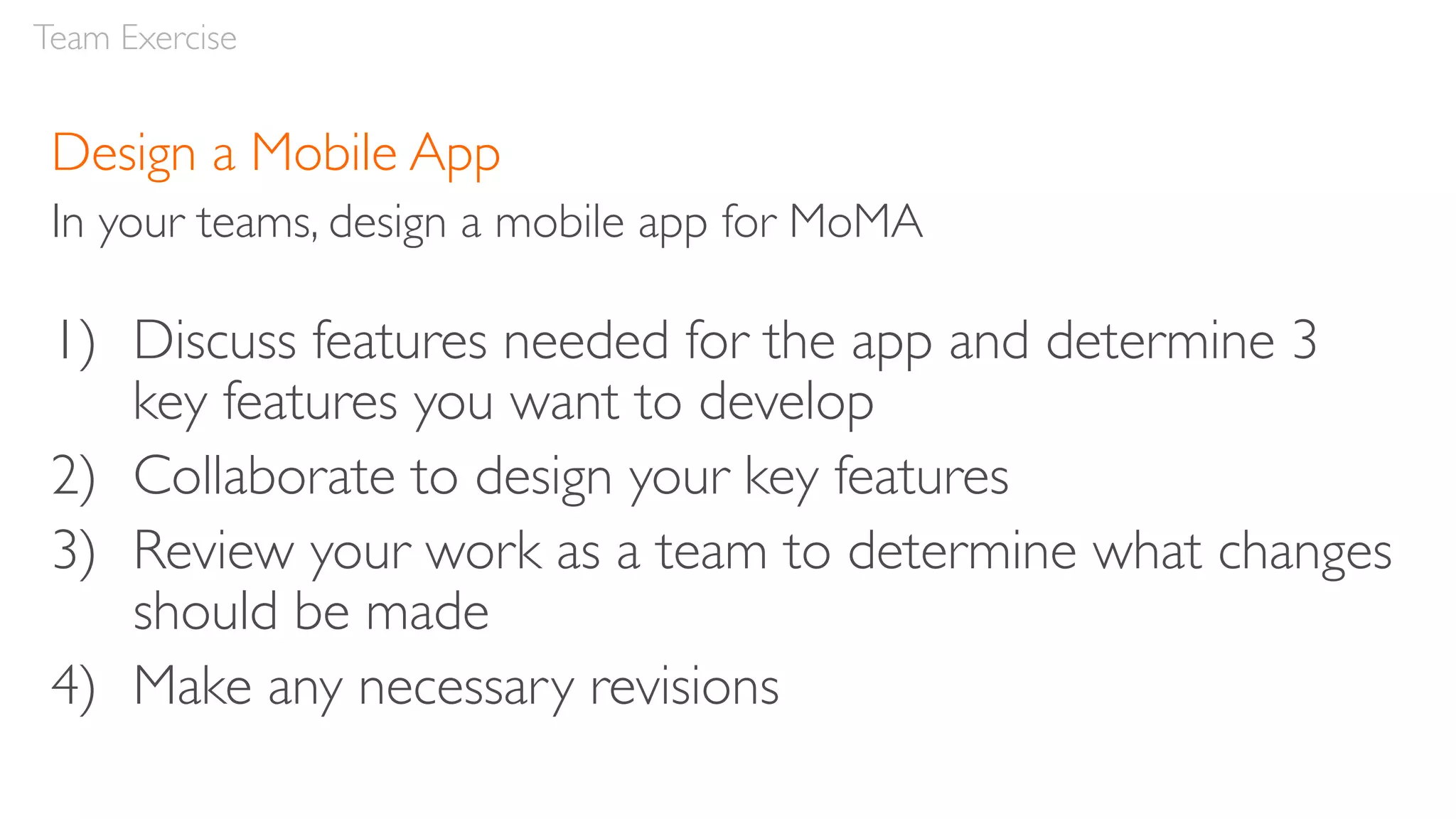
Guidelines for Responsive UX Design
School ofVisual Arts, 16 November, 2019 Robert Stribley
Today’s presentation will be available on SlideShare:
www.slideshare.net/stribs
Robert Stribley
@stribs
Introduction
My clients have included:
β€’ Bank of America, PNC,Wachovia, Citibank, JPMorgan, Morgan Stanley, Oppenheimer Funds,
Prudential, Smith Barney,T. Rowe Price
β€’ Boston Scientific, Nasonex
β€’ AMResorts, Choice Hotels, RCI, Sotheby’s International Realty
β€’ Computer Associates, EMC
β€’ Ford, Lincoln, Mercedes-Benz, MBFS, Mercedes-BenzVans, smart
β€’ FreshDirect
β€’ AT&T, Nextel
β€’ Day One, Red Cross, Smithsonian National Air & Space Museum
β€’ Pearson,Travel Channel,Women’s Wear Daily
AboutYou
β€’ What’s your name?
β€’ What do you do for work?
β€’ What do you do for fun?
β€’ If you could see one museum exhibitβ€”real or imaginaryβ€”
what would it be?
Introduction
Goals of this workshop
β€’ Learn principles and guidelines for responsive design
β€’ Learn about user journeys and create a detailed user
journey as a team
β€’ Develop a site map as a team
β€’ Brainstorm and design a responsive home page as a team
β€’ Brainstorm and design a website and mobile app
experience as a team
Introduction
Agenda
Morning
β€’ Responsive Design Principles
β€’ Project
β€’ User Journeys
β€’ Lunch
Agenda
Afternoon
β€’ Site Maps
β€’ Team Exercise: Responsive Home Page
β€’ Team Exercise: Mobile App
β€’ Review & Feedback
β€’ Q&A
Agenda
52.64%percentage of web traffic via mobile globally in 3rd quarter of 2018
up from 35.1% in 2015
now half of all global pages served
65.7% of all traffic in Asia in 2017
59.5% in Africa
β€œIf a webpage doesn’t
look good on my
phone, I’m less likely
to return to it on my
computer.”
– usability testing participant, 11/7/2019
Responsive Design
Responsive web design is an
approach to web design which
makes web pages render well on a
variety of devices and window or
screen sizes. β€”Wikipedia
Responsive Design
β€œRather than tailoring disconnected designs to each of an
ever-increasing number of web devices, we can treat them as
facets of the same experience.We can design for an optimal
viewing experience, but embed standards-based
technologies into our designs to make them not only more
flexible, but more adaptive to the media that renders them.
In short, we need to practice responsive web design.”
– Ethan Marcotte, Responsive Web Design,A List Apart
Self Study
Responsive Web Design by Ethan Marcotte
Responsive Design
Responsive Design
ResponsiveVersus Adaptive Design
Responsive design is fluid and adapts to the size of the
screen no matter what the target device
Adaptive design uses static (or fixed) layouts based on
breakpoints which don’t respond once they’re initially loaded
Self Study
Responsive vs.Adaptive Design:What’s the Best Choice for Designers? - Jerry Cao, Studio by UXPin
Responsive Design
Responsive Design
Responsive Web Design
by Ethan Marcotte
Responsive Design
The Responsive Web Design Podcast is co-hosted
by Karen McGrane and Ethan Marcotte.
In each episode, they interview the people who
make responsive redesigns happen.
Responsive Design Characteristics
β€’ Mobile first
β€’ Maintain content and features
β€’ Maintain hierarchies
β€’ Break points
β€’ Grids
β€’ Handling navigation
β€’ Handling tables
β€’ Images
β€’ Text
Responsive Design
Mobile First
Mobile First
β€’ Design for β€œmobile first”—the
smallest device first, then work up
from there
β€’ The smallest device may no longer
be a mobile phone
β€’ β€œMobile first” may encourage
simple design, but it need not be
simplistic
Responsive Design
Responsive Design
Content & Features
Maintain Content & Features
β€’ Goal:Wherever possible, maintain content and features across
devices
β€’ Occasionally, content or features can be dropped to save
screen real estate or if they’re not device appropriate
β€’ Establish a clear rationale and principles for dropping any
content or features at the mobile level
β€’ Reducing content can reduce keywords, which can reduce your
site’s ranking on Google
Responsive Design
Responsive Design
Responsive design distributing the same modules across desktop, tablet and mobile
Desktop Tablet Mobile
Responsive Design
Hierarchies
Maintain Hierarchies
β€’ Modules may be repositioned
but hierarchies should be
maintained
β€’ Cluster related content and
features
Responsive Design
Responsive Design
Break Points
Break Points
β€’ Responsive designs adjust at different β€œbreak points” for various
resolutions
β€’ These correspond to the dimensions of various devices, typically
desktop, tablet and mobile
β€’ However, they’re intended to be content, not device-specific
Responsive Design
Responsive Design
β€’ Typically at least two:
β€’ e.g. 320px for mobile,
768px for tablet
(portrait), 1280px for
desktop
β€’ May also add β€œminor
breakpoints” to address
specific issues at various
dimensions
Responsive Design
Grids
Grids
β€’ Grids are fluid within a responsive designβ€”they change
according to screen dimensions
β€’ For example, a desktop design might utilize a 12-column
grid, tablet a 9-column grid, and mobile a 4-column grid
β€’ Depending on the screen, modules may shift both in
size and in placement
Responsive Design
Responsive Design
Navigation
Handling Navigation
β€’ Navigation may be repositioned
β€’ Often repositioned at tablet, but especially on mobile
β€’ On desktop, navigation elements may be activated via hover instead
of click, since users are utilizing a cursor; but in tablet and mobile,
these main nav elements must be activated via touch
β€’ Design navigation to be touch friendlyβ€”e.g. large, tactile targets
β€’ Detailed dropdowns and filters could be presented in an overlay in
mobile
Responsive Design
Responsive Design
Responsive Design
Heavy mobile direction
β€’ Beware the β€œhamburger menu”
Handling Navigation –Tabs
β€’ Tabs may just reduced in size
β€’ They can also be replaced with
– Accordions
– Dropdowns
– Carousel slides
β€’ Consider the content to determine, which of these solutions
works best
Responsive Design
Responsive Design
Responsive Design
Tables
HandlingTables
β€’ Simplest solution for handling tables with multiples columns is to
reduce the number of columns (to one if necessary) and stack them
in mobile.
β€’ You can also allow horizontal scrolling
β€’ Or turn columns into individual slides users can swipe through
Responsive Design
Responsive Design
Desktop
Mobile - Scrolling
Mobile - Stacked
Responsive Design
Responsive Design
Responsive Design
Responsive Design
Not ideal for mobile
Images
Images
β€’ Generally, images should be β€œfluid”
β€’ They will scale down in size as the screen resolution changes
β€’ They may maintain their size, but be cropped if they’re primarily
decorative
β€’ In this case, images must be selected carefully so important
elements aren’t automatically cropped out
β€’ In some cases, if the image isn’t needed, it may be dropped
entirely for mobile
Responsive Design
Responsive Design
Responsive Design
Pay special attention to images with text within them or in overlays
Text
β€’ Maintain text size where possible, though headings and headlines
may be reduced in size
β€’ Text blocks will change in width from desktop to mobile
β€’ However, keep lines of text to a maximum of 70 or 80 characters
β€’ Do not automatically hyphenate text
β€’ Use ellipsis or a β€œread more” CTA to shorten text if necessary
β€’ Provide character limits for titles, captions, etc, so they display
gracefully in mobile
Responsive Design
Responsive Design
Responsive Design
Avoid just shrinking content
Our Project
Develop a museum experience for MoMA which
utilizes both a responsive desktop design and a mobile
app experience, so users can engage with it both at
home on their desktop computer to prepare for their
trip and during their visit via mobile app.
Our Project
Guidelines
β€’ Since the responsive website will display on a mobile phone,
the app must not simply repeat the website content
β€’ Give thought to how the app can help visitors during their
onsite visit, but provide some value to users before and after
their trip, too
β€’ Assume visitors have access to Wi-Fi throughout the entire
museum space
Our Project
Personas
Our Project
Plan an engaging and
educational trip for her
art class.
Competitive Review
Key Findings
β€’ Ability to highlight multiple exhibits
β€’ Access to collections
β€’ Display of upcoming events
β€’ Focus on membership
β€’ Visitor information
β€’ Education and learning information
β€’ Ability to view different locations
β€’ Any key differentiators?
β€’ Anything else?
Competitive Review
Lunch Break
Afternoon
β€’ Site Maps
β€’ Team Exercise: Responsive Home Page
β€’ Team Exercise: Mobile App
β€’ Review & Feedback
β€’ Q&A
Agenda
User Journeys
User Journeys
β€œDesign is all about
entrances and exits.”
β€”Rem Koolhaas
User Journeys
Definition:
β€œA user journey, or journey map, visualizes a path or flow through
a Web site, application, or service experienceβ€”from a starting
point to an end objectiveβ€”based on the user’s motivations and
experiences. Journey mapping helps us to create a mental model
of an experience that the user goes through to achieve a goal.
This valuable information lets us document and visualize existing
paths that the user takes and, in turn, analyze and improve upon
them.”
- Shean Malik, Mapping User Journeys UsingVisual Languages
User Journeys
Methodology:
β€’ Keep personas in mind
β€’ Determine users’ primary needs
β€’ Consider their pain points as well
β€’ Brainstorm different ways to help their needs and address their pain points
β€’ Develop the journey according to a time-based progression
β€’ Consider the various moments within, which can be handled digitally
β€’ Create relevant hooks and calls to action (CTAs)
β€’ Strike a balance between freedom of movement and an ideal path
Self Study
β€œAn introduction to user journeys” - Jason Hobbs, September 6, 2005, Boxes & Arrows
User Journeys
Class Exercise:
Develop a user journey, which incorporates features applicable
to Andy’s persona
β€’ Divide into teams
β€’ Discuss what you expect a typical user to do
– At home
– At the museum
– With a specific exhibit
– With a specific artifact
– Back home
β€’ Develop a high-level diagram, which depicts Andy’s journey
– What are the touchpoints? What technology does he interact
with?
User Journeys
30mins
Features Identified
Let’s discuss some of the features your team identified.
User Journeys
Site Maps
Site Map
Site Map
Class Exercise:
Develop 2 high-level site maps based on features you
discovered in your user journey, plus any additional content
needed to flesh out the experience.
β€’ One for the MoMA web site (for desktop & mobile)
β€’ One for the MoMA mobile app
It’s OK to consult competitor sites if you like.
Site Map
20mins
Review Site Maps
Let’s review your site maps
Site Map
Team Exercise:
Design a Responsive
Home Page
Design a Responsive Home Page
In your teams, design a responsive home page for MoMA’s web site
1) Discuss features needed for a homepage
2) Sketch your ideas for a homepage individually
3) Share your sketches with your team mates
4) Collaborate on a single home page wireframe – for both
mobile and desktop
Team Exercise
1) Discuss features needed for a homepage
Team Exercise
20mins
2) Sketch your ideas for a
homepage individually –
Both desktop and
mobile versions
Team Exercise
10mins
3) Share your sketches with your team mates
Team Exercise
10mins
4) Collaborate on a single home page wireframe
– for both mobile and desktop
Team Exercise
20mins
Break
Team Exercise:
Design a Mobile App
Design a Mobile App
In your teams, design a mobile app for MoMA
1) Discuss features needed for the app and determine 3
key features you want to develop
2) Collaborate to design your key features
3) Review your work as a team to determine what changes
should be made
4) Make any necessary revisions
Team Exercise
1) Discuss features needed for the app and determine the
3 key features you want to develop
At least one feature should be dedicated to exploring an
artifact
No sketching yet
Team Exercise
10mins
2) Collaborate to design your 3 key features
Then review your work as a team to determine if
changes should be made
Make any necessary revisions
Team Exercise
30mins
ShareYour Work
Present your work as a team
Team Exercise
Team Exercise:
Review & Feedback
Bonus
Q&A
My article on how to find a UX job:
UX:Your Guerilla Guide to Breaking In
stay tuned
My next class
My new class in March 2020
We’ll explore user-centered design
deliverables and methodologies with a
particular emphasis upon β€œLean” UX design
and usability testing, as well as specific
topics such as accessibility and design
for privacy and security, which focus on
improving user experiences.
Attendees will also participate in group
activities, which provide practical
experience in developing relevant
deliverables.
No prerequisite, but taking the Introduction to User
Experience Design may be helpful.
Applied Methods for Better UX Design
Slideshare address:
http://www.slideshare.net/stribs
stribley@outlook.com
thank you

Guidelines for Responsive UX Design 11/16/19

  • 1.
    Guidelines for ResponsiveUX Design School ofVisual Arts, 16 November, 2019 Robert Stribley
  • 2.
    Today’s presentation willbe available on SlideShare: www.slideshare.net/stribs
  • 3.
    Robert Stribley @stribs Introduction My clientshave included: β€’ Bank of America, PNC,Wachovia, Citibank, JPMorgan, Morgan Stanley, Oppenheimer Funds, Prudential, Smith Barney,T. Rowe Price β€’ Boston Scientific, Nasonex β€’ AMResorts, Choice Hotels, RCI, Sotheby’s International Realty β€’ Computer Associates, EMC β€’ Ford, Lincoln, Mercedes-Benz, MBFS, Mercedes-BenzVans, smart β€’ FreshDirect β€’ AT&T, Nextel β€’ Day One, Red Cross, Smithsonian National Air & Space Museum β€’ Pearson,Travel Channel,Women’s Wear Daily
  • 5.
    AboutYou β€’ What’s yourname? β€’ What do you do for work? β€’ What do you do for fun? β€’ If you could see one museum exhibitβ€”real or imaginaryβ€” what would it be? Introduction
  • 6.
    Goals of thisworkshop β€’ Learn principles and guidelines for responsive design β€’ Learn about user journeys and create a detailed user journey as a team β€’ Develop a site map as a team β€’ Brainstorm and design a responsive home page as a team β€’ Brainstorm and design a website and mobile app experience as a team Introduction
  • 7.
  • 8.
    Morning β€’ Responsive DesignPrinciples β€’ Project β€’ User Journeys β€’ Lunch Agenda
  • 9.
    Afternoon β€’ Site Maps β€’Team Exercise: Responsive Home Page β€’ Team Exercise: Mobile App β€’ Review & Feedback β€’ Q&A Agenda
  • 10.
    52.64%percentage of webtraffic via mobile globally in 3rd quarter of 2018 up from 35.1% in 2015 now half of all global pages served 65.7% of all traffic in Asia in 2017 59.5% in Africa
  • 11.
    β€œIf a webpagedoesn’t look good on my phone, I’m less likely to return to it on my computer.” – usability testing participant, 11/7/2019
  • 12.
  • 13.
    Responsive web designis an approach to web design which makes web pages render well on a variety of devices and window or screen sizes. β€”Wikipedia Responsive Design
  • 15.
    β€œRather than tailoringdisconnected designs to each of an ever-increasing number of web devices, we can treat them as facets of the same experience.We can design for an optimal viewing experience, but embed standards-based technologies into our designs to make them not only more flexible, but more adaptive to the media that renders them. In short, we need to practice responsive web design.” – Ethan Marcotte, Responsive Web Design,A List Apart Self Study Responsive Web Design by Ethan Marcotte Responsive Design
  • 16.
    Responsive Design ResponsiveVersus AdaptiveDesign Responsive design is fluid and adapts to the size of the screen no matter what the target device Adaptive design uses static (or fixed) layouts based on breakpoints which don’t respond once they’re initially loaded Self Study Responsive vs.Adaptive Design:What’s the Best Choice for Designers? - Jerry Cao, Studio by UXPin
  • 17.
  • 18.
    Responsive Design Responsive WebDesign by Ethan Marcotte
  • 19.
    Responsive Design The ResponsiveWeb Design Podcast is co-hosted by Karen McGrane and Ethan Marcotte. In each episode, they interview the people who make responsive redesigns happen.
  • 20.
    Responsive Design Characteristics β€’Mobile first β€’ Maintain content and features β€’ Maintain hierarchies β€’ Break points β€’ Grids β€’ Handling navigation β€’ Handling tables β€’ Images β€’ Text Responsive Design
  • 21.
  • 22.
    Mobile First β€’ Designfor β€œmobile first”—the smallest device first, then work up from there β€’ The smallest device may no longer be a mobile phone β€’ β€œMobile first” may encourage simple design, but it need not be simplistic Responsive Design
  • 23.
  • 24.
  • 25.
    Maintain Content &Features β€’ Goal:Wherever possible, maintain content and features across devices β€’ Occasionally, content or features can be dropped to save screen real estate or if they’re not device appropriate β€’ Establish a clear rationale and principles for dropping any content or features at the mobile level β€’ Reducing content can reduce keywords, which can reduce your site’s ranking on Google Responsive Design
  • 26.
    Responsive Design Responsive designdistributing the same modules across desktop, tablet and mobile Desktop Tablet Mobile
  • 27.
  • 29.
  • 30.
    Maintain Hierarchies β€’ Modulesmay be repositioned but hierarchies should be maintained β€’ Cluster related content and features Responsive Design
  • 31.
  • 32.
  • 33.
    Break Points β€’ Responsivedesigns adjust at different β€œbreak points” for various resolutions β€’ These correspond to the dimensions of various devices, typically desktop, tablet and mobile β€’ However, they’re intended to be content, not device-specific Responsive Design
  • 34.
    Responsive Design β€’ Typicallyat least two: β€’ e.g. 320px for mobile, 768px for tablet (portrait), 1280px for desktop β€’ May also add β€œminor breakpoints” to address specific issues at various dimensions
  • 35.
  • 36.
  • 37.
    Grids β€’ Grids arefluid within a responsive designβ€”they change according to screen dimensions β€’ For example, a desktop design might utilize a 12-column grid, tablet a 9-column grid, and mobile a 4-column grid β€’ Depending on the screen, modules may shift both in size and in placement Responsive Design
  • 38.
  • 39.
  • 40.
    Handling Navigation β€’ Navigationmay be repositioned β€’ Often repositioned at tablet, but especially on mobile β€’ On desktop, navigation elements may be activated via hover instead of click, since users are utilizing a cursor; but in tablet and mobile, these main nav elements must be activated via touch β€’ Design navigation to be touch friendlyβ€”e.g. large, tactile targets β€’ Detailed dropdowns and filters could be presented in an overlay in mobile Responsive Design
  • 41.
  • 42.
    Responsive Design Heavy mobiledirection β€’ Beware the β€œhamburger menu”
  • 43.
    Handling Navigation –Tabs β€’Tabs may just reduced in size β€’ They can also be replaced with – Accordions – Dropdowns – Carousel slides β€’ Consider the content to determine, which of these solutions works best Responsive Design
  • 44.
  • 45.
  • 46.
  • 47.
    HandlingTables β€’ Simplest solutionfor handling tables with multiples columns is to reduce the number of columns (to one if necessary) and stack them in mobile. β€’ You can also allow horizontal scrolling β€’ Or turn columns into individual slides users can swipe through Responsive Design
  • 48.
    Responsive Design Desktop Mobile -Scrolling Mobile - Stacked
  • 49.
  • 50.
  • 51.
  • 52.
  • 53.
  • 54.
    Images β€’ Generally, imagesshould be β€œfluid” β€’ They will scale down in size as the screen resolution changes β€’ They may maintain their size, but be cropped if they’re primarily decorative β€’ In this case, images must be selected carefully so important elements aren’t automatically cropped out β€’ In some cases, if the image isn’t needed, it may be dropped entirely for mobile Responsive Design
  • 55.
  • 56.
  • 57.
    Pay special attentionto images with text within them or in overlays
  • 59.
    Text β€’ Maintain textsize where possible, though headings and headlines may be reduced in size β€’ Text blocks will change in width from desktop to mobile β€’ However, keep lines of text to a maximum of 70 or 80 characters β€’ Do not automatically hyphenate text β€’ Use ellipsis or a β€œread more” CTA to shorten text if necessary β€’ Provide character limits for titles, captions, etc, so they display gracefully in mobile Responsive Design
  • 60.
  • 61.
  • 62.
  • 63.
    Develop a museumexperience for MoMA which utilizes both a responsive desktop design and a mobile app experience, so users can engage with it both at home on their desktop computer to prepare for their trip and during their visit via mobile app. Our Project
  • 64.
    Guidelines β€’ Since theresponsive website will display on a mobile phone, the app must not simply repeat the website content β€’ Give thought to how the app can help visitors during their onsite visit, but provide some value to users before and after their trip, too β€’ Assume visitors have access to Wi-Fi throughout the entire museum space Our Project
  • 65.
    Personas Our Project Plan anengaging and educational trip for her art class.
  • 66.
  • 71.
    Key Findings β€’ Abilityto highlight multiple exhibits β€’ Access to collections β€’ Display of upcoming events β€’ Focus on membership β€’ Visitor information β€’ Education and learning information β€’ Ability to view different locations β€’ Any key differentiators? β€’ Anything else? Competitive Review
  • 72.
  • 73.
    Afternoon β€’ Site Maps β€’Team Exercise: Responsive Home Page β€’ Team Exercise: Mobile App β€’ Review & Feedback β€’ Q&A Agenda
  • 74.
  • 75.
    User Journeys β€œDesign isall about entrances and exits.” β€”Rem Koolhaas
  • 76.
    User Journeys Definition: β€œA userjourney, or journey map, visualizes a path or flow through a Web site, application, or service experienceβ€”from a starting point to an end objectiveβ€”based on the user’s motivations and experiences. Journey mapping helps us to create a mental model of an experience that the user goes through to achieve a goal. This valuable information lets us document and visualize existing paths that the user takes and, in turn, analyze and improve upon them.” - Shean Malik, Mapping User Journeys UsingVisual Languages
  • 77.
    User Journeys Methodology: β€’ Keeppersonas in mind β€’ Determine users’ primary needs β€’ Consider their pain points as well β€’ Brainstorm different ways to help their needs and address their pain points β€’ Develop the journey according to a time-based progression β€’ Consider the various moments within, which can be handled digitally β€’ Create relevant hooks and calls to action (CTAs) β€’ Strike a balance between freedom of movement and an ideal path Self Study β€œAn introduction to user journeys” - Jason Hobbs, September 6, 2005, Boxes & Arrows
  • 78.
  • 82.
    Class Exercise: Develop auser journey, which incorporates features applicable to Andy’s persona β€’ Divide into teams β€’ Discuss what you expect a typical user to do – At home – At the museum – With a specific exhibit – With a specific artifact – Back home β€’ Develop a high-level diagram, which depicts Andy’s journey – What are the touchpoints? What technology does he interact with? User Journeys 30mins
  • 83.
    Features Identified Let’s discusssome of the features your team identified. User Journeys
  • 84.
  • 85.
  • 86.
  • 87.
    Class Exercise: Develop 2high-level site maps based on features you discovered in your user journey, plus any additional content needed to flesh out the experience. β€’ One for the MoMA web site (for desktop & mobile) β€’ One for the MoMA mobile app It’s OK to consult competitor sites if you like. Site Map 20mins
  • 88.
    Review Site Maps Let’sreview your site maps Site Map
  • 89.
    Team Exercise: Design aResponsive Home Page
  • 90.
    Design a ResponsiveHome Page In your teams, design a responsive home page for MoMA’s web site 1) Discuss features needed for a homepage 2) Sketch your ideas for a homepage individually 3) Share your sketches with your team mates 4) Collaborate on a single home page wireframe – for both mobile and desktop Team Exercise
  • 91.
    1) Discuss featuresneeded for a homepage Team Exercise 20mins
  • 92.
    2) Sketch yourideas for a homepage individually – Both desktop and mobile versions Team Exercise 10mins
  • 93.
    3) Share yoursketches with your team mates Team Exercise 10mins
  • 94.
    4) Collaborate ona single home page wireframe – for both mobile and desktop Team Exercise 20mins
  • 95.
  • 96.
  • 97.
    Design a MobileApp In your teams, design a mobile app for MoMA 1) Discuss features needed for the app and determine 3 key features you want to develop 2) Collaborate to design your key features 3) Review your work as a team to determine what changes should be made 4) Make any necessary revisions Team Exercise
  • 98.
    1) Discuss featuresneeded for the app and determine the 3 key features you want to develop At least one feature should be dedicated to exploring an artifact No sketching yet Team Exercise 10mins
  • 99.
    2) Collaborate todesign your 3 key features Then review your work as a team to determine if changes should be made Make any necessary revisions Team Exercise 30mins
  • 100.
    ShareYour Work Present yourwork as a team Team Exercise
  • 101.
  • 102.
  • 104.
  • 105.
    My article onhow to find a UX job: UX:Your Guerilla Guide to Breaking In
  • 106.
  • 107.
    My new classin March 2020 We’ll explore user-centered design deliverables and methodologies with a particular emphasis upon β€œLean” UX design and usability testing, as well as specific topics such as accessibility and design for privacy and security, which focus on improving user experiences. Attendees will also participate in group activities, which provide practical experience in developing relevant deliverables. No prerequisite, but taking the Introduction to User Experience Design may be helpful. Applied Methods for Better UX Design
  • 108.
  • 109.