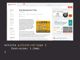
Download as PDF, PPTX


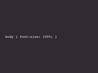


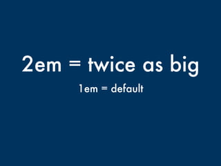
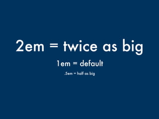
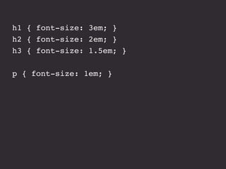
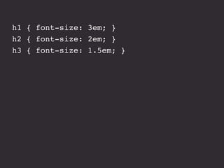
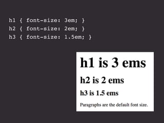
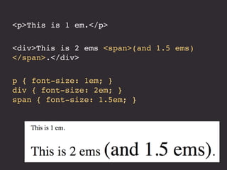


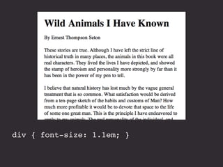
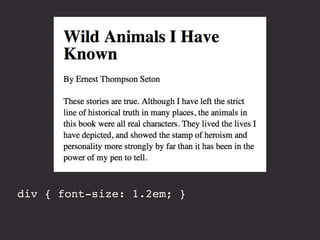
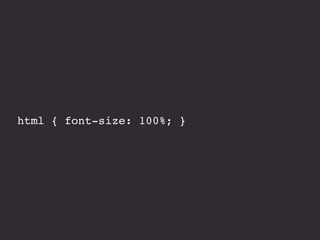
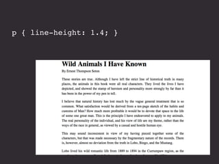
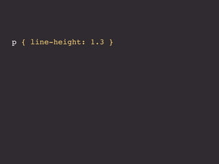
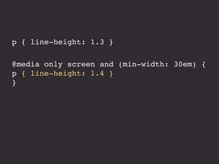
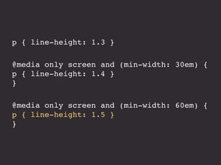

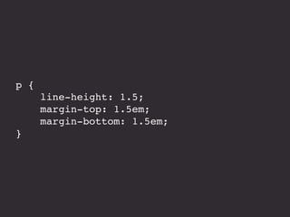
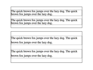


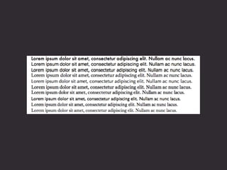


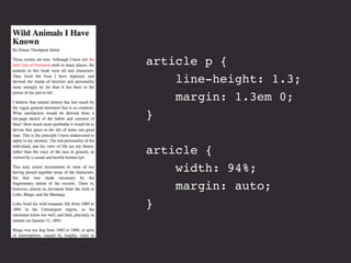


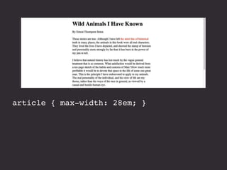

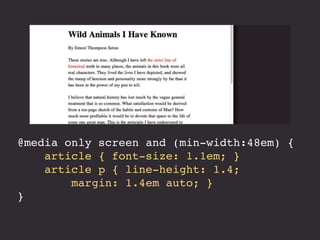


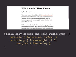


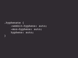
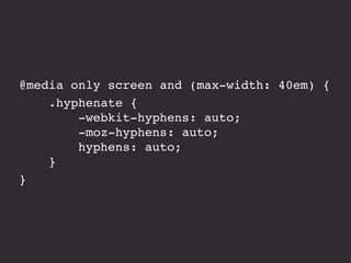


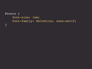
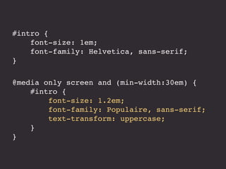
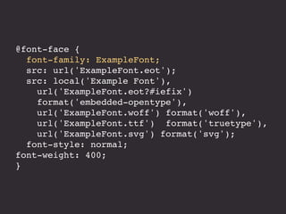
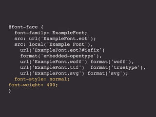

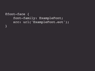
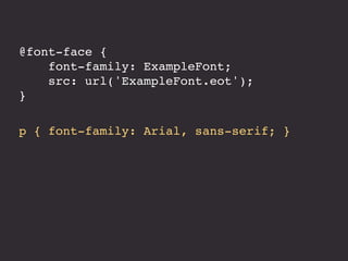
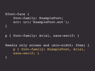


The document discusses responsive typography, emphasizing the use of ems and rems for font sizes, line heights, and margins to enhance readability across different devices. It provides examples of CSS code for various HTML elements and discusses the importance of using fewer and system fonts for performance. Additionally, it includes references to media queries and alignment techniques to ensure text is presented effectively.