The magazine covers and articles analyzed all feature fashion from different decades, with the 1990s and 1960s styles deemed most popular currently. Central model placement, bold titles, and plain backgrounds
Existing Product
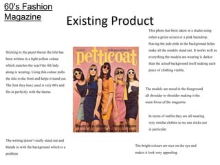
This photohas been taken in a studio using
either a green screen or a pink backdrop.
Having the pale pink in the background helps
make allthe models stand out. It works well as
everything the models are wearing is darker
than the actualbackground itself making each
piece of clothingvisible.
60's Fashion
Magazine
The models are stood in the foreground
all shoulder to shoulder making it the
main focus of the magazine
In terms of outfits they are all wearing
very similarclothesso no one sticksout
in particular
Stickingto the pasteltheme the titlehas
been written in a lightyellow colour
which matches the scarf the 4th lady
along is wearing. Using thiscolour pulls
the titleto the front and helps it stand out.
The font they have used is very 60's and
fits in perfectly with the theme.
The writing doesn’t really stand out and
blends in with the background which is a
problem
The bright colours are nice on the eye and
makes it look very appealing
3.
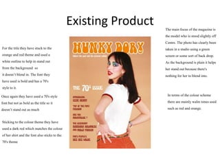
Existing Product Themain focus of the magazine is
the model who is stood slightlyoff
Centre. The photo has clearly been
taken in a studio using a green
screen or some sort of back drop.
As the background is plain it helps
her stand out because there's
nothing for her to blend into.
For the titlethey have stuck to the
orange and red theme and used a
white outlineto help in stand out
from the background so
it doesn’t blend in. The font they
have used is bold and has a 70's
styleto it.
Once again they have used a 70's style
font but not as bold as the titleso it
doesn’t stand out as much
Stickingto the colour theme they have
used a dark red which matches the colour
of her shirt and the font also sticksto the
70's theme
In terms of the colour scheme
there are mainly walm tones used
such as red and orange.
4.
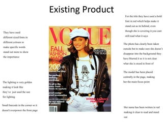
Existing Product
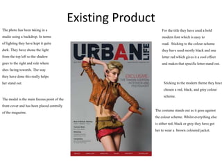
For thetitlethey have used a bold
modern font which is easy to
read. Stickingto the colour scheme
they have used mostlyblack and one
letterred which gives it a cool effect
and makes that specificletterstand out.
The photo has been taking in a
studio using a backdrop. In terms
of lightingthey have kept it quite
dark. They have shone the light
from the top left so the shadow
goes to the right and side where
shes facing towards. The way
they have done this really helps
her stand out.
The model is the main focous point of the
front cover and has been placed centrally
of the magazine.
Stickingto the modern theme they have
chosen a red, black, and grey colour
scheme.
The costume stands out as it goes against
the colour scheme. Whilst everything else
is either red, black or grey they have got
her to wear a brown coloured jacket.
5.
Existing Product Forthe titlethey have used a bold
font in red which helps make it
stand out as itsbehind, even
though she is covering it you cant
stillread what it says
They have used
different sized fonts in
different colours to
make specificwords
stand out more to show
the importance
Small barcode in the corner so it
doesn't overpower the front page
The photo has clearlybeen taken
outsidebut to make sure she doesn’t
disappear into the background they
have blurred it so it is not clear
what she is stood in front of
Her name has been written in red
making it clear to read and stand
out
The model has been placed
centrallyin the page, making
her the main focus point
The lightingis very golden
making it look like
they’ve just used the sun
for lighting
6.
Existing Product
For thetitlethey have used a bold easy to
read font and spread it across both pages.
They have stuck to a
black,
white and grey
keeping it plain and
easy on the eye. It
gives it a very
modern clean effect
The main focous on this
half of the double page
spread is Mark Ronson.
The way they have done
this makes it easy on the
eye and isnt busy to look
at.
For a cool effect they have messed with the
font sizes. As well as splitting the different
paragraphs apart it gives you a clear view as
to where thye sentence starts
They have used different sized fonts and
spaced each paragraph apart carefully.
This is appealingas the reader becaues its
not to overlading to look at
The outfit is very plain and
fits in with the black and
white theme. The one thing
that stands out the most are
his red socks.
The photo has been taken in a
studio using a plain white
background, making no
distractionspushing the
model to the front
7.
Research Analysis
What commonfeatures do the researched products have?
One common feature that I found between all of these productswas how they have positionedthe
models. In each off the magazinesthe model is the main focus of the front cover and then they have
positionedthe writing around them. Another common feature between each magazineis the choice
of font for the title. Each title has been done in a bold font to fit what ever the style off magazineis
using a brightercolour to help it stand out even more . In terms of the backgrounds,most of them
are just plain so it doesn’t take away from the model and makes sure the page doesn’t look to busy.
8.
Research Analysis
What aspectsof the research will you include within your on work?
After looking through all of these products, one thing that I will definitelyinclude in magazine is
some of the fonts and the way they have positionedthe writing around the model as I feel like it
looks professional and makessure that the model is still the main focus of the front cover. Another
thing I will include is how they have done their double page pread with a pictureon one half and
writing on another. The way they have done this makes it so easy to read and make sures the page
isnt busy and overloading to look at.
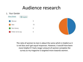
Audience research
The ratioof women to men is about the same which is helpful as it
is not bias and I get equal responses. However, it would have been
more helpful if I had a larger amount of women complete the
survey as my magazine is targeted more towards women.
11.
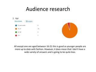
Audience research
All exceptone are aged between 16-21 this is good as younger people are
more up to date with fashion. However, it does mean that I don’t have a
wide variety of answers and is going to be quite bias.
12.
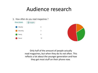
Audience research
Only halfof the amount of people actually
read magazines, but when they do its not often. This
reflects a lot about the younger generation and how
they get most stuff on their phone now.
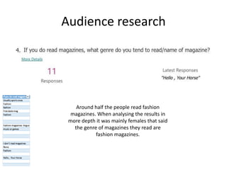
13.
Audience research
Around halfthe people read fashion
magazines. When analysing the results in
more depth it was mainly females that said
the genre of magazines they read are
fashion magazines.
14.
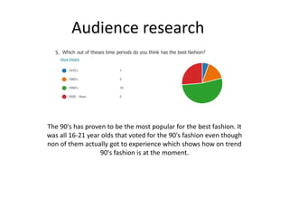
Audience research
The 90'shas proven to be the most popular for the best fashion. It
was all 16-21 year olds that voted for the 90's fashion even though
non of them actually got to experience which shows how on trend
90's fashion is at the moment.
15.
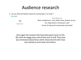
Audience research
Once againthe answers that have been given touch on the
90's with the baggy jeans and all that sort of stuff. They have
also mentioned about flares which shows that the 60's have
also started to come back into fashion.
16.
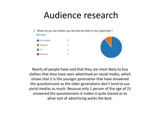
Audience research
Nearly allpeople have said that they are most likely to buy
clothes that they have seen advertised on social media, which
shows that it is the younger generation that have answered
the questionnaire as the older generations don’t tend to use
social medias as much. Because only 1 person of the age of 21
answered the questionnaire it makes it quite biased as to
what sort of advertising works the best.
17.
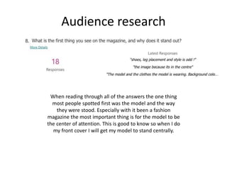
Audience research
When readingthrough all of the answers the one thing
most people spotted first was the model and the way
they were stood. Especially with it been a fashion
magazine the most important thing is for the model to be
the center of attention. This is good to know so when I do
my front cover I will get my model to stand centrally.
18.
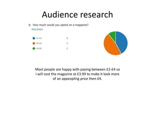
Audience research
Most peopleare happy with paying between £2-£4 so
I will cost the magazine at £3.99 to make it look more
of an appeopling price then £4.
19.
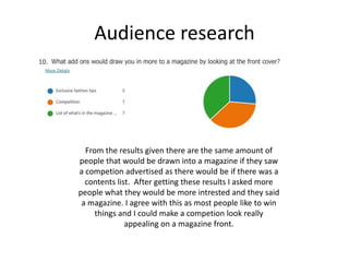
Audience research
From theresults given there are the same amount of
people that would be drawn into a magazine if they saw
a competion advertised as there would be if there was a
contents list. After getting these results I asked more
people what they would be more intrested and they said
a magazine. I agree with this as most people like to win
things and I could make a competion look really
appealing on a magazine front.
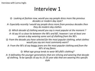
Interview 1
Q- Lookingat fashion now, would you say people dress more like previous
decades or modern day style?
A- Especially recently I would say people dress more from previous decades then
they do modern day clothes
Q- Which decade of clothing would you say is most popular at the moment ?
A- Id say it’s a close tie between the 90's and 60', however I see at least one
person a day wearing some sort of cllothing from the 90's
Q- From the decade you have selected for the most popular clothing, what clothes
would you say are most commonly worn?
A- From the 90's id say baggy jeans are the most popular clothing and from the
60's id say flares.
Q- What age group tends to wear 90's/60's clothing?
A- It definatley the younger generations that are reliving and wearing that decade
of clothing. To be specific id say its 15-25 year olds that are wearing this specific
style
Inerview with Lorna Inglis
22.
Interview Observation
When interviewingI made sure I found someone young who is up
to date with fashion. Like we saw in the survey she has
mentioned about the 90's been one of the most popular styles,
which suggests that my sources have been reliable when getting
information.
To conclude, I will include mostly 90's fashion in my magazine as
that appeals to my target audience the most.
Bibliography
1. The SwingingSixties (1960) Petticoat Magazine Cover
2. Hunky Dory (1970) The 70's Issue
3. Urban Life (April 2010) www.urbanlife-magazine.com
4. Dressing like cover girls (August 1990) VOGUE
5. Mark Ronson(7th Of August 2020)blogs.grammar.sch.gg
Editor's Notes
#3 Choose a recent product similar to your own and annotate it
Type of image- studio/location, angle, effects, post-production
Use of lighting/composition/mise en scene/costume/props/location/colours/fonts etc.
Audience appeal- how does it make its audience want to buy/watch/play it?
#4 Choose a recent product similar to your own and annotate it
Type of image- studio/location, angle, effects, post-production
Use of lighting/composition/mise en scene/costume/props/location/colours/fonts etc.
Audience appeal- how does it make its audience want to buy/watch/play it?
#5 Choose a recent product similar to your own and annotate it
Type of image- studio/location, angle, effects, post-production
Use of lighting/composition/mise en scene/costume/props/location/colours/fonts etc.
Audience appeal- how does it make its audience want to buy/watch/play it?
#6 Choose a recent product similar to your own and annotate it
Type of image- studio/location, angle, effects, post-production
Use of lighting/composition/mise en scene/costume/props/location/colours/fonts etc.
Audience appeal- how does it make its audience want to buy/watch/play it?
#25 List all products researched in previous sections. Include anything additional you have watched/read in preparation for production. Alphabetise your list.