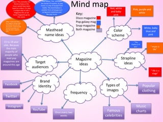
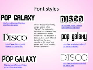
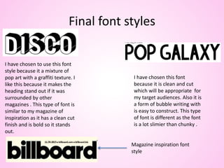
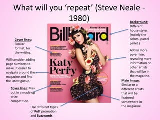
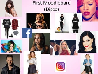
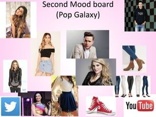
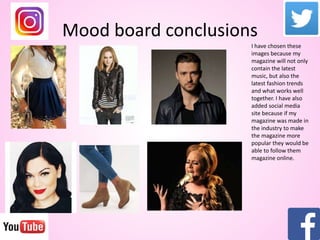
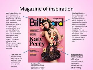
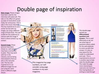
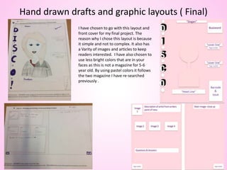
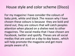
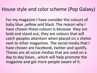
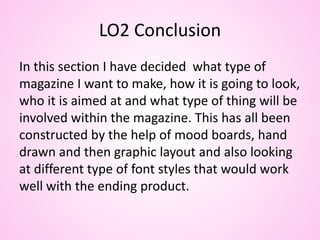
Content
LO2- be able to generate ideas for an original print-based media product ( slide 3-33)
• Mind map (slide 3)
• Font style (slide 4)
• Final font style ( slide 5)
• What will you repeat (Steve Neale -1980) ( slide 6)
• First Mood board (Disco) (slide 7)
• Second Mood board (Pop Galaxy) ( slide 8)
• Mood board conclusions ( slide 9)
• Magazine of inspiration ( slide 10)
• Double page spread of inspiration ( slide 11)
• Summary of ideas ( slide 12&13)
• Target audiences ( slide 14)
• Form and style of magazine ( slide 15)
• Hand drawn front cover ( slide 16,18,20,22)
• Hand drawn double page spread ( slide 17,19,21,23)
• Graphic layout front cover ( slide 24,26,28,30)
• Graphic layout Double page spread ( slide 25,27,29,31)
• Hand drawn and graphic layout final ( slide 32)
• LO2 Conclusion ( slide 33)
Mind map
Magazine
ideas
Color
scheme
Types of
images
frequency
Brand
Identity
Target
audiences
Masthead
name ideas
Strapline
ideas
Snap: it quick and sharp ,
this magazine will get right
to the point and not mess
you around . It also an easy
name to remember not
long like other magazine
titles.
Disco: This connotes the
theme of pop as this
music would have been
heard at a disco. It is also
a unique way to call a
magazine this as not
many magazines go by
this name.
Red, white
and baby
pink
Pink, purple and
white
White, baby
blue and
pink
Once every two
weeks
Famous
celebrities
Music
charts
Popular
clothing
15 to 18 year
olds. Because
the main
majority of
people who
read pop
magazines are
around this age
Pop Galaxy: This connotes
the senses of mystery ,as pop
music is a way of escape from
reality. The word Galaxy is
another form of escape as it
so big and mysterious just
like pop music.
“ music is
life”
“ life is a
stage”
“ The
rhythm is in
you”
Facebook
Twitter
Instagram
YouTube
Key:
Disco magazine
Pop galaxy mag
Snap magazine
Both magazine
Font styles
I found these style of font by
using a website called
“DaFont”. The reason why I
like these font is because they
are clean and cut. Nether
reason why I like these font is
because, they are all different
but still hold the same
meaning in this cause “pop
galaxy” and “Disco”, the joint
reason is pop music.
http://www.dafont.com/the-inbox-
st.font?text=pop+galaxy
http://www.dafont.com/borg.f
ont?text=pop+galaxy
http://www.dafont.com/move-
on.font?text=pop+galaxy
http://www.dafont.com/po
nymaker.font?text=Disco
http://www.dafont.com/slabs.f
ont?text=Disco
http://www.dafont.com/li
on-king.font?text=Disco
Final font styles
I have chosen to use this font
style because it a mixture of
pop art with a graffiti texture. I
like this because it makes the
heading stand out if it was
surrounded by other
magazines . This type of font is
similar to my magazine of
inspiration as it has a clean cut
finish and is bold so it stands
out.
I have chosen this font
because it is clean and cut
which will be appropriate for
my target audiences. Also it is
a form of bubble writing with
is easy to construct. This type
of font is different as the font
is a lot slimier than chunky .
Magazine inspiration font
style
What will you ‘repeat’ (Steve Neale -
1980)
Cover lines:
Similar
format, for
the writing.
Main image:
Similar or a
different artists
that will be
featured
somewhere in
the magazine.
Background:
Different
house styles.
(mainly the
colors- pastel
pallet )
Cover lines: May
put in a made up
prize
competition.
Add in more
cover line,
revealing more
information on
other artists
that will be in
the magazine.
Use different types
of Puff promotion
and Buzzwords
Will consider adding
page numbers to
make ,it easier to
navigate around the
magazine and find
the latest gossip.
First Mood board
(Disco)
Second Mood board
(Pop Galaxy)
Mood board conclusions
I have chosen these
images because my
magazine will not only
contain the latest
music, but also the
latest fashion trends
and what works well
together. I have also
added social media
site because if my
magazine was made in
the industry to make
the magazine more
popular they would be
able to follow them
magazine online.
Magazine of inspiration
Masthead: By using
clean and cut colors and
font, this make the
magazine look more
mature and grown up,
not for people under the
age of 20. This type of
font is used consistently
through out the
magazine. This has
inspired me as I want my
magazine to seem
professional , also I want
it to catch the eyes of
the young adults of
today .
Main Image: By the use
of the front cover it
clearly illustrates, that
the picture of Katy Perry
is the main focus of this
issue ,of Billboard
magazine. Katy Perry is
an musical artist
sensation who is loved
and adored by many.
This has inspired me to
make sure my model of
the magazine really
stands out form the
crowed . This can be
achieve by using
different camera angles
to help connect the
audiences with the
magazine.
Cover lines: May
consider adding
cover lines so the
reader will know
what else is to
come up in the
magazine.
Puff promotion:
Will think about
adding in a
competition and
having Puff
around certain
bits of writing.
Main Image: May use a
similar style of clothing,
but will experiment with
different camera angles
Double page of inspiration
This double page
spread use
differentiated
questions and
answers. This is used
effectively as we can
see what type of
questions where asked,
for the said celebrate
to come up with that
answer. It is also an
easy layout for the
reader to understand
and read . This is
inspirational to me as it
is another way to help
style the double page .
This make the page
more interesting to
read and a lot more fun
then having blocks of
writing to read through
Main image: Theses images
have been used for the
interview with pixie Lott. This
take on the effect of a grown
up state of mind which could
imply, her seriousness that is
take in the music industry.
This has inspired me to use a
similar format with my
images, by using a different
range of head shots. This will
enable for the audiences to
interact with the image if
there is direct contact e.g. eye
contact.
Second image: These
pictures have been
chosen as each person
may have a connection
to pixie. They may work
with her in the
industry, and are being
interviewed to find out
who is the real pixie
Lott. This has also
inspired me to use
different images by not
just using the same
artist in different angle
shouts .
This magazine has page
numbers, so I will
consider using page
numbers in my own
magazine.
Summary of ideas (Top of the Pops)
Disco
• Genre: My magazine will be aimed at people between the ages of 15-18 , it will also be
aimed at the female gender. The reason why I have chosen this age and gender, is because by
doing previous research the female audience would be more attracted to my type of
magazine.
• Colors: When it come to the subject of color for my magazine I have experimented with a lot of colors.
These colors were baby pink & blue, white ,red and black. But the colors that stood out the most from all
the rest was baby pink & blue and white as they all work well together and don’t overwhelm the front
cover with powerful colors. These colors will help complement the image of the subject as it will make
them stand out more and catch the readers attention.
• Price: From previous research I have discovered that popular girl magazines such as the
“Shout” are around the price range of three pound or less. So I will be ranging my magazine
to be between the prices of two to three pounds. As this is less expensive and will make the
reader want to buy this magazine over a five to six pounds magazine.
• Size of magazine if it was made: My magazine if it was made would be printed on A4
sheets, as it is easier to construct into a booklet form. Whereas is it was A3 it would be more
difficult to construct, it may hold more information on each page but in the long run it will
use up less time to use A4 sheets of paper.
Summary of ideas (Billboard magazine)
Pop Galaxy
• Genre: My magazine will be aimed at people between the ages of 15-18 , it will also be
aimed at the female gender. The reason why I have chosen this age and gender, is because by
doing previous research the female audience would be more attracted to my type of
magazine.
• Colors: When it come to the subject of color for my magazine I have experimented with a lot of colors.
These colors were baby pink & blue, white ,red and black. But the colors that stood out the most from all
the rest was baby pink & white and black as they all work well together and don’t overwhelm the front
cover with powerful colors. These colors will help complement the image of the subject as it will make
them stand out more and catch the readers attention.
• Price: From previous research I have discovered that popular girl magazines such as “Top of
the Pop” and “Shout” are around the price range of five pound or less. So I will be ranging my
magazine to be between the prices of two to three pounds. As this is less expensive and will
make the reader want to buy this magazine over a five to six pounds magazine.
• Size of magazine if it was made: My magazine if it was made would be printed on A4
sheets, as it is easier to construct into a booklet form. Whereas is it was A3 it would be more
difficult to construct, it may hold more information on each page but in the long run it will
use up less time to use A4 sheets of paper.
Target Audience
• Hartley: By following Hartley theory the magazine will be aimed at
females by the ages of 15 to 18. They would be more attracted to
the magazine as it holds adult content ,that would not be suitable
of people under this age.
• Maslow: By using Maslow’s theory my magazine will have an
audiences of “Explores” as there will be social changes. But it will
also be “Survivors” as it will a lot have routine to it and security.
• Katz: By following Katz’s theory by using “Diversion” and also
“Inform & Educate” as I want my audiences to escape form reality
but to also learn from my magazine as well.
• Psychographics theory: Psychographic is the study of personality,
opinion, values, attitude, interests and lifestyles. By following this
theory my magazine will be classed as ”Aspirers” as my magazine
will have fashion tips as well as music , for my magazine is for the
female population .
Form and style of magazine
For my magazine I want to use consistent house styles through
out my magazine, that includes the colors and font style as well. I
have also considered adding in a logo but not to sure if it would
go well with the rest of the magazine especially the front cover. I
will also be placing page numbers at the bottom of pages, and
maybe on the front as well next to the cover lines. I want my
magazine to appeal to my target audiences which will be in-
between the ages of 15 and 18. So I will consider adding pictures
of celebrities and interviews into my magazine.
Colour that I
will be using for
the background
of my magazine
Colour that I will
be using around
the font on my
magazine.
Colour that I
will be using for
the font of the
magazine.
Hand drawn magazine (1:Font cover: Disco)
Hand drawn magazine(1: DPS: Disco)
Hand drawn magazine (2:Font cover: Disco)
Hand drawn magazine (2:DPS: Disco)
Hand drawn magazine(3: font cover: pop galaxy)
Hand drawn magazine(3: DPS: pop galaxy)
Hand drawn magazine(4:Front cover: pop galaxy)
Hand drawn magazine(4:DPS: pop galaxy )
Graphic layouts(cover 1:disco)
“Slogan”
Buzzword
“cover line”
Page number
“cover line”
Page number
Barcode
&
issue
“Head Line”
Graphic continuations (DPS 1:disco)
Main image- close up
Image
1
Description of artist from writers
point of view.
Image 2 Image 3 Image 4
Questions & Answers
Page number Page number
Graphic continuations (cover 2:disco)
“slogan”
“ Headline”
“Cover line”
Page number
“Buzz
word
&
Pug”
“Barcode &
issue”
“Second
image”
“Cover Line”
“Page number”
Graphic continuations ( DPS 2:disco)
5
Main image – mid
shot
Page number
Image of
another
artists
Information about artists
Image of
another
artists
Information about artists
Questions & Answers
Page number
Graphic continuations ( cover 3:pop galaxy)
“Buzz word
&
Pug”
“Cover line”
“Page number
“Heading”
“slogan”
Barcode
&
issue
Graphic continuations( DPS 3:pop galaxy)
Main image-mid shot Item
image
Item
image
Item
image
Description of
items
Image
–long
shot
Page number Page number
Graphic continuations ( Cover 4:pop galaxy)
“slogan”
“Heading”
“cover line”
“Page number”
“cover line”
“Page number”
“Buzz
word”
“Barcode
&
Issue”
Graphic continuations(DPS 4:pop galaxy)
Main image-long shot
Second
image-
different
long shot
Questions & Answers
Page numberPage number
Hand drawn drafts and graphic layouts ( Final)
I have chosen to go with this layout and
front cover for my final project. The
reason why I chose this layout is because
it simple and not to complex. It also has
a Varity of images and articles to keep
readers interested. I have also chosen to
use less bright colors that are in your
faces as this is not a magazine for 5-6
year old. By using pastel colors it follows
the two magazine I have re-searched
previously .
House style and color scheme (Disco)
For my magazine I have consider the colours of
baby pink, white and black .The reason why I have
chosen these colours is because they are bold and
stand out, they are colours that will catch peoples
attention when placed on a shelve next to other
magazines. The social media that I have chosen are
Facebook, twitter and spotify. Theses are all social
medias that are used on a day to day bases , which
will help promote the magazine and get more
people aware of it.
House style and color scheme (Pop Galaxy)
For my magazine I have consider the colours of
baby blue ,yellow and black .The reason why I
have chosen these colours is because they are
bold and stand out, they are colours that will
catch peoples attention when placed on a shelve
next to other magazines. The social media that I
have chosen are Facebook, twitter and spotify.
Theses are all social medias that are used on a
day to day bases , which will help promote the
magazine and get more people aware of it.
LO2 Conclusion
In this section I have decided what type of
magazine I want to make, how it is going to look,
who it is aimed at and what type of thing will be
involved within the magazine. This has all been
constructed by the help of mood boards, hand
drawn and then graphic layout and also looking
at different type of font styles that would work
well with the ending product.

Unit 13 LO2

  • 2.
    Content LO2- be ableto generate ideas for an original print-based media product ( slide 3-33) • Mind map (slide 3) • Font style (slide 4) • Final font style ( slide 5) • What will you repeat (Steve Neale -1980) ( slide 6) • First Mood board (Disco) (slide 7) • Second Mood board (Pop Galaxy) ( slide 8) • Mood board conclusions ( slide 9) • Magazine of inspiration ( slide 10) • Double page spread of inspiration ( slide 11) • Summary of ideas ( slide 12&13) • Target audiences ( slide 14) • Form and style of magazine ( slide 15) • Hand drawn front cover ( slide 16,18,20,22) • Hand drawn double page spread ( slide 17,19,21,23) • Graphic layout front cover ( slide 24,26,28,30) • Graphic layout Double page spread ( slide 25,27,29,31) • Hand drawn and graphic layout final ( slide 32) • LO2 Conclusion ( slide 33)
  • 3.
    Mind map Magazine ideas Color scheme Types of images frequency Brand Identity Target audiences Masthead nameideas Strapline ideas Snap: it quick and sharp , this magazine will get right to the point and not mess you around . It also an easy name to remember not long like other magazine titles. Disco: This connotes the theme of pop as this music would have been heard at a disco. It is also a unique way to call a magazine this as not many magazines go by this name. Red, white and baby pink Pink, purple and white White, baby blue and pink Once every two weeks Famous celebrities Music charts Popular clothing 15 to 18 year olds. Because the main majority of people who read pop magazines are around this age Pop Galaxy: This connotes the senses of mystery ,as pop music is a way of escape from reality. The word Galaxy is another form of escape as it so big and mysterious just like pop music. “ music is life” “ life is a stage” “ The rhythm is in you” Facebook Twitter Instagram YouTube Key: Disco magazine Pop galaxy mag Snap magazine Both magazine
  • 4.
    Font styles I foundthese style of font by using a website called “DaFont”. The reason why I like these font is because they are clean and cut. Nether reason why I like these font is because, they are all different but still hold the same meaning in this cause “pop galaxy” and “Disco”, the joint reason is pop music. http://www.dafont.com/the-inbox- st.font?text=pop+galaxy http://www.dafont.com/borg.f ont?text=pop+galaxy http://www.dafont.com/move- on.font?text=pop+galaxy http://www.dafont.com/po nymaker.font?text=Disco http://www.dafont.com/slabs.f ont?text=Disco http://www.dafont.com/li on-king.font?text=Disco
  • 5.
    Final font styles Ihave chosen to use this font style because it a mixture of pop art with a graffiti texture. I like this because it makes the heading stand out if it was surrounded by other magazines . This type of font is similar to my magazine of inspiration as it has a clean cut finish and is bold so it stands out. I have chosen this font because it is clean and cut which will be appropriate for my target audiences. Also it is a form of bubble writing with is easy to construct. This type of font is different as the font is a lot slimier than chunky . Magazine inspiration font style
  • 6.
    What will you‘repeat’ (Steve Neale - 1980) Cover lines: Similar format, for the writing. Main image: Similar or a different artists that will be featured somewhere in the magazine. Background: Different house styles. (mainly the colors- pastel pallet ) Cover lines: May put in a made up prize competition. Add in more cover line, revealing more information on other artists that will be in the magazine. Use different types of Puff promotion and Buzzwords Will consider adding page numbers to make ,it easier to navigate around the magazine and find the latest gossip.
  • 7.
  • 8.
  • 9.
    Mood board conclusions Ihave chosen these images because my magazine will not only contain the latest music, but also the latest fashion trends and what works well together. I have also added social media site because if my magazine was made in the industry to make the magazine more popular they would be able to follow them magazine online.
  • 10.
    Magazine of inspiration Masthead:By using clean and cut colors and font, this make the magazine look more mature and grown up, not for people under the age of 20. This type of font is used consistently through out the magazine. This has inspired me as I want my magazine to seem professional , also I want it to catch the eyes of the young adults of today . Main Image: By the use of the front cover it clearly illustrates, that the picture of Katy Perry is the main focus of this issue ,of Billboard magazine. Katy Perry is an musical artist sensation who is loved and adored by many. This has inspired me to make sure my model of the magazine really stands out form the crowed . This can be achieve by using different camera angles to help connect the audiences with the magazine. Cover lines: May consider adding cover lines so the reader will know what else is to come up in the magazine. Puff promotion: Will think about adding in a competition and having Puff around certain bits of writing. Main Image: May use a similar style of clothing, but will experiment with different camera angles
  • 11.
    Double page ofinspiration This double page spread use differentiated questions and answers. This is used effectively as we can see what type of questions where asked, for the said celebrate to come up with that answer. It is also an easy layout for the reader to understand and read . This is inspirational to me as it is another way to help style the double page . This make the page more interesting to read and a lot more fun then having blocks of writing to read through Main image: Theses images have been used for the interview with pixie Lott. This take on the effect of a grown up state of mind which could imply, her seriousness that is take in the music industry. This has inspired me to use a similar format with my images, by using a different range of head shots. This will enable for the audiences to interact with the image if there is direct contact e.g. eye contact. Second image: These pictures have been chosen as each person may have a connection to pixie. They may work with her in the industry, and are being interviewed to find out who is the real pixie Lott. This has also inspired me to use different images by not just using the same artist in different angle shouts . This magazine has page numbers, so I will consider using page numbers in my own magazine.
  • 12.
    Summary of ideas(Top of the Pops) Disco • Genre: My magazine will be aimed at people between the ages of 15-18 , it will also be aimed at the female gender. The reason why I have chosen this age and gender, is because by doing previous research the female audience would be more attracted to my type of magazine. • Colors: When it come to the subject of color for my magazine I have experimented with a lot of colors. These colors were baby pink & blue, white ,red and black. But the colors that stood out the most from all the rest was baby pink & blue and white as they all work well together and don’t overwhelm the front cover with powerful colors. These colors will help complement the image of the subject as it will make them stand out more and catch the readers attention. • Price: From previous research I have discovered that popular girl magazines such as the “Shout” are around the price range of three pound or less. So I will be ranging my magazine to be between the prices of two to three pounds. As this is less expensive and will make the reader want to buy this magazine over a five to six pounds magazine. • Size of magazine if it was made: My magazine if it was made would be printed on A4 sheets, as it is easier to construct into a booklet form. Whereas is it was A3 it would be more difficult to construct, it may hold more information on each page but in the long run it will use up less time to use A4 sheets of paper.
  • 13.
    Summary of ideas(Billboard magazine) Pop Galaxy • Genre: My magazine will be aimed at people between the ages of 15-18 , it will also be aimed at the female gender. The reason why I have chosen this age and gender, is because by doing previous research the female audience would be more attracted to my type of magazine. • Colors: When it come to the subject of color for my magazine I have experimented with a lot of colors. These colors were baby pink & blue, white ,red and black. But the colors that stood out the most from all the rest was baby pink & white and black as they all work well together and don’t overwhelm the front cover with powerful colors. These colors will help complement the image of the subject as it will make them stand out more and catch the readers attention. • Price: From previous research I have discovered that popular girl magazines such as “Top of the Pop” and “Shout” are around the price range of five pound or less. So I will be ranging my magazine to be between the prices of two to three pounds. As this is less expensive and will make the reader want to buy this magazine over a five to six pounds magazine. • Size of magazine if it was made: My magazine if it was made would be printed on A4 sheets, as it is easier to construct into a booklet form. Whereas is it was A3 it would be more difficult to construct, it may hold more information on each page but in the long run it will use up less time to use A4 sheets of paper.
  • 14.
    Target Audience • Hartley:By following Hartley theory the magazine will be aimed at females by the ages of 15 to 18. They would be more attracted to the magazine as it holds adult content ,that would not be suitable of people under this age. • Maslow: By using Maslow’s theory my magazine will have an audiences of “Explores” as there will be social changes. But it will also be “Survivors” as it will a lot have routine to it and security. • Katz: By following Katz’s theory by using “Diversion” and also “Inform & Educate” as I want my audiences to escape form reality but to also learn from my magazine as well. • Psychographics theory: Psychographic is the study of personality, opinion, values, attitude, interests and lifestyles. By following this theory my magazine will be classed as ”Aspirers” as my magazine will have fashion tips as well as music , for my magazine is for the female population .
  • 15.
    Form and styleof magazine For my magazine I want to use consistent house styles through out my magazine, that includes the colors and font style as well. I have also considered adding in a logo but not to sure if it would go well with the rest of the magazine especially the front cover. I will also be placing page numbers at the bottom of pages, and maybe on the front as well next to the cover lines. I want my magazine to appeal to my target audiences which will be in- between the ages of 15 and 18. So I will consider adding pictures of celebrities and interviews into my magazine. Colour that I will be using for the background of my magazine Colour that I will be using around the font on my magazine. Colour that I will be using for the font of the magazine.
  • 16.
    Hand drawn magazine(1:Font cover: Disco)
  • 17.
  • 18.
    Hand drawn magazine(2:Font cover: Disco)
  • 19.
    Hand drawn magazine(2:DPS: Disco)
  • 20.
    Hand drawn magazine(3:font cover: pop galaxy)
  • 21.
    Hand drawn magazine(3:DPS: pop galaxy)
  • 22.
    Hand drawn magazine(4:Frontcover: pop galaxy)
  • 23.
  • 24.
    Graphic layouts(cover 1:disco) “Slogan” Buzzword “coverline” Page number “cover line” Page number Barcode & issue “Head Line”
  • 25.
    Graphic continuations (DPS1:disco) Main image- close up Image 1 Description of artist from writers point of view. Image 2 Image 3 Image 4 Questions & Answers Page number Page number
  • 26.
    Graphic continuations (cover2:disco) “slogan” “ Headline” “Cover line” Page number “Buzz word & Pug” “Barcode & issue” “Second image” “Cover Line” “Page number”
  • 27.
    Graphic continuations (DPS 2:disco) 5 Main image – mid shot Page number Image of another artists Information about artists Image of another artists Information about artists Questions & Answers Page number
  • 28.
    Graphic continuations (cover 3:pop galaxy) “Buzz word & Pug” “Cover line” “Page number “Heading” “slogan” Barcode & issue
  • 29.
    Graphic continuations( DPS3:pop galaxy) Main image-mid shot Item image Item image Item image Description of items Image –long shot Page number Page number
  • 30.
    Graphic continuations (Cover 4:pop galaxy) “slogan” “Heading” “cover line” “Page number” “cover line” “Page number” “Buzz word” “Barcode & Issue”
  • 31.
    Graphic continuations(DPS 4:popgalaxy) Main image-long shot Second image- different long shot Questions & Answers Page numberPage number
  • 32.
    Hand drawn draftsand graphic layouts ( Final) I have chosen to go with this layout and front cover for my final project. The reason why I chose this layout is because it simple and not to complex. It also has a Varity of images and articles to keep readers interested. I have also chosen to use less bright colors that are in your faces as this is not a magazine for 5-6 year old. By using pastel colors it follows the two magazine I have re-searched previously .
  • 33.
    House style andcolor scheme (Disco) For my magazine I have consider the colours of baby pink, white and black .The reason why I have chosen these colours is because they are bold and stand out, they are colours that will catch peoples attention when placed on a shelve next to other magazines. The social media that I have chosen are Facebook, twitter and spotify. Theses are all social medias that are used on a day to day bases , which will help promote the magazine and get more people aware of it.
  • 34.
    House style andcolor scheme (Pop Galaxy) For my magazine I have consider the colours of baby blue ,yellow and black .The reason why I have chosen these colours is because they are bold and stand out, they are colours that will catch peoples attention when placed on a shelve next to other magazines. The social media that I have chosen are Facebook, twitter and spotify. Theses are all social medias that are used on a day to day bases , which will help promote the magazine and get more people aware of it.
  • 35.
    LO2 Conclusion In thissection I have decided what type of magazine I want to make, how it is going to look, who it is aimed at and what type of thing will be involved within the magazine. This has all been constructed by the help of mood boards, hand drawn and then graphic layout and also looking at different type of font styles that would work well with the ending product.