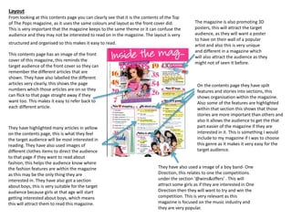
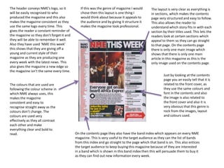
SlideShare a Scribd company logo
NME music magazine 
Top of the Pops music magazine
Colours 
The colours used on the magazine are pinks 
and purples, this is very stereotypical as 
these are the usual colours that young girls 
will like, as they have used these colours 
this will entice young girls to this magazine 
as the colours are very vibrant and bold and 
they are very girly. All of the Top of the 
Pops magazines uses these colours as it 
catches the attention of young girls as they 
are colourful. 
Masthead 
The masthead is very big and bright on this 
magazine, it covers 1/3 of the page. They have also 
used the colour bright pink, which is stereotypical 
as this will attract young girls as they like bright and 
bright things, so by using this this will attract them 
very easily. As the masthead is very bold this will 
make it very easy to read which is suitable for 
young girls because otherwise they would loose 
interest and it is also very symbolic of a girls hand 
writing. 
Layout 
The layout of the magazine is very busy and 
has many different features on the front 
cover. This is because young girls have a sort 
attention span, so if the magazine is covered 
in artist and actors that they like then they 
will be interested in this magazine as they 
like everyone on the front cover. It is also 
very informal as they are using ‘text talk’ as 
they young girls would only want to read the 
smallest amount and look pictures the rest 
of time as they young. 
Central Image 
The central image is a picture of Cher Lloyd she has 
been a star on the X-Factor and has released a few 
songs. They have put Cher on the front cover as she is 
young and stylish and therefore young girls would 
want to aspire to her, as she wears the latest clothes 
and she has nice make-up and hair. Young girls would 
aspire to look up to Cher as she is successful and 
popular. As young girls will know who this artist is this 
means that they will be more inclined to buy this 
magazine and also Cher is represented in a positive 
way to girls. 
Anchorage text 
On the front cover of the magazine they usually 
use text from inside the magazine to draw buyers 
to the attention so they will be interested in 
magazine. This makes them want to purchase the 
magazine just from reading a little incentive about 
the magazine. This is positioned next to Cher 
which the anchorage text is about. 
Barcode, date & price 
This is important as it lets the 
target audience know if they 
have to up to date issue of this 
magazine and also shows the 
price of the magazine. 
Institutional presence 
This allows the target audience to 
know about the institutional 
presence and as it’s the BBC 
everyone will know about it as 
they are very well known. 
Puffs 
Puffs are used to attract the attention of the 
audience, as they are usually about the latest stories 
and the best deals you can find, on this magazine they 
use a puff with the latest stories about the celebrities 
which would attract the target audience as they are 
interested in fashion. 
Graphic features 
This helps incise the target audience to 
read and buy this magazine, as they use 
images on the magazine that are 
popular with the target audience and 
also they are the latest images from the 
media. They use well known images that 
are very popular with the target 
audience. 
Target audience 
The target audience for this genre 
of magazine is young girls from age 
8-13. As they have different artist 
on the front that they would listen 
to as they are popular with young 
children. They enjoy listening to the 
latest music and wearing the same 
clothes as this artist, as they want 
to be like them.
Colours 
There are many colours used on this magazine 
such as, red, yellow, blue, black and white this 
colours are all primary colours and are very bold 
which creates the magazine to have a 3D effect. 
This attracts the readers as it looks like the text 
is coming out of the page because of the colours 
that are used. The articles on this cover are 
mainly in blue and the main cover line is yellow 
causing to stand out than anything else on the 
page, this will grab the attention of the buyers as 
they know that it is about The Wombats. 
Puffs 
Puffs are used to attract the attention of the 
audience, as they are usually about the latest stories 
and the best deals you can find, on this magazine they 
use a puff with the latest list of gigs and events that 
are happening that their target audience will be 
interested in. As they are writing about gigs, the 
target audience will want to know about them so they 
can see their favourite artists. 
Graphic features 
On this magazine they have other 
graphic images, these are images of 
other boy bands and artists, which are 
popular with the target audience. This 
attracts the buyers to this magazine as 
they can also see what else is featuring 
in the magazine, this makes them 
interested so then they will want to 
purchase the magazine. 
Layout 
The layout of the magazine is very informal 
as the target audience are males and at 
young age this will attract them, as they 
only want to read small articles. The layout 
is busy but structured so you can see 
everything on the cover very clearly and its 
easy to read and also there many articles 
and pictures on the cover so it doesn’t look 
empty. 
Central Image 
An eye level shot has been used on the front cover of The 
Wombats they are looking directly at the camera which 
makes it look like they are staring straight at the buyer, 
this makes the buyer feel like are developing a relationship 
with the magazine. The Wombats are all at different 
heights, this may show the different levels of responsibility 
and authority they have within the group. In the image 
they all look scruffy and they are wearing messy clothes 
and they all look lazy and effortless, this portrays the 
target audience which is students as they can relate to this 
image as most students are like this. 
Tagline 
The tagline is bright yellow with black writing which 
will attract the buyers attention straight away, this 
will then lead the buyer onto reading the article 
about ‘Glasto’. Readers like seeing information 
about different festivals coming up as they can 
prepare themselves and also know the line up so by 
using information about Glastonbury this makes the 
magazine very popular. 
Barcode, date & price 
This is important as it lets the 
target audience know if they 
have to up to date issue of this 
magazine and also shows the 
price of the magazine. 
Masthead 
NME is a very popular magazine and this 
why the masthead is very recognisable. The 
masthead have colours such as, red black 
and white and is also very bold this makes 
the masthead easy to remember. The 
masthead is always at the top of the 
magazine, as this is the first thing you would 
be able to see when looking at this 
magazine. 
Target audience 
The target audience for this 
magazine is mainly aimed at males 
ages 16-22 years old, as they are 
messy and lazy like the image is 
portraying on the front cover. They 
also use other bands and artists 
that males like which would also 
entice them to read this magazine 
as that is what they would be 
interested in. 
Slogan 
The slogan used for NME is 
placed just below the masthead 
and it stands for ‘New Musical 
Express’ which lets the readers 
know that it’s a music magazine 
straight away. 
Main cover line 
The Wombats is in bright yellow and is very big 
and bold on the front cover, covering part of the 
main image. This attracts the buyers straight away 
as the yellow stands out and is the brightest 
feature on the cover. This also lets the target 
audience know that their will be a article on The 
Wombats. This entices them to buy this magazine 
as this band is popular with the target audience.
Top of The Pops contents page 
NME contents page
Layout 
From looking at this contents page you can clearly see that it is the contents of the Top 
of The Pops magazine, as it uses the same colours and layout as the front cover did. 
This is very important that the magazine keeps to the same theme or it can confuse the 
audience and they may not be interested to read on in the magazine. The layout is very 
structured and organised so this makes it easy to read. 
This contents page has an image of the front 
cover of this magazine, this reminds the 
target audience of the front cover so they can 
remember the different articles that are 
shown. They have also labelled the different 
articles very clearly, this shows the page 
numbers which those articles are on so they 
can flick to that page straight away if they 
want too. This makes it easy to refer back to 
each different article. 
They have highlighted many articles in yellow 
on the contents page, this is what they feel 
the target audience will be most interested in 
reading. They have also used images of 
different clothes items to direct the audience 
to that page if they want to read about 
fashion, this helps the audience know where 
the fashion features are within the magazine 
as this may be the only thing they are 
interested in. They have also got a section 
about boys, this is very suitable for the target 
audience because girls at that age will start 
getting interested about boys, which means 
this will attract them to read this magazine. 
The magazine is also promoting 3D 
posters, this will attract the target 
audience, as they will want a poster 
to have on their wall of a popular 
artist and also this is very unique 
and different in a magazine which 
will also attract the audience as they 
might not of seen it before. 
On the contents page they have spilt 
features and stories into sections, this 
shows organisation within the magazine. 
Also some of the features are highlighted 
within that section this shows that those 
stories are more important than others and 
also it allows the audience to get the that 
part easier of the magazine if they are 
interested in it. This is something I would 
include to my magazine if I was to choose 
this genre as it makes it very easy for the 
target audience. 
They have also used a image of a boy band- One 
Direction, this relates to one the competitions 
under the section ‘@wins&offers’ . This will 
attract some girls as if they are interested in One 
Direction then they will want to try and win the 
competition. This is very relevant as this 
magazine is focused on the music industry and 
they are very popular.
The header conveys NME’s logo, so it 
will be easily recognised to who 
produced the magazine and this also 
makes the magazine consistent as they 
use the same logo every time. This 
gives the reader a constant reminder of 
the magazine so they don’t forget it and 
they will be able to remember it well. 
Also they have used ‘NME this week’ 
this shows that they are giving off a 
young and current style of their 
magazine as they are producing one 
every week with the latest news. This 
also gives the magazine a new edge so 
the magazine isn’t the same every time. 
The colours that are used are 
following the colour scheme in 
which NME always uses, this 
makes the magazine 
consistent and easy to 
recognise straight away as the 
colours don’t change. The 
colours are used very 
effectively as they all contrast 
each other and make 
everything clear and bold to 
read. 
The layout is very clear as everything is 
in sections, which makes the contents 
page very structured and easy to follow. 
This also allows the reader to 
understand which story fits in with each 
section by their titles used. This lets the 
readers look at certain sections which 
appeal to them so they can go straight 
to that page. On the contents page 
there is only one main image which 
shows that there is only one main 
article in this magazine as this is the 
only image used on the contents page. 
Just by looking at the contents 
page you an easily tell that it is 
related to the front cover, as 
they use the same colours and 
font in the contents and also 
the image is also related to 
the front cover and also it is 
very obvious that this genre is 
rock from the images, layout 
and colours used. 
If this was the genre of magazine I would 
chose then this layout is one thing I 
would think about because it appeals to 
the audience and by giving it structure it 
makes the magazine look professional. 
On the contents page they also have the band index which appears on every NME 
magazine. This is very useful to the target audience as they can the list of bands 
from this index and go straight to the page which that band is on. This also entices 
the target audience to keep buying this magazine because of they are interested 
in a band which is shown in this band index then this will persuade them to buy it 
as they can find out new information every week.
Top of The Pops double page spread 
NME double page spread
The main image on this double 
page spread is Cher Lloyd as she 
has featured on the front cover 
and the contents page. This image 
is a full body image of Cher Lloyd, 
she is wearing fashionable clothes 
which will appeal to young girls as 
they want to keep up with the 
latest's trends so this shows that 
she like fashion. Cher's pose is 
very unique as she is holding a 
camera with her hand over her 
mouth whilst bending over, this 
shows that Cher can be cheeky 
and mischievous sometimes this 
portrays the image of the target 
audience as this is how they 
would act as well. 
The colours that are used are the same as the front cover and the contents 
page so this magazine is easy to recognise and also makes the magazine 
consistent and professional. By using the colours pink and yellow this makes 
the text very bold and clear to read and by using the yellow this is highlighting 
the text and feels like that those parts are the most important to read. This 
allows the target audience just to read those parts and still be able to know 
about the story, as the target audience is young they won’t want to read a lot 
as they have a short attention span. 
This double page spread 
has been broken down 
into columns so it is easy 
to read and doesn’t seem 
like there is lots of text on 
the page. If I was to do 
this genre of magazine 
then I would use this 
layout as it would be very 
appealing to the target 
audience. 
Under the pull quote from the text 
they have a sub heading this gives 
an incite to readers about what is 
happening in the story and this 
makes them interested in reading it 
as they have said “forget everything 
you think you know about Cher 
Lloyd” this makes this article seem 
like its one off and you should read 
it as you will get new information 
about Cher that you cant find 
anywhere else. 
On the page they have a page 
number this allows the readers 
to go straight to that page to 
find out more about he story 
this is very useful as then they 
don’t need to go through all the 
pages to find the story. They 
can ensure that they will go to 
that page as they have been 
given the page number. 
This double page spread is very applicable to read and 
to interpret when looking at the magazine. This 
suggests that the magazine is aimed for younger girls 
as they don’t want to read a lot. This is very clear 
from the magazine and this is useful for other people 
as then they can see straight away who is it aimed at 
and this would one thing to include for this genre of 
magazine.
This image shows a boy band who 
looked very engaged with the target 
audience trying to draw them in to 
buy this magazine as it looks like 
they are looking straight at you, they 
also look a bit ragged in their 
clothes and this would appeal to 
men as they don’t really care what 
they look like. To be successful you 
don’t need to be wearing the most 
expensive clothes as this image 
portrays and this again would 
interest men as they don’t really 
worry about their own appearance. 
Also this emphasises that if you 
want to be successful you should 
just be yourself as you don’t need to 
look and be the best. 
The background used is the same colour of some of their clothes it is very simple and plain 
which suggests that the band don’t want to stand out they just want to be seen as simple and 
they don’t want to be like other music artists. The clothes portray the image that this band is 
very vintage and this appeals to their target audience as people that like rock generally wear 
vintage and unique clothing. 
The image is a medium shot as you 
can see their clothing from the 
waist. Also they are positioned in 
an order which shows that the man 
at the front is the lead singer and 
that he is the most well known of 
the group and the other members 
are still important but many people 
many not recognise these people. 
The use of simplistic colours and the 
vintage look for a boy band is very popular 
and I think it sells the magazine very well. 
This is something that I would like to use in 
my magazine as it gives off a great effect 
about the band and how they are as a 
band and if you were to see them then this 
is how they would be. 
The title of the magazine is very plain 
which links well with the design of this 
magazine which is very simplistic. This 
makes it appealing to young men as they 
like simple things to read because if its 
complicated then they won’t want to read 
it. This is something that I may incorporate 
if I use this style of magazine. 
This article is set out like a news 
paper with the columns used. This 
shows the basic layout for this 
genre of magazine, this is useful to 
use as if I was to do this particular 
design in my magazine then this 
would be the layout I would like to 
have. Also by using the blue this 
contrasts the usual colour of red 
for the NME logo.

More Related Content

What's hot

The Music Magazine Industry
The Music Magazine IndustryThe Music Magazine Industry
The Music Magazine Industry
izzymoore99
 
Music Magazine Questionnaire Analysis
Music Magazine Questionnaire AnalysisMusic Magazine Questionnaire Analysis
Music Magazine Questionnaire Analysis
sineadrosemc
 
Music Magazine Planning
Music Magazine PlanningMusic Magazine Planning
Music Magazine Planning
sineadrosemc
 
My magzine pitch
My magzine pitchMy magzine pitch
My magzine pitch
Noahmaury101
 
AS Media Final Evaluation
AS Media  Final EvaluationAS Media  Final Evaluation
AS Media Final Evaluation
Nav Man
 
My magzine pitch
My magzine pitch My magzine pitch
My magzine pitch
Noahmaury101
 
C1 a2
C1 a2C1 a2
C1 a2
Neill Ford
 
AS Media Studies- Music Magazine Evaluation
AS Media Studies- Music Magazine EvaluationAS Media Studies- Music Magazine Evaluation
AS Media Studies- Music Magazine EvaluationNickySahota
 
Media%20 evaluation%20questions[1]
Media%20 evaluation%20questions[1]Media%20 evaluation%20questions[1]
Media%20 evaluation%20questions[1]beckychapman
 
Media Evaluation 2
Media Evaluation 2Media Evaluation 2
Media Evaluation 2LaurenBC
 
Front cover analysis
Front cover analysisFront cover analysis
Front cover analysis
lilytaylor99
 
Media evauation
Media evauationMedia evauation
Media evauation
jess98brown
 

What's hot (16)

The Music Magazine Industry
The Music Magazine IndustryThe Music Magazine Industry
The Music Magazine Industry
 
Music Magazine Questionnaire Analysis
Music Magazine Questionnaire AnalysisMusic Magazine Questionnaire Analysis
Music Magazine Questionnaire Analysis
 
Music Analysis
Music Analysis Music Analysis
Music Analysis
 
Music Magazine Planning
Music Magazine PlanningMusic Magazine Planning
Music Magazine Planning
 
My magzine pitch
My magzine pitchMy magzine pitch
My magzine pitch
 
AS Media Final Evaluation
AS Media  Final EvaluationAS Media  Final Evaluation
AS Media Final Evaluation
 
My magzine pitch
My magzine pitch My magzine pitch
My magzine pitch
 
Evaluationmol
EvaluationmolEvaluationmol
Evaluationmol
 
C1 a2
C1 a2C1 a2
C1 a2
 
AS Media Studies- Music Magazine Evaluation
AS Media Studies- Music Magazine EvaluationAS Media Studies- Music Magazine Evaluation
AS Media Studies- Music Magazine Evaluation
 
Media%20 evaluation%20questions[1]
Media%20 evaluation%20questions[1]Media%20 evaluation%20questions[1]
Media%20 evaluation%20questions[1]
 
Magazine Evaluation
Magazine EvaluationMagazine Evaluation
Magazine Evaluation
 
Media Evaluation 2
Media Evaluation 2Media Evaluation 2
Media Evaluation 2
 
Evaluation
EvaluationEvaluation
Evaluation
 
Front cover analysis
Front cover analysisFront cover analysis
Front cover analysis
 
Media evauation
Media evauationMedia evauation
Media evauation
 

Viewers also liked

Yorkglobal english for all
Yorkglobal english for allYorkglobal english for all
Yorkglobal english for all
mail2yorkglobal
 
Digipack moodboard
Digipack moodboardDigipack moodboard
Digipack moodboard
azizamrobinsonmedia
 
πανελλήνια ημέρα σχολικού αθλητισμού
πανελλήνια ημέρα σχολικού αθλητισμούπανελλήνια ημέρα σχολικού αθλητισμού
πανελλήνια ημέρα σχολικού αθλητισμού
gymnasio_tilou
 
Extended project qualification evaluation
Extended project qualification evaluationExtended project qualification evaluation
Extended project qualification evaluation
azizamrobinsonmedia
 
FRONT//CONTENTS PAGE
FRONT//CONTENTS PAGEFRONT//CONTENTS PAGE
FRONT//CONTENTS PAGE
azizamrobinsonmedia
 
Drake
Drake Drake
Digipack mock up
Digipack mock upDigipack mock up
Digipack mock up
azizamrobinsonmedia
 
Evaluation part 7
Evaluation part 7Evaluation part 7
Evaluation part 7
azizamrobinsonmedia
 
Παγκόσμια Ημέρα Αθλητισμού
Παγκόσμια Ημέρα ΑθλητισμούΠαγκόσμια Ημέρα Αθλητισμού
Παγκόσμια Ημέρα Αθλητισμού
gymnasio_tilou
 
Digipack mock uppppp
Digipack mock upppppDigipack mock uppppp
Digipack mock uppppp
azizamrobinsonmedia
 
House style & mode of address
House style & mode of addressHouse style & mode of address
House style & mode of address
beckytaplin
 
Wybory samorządowe na Prezydenta Miasta Nowego Sącza 2014 r.
Wybory samorządowena Prezydenta Miasta Nowego Sącza 2014 r. Wybory samorządowena Prezydenta Miasta Nowego Sącza 2014 r.
Wybory samorządowe na Prezydenta Miasta Nowego Sącza 2014 r.
DTS24
 
Potential for rapid development: Yelahanka
Potential for rapid development: YelahankaPotential for rapid development: Yelahanka
Potential for rapid development: Yelahanka
Vestian
 
House style & mode of address
House style & mode of addressHouse style & mode of address
House style & mode of address
beckytaplin
 
House style & mode of address
House style & mode of addressHouse style & mode of address
House style & mode of address
beckytaplin
 
PICTURES TAKEN
PICTURES TAKENPICTURES TAKEN
PICTURES TAKEN
azizamrobinsonmedia
 
Commercial development pushing growth: Bellary Road
Commercial development pushing growth: Bellary RoadCommercial development pushing growth: Bellary Road
Commercial development pushing growth: Bellary Road
Vestian
 
Drake
DrakeDrake

Viewers also liked (20)

Yorkglobal english for all
Yorkglobal english for allYorkglobal english for all
Yorkglobal english for all
 
Digipack moodboard
Digipack moodboardDigipack moodboard
Digipack moodboard
 
πανελλήνια ημέρα σχολικού αθλητισμού
πανελλήνια ημέρα σχολικού αθλητισμούπανελλήνια ημέρα σχολικού αθλητισμού
πανελλήνια ημέρα σχολικού αθλητισμού
 
Extended project qualification evaluation
Extended project qualification evaluationExtended project qualification evaluation
Extended project qualification evaluation
 
tugas ke 3
tugas ke 3tugas ke 3
tugas ke 3
 
Survey results
Survey resultsSurvey results
Survey results
 
FRONT//CONTENTS PAGE
FRONT//CONTENTS PAGEFRONT//CONTENTS PAGE
FRONT//CONTENTS PAGE
 
Drake
Drake Drake
Drake
 
Digipack mock up
Digipack mock upDigipack mock up
Digipack mock up
 
Evaluation part 7
Evaluation part 7Evaluation part 7
Evaluation part 7
 
Παγκόσμια Ημέρα Αθλητισμού
Παγκόσμια Ημέρα ΑθλητισμούΠαγκόσμια Ημέρα Αθλητισμού
Παγκόσμια Ημέρα Αθλητισμού
 
Digipack mock uppppp
Digipack mock upppppDigipack mock uppppp
Digipack mock uppppp
 
House style & mode of address
House style & mode of addressHouse style & mode of address
House style & mode of address
 
Wybory samorządowe na Prezydenta Miasta Nowego Sącza 2014 r.
Wybory samorządowena Prezydenta Miasta Nowego Sącza 2014 r. Wybory samorządowena Prezydenta Miasta Nowego Sącza 2014 r.
Wybory samorządowe na Prezydenta Miasta Nowego Sącza 2014 r.
 
Potential for rapid development: Yelahanka
Potential for rapid development: YelahankaPotential for rapid development: Yelahanka
Potential for rapid development: Yelahanka
 
House style & mode of address
House style & mode of addressHouse style & mode of address
House style & mode of address
 
House style & mode of address
House style & mode of addressHouse style & mode of address
House style & mode of address
 
PICTURES TAKEN
PICTURES TAKENPICTURES TAKEN
PICTURES TAKEN
 
Commercial development pushing growth: Bellary Road
Commercial development pushing growth: Bellary RoadCommercial development pushing growth: Bellary Road
Commercial development pushing growth: Bellary Road
 
Drake
DrakeDrake
Drake
 

Similar to Genre layout and conventions

Magazine anaylisis
Magazine anaylisisMagazine anaylisis
Magazine anaylisis
katiemarieedwards23
 
Music magazine research
Music magazine researchMusic magazine research
Music magazine researchbroganl4
 
Contents page analysis
Contents page analysisContents page analysis
Contents page analysisbhatty97
 
Task3 smash hits analysis
Task3 smash hits analysisTask3 smash hits analysis
Task3 smash hits analysisdenhamj1
 
Analysis of Front Cover Music Magazine
Analysis of Front Cover Music MagazineAnalysis of Front Cover Music Magazine
Analysis of Front Cover Music Magazine
courteneyblack
 
Content page research
Content page researchContent page research
Content page researchezreen_b
 
Media magazine cover
Media magazine coverMedia magazine cover
Media magazine cover
rebeccaosborne1
 
Music magazine analysis
Music magazine analysisMusic magazine analysis
Music magazine analysisdncA2media
 
Analysing 3 magazine covers
Analysing 3 magazine coversAnalysing 3 magazine covers
Analysing 3 magazine covers
black-bird
 
Magazine Analyses
Magazine AnalysesMagazine Analyses
Magazine Analyses
Nathaniel Smith
 
Megan Howarth media AS evaluation
Megan Howarth  media AS evaluationMegan Howarth  media AS evaluation
Megan Howarth media AS evaluationablizz
 
Analysis of magazine - TOTP
Analysis of magazine - TOTPAnalysis of magazine - TOTP
Analysis of magazine - TOTPShivani_Mohan
 
Anaylisis of magazine totp
Anaylisis of magazine   totpAnaylisis of magazine   totp
Anaylisis of magazine totpShivani_Mohan
 
Anaylisis of magazine totp
Anaylisis of magazine   totpAnaylisis of magazine   totp
Anaylisis of magazine totpShivani_Mohan
 
Market research
Market researchMarket research
Market research
Karis Hays
 
Task 2,3
Task 2,3Task 2,3
Task 2,3akii786
 
Front cover analysis
Front cover analysisFront cover analysis
Front cover analysis
jamiedawsonvyners
 
Front cover analysis
Front cover analysisFront cover analysis
Front cover analysis
jamiedawsonvyners
 
Front cover analysis
Front cover analysisFront cover analysis
Front cover analysis
jamiedawsonvyners
 
Front cover analysis
Front cover analysisFront cover analysis
Front cover analysis
jamiedawsonvyners
 

Similar to Genre layout and conventions (20)

Magazine anaylisis
Magazine anaylisisMagazine anaylisis
Magazine anaylisis
 
Music magazine research
Music magazine researchMusic magazine research
Music magazine research
 
Contents page analysis
Contents page analysisContents page analysis
Contents page analysis
 
Task3 smash hits analysis
Task3 smash hits analysisTask3 smash hits analysis
Task3 smash hits analysis
 
Analysis of Front Cover Music Magazine
Analysis of Front Cover Music MagazineAnalysis of Front Cover Music Magazine
Analysis of Front Cover Music Magazine
 
Content page research
Content page researchContent page research
Content page research
 
Media magazine cover
Media magazine coverMedia magazine cover
Media magazine cover
 
Music magazine analysis
Music magazine analysisMusic magazine analysis
Music magazine analysis
 
Analysing 3 magazine covers
Analysing 3 magazine coversAnalysing 3 magazine covers
Analysing 3 magazine covers
 
Magazine Analyses
Magazine AnalysesMagazine Analyses
Magazine Analyses
 
Megan Howarth media AS evaluation
Megan Howarth  media AS evaluationMegan Howarth  media AS evaluation
Megan Howarth media AS evaluation
 
Analysis of magazine - TOTP
Analysis of magazine - TOTPAnalysis of magazine - TOTP
Analysis of magazine - TOTP
 
Anaylisis of magazine totp
Anaylisis of magazine   totpAnaylisis of magazine   totp
Anaylisis of magazine totp
 
Anaylisis of magazine totp
Anaylisis of magazine   totpAnaylisis of magazine   totp
Anaylisis of magazine totp
 
Market research
Market researchMarket research
Market research
 
Task 2,3
Task 2,3Task 2,3
Task 2,3
 
Front cover analysis
Front cover analysisFront cover analysis
Front cover analysis
 
Front cover analysis
Front cover analysisFront cover analysis
Front cover analysis
 
Front cover analysis
Front cover analysisFront cover analysis
Front cover analysis
 
Front cover analysis
Front cover analysisFront cover analysis
Front cover analysis
 

Recently uploaded

Unlock TikTok Success with Sociocosmos..
Unlock TikTok Success with Sociocosmos..Unlock TikTok Success with Sociocosmos..
Unlock TikTok Success with Sociocosmos..
SocioCosmos
 
LORRAINE ANDREI_LEQUIGAN_HOW TO USE TRELLO
LORRAINE ANDREI_LEQUIGAN_HOW TO USE TRELLOLORRAINE ANDREI_LEQUIGAN_HOW TO USE TRELLO
LORRAINE ANDREI_LEQUIGAN_HOW TO USE TRELLO
lorraineandreiamcidl
 
7 Tips on Social Media Marketing strategy
7 Tips on Social Media Marketing strategy7 Tips on Social Media Marketing strategy
7 Tips on Social Media Marketing strategy
Digital Marketing Lab
 
Grow Your Reddit Community Fast.........
Grow Your Reddit Community Fast.........Grow Your Reddit Community Fast.........
Grow Your Reddit Community Fast.........
SocioCosmos
 
SluggerPunk Final Angel Investor Proposal
SluggerPunk Final Angel Investor ProposalSluggerPunk Final Angel Investor Proposal
SluggerPunk Final Angel Investor Proposal
grogshiregames
 
Buy Pinterest Followers, Reactions & Repins Go Viral on Pinterest with Socio...
Buy Pinterest Followers, Reactions & Repins  Go Viral on Pinterest with Socio...Buy Pinterest Followers, Reactions & Repins  Go Viral on Pinterest with Socio...
Buy Pinterest Followers, Reactions & Repins Go Viral on Pinterest with Socio...
SocioCosmos
 
Multilingual SEO Services | Multilingual Keyword Research | Filose
Multilingual SEO Services |  Multilingual Keyword Research | FiloseMultilingual SEO Services |  Multilingual Keyword Research | Filose
Multilingual SEO Services | Multilingual Keyword Research | Filose
madisonsmith478075
 
Surat Digital Marketing School - course curriculum
Surat Digital Marketing School - course curriculumSurat Digital Marketing School - course curriculum
Surat Digital Marketing School - course curriculum
digitalcourseshop4
 
Improving Workplace Safety Performance in Malaysian SMEs: The Role of Safety ...
Improving Workplace Safety Performance in Malaysian SMEs: The Role of Safety ...Improving Workplace Safety Performance in Malaysian SMEs: The Role of Safety ...
Improving Workplace Safety Performance in Malaysian SMEs: The Role of Safety ...
AJHSSR Journal
 
Social Media Marketing Strategies .
Social Media Marketing Strategies                     .Social Media Marketing Strategies                     .
Social Media Marketing Strategies .
Virtual Real Design
 
“To be integrated is to feel secure, to feel connected.” The views and experi...
“To be integrated is to feel secure, to feel connected.” The views and experi...“To be integrated is to feel secure, to feel connected.” The views and experi...
“To be integrated is to feel secure, to feel connected.” The views and experi...
AJHSSR Journal
 
Your Path to YouTube Stardom Starts Here
Your Path to YouTube Stardom Starts HereYour Path to YouTube Stardom Starts Here
Your Path to YouTube Stardom Starts Here
SocioCosmos
 
SluggerPunk Angel Investor Final Proposal
SluggerPunk Angel Investor Final ProposalSluggerPunk Angel Investor Final Proposal
SluggerPunk Angel Investor Final Proposal
grogshiregames
 

Recently uploaded (13)

Unlock TikTok Success with Sociocosmos..
Unlock TikTok Success with Sociocosmos..Unlock TikTok Success with Sociocosmos..
Unlock TikTok Success with Sociocosmos..
 
LORRAINE ANDREI_LEQUIGAN_HOW TO USE TRELLO
LORRAINE ANDREI_LEQUIGAN_HOW TO USE TRELLOLORRAINE ANDREI_LEQUIGAN_HOW TO USE TRELLO
LORRAINE ANDREI_LEQUIGAN_HOW TO USE TRELLO
 
7 Tips on Social Media Marketing strategy
7 Tips on Social Media Marketing strategy7 Tips on Social Media Marketing strategy
7 Tips on Social Media Marketing strategy
 
Grow Your Reddit Community Fast.........
Grow Your Reddit Community Fast.........Grow Your Reddit Community Fast.........
Grow Your Reddit Community Fast.........
 
SluggerPunk Final Angel Investor Proposal
SluggerPunk Final Angel Investor ProposalSluggerPunk Final Angel Investor Proposal
SluggerPunk Final Angel Investor Proposal
 
Buy Pinterest Followers, Reactions & Repins Go Viral on Pinterest with Socio...
Buy Pinterest Followers, Reactions & Repins  Go Viral on Pinterest with Socio...Buy Pinterest Followers, Reactions & Repins  Go Viral on Pinterest with Socio...
Buy Pinterest Followers, Reactions & Repins Go Viral on Pinterest with Socio...
 
Multilingual SEO Services | Multilingual Keyword Research | Filose
Multilingual SEO Services |  Multilingual Keyword Research | FiloseMultilingual SEO Services |  Multilingual Keyword Research | Filose
Multilingual SEO Services | Multilingual Keyword Research | Filose
 
Surat Digital Marketing School - course curriculum
Surat Digital Marketing School - course curriculumSurat Digital Marketing School - course curriculum
Surat Digital Marketing School - course curriculum
 
Improving Workplace Safety Performance in Malaysian SMEs: The Role of Safety ...
Improving Workplace Safety Performance in Malaysian SMEs: The Role of Safety ...Improving Workplace Safety Performance in Malaysian SMEs: The Role of Safety ...
Improving Workplace Safety Performance in Malaysian SMEs: The Role of Safety ...
 
Social Media Marketing Strategies .
Social Media Marketing Strategies                     .Social Media Marketing Strategies                     .
Social Media Marketing Strategies .
 
“To be integrated is to feel secure, to feel connected.” The views and experi...
“To be integrated is to feel secure, to feel connected.” The views and experi...“To be integrated is to feel secure, to feel connected.” The views and experi...
“To be integrated is to feel secure, to feel connected.” The views and experi...
 
Your Path to YouTube Stardom Starts Here
Your Path to YouTube Stardom Starts HereYour Path to YouTube Stardom Starts Here
Your Path to YouTube Stardom Starts Here
 
SluggerPunk Angel Investor Final Proposal
SluggerPunk Angel Investor Final ProposalSluggerPunk Angel Investor Final Proposal
SluggerPunk Angel Investor Final Proposal
 

Genre layout and conventions

  • 1. NME music magazine Top of the Pops music magazine
  • 2. Colours The colours used on the magazine are pinks and purples, this is very stereotypical as these are the usual colours that young girls will like, as they have used these colours this will entice young girls to this magazine as the colours are very vibrant and bold and they are very girly. All of the Top of the Pops magazines uses these colours as it catches the attention of young girls as they are colourful. Masthead The masthead is very big and bright on this magazine, it covers 1/3 of the page. They have also used the colour bright pink, which is stereotypical as this will attract young girls as they like bright and bright things, so by using this this will attract them very easily. As the masthead is very bold this will make it very easy to read which is suitable for young girls because otherwise they would loose interest and it is also very symbolic of a girls hand writing. Layout The layout of the magazine is very busy and has many different features on the front cover. This is because young girls have a sort attention span, so if the magazine is covered in artist and actors that they like then they will be interested in this magazine as they like everyone on the front cover. It is also very informal as they are using ‘text talk’ as they young girls would only want to read the smallest amount and look pictures the rest of time as they young. Central Image The central image is a picture of Cher Lloyd she has been a star on the X-Factor and has released a few songs. They have put Cher on the front cover as she is young and stylish and therefore young girls would want to aspire to her, as she wears the latest clothes and she has nice make-up and hair. Young girls would aspire to look up to Cher as she is successful and popular. As young girls will know who this artist is this means that they will be more inclined to buy this magazine and also Cher is represented in a positive way to girls. Anchorage text On the front cover of the magazine they usually use text from inside the magazine to draw buyers to the attention so they will be interested in magazine. This makes them want to purchase the magazine just from reading a little incentive about the magazine. This is positioned next to Cher which the anchorage text is about. Barcode, date & price This is important as it lets the target audience know if they have to up to date issue of this magazine and also shows the price of the magazine. Institutional presence This allows the target audience to know about the institutional presence and as it’s the BBC everyone will know about it as they are very well known. Puffs Puffs are used to attract the attention of the audience, as they are usually about the latest stories and the best deals you can find, on this magazine they use a puff with the latest stories about the celebrities which would attract the target audience as they are interested in fashion. Graphic features This helps incise the target audience to read and buy this magazine, as they use images on the magazine that are popular with the target audience and also they are the latest images from the media. They use well known images that are very popular with the target audience. Target audience The target audience for this genre of magazine is young girls from age 8-13. As they have different artist on the front that they would listen to as they are popular with young children. They enjoy listening to the latest music and wearing the same clothes as this artist, as they want to be like them.
  • 3. Colours There are many colours used on this magazine such as, red, yellow, blue, black and white this colours are all primary colours and are very bold which creates the magazine to have a 3D effect. This attracts the readers as it looks like the text is coming out of the page because of the colours that are used. The articles on this cover are mainly in blue and the main cover line is yellow causing to stand out than anything else on the page, this will grab the attention of the buyers as they know that it is about The Wombats. Puffs Puffs are used to attract the attention of the audience, as they are usually about the latest stories and the best deals you can find, on this magazine they use a puff with the latest list of gigs and events that are happening that their target audience will be interested in. As they are writing about gigs, the target audience will want to know about them so they can see their favourite artists. Graphic features On this magazine they have other graphic images, these are images of other boy bands and artists, which are popular with the target audience. This attracts the buyers to this magazine as they can also see what else is featuring in the magazine, this makes them interested so then they will want to purchase the magazine. Layout The layout of the magazine is very informal as the target audience are males and at young age this will attract them, as they only want to read small articles. The layout is busy but structured so you can see everything on the cover very clearly and its easy to read and also there many articles and pictures on the cover so it doesn’t look empty. Central Image An eye level shot has been used on the front cover of The Wombats they are looking directly at the camera which makes it look like they are staring straight at the buyer, this makes the buyer feel like are developing a relationship with the magazine. The Wombats are all at different heights, this may show the different levels of responsibility and authority they have within the group. In the image they all look scruffy and they are wearing messy clothes and they all look lazy and effortless, this portrays the target audience which is students as they can relate to this image as most students are like this. Tagline The tagline is bright yellow with black writing which will attract the buyers attention straight away, this will then lead the buyer onto reading the article about ‘Glasto’. Readers like seeing information about different festivals coming up as they can prepare themselves and also know the line up so by using information about Glastonbury this makes the magazine very popular. Barcode, date & price This is important as it lets the target audience know if they have to up to date issue of this magazine and also shows the price of the magazine. Masthead NME is a very popular magazine and this why the masthead is very recognisable. The masthead have colours such as, red black and white and is also very bold this makes the masthead easy to remember. The masthead is always at the top of the magazine, as this is the first thing you would be able to see when looking at this magazine. Target audience The target audience for this magazine is mainly aimed at males ages 16-22 years old, as they are messy and lazy like the image is portraying on the front cover. They also use other bands and artists that males like which would also entice them to read this magazine as that is what they would be interested in. Slogan The slogan used for NME is placed just below the masthead and it stands for ‘New Musical Express’ which lets the readers know that it’s a music magazine straight away. Main cover line The Wombats is in bright yellow and is very big and bold on the front cover, covering part of the main image. This attracts the buyers straight away as the yellow stands out and is the brightest feature on the cover. This also lets the target audience know that their will be a article on The Wombats. This entices them to buy this magazine as this band is popular with the target audience.
  • 4. Top of The Pops contents page NME contents page
  • 5. Layout From looking at this contents page you can clearly see that it is the contents of the Top of The Pops magazine, as it uses the same colours and layout as the front cover did. This is very important that the magazine keeps to the same theme or it can confuse the audience and they may not be interested to read on in the magazine. The layout is very structured and organised so this makes it easy to read. This contents page has an image of the front cover of this magazine, this reminds the target audience of the front cover so they can remember the different articles that are shown. They have also labelled the different articles very clearly, this shows the page numbers which those articles are on so they can flick to that page straight away if they want too. This makes it easy to refer back to each different article. They have highlighted many articles in yellow on the contents page, this is what they feel the target audience will be most interested in reading. They have also used images of different clothes items to direct the audience to that page if they want to read about fashion, this helps the audience know where the fashion features are within the magazine as this may be the only thing they are interested in. They have also got a section about boys, this is very suitable for the target audience because girls at that age will start getting interested about boys, which means this will attract them to read this magazine. The magazine is also promoting 3D posters, this will attract the target audience, as they will want a poster to have on their wall of a popular artist and also this is very unique and different in a magazine which will also attract the audience as they might not of seen it before. On the contents page they have spilt features and stories into sections, this shows organisation within the magazine. Also some of the features are highlighted within that section this shows that those stories are more important than others and also it allows the audience to get the that part easier of the magazine if they are interested in it. This is something I would include to my magazine if I was to choose this genre as it makes it very easy for the target audience. They have also used a image of a boy band- One Direction, this relates to one the competitions under the section ‘@wins&offers’ . This will attract some girls as if they are interested in One Direction then they will want to try and win the competition. This is very relevant as this magazine is focused on the music industry and they are very popular.
  • 6. The header conveys NME’s logo, so it will be easily recognised to who produced the magazine and this also makes the magazine consistent as they use the same logo every time. This gives the reader a constant reminder of the magazine so they don’t forget it and they will be able to remember it well. Also they have used ‘NME this week’ this shows that they are giving off a young and current style of their magazine as they are producing one every week with the latest news. This also gives the magazine a new edge so the magazine isn’t the same every time. The colours that are used are following the colour scheme in which NME always uses, this makes the magazine consistent and easy to recognise straight away as the colours don’t change. The colours are used very effectively as they all contrast each other and make everything clear and bold to read. The layout is very clear as everything is in sections, which makes the contents page very structured and easy to follow. This also allows the reader to understand which story fits in with each section by their titles used. This lets the readers look at certain sections which appeal to them so they can go straight to that page. On the contents page there is only one main image which shows that there is only one main article in this magazine as this is the only image used on the contents page. Just by looking at the contents page you an easily tell that it is related to the front cover, as they use the same colours and font in the contents and also the image is also related to the front cover and also it is very obvious that this genre is rock from the images, layout and colours used. If this was the genre of magazine I would chose then this layout is one thing I would think about because it appeals to the audience and by giving it structure it makes the magazine look professional. On the contents page they also have the band index which appears on every NME magazine. This is very useful to the target audience as they can the list of bands from this index and go straight to the page which that band is on. This also entices the target audience to keep buying this magazine because of they are interested in a band which is shown in this band index then this will persuade them to buy it as they can find out new information every week.
  • 7. Top of The Pops double page spread NME double page spread
  • 8. The main image on this double page spread is Cher Lloyd as she has featured on the front cover and the contents page. This image is a full body image of Cher Lloyd, she is wearing fashionable clothes which will appeal to young girls as they want to keep up with the latest's trends so this shows that she like fashion. Cher's pose is very unique as she is holding a camera with her hand over her mouth whilst bending over, this shows that Cher can be cheeky and mischievous sometimes this portrays the image of the target audience as this is how they would act as well. The colours that are used are the same as the front cover and the contents page so this magazine is easy to recognise and also makes the magazine consistent and professional. By using the colours pink and yellow this makes the text very bold and clear to read and by using the yellow this is highlighting the text and feels like that those parts are the most important to read. This allows the target audience just to read those parts and still be able to know about the story, as the target audience is young they won’t want to read a lot as they have a short attention span. This double page spread has been broken down into columns so it is easy to read and doesn’t seem like there is lots of text on the page. If I was to do this genre of magazine then I would use this layout as it would be very appealing to the target audience. Under the pull quote from the text they have a sub heading this gives an incite to readers about what is happening in the story and this makes them interested in reading it as they have said “forget everything you think you know about Cher Lloyd” this makes this article seem like its one off and you should read it as you will get new information about Cher that you cant find anywhere else. On the page they have a page number this allows the readers to go straight to that page to find out more about he story this is very useful as then they don’t need to go through all the pages to find the story. They can ensure that they will go to that page as they have been given the page number. This double page spread is very applicable to read and to interpret when looking at the magazine. This suggests that the magazine is aimed for younger girls as they don’t want to read a lot. This is very clear from the magazine and this is useful for other people as then they can see straight away who is it aimed at and this would one thing to include for this genre of magazine.
  • 9. This image shows a boy band who looked very engaged with the target audience trying to draw them in to buy this magazine as it looks like they are looking straight at you, they also look a bit ragged in their clothes and this would appeal to men as they don’t really care what they look like. To be successful you don’t need to be wearing the most expensive clothes as this image portrays and this again would interest men as they don’t really worry about their own appearance. Also this emphasises that if you want to be successful you should just be yourself as you don’t need to look and be the best. The background used is the same colour of some of their clothes it is very simple and plain which suggests that the band don’t want to stand out they just want to be seen as simple and they don’t want to be like other music artists. The clothes portray the image that this band is very vintage and this appeals to their target audience as people that like rock generally wear vintage and unique clothing. The image is a medium shot as you can see their clothing from the waist. Also they are positioned in an order which shows that the man at the front is the lead singer and that he is the most well known of the group and the other members are still important but many people many not recognise these people. The use of simplistic colours and the vintage look for a boy band is very popular and I think it sells the magazine very well. This is something that I would like to use in my magazine as it gives off a great effect about the band and how they are as a band and if you were to see them then this is how they would be. The title of the magazine is very plain which links well with the design of this magazine which is very simplistic. This makes it appealing to young men as they like simple things to read because if its complicated then they won’t want to read it. This is something that I may incorporate if I use this style of magazine. This article is set out like a news paper with the columns used. This shows the basic layout for this genre of magazine, this is useful to use as if I was to do this particular design in my magazine then this would be the layout I would like to have. Also by using the blue this contrasts the usual colour of red for the NME logo.