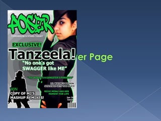
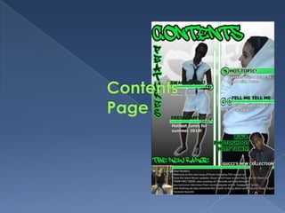
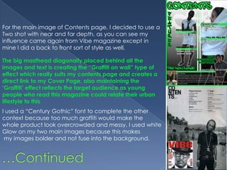
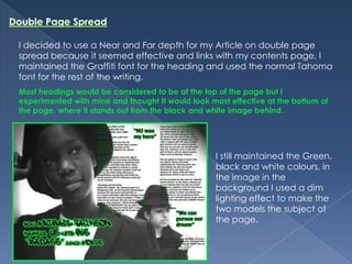
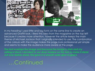
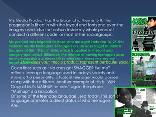
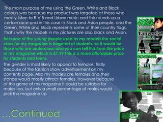
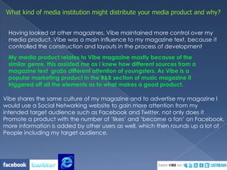
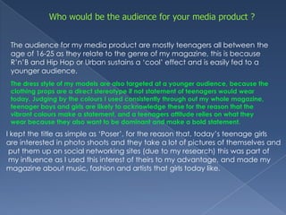
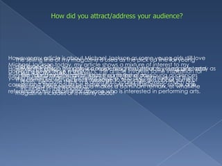
This document summarizes how the media producer's magazine represents and attracts its target audience. The magazine targets teenagers aged 16-25 through its urban style featuring hip hop music and fashion. It uses vibrant colors of green, white, and black that appeal to black and Asian youth. Photos of black and Asian female models further represent these social groups. Teen language in headlines helps address this audience. The magazine would be distributed through websites like Facebook that target youth to promote the product to its intended audience.
This document summarizes the key aspects of a music magazine media product called "Poser". The magazine targets teenagers aged 16-20 and represents urban social groups interested in R&B music. It was influenced by the layout and style of Vibe magazine. Feedback from audiences helped refine the magazine to better attract its target demographic through the use of urban-styled imagery, relevant artist coverage, and consistent colors of green, white and black throughout.
This document summarizes how the media product, an R&B music magazine called "Poser", represents and targets particular social groups. The magazine targets teenagers aged 16-25 through its urban style with graffiti-inspired fonts and colors of green, white, and black. Images of black and Asian models also represent particular racial groups. Teen language in headlines helps attract teenage readers. The $1.99 price makes it affordable for students. Females are the primary audience through fashion advertisements and poses of female models. The magazine would be distributed by similar urban music magazines like Vibe to reach its target teenage demographic.
The document compares the author's draft and actual front covers for their R&B magazine called "Desire". For the actual cover, the author zoomed in more on the model's face to make her the center of attention. Colors were changed to red, black, and white to appeal to the target audience. More text was added for more information. A barcode and issue number were included to make it seem more like a real magazine. The name "Desire" was chosen to create an association between the magazine and readers.
- The document evaluates the author's magazine project and how it represents and is targeted towards young females aged 15-21.
- The magazine uses conventional layouts, fonts, and imagery found in other music magazines in order to look professional while representing its target audience.
- Images in the magazine aim to portray artists as fun yet serious role models for overcoming issues like drug addiction that young people face.
- The magazine would be well-suited for distribution by Condé Nast Publications, which publishes magazines for similar audiences, both online and in print.
- The document evaluates the author's magazine project and how it represents and is targeted towards young females aged 15-21.
- The magazine uses conventions from existing music magazines in its layout, fonts, and images but also challenges conventions in some ways.
- It represents its target audience, young females, through featuring a young female artist who has overcome drug and alcohol addiction, and uses bright, female-oriented colors in its design.
- A company like Conde Nast that publishes magazines for young women, such as Teen Vogue, might distribute the magazine online and in print to reach its target audience.
- The document evaluates the author's magazine project and how it uses and develops conventions of real media products.
- The author aims their magazine at young females aged 15-21 and represents this group through featuring a young female artist who overcame drug addiction as a role model.
- The magazine would be distributed by a company like Conde Nast who publishes magazines targeting young women, and the audience would specifically be females aged 16-21 interested in fashion and popular music.
The document provides a deconstruction of a magazine created by the student to evaluate how it uses, develops, or challenges conventions of real media products. The summary analyzes how the magazine follows conventions to appeal to its target demographic of mainstream young females. Key aspects summarized include using bright colors and images of approachable models to portray a "pop" genre. Pull quotes, mastheads, and addressing topics of interest like celebrity gossip help engage the intended audience. The magazine also incorporates elements of synergy like social media links to further appeal to its young, internet-using readers.
This document summarizes Alice Bates' evaluation of her media magazine product. Some key points:
1) Alice aimed to create a minimalist, sophisticated magazine inspired by magazines like Loud & Quiet. She developed her skills in Photoshop and InDesign throughout the process.
2) Her magazine represents young women and challenges stereotypes by portraying the main subject Amelia as confident. It also represents youth culture by focusing on topics relevant to its target 16-18 audience.
3) A small independent publisher might be suited to distribute the magazine given its unique style compared to larger publishers like Anthem. The target audience is music-interested 16-18 year old girls.
4) Alice
This document provides an evaluation of Alice Bates' media magazine product. It describes how the magazine developed from initial plans and research into magazines and how the final product challenged conventions. It discusses how the front cover, contents page, and double page spread were designed and how they drew from but also differed from real magazines. It also addresses how the magazine represents particular social groups like women, youth, and lack of diversity. The target audience is identified as 16-18 year olds. Key technologies used in constructing the magazine included Photoshop, InDesign, and Bridge.
This document provides an evaluation of Alice Bates' media magazine product. It discusses how the magazine developed from initial plans and analyses of other magazines. Key aspects of the magazine's design are discussed, including the front cover, contents page, and double page spread. The magazine aims to represent particular social groups like young women and youth through the images and content featured. Large publishing companies and niche publishers are considered as potential distributors. The target audience is identified as 16-18 year olds interested in music. Valuable skills and technologies learned through the process are also outlined.
The document discusses how the media product uses and challenges conventions of real magazines. It includes a masthead on the left like Kerrang and Q magazines. Images and limited fonts are used to attract audiences and show brand identity. Social media was used to advertise and gather audience feedback. The product represents a younger rock audience through images, articles, and price point. Distribution by Bauer Media Group was chosen for their experience with similar magazines.
The document is a portfolio submission for a media studies course that outlines the development of a music magazine product aimed at teenage girls. It describes choosing Billboard magazine as the primary influence for targeting an older audience with a focus on pop music and fashion. Details are provided about selecting pink and other colors for the branding and choosing celebrity covers that would appeal to 15-17 year old girls. The document also addresses conventions from real magazines that were utilized or challenged in the design of the fake magazine, such as using a masthead, cover lines and secondary images in the layout.
The document summarizes the student's music magazine project. Some key points:
1) The student's magazine cover uses similar conventions to real magazines like pink colors and an attractive person on the cover.
2) For the contents page, the student took inspiration from two magazines they analyzed and combined designs they liked.
3) Their double page spread focuses on a pop star like the magazines they analyzed, with a picture on one page and article on the other.
4) Through this project, the student learned new skills like using Photoshop and transferring photos between devices to construct their magazine.
The document provides details on Georgina Malpass' planning for a fashion magazine called "Urban". It includes research on existing magazine layouts, covers, and content pages. Malpass analyzed fonts, photo styles, and celebrity images used in popular magazines. She considered potential magazine names and tallied reader preferences. Based on the research, Malpass chose "Urban" as her magazine name and the Gungsuh font for the masthead. She will apply conventions like placing the masthead and double page spread prominently on the cover.
The document discusses the design process and choices made for the student's music magazine project. It describes how the student analyzed existing magazines to determine a style, then experimented with layouts, images, and design elements. Key aspects included a minimalist, sophisticated style with high quality photos. The front cover masthead was challenging to design but the student found a solution. Representation of social groups like women and youth were considered in the photos and content chosen. The target audience is identified as 16-18 year olds interested in music. New software like Photoshop and InDesign were used to create and refine the magazine design.
The document discusses the design process and choices made for a music magazine called STAGE&SPEAKER. It describes how the designer analyzed existing magazines and developed a minimalist, sophisticated style with high quality images and white space. Photos were taken of the featured artist, Amelia, and edited for tone and contrast. The front cover masthead was experimented with in different fonts and colors. Similarities and differences between the magazine design and conventions were noted. The contents page and double page spread were also designed, drawing inspiration from other magazines. Technologies like Photoshop and InDesign were used in the design process. The intended audience is described as 16-18 year olds interested in music. Representation of social groups like
The document discusses how the student's media magazine represents particular social groups through its design and content. Specifically:
- The front cover photograph of Amelia represents young women by portraying her as confident and direct, challenging stereotypes.
- Images of Amelia throughout portray her as strong yet fashionable, appealing to the target audience of 16-19 year old women.
- Quotes and articles aim to empower young women and musicians to not be limited by stereotypes.
- While the magazine does not feature ethnic diversity due to the local area, it represents the acoustic music genre which is diverse.
The document discusses how the magazine targets its audience of 14-18 year old indie teenage girls. On the front cover, the main image uses direct eye contact to engage the reader. The colors blue, purple and black are used consistently throughout. The bold masthead and trendy burgundy color help grab attention. Cover lines about fashion, music and internet trends appeal to the target audience. The double page spread uses an interview format which is easier for readers to understand. Photos show outfits and styles the audience can relate to. The magazine uses a feminine tone, voice and colors throughout to address its audience.
The document discusses conventions of rap/R&B magazines and how the media product Kulture magazine meets and challenges some of these conventions. It explains that due to the target audience, artists are dressed simply without flashy jewelry. The logo uses a Japanese font and purple color to attract different cultures and represent sophistication. Close-up photos and lighting are used intentionally. Locations include a studio and library to be conventional but also challenge expectations. Overall, the magazine challenges stereotypes about rappers and aims to attract a wider audience.
The document describes the conventions used in the student's media magazine project. It discusses using a contrasting masterhead with capital and lowercase letters. It includes a pull quote about a TV show. Images on the contents page include page numbers and the front cover. Columns are used to break up text. Double page spreads include a large poster image and columns for text. The target audience is represented as teenage girls through stereotypical images and references to social media and TV. Egmont publishing would be a good fit as they currently only have one teen music magazine. The audience is attracted through pink and purple color scheme, elegant yet readable fonts, and flattering images of girls with natural looks and outfits. The student learned new skills
The document describes a music magazine called "MMade" that was created as part of an evaluation task. Some key points:
1. MMade challenges conventions by having a vertical masthead and minimal text on the cover to stand out.
2. Photographs are given prominence over text in layouts to tell the story visually.
3. The magazine represents social groups of 16-20 year olds interested in music and fashion on a budget through natural poses and stories of "real people."
Evaluation on front cover, contents page and double page spreadJade Foreman
My media product develops conventions used in real magazines, such as a masthead in the top left corner with the magazine's name ('K') in a house style combining red, black, white and blue. The front cover features the artist's name across their body with a customized line underneath, and cover lines on the left side about the artist. The large central image establishes the artist's genre through their expression. The contents page includes a variety of images representing the magazine's content, and text about artists/groups. The double page spread begins with the artist's name in a font conveying their feeling, with an image projecting their confident attitude and genre. Feedback from focus groups showed the products successfully looked professional and met audiences' needs
As media foundation research into existing magazine productsGeorginaMediaStudies
Teen Vogue uses sophisticated design conventions for its front covers and content pages to appeal to its target audience of teenage girls. It analyzes the front cover of the April 2011 issue, noting the main image of actress Emma Watson, colorful masthead combining serif and sans serif fonts, and cover lines in primary colors framing the main image. For the content page, it highlights the small masthead and date to allow more space for the large celebrity image, and uses hints of pink and orange with mostly black text for a youthful yet classical look. In comparison, Top Pop's content page uses a multi-column layout and brighter colors to give the impression of lots of engaging articles.
Evaluation on front cover, contents page and double page spreadJade Foreman
My media product develops conventions used in real magazines, such as a masthead in the top left corner with the magazine's name ('K') in a dark red font on a red background. The front cover features the artist's name written across their body with a customized line underneath, and cover lines on the left side about the artist. The contents page includes a variety of images representing what's in the magazine, and text about artists/groups. The double page spread begins with the artist's name in a font representing their style to give feeling. Images are used to represent the artist's genre and personality. The magazine would appeal to a wide audience aged approximately 12-30, featuring a variety of music genres and both male and female
The document discusses how the media product represents social groups. It specifically targets white British teenagers and young adults aged 17-25. Images in the magazine feature white British male models around the same age to allow the target audience to connect with and relate to the artists. The magazine also represents middle-class audiences. Photos are used to engage the male audience and create a sense of identification and relationship with the magazine. Shot types, layout, and ideology are designed to attract the target demographic and build fan loyalty.
The document discusses how the media product represents social groups. It specifically targets white British teenagers and young adults aged 17-25. Images in the magazine feature white British male models around the same age to allow the target audience to connect with and relate to the artists. The magazine also represents middle-class audiences. Photos are shot using eye-level shots to directly engage the audience, most of whom are male. Layout and design aim to attract young male readers through limited text and emphasis on images while maintaining a sophisticated style befitting the target demographic.
The document summarizes a student's media project creating a music magazine. The student used conventions from real music magazines like NME in their magazine's design but also challenged some conventions. They included a front cover, contents page, and double page interview spread that drew inspiration from NME in terms of layout, images, and use of color while also making some unique design choices. The magazine's target audience is described as males and females aged 15-25 interested in indie music.
The document discusses the process of creating a music magazine called "Vibe" as a class project. Key points include:
- The magazine was inspired by Spin magazine and uses similar conventions like images of artists, headlines, and stories about music.
- Photoshop skills like airbrushing, adding text, and adjusting layers were used to design the magazine cover and layout.
- Research of existing magazines helped determine design elements and the target audience of teenagers aged 13-19.
- Artists like Miley Cyrus and Pixie Lott were featured to appeal to this young demographic.
My music magazine represents young adult females who enjoy reggae music. It features a female model smiling and wearing bright colors to represent happiness and strength. The magazine will be digitally distributed to reach a wide audience, especially young females aged 17-24. Distributing it online allows global access and sharing on social media. Through constructing the magazine, the student learned photography and design skills in Photoshop, such as photo manipulation and layout techniques. Feedback helped them apply magazine conventions to better target their intended audience.
The document discusses the evaluation of a music magazine product. It compares the product to real music magazines like Billboard and Vibe, examining similarities and differences in areas like cover design, layout, images and content. It also addresses questions about the target audience, how the product represents social groups, and what media institution might distribute it.
The document provides an evaluation of a magazine created by the author. It summarizes the research and design process, comparing the author's magazine cover and contents page to existing magazines like NME. The author considered layout, images, fonts, and language to target their audience of young music fans aged 18-23. Potential publishers like Bauer and IPC were researched. Throughout the course, the author developed their understanding of magazine design and learned to use more advanced technology and editing tools to create a professional product.
The document describes the design elements and conventions used in a mock student-created magazine covering hip hop music. Key design elements include a masthead referencing a Jamaican reggae song, the use of direct eye contact in a portrait on the cover, main cover lines, placement of images and text following design principles. Color schemes, fonts and layouts are used to create visual interest and appeal while maintaining the style of other hip hop magazines. Both conventional design elements and some unconventional touches like mock Polaroids are incorporated.
This document contains an evaluation of a student's media studies coursework project to create a music magazine. The student summarizes their use of conventions from their magazine of inspiration ("Q" magazine) in designing the layout, structure, and content of their magazine. This includes replicating elements like the location of the masthead, adding artist listings on the cover, and using consistent colors. The student also discusses some ways their magazine differs, such as through more casual clothing of their model and personal responses in the interview feature. The evaluation reflects on how the magazine represents social groups like young R&B fans and troubled young men through the images and language used.
The document provides details about the process of creating a music magazine. It describes designing elements like the front cover, contents page, and articles. Conventions from other music magazines were researched and applied, like layout, fonts, and inclusion of photos, quotes, and page numbers. Feedback was gathered through surveys to help decisions. Skills with Photoshop and digital photography improved over iterations. The target audience was identified as teenage boys interested in genres like rap and R&B. Distribution through an existing media company was considered.
The document describes the development of a media magazine product. It discusses using coordinated colors on the cover to resemble real magazines. Two people are used on the cover instead of one to make it stand out. Font and layout choices are discussed for different pages, and comparisons are made to real magazines like Billboard. Feedback is provided on how the content page could be improved by reducing clutter. The intended audience is described as teenagers based on the music, language, and styles used. Technologies like Photoshop and surveys were used to construct the magazine. Lessons were learned around layout, fonts, and modeling styles from researching real magazines.
The document compares the author's draft and actual front covers for their R&B magazine called "Desire". For the actual cover, the author zoomed in more on the model's face to make her the center of attention. Colors were changed to red, black, and white to appeal to the target audience. More text was added for more information. A barcode and issue number were included to make it look like a real magazine. The name "Desire" was chosen to create an association between the magazine and readers.
The document discusses the evaluation of the student's music magazine portfolio. It addresses how the magazine uses, develops, and challenges conventions of real music magazines in the front cover, double page spread, and contents page through layout, design elements, and continuity across pages. The student also discusses how the magazine represents young adult females through imagery and color, and how it would be distributed to its target audience online and in music shops to have wide accessibility. The student reflects on technologies learned through constructing the magazine in Photoshop.
The document summarizes the process of creating a magazine from start to finish. It discusses researching conventions of music magazines, designing elements like the front cover, contents page, and articles. Photos were taken and edited in Photoshop. Feedback was gathered through surveys. The target audience is identified as teenage boys interested in genres like rap and R&B. Publishing bi-monthly was decided based on reader preferences. Skills in photography, design, and gathering feedback were improved throughout the process.
1) The document evaluates the student's music magazine project for class by addressing several questions about how it uses and develops conventions of real music magazines.
2) The student discusses how their front cover, double page spread, and contents page follow conventions in their layout, use of images, and continuity between pages.
3) The magazine represents young adult females who enjoy reggae as happy yet strong through the imagery and colors used.
4) The student proposes distributing the magazine both in music shops and online for wider reach, especially among its target teenage and young adult female audience.
5) Through creating the magazine, the student learned new Photoshop skills like using tools and layers, as well as the importance of
The document describes the process the author went through to create their media product. They had to do extensive research and planning before constructing the product. Now that it is finished, the author feels it is appropriate to analyze the process they took to reach this stage.
The document summarizes the student's final evaluation of their magazine design project. They analyzed existing music magazines to understand conventions for their target audience of 18-23 year olds interested in indie/rock music. For the cover, they used a large central image and bold masthead placement inspired by NME. Layout, typography, and color choices were also informed by research. Photoshop was used to edit images for professional quality. Overall, the student demonstrated applying research and technical skills to create an authentic magazine design.
- The document discusses the evaluation of a music magazine created by the author
- The author used conventions like a masthead, cover lines, images, and pricing to attract readers and represent a music magazine format
- The target audience of the magazine is described as female teenagers interested in R&B music and celebrity gossip
- Creating the full magazine helped the author learn skills like photo editing, research on competitors, and balancing design elements to effectively engage an audience
The document describes the design choices made for a music magazine focused on the R&B genre and female empowerment. Key design elements were inspired by the existing magazine "Vibe," including a zigzag layout, overlapping the main image over the masthead, and linking design elements between the cover and contents page. The target audience is described as female R&B fans interested in following artists and entering competitions. Distribution options considered include both physical retailers focused on R&B music and digital distribution online to reach a wide audience.
Fashionista Chic Couture Maze & Coloring Adventures is a coloring and activity book filled with many maze games and coloring activities designed to delight and engage young fashion enthusiasts. Each page offers a unique blend of fashion-themed mazes and stylish illustrations to color, inspiring creativity and problem-solving skills in children.
This document announces the winners of the 2024 Youth Poster Contest organized by MATFORCE. It lists the grand prize and age category winners for grades K-6, 7-12, and individual age groups from 5 years old to 18 years old.
Heart Touching Romantic Love Shayari In English with ImagesShort Good Quotes
Explore our beautiful collection of Romantic Love Shayari in English to express your love. These heartfelt shayaris are perfect for sharing with your loved one. Get the best words to show your love and care.
The cherry: beauty, softness, its heart-shaped plastic has inspired artists since Antiquity. Cherries and strawberries were considered the fruits of paradise and thus represented the souls of men.
5. In what ways does your media product use, develop or challenge forms and conventions of real media products ? Cover Page For my cover page I used similar colours to keep consistency within my magazine. I organised my Layouts by giving all my input a lot of space so that the whole cover doesn’t looked overcrowded or vacant. To retrieve the “Urban” look of my R & B Music Magazine I used only three colours that would clash and make the magazine stand out more; Green, White and Black, this combination doesn’t make the magazine seem flat. I didn’t use too many cover lines but I used a silhouette of Michael Jackson him self to ensure it represents the cover story, also to help keep with the consistency of the Michael Jackson theme.
6. The main influence for my front cover came from Vibe Magazine. As I wanted to do my Article on Michael Jackson. It made sense to base my cover page on that Michael Jackson style too, so to achieve that look I took A hint off Vibe Magazine as Janet Jackson has the same look that I wanted, so to keep that relation to my Cover page look I Decided to manipulate some of that influence in to my own pose except my facial expression is full of attitude, As you would see in most hip hop magazines. I liked the idea of holding the hat as well because as part of one of the “Michael Jackson pose” holding the hat is essential and I wanted to maintain that consistency of professionalism in order to meet the provision of a real media product. The style of my magazine is really Urban yet cool and full Of careful outburst of the main colour I used, which was Green. I liked the consistency of the colour Yellow for The masthead and cover lines on Vibe magazine, so I used That regularity on my front cover. This triggers off the sense Of ‘cool’ which is dominant in my target audience. I tried to use the Michael Jackson style in a range of Poses such as this one …Continued
7. Contents Page I decided to do my contents page a little different to what most music magazines would have in terms of layout. I used the Linear Gradient background but used the same black and white colours. I also used the same Green, White and Black colour to maintain the consistency. The same font was used for the Mast head of my Cover page and also in the contents page, I think the ‘Graffiti’ font would stand out and maintain the Urban Style. I put only four of the contents features down To prevent the page from being overcrowded. I used two images underneath because each tells a different story, without overcrowding the contents page. The contrast of the fonts and colours matches my imagery because I have the dark and light clothing and skin tones here. This also links to the social groups of my product.
8. For the main image of Contents page, I decided to use a Two shot with near and far depth, as you can see my influence came again from Vibe magazine except in mine I did a back to front sort of style as well. The big masthead diagonally placed behind all the images and text is creating the “Graffiti on wall” type of effect which really suits my contents page and creates a direct link to my Cover Page, also maintaining the ‘Graffiti’ effect reflects the target audience as young people who read this magazine could relate their urban lifestyle to this I used a “Century Gothic” font to complete the other context because too much graffiti would make the whole product look overcrowded and messy. I used white Glow on my two main images because this makes my images bolder and not fuse into the background. …Continued
9. Double Page Spread I decided to use a Near and Far depth for my Article on double page spread because it seemed effective and links with my contents page, I maintained the Graffiti font for the heading and used the normal Tahoma font for the rest of the writing. Most headings would be considered to be at the top of the page but I experimented with mine and thought It would look most effective at the bottom of the page, where it stands out from the black and white image behind. I still maintained the Green, black and white colours, in the image in the background I used a dim lighting effect to make the two models the subject of the page.
10. In my heading I used little and big fonts on the same line to create an advanced Graffiti look. I liked this idea from the magazine on the top left because it creates more attention, however the article keeps the main theme of Michael Jackson that I originally intended to use. The combination of the colours with the image makes the page look professional yet simple and seems to make the audience more aware of the page. The text overlaps the image and because the image is dark and my writing is black I decided to use drop shadow on the text to make it stand out over darker areas, this gave it a smooth outer glow in green. …Continued
11. My Media Product has the Urban chic theme to it, the progression is fitted in with the layout and fonts and even the imagery used, also the colours inside my whole product conduct a different code for most of the social groups. My product was targeted at those who are aged between 16-25, this includes mostly teenagers. Teenagers are an easy target audience because of the “Urban” style, which is applied in the font and imagery and layout. Ultimately the relation of having teenagers pose for my magazine is a direct link to attract the teens who are my target audience. How does your media product represent particular social groups? Cover lines such as “No ones got SWAGGER like me” reflects teenage language used in today's society and shows off a personality, a typical teenager would possess along with the attitude. Another example of this is “WIN Copy of MJ’s MASHUP remixes” again the phrase “Mashup” is a indication Of some of the teenage language used today. This sort of language promotes a direct status of who teenagers Are.
12. The main purpose of me using the Green, White and Black colours was because my product was targeted at those who mostly listen to R’n’B and Urban music and this rounds up a certain race and in this case its Black and Asian people, and the Green, White and Black represents some of their country flags, that’s why the models in my pictures are also black and Asian. Because of the young people used as my models the social class for my magazine is targeted at students, so it would be those who are underclass-also you can tell this from the price of my magazine which is £1.99 This is a more affordable price for students and teens. The gender is most likely to appeal to females, firstly because of the fashion show advertisement on my contents page. Also my models are females and their stance would mostly attract females. However because of the genre of my magazine it could be suitable for males too, but only a small percentage of males would pick this magazine up …Continued
13. What kind of media institution might distribute your media product and why? Having looked at other magazines, Vibe maintained more control over my media product. Vibe was a main influence to my magazine text, because it controlled the construction and layouts in the process of development My media product relates to Vibe magazine mostly because of the similar genre, this assisted me as I knew how different sources from a magazine text grabs different attention of youngsters. As Vibe is a popular marketing product in the R&B section of music magazine it triggered off all the elements as to what makes a good product. Vibe shares the same culture of my magazine and to advertise my magazine I would use a Social Networking website to gain more attention from my intended target audience such as Facebook and Twitter, not only does it Promote a product with the number of ‘likes’ and ‘become a fan’ on Facebook, more information is added by other users as well, which then rounds up a lot of People including my target audience.
14. Who would be the audience for your media product ? The audience for my media product are mostly teenagers all between the age of 16-25 as they relate to the genre of my magazine, this is because R’n’B and Hip Hop or Urban sustains a ‘cool’ effect and is easily fed to a younger audience. The dress style of my models are also targeted at a younger audience, because the clothing props are a direct stereotype if not statement of teenagers would wear today. Judging by the colours I used consistently through out my whole magazine, teenager boys and girls are likely to acknowledge these for the reason that the vibrant colours make a statement, and a teenagers attitude relies on what they wear because they also want to be dominant and make a bold statement. I kept the title as simple as ‘Poser’, for the reason that, today’s teenage girls are interested in photo shoots and they take a lot of pictures of themselves and put them up on social networking sites (due to my research) this was part of my influence as I used this interest of theirs to my advantage, and made my magazine about music, fashion and artists that girls today like.
15. How did you attract/address your audience? However my article is about Michael Jackson as some young girls still love Michael Jackson today, my article shows a mixture of interest to my audience even those n their 20’s, the article involves some inspiration for young readers and might interest people who are still thinking of their careers and these could be those who are still in University, so the age reference in my article is for anyone who is interested in performing arts. The selling line of my magazine is used as the pick up line for young girls especially: TOMORROWS STAR TODAY This continues with a direct message to teenage girls about some of their favourite celebrities and makes a dominant remark, of what the magazine includes or is mainly about Mainly through the colour consistency throughout my magazine, and the young models, also I kept the interest of my young audiences artists, because the R’n’B artists that young girls love so much are included in this magazine. However the gossip of artists is a major thing that attracts young girls today as they like “discussing” what artists are up to these days.
16. What have you learnt about technologies from the process of constructing this product ? I learnt (which also maintains a professional skill) of how to edit, crop and use other tools on Adobe Photoshop. I learnt how to make a image stand out More by desaturating and saturating the image, as well as feathering the image after Cropping it and using glows to make different texts stand out I learnt to use different type faces to match my target audiences interest such as ‘Justaiiiittteeee’, which is a Graffiti font and this directly links to my audiences backgrounds and what makes a specific teenager who they are. I learnt to align my font with my pictures so that they don’t inter link or replace each other, but I did this through different layers.
17. Looking back at your preliminary task, what do you feel you have learnt in theprogression from it to the full product ? I made my preliminary task on Microsoft Publisher, it was easier to use on that programme because it was all on one page and it wasn’t really hard to experiment with different pictures, however on Adobe Photoshop I had to create lots of different layers in order to make sure my image wasn’t too bright or dark or my text still created the same standing out effect. I learnt to use text in a different areas by means of manipulation etc. I became skilled at creating shadows to make text stand out more, and glow around pictures to make them seem bolder along with strokes in Adobe Photoshop And as you can see ‘Poser’ magazine made a better magazine. The journey from Microsoft Publisher publication to the Adobe Photoshop publication, shows a great progression route because the Microsoft Publisher publication seems overcrowded and unprofessional and there isn’t a theme which controls the colour schemes either, however in the Adobe Photoshop publication you can see how neat it looks and a theme is controlling the font, layout and colours which maintains professionalism and realism. I experimented with: Fonts Images Cover Lines Puffs Selling Lines Microsoft Publisher Adobe Photoshop
18. Audience Feedback I made plans of my production and asked people which one they preferred and then made my product according to that. During the production of my magazine I had a few people overlooking at my work, I received criticism and admirations of my product, which made me tweak a few things and emphasise a few things about my product. Before I made my final production I made surveys and handed it out to 25 people, which provided me with data and information about their music interest, which gave me a main outline of what my magazine should consist of. My estimated admiration was for the photography along with the colours which was successfully approved by teenagers, as it showed me that my product really interacted with the audience and that I was successful in using the combination of them images and texts. I decided to do my evaluation on PowerPoint for the reason that it shows clearly the links between my work and other media products and gives me room to briefly assess my work, also the custom animation allows the Viewer to professionally observe my progression route by neat