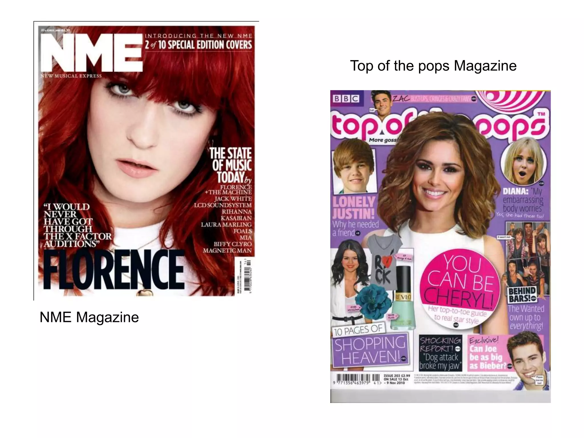
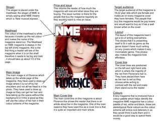
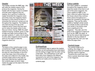
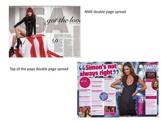
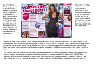
The document describes the design elements of two magazine covers - NME magazine and Top of the Pops magazine. For NME, it discusses the color palette of red, white and black which appeals to its rock music audience. The large masthead in white stands out against the red background. The main image takes up the whole cover with a close-up shot of Florence. For Top of the Pops, the target audience is young girls aged 8-13. It uses a girly color palette of pink, white and purple. The cover features a mid-shot of Cheryl Cole and text that tells readers "you can be Cheryl." Both magazines employ consistent color palettes, prominent cover lines and images, and mast
The document provides information about music magazines, including:
- The first music magazine was founded in 1894 called Billboard. Music magazines grew popular in the 1950s-1960s with magazines like NME and Rolling Stone.
- The biggest music magazine publishers currently are Rolling Stone, NME, Smash Hits, Kerrang!, and Billboard.
- The document then analyzes sample pages from magazines like NME and Smash Hits, examining things like layout, colors, target audiences, and conventions used across issues.
The document analyzes several magazine covers and contents pages. It discusses design elements like mastheads, images, layouts, and color schemes. Across the magazines, common techniques are used to grab readers' attention, showcase celebrity subjects, and make navigating the content easy. Images often employ direct address to engage the audience and suggestive poses appeal to male gazes. Formats aim to attract target demographics through inclusive fonts and balanced gender representations.
The document analyzes magazine covers, contents pages, and double page spreads. Some common features identified across magazines include brightly colored titles and celebrity images on covers that use direct address. Contents pages split information into sections with subheadings and images to break up text. Double page spreads feature large central images of the topic and pull quotes from associated articles. Color schemes are used consistently throughout magazines to guide readers to different sections.
- The foreground image takes up half the double page spread, focusing attention on Lana Del Rey. Her seductive pose appeals to male readers.
- Red, white, and black are used throughout for color cohesion. Red complements the white text to make important parts stand out.
- Font style is similar to the magazine's masthead, conveying an edgy tone that attracts younger audiences. Images of the band performing dominate without eye contact, showing their importance.
The document discusses elements that should be included on the front cover of a school magazine, such as the masthead, main image, cover lines, and barcode/price to identify the publication and attract readers. It also provides audience research showing common elements readers feel should be in a school magazine, like student achievements and photos. The end includes forms for planning a school magazine cover and contents page by considering the target audience, images, colors, and technical details.
This document analyzes and summarizes the key design elements of two magazine double page spreads (DPS). The first DPS is from Q magazine and discusses the small font size, sparse use of bold text, plain layout that utilizes all available space, tight column positioning, minimal color usage, and well-planned use of space. The second DPS is from NME magazine about Nicki Minaj. It has a vibrant, exciting style created by a bold central image and bright color scheme atypical of NME. The layout separates the article into different topic sections to appeal to younger readers.
- The document analyzes several magazine covers.
- Key elements discussed include mastheads, color schemes, layouts, foreground images, and how elements are used to attract audiences.
- Analyses find that elements like bold colors, prominent images, and headlines about popular artists/bands help draw in readers. Placement of elements and rule of thirds are also used compositionally.
This magazine cover features Lily Allen as the foreground image. It uses a color scheme of white, grey, and pink that creates contrast and draws attention. The masthead is in white, conveying a clean, classic style. Lily Allen's black hair and makeup contrast with her white top, showing the magazine's original genre. Her natural look sets a good example. The close-up angle focuses on the iconic foreground image as most important. Callouts advertise other featured artists to potential readers.
This magazine cover features Cheryl Cole as the main image. The large main cover line "Cheryl Cole rocks" engages readers about what may be said about her in the magazine. Additional cover lines in red and white text advertise other music artists and stories featured inside. The masthead at the top identifies this as issue of "Q" magazine.
1) The magazine cover features a large image of the famous artist Trey Songz, who is looking directly at the camera, in order to attract readers who are fans of the artist.
2) Bold fonts and use of the color red throughout draw attention to headlines and articles about hip hop music and culture.
3) Details like the prison-like bathroom backdrop for Trey Songz's image and hard-hitting language help position the magazine as authentic and "in the know" regarding hip hop music and lifestyle.
The document provides an analysis of the layout, design elements, and techniques used across several music magazine covers to attract audiences. Key elements discussed include the use of bright colors and large fonts to make text and mastheads stand out, center images of artists to represent the main stories, and teaser text and questions to engage readers. Multiple magazines employ layered and overlapping design elements to give the impression of being packed with content. Overall the document examines how magazines utilize visual cues and advertising approaches to draw in their target demographics.
This magazine cover uses several visual techniques to attract and inform readers. The masthead stands out against the dark background in bright white text. The central image of a guitarist overlaps the masthead and cover lines to create a 3D effect. Additional images and cover lines around the page provide multiple snippets of content and stories within the magazine to draw in a variety of readers.
Front covers, contents pages, double page spreads #5QureshiSohail
- The main image takes up the entire left page and is in black and white, contrasting with the page. It does not have direct eye contact with the viewer.
- The kicker at the top right provides background information on the subject of the article, the band Beady Eye.
- The large header "Beady Eye" is the biggest text and draws the eye to learn what the article is about. Additional information and the continuation of the text are on the right page to complement the main image.
The document analyzes the magazine cover and contents page design of different music magazines. It discusses various design elements and how they are used to attract audiences. For the magazine cover, it examines the use of images, logos, fonts, layout, and color schemes. It notes how these elements are tailored for the target readership and genre of music featured. For the contents page, it discusses the organization of content sections, use of headings, images and advertisements. Across magazines, there is consistency in branding elements but also uniqueness in design to suit the publication's style of music coverage.
The document analyzes the design elements of magazine covers and pages. It discusses the purpose of elements like mastheads, headers, dates, images, colors and layouts. The goal is to attract readers and target specific audiences using visual styles and prominent features that draw attention and convey information about the content. Elements are carefully designed and placed to market the magazines effectively.
The document describes the design choices made for the cover and inside pages of a magazine. For the cover, conventions like using a medium shot of an artist were followed, while the pose challenged expectations. Inside, a contents page included images and listings like other magazines. A double-page feature spread placed the image on the left, with a long-shot of the artist in black and white. Fonts, colors and layouts were consistent throughout to resemble an authentic magazine. While some conventions were followed, some were challenged to make the magazine stand out.
Front covers, contents pages, double page spreads #5QureshiSohail
The double page spread features an image of Liam Gallagher on the left page taking up the entire space. On the right page is a header "Beady Eye" in large text at the top with background information on the band below in a "kicker". The text article begins with a large "T" and uses a formal style aimed at an older, higher audience. The layout is simple with the image on one side and text on the other, following magazine conventions. The overall design provides information to readers about the featured artist through the use of images, text styles and placements.
The document discusses the design elements of various magazine covers and contents pages. Key points analyzed include mastheads, color schemes, foreground images, callouts, and layouts. Across the examples, effective design is shown to attract readers through bold fonts, prominent icons, and visually appealing compositions that highlight important information. Younger audiences are particularly drawn to edgier, contrasting designs that portray subjects in a raw or unconventional light. Overall organization and consistency of branding is important to guide readers through content in a simple yet engaging manner.
The document summarizes how the student's media product of a music magazine uses and develops conventions of real music magazines. The magazine includes a cover, contents page, and article that follow standard structures and designs. The cover includes elements like the masthead, selling line, cover lines, main image of the artist, and pull quotes. The contents page lists the features, artists, and main story. The article focuses on the main artist through a question and answer format, with images and pull quotes. Overall, the student aimed to create a magazine that would appeal to teenage girls through its bright, fun style while adhering to common magazine conventions.
NME is a weekly British music magazine that was first published in 1952. It began as a music newspaper and transitioned to a magazine format in the 1980s. The target audience is males aged 17-25. Elements that link the different pages together include consistent use of font, colors like red and black, and an informal tone throughout the text.
How my magazine appeals to the target audienceJoshd96
The document discusses how the magazine's design appeals to its target rock music audience. Key design elements discussed include using aggressive colors like red, black and grey on the cover and throughout for their rock connotations. Fonts and images are also chosen to be bold and eye-catching as is typical for rock magazines. The content focuses on rock news, bands and articles written in an informal tone to appeal to younger readers. Overall, the document emphasizes using conventional rock magazine design tropes to attract the target audience.
The document provides details on the design elements of magazine covers and contents pages. It analyzes elements like the masthead, headlines, images, layout, and other visual components. According to the document, these elements are intentionally designed to attract readers' attention and encourage them to purchase the magazine. For example, prominent images of famous artists are used to draw interest, while plugs and free gifts provide an incentive. Additionally, the document notes that simplicity in design helps avoid overwhelming readers. Overall, the document examines how magazine covers and contents pages use visual rhetoric to market the publication to potential audiences.
This document provides a detailed analysis of the typography, layout, color, images, language, and conventions used in a music magazine cover and contents page. For the cover: the typography uses different font sizes to highlight the main story; the layout follows the eye's path and leaves space; bright colors attract readers, especially younger ones; the main image is of popular artist Justin Bieber. For the contents page: the typography is small to fit more but uses serif and sans serif fonts; the layout also follows the eye's path and uses the left column for charts; color contrasts but links to the cover; images showcase artists in the issue. Both follow conventions like using the left column and masthead prominently.
The document analyzes 3 magazine covers. It summarizes each cover's key elements including the header, masthead, main image, main sell line, barcode/price, and additional details. For each cover, it describes design elements like fonts, colors, images and their purpose in attracting the intended audience for each magazine's genre of music.
This short document discusses Japanese techniques for multiplication that can change the way numbers are multiplied. It provides a link to a YouTube video that demonstrates these techniques for multiplying numbers in an unconventional way. The document suggests these techniques may improve how multiplication is performed.
This document contains contact and personal information for Amr Diaa Mohamed Rashad. It details his work experience as a senior property consultant and sales representative for several real estate companies in Egypt from 2009 to the present. It also lists his education, training courses, computer skills, and languages. His objective is to find a job opportunity utilizing his interpersonal, analytical, and technical skills.
This document is a curriculum vitae for Harish Kumar. It summarizes his educational qualifications including a B.Tech in Mechanical Engineering from KUK University in 2011. It outlines his professional experience as a Quality/Process Control engineer at MV ELECTROSYSTEMS PVT LTD since 2012. It also lists his roles and responsibilities in quality inspection, documentation, and customer service. Finally, it provides details on his technical skills, areas of expertise, computer proficiency, and personal details.
This document contains contact and personal information for Amr Diaa Mohamed Rashad. It details his education, including completing military status and earning a degree from Akhbar El Yom Academy. It outlines his career experience in real estate and property consulting roles from 2009 to the present. It also lists his training, languages, computer skills, and hobbies. The objective is to find a job utilizing his interpersonal, analytical, and technical skills.
Glass Animals uses their website to engage with fans and promote their band. The website allows fans to create an account to receive exclusive information like early access to tour dates and pre-sale tickets. It also features a large collection of photos from concerts and behind the scenes. Social media links on the site encourage fans to interact more with the band and deepen their appreciation.
The artist's website has a jungle/rainforest background matching the setting of most of their music videos. It contains links to social media to encourage fan interaction and promotion of the band. Fans can make an account to access exclusive information, tour dates, and pre-sale tickets. The site also has an engaging style and store where fans can buy band merchandise.
This document contains information about payments, including an email related to payment, the payment gateway, and uninvoiced cases. The document appears to be related to financial transactions and billing within an organization.
Ganges Advisors is a business advisory firm that specializes in strategic business planning, high performance management, and helping businesses manage growth successfully. It provides innovative, practical, and implementable solutions to clients. Ganges Advisors works with clients on a continuous, integrated, and long-term basis to add value by improving business performance and creating long-term value.
Maryam Borhani-Haghighi presents an overview of immunohistochemistry. Immunohistochemistry allows visualization of antigens in tissue sections using labeled antibodies. It involves using antibodies that target cellular antigens like proteins, lipids, and nucleic acids. Antibodies can be polyclonal or monoclonal. The tissue is processed using techniques like fixation, sectioning, antigen retrieval and blocking to reduce background staining before incubation with labeled primary antibodies. This allows detection of target antigens using methods like fluorescence, enzyme labeling or colloidal gold. Controls are important to validate results.
- The first music magazine was founded in 1894 called Billboard which was devoted to the music industry. Music magazines became popular in the 1950s-1960s with magazines like NME and Rolling Stone.
- Some of the biggest music magazine publishers today include Rolling Stone, NME, Smash Hits, Kerrang, and Billboard. They cover various genres of music and have large international readerships.
- Music magazine covers use visual elements like photos and minimal text to attract readers' attention. Colors, layouts, and logos are consistent to help readers recognize the magazine. Covers aim to appeal to the target demographic for each publication.
The document provides information about music magazines, including:
- The first music magazine was founded in 1894 called Billboard. Music magazines grew in popularity in the 1950s-1960s with magazines like NME and Rolling Stone.
- The biggest music magazine publishers currently are Rolling Stone, NME, Smash Hits, Kerrang!, and Billboard.
- Sample pages from magazines like NME and Smash Hits show conventions like layout, colors, pictures, and writing styles used to appeal to different target audiences.
This document analyzes magazine covers and contents pages for two different magazines - Top of the Pops and NME. For the Top of the Pops magazine cover and contents page, the analysis finds that they target young girls ages 8-13 through the use of bright colors like pink and purple, images of popular artists like Cher Lloyd, and fashion/celebrity focused content. The NME magazine cover and contents page are analyzed as targeting males ages 16-22 through grittier band images, content focused on concerts and music news, and a simple color scheme. Key design elements like logos, images, and sectioning of content are also examined.
The document analyzes the design elements of a music magazine focused on the band Arctic Monkeys. It notes that the magazine maintains a consistent color scheme using red to stand out. Red is used for the masthead, page numbers, and captions. Bold fonts are also used to make elements like the masthead and cover lines stand out. Older, analytical language and swearing indicate the magazine targets an older audience. Images and pull quotes help readers understand the magazine's content at a glance. The front cover image of the band attracts fans and represents the target demographic. Overall, the consistent design ensures the magazine stands out and attracts its intended audience.
Front covers, contents pages, double page spreads #5QureshiSohail
The double page spread features the band Beady Eye. The large "T" at the start of the article gives it a professional look. The kicker provides background information on the band for readers who may not know them. The header "Beady Eye" appears at the top right in the largest text to draw the eye. The main image takes up the left page in black and white, showing the relaxed style of the band. The overall style uses pink, white, and grey colors and is aimed at an older, female audience.
This magazine cover targets 10-15 year olds. It uses bright, fun colors like pink and features many male artists to attract its primarily female audience. The cover is cluttered with images and text scattered across the page rather than following traditional layout rules, mirroring how busy a teenager's life may feel. The main cover line anchors with an image of singer Shayne Ward, drawing the most attention to promote his story inside.
The document analyzes the front covers of several music magazines, comparing their design elements and how they target different audiences. For Top of the Pops magazine, which targets teenage girls, the analysis notes the use of bright colors, celebrities, and slang to appeal to readers. Billboard magazine, aimed at ages 16-28 of both genders, features Katy Perry and uses pink and blue to attract multiple demographics. Kerrang magazine, focused on rock music, has a bold title and short headlines featuring exclamation points to grab attention. Across magazines, common design elements include the masthead, barcodes, and consistent color schemes, while language, images and styles are tailored to each publication's unique genre and readership.
The document provides an analysis of the front cover and contents page of two music magazines - "Q" magazine and "Top of the Pops" magazine.
The analysis of the "Q" magazine front cover notes the masthead, banner, cover lines, images, colors and fonts used. It summarizes the target audience and purpose of design elements.
The analysis of the "Top of the Pops" magazine front cover describes similar design elements - masthead, banner, cover lines, images, colors and fonts. It also analyzes the target audience and messages conveyed.
The document compares the similarities and differences between the two magazine covers in terms of target audiences, layouts, languages and styles.
The document provides an analysis of the layout, design elements, and stylistic choices in sample issues of the magazines Kerrang! and NME. For Kerrang!, key elements highlighted include the bold masthead, sell lines featuring quotes, and double page spreads cramming pictures over words. NME's design is described as resembling a newspaper with dull colors and randomly placed pictures. Both magazines utilize consistent house styles and subscription information on the contents pages to appeal to readers.
This document analyzes the layout and design elements of the front cover of a music magazine called NME. It discusses several key aspects of the cover:
1. The masthead is large and bold in red to stand out. Its stamp style and placement in the top left is typical for NME covers.
2. The main image uses direct eye contact to engage viewers and convey the seriousness and confidence of the featured band.
3. Unusual layout elements like reversed order of cover lines are used to attract interest and maintain NME's daring reputation with readers.
4. Bold colors like red and black are used to stimulate quick decisions and draw attention, reflecting NME's focus on new and
The dominant central image takes up the full page, featuring artist Beyoncé wearing over-the-top makeup, hair and outfits to convey her as a very attention-seeking artist. The words "woman of the year" are emphasized in black text to highlight her impressive title and make the reader remember the article. The article uses traditional columns and features a bold, unique font for the title to stand out from the text and intrigue readers. The magazine's use of pink, purple and white suggests it targets a female audience, consistent with Beyoncé's style and genre of pop and R&B music.
The document discusses the design elements of the contents page for a Top of the Pops magazine targeted at younger readers. Key design elements included using consistent colors across issues to create brand recognition, large page numbers and structured subheadings to help readers navigate sections, and a bold masthead and casual language to attract younger readers. Images and competitions were placed prominently to grab attention, and the editor's letter addressed readers directly to develop a personal relationship and promote popular artists. The color scheme and use of white space created a simple, balanced, and professional design.
The document analyzes the contents page of a magazine. It discusses various design elements including the title, editor's comment, use of images to highlight cover stories, colors used, subscription deals section, summaries of articles, fonts, and layout. Overall, the contents page follows typical magazine design conventions but also has some unique elements like starting columns halfway down and using the top half for images only. The analysis provides insights into how the contents page is effectively designed to engage and guide readers.
The document analyzes the layout and design elements of magazine covers and pages. It discusses various components like the masthead, main image, fonts, and color schemes. Specific examples are provided from magazines like Top of the Pops, We Heart Pop, and Billboard. Key points analyzed include how elements appeal to target audiences, draw attention, and convey implied meanings through stylistic choices.
This document analyzes the cover of a music magazine. The masthead uses a bright sans-serif font to appeal to teens and young adults. The main cover image is of singer Lana Del Rey looking directly at the camera. Cover lines along the side advertise additional content inside the magazine using diagonal text for a unique layout. The contents page lists articles in a newspaper-like format to attract a mature audience while still relating to younger readers.
The Q magazine cover uses a dominant image of Ed Sheeran to intrigue viewers. He is casually dressed with an acoustic guitar, suggesting a laid-back musician. The lighting suggests he has overcome a dark past. The masthead is in bold red behind Sheeran, showing he is most important. The coverlines advertise other articles in bold font. The plug stands out in red to attract attention. The target audience is ages 16-24 based on the organized layout and color scheme.
The document discusses the target audience for a music magazine. It would target mature individuals between 16-45 years old with an interest in rock/alternative music. While appealing to both genders, it is slightly more oriented towards males due to the chosen artists, color scheme, and style of articles. The wide age range is possible because the magazine covers bands that appeal to different subsets within that overall range but share a musical style. Distribution by IPC media would make sense as they already distribute a similar magazine, NME.
This document analyzes the cover of a music magazine. The main cover features singer Lana Del Rey with blood on her head and the headline "So what's so bloody good?". Additional elements on the cover include cover lines, a subscription offer, and "free" posters advertised. The contents page has a diverse layout with images, quotes, and articles about various artists described in a casual tone to appeal to younger readers.
This document analyzes the cover of a music magazine. The main cover features singer Lana Del Rey with blood on her head and the headline "So what's so bloody good?". Additional elements on the cover include cover lines, a barcode, subscription information, and ads for free posters. The layout and design aim to attract the target audience of young adults interested in rock music through an unconventional style and provocative imagery.
The document analyzes the design elements of 3 different music magazine covers.
The first magazine features Drake on the cover to attract music fans. It uses a black, yellow, and white color scheme to connote danger and edge.
The second magazine, Q, stands out with a bold red letter Q masthead. It uses a close-up shot of a musician to depict an attitude of rebellion.
The third magazine aimed at teenage girls features a smiling photo of Jessie J. It uses pink and images of fashion/artists to appeal to its young target audience. Barcodes, mastheads, and cover lines are consistently used across the magazines following convention.
Introduction to AI for Nonprofits with Tapp NetworkTechSoup
Dive into the world of AI! Experts Jon Hill and Tareq Monaur will guide you through AI's role in enhancing nonprofit websites and basic marketing strategies, making it easy to understand and apply.
How to Fix the Import Error in the Odoo 17Celine George
An import error occurs when a program fails to import a module or library, disrupting its execution. In languages like Python, this issue arises when the specified module cannot be found or accessed, hindering the program's functionality. Resolving import errors is crucial for maintaining smooth software operation and uninterrupted development processes.
it describes the bony anatomy including the femoral head , acetabulum, labrum . also discusses the capsule , ligaments . muscle that act on the hip joint and the range of motion are outlined. factors affecting hip joint stability and weight transmission through the joint are summarized.
The simplified electron and muon model, Oscillating Spacetime: The Foundation...RitikBhardwaj56
Discover the Simplified Electron and Muon Model: A New Wave-Based Approach to Understanding Particles delves into a groundbreaking theory that presents electrons and muons as rotating soliton waves within oscillating spacetime. Geared towards students, researchers, and science buffs, this book breaks down complex ideas into simple explanations. It covers topics such as electron waves, temporal dynamics, and the implications of this model on particle physics. With clear illustrations and easy-to-follow explanations, readers will gain a new outlook on the universe's fundamental nature.
A review of the growth of the Israel Genealogy Research Association Database Collection for the last 12 months. Our collection is now passed the 3 million mark and still growing. See which archives have contributed the most. See the different types of records we have, and which years have had records added. You can also see what we have for the future.
A Strategic Approach: GenAI in EducationPeter Windle
Artificial Intelligence (AI) technologies such as Generative AI, Image Generators and Large Language Models have had a dramatic impact on teaching, learning and assessment over the past 18 months. The most immediate threat AI posed was to Academic Integrity with Higher Education Institutes (HEIs) focusing their efforts on combating the use of GenAI in assessment. Guidelines were developed for staff and students, policies put in place too. Innovative educators have forged paths in the use of Generative AI for teaching, learning and assessments leading to pockets of transformation springing up across HEIs, often with little or no top-down guidance, support or direction.
This Gasta posits a strategic approach to integrating AI into HEIs to prepare staff, students and the curriculum for an evolving world and workplace. We will highlight the advantages of working with these technologies beyond the realm of teaching, learning and assessment by considering prompt engineering skills, industry impact, curriculum changes, and the need for staff upskilling. In contrast, not engaging strategically with Generative AI poses risks, including falling behind peers, missed opportunities and failing to ensure our graduates remain employable. The rapid evolution of AI technologies necessitates a proactive and strategic approach if we are to remain relevant.
2. Colours
Every magazine that is produced has a
colour palette which helps identify the
magazine NME magazine has a colour
palette of red, white and black, these are
stereotypical Rock colours as this colour
scheme will entice rock listeners in as
they would think it suits them and it
would be a good way to spend there
money.
Masthead
The colour of the masthead is white
because it breaks up the red colour
and makes the name of the
magazine stand out. The Masthead
on NME magazine is always in the
top left of the magazine, this is the
first thing a reader will see of the
magazine when it is on the shelf
therefore it needs to be big and bold
, it should take up about 1/3 of the
page.
Main Image
The main image is of Florence which
takes up the whole page of the
magazine, they have used a close up
image where it is cut off by her
shoulders and not all her head is in the
photo. They have used a close up
image so they can get her hair and
face taking up the space without the
background in it this is good as they
will use the colour of her hair in their
colour scheme of the magazine.
Main Cover line
The main cover line on this magazine is about
Florence this shows the reader that there is an
article about her in the magazine. One of the main
reasons they have used this as a cover line is that
it is quite an important and main article.
Target audience
The target audience of this magazine is
16-22 year olds which are female and
males as on every magazine cover
they have females. The people that
buy this magazine would be pop lovers
and would want to buy as it has a well
known artist on the cover.
Slogan
The slogan is placed under the
masthead, the slogan of NME is
simply saying what NME means
which is ‘New musical express.’
Price and issue
This informs the reader of how much the
magazine will cost and what issue they are
buying. The issue number is there for the
people that buy the magazine regularly as
they wouldn’t want to miss an issue.
Layout
The layout of this magazine hasn’t
got a lot of writing everywhere.
This shows that it is presenting
itself to fit in with its genre as the
genre doesn’t have much writing
on any covers which makes it very
minimalistic genre. This photos
also makes the magazine look
effortless.
Cover line
The cover lines are positioned
on the left and right hand side
which is where the majority of
the red from Florence's hair is.
They have placed them here
as her hair is red so they
choose white writing to
contrast with the red and make
them stand out to the reader.
3. Target audience
The target audience of this magazine is 8-13
year old girls. This is a magazine for girls
because of the colours on the magazine such as
pinks and purples which are girly colours and
they also have photos of well known artist such
as the wanted , Justin Bieber and Cheryl Cole
and this is the type of music this age range
would listen to.
Colours
Every magazine that is produced has a colour
palette which helps identify the magazine top of
the pop magazine has a colour palette of pink,
white and purples, these are stereotypical girly
colours as this colour scheme will entice young
girls in as they would think it suits them and it
would be a good way to spend there pocket
money to find out the gossip of the celebrities in
the magazine.
Masthead
The masthead on this magazine isn't as big
as they normally are on magazines as the
masthead is normally 1/3 of the page as this
one isn't, the writing of the masthead is very
bubbly which could show represent little
girls hand writing as they like to bubble
write. The colour of the masthead is pink ,
this will attract young girls as they like bright
bold colours
Institutional presence
The institutional presence of this magazine
is BBC which is a popular TV broadcaster
which everyone knows and lets the reader
contact the magazine also allows them to
follow on different social media sites that
the reader could get updates about the
magazine on.
Direct mode of address
The direct mode of address of ‘you can be Cheryl’
will make the reader think that the magazine is
talking to them as it makes them feel special and
that they are going to be the only one that is going to
be like Cheryl. This will make the readers buy this
magazine as they have Cheryl Cole as a role model
on the front cover.
Main image
The main image is of Cheryl Cole which takes
up the majority of page of the magazine, they
have used a mid shot image where it is cut off
by her waist and goes to her head . They have
used a mid shot image so they can see who the
magazine is going to be focused on. Cheryl
only takes up the middle of the page but doesn’t
take up the whole front cover of the magazine
this is good so they can have other photos on
the side to entice the readers in.
Anchorage text
The anchorage text gives you an insight into
the articles in the magazine and what is going to
be said in the magazine, these help the reader
get an idea of what the articles will be about
with just a glance at the cover.
Graphic features
Graphic features are pictures on the front cover
of a magazine. Graphic features helps capture
the reader attention when looking for a
magazine, if there are photos of a well known
artist that they like they might wonder what the
magazine is advertising about them which would
make them intrigued about them which means
they would buy the magazine to find out some
gossip.
Price, date & barcode
The barcode, price and date is used on every
magazine as it allows the buyer to buy the magazine
and tell the shop how much this magazine costs, and
for the shop selling the magazine to physically scan the
magazine so the readers can pay for the magazine, the
date is on the magazine so the readers can see how
old the magazine is.
5. Header
The header includes the NME logo , this
will make the readers aware of who
produce the magazine. Having the
header with the logo in gives a constant
reminder what magazine they are
reading, this is good so it makes the
reader remember the magazine name
and if they enjoy the magazine means
that there is more chance for them to
remember the name as it comes up a lot
throughout the magazine. The header is
very bold and big at the top of the
magazine which means that they want
you to notice the header which is why
they put it there. Having ‘NME this week’
instead of having ‘contents’ gives it a feel
of edge and helps communicate to the
younger audience. It adds a bit of variety
to every other magazine and not just the
same so this helps to make the
magazine stand out.
Colour palette
The colour palette is consistent
throughout the magazine which
helps the reader know that it is all
part of the same magazine, the
colour palette for NME is red,
black, white and yellow these are
the house colours they continue
these colours throughout as it
keeps the consistency through the
magazine. They use the colour
palette to highlight certain words
and articles as they could be the
main article or the words could
have a significant to the
magazine. They also use it for
parts of the magazine to stand out
such as the ‘NME this week’ at
the top the colours help bring your
attention to the top instead of
anything else first, then your eye
follow the page down.
Layout
The layout of the contents page is very
conventional to NME magazine as they
like to keep the majority of the writing on
the side as it demonstrates on the front
cover they keep most of the writing on
the sides and a little bit In the middle, this
contents pages sticks to this style as
they have used the box method to set
this contents page out which helps
makes the page suit the style of the front
colour of NME.
Subheadings
The subheading help to capture the readers
attention as the subheading have bold letters
and the writing is bigger than the other writing
underneath. The subheadings on the right
hand side of the magazine are different
compared to the rest of the magazine, this
affective as it adds a bit of variety to the
contents page.
Central image
The central image Is of a
building, this image isn't
prepared for as there isn't people
that they need to organise.
Therefore this could mean that
there is gossip about back stage
in the magazine.
6. Header
The header doesn’t have the word
contents which makes it young and
appeals to the target audience as it
isn't the normal contents page
therefore this helps the magazine
to stand out from every other
magazine in this genre. The writing
used on the magazine is very
bubbly and could be used to
represent young girls hand writing
as this is a similar look to how they
write and just makes it clearer for
the magazines target audience.
Layout
This contents page has used the
grid method to make the page look
equal, having the magazine front
cover on the contents page helps
you remember the magazine your
reading and just shows that the
contents and front cover match and
go together. The use of little
pictures on the contents page
helps to add colour to the page and
this helps attracts the readers
attentions as young girls would
prefer to look at photos instead of
reading everything.
Colour palette
The colour palette is consistent
throughout the magazine which helps the
reader know that it is all part of the same
magazine, the colour palette for top of the
pops purple, pink and white these are the
house colours they continue these colours
throughout as it keeps the consistency
through the magazine. They use the colour
palette to highlight certain words and
articles as they could be the main article or
the words could have a significant to the
magazine. They have used white for the
‘inside the mag..’ to stand out clearly on the
pink.
Subheadings
The subheading help to capture the
readers attention as the subheading
have bold letters and the writing is bigger
than the other writing underneath. The
subheading are mainly all to the bottom
as there is a picture of the front cover at
the top to show where the certain articles
on the front are in the magazine this
helps the reader as they could flick
straight to the article they want to read
instead of reading the whole magazine .
8. NME double page spread
stick with the colour
scheme of the whole
magazine with the red,
white and black colour
scheme they have kept
this on this double page
spread by dressing
Florence in black and
then her hair and blanket
that is red which helps
follow the house style.
Compared to the other
double page spread in
NME magazine, the
title of this double
page spread is more
elegantly written this is
to show the elegance
of Florence so they
match the writing with
the celebrity. So if they
had a celebrity that
was more out there
and vibrant they would
have a more strong
title font.
The double page spread is based on the singer Florence Welch which is why the main image is of Florence
which takes up half of the double page which is put on the left hand side of the magazine this shows consistency
throughout the magazines produced as every NME magazine that is produced has the photo on the left of a
double page spread. The photo is in colour which means it helps stands out and adds colour to the page. She
has a direct gaze towards the camera with her arm twisting her round to look at the camera.
The article is set out in columns which makes it easier for the readers to scan through. Having the double page spread
in columns keeps it consistent and gives it the sense of organisation. The text of the article is black but has ‘Florence
Welch’ in blue to show who the article is about. The use of black writing helps as it sticks with the colour scheme and
contrast to the colour in the photo.
9. Top of the pops
double page spread
stick with the colour
scheme of the whole
magazine with the
pink, purple and
white colour scheme
they have kept this
on this double page
spread by have the
questions asked in
pink and a quote in
pink to stand out and
to show the bits that
the reader will be
interested in.
The quote at the tops
instead of a title add
variety to other
magazine as most
other magazines have
a title for their article
but this one has a
quote which makes it
different and will help
for the magazine to
stick in peoples heads
as it is different.
The double page spread is based on the singer Cheryl Cole which is why the main image is of Cheryl which takes up the
majority of the right hand side of the double page. The top of the pops magazine has the majority of the central images in the
middle or to the right hand side of the page but some times they change this to add a bit of variety to the magazine. This
photo is in colour which makes it more interesting for young girls as they would be more interested in the photos not all the
text.
The article is set out in columns which makes it easier for the readers to scan through. Having the double page spread in
columns keeps it consistent and gives it the sense of organisation. Having different photos to put with the interview
keeps the readers attention for longer as they have a short attention span to reading therefore if they put photos in it will
break up the text more so then that means they can have a break to look at the photos then they can continue reading.