E X I S T I N G O N E S
REGIONAL MAGAZINES
LIVING NORTH
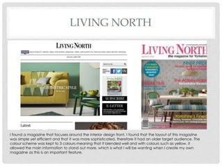
I found a magazine that focuses around the interior design front. I found that the layout of this magazine
was simple yet efficient and that it was more sophisticated, therefore it had an older target audience. The
colour scheme was kept to 3 colours meaning that It blended well and with colours such as yellow, it
allowed the main information to stand out more, which is what I will be wanting when I create my own
magazine as this is an important feature.
OUT! NORTHEAST
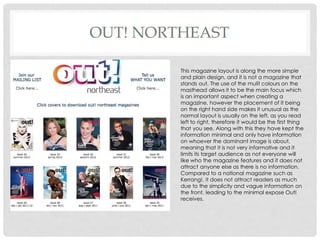
This magazine layout is along the more simple
and plain design, and it is not a magazine that
stands out. The use of the mulit colours on the
masthead allows it to be the main focus which
is an important aspect when creating a
magazine, however the placement of it being
on the right hand side makes it unusual as the
normal layout is usually on the left, as you read
left to right, therefore it would be the first thing
that you see. Along with this they have kept the
information minimal and only have information
on whoever the dominant image is about,
meaning that it is not very informative and it
limits its target audience as not everyone will
like who the magazine features and it does not
attract anyone else as there is no information.
Compared to a national magazine such as
Kerrang!, it does not attract readers as much
due to the simplicity and vague information on
the front, leading to the minimal expose Out!
receives.
ETC FASHION MAGAZINE
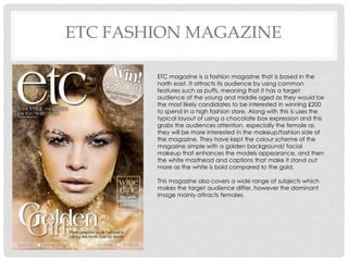
ETC magazine is a fashion magazine that is based in the
north east. It attracts its audience by using common
features such as puffs, meaning that it has a target
audience of the young and middle aged as they would be
the most likely candidates to be interested in winning £200
to spend in a high fashion store. Along with this is uses the
typical layout of using a chocolate box expression and this
grabs the audiences attention, especially the female as
they will be more interested in the makeup/fashion side of
the magazine. They have kept the colour scheme of the
magazine simple with a golden background/ facial
makeup that enhances the models appearance, and then
the white masthead and captions that make it stand out
more as the white is bold compared to the gold.
This magazine also covers a wide range of subjects which
makes the target audience differ, however the dominant
image mainly attracts females.

Regional magazines

  • 1.
    E X IS T I N G O N E S REGIONAL MAGAZINES
  • 2.
    LIVING NORTH I founda magazine that focuses around the interior design front. I found that the layout of this magazine was simple yet efficient and that it was more sophisticated, therefore it had an older target audience. The colour scheme was kept to 3 colours meaning that It blended well and with colours such as yellow, it allowed the main information to stand out more, which is what I will be wanting when I create my own magazine as this is an important feature.
  • 3.
    OUT! NORTHEAST This magazinelayout is along the more simple and plain design, and it is not a magazine that stands out. The use of the mulit colours on the masthead allows it to be the main focus which is an important aspect when creating a magazine, however the placement of it being on the right hand side makes it unusual as the normal layout is usually on the left, as you read left to right, therefore it would be the first thing that you see. Along with this they have kept the information minimal and only have information on whoever the dominant image is about, meaning that it is not very informative and it limits its target audience as not everyone will like who the magazine features and it does not attract anyone else as there is no information. Compared to a national magazine such as Kerrang!, it does not attract readers as much due to the simplicity and vague information on the front, leading to the minimal expose Out! receives.
  • 4.
    ETC FASHION MAGAZINE ETCmagazine is a fashion magazine that is based in the north east. It attracts its audience by using common features such as puffs, meaning that it has a target audience of the young and middle aged as they would be the most likely candidates to be interested in winning £200 to spend in a high fashion store. Along with this is uses the typical layout of using a chocolate box expression and this grabs the audiences attention, especially the female as they will be more interested in the makeup/fashion side of the magazine. They have kept the colour scheme of the magazine simple with a golden background/ facial makeup that enhances the models appearance, and then the white masthead and captions that make it stand out more as the white is bold compared to the gold. This magazine also covers a wide range of subjects which makes the target audience differ, however the dominant image mainly attracts females.